E*TRADE Design System
E*TRADE's marketing system as a DESIGN.md file — electric violet voltage on deep indigo, GraphikETRADE display at weight 600, and a 16px-dominant radius scale. Tokens for React, Next.js, and AI coding tools.
Add shadcn.io to your AI agent. · Pro It installs blocks, icons and templates in your design system from a prompt, with Pro.
Set up MCP- Primary
- #5627d8
- Typeface
- GraphikETRADE
- Shape
- Mixed
- Base radius
- 8px
- Colors
- 18
- Type tokens
- 11
- Components
- 18
- Spacing values
- 9
About
About E*TRADE DESIGN.md
Curated by Dov Azencot · Updated May 19, 2026 · Source us.etrade.com (opens in a new tab)
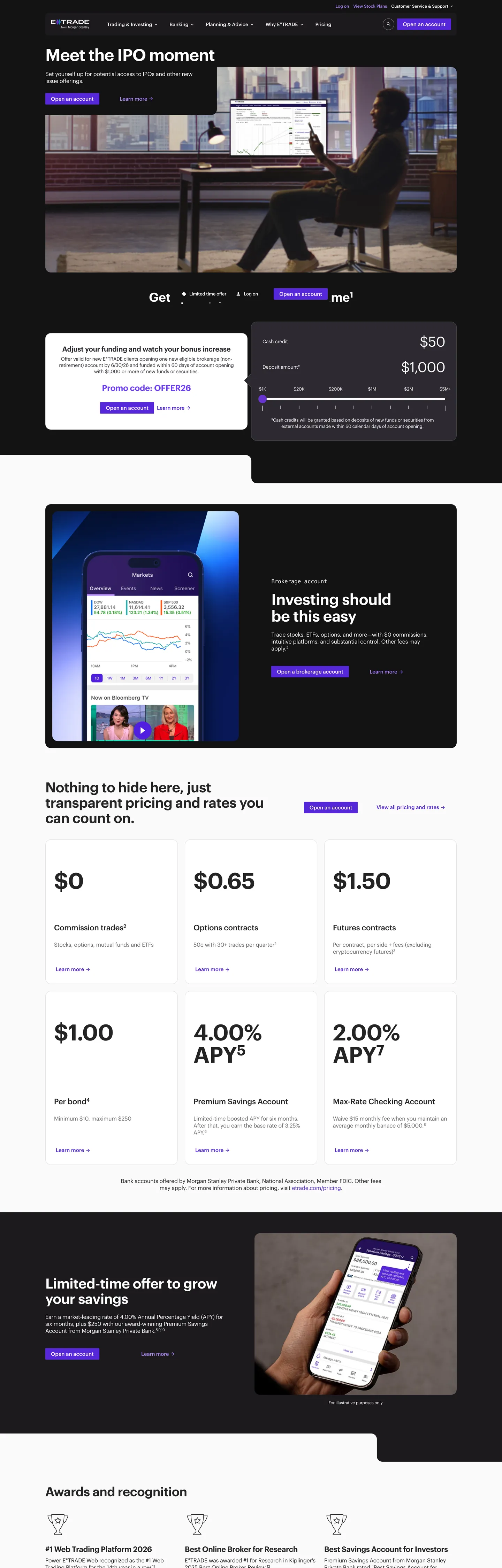
E*TRADE's marketing site sits in an unusual chromatic neighborhood for a broker. The brand voltage is electric violet — hex 5627d8 — wired into CSS as `--color-interactive-primary-default`, `--color-status-info-branded`, and `--color-border-window-active`, appearing 71 times in the captured page across the primary CTA, info-status badges, and accent borders. The above-fold hero canvas is a deep indigo near-black (hex 241056, wired as `--color-background-hero` and `--color-background-primary-navigation`), with a photographic hero ("Meet the IPO moment") showing a trader's silhouette at a multi-monitor setup. Where Vanguard fills its hero with a saturated crimson, Schwab leans on corporate navy, and Robinhood goes matte black with a green-orange split, E*TRADE picks a chromatic position that reads as "broker-fintech with a violet edge" — closer to the Morgan Stanley parent brand than to a discount-broker peer.
The DESIGN.md file packages the system into a machine-readable spec for React tooling. Inside: 18 colors tokens drawn from a Campfire design-system token set, organized into a brand-voltage tier (violet primary, violet hover, secondary cyan), a structural near-black indigo for hero surfaces, a structural ink-and-grayscale tier for editorial chrome, plus a separate categorical chart palette that ships 36 declared accents but renders zero of them on the marketing surface. 11 typography tokens span GraphikETRADE in display, heading, body, and button tiers, with a Material Icons mono companion for iconography labels. 18 components cover the violet primary CTA, the dark-band testimonial card, the white pricing strip with weight-600 numerals, the awards-and-recognition footer row, and the indigo top-nav with white wordmark.
Feed this file to Claude or Cursor and it will reproduce E*TRADE's specific moves: electric violet voltage on a deep indigo hero canvas, GraphikETRADE display at weight 600 with -1px tracking, the 2px tight CTA radius against a 16px-dominant body radius, and the alternating dark-light editorial banding. The one thing worth borrowing carefully: the proprietary Campfire token set ships an enormous categorical chart palette wired to CSS custom properties, but the marketing chrome only renders the four brand-tier values. If you fork the tokens, prune the categorical accents — they belong to the dashboard product, not the marketing surface.
What makes it distinct
5
- Electric violet voltagehex 5627d8 carries the primary CTA, info-status badges, and accent borders across the page, with deep indigo near-black at hex 241056 doing the hero-canvas work
- GraphikETRADE proprietary sansdisplay sits at 48-64px in weight 600 with -1px tracking, body at 12-16px in weight 400 with -0.21px tracking
- Tight 2px CTA radiusthe primary button breaks the system's 16px-dominant rounding with a deliberately small-step corner that reads as broker-form chrome
- Banded editorial rhythmdark indigo hero, white pricing strip, dark testimonial band, white awards row, alternating chromatic statements rather than gradient atmosphere
- Categorical chart palette36 declared categorical color tokens cover the dashboard chart family but never bleed into marketing chrome
us.etrade.com
Live at us.etrade.com
A snapshot of the brand in production. Scroll the frame to see the whole page.
Colors
18 colors
E*TRADE's system runs on #5627d8 as its primary voltage, used in 2 of 18 components. Type is set in GraphikETRADE across 11 tokens from 12px to 64px, weights 400–600. Shape language is mixed across 18 components, blending pills, soft rounds, and squarer corners.
Brand & Accent
Sparing, CTA-only voltage · 6
Surface
Page and card backgrounds · 1
Text
Headlines, body, captions · 4
Borders & Hairlines
Dividers, outlines, rules · 1
Semantic
Status, errors, success, links · 2
Other
Specialty colors · 4
Typography
11 type tokens
Set in GraphikETRADE across 11 tokens, from 12px to 64px, weights 400–600. Shown in its own stack: where the font isn't installed, the fallback the file names stands in.
- display-xl64px · weight 600 · lh 64px · tracking -0.8pxThe quick brown fox jumps over the lazy dog
- display-lg48px · weight 600 · lh 52px · tracking -1pxThe quick brown fox jumps over the lazy dog
- display-md36px · weight 600 · lh 40px · tracking -0.4pxThe quick brown fox jumps over the lazy dog
- heading-lg24px · weight 600 · lh 28px · tracking -0.21pxThe quick brown fox jumps over the lazy dog
- heading-md22px · weight 500 · lh 28px · tracking -0.21pxThe quick brown fox jumps over the lazy dog
- heading-sm20px · weight 600 · lh 24pxThe quick brown fox jumps over the lazy dog
- body-md16px · weight 400 · lh 20px · tracking -0.21pxThe quick brown fox jumps over the lazy dog
- body-sm13px · weight 400 · lh 18px · tracking -0.21pxThe quick brown fox jumps over the lazy dog
- body-xs12px · weight 400 · lh 16px · tracking -0.21pxThe quick brown fox jumps over the lazy dog
- button-md15px · weight 500 · lh 15pxThe quick brown fox jumps over the lazy dog
- nav-link14px · weight 500 · lh 18px · tracking -0.21pxThe quick brown fox jumps over the lazy dog
Layout
Radii and spacing
6 corner radii and 9 spacing values. Shape language: mixed.
Radii
- none0px
- xs2px
- md8px
- lg16px
- pill30px
- full9999px
Spacing
- xs4px
- sm8px
- base10px
- md15px
- lg16px
- xl20px
- 2xl24px
- 3xl30px
- 4xl60px
Components
18 components
Each rendered from its tokens (color, type, radius, padding) on E*TRADE's own canvas.
- Button Primarybutton-primaryButton Primary
- Button Primary Hoverbutton-primary-hoverButton Primary Hover
- Button Primary Activebutton-primary-activeButton Primary Active
- Button Secondarybutton-secondaryButton Secondary
- Button On Darkbutton-on-darkButton On Dark
- Top Navtop-navTop Nav
- Nav Linknav-linkNav Link
- Nav Link Mutednav-link-mutedNav Link Muted
- Hero Sectionhero-sectionHero Section
- Hero Headinghero-headingHero Heading
- Section Headingsection-headingSection Heading
- Body Paragraphbody-paragraphBody Paragraph
- Body Paragraph Mutedbody-paragraph-mutedBody Paragraph Muted
- Card Lightcard-lightCard Light
- Card Darkcard-darkCard Dark
- Pricing Cellpricing-cellPricing Cell
- Info Badgeinfo-badgeInfo Badge
- Type here…text-inputText Input
In use
The system, in use
E*TRADE's tokens on the kind of product it builds.
Build something people actually use.
A short paragraph of marketing copy that previews how the brand's display tier and body tier read together. Two sentences is usually enough.
FAQ
E*TRADE design system FAQ
Common questions about E*TRADE's tokens, components, and how to use this DESIGN.md in your project.
Read next
Related reading
Specs, directories, and component libraries that pair with this design system.
- Browse all design systemsThe full directory of DESIGN.md files on shadcn.io, with live mockups for each.shadcn.io
- E*TRADE — official siteE*TRADE's public marketing site — the source of truth for the live tokens captured in this file.us.etrade.com (opens in a new tab)
- The DESIGN.md specificationGoogle Labs' open spec for machine-readable design system files — the format this page is built on.github.com (opens in a new tab)
Use it
Use E*TRADE in your project
One machine-readable file. Drop it into Claude, Cursor, or any AI tool that reads DESIGN.md.
Download the DESIGN.md
One machine-readable file: every color, type, radius, spacing, and component token of E*TRADE.
Feed it to your AI tool
Drop it into Claude, Cursor, or GitHub Copilot. The agent writes React components and Tailwind classes that match E*TRADE's visual language.
Reference the tokens directly
Or paste the values into your Tailwind config, CSS variables, or component library: every color, size and radius is a quoted, ready-to-copy value.
Read the full DESIGN.md: overview, rationale, do’s and don’ts
Overview
E*TRADE's marketing site sits in a chromatic neighborhood no other major US broker occupies. Violet-indigo pairing. The brand voltage is electric violet ({colors.primary} — #5627d8) wired into the Campfire token set as --color-interactive-primary-default, --color-status-info-branded, and --color-border-window-active. The hero canvas is a deep indigo near-black ({colors.hero-canvas} — #241056) wired as --color-background-hero and --color-background-primary-navigation, with the photographic hero ("Meet the IPO moment") showing a silhouetted trader at a multi-monitor setup. Where Vanguard fills its hero with saturated crimson, Schwab leans on corporate navy, and Robinhood goes matte black with a green-orange split, the violet-indigo pairing reads as Morgan Stanley-era luxury fintech rather than discount-broker chrome.
The typographic system is GraphikETRADE single-voice. A licensed Commercial Type cut of Graphik does every tier — display, heading, body, button, label — with no second family on the marketing surface. Display sits at 48-64px in weight 600 with -0.8 to -1px tracking; body at 12-16px in weight 400 with -0.21px tracking; nav and button labels at 14-15px in weight 500. The -0.21px tracking on body is unusual; most systems hold body type at 0 tracking. The slight negative tightens the optical color and signals broker-statement chrome rather than SaaS-marketing body. A Material Icons stack carries icon labels at 14-20px.
The radius scale is multi-tier with a tight CTA. 16px ({rounded.lg}) dominates with 20 occurrences across cards and editorial tiles, but the primary CTA breaks down to a deliberately tight 2px ({rounded.xs}) — 8 occurrences across primary buttons and small chips. A 30px pill ({rounded.pill}) handles pricing-emphasis chips, 8px ({rounded.md}) handles icon buttons, and a single 40px and 9999px appear on rare large cards and status badges. The 2px CTA breaks the systemic 16px rhythm intentionally — it reads as terminal chrome, closer to a Bloomberg form than a SaaS hero.
Key Characteristics:
- Electric violet voltage (
{colors.primary}— #5627d8) carries the primary CTA and accent borders at frequency 71 (33 as text, 31 as border, 7 as background); deep indigo ({colors.hero-canvas}— #241056) fills the hero canvas and top-nav. - GraphikETRADE single-voice typography — proprietary Commercial Type cut with -0.21px tracking on body and -0.8 to -1px on display, no serif or monospace voice on the marketing surface.
- Tight 2px (
{rounded.xs}) CTA radius breaks the 16px-dominant body scale — broker-statement chrome instead of fintech-marketing softness. - Banded editorial rhythm — dark indigo hero → white pricing strip with weight-600 numerals at 64px → dark indigo testimonial band → white awards-and-recognition row. Alternating chromatic statements, no gradient transitions.
- Near-black ink (
{colors.ink}— #242424) at frequency 1378 dominates editorial chrome; hairline at #e2e2e2 carries 9 of 9 captured border roles outside the violet voltage. - Categorical chart palette (36 declared
--color-categorical-*tokens) belongs to the dashboard product and never renders on the marketing chrome — included in extraction but omitted from the spec. - 2:1 split between violet (
{colors.primary}) and a softer violet accent ({colors.accent-light}— #6e3df5) — the lighter accent appears 74 times as secondary border and tertiary text, the saturated primary holds CTA and status duty. - Info-status badge uses a soft lavender tint (
{colors.highlight-tint}— #f3f0ff) with violet text — the only true tinted-surface moment on the marketing chrome.
Colors
Brand
- Electric Violet (
{colors.primary}— #5627d8): frequency 71 — 33 as text, 31 as border, 7 as background. The brand voltage. Wired as--color-interactive-primary-default,--color-status-info-branded,--color-border-window-active,--temp-legacy-snackbar-btn-border. Carries the primary CTA, info-status badges, the active-window border ring, accent strokes on dark-band cards. - Violet Hover (
{colors.primary-hover}— #7852e0): the hover variant. Wired as--color-interactive-primary-hover,--color-interactive-primary-focus,--temp-legacy-snackbar-btn-background-hover. Declared but absent from the captured render (count 0); reserved for hover and focus states. - Violet Active (
{colors.primary-active}— #451fad): the pressed variant. Wired as--color-interactive-primary-activeand--temp-legacy-snackbar-btn-background-active. Also reserved — captured render does not include the press state. - Violet Light (
{colors.accent-light}— #6e3df5): frequency 74 — 37 as text, 37 as border. Lighter violet, used as secondary border and tertiary accent text. Despite higher frequency than the primary, this is not the brand voltage — it sits a step lighter and slightly more chromatic. - Violet Soft (
{colors.accent-soft}— #cdb3ff): frequency 40 — 20 as text, 20 as border. The softest violet tier — used on focus rings and disabled-state borders. - Violet Muted (
{colors.accent-muted}— #ab80ff): frequency 18 — 10 as text, 8 as border. The on-dark nav-link tone, used for inactive product-nav labels against the indigo top-nav.
Surface
- Hero Canvas (
{colors.hero-canvas}— #241056): the deep indigo near-black used for the hero block, the top-nav, and the testimonial band. Wired as--color-background-heroand--color-background-primary-navigation. Distinct from a pure black — the violet-leaning hue ties the canvas to the brand voltage chromatically. - Canvas (
{colors.canvas}— #ffffff): frequency 343 — 158 as text, 37 as background, 148 as border. The dominant body surface below the fold. Wired as--color-background-platform,--color-background-container,--color-background-header. - Ink Deep (
{colors.ink-deep}— #121213): frequency 9 as background. The darker testimonial-card surface — close to black but shifted slightly toward the violet hue. - Ink Soft (
{colors.ink-soft}— #2c2931): frequency 5 — small charcoal accents on dark-band card edges.
Text
- Ink (
{colors.ink}— #242424): frequency 1378 — 698 as text, 680 as border. The dominant text and divider tone. Wired as--color-text-default,--color-elevation-core-high,--color-interactive-secondary-default. Near-black, slightly desaturated. - Muted (
{colors.muted}— #666666): frequency 34 — 17 as text, 17 as border. Secondary text. Wired as--color-text-label,--color-text-secondary,--color-text-placeholder,--color-text-muted,--color-text-disabled. Single token doing multiple semantic jobs.
Hairline
- Hairline (
{colors.hairline}— #e2e2e2): frequency 9 — 9 as border. The dominant hairline tone. Wired as--color-border-divider,--color-border-window-default,--color-border-container. Light gray; the system uses no second hairline tier.
Semantic
- Positive (
{colors.positive}— #107a1b): declared as--color-interactive-positive-default,--color-status-positive,--color-text-positive. Absent from captured render (count 0); reserved for portfolio gains and confirmation states in the dashboard. - Warning (
{colors.warning}— #bb831b): declared as--color-status-warning,--color-text-warning. Absent from captured render. Reserved for status flags. - Status Info (
{colors.status-info}— #0065e3): declared as--color-status-info. Saturated cobalt, distinct from the brand violet — used for informational banner accents inside the authenticated product. - Highlight Tint (
{colors.highlight-tint}— #f3f0ff): wired as--color-background-highlight,--color-status-info-branded-background. Soft lavender — the only true tinted-surface moment, used on info-status badges.
Shadow
- Shadow (
{colors.shadow}— #000000): frequency 2 as elevation ink. The system uses RGB shadows derived from the ink tone, not from a tinted shadow —--color-elevation-cast-highresolves torgba(36,36,36,.161).
Typography
Font Family
The system runs GraphikETRADE — a licensed customization of Commercial Type's Graphik. Fallbacks walk "Helvetica Neue", Helvetica, arial, sans-serif. There is no serif voice and no monospace tier on the marketing surface; a Material Icons stack handles iconography at 14-20px alongside the sans, sized to match the surrounding body line-height.
Hierarchy
| Token | Size | Weight | Line Height | Letter Spacing | Use |
|---|---|---|---|---|---|
{typography.display-xl} | 64px | 600 | 64px | -0.8px | Pricing strip numerals ("$0", "0.65", "4.00% APY") |
{typography.display-lg} | 48px | 600 | 52px | -1px | Hero h1 ("Meet the IPO moment") |
{typography.display-md} | 36px | 600 | 40px | -0.4px | Section h2 ("Get up to $1,500 for a limited time") |
{typography.heading-lg} | 24px | 600 | 28px | -0.21px | Card titles inside dark testimonial bands |
{typography.heading-md} | 22px | 500 | 28px | -0.21px | Sub-section emphasis text |
{typography.heading-sm} | 20px | 600 | 24px | 0 | h3 / feature-cell titles |
{typography.body-md} | 16px | 400 | 20px | -0.21px | Default running text |
{typography.body-sm} | 13px | 400 | 18px | -0.21px | Caption rows, secondary text |
{typography.body-xs} | 12px | 400 | 16px | -0.21px | Footnote disclaimer text |
{typography.button-md} | 15px | 500 | 15px | 0 | Primary CTA label, secondary CTA label |
{typography.nav-link} | 14px | 500 | 18px | -0.21px | Top-nav link labels |
Principles
Display weight holds at 600 across every size from 36px up. The 64px pricing-strip numerals are the largest typographic moment in the system — heavier optical weight than the 48px hero h1, because the pricing strip is the page's commercial argument and the numerals do the persuasion. The -0.8 to -1px display tracking is calibrated to keep the weight-600 from looking like an under-leaded weight-500.
Body tracking at -0.21px is unusual. Most systems hold body at 0 tracking; the slight negative on every size from 12px through 22px is a deliberate broker-statement signature — it tightens the optical color and gives the editorial bands a slightly more compressed reading rhythm than a standard SaaS marketing body. The Campfire token --campfire-font-family-inter is declared as a fallback for legal pages, but the marketing surface never renders Inter.
Note on Font Substitutes
GraphikETRADE is a licensed Commercial Type family. The closest open-source substitute is Inter at the same weights, though Graphik's slightly narrower x-height and tighter aperture make Inter feel marginally wider at 13-14px body. For the 64px display tier, General Sans is closer in proportion but not free. The -0.21px body tracking transfers cleanly to Inter at the same value.
Layout
Spacing System
- Base unit: 10px (the dominant module — 33 occurrences) plus an 8px secondary module.
- Tokens:
{spacing.xs}4px ·{spacing.sm}8px ·{spacing.base}10px ·{spacing.md}15px ·{spacing.lg}16px ·{spacing.xl}20px ·{spacing.2xl}24px ·{spacing.3xl}30px ·{spacing.4xl}60px. - Section padding (vertical): ~60px between major bands; the hero block sits with 60x24 padding.
- Card internal padding:
{spacing.2xl}(24px) on the{component.card-light}and{component.card-dark}cards; 24x20 on the pricing-strip cells. - Top-nav padding:
{spacing.base}(10px) vertical,{spacing.xl}(20px) horizontal. Nav band sits at 56px height.
Grid & Container
- Max content width:
--site-max-widthdeclares 1200px; hero band extends edge-to-edge with content centered at 1180px. - Hero block: full-bleed indigo canvas with the photographic trader silhouette occupying the right two-thirds and the headline + CTA stack at the left third.
- Pricing strip: 4-column grid showing "$0 commission" / "$0.65 per options contract" / "$1.50 per futures contract" / "$1.00 per bond" stat-emphasis cells, each ~280px wide with 24px gutter.
- Testimonial band: 50/50 split between a phone-mockup product card on the left and a quote block on the right.
Rhythm
The page alternates between chromatic statement bands (indigo hero, dark testimonial, dark limited-offer band) and white editorial bands (pricing strip, awards-and-recognition row, footnote band). The rhythm is hard-edged — every section either commits to a saturated indigo or returns to pure white. No gradient transitions, no atmospheric fades; the surface either is indigo, or is not. This is the broker-statement editorial cadence, closer to a Morgan Stanley print spread than to a fintech-startup landing page.
Elevation
The system has a minimal shadow tier anchored on tinted ink rather than neutral black:
- Flat (no shadow): hero, body bands, pricing strip, awards row, footer — 95% of surfaces.
- Card elevation:
--color-elevation-core-highresolves torgba(36,36,36,.161),--color-elevation-cast-lowtorgba(36,36,36,.078). The system uses RGB shadows derived from the ink tone ({colors.ink}— #242424) rather than from pure black. Dark cards on the testimonial band carry a faint 4-6px shadow at 16% alpha. - Hairlines (
{colors.hairline}— #e2e2e2) carry the work that shadows would carry in a more elevation-heavy system; the pricing-strip cells are divided by 1px hairlines rather than shadow halos.
Shapes
The radius scale is multi-tier with a tight CTA:
{rounded.none}0px — top-nav and pricing-strip cells.{rounded.xs}2px — frequency 8. The primary CTA ({component.button-primary}), secondary buttons, small chips. The tight CTA radius is the systemic exception — most fintech systems use 8-16px on primary buttons; here the 2px reads as broker-statement chrome.{rounded.md}8px — frequency 4. Icon buttons, secondary inputs.{rounded.lg}16px — frequency 20. The dominant card and editorial-tile radius.{rounded.pill}30px — frequency 5. The pricing-emphasis pill ("Up to $1,500 for a limited time") and similar inline accents.{rounded.full}9999px — frequency 1. The single status badge.
The contrast between 2px CTAs and 16px cards is the radius signature. Vanguard goes the opposite direction (32px panels, 80px pills); E*TRADE inverts to tight buttons inside generous cards.
Components
button-primary — The signature CTA. Violet {colors.primary} fill, white text, {rounded.xs} 2px radius, 8x15 padding, 33px height. "Open an account" is the canonical instance, appearing in the top-nav and the hero block.
button-primary-hover — Background flips to {colors.primary-hover} (#7852e0). The hover variant.
button-primary-active — Background flips to {colors.primary-active} (#451fad). The pressed variant.
button-secondary — White {colors.canvas} fill with near-black text and a 1px {colors.ink} border. Same 2px radius and 33px height as primary; used for "Learn more" and tertiary actions.
button-on-dark — White {colors.canvas} fill with indigo {colors.hero-canvas} text. Used for inverse CTAs on the indigo bands.
top-nav — Indigo {colors.hero-canvas} surface, 56px height, 10x20 padding. Holds the E*TRADE wordmark flush left, primary product nav center, and "Open an account" CTA flush right. The indigo carries seamlessly into the hero band — no transition between nav and hero canvas.
nav-link — Transparent background, white text in {typography.nav-link} (14px / 500), 10x15 padding. The active nav-link tone.
nav-link-muted — Transparent background, soft violet {colors.accent-muted} (#ab80ff) text. The inactive nav-link tone — readable against the indigo canvas but visibly de-emphasized.
hero-section — Indigo {colors.hero-canvas} fill, white text, {rounded.lg} 16px radius, 60x24 padding. The full-bleed-but-inset hero block holding the trader-silhouette photograph and the CTA stack.
hero-heading — White text on the indigo hero, GraphikETRADE 48px / 600 with -1px tracking.
section-heading — {colors.ink} text on white, {typography.display-md} (36px / 600 with -0.4px tracking). Used for "Get up to $1,500 for a limited time."
body-paragraph — Default ink running text at {typography.body-md}. The workhorse paragraph style.
body-paragraph-muted — {colors.muted} variant for secondary copy and footnote text.
card-light — White {colors.canvas} surface, 1px {colors.hairline} border, {rounded.lg} 16px radius, 24px internal padding. The default content card on the white editorial bands.
card-dark — Deep ink {colors.ink-deep} (#121213) fill, white text, {rounded.lg} 16px radius, 24px padding. The testimonial-band card.
pricing-cell — White surface, large {typography.display-lg} (48px / 600) numerals, 24x20 padding. Divided from siblings by 1px hairline vertical rules. The "$0 / $0.65 / $1.50 / $1.00" pricing-strip cells.
info-badge — Soft lavender {colors.highlight-tint} (#f3f0ff) fill, violet {colors.primary} text, {rounded.pill} 30px radius, 4x10 padding, 24px height. The "Limited-time offer" and "New" status badges.
text-input — White surface, ink text, 1px muted-gray border, {rounded.xs} 2px radius, 10x15 padding, 40px height. Form input style.
Do's and Don'ts
Do pair the electric violet {colors.primary} with the deep indigo {colors.hero-canvas} (#241056). The violet-indigo pairing is the system's chromatic signature; using the violet alone on a white canvas drops the Morgan Stanley-era luxury-fintech signal that the indigo carries.
Do keep the primary CTA at the tight 2px {rounded.xs} radius, even though every surrounding card sits at 16px. The contrast is the broker-statement signature — softening the CTA to 8px makes it read as a generic SaaS button and undercuts the "broker terminal" voice.
Do use {typography.display-xl} (64px / 600) for pricing-strip numerals — not the 48px hero tier. The pricing numerals are the page's commercial argument; rendering them smaller than the hero h1 weakens the persuasion structure.
Do keep body tracking at -0.21px across every body size. The slight negative is calibrated for GraphikETRADE's tighter aperture; resetting to 0 makes the editorial bands read as generic Inter chrome.
Don't introduce the categorical chart palette (--color-categorical-* tokens — 36 declared accents) onto the marketing chrome. These tokens belong to the dashboard trading product; using them on marketing surfaces would shatter the brand voltage discipline.
Don't swap the hero canvas from {colors.hero-canvas} (#241056) to a pure black or to a corporate navy. The slight violet hue ties the canvas to the brand voltage chromatically — pure black breaks that tie and the page loses its position in the broker chromatic neighborhood.
Don't render the primary CTA at the 16px or 30px radius. The 2px is intentional and structural; the only acceptable alternatives are increasing the height (to a 48-56px CTA) while holding the 2px radius, never softening the corner.
Don't use {colors.muted} (#666666) for primary running text — it's calibrated for labels, placeholders, and disabled states. Body running text should use {colors.ink} (#242424) at the full ink weight.
Known Gaps
- Hover and focus states beyond
{component.button-primary-hover}: the full state matrix (focus rings, active press, disabled tints) is declared in the token set but absent from the captured marketing render. - Form input error states:
{component.text-input}carries the resting state; error / validation styling lives in the authenticated dashboard and onboarding flows. - Dark mode: the marketing surface alternates between indigo and white bands but does not expose a true dark-mode variant; a dark theme exists in the trading dashboard for after-hours views.
- Motion: the hero photograph carries a subtle parallax on scroll, the pricing strip count-ups on intersection — the spec captures end-state values only.
- Categorical chart palette: 36 declared
--color-categorical-*tokens belong to the dashboard product. They're listed in the extraction but omitted from the spec because they do not render on the marketing surface; reproduce the dashboard separately if you need the chart family. - Authenticated surfaces: this DESIGN.md captures the public marketing site only. The ETRADE trading dashboard, the Morgan Stanley Wealth Management surface, and the Power ETRADE platform carry richer token systems with table chrome, chart palettes, and inline alerts not represented here.
- Sub-brand surfaces: Morgan Stanley Online, Power E*TRADE, and Morgan Stanley Smith Barney each carry sub-brand chrome variations not exposed on this consumer marketing surface.
Fintech & Crypto
More systems like this
More DESIGN.md files in Fintech & Crypto.
Pricing
Build it with Pro
The DESIGN.md files are free. Pro adds 6,000+ blocks, premium templates and the MCP server, so your AI editor builds in your system for you.
4.9/5 out of 5 · 150+ reviewsfrom 150+ founders and developers.
Billing
Billed once a year in USD. Cancel anytime.
- How many people can use the license.
- Client work, SaaS products and anything you charge for.
- Production-ready React sections: hero, pricing, features, dashboards and more.
- Complete multi-page sites you can ship as they are.
- React icons from every major library, installable with one command.
- Presets that restyle every block, in light and dark.
- Lets your AI editor search, preview and install blocks for you.
- Priority requests are answered first.
Individual
For personal projects & open source
$32instead of $49/mo
$389 billed yearly
- Seats: 1 seat
- Commercial use: Personal & open source only
- Pro blocks: 6,000+ blocks
- Templates: All 14 templates
- React icons: 294k+ icons
- Themes: All 59 themes
- MCP server: Basic usage
- Support: Standard
Team
Most popularFor freelancers, agencies & startups
$66instead of $99/mo
$789 billed yearly · ≈ $13/dev/mo
- Seats: Up to 5 seats
- Commercial use: Included
- Pro blocks: 6,000+ blocks
- Templates: All 14 templates
- React icons: 294k+ icons
- Themes: All 59 themes
- MCP server: High usage
- Support: Priority
Organization
For companies with larger teams
$132instead of $199/mo
$1,589 billed yearly
- Seats: Unlimited seats
- Commercial use: Included
- Pro blocks: 6,000+ blocks
- Templates: All 14 templates
- React icons: 294k+ icons
- Themes: All 59 themes
- MCP server: Unlimited usage
- Support: Priority
Billed once a year in USD. Cancel anytime.
Individual
For personal projects & open source
$32instead of $49/mo
$389 billed yearly
- How many people can use the license.Seats: 1 seat
- Client work, SaaS products and anything you charge for.Commercial use: Personal & open source only
- Production-ready React sections: hero, pricing, features, dashboards and more.Pro blocks: 6,000+ blocks
- Complete multi-page sites you can ship as they are.Templates: All 14 templates
- React icons from every major library, installable with one command.React icons: 294k+ icons
- Presets that restyle every block, in light and dark.Themes: All 59 themes
- Lets your AI editor search, preview and install blocks for you.MCP server: Basic usage
- Priority requests are answered first.Support: Standard
Team
Most popularFor freelancers, agencies & startups
$66instead of $99/mo
$789 billed yearly · ≈ $13/dev/mo
Everything in Individual, plus
- How many people can use the license.Seats: Up to 5 seats
- Client work, SaaS products and anything you charge for.Commercial use: Included
- Lets your AI editor search, preview and install blocks for you.MCP server: High usage
- Priority requests are answered first.Support: Priority
Organization
For companies with larger teams
$132instead of $199/mo
$1,589 billed yearly
Everything in Team, plus
- How many people can use the license.Seats: Unlimited seats
- Lets your AI editor search, preview and install blocks for you.MCP server: Unlimited usage
- Secure checkout via Stripe
- Code lives in your repo
- Keep what you've shipped if you cancel
- License terms
Your system, built for you
Every block, template and icon, installed by your AI agent in your design system. The DESIGN.md files stay free.