Drizzle ORM Design System
Drizzle ORM's design system as a DESIGN.md file — no primary brand color, dark gray #222222 ink, system-ui at 40px display, Menlo monospace, 8px radius. For React, Next.js, and AI tools.
Add shadcn.io to your AI agent. · Pro It installs blocks, icons and templates in your design system from a prompt, with Pro.
Set up MCP- Primary
- #0a0a0a
- Typeface
- ui-sans-serif
- Shape
- Mixed
- Base radius
- 5px
- Colors
- 15
- Type tokens
- 13
- Components
- 17
- Spacing values
- 9
About
About Drizzle ORM DESIGN.md
Curated by Dov Azencot · Updated May 19, 2026 · Source orm.drizzle.team (opens in a new tab)
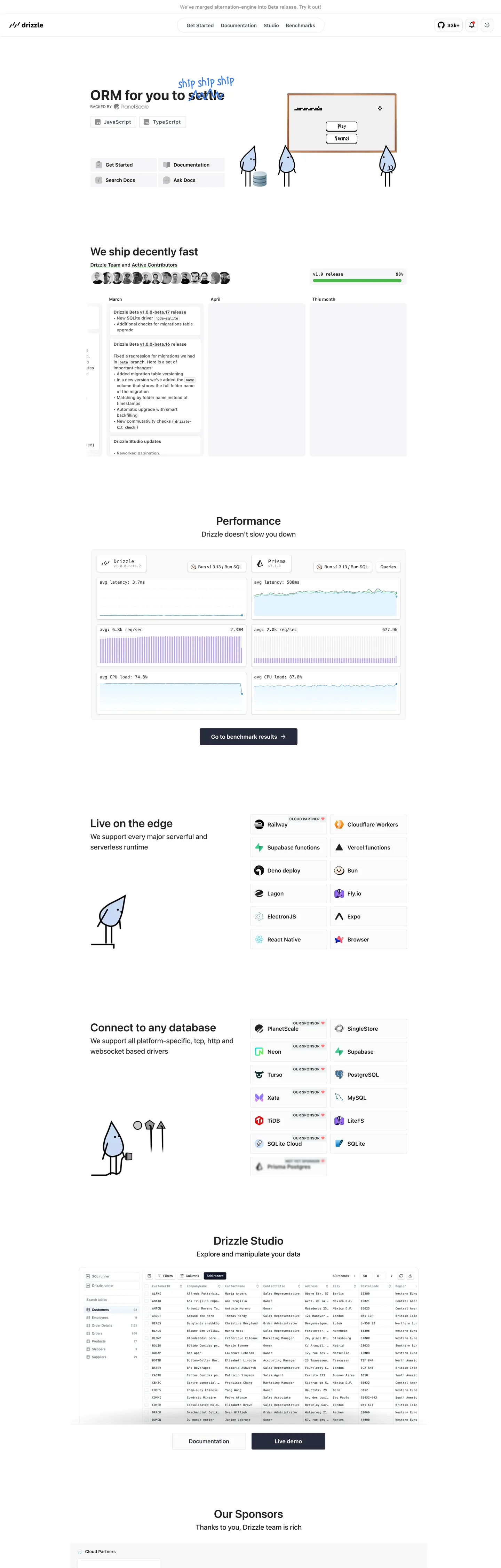
Drizzle's marketing page does not have a brand color. The CSS custom properties expose no --primary, no --accent, no brand hex in any variable name — the entire rendered surface runs on a cool dark-gray scale anchored by near-black charcoal ink (#222222) and mid-gray body text (#444444). The hero headline "ORM for you to settle" uses system-ui at 40px / weight 700 in the same charcoal as every other heading on the page, and the animated stacked emoji above it (three drizzle water-drop emoji) are the only non-gray visual decoration. Unlike Prisma, which holds a single teal CTA in reserve, or PlanetScale, which pairs a brand violet with a white canvas, Drizzle withholds color entirely and names the tool after the weather. The restraint is the brand.
The DESIGN.md file packages this into machine-readable tokens. Inside: 15 colors tokens on a strict achromatic gray ladder from near-black #222222 to off-white #ffffff, plus a cobalt link accent #006be6 (the system's only chromatic moment, appearing 20 times on external reference links); 13 typography tokens using the system-ui sans stack for all prose and Menlo/system-mono for two distinct code tiers; 8 radius values dominated by 8px (141 occurrences); 9 spacing values on a mixed 8–12px rhythm; and 17 components definitions covering the gray-surface release badge, the two-column performance benchmark panel, the runtime integration chip grid, and the Drizzle Studio data-table panel.
Feed this file to Claude or Cursor and it reproduces Drizzle's specific moves: no brand color, only cobalt links; system-ui headlines at modest weights rather than a display typeface; monospace at 9–12px for inline code and sidebar trees; and 8px card geometry throughout. The one move worth borrowing for any documentation-first tool: the willingness to make the page look like a very good README rather than a marketing site. Drizzle reads like a tool by developers who respect that their audience will evaluate the code, not the colors.
What makes it distinct
5
- No primary brand colorthe CSS custom properties declare no brand hex; the entire system runs on a cool achromatic gray scale with a single cobalt link accent
- Emoji as the brand illustration layerthe hero stacks three drizzle emoji above the headline rather than custom SVG artwork or photography
- Two-speed monospaceMenlo at 9.75px for inline code chips and a system mono stack at 12px for sidebar tree entries; monospace at tiny sizes signals the ORM's SQL-native philosophy
- 8px dominant radius (141 occurrences)card geometry is consistently mid-soft with a 2px base tier for syntax annotation chips
- Gray scale onlyno gradient, no shadow illustration, no chromatic accent beyond the cobalt link color; the page reads as a documentation entry point, not a marketing surface
orm.drizzle.team
Live at orm.drizzle.team
A snapshot of the brand in production. Scroll the frame to see the whole page.
Colors
15 colors
Drizzle ORM's system runs on #0a0a0a as its primary voltage, used in 1 of 17 components. Type is set in ui-sans-serif across 13 tokens from 9.75px to 40px, weights 400–700. Shape language is mixed across 17 components, blending pills, soft rounds, and squarer corners.
Surface
Page and card backgrounds · 4
Text
Headlines, body, captions · 7
Borders & Hairlines
Dividers, outlines, rules · 1
Other
Specialty colors · 3
Typography
13 type tokens
Set in ui-sans-serif across 13 tokens, from 9.75px to 40px, weights 400–700. Shown in its own stack: where the font isn't installed, the fallback the file names stands in.
- display-xl40px · weight 700 · lh 48pxThe quick brown fox jumps over the lazy dog
- display-lg32px · weight 600 · lh 48pxThe quick brown fox jumps over the lazy dog
- heading-md20px · weight 500 · lh 30pxThe quick brown fox jumps over the lazy dog
- heading-sm18px · weight 600 · lh 27pxThe quick brown fox jumps over the lazy dog
- body-lg16px · weight 400 · lh 24pxThe quick brown fox jumps over the lazy dog
- body-md14px · weight 400 · lh 21pxThe quick brown fox jumps over the lazy dog
- body-bold14px · weight 700 · lh 21pxThe quick brown fox jumps over the lazy dog
- label-md14px · weight 600 · lh 21pxThe quick brown fox jumps over the lazy dog
- label-sm12px · weight 500 · lh 17pxThe quick brown fox jumps over the lazy dog
- label-upper10px · weight 600 · lh 15pxThe quick brown fox jumps over the lazy dog
- button-md14px · weight 600 · lh 21pxThe quick brown fox jumps over the lazy dog
- mono-sm9.75px · weight 500 · lh normalThe quick brown fox jumps over the lazy dog
- mono-md12px · weight 500 · lh 12pxThe quick brown fox jumps over the lazy dog
Layout
Radii and spacing
8 corner radii and 9 spacing values. Shape language: mixed.
Radii
- none0px
- xxs2px
- xs3px
- sm4px
- md5px
- lg8px
- xl12px
- full50%
Spacing
- xxs2px
- xs4px
- sm6px
- md8px
- base12px
- lg16px
- xl20px
- 2xl40px
- 3xl64px
Components
17 components
Each rendered from its tokens (color, type, radius, padding) on Drizzle ORM's own canvas.
- Button Primarybutton-primaryButton Primary
- Button Secondarybutton-secondaryButton Secondary
- Top Navtop-navTop Nav
- Nav Linknav-linkNav Link
- Hero Headinghero-headingHero Heading
- Section Headingsection-headingSection Heading
- Body Paragraphbody-paragraphBody Paragraph
- CardcardCard
- Release Badgerelease-badgeRelease Badge
- Code Inlinecode-inlineCode Inline
- Benchmark Cardbenchmark-cardBenchmark Card
- Runtime Chipruntime-chipRuntime Chip
- Database Chipdatabase-chipDatabase Chip
- Studio Panelstudio-panelStudio Panel
- Type here…text-inputText Input
- Cobalt Linkcobalt-linkCobalt Link
- FooterfooterFooter
In use
The system, in use
Drizzle ORM's tokens on the kind of product it builds.
Build something people actually use.
A short paragraph of marketing copy that previews how the brand's display tier and body tier read together. Two sentences is usually enough.
FAQ
Drizzle ORM design system FAQ
Common questions about Drizzle ORM's tokens, components, and how to use this DESIGN.md in your project.
Read next
Related reading
Specs, directories, and component libraries that pair with this design system.
- Browse all design systemsThe full directory of DESIGN.md files on shadcn.io, with live mockups for each.shadcn.io
- Drizzle ORM — official siteDrizzle ORM's public marketing site — the source of truth for the live tokens captured in this file.orm.drizzle.team (opens in a new tab)
- The DESIGN.md specificationGoogle Labs' open spec for machine-readable design system files — the format this page is built on.github.com (opens in a new tab)
Use it
Use Drizzle ORM in your project
One machine-readable file. Drop it into Claude, Cursor, or any AI tool that reads DESIGN.md.
Download the DESIGN.md
One machine-readable file: every color, type, radius, spacing, and component token of Drizzle ORM.
Feed it to your AI tool
Drop it into Claude, Cursor, or GitHub Copilot. The agent writes React components and Tailwind classes that match Drizzle ORM's visual language.
Reference the tokens directly
Or paste the values into your Tailwind config, CSS variables, or component library: every color, size and radius is a quoted, ready-to-copy value.
Read the full DESIGN.md: overview, rationale, do’s and don’ts
Overview
Drizzle's marketing page has no brand color — not a restrained one, not a held-in-reserve one. The CSS custom property namespace contains zero color tokens with brand, accent, or primary in any name. Achromatic confidence. Every surface resolves through an achromatic gray ladder from near-black charcoal ink (#222222) down to off-white canvas (#ffffff), with the single chromatic exception of cobalt link text (#006be6) that reads more like a browser convention than a brand decision. Where Prisma holds teal in reserve, and Cloudflare fills the canvas with orange, Drizzle makes no chromatic commitment at all — a system that trusts the product's technical merit to do what color would do for lesser tools.
The hero is deliberately low-ceremony. Three animated drizzle emoji (💧💧💧) float above a 40px system-ui headline — not a custom display typeface, not a hero image, not a mesh gradient. System-ui renders differently on every platform (San Francisco on macOS, Segoe UI on Windows, Noto Sans on Linux), and Drizzle makes no attempt to normalize this. Unlike Prisma's Mona Sans VF or Cloudflare's FT Kunst Grotesk, there is no type-as-brand-statement here. The system says: read the code, not the headline.
The shape language is 8px-dominant and documentation-native. The 8px radius (141 occurrences) appears on every card, panel, and chip. A 2px tier (77 occurrences) handles the tiny inline code annotation chips that appear throughout the performance and integration sections. The Drizzle Studio data-table panel, the runtime chip grid, and the database integration grid all share the same 8px-rounded hairline-bordered card treatment — not because the design system mandates it, but because one surface and one radius covers the entire product.
Key Characteristics:
- No declared primary color in CSS variables — the first developer-tools brand in this directory with a fully achromatic system.
- Three animated emoji as the sole hero illustration — no custom SVG, no gradient mesh, no product screenshot above the fold.
- System-ui for all prose and headings — the only non-system fonts are Menlo at 9.75px for inline code and a system mono stack at 12px for sidebar trees.
- 8px dominant radius (141 occurrences), with a 2px base for code annotation chips.
- Cobalt #006be6 for external reference links only — 20 total occurrences, all as link text/border, never as a button fill.
- Gray-on-white hairline cards throughout — #cfd9de/#e8e8e8 borders on a white canvas, zero marketing-layer drop shadows.
- Changelog-style release timeline running vertically in the hero section — "We ship decently fast" with a scrollable commit log next to a GitHub contributor avatar strip.
Colors
Structural
- Ink (
#222222): frequency 1849. Used as text (978) and border (871) — the dominant near-black. Shared between the code editor foreground (--astro-code-color-text) and all heading text. Not pure black; a slightly warmer charcoal. - Ink Dark (
#0a0a0a): frequency 71. Used as text (69) — the darkest readable text tone, used for the primary CTA button label and the tightest headline weight. - Ink Mid (
#282b3b): frequency 341. Used as text (185) and border (153) — a slightly blue-dark gray used for body copy in the sidebar navigation and documentation-entry text blocks. - Ink Muted (
#444444): frequency 870. Used as text (409) and border (461) — the secondary text and border workhorse. Wired as --astro-code-token-punctuation. - Ink Secondary (
#4b5563): frequency 15. Used as text (8) and border (7) — tertiary text for captions and footer metadata. - Ink Tertiary (
#71767b): frequency 44. Used as text (22) and border (22) — the muted metadata tone for dates, contributor handles, and secondary labels. - Ink Faint (
#909090): frequency 14. Used as text (7) and border (7) — the most muted readable text, used for placeholder labels and disabled states. - Canvas (
#ffffff): frequency 290. Used as background (247), border (17), shadow (13), gradient (10), text (3). The page floor, card surfaces, and the docsearch modal background. - Surface-1 (
#e8e8e8): frequency 183. Used as background (44) and border (139) — the light gray border and muted surface tone. Wired as --docsearch-searchbox-background and the release badge background fill. - Surface Muted (
#808080): frequency 17. Used as background (14) — mid-gray fill for the performance chart secondary elements. - Surface Dark (
#333333): frequency 8. Used as text (4) and border (4) — a dark-tone surface variant for the changelog timeline markers. - Hairline (
#cfd9de): frequency 7. Used as border (5) and gradient (2) — the lightest structural border, used for card separators and the key-gradient on the docsearch chip.
Accent
- Cobalt (
#006be6): frequency 20. Used as text (10) and border (10) — the only chromatic moment in the system. External reference links in the integration and sponsor sections. Not declared as a CSS custom property — it appears to be browser-default-adjacent link styling. - Cobalt Light (
#3e7ff0): frequency 2. Used as text (1) and border (1) — a lighter cobalt variant in a single location. - Shadow (
#000000): frequency 156. Used as text (62), border (59), shadow (35) — the pure-black shadow ink for drop-shadow halos on cards and the docsearch modal.
Typography
Font Families
The system runs two voices: system-ui (resolving to San Francisco / Segoe UI / Noto Sans per platform) for all prose, headings, and navigation; and Menlo (with system mono fallback) for two distinct code tiers. There is no branded display typeface.
Unlike every other developer-tools brand in the directory, Drizzle commits to system-ui at the display tier — the headline looks like the OS's default sans-serif because it is. The code tier uses Menlo at 9.75px for inline annotation chips (the smallest code tier in any captured system) and a system mono stack at 12px for sidebar tree entries.
Hierarchy
| Token | Size | Weight | Use |
|---|---|---|---|
{typography.display-xl} | 40px | 700 | Hero h2 "ORM for you to settle" and "We ship decently fast" |
{typography.display-lg} | 32px | 600 | "Performance" and "Connect to any database" section headings |
{typography.heading-md} | 20px | 500 | Sub-section labels and integration category titles |
{typography.heading-sm} | 18px | 600 | Feature card headings ("Live on the edge", etc.) |
{typography.body-lg} | 16px | 400 | Default div/span body text, wider reading blocks |
{typography.body-md} | 14px | 400 | Primary paragraph body copy |
{typography.body-bold} | 14px | 700 | Bold emphasis within paragraphs |
{typography.label-md} | 14px | 600 | Runtime chip labels, integration names |
{typography.label-sm} | 12px | 500 | Dominant UI label — navigation, sidebar, metadata (469 occurrences) |
{typography.label-upper} | 10px | 600 | Uppercase section divider labels |
{typography.button-md} | 14px | 600 | Button and CTA labels |
{typography.mono-sm} | 9.75px | 500 | Inline code chips — the system's smallest code tier |
{typography.mono-md} | 12px | 500 | Sidebar tree entries and compact code labels |
Principles
The dominant size is 12px / weight 500 (469 occurrences of {typography.label-sm}) — the system spends more time in compact navigation and sidebar labels than in body paragraphs. This is a documentation-first type hierarchy, not a marketing one. The 40px display headline at weight 700 is the single moment the scale opens up.
Note on Font Substitutes
System-ui renders as San Francisco on macOS (with its distinctive 'a' and 'g' letterforms) and as Segoe UI on Windows (with noticeably wider inter-letter spacing). For a cross-platform system where consistency matters, substitute Inter at weight 400–700 at all tiers — Inter is the closest neutral approximation of the system-ui register across all platforms.
Layout
Spacing System
- Base rhythm: 8–12px, with the two most frequent single-value spacing tokens being 12px (54 occurrences) and 8px (39 occurrences).
- Tokens:
{spacing.xxs}2px ·{spacing.xs}4px ·{spacing.sm}6px ·{spacing.md}8px ·{spacing.base}12px ·{spacing.lg}16px ·{spacing.xl}20px ·{spacing.2xl}40px ·{spacing.3xl}64px. - Component padding:
{spacing.md}8px ×{spacing.base}12px (105 occurrences — the most common multi-value padding, used on nav items and small chips). - Section spacing: approximately 40–64px between major sections.
Grid & Container
- Hero layout: two-column split at desktop — headline + integration badge strip left, product screenshot or release changelog right.
- Performance benchmarks: two-panel side-by-side comparison grid at ~50/50 width.
- Runtime integration: two-column chip grid listing Bun, Railway, Supabase Functions, Vercel Functions, Deno, Deploy, Fly.io, Lagon, ElectronJS, React Native, Expo, Browser.
- Database integration: two-column chip grid with version badge annotations (e.g., "PlanetScale — BETA", "PostgreSQL — stable").
- Drizzle Studio: full-width data-table panel with sidebar column tree, table header row, and paginated data rows.
- Sponsor section: flat wordmark grid of cloud partners.
Rhythm
The page alternates between editorial text sections (left-aligned headline + body paragraph) and dense grid sections (chip grids, benchmark panels, the studio panel). The editorial sections have no surface fill — they read as negative space on the white canvas. The grid sections are bordered cards that create visual density without color. The rhythm is utilitarian: information density over pacing.
Elevation
The system uses two elevation tiers: flat white canvas for editorial sections, and hairline-bordered white cards for interactive and product UI surfaces. Shadow occurrences total 156, all using pure black (#000000) at low opacity — confined to the docsearch modal overlay and small card halos rather than any marketing-surface elevation. There is no tonal lift surface (no surface-1 used for card backgrounds) — cards share the same white canvas as the page floor and distinguish themselves exclusively through hairline borders.
- Flat: all editorial sections, hero, footer.
- Hairline-bordered: all cards, chips, the release badge, the studio panel, benchmark panels.
- Modal shadow: the docsearch modal uses a multi-layer box-shadow with a dark blue-gray tint — the one meaningfully-elevated surface on the page.
Shapes
The radius scale is 8px-dominant with a 2px annotation tier:
{rounded.none}0px — hero container and editorial section backgrounds.{rounded.xxs}2px — inline code annotation chips (77 occurrences) — the smallest code-label tier in any captured system.{rounded.xs}3px — secondary small UI surfaces.{rounded.sm}4px — tertiary card edges and form element variants.{rounded.md}5px — release badge chip.{rounded.lg}8px — the dominant card radius (141 occurrences): all feature cards, benchmark panels, runtime and database chip grids, the studio panel, input fields, and the primary CTA button.{rounded.xl}12px — the docsearch modal overlay (the search modal is the most elevated surface and gets the largest radius).{rounded.full}50% — contributor avatar circles in the team strip.
There is no pill radius. The maximum button radius is 8px, matching the card default exactly — buttons do not receive special rounding treatment.
Components
button-primary — Near-black {colors.ink-dark} fill, white text, system-ui 14px / 600, {rounded.lg} 8px radius, 8×12px padding, 48px height. "Get Started" is the canonical instance. The CTA is a dark rectangle with no chromatic brand — it reads more like a terminal Run button than a marketing CTA.
button-secondary — White canvas fill, ink text, 1px {colors.hairline} border, 8px radius, 40px height. Used for "Documentation", "Search Docs", "Ask Docs" on the hero badge strip.
top-nav — White canvas, 48px height. Drizzle wordmark left, "Get Started / Documentation / Studio / Benchmarks" links right, plus a GitHub star count badge and a social media icon.
nav-link — Transparent background, ink text at {typography.label-sm} (12px / 500), 4×8px padding.
hero-heading — Near-black ink, system-ui 40px / weight 700. "ORM for you to settle" (with animated drizzle emoji above it).
section-heading — Same ink, system-ui 32px / weight 600. "We ship decently fast," "Performance," "Connect to any database."
body-paragraph — {colors.ink-muted} (#444444), system-ui 14px / 400. The workhorse paragraph style.
card — White canvas, 1px {colors.hairline} border, 8px radius, 12px padding. The universal component container.
release-badge — Light gray {colors.surface-1} fill, dark ink text, monospace 9.75px, 5px radius, 8×10px padding, 48px height. The "v1.0 release 98%" chip above the hero badge strip — a release-progress indicator rather than a conventional hero annotation badge.
code-inline — Light gray fill, dark ink text, Menlo 9.75px, 2px radius, 1×3px padding. The inline code chip used throughout the body and integration descriptions.
benchmark-card — White canvas, 1px hairline border, 8px radius, 12px padding. Holds a performance metric label, a line/area chart, and numeric summary rows.
runtime-chip — White canvas, 1px hairline border, 8px radius, 8×12px padding. Holds a service icon + name label. "Railway", "Supabase functions", "Vercel Functions" etc.
database-chip — Same treatment as runtime-chip with an additional version badge annotation ("BETA", "stable" in a monospace micro-label).
studio-panel — White canvas, 1px hairline border, 8px radius. Full-width data-table: sidebar column tree left, column header row, paginated rows. The only table-style component in the captured surface.
text-input — White canvas, 1px hairline border, 8px radius, 8×12px padding, 40px height. Used in the docsearch trigger and the search modal.
cobalt-link — Transparent background, cobalt #006be6 text. External reference links — the only chromatic text in the system.
footer — White canvas, ink-muted text, 12px / 500. Flat footer: sponsor wordmarks, GitHub star count, Drizzle team credit.
Do's and Don'ts
Do commit to the achromatic palette fully. The system's distinctiveness is the absence of brand color — adding even a low-saturation teal or indigo accent breaks the one design decision that makes Drizzle recognizable in a category full of voltage-heavy competitors.
Do use system-ui at 40px / weight 700 for the top-level display headline. The system makes no attempt to normalize cross-platform rendering — the platform-native typeface IS the design. Using Inter or another loaded web font instead imports an editorial intention that the system explicitly lacks.
Do use Menlo at 9.75px for inline code chips. The ultra-small mono tier is the system's highest-density information surface — it lets code annotations sit inline without breaking paragraph rhythm. Using a larger mono size (14px+) would visually overwhelm the surrounding body copy.
Do use hairline borders (#cfd9de / #e8e8e8) exclusively for card elevation. There are no tonal-lift surfaces (no gray card backgrounds), no drop shadows on marketing cards. Every card distinguishes itself from the canvas through a 1px border only.
Don't introduce a brand color for the primary CTA button. The near-black {colors.ink-dark} fill is not a placeholder — it is the deliberate CTA treatment for a tool that trusts its technical documentation over chromatic persuasion. Changing it to teal, indigo, or green imports a visual hierarchy borrowed from competitors.
Don't use the cobalt link color (#006be6) for anything other than external reference links. It appears exclusively on outbound link text and borders — it is not a brand accent, a CTA fill, or an interactive state indicator. Placing cobalt on a button or card background would misrepresent its semantic role.
Don't add a custom display typeface above the system-ui stack. The system-ui rendering variance across platforms is load-bearing — the slightly-different San Francisco / Segoe UI / Noto Sans rendering across macOS / Windows / Linux is what gives the page a "native documentation" rather than "branded marketing" feel. A display typeface collapses that variance into a uniform editorial signal.
Don't use the Menlo {typography.mono-sm} (9.75px) tier for any non-code content. At 9.75px it is below comfortable reading size for prose — its only valid use is inline code annotation chips where the monospace convention signals "this is a code identifier" to a developer audience.
Known Gaps
- No brand color documentation: because the system has no primary CSS color variable, there is no canonical reference for what Drizzle's "brand color" would be in a more decorated context (e.g., a conference slide, a social media card, a sponsor badge). The system is genuinely achromatic by decision, not by omission.
- No dark mode: the captured page is light-only. The CSS does not expose a dark-mode color set. The Drizzle Studio product panel uses a dark background internally, but this is a product-surface UI choice rather than a system-level dark mode.
- Navigation hover states:
navLinkis captured in its resting state only. Hover styles (which likely add a light gray background fill) are not represented. - Animation and motion: the three emoji above the hero headline animate on a scroll-triggered sequence. The emoji themselves are the only animated element on the page. Easing curves and duration values are not captured.
- Table component internals: the Drizzle Studio panel shows a data table with column sorting, row selection, and pagination controls. The precise token values for the table header, row hover, and selection states are not represented.
- Sponsor tier styling: the "Our Sponsors" grid uses a flat wordmark layout whose hover states and tier-distinction (Cloud vs. Silver partner) use visual treatments not captured in the static screenshot.
Backend, Database & DevOps
More systems like this
More DESIGN.md files in Backend, Database & DevOps.
Pricing
Build it with Pro
The DESIGN.md files are free. Pro adds 6,000+ blocks, premium templates and the MCP server, so your AI editor builds in your system for you.
4.9/5 out of 5 · 150+ reviewsfrom 150+ founders and developers.
Billing
Billed once a year in USD. Cancel anytime.
- How many people can use the license.
- Client work, SaaS products and anything you charge for.
- Production-ready React sections: hero, pricing, features, dashboards and more.
- Complete multi-page sites you can ship as they are.
- React icons from every major library, installable with one command.
- Presets that restyle every block, in light and dark.
- Lets your AI editor search, preview and install blocks for you.
- Priority requests are answered first.
Individual
For personal projects & open source
$32instead of $49/mo
$389 billed yearly
- Seats: 1 seat
- Commercial use: Personal & open source only
- Pro blocks: 6,000+ blocks
- Templates: All 14 templates
- React icons: 294k+ icons
- Themes: All 59 themes
- MCP server: Basic usage
- Support: Standard
Team
Most popularFor freelancers, agencies & startups
$66instead of $99/mo
$789 billed yearly · ≈ $13/dev/mo
- Seats: Up to 5 seats
- Commercial use: Included
- Pro blocks: 6,000+ blocks
- Templates: All 14 templates
- React icons: 294k+ icons
- Themes: All 59 themes
- MCP server: High usage
- Support: Priority
Organization
For companies with larger teams
$132instead of $199/mo
$1,589 billed yearly
- Seats: Unlimited seats
- Commercial use: Included
- Pro blocks: 6,000+ blocks
- Templates: All 14 templates
- React icons: 294k+ icons
- Themes: All 59 themes
- MCP server: Unlimited usage
- Support: Priority
Billed once a year in USD. Cancel anytime.
Individual
For personal projects & open source
$32instead of $49/mo
$389 billed yearly
- How many people can use the license.Seats: 1 seat
- Client work, SaaS products and anything you charge for.Commercial use: Personal & open source only
- Production-ready React sections: hero, pricing, features, dashboards and more.Pro blocks: 6,000+ blocks
- Complete multi-page sites you can ship as they are.Templates: All 14 templates
- React icons from every major library, installable with one command.React icons: 294k+ icons
- Presets that restyle every block, in light and dark.Themes: All 59 themes
- Lets your AI editor search, preview and install blocks for you.MCP server: Basic usage
- Priority requests are answered first.Support: Standard
Team
Most popularFor freelancers, agencies & startups
$66instead of $99/mo
$789 billed yearly · ≈ $13/dev/mo
Everything in Individual, plus
- How many people can use the license.Seats: Up to 5 seats
- Client work, SaaS products and anything you charge for.Commercial use: Included
- Lets your AI editor search, preview and install blocks for you.MCP server: High usage
- Priority requests are answered first.Support: Priority
Organization
For companies with larger teams
$132instead of $199/mo
$1,589 billed yearly
Everything in Team, plus
- How many people can use the license.Seats: Unlimited seats
- Lets your AI editor search, preview and install blocks for you.MCP server: Unlimited usage
- Secure checkout via Stripe
- Code lives in your repo
- Keep what you've shipped if you cancel
- License terms
Your system, built for you
Every block, template and icon, installed by your AI agent in your design system. The DESIGN.md files stay free.