Discover Design System
Discover's marketing-site design system as a DESIGN.md file. Tangerine on the primary CTA, mustard on the rotating hero, navy-purple ink at 645 occurrences, DiscoverSans across every tier. Tokens for React, Next.js, and AI tools.
Add shadcn.io to your AI agent. · Pro It installs blocks, icons and templates in your design system from a prompt, with Pro.
Set up MCP- Primary
- #ea6a28
- Typeface
- DiscoverSans-Semibold
- Shape
- Soft
- Base radius
- 20px
- Colors
- 12
- Type tokens
- 13
- Components
- 16
- Spacing values
- 7
About
About Discover DESIGN.md
Curated by Dov Azencot · Updated May 19, 2026 · Source discover.com (opens in a new tab)
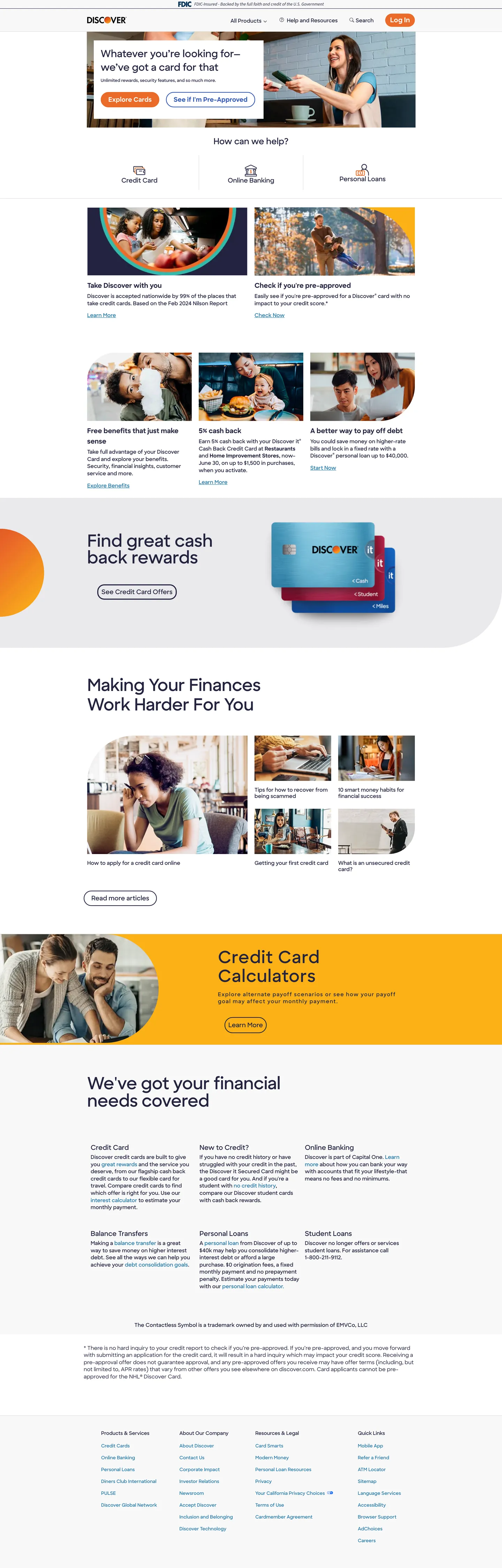
Discover's marketing site spends two oranges where most card brands hold one in reserve. The primary CTA pill — the Log In button at the top-right of the nav and the apply-now CTAs scattered through the page — is rendered in saturated tangerine #ea6a28; meanwhile the wide rotating hero banner sits on a warmer mustard-gold #fcb116, and the cashback-rewards illustration mid-page uses the same mustard tone as its background block with a rendered Discover card floating across it. The split is deliberate: the saturated tangerine carries actions, the warmer mustard carries ambient brand warmth. Where Chase paints its hero in cobalt and Capital One leans on red, Discover trusts the orange-family voice to do both the action work and the editorial backdrop work without ever needing a third color.
The DESIGN.md file packages the system into a machine-readable spec for React tooling. Inside: 12 colors tokens drawn from the 14 raw values rendered on the captured page, organized into a brand-voltage tier (tangerine for actions, mustard for ambient warmth), a structural tier dominated by a single navy-purple ink #23233f at 645 occurrences that carries every heading, body paragraph, and border on the page, plus a secondary teal #2477ab that colors the utility strip above the primary nav; 14 typography tokens running DiscoverSans across every step — display at 48px / weight 400, sub-section headings at 19px / weight 700, body at 15px / weight 400 — with a brief Source Sans 12.8px italic appearance reserved for legal-disclaimer footnotes; a 4-step radius scale of 20 / 25 / 80 / 135px (no small-step tier — everything is generous); and 16 components definitions covering the tangerine CTA pill, the mustard rotating hero, the cashback illustration block, the credit-card-calculator promotional band, and the 5-column feature footer.
Feed this file to Claude or Cursor and it reproduces Discover's specific moves: two-orange voltage split between action and ambient, navy-purple ink instead of charcoal or pure black, DiscoverSans across every tier with bold-700 reserved for sub-section h3s only, fully-rounded card chrome at 25px (not 8 or 12), and a secondary teal utility strip above the primary nav. The one move worth borrowing for any consumer-finance brand: the willingness to spend the brand color on a 25px-radius promotional-band background rather than holding it back for the CTA — Discover gives the page chromatic warmth above the action, instead of saving every drop for the click target.
What makes it distinct
5
- Two-orange voltagetangerine #ea6a28 carries the CTA pill while mustard-gold #fcb116 colors the rotating promotional hero and the cashback-card illustration, splitting orange between action and ambient warmth
- Navy-purple ink as the canvas voiceDiscoverSans #23233f at 645 captured occurrences carries every heading, body paragraph, and border on the page; never pure black
- DiscoverSans-Semibold across every tierdisplay at 48px / weight 400 lives next to bold-700 sub-section headlines, splitting display authority between size and weight
- Fully-rounded card chrome25px corner radius (4 of 8 captured radii) gives every promotional tile and cashback illustration a friendly bank-app silhouette, never sharp
- Top-strip teal #2477aba secondary blue that carries the help-and-account utility band above the primary nav, distinct from any of the orange or navy brand voltages
discover.com
Live at discover.com
A snapshot of the brand in production. Scroll the frame to see the whole page.
Colors
12 colors
Discover's system runs on #ea6a28 as its primary voltage, used in 1 of 16 components. Type is set in DiscoverSans-Semibold across 13 tokens from 10.5px to 48px, weights 400–700. Shape language is soft — components average 16px corner radius, with no sharp interactive edges.
Brand & Accent
Sparing, CTA-only voltage · 2
Surface
Page and card backgrounds · 3
Text
Headlines, body, captions · 5
Borders & Hairlines
Dividers, outlines, rules · 1
Other
Specialty colors · 1
Typography
13 type tokens
Set in DiscoverSans-Semibold across 13 tokens, from 10.5px to 48px, weights 400–700. Shown in its own stack: where the font isn't installed, the fallback the file names stands in.
- display-xl48px · weight 400 · lh 56px · tracking -0.39984pxThe quick brown fox jumps over the lazy dog
- display-md28px · weight 400 · lh 38.5pxThe quick brown fox jumps over the lazy dog
- heading-md24px · weight 400 · lh 31pxThe quick brown fox jumps over the lazy dog
- heading-sm19px · weight 700 · lh 30pxThe quick brown fox jumps over the lazy dog
- heading-xs18px · weight 700 · lh 24pxThe quick brown fox jumps over the lazy dog
- body-md15px · weight 400 · lh 20.625pxThe quick brown fox jumps over the lazy dog
- body-sm14px · weight 400 · lh 20.65px · tracking -0.11662pxThe quick brown fox jumps over the lazy dog
- body-xs13.125px · weight 400 · lh 18pxThe quick brown fox jumps over the lazy dog
- label-md18px · weight 400 · lh 18pxThe quick brown fox jumps over the lazy dog
- caption12px · weight 400 · lh 16.5pxThe quick brown fox jumps over the lazy dog
- micro10.5px · weight 400 · lh 18pxThe quick brown fox jumps over the lazy dog
- button-md19px · weight 700 · lh 20pxThe quick brown fox jumps over the lazy dog
- legal-italic12.8px · weight 400 · lh 12.8pxThe quick brown fox jumps over the lazy dog
Layout
Radii and spacing
5 corner radii and 7 spacing values. Shape language: soft.
Radii
- none0px
- md20px
- lg25px
- xl80px
- full135px
Spacing
- xs8px
- sm9px
- base10px
- md13px
- lg18px
- xl20px
- 2xl24px
Components
16 components
Each rendered from its tokens (color, type, radius, padding) on Discover's own canvas.
- Button Primarybutton-primaryButton Primary
- Button Secondarybutton-secondaryButton Secondary
- Utility Striputility-stripUtility Strip
- Top Navtop-navTop Nav
- Nav Linknav-linkNav Link
- Rotating Herorotating-heroRotating Hero
- Hero Headinghero-headingHero Heading
- Section Headingsection-headingSection Heading
- Body Paragraphbody-paragraphBody Paragraph
- Rewards Illustrationrewards-illustrationRewards Illustration
- Calculator Bandcalculator-bandCalculator Band
- Card Tilecard-tileCard Tile
- Feature Cellfeature-cellFeature Cell
- Inline Linkinline-linkInline Link
- Legal Footnotelegal-footnoteLegal Footnote
- FooterfooterFooter
In use
The system, in use
Discover's tokens on the kind of product it builds.
Build something people actually use.
A short paragraph of marketing copy that previews how the brand's display tier and body tier read together. Two sentences is usually enough.
FAQ
Discover design system FAQ
Common questions about Discover's tokens, components, and how to use this DESIGN.md in your project.
Read next
Related reading
Specs, directories, and component libraries that pair with this design system.
- Browse all design systemsThe full directory of DESIGN.md files on shadcn.io, with live mockups for each.shadcn.io
- Discover — official siteDiscover's public marketing site — the source of truth for the live tokens captured in this file.discover.com (opens in a new tab)
- The DESIGN.md specificationGoogle Labs' open spec for machine-readable design system files — the format this page is built on.github.com (opens in a new tab)
Use it
Use Discover in your project
One machine-readable file. Drop it into Claude, Cursor, or any AI tool that reads DESIGN.md.
Download the DESIGN.md
One machine-readable file: every color, type, radius, spacing, and component token of Discover.
Feed it to your AI tool
Drop it into Claude, Cursor, or GitHub Copilot. The agent writes React components and Tailwind classes that match Discover's visual language.
Reference the tokens directly
Or paste the values into your Tailwind config, CSS variables, or component library: every color, size and radius is a quoted, ready-to-copy value.
Read the full DESIGN.md: overview, rationale, do’s and don’ts
Overview
Discover's marketing site spends two oranges where most card brands hold one in reserve. Two-orange voltage. The primary CTA — the Log In pill at the top-right of the nav, the Apply Now buttons scattered through the body, the View Card affordances — is rendered in saturated tangerine {colors.primary} (#ea6a28) at 20px radius. The wide rotating hero banner at the top of the page and the cashback-rewards illustration block mid-page use a warmer mustard-gold {colors.primary-accent} (#fcb116) as their background fill — same chromatic family, lower saturation, higher luminance. The split lets the page carry editorial warmth on its promotional bands while reserving the most saturated tone for the one decision the visitor should make. Where Chase paints its hero in cobalt and Capital One leans on red, Discover trusts the orange-family voice to do both the action work and the editorial backdrop without ever needing a third color.
Ink is navy-purple, not black. {colors.ink} (#23233f) carries 645 captured occurrences — 326 as text, 319 as border — making it the load-bearing structural color of the system. The slight chroma toward warm purple sits between a true neutral and a cool indigo; it gives the page warmth without competing with the orange voltage. Pure black ({colors.shadow} — #000000) shows up only twice in the captured page. This is the inverse of fintech-canonical text discipline at Stripe (which holds body text on a deep navy) and Square (which holds it on true black) — Discover lets the text itself carry chromatic warmth instead of relying on accent colors to add it back.
A secondary blue tier handles utility work. {colors.link-blue} (#2477ab) at 116 occurrences runs across the inline-link tier, the utility strip above the primary nav, and the footer category links — a cooler accent that signals "navigation" rather than "action." A deeper {colors.link-blue-deep} (#3057b9) appears as the hover state on inline links. The two blues stay out of the action tier; orange always wins for clickable CTAs.
Key Characteristics:
- Two-orange voltage — tangerine
{colors.primary}carries CTAs and apply-now actions; mustard{colors.primary-accent}carries the rotating hero and cashback-rewards illustration. Action vs. ambient warmth. - Navy-purple ink
{colors.ink}(#23233f) at 645 occurrences carries every heading, body paragraph, and border on the page. Never pure black. - DiscoverSans across every tier — display at 48px / weight 400, sub-section h3 at 19px / weight 700, body at 15px / weight 400. The weight split is the move.
- Generous radius scale — 20 / 25 / 80 / 135px, no small-step tier. The smallest rounded surface is the CTA pill at 20px.
- Secondary blue
{colors.link-blue}(#2477ab) handles inline links, the utility strip above the primary nav, and the footer category labels — a navigation color, never an action color. - 16 face DiscoverSans family wired into CSS as
--DiscoverSans-Thinthrough--DiscoverSans-ExtraboldItalic— Discover ships a full optical-size foundry-style family. - Source Sans 12.8px italic appears only inside the legal-disclaimer footnote — the one place the proprietary family is not used.
- 10px base spacing module with cluster at 8 / 13 / 18 / 24px and 25px on outer card padding.
Colors
Brand
- Tangerine Primary (
{colors.primary}— #ea6a28): frequency 3. Used as background (2), border (1). The action voltage — fills the primary CTA pill (Log In, Apply Now, View Card), wired as the explicitbackgroundColoron every primary button. The only saturated tangerine in the system; reserved for clickable CTAs. - Mustard Accent (
{colors.primary-accent}— #fcb116): frequency 4 as background. The ambient brand warmth — fills the wide rotating hero banner at the top of the page, the cashback-rewards illustration block mid-page, the credit-card calculator promotional band. Same chromatic family as the tangerine, lower saturation. Reserved for editorial backdrop, never for CTAs.
Link
- Link Blue (
{colors.link-blue}— #2477ab): frequency 116 — 58 as text, 58 as border. The secondary blue tier — runs across inline links in body copy, the utility strip above the primary nav, the footer category labels. A cooler accent that signals navigation rather than action. The dominant link color in the system. - Link Blue Deep (
{colors.link-blue-deep}— #3057b9): frequency 4. The hover / press state on inline links — a step darker and slightly more saturated than the resting link blue.
Text
- Ink (
{colors.ink}— #23233f): frequency 645 — 326 as text, 319 as border. The dominant structural color of the system. Navy-purple, not black — the slight chroma toward warm purple gives the page warmth without competing with the orange brand voltage. Carries every heading, body paragraph, and primary border on the page. - Ink Secondary (
{colors.ink-secondary}— #293033): frequency 4 — 2 as text, 2 as border. A second-tier neutral used for smaller utility text and disclaimer subheads — slightly darker, slightly less purple. - Ink on Orange (
{colors.ink-on-orange}— #ffffff): frequency 15. White text used on the tangerine CTA pill and on imagery overlays. The only place white appears as a text color in the captured page.
Surface
- Canvas (
{colors.canvas}— #ffffff): frequency 15 — 10 as background, 3 as text, 2 as border. The body floor and card-tile fill. Pure white. - Surface-1 (
{colors.surface-1}— #f8f8f8): the very-pale neutral used for the utility strip above the primary nav, the legal-footnote band, and the footer canvas. Wired as a slight tint off the canvas so the utility strip reads as a separate band without forcing a border. - Surface Divider (
{colors.surface-divider}— #e9e9ec): frequency 2 as background. The mid-tone neutral used for section dividers and the FAQ-collapse interior fill.
Hairline
- Hairline (
{colors.hairline}— #dbdbdb): frequency 1 as border. A pale neutral hairline used on card outlines. Far less dominant than the navy-purple ink, which carries most of the structural border work.
Shadow
- Shadow (
{colors.shadow}— #000000): frequency 2 — 1 as text, 1 as border. Pure black appears only twice in the entire captured page, both as decorative micro-elements in illustration. The system does not use shadows for elevation.
Typography
Font Family
The system runs DiscoverSans for everything — a commissioned proprietary sans wired into 16 separate face files exposed as CSS variables (--DiscoverSans-Thin through --DiscoverSans-ExtraboldItalic, including italic variants for every weight). The family ships with foundry-style optical sizing: Thin, Light, Book, Medium, Semibold, Bold, Extrabold across both roman and italic, giving Discover a full editorial range. Fallbacks walk to sans-serif. Source Sans 12.8px italic appears only inside the legal-disclaimer footnote at the bottom of the page — the one place the proprietary family is not used.
Hierarchy
| Token | Size | Weight | Line Height | Letter Spacing | Use |
|---|---|---|---|---|---|
{typography.display-xl} | 48px | 400 | 56px | -0.40px | Hero h2 ("Making Your Finances Work Harder For You") |
{typography.display-md} | 28px | 400 | 38.5px | 0 | Calculator-band display, rotating-hero callouts |
{typography.heading-md} | 24px | 400 | 31px | 0 | Section h2 ("How can we help?") |
{typography.heading-sm} | 19px | 700 | 30px | 0 | Sub-section h3s (DiscoverSans-Bold) |
{typography.heading-xs} | 18px | 700 | 24px | 0 | Small section h3 labels (DiscoverSans-Bold) |
{typography.body-md} | 15px | 400 | 20.625px | 0 | Default running text, card body, paragraph copy |
{typography.body-sm} | 14px | 400 | 20.65px | -0.11px | Lead h2 paragraphs, dense text rows |
{typography.body-xs} | 13.125px | 400 | 18px | 0 | Top-nav links, footer category labels |
{typography.label-md} | 18px | 400 | 18px | 0 | Block titles inside cards |
{typography.caption} | 12px | 400 | 16.5px | 0 | Metadata, fine print |
{typography.micro} | 10.5px | 400 | 18px | 0 | Footer copyright, micro-disclosures |
{typography.button-md} | 19px | 700 | 20px | 0 | Primary CTA pill label (DiscoverSans-Bold) |
{typography.legal-italic} | 12.8px | 400 | 12.8px | 0 | Legal-disclaimer footnote only (Source Sans Italic) |
Principles
The weight system splits work between display and h3. Display sits at 48px in Semibold weight 400 — the editorial-magazine treatment with -0.40px tracking; sub-section h3s sit at 19px in Bold weight 700 — the dense-headline treatment that pulls the eye through a long-scroll page of feature blocks. Where Stripe holds every tier at weight 300 and Cloudflare holds at weight 500, Discover runs both — 400 on the loud display and 700 on the dense sub-section. The result reads more "consumer-finance editorial" than "fintech minimal."
Note on Font Substitutes
DiscoverSans is a commissioned proprietary family. Inter at the same weights is the closest open-source substitute; Source Sans 3 (already used in the legal footnote) is closer in feel and is the lighter cousin of the same humanist style. For the bold tier (h3s at weight 700), Inter Bold transfers cleanly. The weight split — display at 400, h3 at 700 — is the move to preserve regardless of which family you swap in.
Layout
Spacing System
- Base unit: 10px — the dominant gap module, with secondary clusters at 8 / 13 / 18 / 24px.
- Tokens:
{spacing.xs}8px ·{spacing.sm}9px ·{spacing.base}10px ·{spacing.md}13px ·{spacing.lg}18px ·{spacing.xl}20px ·{spacing.2xl}24px. - Section padding (vertical): ~80px between major bands on the body; the rotating-hero and rewards-illustration blocks sit edge-to-edge with their orange fills.
- Card internal padding:
{spacing.xl}(20px) for{component.card-tile};{spacing.2xl}(24px) for{component.rewards-illustration}and{component.calculator-band}. - Top-nav padding:
{spacing.md}(13px) vertical,{spacing.lg}(18px) horizontal.
Grid & Container
- Max content width: ~1100px on display headlines and editorial blocks, ~1280px on the cashback-illustration and footer bands.
- Rotating hero: full-bleed mustard
{colors.primary-accent}block with photographic content overlay; 24x20 padding, 20px outer radius. - 3-up promotional row: three side-by-side card tiles (Find cash back rewards / Earn rewards on every purchase / Rates to fit your needs) on a white canvas, each at 25px radius.
- Rewards illustration: 2-column block pairing a 50/50 mustard fill on the left with a rendered Discover card floating over it on the right.
- Calculator promotional band: full-width mustard band reading "Credit Card Calculators" with a tangerine CTA pill centered beneath.
- Footer: 5-column site-map block with category headings in navy-purple and links in
{colors.link-blue}on the{colors.surface-1}canvas.
Rhythm
The page alternates between promotional bands (full-bleed mustard with display copy) and editorial bands (white-canvas card grids with body copy). The rotating hero is promotional, the 3-up cashback row is editorial, the rewards illustration is promotional, the "Making Your Finances Work Harder" block is editorial, and so on. Mustard signals "promotional brand moment," white signals "editorial information." The page never lets two promotional bands stack — the editorial bands carry the visual breath.
Elevation
The system has essentially no shadow tier. Pure black {colors.shadow} (#000000) appears only twice in the entire captured page, both as decorative micro-elements in illustration rather than as ambient shadow ink. Depth comes from {colors.ink} (#23233f) 1px borders on card tiles (319 captured border occurrences) and from the surface-color contrast between {colors.canvas} (pure white) and {colors.surface-1} (#f8f8f8) on the utility strip and footer.
- Flat (no shadow): rotating hero, body bands, card tiles, calculator band, footer — 100% of surfaces.
- Card outline:
{colors.ink}(#23233f) at 1px on card-tile borders carries the depth work. - Surface contrast: the
{colors.surface-1}(#f8f8f8) utility strip and footer canvas read as separate bands against the pure-white body without needing a border or shadow.
Shapes
The radius scale is generously rounded — the smallest surface is at 20px, and the system skips the 4–12px tier that most fintech brands use:
{rounded.none}0px — only on full-bleed editorial bands and image overlays.{rounded.md}20px (2 occurrences) — the primary CTA pill{component.button-primary}. Fully rounded at the button height; reads as a soft-edge pill.{rounded.lg}25px (4 occurrences) — card tiles, the cashback-rewards illustration block, the 3-up promotional row. The dominant card radius.{rounded.xl}80px (1 occurrence) — the rotating-hero outer corner masking.{rounded.full}135px (1 occurrence) — large promotional banner masking on the calculator-band illustration.
There is no 4 / 8 / 12px tier. The smallest rounded surface is 20px. The result is a friendly bank-app silhouette across every card and CTA — distinct from Stripe's 4px tight radius or Mastercard's 8px standard.
Components
button-primary — The signature CTA. Tangerine {colors.primary} fill, white text, {rounded.md} (20px), 9px padding, 38px height, weight 700. The Log In pill at the top-right of the nav and the Apply Now / View Card buttons throughout the body. The only saturated-tangerine background-fill instance in the system.
button-secondary — White canvas fill, {colors.link-blue} text, 1px link-blue border, {rounded.md} 20px radius. The "Learn more" / "Continue" alternative used inside cards.
utility-strip — Pale neutral {colors.surface-1} (#f8f8f8) fill, {colors.link-blue} text, 8x24 padding, 32px height. The thin utility band above the primary nav holding the customer-service phone, login, account-management links. Sits as a separate band against the white nav without needing a border.
top-nav — White {colors.canvas} surface, 60px height, navy-purple text. Discover wordmark flush left, primary nav links (Credit Cards / Banking / Loans / Investing / About) center, right-aligned Log In tangerine CTA. The wordmark is the only place the brand voltage appears as a background fill in the nav band.
nav-link — Transparent background, navy-purple text in {typography.body-xs} (13.125px / 400), 0x10 padding.
rotating-hero — Full-bleed mustard {colors.primary-accent} (#fcb116) block holding the rotating promotional carousel, 24x20 padding, 20px outer radius. Holds a display headline, lead paragraph, and centered CTA pill.
hero-heading — Navy-purple text on the white canvas, {typography.display-xl} (48px / 400, -0.40px tracking). The editorial-magazine display tier. Padding offset 0x0x0x10 — the headline indents 10px from the left grid line.
section-heading — Navy-purple text, {typography.heading-md} (24px / 400). The "How can we help?" / "We've got your financial needs covered" tier.
body-paragraph — Default navy-purple running text at {typography.body-md} (15px / 400).
rewards-illustration — Mustard {colors.primary-accent} fill, navy-purple text, {rounded.lg} 25px radius, 24px padding. The "Find great cash back rewards" block pairs a mustard fill on the left with a rendered Discover card on the right at 50/50.
calculator-band — Mustard fill, navy-purple text, edge-to-edge with no radius, 24px padding. The "Credit Card Calculators" promotional band — full-width canvas reading the headline above a tangerine CTA.
card-tile — White canvas fill, navy-purple text, 1px hairline {colors.hairline} border, {rounded.lg} 25px radius, 20px padding. The default content card used in the 3-up promotional row and footer feature cells.
feature-cell — White canvas, navy-purple text, 20px padding, no border. The 5-column footer feature row holds a small heading and 3-4 link rows per cell.
inline-link — Inline text in {colors.link-blue} (#2477ab) at {typography.body-md}. Links in body copy and FAQ entries. The link voltage; never tangerine.
legal-footnote — Pale neutral {colors.surface-1} fill, navy-purple text, {typography.legal-italic} (12.8px Source Sans Italic), 24px padding. The legal-disclaimer band at the bottom of the body, just above the footer. The one place the proprietary DiscoverSans family is not used.
footer — Pale neutral {colors.surface-1} (#f8f8f8) canvas, link-blue category labels, 24px padding. Multi-column site map with category headings in navy-purple and links in the secondary link-blue tier.
Do's and Don'ts
Do spend two oranges, not one. Reserve {colors.primary} (tangerine #ea6a28) for the CTA pill and {colors.primary-accent} (mustard #fcb116) for the rotating hero and cashback-illustration bands. Painting both surfaces in the saturated tangerine collapses the action-vs-ambient distinction the page depends on.
Do use {colors.ink} (#23233f) — never pure {colors.shadow} (#000000) — for body text and card borders. The navy-purple chroma adds warmth without competing with the orange voltage; pure black would read cold and would clash with the warm orange editorial bands.
Do keep card radius at {rounded.lg} (25px) or larger. The system is deliberately generous — even the smallest surface (the CTA pill) sits at 20px. Adding a 4–12px middle tier softens the friendly bank-app silhouette.
Do reserve {colors.link-blue} (#2477ab) for inline links, utility-strip text, and footer category labels — never for the primary CTA. The system splits the action voltage (tangerine) from the navigation voltage (link blue); using blue on a CTA breaks the cross-page convention.
Don't use {colors.primary-accent} (mustard #fcb116) as a button background. The mustard reads as ambient brand warmth, not as a clickable surface — the page consistently overlays a separate tangerine CTA on top of mustard fields rather than letting the mustard itself act as the affordance.
Don't introduce a small-step radius tier (4 / 8 / 12px). The system skips this entirely — the smallest rounded surface in the captured page is 20px. Dropping below would shift the silhouette from "consumer bank app" to "fintech tool" and break the visual rhythm of the page.
Don't render {typography.heading-sm} (h3 sub-sections) at weight 400. The weight split — display at 400, h3 at 700 — is the page's vertical-hierarchy device. Flattening the h3 to display weight loses the dense-headline pull that carries the long-scroll feature blocks.
Don't reach for pure white {colors.canvas} inside the legal-footnote band. The footnote sits on {colors.surface-1} (#f8f8f8) and is rendered in Source Sans Italic — the surface tint and italic typeface together signal "secondary editorial / legal context," and dropping the tint loses the band's affordance.
Known Gaps
- Hover and focus states: the captured page renders resting-state values only; focus rings, active press, and disabled tints on the primary CTA are not exposed in the marketing surface.
- Form input states: the page captures no form-input components — the apply-now flow lives behind the CTA and is not represented here. Discover ships full form chrome in the application portal that is not in scope.
- Dark mode: the marketing surface is light-only. No
--theme-*dark variants are exposed in the captured CSS. - Motion: the rotating-hero carousel animates on a timed loop; transition timing, easing, and stagger live in the runtime JavaScript and are not captured as CSS tokens.
- Product surfaces: this DESIGN.md captures the marketing site only. The Discover online-banking portal, the credit-card-account dashboard, and the loan-application flows carry their own token systems that are not represented here.
- Card-art catalog: the rotating-hero and rewards-illustration blocks render specific Discover card art (it gets it Card, Cashback Debit, Student Card, etc.) — the card-art SVG palette and styling are not included as tokens in this spec.
- Multi-italic legal tier: the captured page exposes only Source Sans 400 italic at 12.8px for legal copy, but the
--Source-Sans-400-normalCSS variable is also declared — its roman variant is reserved for legal-copy roman text but doesn't render on the homepage.
Banking & Payments
More systems like this
More DESIGN.md files in Banking & Payments.
Pricing
Build it with Pro
The DESIGN.md files are free. Pro adds 6,000+ blocks, premium templates and the MCP server, so your AI editor builds in your system for you.
4.9/5 out of 5 · 150+ reviewsfrom 150+ founders and developers.
Billing
Billed once a year in USD. Cancel anytime.
- How many people can use the license.
- Client work, SaaS products and anything you charge for.
- Production-ready React sections: hero, pricing, features, dashboards and more.
- Complete multi-page sites you can ship as they are.
- React icons from every major library, installable with one command.
- Presets that restyle every block, in light and dark.
- Lets your AI editor search, preview and install blocks for you.
- Priority requests are answered first.
Individual
For personal projects & open source
$32instead of $49/mo
$389 billed yearly
- Seats: 1 seat
- Commercial use: Personal & open source only
- Pro blocks: 6,000+ blocks
- Templates: All 14 templates
- React icons: 294k+ icons
- Themes: All 59 themes
- MCP server: Basic usage
- Support: Standard
Team
Most popularFor freelancers, agencies & startups
$66instead of $99/mo
$789 billed yearly · ≈ $13/dev/mo
- Seats: Up to 5 seats
- Commercial use: Included
- Pro blocks: 6,000+ blocks
- Templates: All 14 templates
- React icons: 294k+ icons
- Themes: All 59 themes
- MCP server: High usage
- Support: Priority
Organization
For companies with larger teams
$132instead of $199/mo
$1,589 billed yearly
- Seats: Unlimited seats
- Commercial use: Included
- Pro blocks: 6,000+ blocks
- Templates: All 14 templates
- React icons: 294k+ icons
- Themes: All 59 themes
- MCP server: Unlimited usage
- Support: Priority
Billed once a year in USD. Cancel anytime.
Individual
For personal projects & open source
$32instead of $49/mo
$389 billed yearly
- How many people can use the license.Seats: 1 seat
- Client work, SaaS products and anything you charge for.Commercial use: Personal & open source only
- Production-ready React sections: hero, pricing, features, dashboards and more.Pro blocks: 6,000+ blocks
- Complete multi-page sites you can ship as they are.Templates: All 14 templates
- React icons from every major library, installable with one command.React icons: 294k+ icons
- Presets that restyle every block, in light and dark.Themes: All 59 themes
- Lets your AI editor search, preview and install blocks for you.MCP server: Basic usage
- Priority requests are answered first.Support: Standard
Team
Most popularFor freelancers, agencies & startups
$66instead of $99/mo
$789 billed yearly · ≈ $13/dev/mo
Everything in Individual, plus
- How many people can use the license.Seats: Up to 5 seats
- Client work, SaaS products and anything you charge for.Commercial use: Included
- Lets your AI editor search, preview and install blocks for you.MCP server: High usage
- Priority requests are answered first.Support: Priority
Organization
For companies with larger teams
$132instead of $199/mo
$1,589 billed yearly
Everything in Team, plus
- How many people can use the license.Seats: Unlimited seats
- Lets your AI editor search, preview and install blocks for you.MCP server: Unlimited usage
- Secure checkout via Stripe
- Code lives in your repo
- Keep what you've shipped if you cancel
- License terms
Your system, built for you
Every block, template and icon, installed by your AI agent in your design system. The DESIGN.md files stay free.