Citi Design System
Citi's marketing-site design system as a DESIGN.md file. Navy primary #002d72, cerulean link blue #056dae, Interstate type family, 12 colors tokens, 14 components. For React, Next.js, and AI tools.
Add shadcn.io to your AI agent. · Pro It installs blocks, icons and templates in your design system from a prompt, with Pro.
Set up MCP- Primary
- #002d72
- Typeface
- Interstate_Regular
- Shape
- Mixed
- Base radius
- 8px
- Colors
- 12
- Type tokens
- 11
- Components
- 14
- Spacing values
- 8
About
About Citi DESIGN.md
Curated by Dov Azencot · Updated May 19, 2026 · Source citi.com (opens in a new tab)
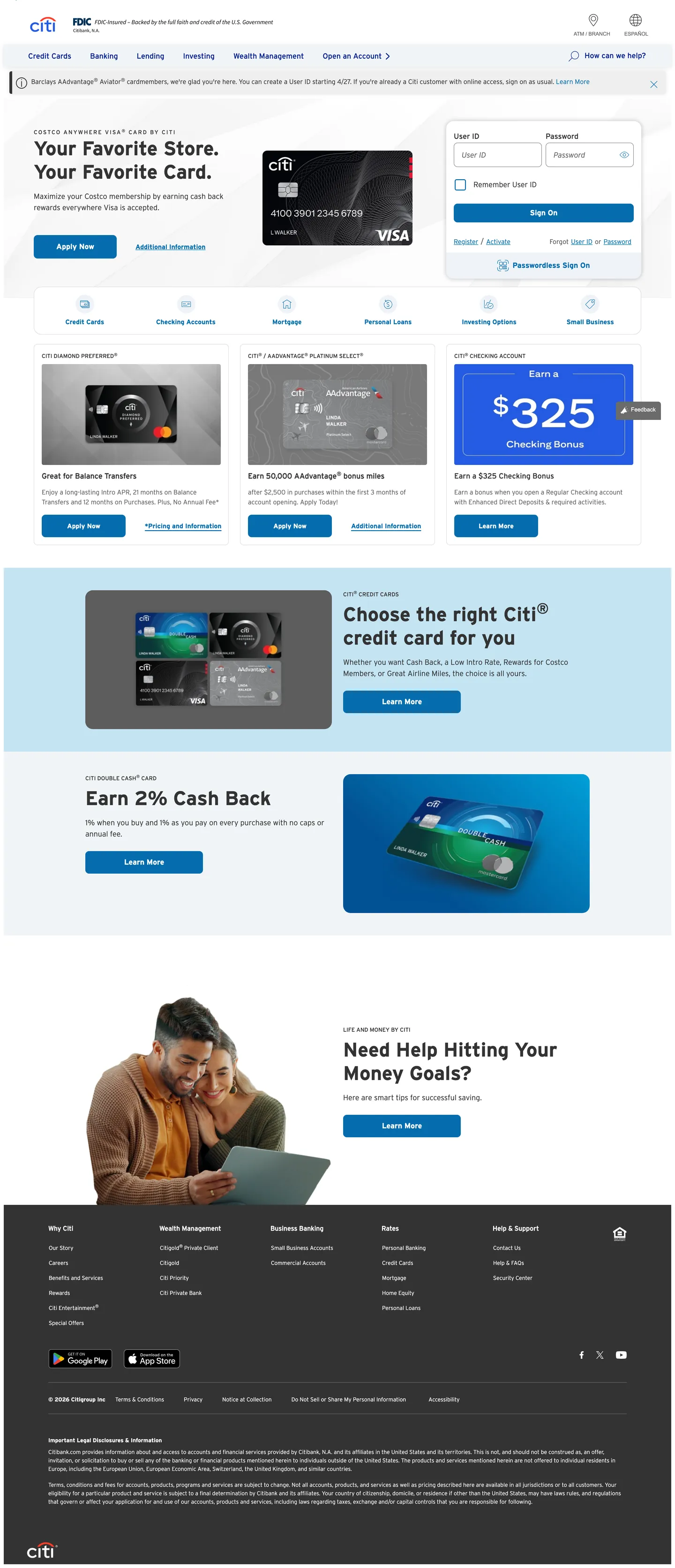
Citi's homepage is a banking page in the most literal sense: white canvas, navy top navigation, cerulean link text everywhere, card product photography, and dense utility navigation above the fold. The Citi arc logo — the two blue arcs framing the wordmark — is the only expressive brand mark on the page. Below it, the system is entirely workhorse. Where Chase leans on dark navy fills and JPMorgan applies institutional photography at scale, Citi holds everything on white and lets the cerulean link color do all the wayfinding. The hero area is a light blue-tinted band that sits just below the nav, not a full-bleed canvas; the brand color never escapes to fill a section.
The DESIGN.md file packages the system into machine-readable tokens for React and AI tools. Inside: 12 colors tokens anchored by deep navy #002d72 (the CSS --cdsbs-primary, layer: brand) and cerulean #056dae (appearing 115 times as the link and interactive surface color), with a supporting cast of near-black #333333 for body text, white for the canvas, and a light grey #f4f4f4 for alternate section fills. Typography runs Interstate exclusively — Light at 300 weight for caption and body, Regular at 400 for nav and running text, Bold at 700 for display headlines (42px) and label accents. Fifteen components cover the dual-button nav, credit card product tiles, the sign-on form, and the primary CTA.
Feed this file to an AI coding tool and it reproduces Citi's specific moves: dual-blue wayfinding, Interstate weight system, 8px radius on every interactive surface, and white-canvas banking-first layout. The one discipline worth borrowing for any financial product: separating the brand blue (deep navy, used sparingly for the logo and primary variable) from the interactive blue (cerulean, used everywhere that needs to feel clickable), rather than collapsing both into a single brand accent. Citi's link color and button color are the same cerulean — a deliberate convention that trains users to trust the color as interactive rather than decorative.
What makes it distinct
5
- Dual-blue hierarchydeep navy #002d72 anchors the brand primary while cerulean #056dae carries all interactive link and CTA surfaces, appearing 115 times across the page
- Interstate across every tierthe proprietary highway sans runs in three weights (Light/Regular/Bold) with no secondary family, from 42px display to 12px caption
- Institutional white canvasthe page floor is pure white with light grey (#f4f4f4) section bands; no hero canvas fill, no expressive color moments outside the nav
- 8px default radiusconsistent rounded-md on every card, button, and input; the system neither commits to sharp corners nor to generous rounding
- High-density nav with utility linksthe top nav bands a thin utility strip (Find a branch, Sign on) above the primary product nav (Credit Cards, Banking, Loans, Investing)
citi.com
Live at citi.com
A snapshot of the brand in production. Scroll the frame to see the whole page.
Colors
12 colors
Citi's system anchors on #002d72 (primary) as its primary color. Type is set in Interstate_Regular across 11 tokens from 12px to 42px, weights 300–700. Shape language is mixed across 14 components, blending pills, soft rounds, and squarer corners.
Brand & Accent
Sparing, CTA-only voltage · 1
Surface
Page and card backgrounds · 2
Text
Headlines, body, captions · 5
Borders & Hairlines
Dividers, outlines, rules · 2
Semantic
Status, errors, success, links · 1
Other
Specialty colors · 1
Typography
11 type tokens
Set in Interstate_Regular across 11 tokens, from 12px to 42px, weights 300–700. Shown in its own stack: where the font isn't installed, the fallback the file names stands in.
- display-xl42px · weight 700 · lh 50pxThe quick brown fox jumps over the lazy dog
- heading-md16px · weight 400 · lh 24pxThe quick brown fox jumps over the lazy dog
- body-lg16px · weight 300 · lh 24pxThe quick brown fox jumps over the lazy dog
- body-md14px · weight 300 · lh 21pxThe quick brown fox jumps over the lazy dog
- body-sm12px · weight 300 · lh 18pxThe quick brown fox jumps over the lazy dog
- label-md14px · weight 700 · lh 20pxThe quick brown fox jumps over the lazy dog
- label-sm12px · weight 400 · lh 18pxThe quick brown fox jumps over the lazy dog
- label-caps12px · weight 400 · lh 18px · tracking 2pxThe quick brown fox jumps over the lazy dog
- button-md16px · weight 400 · lh 24pxThe quick brown fox jumps over the lazy dog
- nav-link16px · weight 400 · lh 30pxThe quick brown fox jumps over the lazy dog
- caption12px · weight 400 · lh 18pxThe quick brown fox jumps over the lazy dog
Layout
Radii and spacing
5 corner radii and 8 spacing values. Shape language: mixed.
Radii
- none0px
- sm4px
- md8px
- lg16px
- pill50rem
Spacing
- xs4px
- sm8px
- md12px
- base16px
- lg20px
- xl24px
- 2xl32px
- 3xl48px
Components
14 components
Each rendered from its tokens (color, type, radius, padding) on Citi's own canvas.
- Button Primarybutton-primaryButton Primary
- Button Secondarybutton-secondaryButton Secondary
- Top Navtop-navTop Nav
- Nav Linknav-linkNav Link
- Hero Headinghero-headingHero Heading
- Body Paragraphbody-paragraphBody Paragraph
- Body Paragraph Mutedbody-paragraph-mutedBody Paragraph Muted
- CardcardCard
- Card Bluecard-blueCard Blue
- Section Bandsection-bandSection Band
- Type here…text-inputText Input
- LabellabelLabel
- Caption Labelcaption-labelCaption Label
- FooterfooterFooter
In use
The system, in use
Citi's tokens on the kind of product it builds.
Build something people actually use.
A short paragraph of marketing copy that previews how the brand's display tier and body tier read together. Two sentences is usually enough.
FAQ
Citi design system FAQ
Common questions about Citi's tokens, components, and how to use this DESIGN.md in your project.
Read next
Related reading
Specs, directories, and component libraries that pair with this design system.
- Browse all design systemsThe full directory of DESIGN.md files on shadcn.io, with live mockups for each.shadcn.io
- Citi — official siteCiti's public marketing site — the source of truth for the live tokens captured in this file.citi.com (opens in a new tab)
- The DESIGN.md specificationGoogle Labs' open spec for machine-readable design system files — the format this page is built on.github.com (opens in a new tab)
Use it
Use Citi in your project
One machine-readable file. Drop it into Claude, Cursor, or any AI tool that reads DESIGN.md.
Download the DESIGN.md
One machine-readable file: every color, type, radius, spacing, and component token of Citi.
Feed it to your AI tool
Drop it into Claude, Cursor, or GitHub Copilot. The agent writes React components and Tailwind classes that match Citi's visual language.
Reference the tokens directly
Or paste the values into your Tailwind config, CSS variables, or component library: every color, size and radius is a quoted, ready-to-copy value.
Read the full DESIGN.md: overview, rationale, do’s and don’ts
Overview
Citi's marketing homepage runs on institutional restraint. Dual-blue wayfinding. Where Chase paints entire hero bands in dark navy and JPMorgan applies deep-blue fills to section panels, Citi holds the entire page on white and separates brand blue (deep navy #002d72) from interactive blue (cerulean #056dae) — the former reserved for the Citi arc logo and the CSS primary variable, the latter deployed 115 times as every link, CTA, and hover accent on the page. The split is the system's organizing principle: users learn to read cerulean as "tap here" rather than "brand identity."
The system's typographic move is equally pragmatic. Interstate — a geometric highway sans — runs in three weight variants (Light 300, Regular 400, Bold 700) across every tier without a secondary family. The display headline at 42px / 700 is the loudest typographic moment; below that, the type scale drops quickly to 16px / 300 and 14px / 300 for running text. There is no editorial display treatment, no tight letter-spacing — the type does information delivery, not brand expression.
Structurally, the page is a series of white sections interrupted by light-grey (#f4f4f4) horizontal bands for alternate sections. Every interactive element — buttons, cards, inputs — uses the same 8px corner radius. The result reads more like a data-dense banking portal than a marketing site, which is precisely the intent for a primary audience of credit-card and deposit-account shoppers comparing features.
Key Characteristics:
- Deep navy primary (
{colors.primary}— #002d72) appears only in the Citi arc logo and CSS variable declarations; the cerulean ({colors.link}— #056dae) carries all 115 rendered interactive occurrences. - Interstate Bold at 700 weight for display (42px) and labels; Interstate Light at 300 weight for all body and caption text — no weight between 300 and 700 is used on the marketing page.
- Pure white canvas with #f4f4f4 alternate-section fills — no expressive hero canvas, no gradient, no brand-colored section fills outside the nav.
- 8px radius universally — buttons, cards, and input fields share the same
{rounded.md}treatment. - Dense two-tier navigation: a utility strip (branch finder, sign-on) stacked above the product nav (Credit Cards, Banking, Loans, Investing, Wealth Management).
- Credit card product tiles render at the center of the page with card photography, sub-headlines in Interstate_Regular, and dual-button CTA clusters (primary fill + secondary outline).
- Footer is near-black (
{colors.ink}— #333333) with white text — the only dark-surface element in the system.
Colors
Brand
- Primary Navy (
{colors.primary}— #002d72): declared as--cdsbs-primaryand--cdsbs-focus-ring-color, layer: brand. Appears in the Citi arc logo and as the focus-ring rgba. Not directly rendered as a visible fill on the marketing body — its role is identity anchoring and focus accessibility. - Cerulean Link (
{colors.link}— #056dae): frequency 115. Used as text (52), border (55), background (8). The interactive system color — every CTA button fill, every hyperlink, every card header accent. Wired as--cdsbs-link-color. - Link Hover (
{colors.link-hover}— #002256): declared as--cdsbs-link-hover-color. The darkened cerulean for hover and active states — a noticeably deeper navy-blue rather than a straight tint shift.
Text
- Ink (
{colors.ink}— #333333): frequency 701 — the dominant text color for body copy, display headlines, and labels. Wired as--cdsbs-body-color,--cdsbs-dark,--cdsbs-secondary-color. Near-black but not pure black; the warmth is standard for banking readability. - Ink Muted (
{colors.ink-muted}— #666666): frequency 12. Secondary body text, caption footnotes, and sub-label tones. - Ink Subtle (
{colors.ink-subtle}— #555555): frequency 4. A mid-grey between ink and muted, wired as--cdsbs-gray-700.
Surface
- Canvas (
{colors.canvas}— #ffffff): frequency 72. The page floor and card fill — pure white throughout. Wired as--cdsbs-body-bg,--cdsbs-white. - Surface-1 (
{colors.surface-1}— #f4f4f4): frequency 9. Alternate-section band fills and the light-blue-tinted hero area. The extractor merged several near-white section tints into this cluster — all carry the same light-grey or faint blue cast that differentiates them from the pure white canvas.
Hairline
- Hairline (
{colors.hairline}— #dddddd): frequency 4. Card and section dividers. Wired as--cdsbs-border-colorcluster. - Hairline Strong (
{colors.hairline-strong}— #888888): frequency 2. Input field border in resting state.
Semantic
- Danger (
{colors.danger}— #d60000): wired as--cdsbs-danger,--cdsbs-form-invalid-color. Form validation error state. - Success (
{colors.success}— #006e0a): wired as--cdsbs-success,--cdsbs-form-valid-color. Form validation success state.
Typography
Font Family
The system runs Interstate exclusively — a geometric sans-serif originally designed for U.S. highway signage, licensed as Interstate_Light, Interstate_Regular, and Interstate_Bold. Fallback is sans-serif. There is no secondary display family, no serif tier, no monospace voice. Interstate_Bold handles every emphasis moment — display headlines at 42px, bold labels, and emphasis spans inside body copy. Interstate_Light handles all running text.
Hierarchy
| Token | Size | Weight | Line Height | Use |
|---|---|---|---|---|
{typography.display-xl} | 42px | 700 | 50px | Primary hero headline ("Choose the right Citi® credit card for you") |
{typography.heading-md} | 16px | 400 | 24px | Section sub-headings ("Great for Balance Transfers") |
{typography.body-lg} | 16px | 300 | 24px | Hero body paragraph and section lead copy |
{typography.body-md} | 14px | 300 | 21px | Card descriptive text and feature lists |
{typography.body-sm} | 12px | 300 | 18px | Caption, fine print, footnotes |
{typography.label-md} | 14px | 700 | 20px | Emphasis labels and card feature highlights |
{typography.label-sm} | 12px | 400 | 18px | Metadata and disclaimer labels |
{typography.label-caps} | 12px | 400 | 18px | All-caps section labels with 2px letter-spacing |
{typography.button-md} | 16px | 400 | 24px | Primary and secondary button labels |
{typography.nav-link} | 16px | 400 | 30px | Product nav and utility nav links |
{typography.caption} | 12px | 400 | 18px | Fine print and legal disclaimer text |
Principles
The weight system has a binary gap: 300 (Light) for informational text and 700 (Bold) for emphasis, with 400 (Regular) carrying nav links and inline elements. There is no semibold or medium tier. The 42px display headline is the single loudest typographic moment; everything below drops to 16px or 14px. This keeps the display heading functionally large without creating a multi-tier scale that would introduce visual noise on a dense banking page.
Note on Font Substitutes
Interstate is a licensed family. Barlow at the same weight spread is the closest open-source substitute — the squared-off geometry and highway-legibility origins transfer well. DM Sans works for the Light and Regular tiers but lacks Interstate's characteristic width at Bold. For a retail banking UI where Interstate feels too branded, Source Sans Pro at 300/400/700 is a safe system-neutral alternative.
Layout
Spacing System
- Base unit: 8px.
- Tokens:
{spacing.xs}4px ·{spacing.sm}8px ·{spacing.md}12px ·{spacing.base}16px ·{spacing.lg}20px ·{spacing.xl}24px ·{spacing.2xl}32px ·{spacing.3xl}48px. - Internal card padding:
{spacing.base}(16px) on product tiles;{spacing.xl}(24px) on hero band. - Button padding: 11px top/bottom, 16px horizontal — the asymmetric vertical keeps the 46px button height without extra padding tokens.
- Nav link padding:
{spacing.lg}(20px) right-only for the cascading utility-link strip.
Grid & Container
- Max content width: approximately 1280px, with a secondary 1024px max on the product-card grid.
- Hero band: a full-width light-tinted surface (
{colors.surface-1}) holding the headline, a lifestyle image or card photograph, and a dual-CTA cluster. - Product card grid: 3-column or 4-column layout of credit card tiles at desktop — each tile holds card photography, a short feature headline, a feature list, and a dual-button cluster (primary fill + secondary outline).
- Alternate sections: white and light-grey bands alternate below the hero.
Rhythm
The page moves in dense horizontal bands — nav, hero, 3-up cards, feature highlight, 2-up feature row, editorial image, footer. There is no breathing room between bands beyond a single {spacing.xl} gap; the tempo is intentionally compact for a banking homepage where users scan rather than read.
Elevation
The system uses minimal shadow. Cards use a 1px {colors.hairline} border as the primary separation mechanism, not shadow. Depth comes from canvas-color contrast between white cards and the grey section bands. The CSS declares --cdsbs-box-shadow-sm: 0 0.125rem 0.25rem rgba(0,0,0,.075) for subtle interactive hover states on cards, but this shadow is nearly invisible in practice.
- Flat: all sections, all body text — 99% of surfaces.
- Card hover:
rgba(0,0,0,.075)soft halo on product card hover. - Input focus:
rgba(0,45,114,.25)focus ring at 4px width using the primary navy — the only visible focus-ring system in the page.
Shapes
The radius scale is compact and consistent:
{rounded.none}0px — section bands and the hero background.{rounded.sm}4px — small form elements and inner chip labels.{rounded.md}8px — the default. Buttons (23 occurrences), input fields, product cards, feature tiles.{rounded.lg}16px — larger card treatments (6 occurrences).{rounded.pill}50rem — the declared CSS border-radius-pill variable; used for fully circular chips in the UI library.
The dominant radius is 8px. The system makes no expressive use of rounding — 8px is a functional minimum for banking readability, not a design statement.
Components
button-primary — Cerulean {colors.link} fill, white text, Interstate_Bold at {typography.button-md}, {rounded.md} 8px, 11×16px padding, 46px height. "Apply Now", "Learn More", and "Explore Rewards" are the canonical instances.
button-secondary — White fill, cerulean text and 1px cerulean border, same typography and radius. Used alongside button-primary in dual-button CTA clusters on product tiles.
top-nav — White canvas surface, 48px height, holds the Citi arc logo flush left and product nav links center. A secondary utility strip above at approximately 32px height in lighter grey holds branch-finder, sign-on, and language links.
nav-link — Transparent background, cerulean text in {typography.nav-link}, 6px top / 20px right padding for the cascading horizontal strip. No hover fill; underline appears on hover.
hero-heading — Near-black {colors.ink} text at {typography.display-xl} (42px / 700). The dominant display moment on the page — "Choose the right Citi® credit card for you" is the canonical instance.
body-paragraph — Near-black {colors.ink} text at {typography.body-lg} (16px / 300). Hero sub-paragraph and section lead copy.
body-paragraph-muted — {colors.ink-muted} (#666666) at {typography.body-md} for secondary feature descriptions and fine print.
card — White surface, 1px {colors.hairline} border, {rounded.md} 8px radius, 16px padding. The default credit card product tile — holds card photography, heading, feature list, and dual CTA.
card-blue — {colors.surface-1} light-grey fill, {rounded.md} radius, 16px padding. Used for the hero band and alternate section panels where card content needs light tinting.
section-band — {colors.surface-1} fill, full-width, 24px vertical padding. The alternating-section device that creates visual rhythm without a separate surface color.
text-input — White fill, cerulean text (inherited from the sign-on form context), {rounded.md} 8px radius, 13×16px padding, 52px height, {colors.hairline-strong} 1px border. The sign-on username/password fields are the canonical instances.
label — Near-black text at {typography.label-md} (14px / 700). Inline emphasis labels and card feature call-outs.
caption-label — {colors.ink-muted} at {typography.caption} (12px / 400). Disclaimer text and legal footnotes below product cards.
footer — {colors.ink} (#333333) fill, white text, {typography.body-sm} (12px / 300), 24×16px padding. The footer is the only dark-surface element in the system — a conventional banking footer with three to four column product-link groups.
Do's and Don'ts
Do treat cerulean {colors.link} as the sole interactive signal. Every tappable surface on the page uses this color — buttons, links, form highlights. Introducing a second accent color for CTAs would break the user's learned signal that cerulean means "action."
Do use Interstate_Bold (700) only for the 42px display headline and emphasis labels. The weight gap between Light (300) and Bold (700) is the system's typographic hierarchy; adding a 600 semibold tier would compress the distinction.
Do keep cards and buttons at {rounded.md} 8px. The consistent radius across every interactive element creates the visual grammar of "this is a tappable banking surface" — mismatching radii on sibling components breaks that grammar.
Do use {colors.surface-1} (#f4f4f4) for alternate-section fills rather than tinting with cerulean. The light-grey creates rhythm without introducing a second chromatic voice that would compete with the cerulean interactive signals.
Don't fill hero sections with the primary navy {colors.primary} (#002d72) as a canvas color. The navy is a brand identity token, not a surface token — Citi does not put the brand color on the floor. Using it as a hero fill would contradict the system's entire white-canvas convention.
Don't use {colors.ink} (#333333) for interactive text elements. The ink color reads as "non-interactive body text"; any text the user should click must be in {colors.link} cerulean. Mixing the two would break the single interactive-color contract.
Don't introduce a gradient or expressive hero fill. The page's authority comes from its white restraint — a gradient hero would read as consumer fintech rather than institutional banking and undercut the trust signal.
Don't go below {rounded.md} 8px on any interactive surface. The system has 23 occurrences of 8px radius and only 5 at 4px (all on small internal chips). Sharp-cornered buttons at 0–4px would feel jarring against the card and input rounding.
Known Gaps
- Brand red / Citi arc color: the Citi logo includes a distinctive red arc, but no red token appears in the rendered marketing page. The arc's red is logo-only, not a system color; it is absent from the token set.
- Hover states beyond link-hover: the system documents
{colors.link-hover}for text links but does not expose hover states for button fills or card overlays from the captured marketing surface. - Mobile nav: the two-tier desktop nav collapses to a hamburger at mobile; the collapsed nav surface and flyout drawer are not represented here.
- Sign-on form state matrix: the input captures only the resting state. Error, success, and focus states are wired as CSS variables (
--cdsbs-form-invalid-color,--cdsbs-form-valid-color,--cdsbs-focus-ring-color) but not visually captured. - Product-tier color variants: Citi's product family (Double Cash, Custom Cash, Strata Premier, Diamond Preferred) uses slightly different card photography tones but the same system tokens — no per-product color split is captured.
- Dark mode: the system has no dark-mode variant on the marketing site; the
--cdsbs-*variable system does not declare dark-context overrides.
Banking & Payments
More systems like this
More DESIGN.md files in Banking & Payments.
Pricing
Build it with Pro
The DESIGN.md files are free. Pro adds 6,000+ blocks, premium templates and the MCP server, so your AI editor builds in your system for you.
4.9/5 out of 5 · 150+ reviewsfrom 150+ founders and developers.
Billing
Billed once a year in USD. Cancel anytime.
- How many people can use the license.
- Client work, SaaS products and anything you charge for.
- Production-ready React sections: hero, pricing, features, dashboards and more.
- Complete multi-page sites you can ship as they are.
- React icons from every major library, installable with one command.
- Presets that restyle every block, in light and dark.
- Lets your AI editor search, preview and install blocks for you.
- Priority requests are answered first.
Individual
For personal projects & open source
$32instead of $49/mo
$389 billed yearly
- Seats: 1 seat
- Commercial use: Personal & open source only
- Pro blocks: 6,000+ blocks
- Templates: All 14 templates
- React icons: 294k+ icons
- Themes: All 59 themes
- MCP server: Basic usage
- Support: Standard
Team
Most popularFor freelancers, agencies & startups
$66instead of $99/mo
$789 billed yearly · ≈ $13/dev/mo
- Seats: Up to 5 seats
- Commercial use: Included
- Pro blocks: 6,000+ blocks
- Templates: All 14 templates
- React icons: 294k+ icons
- Themes: All 59 themes
- MCP server: High usage
- Support: Priority
Organization
For companies with larger teams
$132instead of $199/mo
$1,589 billed yearly
- Seats: Unlimited seats
- Commercial use: Included
- Pro blocks: 6,000+ blocks
- Templates: All 14 templates
- React icons: 294k+ icons
- Themes: All 59 themes
- MCP server: Unlimited usage
- Support: Priority
Billed once a year in USD. Cancel anytime.
Individual
For personal projects & open source
$32instead of $49/mo
$389 billed yearly
- How many people can use the license.Seats: 1 seat
- Client work, SaaS products and anything you charge for.Commercial use: Personal & open source only
- Production-ready React sections: hero, pricing, features, dashboards and more.Pro blocks: 6,000+ blocks
- Complete multi-page sites you can ship as they are.Templates: All 14 templates
- React icons from every major library, installable with one command.React icons: 294k+ icons
- Presets that restyle every block, in light and dark.Themes: All 59 themes
- Lets your AI editor search, preview and install blocks for you.MCP server: Basic usage
- Priority requests are answered first.Support: Standard
Team
Most popularFor freelancers, agencies & startups
$66instead of $99/mo
$789 billed yearly · ≈ $13/dev/mo
Everything in Individual, plus
- How many people can use the license.Seats: Up to 5 seats
- Client work, SaaS products and anything you charge for.Commercial use: Included
- Lets your AI editor search, preview and install blocks for you.MCP server: High usage
- Priority requests are answered first.Support: Priority
Organization
For companies with larger teams
$132instead of $199/mo
$1,589 billed yearly
Everything in Team, plus
- How many people can use the license.Seats: Unlimited seats
- Lets your AI editor search, preview and install blocks for you.MCP server: Unlimited usage
- Secure checkout via Stripe
- Code lives in your repo
- Keep what you've shipped if you cancel
- License terms
Your system, built for you
Every block, template and icon, installed by your AI agent in your design system. The DESIGN.md files stay free.