Circle Design System
Circle's marketing-site design system as DESIGN.md. Aubergine licorice ink, Circularxx type, periwinkle canvas, USDC blue accents, 16 colors tokens, 18 components. For React, Next.js, and AI tools.
Add shadcn.io to your AI agent. · Pro It installs blocks, icons and templates in your design system from a prompt, with Pro.
Set up MCP- Primary
- #29233b
- Typeface
- Circularxx
- Shape
- Soft
- Base radius
- 10px
- Colors
- 16
- Type tokens
- 13
- Components
- 18
- Spacing values
- 7
About
About Circle DESIGN.md
Curated by Dov Azencot · Updated May 19, 2026 · Source circle.com (opens in a new tab)
Circle's marketing site has an identity signal that takes a moment to name: the dark color that does everything is not black, not navy, but aubergine. The primary ink, the button fill, the button border, the text-selection highlight, and the CSS variable `--colors-all--primary` all resolve to the same deep purple-near-black (#29233b), wired as "Licorice 700" in the system's semantic palette. The effect, against a pale periwinkle canvas, is that Circle reads simultaneously as a financial institution (dark, authoritative) and a product with a distinctive chromatic identity (the canvas is never neutral white, always blue-lavender). Where Stripe leans indigo, and where most crypto-infrastructure brands reach for electric blue on dark surfaces, Circle plants its authority in an aubergine that doesn't announce itself as purple but reads differently from any neutral.
The DESIGN.md file packages the system into a machine-readable spec for React and AI coding tools. Inside: 16 colors tokens drawn from Circle's palette-bestiary — Licorice (aubergine-dark tier), Jelly (violet accent for gradients), Gumdrop (sky-blue link and accent tier), plus structural whites and hairlines. Thirteen typography tokens run Circularxx across every surface: the hero h1 at 80px/500 with -1.5px tracking, h2 section displays at 51-66px, a 12px/500/uppercase eyebrow style that appears 28 times, and body copy at 14-18px/400. Radius tokens center on 20px for card surfaces and 50px for pill elements. Eighteen components cover the product-grid with tabbed navigation, the stats counter strip, the news-card set, and the CTAs.
Feed this file to Claude or Cursor and it will reproduce Circle's specific moves: periwinkle canvas instead of white, aubergine primary used as both ink and button fill with no separate accent reserved for CTAs, Circularxx at the same geometric weight across every tier, uppercase eyebrows at 12px for category labeling, and the violet-to-cyan gradient orb that floats beside the hero headline. The system's design lesson: when a single color carries every semantic role (text, border, button, selection), the palette achieves coherence through simplicity rather than through careful accent isolation.
What makes it distinct
5
- Licorice-as-everythingthe aubergine near-black (#29233b) serves simultaneously as primary ink, button fill, button border, and even the browser text-selection background
- Circularxx across every tierthe same rounded geometric sans from 12px uppercase eyebrows to 80px hero h1, with no weight heavier than 700 anywhere above body copy
- Periwinkle canvasthe page background is a pale blue-lavender (#edf1fc from themeColor) rather than pure white, carrying a faint blockchain-native color signal
- Jelly violet gradientthe hero decoration is a 3D-rendered orb in violet-to-cyan gradients using the Jelly (#9f72ff) and Gumdrop (#1894e8) palette families
- UPPERCASE eyebrows at 12pxsmall-caps category labels run Circularxx 12px/500 uppercase with 1.2px letter-spacing, appearing 28 times across the page
circle.com
Live at circle.com
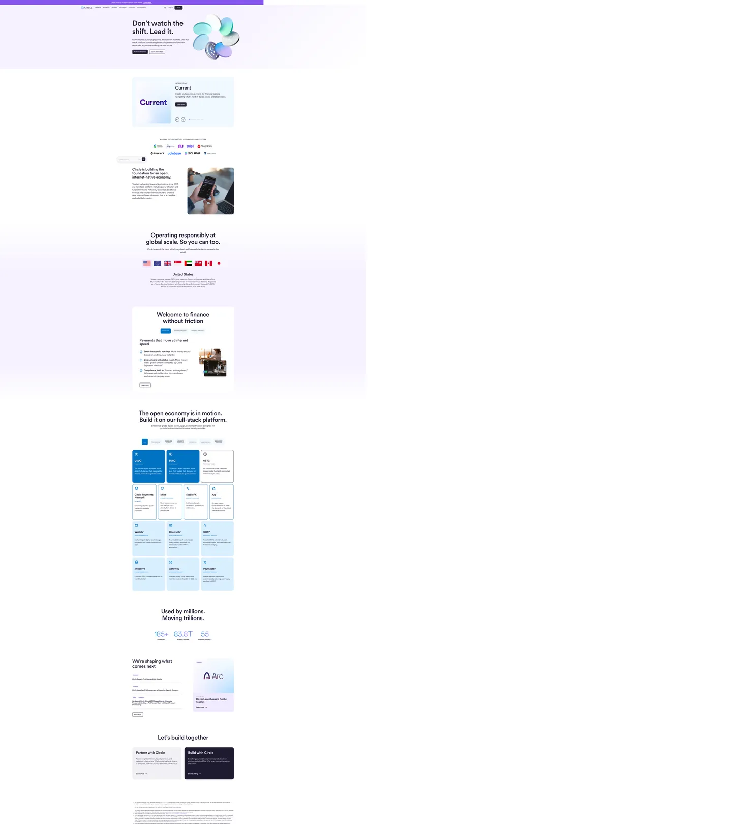
A snapshot of the brand in production. Scroll the frame to see the whole page.
Colors
16 colors
Circle's system runs on #29233b as its primary voltage, used in 14 of 18 components. Type is set in Circularxx across 13 tokens from 12px to 80px, weights 400–700. Shape language is soft — components average 12px corner radius, with no sharp interactive edges.
Brand & Accent
Sparing, CTA-only voltage · 2
Surface
Page and card backgrounds · 3
Text
Headlines, body, captions · 4
Borders & Hairlines
Dividers, outlines, rules · 2
Other
Specialty colors · 5
Typography
13 type tokens
Set in Circularxx across 13 tokens, from 12px to 80px, weights 400–700. Shown in its own stack: where the font isn't installed, the fallback the file names stands in.
- display-xl80px · weight 500 · lh 88px · tracking -1.5pxThe quick brown fox jumps over the lazy dog
- display-lg65.6px · weight 500 · lh 72.16px · tracking -1.5pxThe quick brown fox jumps over the lazy dog
- display-md51px · weight 500 · lh 56.1px · tracking -1.5pxThe quick brown fox jumps over the lazy dog
- heading-lg38px · weight 500 · lh 41.8px · tracking -0.5pxThe quick brown fox jumps over the lazy dog
- heading-md28px · weight 700 · lh 30.8px · tracking -0.5pxThe quick brown fox jumps over the lazy dog
- heading-sm24px · weight 400 · lh 31.2px · tracking -0.5pxThe quick brown fox jumps over the lazy dog
- body-lg18px · weight 400 · lh 27pxThe quick brown fox jumps over the lazy dog
- body-md16px · weight 400 · lh 24px · tracking -0.5pxThe quick brown fox jumps over the lazy dog
- body-sm14px · weight 400 · lh 23.3pxThe quick brown fox jumps over the lazy dog
- caption12px · weight 400 · lh 18pxThe quick brown fox jumps over the lazy dog
- eyebrow12px · weight 500 · lh 20.8px · tracking 1.2pxThe quick brown fox jumps over the lazy dog
- button-md16px · weight 700 · lh 16px · tracking -0.64pxThe quick brown fox jumps over the lazy dog
- nav-link16px · weight 500 · lh 18pxThe quick brown fox jumps over the lazy dog
Layout
Radii and spacing
7 corner radii and 7 spacing values. Shape language: soft.
Radii
- none0px
- xs2px
- sm8px
- md10px
- lg20px
- xl50px
- full9999px
Spacing
- xs4px
- sm8px
- md12px
- base16px
- lg24px
- xl40px
- 2xl96px
Components
18 components
Each rendered from its tokens (color, type, radius, padding) on Circle's own canvas.
- Button Primarybutton-primaryButton Primary
- Button Primary Hoverbutton-primary-hoverButton Primary Hover
- Button Secondarybutton-secondaryButton Secondary
- Top Navtop-navTop Nav
- Nav Linknav-linkNav Link
- Hero Headinghero-headingHero Heading
- Section Headingsection-headingSection Heading
- Eyebrow Labeleyebrow-labelEyebrow Label
- Body Paragraphbody-paragraphBody Paragraph
- Body Paragraph Mutedbody-paragraph-mutedBody Paragraph Muted
- CardcardCard
- Card Productcard-productCard Product
- Card Darkcard-darkCard Dark
- Stats Numberstats-numberStats Number
- Tab Activetab-activeTab Active
- Tab Inactivetab-inactiveTab Inactive
- Type here…text-inputText Input
- News Cardnews-cardNews Card
In use
The system, in use
Circle's tokens on the kind of product it builds.
Build something people actually use.
A short paragraph of marketing copy that previews how the brand's display tier and body tier read together. Two sentences is usually enough.
- · 1 project
- · Community support
- · 10k req/mo
- · 10 projects
- · Priority support
- · 1M req/mo
- · Custom domains
- · Unlimited
- · SLA
- · Audit log
- · SSO
FAQ
Circle design system FAQ
Common questions about Circle's tokens, components, and how to use this DESIGN.md in your project.
Read next
Related reading
Specs, directories, and component libraries that pair with this design system.
- Browse all design systemsThe full directory of DESIGN.md files on shadcn.io, with live mockups for each.shadcn.io
- Circle — official siteCircle's public marketing site — the source of truth for the live tokens captured in this file.circle.com (opens in a new tab)
- The DESIGN.md specificationGoogle Labs' open spec for machine-readable design system files — the format this page is built on.github.com (opens in a new tab)
Use it
Use Circle in your project
One machine-readable file. Drop it into Claude, Cursor, or any AI tool that reads DESIGN.md.
Download the DESIGN.md
One machine-readable file: every color, type, radius, spacing, and component token of Circle.
Feed it to your AI tool
Drop it into Claude, Cursor, or GitHub Copilot. The agent writes React components and Tailwind classes that match Circle's visual language.
Reference the tokens directly
Or paste the values into your Tailwind config, CSS variables, or component library: every color, size and radius is a quoted, ready-to-copy value.
Read the full DESIGN.md: overview, rationale, do’s and don’ts
Overview
Circle's marketing site positions a stablecoin infrastructure business through a single unorthodox chromatic decision. Licorice-as-everything: the same aubergine near-black (#29233b, named "Licorice 700" in Circle's CSS palette) serves as body text, button background, button border, and even the browser text-selection highlight color. There is no CTA accent set aside in a separate hue — the primary action is the brand color, which is also the text color. Where Stripe wires indigo into a voltage that appears selectively against white backgrounds, and where most fintech brands hold a blue or green for action-state differentiation, Circle collapses the distinction. The button and the paragraph are one color family.
The page's background resists neutrality. The themeColor meta tag declares #edf1fc — a pale periwinkle — and the section backgrounds cluster in the blue-violet family (near-white surfaces tinted with Jelly violet or Gumdrop blue). The hero carries a 3D-rendered orb in violet-to-cyan gradient alongside the headline "Don't watch the shift. Lead it." — the decoration is chromatic, the surrounding page is structured and restrained. Below the fold, the product grid shows 12 product tiles, each with a small icon and a product name, demonstrating USDC, EURC, the Payments Network, and nine other services on a single scrollable page without a tabbed sub-navigation.
Uppercase everywhere, once: the eyebrow label system is unusually active. The 12px/500/uppercase Circularxx style with 1.2px letter-spacing appears 28 times across the page — every section opens with a category label before its display heading. This regularity disciplines the scroll rhythm.
Key Characteristics:
- Aubergine primary (#29233b — 921 occurrences: 460 text, 455 border, 6 background) carries every structural role simultaneously.
- Circularxx rounded geometric sans across every tier from 12px eyebrow to 80px hero — no second family, no serif, no mono.
- 12px/500/uppercase eyebrow labels with 1.2px tracking appear 28 times, disciplining every section's entry point.
- Jelly violet (#8656ef — 67 occurrences) appears in the hero orb gradient, borders, and decorative accent text; it is the secondary chromatic voice.
- Blue Gumdrop (#0073c3 — 54 occurrences) handles active tab states, link text, and the statistics counter numbers ("185+ countries," "83.8T of on-chain TX").
- Pale periwinkle surface backgrounds in the Licorice-50 (#f6f2ff) and Gumdrop-75 (#d9efff) families — the page is never pure white.
- 20px card radius dominant (22 occurrences); 10px for form elements; 50px for pill-style elements.
Colors
Brand
- Primary (Licorice) (
{colors.primary}— #29233b): frequency 921. Text (460), border (455), background (6). The brand voltage that simultaneously serves ink, button fill, and selection background. Wired as--colors-all--primary,--colors--licorice--700,--_buttons---background,--_buttons---border,--wb-primary-color. - Primary Hover (
{colors.primary-hover}— #4e4763): frequency 0 rendered, declared as--_buttons---background-hoverand--_buttons---border-hover. The lightened aubergine on button hover. - Secondary (Gumdrop Blue) (
{colors.secondary}— #1894e8): frequency 16. Text (6), border (6), gradient (4). Wired as--wb-secondary-colorand--colors--gumdrop--400. The hover-state blue and the 3D orb gradient fill. - Jelly Violet (
{colors.jelly-violet}— #8656ef): frequency 67. Text (33), border (33), background (1). The secondary accent for decorative gradient surfaces and accent borders. Wired as--colors--jelly--400. - Jelly Mid (
{colors.jelly-mid}— #9f72ff): frequency 6, primarily gradient (4). Wired as--colors--jelly--300. Lighter violet for gradient mid-stops. - Jelly Light (
{colors.jelly-light}— #b090f5): frequency 4, all gradient. Wired as--colors--jelly--200. The pale violet gradient end-stop. - Gumdrop Blue (
{colors.gumdrop-blue}— #0073c3): frequency 54. Text (22), background (4), border (28). The active-tab fill, stat counter numbers, and link text accent. Wired as--colors--stable-blue--500and--colors--gumdrop--500.
Surface
- Canvas (
{colors.canvas}— #ffffff): frequency 313. Text (152), background (14), border (144), gradient (3). The base page floor for cards and content zones. - Surface-1 (
{colors.surface-1}— #f6f2ff): frequency 15. Background (8), gradient (3). The pale violet section band — Jelly-50 tone. Wired as--colors--jelly--50and--colors--licorice--50. - Surface-2 (
{colors.surface-2}— #d9efff): frequency 12. Background (6), border (6). The pale blue section band — Gumdrop-75 and Icee-75 tones. Also the declared--colors--website--bg.
Text / Hairline
- Ink Muted (
{colors.ink-muted}— #a7a3b5): frequency 108. Text (54), border (54). Secondary text and dividers. Wired as--colors--licorice--200. - Ink Dark (
{colors.ink-dark}— #3d3652): frequency 6, text (3) and border (3). Darker secondary text within card surfaces. Wired as--colors--licorice--600. - Ink Faint (
{colors.ink-faint}— #6b6580): frequency 2. Tertiary label text. Wired as--colors--licorice--400. - Hairline (
{colors.hairline}— #e1dfe8): frequency 25. Text (12), border (13). Card outlines and section dividers. Wired as--colors--licorice--75.
Typography
Font Family
The system runs Circularxx — Lineto's licensed rounded geometric sans — across every surface. There is no second family. Body, button, nav, eyebrow, and display all share the same geometric proportions; hierarchy comes from size, weight, letter-spacing, and text-transform, not from typeface contrast. The declared CSS variables reference Circularxx with a sans-serif fallback.
Hierarchy
| Token | Size | Weight | Line Height | Letter Spacing | Use |
|---|---|---|---|---|---|
{typography.display-xl} | 80px | 500 | 88px | -1.5px | Hero h1 — "Don't watch the shift. Lead it." |
{typography.display-lg} | 65.6px | 500 | 72.16px | -1.5px | Section display alternate |
{typography.display-md} | 51px | 500 | 56.1px | -1.5px | Section h2 ("Current" insight cards), stat labels |
{typography.heading-lg} | 38px | 500 | 41.8px | -0.5px | Sub-section headings |
{typography.heading-md} | 28px | 700 | 30.8px | -0.5px | h3 product-tile heading — the one weight-700 display tier |
{typography.heading-sm} | 24px | 400 | 31.2px | -0.5px | Section intros and card lead text |
{typography.body-lg} | 18px | 400 | 27px | 0 | Hero sub-paragraph and section body |
{typography.body-md} | 16px | 400 | 24px | -0.5px | Default running text |
{typography.body-sm} | 14px | 400 | 23.3px | 0 | Nav and secondary body |
{typography.caption} | 12px | 400 | 18px | 0 | Legal fine print and metadata |
{typography.eyebrow} | 12px | 500 | 20.8px | 1.2px | UPPERCASE category labels — appears 28 times |
{typography.button-md} | 16px | 700 | 16px | -0.64px | CTA button labels |
{typography.nav-link} | 16px | 500 | 18px | 0 | Top-nav link labels |
Principles
The display tier is weight-500 through 80px — not the weight-300 confidence of Stripe or the weight-700 authority of most fintech buttons. The eyebrow treatment (12px/500/uppercase/1.2px tracking) is the system's most active typographic signal: it appears before every section heading, creating a consistent entry cadence. The 28 occurrences make this the dominant label strategy rather than an occasional accent. One notable exception: the h3 product-tile heading at 28px breaks to weight 700 — the only display-size element in the system that reaches heavier than 500.
Note on Font Substitutes
Circularxx is a licensed Lineto font. The closest open-source substitute is Nunito at equivalent weights — the rounded apertures transfer cleanly at display sizes. Outfit is slightly tighter and works better for the 14-16px body tiers. For teams that want the uppercase eyebrow treatment with a free font, Plus Jakarta Sans at weight 600 with letter-spacing: 0.1em; text-transform: uppercase approximates the visual effect.
Layout
Spacing System
- Base unit: 4px (appearing 46 times, the most frequent gap value).
- Tokens:
{spacing.xs}4px ·{spacing.sm}8px ·{spacing.md}12px ·{spacing.base}16px ·{spacing.lg}24px ·{spacing.xl}40px ·{spacing.2xl}96px. - Section padding (vertical): 96px top/bottom on the hero band. Below-fold sections use 64px or 48px between major blocks.
- Card internal padding: 24px for editorial and news cards; 16px for compact product tiles.
- Container max-width: declared as
--spacing-layout--container-max-width: 1110px.
Grid & Container
- Hero: white or pale-tinted full-width band at 1110px max content width. Headline left-aligned with the 3D orb floating right.
- Product grid: 3-column tile grid for the 12 product entries (USDC, EURC, USYC, Circle Payments Network, Mint, StablePay, Arc, Wallets, Contracts, CCTP, eReserve, Gateway, Paymaster). Cards use 20px radius with 16px internal padding.
- Insight panel ("Current"): a full-width card carrying a brand logo, description, and read-more link — a featured partner case-study format.
- Stats strip: "185+ countries · 83.8T of on-chain TX · 55 issuer regions" — three numbers in Gumdrop blue display text.
Rhythm
The page alternates between a sparse editorial mode (large display heading + short dek + one CTA) and a dense grid mode (the 12-product tile grid, the news-card strip). Neither mode holds for more than two sections before switching. This prevents the long-scroll monotony common in infrastructure platforms.
Elevation
Circle uses a light shadow vocabulary. The declared shadows are rgba(0,0,0,0.08-0.10) neutrals without tinting. Cards on the page use hairline borders rather than shadows as the primary elevation signal.
- Flat: hero and editorial sections — no shadow.
- Hairline-border cards: the product tiles and news cards use 1px
{colors.hairline}borders with 20px radius, no shadow. Elevation comes from background contrast (white card on pale-tinted surface). - Search widget: the deployed AI search widget (Webless) carries
box-shadow: 2px 4px 62px 12px rgba(0,0,0,0.1)— the only hard shadow on the page.
Shapes
The radius scale is medium-generous with a pill option:
{rounded.xs}2px — minimal, for fine-rule elements (24 occurrences).{rounded.sm}8px — the button radius (11 occurrences); also the declared--component-button--border-radius: 8pxand search-input radius.{rounded.md}10px — intermediate UI surfaces and tab elements (19 occurrences).{rounded.lg}20px — the dominant card radius (22 occurrences). The declared--component-card--border-radius: 20px. Content cards, product tiles, insight panels.{rounded.xl}50px — pill CTAs and nav search bar (5 occurrences).{rounded.full}9999px — avatar circles and flag thumbnails (50% radius in CSS, rendered as full circle).
Components
button-primary — Aubergine {colors.primary} fill, white text, Circularxx 700 at 16px / -0.64px tracking, 8px radius, 12.5×20px padding, 44px height. The declared CSS sets --component-button--horizontal-padding: 20px and --component-button--vertical-padding: 12.5px.
button-primary-hover — Slightly lighter aubergine {colors.primary-hover} (#4e4763), same dimensions.
button-secondary — Transparent fill, aubergine text, 1px aubergine border, 8px radius. The outline variant used for secondary CTAs ("Learn more").
top-nav — White canvas, 60px height. Circle logo mark flush left, nav links center (Home, Solutions, Transparency, Developers, Resources, About), search + "Talk to sales" CTA flush right. Nav uses 16px/500 Circularxx.
nav-link — Aubergine text, 16px/500, 0×12px padding, 32px height.
hero-heading — Aubergine text, Circularxx 80px/500, -1.5px tracking. "Don't watch the shift. Lead it." in 2 lines.
section-heading — Aubergine text at {typography.display-md} (51px/500). Section h2 labels like "Current" and "Operating responsibly at global scale."
eyebrow-label — 12px/500 uppercase with 1.2px letter-spacing, aubergine text. The section-entry label that appears 28 times — always the first element inside a section, in all-caps, before the display heading.
body-paragraph — Aubergine text at {typography.body-lg} (18px/400). Section leads and card descriptions.
body-paragraph-muted — Ink-muted (#a7a3b5) text at {typography.caption} (12px/400). Legal fine print and metadata captions.
card — White fill, 1px hairline border, 20px radius, 24px padding. The default editorial and news card.
card-product — White fill, 1px hairline border, 20px radius, 16px padding. The compact tile for the 12-product grid. Holds icon + product name in 18px/700 + 2-line description.
card-dark — Aubergine fill, white text, 20px radius, 24px padding. The "Build with Circle" CTA panel — the single instance of the brand color as a card background.
stats-number — Gumdrop blue text at {typography.display-md} (51px/500). The three impact metrics in the stats strip.
tab-active — Gumdrop blue fill, white text, 10px radius. The selected product category tab in the open-economy grid.
tab-inactive — Transparent, aubergine text, hairline border, 10px radius. The unselected state.
text-input — White fill, aubergine text, 8px radius, 10.25×12px padding. The email field in the footer newsletter strip.
news-card — White fill, hairline border, 20px radius, 16px padding. News article cards in the "shaping what comes next" section.
Do's and Don'ts
Do use the aubergine (#29233b) for both body text and button fills. The system's coherence comes from this single color carrying every role; introducing a separate button accent would create a competing voltage that the page doesn't support.
Do open every section with a 12px/500/uppercase eyebrow label before the display heading. The 28-occurrence regularity is a deliberate rhythm device; skipping the eyebrow makes sections feel like they start in the middle of a thought.
Do tint section backgrounds with the pale Jelly (#f6f2ff) or pale Gumdrop (#d9efff) variants rather than leaving sections on pure white. The periwinkle undertone across surfaces is the canvas identity; reverting to neutral white breaks the chromatic coherence.
Do reserve Gumdrop blue (#0073c3) for data-emphasis elements — stat counters, active tabs, link text. It appears in 54 occurrences, all carrying an action-state or data-emphasis signal.
Don't use the Jelly violet (#8656ef) for primary actions. The 67 occurrences are all text and border accents or gradient decoration — never a button fill. Using it as a CTA background introduces a third chromatic voice the system cannot support.
Don't set display headings above weight 500. The hero at 80px/500 is the loudest typographic moment; bumping to 700 makes the heading read as aggressive rather than confident. Weight 700 appears only at 28px card titles.
Don't use the aubergine border color (#29233b) for hairline dividers. It has 455 border occurrences but these are all for interactive elements (buttons, tab outlines, nav items). For card borders and dividers, use {colors.hairline} (#e1dfe8).
Don't introduce a pure-black canvas or a dark-mode section. The system's identity is light-surface with aubergine ink — the only dark-background element is the {component.card-dark} panel in the CTA section, which uses the aubergine as a fill rather than a neutral black.
Known Gaps
- Hover and focus states: documented for
{component.button-primary-hover}only. The full state matrix (focus rings, disabled opacity, active press) is not captured from the marketing surface. - 3D orb animation: the hero decoration is a Spline or WebGL-rendered 3D orb that rotates slowly. The end-state texture is visible in the screenshot; easing, rotation rate, and parallax depth are not captured as tokens.
- Dark mode: no dark-mode media query is declared in the extracted CSS. The product dashboard (Circle's internal tooling) may carry a dark-mode system; it is not represented here.
- Mobile nav: the captured desktop surface shows the full nav; mobile hamburger states and the sliding drawer are not captured.
- Richer Jelly and Gumdrop sub-palettes: the CSS declares 7 Jelly tones (50-500) and 5 Gumdrop tones (50-500), but the captured page uses only 3-4 of each. The full palette families are available for product-surface use not captured here.
- USDC-specific branding: the USDC product tile and the on-chain TX statistics use a distinct blue treatment; a dedicated USDC sub-brand system likely exists but is not separated in the extracted tokens.
Fintech & Crypto
More systems like this
More DESIGN.md files in Fintech & Crypto.
Pricing
Build it with Pro
The DESIGN.md files are free. Pro adds 6,000+ blocks, premium templates and the MCP server, so your AI editor builds in your system for you.
4.9/5 out of 5 · 150+ reviewsfrom 150+ founders and developers.
Billing
Billed once a year in USD. Cancel anytime.
- How many people can use the license.
- Client work, SaaS products and anything you charge for.
- Production-ready React sections: hero, pricing, features, dashboards and more.
- Complete multi-page sites you can ship as they are.
- React icons from every major library, installable with one command.
- Presets that restyle every block, in light and dark.
- Lets your AI editor search, preview and install blocks for you.
- Priority requests are answered first.
Individual
For personal projects & open source
$32instead of $49/mo
$389 billed yearly
- Seats: 1 seat
- Commercial use: Personal & open source only
- Pro blocks: 6,000+ blocks
- Templates: All 14 templates
- React icons: 294k+ icons
- Themes: All 59 themes
- MCP server: Basic usage
- Support: Standard
Team
Most popularFor freelancers, agencies & startups
$66instead of $99/mo
$789 billed yearly · ≈ $13/dev/mo
- Seats: Up to 5 seats
- Commercial use: Included
- Pro blocks: 6,000+ blocks
- Templates: All 14 templates
- React icons: 294k+ icons
- Themes: All 59 themes
- MCP server: High usage
- Support: Priority
Organization
For companies with larger teams
$132instead of $199/mo
$1,589 billed yearly
- Seats: Unlimited seats
- Commercial use: Included
- Pro blocks: 6,000+ blocks
- Templates: All 14 templates
- React icons: 294k+ icons
- Themes: All 59 themes
- MCP server: Unlimited usage
- Support: Priority
Billed once a year in USD. Cancel anytime.
Individual
For personal projects & open source
$32instead of $49/mo
$389 billed yearly
- How many people can use the license.Seats: 1 seat
- Client work, SaaS products and anything you charge for.Commercial use: Personal & open source only
- Production-ready React sections: hero, pricing, features, dashboards and more.Pro blocks: 6,000+ blocks
- Complete multi-page sites you can ship as they are.Templates: All 14 templates
- React icons from every major library, installable with one command.React icons: 294k+ icons
- Presets that restyle every block, in light and dark.Themes: All 59 themes
- Lets your AI editor search, preview and install blocks for you.MCP server: Basic usage
- Priority requests are answered first.Support: Standard
Team
Most popularFor freelancers, agencies & startups
$66instead of $99/mo
$789 billed yearly · ≈ $13/dev/mo
Everything in Individual, plus
- How many people can use the license.Seats: Up to 5 seats
- Client work, SaaS products and anything you charge for.Commercial use: Included
- Lets your AI editor search, preview and install blocks for you.MCP server: High usage
- Priority requests are answered first.Support: Priority
Organization
For companies with larger teams
$132instead of $199/mo
$1,589 billed yearly
Everything in Team, plus
- How many people can use the license.Seats: Unlimited seats
- Lets your AI editor search, preview and install blocks for you.MCP server: Unlimited usage
- Secure checkout via Stripe
- Code lives in your repo
- Keep what you've shipped if you cancel
- License terms
Your system, built for you
Every block, template and icon, installed by your AI agent in your design system. The DESIGN.md files stay free.