Cash App Design System
Cash App's design system as a DESIGN.md file. Green #00e013 canvas, Cash Sans 400, 18 colors, 17 components. For React, Next.js, and AI tools.
Add shadcn.io to your AI agent. · Pro It installs blocks, icons and templates in your design system from a prompt, with Pro.
Set up MCP- Primary
- #00e013
- Typeface
- Cash Sans
- Shape
- Soft
- Base radius
- 0px
- Colors
- 18
- Type tokens
- 10
- Components
- 17
- Spacing values
- 9
About
About Cash App DESIGN.md
Curated by Dov Azencot · Updated May 13, 2026 · Source cash.app (opens in a new tab)
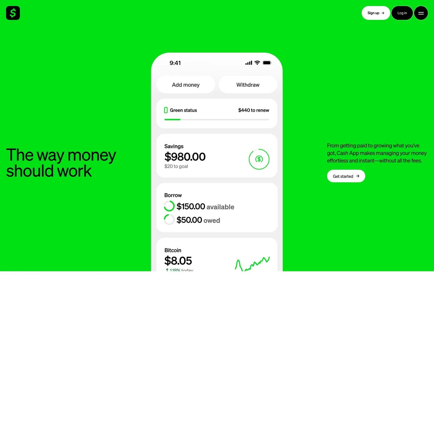
Cash App's marketing canvas inverts the fintech default. Where Stripe paints indigo onto a white canvas and Monzo paints navy onto white, Cash App paints the entire canvas Cash Green `#00e013` — a fully-saturated digital green at `oklch(0.79 0.26 143)` — and lets black and white do everything else. The hero band fills the viewport with green; an iPhone mockup floats centre on white-ish app surfaces; the brand wordmark sits inside a black rounded-square at the top left; and the only two buttons on the page are a white-outlined pill ("Sign up") and a black-filled pill ("Log in") in the top-right nav. Display type is Cash Sans at a single weight — 400 — across every size from the 56px hero down to the 12px button label, with a tight negative-tracking ladder from `-1.68px` to `-0.24px`.
This page packages the Cash App marketing canvas into a single DESIGN.md file built on the Google Labs DESIGN.md specification. Inside the spec: 18 colour tokens grouped into brand-canvas, ink, on-green, and structural roles; 10 typography tokens spanning a 56px hero down to a 12px label with the full Cash Sans weight-400 ladder including a 25px lead paragraph and a 39px section heading; five radius tokens including the load-bearing `999px` pill, a `100px` mid-card corner, and a `50%` circular avatar; nine spacing tokens climbing from 4px to a 90px section band; and 17 components tokens covering buttons, the green hero band, the white iPhone mockup surface, the status-progress bar, money-display rows, FAQ items, and the footer link grid. Every value is quoted as an exact hex, pixel, or weight number.
A working React or Next.js developer drops the file into Claude, Cursor, or GitHub Copilot and the agent reproduces Cash App's green-canvas rhythm — full-bleed Cash Green hero, black-pill nav CTAs, Cash Sans weight-400 uniformity, iPhone-mockup white surface composited centre-band — rather than a generic neobank theme. Tokens map onto Tailwind config or CSS variables, and components reference each other by name. The system is worth studying for one disciplined choice that mirrors Linear's single-accent restraint: the brand voltage is too saturated to share the page with any secondary accent, so the system gives up the secondary accent entirely. Where most fintech brands hold their brand colour in reserve as a button fill, Cash App spends it all at once on the canvas — and then has nothing else to spend.
What makes it distinct
5
- Brand voltage as canvas`#00e013` floods the full hero band as background, not as a CTA fill
- Black pill as primary CTA`#000000` background, white text, `999px` radius, `0px 20px` padding at 46px height
- Single-weight Cash Sansevery tier from 56px hero to 12px button label renders at weight 400
- Negative tracking ladder`-1.68px` at 56px, `-1.20px` at 40px, `-0.54px` at 18px body
- No secondary accentblack, white, green, and one neutral gray `#999999` do every job on the page
cash.app
Live at cash.app
A snapshot of the brand in production. Scroll the frame to see the whole page.
Colors
18 colors
Cash App's system anchors on #00e013 (primary) as its primary color. Type is set in Cash Sans across 10 tokens from 9px to 56px, weights 400–700. Shape language is soft — components average 317px corner radius, with no sharp interactive edges.
Brand & Accent
Sparing, CTA-only voltage · 2
Surface
Page and card backgrounds · 5
Text
Headlines, body, captions · 7
Borders & Hairlines
Dividers, outlines, rules · 3
Other
Specialty colors · 1
Typography
10 type tokens
Set in Cash Sans across 10 tokens, from 9px to 56px, weights 400–700. Shown in its own stack: where the font isn't installed, the fallback the file names stands in.
- display-xxl56px · weight 400 · lh 53.2px · tracking -1.68pxThe quick brown fox jumps over the lazy dog
- display-xl40px · weight 400 · lh 44px · tracking -1.2pxThe quick brown fox jumps over the lazy dog
- display-md25px · weight 400 · lh 29.8px · tracking -0.75pxThe quick brown fox jumps over the lazy dog
- body-lg20px · weight 400 · lh 28.3px · tracking -0.6pxThe quick brown fox jumps over the lazy dog
- body-md18px · weight 400 · lh 25.2px · tracking -0.54pxThe quick brown fox jumps over the lazy dog
- body-bold20px · weight 700 · lh 28.3px · tracking -0.6pxThe quick brown fox jumps over the lazy dog
- caption14px · weight 400 · lh 14px · tracking -0.28pxThe quick brown fox jumps over the lazy dog
- label12px · weight 500 · lh 12px · tracking -0.24pxThe quick brown fox jumps over the lazy dog
- micro12px · weight 400 · lh 14.4px · tracking -0.24pxThe quick brown fox jumps over the lazy dog
- superscript9px · weight 400 · lh 12.6px · tracking -0.54pxThe quick brown fox jumps over the lazy dog
Layout
Radii and spacing
5 corner radii and 9 spacing values. Shape language: soft.
Radii
- none0px
- card-mid100px
- pill999px
- pill-alt100px
- circle50%
Spacing
- xs4px
- sm8px
- md20px
- lg24px
- xl32px
- xxl40px
- band-y90px
- band-x20px
- cta-x20px
Components
17 components
Each rendered from its tokens (color, type, radius, padding) on Cash App's own canvas.
- Button Primary Pillbutton-primary-pillButton Primary Pill
- Button Primary Pill On Greenbutton-primary-pill-on-greenButton Primary Pill On Green
- Button Secondary Pill On Greenbutton-secondary-pill-on-greenButton Secondary Pill On Green
- Button Cta Arrowbutton-cta-arrowButton Cta Arrow
- Hero Band Greenhero-band-greenHero Band Green
- Hero Headlinehero-headlineHero Headline
- Hero Supporting Copyhero-supporting-copyHero Supporting Copy
- Iphone Mockup Surfaceiphone-mockup-surfaceIphone Mockup Surface
- Card Status Rowcard-status-rowCard Status Row
- Card Money Displaycard-money-displayCard Money Display
- Progress Bar Greenprogress-bar-greenProgress Bar Green
- Brand Mark Squarebrand-mark-squareBrand Mark Square
- Top Navtop-navTop Nav
- Section Headingsection-headingSection Heading
- Body Paragraphbody-paragraphBody Paragraph
- Footer Rowfooter-rowFooter Row
- Legal Superscriptlegal-superscriptLegal Superscript
In use
The system, in use
Cash App's tokens on the kind of product it builds.
Build something people actually use.
A short paragraph of marketing copy that previews how the brand's display tier and body tier read together. Two sentences is usually enough.
FAQ
Cash App design system FAQ
Common questions about Cash App's tokens, components, and how to use this DESIGN.md in your project.
Read next
Related reading
Specs, directories, and component libraries that pair with this design system.
- Browse all design systemsThe full directory of DESIGN.md files on shadcn.io, with live mockups for each.shadcn.io
- Cash App — official siteThe Block-owned consumer fintech's marketing canvas — source of every hex, font, and radius in this spec.cash.app (opens in a new tab)
- The DESIGN.md specificationGoogle Labs' open spec for machine-readable design system files — the format this page is built on.github.com (opens in a new tab)
Use it
Use Cash App in your project
One machine-readable file. Drop it into Claude, Cursor, or any AI tool that reads DESIGN.md.
Download the DESIGN.md
One machine-readable file: every color, type, radius, spacing, and component token of Cash App.
Feed it to your AI tool
Drop it into Claude, Cursor, or GitHub Copilot. The agent writes React components and Tailwind classes that match Cash App's visual language.
Reference the tokens directly
Or paste the values into your Tailwind config, CSS variables, or component library: every color, size and radius is a quoted, ready-to-copy value.
Read the full DESIGN.md: overview, rationale, do’s and don’ts
Overview
Cash App's marketing canvas opens with a single design decision: the brand voltage is the canvas. A fully-saturated Cash Green #00e013 — oklch(0.79 0.26 143), a chroma value high enough that only pure black or pure white can be set on top — floods the entire above-the-fold band, edge to edge, ceiling to floor. The hero headline ("The way money should work") sits at 56px in Cash Sans weight 400 with letterSpacing: -1.68px on the green canvas in pure black. An iPhone mockup floats centre-page on a white-ish app surface #f7f7f7, displaying composited money rows ("Savings $980.00", "Borrow $150.00 available", "Bitcoin $8.05"). The only two buttons on the page — "Sign up" outlined in white and "Log in" filled black — sit pinned to the top-right nav.
The colour system has two structural backgrounds and one ink stack. Canvas Green ({colors.canvas-green} — #00e013) is the brand voltage, painted as a band rather than reserved for a CTA. Canvas Light ({colors.canvas-light} — #ffffff) is the alternate body band beneath the hero. Ink ({colors.ink} — #000000, pure black) does every text job — hero, h2, body, button label, footer. Ink Mute ({colors.ink-mute} — #999999) carries helper copy like "$20 to goal" inside the iPhone mockup. There is no fifth role and no secondary accent.
Typography is Cash Sans at the single weight 400 across every tier — a hero at 56px, h2 at 40px, lead paragraph at 25px, body at 18px, button label at 12px — with a negative-tracking ladder from -1.68px down to -0.24px. Light-weight as no-weight: Where Stripe holds display at weight 300 to signal editorial confidence and Monzo pins every heading at weight 800 to signal warmth, Cash App holds every tier at weight 400 — the absence of weight variation is the brand's confidence signal. The page never gets visually heavier; it gets visually larger.
Key Characteristics:
- Canvas-as-voltage: Cash Green
#00e013fills the full-bleed hero band as background, never as a CTA fill. - Single-weight Cash Sans across every tier from 56px hero down to 12px label — no bold, no thin, no italic.
- Black-pill CTA on green canvas:
#000000background, white text,999pxradius,0px 20pxpadding, 46px height. - White-outlined secondary pill: same geometry, transparent fill on green, 1px white border, black text.
- Oversized
100pxcontent-card radius — every mid-size surface inside the iPhone mockup carries this soft pill silhouette. - Negative-tracking ladder:
-1.68pxat 56px,-1.20pxat 40px,-0.75pxat 25px,-0.54pxat 18px,-0.24pxat 12px. - Zero secondary accent — black, white, green, gray do every job; the brand has spent its voltage on the canvas and held nothing back.
Colors
Source pages: home (
/).
Brand & Canvas
- Cash Green (
{colors.canvas-green}— #00e013) — frequency 2. Used as bg (2). The brand voltage, painted as a full-bleed canvas band. Carries the hero and the wordmark fill. - Brand Mark Green (
{colors.brand-mark}— #00e013) — alias of Cash Green used inside the top-left rounded-square wordmark on black.
Ink
- Black (
{colors.ink}— #000000) — frequency 439. Used as text (220) and border (217). The universal ink for every type tier on green or white surfaces, and the fill of every primary CTA pill. - Ink Mute (
{colors.ink-mute}— #999999) — frequency 58. Used as text (29) and border (29). Helper copy and disabled chrome inside the iPhone mockup ("$20 to goal", "owed"). - Ink Disabled (
{colors.ink-disabled}— #bfbfbf): A neutral step betweenink-muteandhairlinereserved for disabled chip outlines and inactive footer dots — observed in the iPhone mockup outline strokes.
On-Surface
- On Ink (
{colors.on-ink}— #ffffff): Text on black pills and dark surfaces. - On Green (
{colors.on-green}— #000000): Black text on the Cash Green canvas — the structural rule for every word inside the hero band. - On Green Soft (
{colors.on-green-soft}— #ffffff): White text and white pill outline on Cash Green — used on the secondary nav button.
Surface
- Canvas Light (
{colors.canvas-light}— #ffffff) — frequency 8. Used as bg (4). Default body band beneath the green hero. - Surface White (
{colors.surface-white}— #ffffff): Alias of canvas-light for CTA fills on green ("Get started" pill on white-ish surface). - Surface App (
{colors.surface-app}— #f7f7f7): The off-white inside the iPhone mockup chrome that holds the composited money rows. - Surface Card (
{colors.surface-card}— #ffffff): The fill of every mid-size content card composited inside the iPhone mockup.
Hairline
- Hairline (
{colors.hairline}— #e5e5e5): 1px outlines on the iPhone mockup status rows. - Hairline Mute (
{colors.hairline-mute}— #cccccc): A slightly darker hairline on disabled chip outlines. - Divider Soft (
{colors.divider-soft}— #f0f0f0): The lightest divider used between footer link groups on the white band.
Link & Scrim
- Link (
{colors.link}— #0000ee) — frequency 6. Used as text (3) and border (3). Default browser-blue used on legal footer links — the brand keeps the user-agent link colour unstyled rather than overriding it to black or green. - Scrim (
{colors.scrim}— #000000): Pure black overlay used as the modal backdrop and the mobile menu scrim.
Typography
Font Family
The display and UI tier is Cash Sans (proprietary) at the single weight 400. The variable font is loaded with no font-feature-settings modifications observed in the captured CSS. The fallback stack is "Cash Sans", "Helvetica Neue", helvetica, sans-serif.
When Cash Sans is unavailable, Inter (open-source via Google Fonts) at weight 400 with matching negative letter-spacing from -1.68px at 56px down to -0.24px at 12px renders the closest open-source approximation. General Sans at weight 400 also reads correctly. Avoid Helvetica or system-ui defaults — they round the letterforms wider than the brand needs.
Hierarchy
| Token | Size | Weight | Line Height | Letter Spacing | Use |
|---|---|---|---|---|---|
{typography.display-xxl} | 56px | 400 | 53.2px | -1.68px | Hero headline |
{typography.display-xl} | 40px | 400 | 44px | -1.20px | Section h2 / h3 |
{typography.display-md} | 25px | 400 | 29.8px | -0.75px | Lead paragraph |
{typography.body-lg} | 20px | 400 | 28.3px | -0.60px | Long-form body |
{typography.body-md} | 18px | 400 | 25.2px | -0.54px | Default UI body |
{typography.body-bold} | 20px | 700 | 28.3px | -0.60px | Strong emphasis inline |
{typography.caption} | 14px | 400 | 14px | -0.28px | Nav link / inline caption |
{typography.label} | 12px | 500 | 12px | -0.24px | Button label |
{typography.micro} | 12px | 400 | 14.4px | -0.24px | Footer link / legal copy |
{typography.superscript} | 9px | 400 | 12.6px | -0.54px | Hero superscript legal mark |
Principles
- Single weight is the brand. Display tiers and body tiers both render at weight 400. The one weight-700 token is an inline-bold variant used inside paragraph copy for emphasis — it is not a display weight.
- Negative tracking on every tier. Every typography token carries negative
letter-spacingfrom-1.68pxat 56px down to-0.24pxat 12px. The tightened tracking is the brand's typographic signature. lineHeighttighter than display. HerolineHeight: 53.2pxis shorter than thefontSize: 56px— a deliberate over-stack that pulls the two display lines tighter than the cap height suggests.
Note on Font Substitutes
Cash Sans is proprietary. Use Inter (open-source via Google Fonts) at weight 400 with letter-spacing: -1.68px on the 56px display tier as the closest analogue. Avoid pushing display weight above 400 — at 500 the brand's confidence-through-restraint signature collapses, and at 700+ the page reads as a generic challenger-bank theme.
Layout
Spacing System
- Base unit: 4px (with 8 / 20 / 24 / 32 / 40 sub-tokens for finer work).
- Tokens:
{spacing.xs}4px ·{spacing.sm}8px ·{spacing.md}20px ·{spacing.lg}24px ·{spacing.xl}32px ·{spacing.xxl}40px ·{spacing.band-y}90px ·{spacing.band-x}20px ·{spacing.cta-x}20px. - Section padding:
90px 0pxvertical on full-bleed bands;40px 32pxon footer rows;0px 20pxon horizontal CTA padding. - Card internal padding: 32px 24px on the iPhone mockup chrome; 24px on the inner money-display rows.
Grid & Container
- Marketing page renders edge-to-edge: the green hero band fills the viewport width with no inner container. Content centres at roughly 1200px with the iPhone mockup pinned centre-band.
- Two-column hero layout: headline left, supporting copy + CTA right, iPhone mockup pinned centre.
- Footer collapses to a single-column link grid on mobile.
Whitespace Philosophy
Vertical rhythm is built on the 90px section-band stride. Each full-bleed band gets 90px 0px padding top and bottom; nothing inside the band tightens below 20px. The brand does not soften the boundary between the green hero band and the white body band — the surface transition is a hard edge.
Elevation & Depth
| Level | Treatment | Use |
|---|---|---|
| 0 | Flat | Default surface — green canvas, white body band |
| 1 | iPhone mockup chrome | Composited screenshot of a real iPhone over the canvas — the brand's depth medium |
| 2 | Inner content card | Mid-size cards inside the iPhone mockup at 100px radius — the only stacked surface |
Decorative Depth
The iPhone mockup IS the depth system. The brand does not use CSS box-shadow on marketing surfaces — depth is supplied by the device-frame mockup composited over the green canvas, with the device's own bezel and inner-screen surface doing the elevation work. Literal CSS shadows would compete with the canvas voltage; the brand omits them entirely.
Shapes
Border Radius Scale
| Token | Value | Use |
|---|---|---|
{rounded.none} | 0px | Full-bleed bands, plain prose |
{rounded.pill-alt} | 100px | Mid-size content cards inside the iPhone mockup, the brand wordmark square |
{rounded.card-mid} | 100px | Alias for content cards |
{rounded.pill} | 999px | All buttons, progress bar fills |
{rounded.circle} | 50% | Avatars, circular Bitcoin icon, hamburger menu button |
Photography Geometry
The brand uses a single composited iPhone mockup more than photography. The device frame is a real iPhone, rendered at roughly 720x1200px centre-band, with its inner screen displaying a stack of money-display rows. There is no other photography on the home page — no customer logos, no team photos, no lifestyle shots.
Components
Buttons
button-primary-pill — the dominant CTA system-wide.
- Background
{colors.ink}(#000000), text{colors.on-ink}(#ffffff), type{typography.label}(12px / 500 / -0.24px), padding0px 20px, height 46px, rounded{rounded.pill}999px.
button-primary-pill-on-green — identical geometry, the same black pill rendered on the green canvas. The "Log in" CTA in the top-right nav.
button-secondary-pill-on-green — outline-style alternative on green.
- Background
{colors.canvas-green}(transparent over green), text{colors.ink}(#000000), 1px stroke{colors.on-green-soft}(#ffffff) border, same pill geometry. The "Sign up" CTA in the top-right nav.
button-cta-arrow — white pill with an inline arrow used on green.
- Background
{colors.surface-white}(#ffffff), text{colors.ink}(#000000), same pill geometry, with a small black arrow glyph appended after the label. The "Get started" CTA inside the green hero.
Hero & Bands
hero-band-green — the brand's signature band.
- Background
{colors.canvas-green}(#00e013), text{colors.ink}, padding90px 20px, no radius. Carries the hero headline left, supporting copy right, and the iPhone mockup centre.
hero-headline — the 56px headline on green.
- Text
{colors.ink}(#000000) rendered in{typography.display-xxl}(56 / 400 / -1.68px),lineHeight: 53.2px. Set on the Cash Green canvas with no extra background fill.
hero-supporting-copy — the right-rail paragraph on green.
- Text
{colors.ink}rendered in{typography.body-md}(18 / 400 / -0.54px). One paragraph, two-three lines, no decoration.
iPhone Mockup
iphone-mockup-surface — the composited device frame's inner screen.
- Background
{colors.surface-app}(#f7f7f7), text{colors.ink}, padding32px 24px, rounded{rounded.pill-alt}100px. Holds a vertical stack of money-display rows.
card-status-row — the green-status progress row inside the mockup.
- Background
{colors.surface-card}(#ffffff), text{colors.ink}, padding24px, rounded{rounded.pill-alt}100px. Contains a label, an amount-to-goal helper in{colors.ink-mute}, and aprogress-bar-greenfill.
card-money-display — the savings / borrow / bitcoin money rows.
- Background
{colors.surface-card}(#ffffff), text{colors.ink}(#000000), type{typography.display-xl}(40px / 400 / -1.2px) for the amount, padding24px, rounded{rounded.pill-alt}100px. A title sits above the amount in{typography.body-md}; a helper sits below in{typography.caption}and{colors.ink-mute}.
progress-bar-green — the status fill bar inside card-status-row.
- Background
{colors.canvas-green}(#00e013), height 8px, rounded{rounded.pill}999px. The only place Cash Green appears inside the iPhone mockup surface.
Brand Mark & Nav
brand-mark-square — the rounded-square wordmark at the top-left.
- Background
{colors.ink}(#000000), text{colors.canvas-green}(#00e013) — the green wordmark glyph rendered inside a black square at{rounded.pill-alt}100px. The only place the green appears as a non-canvas fill.
top-nav — the top navigation bar on green.
- Background
{colors.canvas-green}(#00e013), text{colors.ink}, padding20px 32px, no radius. Holds the brand mark left, sign-up + log-in pills right, and a circular hamburger button at{rounded.circle}50%.
Body & Footer
section-heading — the h2 rendered on either band.
- Text
{colors.ink}rendered in{typography.display-xl}(40px / 400 / -1.2px). Used as section openers ("Earn, save, and do more with Cash App Green").
body-paragraph — default prose on the white body band.
- Background
{colors.canvas-light}(#ffffff), text{colors.ink}, type{typography.body-md}(18px / 400 / -0.54px), no radius.
footer-row — the site-wide footer.
- Background
{colors.canvas-light}(#ffffff), text{colors.ink-mute}(#999999), type{typography.caption}(14px / 400 / -0.28px), padding40px 32px. Holds a multi-column link grid, app-store badges, and a legal regulatory text block.
legal-superscript — the 9px legal-mark superscript next to hero claims.
- Text
{colors.ink}rendered in{typography.superscript}(9px / 400 / -0.54px). Inline next to numeric or claim copy as a footnote reference.
Do's and Don'ts
Do
- Paint Cash Green
#00e013as the full-bleed canvas of the hero band, not as a button fill. - Hold every type tier at Cash Sans weight 400; reserve weight 500 for the 12px button label and weight 700 only for inline
<b>emphasis at 20px. - Render every CTA as a
999pxpill at 46px height with0px 20pxpadding — the brand never ships a rounded-rectangle button. - Use the oversized
100pxradius on every mid-size content card composited inside the iPhone mockup. - Apply negative
letter-spacingon every tier —-1.68pxat 56px scaling down to-0.24pxat 12px. - Pin black text on Cash Green and white text on black
{colors.ink}— those two pairings carry every type role.
Don't
- Don't use
#00e013({colors.canvas-green}) as a button fill on a white surface — atoklch(0.79 0.26 143)the chroma is high enough that no text colour reads cleanly at button scale. The brand reserves the green for the canvas at 2-count frequency; promoting it to a button breaks the canvas-as-voltage rule. - Don't introduce a third accent colour for highlights or success states — the system runs on green / black / white / gray and has no fifth role. A purple or red accent would compete with the canvas voltage.
- Don't render display tiers at weight 600+ — at 500 the brand's confidence-through-restraint signature starts to read as generic, and at 700+ the page becomes a different challenger-bank entirely.
- Don't drop the negative
letter-spacingon body sizes — even the 12px label ships at-0.24px. Default tracking reads loose against the tight display ladder. - Don't replace the
100pxcontent-card radius with a customary 8-12px rectangle. The oversized fixed-pixel radius is the brand's mid-card silhouette; rectangles read as foreign. - Don't apply CSS
box-shadowto marketing surfaces — the iPhone mockup is the depth system, and literal shadows would compete with the canvas voltage at saturation0.26. - Don't override the default-browser link colour
#0000eeon the legal footer — the brand intentionally keeps user-agent link styling for the regulatory block.
Responsive Behavior
Breakpoints
| Name | Width | Key Changes |
|---|---|---|
| Wide | ≥ 1440px | Hero band edge-to-edge; iPhone mockup at full scale centre-band |
| Desktop | 1024–1440px | Default two-column hero with iPhone mockup centred |
| Tablet | 768–1023px | Hero collapses to single column; iPhone mockup pins below headline |
| Mobile | < 768px | Hero drops 56 → 36px; CTA pills stack vertically; hamburger replaces nav |
Touch Targets
- Pill buttons hit 46x46px minimum via the height token. On smaller screens, buttons retain the 46px height to maintain WCAG AAA.
- Hamburger menu and circular icons stay at 40x40px minimum.
Collapsing Strategy
- Display tier stair-steps 56 → 40 → 32 → 28px through the breakpoints.
- Hero layout collapses two-column → single-column, with the iPhone mockup pinning below the headline + supporting copy.
- The green canvas stays full-bleed at every breakpoint — the brand does not introduce a side gutter on mobile.
Image Behavior
The iPhone mockup uses srcset with art-direction crops at major breakpoints. Mobile crops focus on the centre of the device screen showing the savings row; desktop crops show the full multi-row composition.
Known Gaps
- Hover and pressed states: only the base CTA pairing (black pill on green / white pill on green) is documented. Hover, pressed, and focus specs are not captured from the marketing surface.
- Cash App Pay merchant palette: the merchant-checkout surface and the Cash App Card physical-card art tokens live on separate surfaces and are not part of this marketing-system spec.
- Logged-in app: Pay, Cash Card, Bitcoin, Stocks, Savings, and Borrow surfaces are out of scope; only the public marketing canvas at cash.app is captured.
- iPhone mockup inner-UI raster art: the green-status progress fill, the Bitcoin sparkline, and the circular Bitcoin glyph appear as composited raster art and are not enumerated as design tokens.
- Motion specs: the hero may carry a subtle parallax or zoom on scroll; precise easing and duration tokens were not captured.
- Mobile menu and modal: the hamburger-triggered overlay and any in-page modals are described in prose but not enumerated as token sets.
Fintech & Crypto
More systems like this
More DESIGN.md files in Fintech & Crypto.
Pricing
Build it with Pro
The DESIGN.md files are free. Pro adds 6,000+ blocks, premium templates and the MCP server, so your AI editor builds in your system for you.
4.9/5 out of 5 · 150+ reviewsfrom 150+ founders and developers.
Billing
Billed once a year in USD. Cancel anytime.
- How many people can use the license.
- Client work, SaaS products and anything you charge for.
- Production-ready React sections: hero, pricing, features, dashboards and more.
- Complete multi-page sites you can ship as they are.
- React icons from every major library, installable with one command.
- Presets that restyle every block, in light and dark.
- Lets your AI editor search, preview and install blocks for you.
- Priority requests are answered first.
Individual
For personal projects & open source
$32instead of $49/mo
$389 billed yearly
- Seats: 1 seat
- Commercial use: Personal & open source only
- Pro blocks: 6,000+ blocks
- Templates: All 14 templates
- React icons: 294k+ icons
- Themes: All 59 themes
- MCP server: Basic usage
- Support: Standard
Team
Most popularFor freelancers, agencies & startups
$66instead of $99/mo
$789 billed yearly · ≈ $13/dev/mo
- Seats: Up to 5 seats
- Commercial use: Included
- Pro blocks: 6,000+ blocks
- Templates: All 14 templates
- React icons: 294k+ icons
- Themes: All 59 themes
- MCP server: High usage
- Support: Priority
Organization
For companies with larger teams
$132instead of $199/mo
$1,589 billed yearly
- Seats: Unlimited seats
- Commercial use: Included
- Pro blocks: 6,000+ blocks
- Templates: All 14 templates
- React icons: 294k+ icons
- Themes: All 59 themes
- MCP server: Unlimited usage
- Support: Priority
Billed once a year in USD. Cancel anytime.
Individual
For personal projects & open source
$32instead of $49/mo
$389 billed yearly
- How many people can use the license.Seats: 1 seat
- Client work, SaaS products and anything you charge for.Commercial use: Personal & open source only
- Production-ready React sections: hero, pricing, features, dashboards and more.Pro blocks: 6,000+ blocks
- Complete multi-page sites you can ship as they are.Templates: All 14 templates
- React icons from every major library, installable with one command.React icons: 294k+ icons
- Presets that restyle every block, in light and dark.Themes: All 59 themes
- Lets your AI editor search, preview and install blocks for you.MCP server: Basic usage
- Priority requests are answered first.Support: Standard
Team
Most popularFor freelancers, agencies & startups
$66instead of $99/mo
$789 billed yearly · ≈ $13/dev/mo
Everything in Individual, plus
- How many people can use the license.Seats: Up to 5 seats
- Client work, SaaS products and anything you charge for.Commercial use: Included
- Lets your AI editor search, preview and install blocks for you.MCP server: High usage
- Priority requests are answered first.Support: Priority
Organization
For companies with larger teams
$132instead of $199/mo
$1,589 billed yearly
Everything in Team, plus
- How many people can use the license.Seats: Unlimited seats
- Lets your AI editor search, preview and install blocks for you.MCP server: Unlimited usage
- Secure checkout via Stripe
- Code lives in your repo
- Keep what you've shipped if you cancel
- License terms
Your system, built for you
Every block, template and icon, installed by your AI agent in your design system. The DESIGN.md files stay free.