shadcn.io is not affiliated with official shadcn/ui
A short list, like a status or a country, uses the operating system's own menu. It still matches the border and height of the fields next to it.
Use it when the platform menu is the familiar one, especially on a phone. Open a Select when the popup has to match the app, hold richer rows, or share keyboard behavior with the other controls. In Solid you read the value like any other select, and Ark UI leaves the open menu alone.
Installation
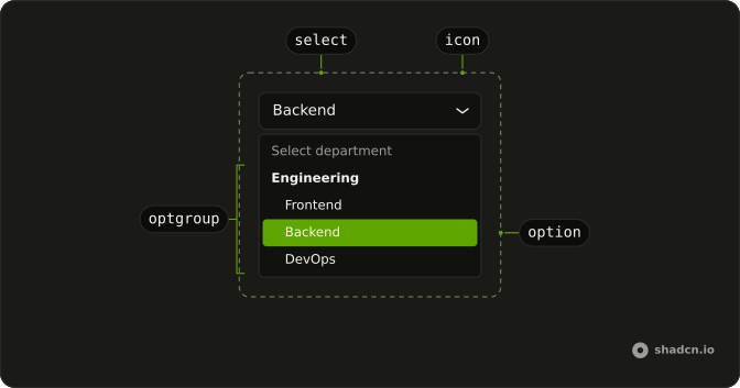
Anatomy
Usage
import {
  NativeSelect, NativeSelectOption,
} from "@/components/ui/native-select";<NativeSelect>
<NativeSelectOption value="">Select status</NativeSelectOption>
<NativeSelectOption value="todo">Todo</NativeSelectOption>
<NativeSelectOption value="in-progress">In Progress</NativeSelectOption>
<NativeSelectOption value="done">Done</NativeSelectOption>
<NativeSelectOption value="cancelled">Cancelled</NativeSelectOption>
</NativeSelect>Demos
Groups
NativeSelectOptGroup is a native optgroup, and label is the heading the platform menu draws. Engineering, sales, and operations sit under one empty placeholder. Group a list when it is long enough to scan by category and still short enough to stay a system menu. Once you would rather paint those headings yourself, that is a Select.
Disabled
disabled is the platform disabled state, and the wrapper fades with the control. Use it when the choice is not available yet, such as a field waiting on an earlier answer. Removing the select instead makes the form look like it forgot a question. A disabled control will not take a new value, so keep the current option if that old value still has to submit.
Invalid
aria-invalid marks the control, and the invalid prop sets that same attribute if you would rather not pass it by hand. The markup here sets the attribute itself. The select renders no error sentence, so put the explanation beside it with Field. Show the state after a failed submit, not as a standing hint, since the open menu stays the platform menu.
Rtl
dir="rtl" turns the field for Arabic or Hebrew, so the text, the chevron, and the platform menu follow the reading order. Set it on the select when this is the only right-to-left control on the page. A whole form should inherit direction from Direction. The empty-value option can remain the placeholder either way.
FAQ
How do I control a Native Select in Solid?
It is a native select, so the selected option is the element's value rather than a collection, and each NativeSelectOption carries its own value, with an empty value as the placeholder. Set name when the form should submit that option, and use disabled for the native disabled state, which also fades the wrapper. Pass value and onChange, and read the next option from event.currentTarget.value.
How do I group Native Select options?
Wrap related NativeSelectOption elements in NativeSelectOptGroup and set label to the group name, as the Groups demo does. A placeholder option can sit before the groups. The group renders a native optgroup, so the platform menu draws the heading. You do not pass a collection or map items the way a Listbox does.
How do I mark a Native Select invalid?
Set invalid, which sets aria-invalid on the select, or pass aria-invalid yourself, as the Invalid demo does. The control does not render an error message. Put the explanation beside it with Field. The open list is the platform menu, so popup classes from Select will not theme it.
How do I change the Native Select size?
Set size to sm, md, or lg, with md as the default. data-size on the wrapper and the select is default when the size is md, and sm or lg otherwise, so styles can target the scale. The chevron is decorative and hidden from assistive tech, and the Rtl demo shows the control in a right-to-left row.
Should I use Native Select or Select?
Use Native Select when the platform picker is enough, which is often the familiar menu on a phone. Use Select when you need a custom popup, rich items, or keyboard behavior that matches the rest of the app. A native select joins a normal form post through its name attribute. The open list stays the platform menu, so popup classes from Select do not theme it.
How do I style a Native Select with Ark UI?
Edit the native select file under components/ui. The select sets data-slot to native-select, the wrapper sets data-slot to native-select-wrapper, and data-size reflects the size prop. Option and group backgrounds use the canvas system colors so the open platform menu stays readable, which means popover classes will not theme that menu.
How do I install Native Select in Solid?
Run the command in the Installation section on this page, which adds Native Select, NativeSelectOption, and NativeSelectOptGroup to your ui folder. Import them from that folder and pass options as children, with no collection package to add. The command uses the shadcn CLI.
API Reference
NativeSelect
<div> data-slot="native-select"
invalid?boolean
Whether the select is invalid.
- Default
false
size?"sm" | "md" | "lg"
The size.
- Type
"sm" | "md" | "lg"- Default
"md"
asChild?(props: ParentProps) => JSX.Element
Render your own element: a function that gets the part's props to spread on it.
- Type
(props: ParentProps) => JSX.Element
class?string
Merged with the part's classes.
data-size?stringNativeSelectOption
<option> data-slot="native-select-option"
asChild?(props: ParentProps) => JSX.Element
Render your own element: a function that gets the part's props to spread on it.
- Type
(props: ParentProps) => JSX.Element
class?string
Merged with the part's classes.
NativeSelectOptGroup
<optgroup> data-slot="native-select-optgroup"
asChild?(props: ParentProps) => JSX.Element
Render your own element: a function that gets the part's props to spread on it.
- Type
(props: ParentProps) => JSX.Element
class?string
Merged with the part's classes.
With other components
Field
InputsLabel, description, error
Label
InputsName the control
Button Group
ButtonsCompact filter bar
Input
InputsSame form row
Card
LayoutSettings on a card
Tooltip
OverlaysExplain a disabled option
Related
Select
SelectionCustom option rendering
Combobox
SelectionSearch a long list
Radio Group
SelectionEvery option visible
Dropdown Menu
MenusActions, not values
Command
OverlaysPalette with search
Direction
LayoutRTL for the page