shadcn.io is not affiliated with official shadcn/ui
Radio buttons leave every option visible, and picking one clears the others.
Use them when the list is short and the form should submit exactly one value. A long list belongs in a Select. In Solid, Ark UI moves focus with the arrow keys and checks the item you move to.
Installation
Anatomy
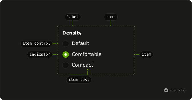
RadioGroup
├── RadioGroupLabel
├── RadioGroupItem
│   ├── RadioGroupText
│   └── RadioGroupItemControl
└── RadioGroupIndicator
Usage
import {
  RadioGroup, RadioGroupItem,
} from "@/components/ui/radio-group";<RadioGroup class="w-fit" defaultValue="comfortable">
<RadioGroupItem value="default">Default</RadioGroupItem>
<RadioGroupItem value="comfortable">Comfortable</RadioGroupItem>
<RadioGroupItem value="compact">Compact</RadioGroupItem>
</RadioGroup>Accessibility
- Tab
- Moves focus to either the checked radio item or the first radio item in the group.
- Space
- When focus is on an unchecked radio item, checks it.
- Arrow Down
- Moves focus and checks the next radio item in the group.
- Arrow Right
- Moves focus and checks the next radio item in the group.
- Arrow Up
- Moves focus to the previous radio item in the group.
- Arrow Left
- Moves focus to the previous radio item in the group.
- End
- Go to the end.
Demos
Description
Each option has a second line, not just a name. Field sits the radio and a FieldDescription on one row, so "comfortable" can say that it adds space, instead of hoping the label is enough. Use this when the choice has a consequence people should see before they pick it. Three bare words do not need the extra line.
Choice Card
The whole card is the hit target, not only the radio. FieldLabel wraps the Field, with a title and a short line about who the plan is for, and the control sits at the end of the row. Use this for a product, a tier, or anything where the option is a small decision rather than a word in a column. Keep the cards few.
Fieldset
The group itself needs a name. FieldSet and FieldLegend label the question, subscription plan, and FieldDescription says why the yearly option exists. The radios are the answers under that legend. Use a fieldset when the question would otherwise be invisible to assistive tech, or when several groups on the page would blur together.
Disabled
One option is switched off and the others still work. The group keeps a different option selected, which is what you want when a plan is unavailable but a choice is still required. Set disabled on that RadioGroupItem, or on the group to lock every option. On React Aria the prop is isDisabled instead, and data-disabled on the Field keeps the row styling in agreement.
Invalid
The options are flagged invalid, and data-invalid on the field turns on the error styling. The legend still only says what the group is for, so add a sentence that says what failed. Color on the radios is not the message. Set aria-invalid on each RadioGroupItem, or isInvalid on RadioGroup for React Aria.
Rtl
The group sets dir to rtl, and the Arabic labels lead, with the description following. Use this to check a translated form, not as a variant you render only for one language. The row should flip with its parent. If this group must flip while the rest of the document stays left to right, set dir on the group itself rather than on the page.
FAQ
How do I control the selected Radio Group value in Solid?
A Radio Group selects exactly one string, so keep that string in state and pass it back, or leave the group uncontrolled when the first choice is enough. Each RadioGroupItem has its own value.
Pass value, and onValueChange receives details.value. Set defaultValue when the group should manage itself.
How do I submit a Radio Group with a form?
Set name on Radio Group to the field name the form should receive. The checked item's value is submitted under that name, not the visible label. Keep the group inside the form element so the browser includes it. An unchecked group submits nothing.
Why is my Radio Group label not clickable?
The item and its text must be associated, even though the markup is not the same on every base, and clicking the text then checks the item. Follow the Description demo for the markup on your base.
Pass the label as the child of RadioGroupItem. The item renders that child as its label.
Can I use a Radio Group from the keyboard?
Yes, Tab moves focus to the checked item, or to the first item when none is checked. The arrow keys move to another item and check it, and Space checks the item that has focus. End moves to the last item, and Tab then leaves the group.
How do I show a Radio Group as invalid with Ark UI?
Show the error on the field, not only with color, because color alone is not the error. Keep a text message in the field. The Invalid demo pairs the group with Field so that message sits with the options.
Set aria-invalid on each RadioGroupItem and data-invalid on the surrounding Field.
How do I disable a Radio Group?
Disable the whole set or a single option. A disabled item stays visible but cannot be checked, and the Disabled demo leaves one item disabled and selects another.
Set disabled on Radio Group for every item, or on one RadioGroupItem.
Should I use a Radio Group or a Segment Group?
Use a Radio Group when each option needs a label, a description, or its own place in a form. Use a Segment Group for a short row of choices with a sliding indicator. Use a Checkbox when more than one option can be on at the same time.
How do I install Radio Group in Solid?
Run the command in the Installation section above. It adds Radio Group and its parts to your ui folder. Import from that folder when the command finishes, instead of copying the source by hand, and rerun the command later if you want the latest files. The command uses the shadcn CLI.
API Reference
RadioGroup
<div> data-slot="radio-group"
value?string | null
The controlled value of the radio group.
- Type
string | null
defaultValue?string | null
The initial value of the checked radio when rendered. Use when you don't need to control the value of the radio group.
- Type
string | null
onValueChange?(details: ValueChangeDetails) → void
Function called once a radio is checked.
- Type
(details: ValueChangeDetails) → void- Parameters
details– { value: string | null }- Returns
void
idstring
The unique identifier of the machine.
dir?"ltr" | "rtl"
The document's text/writing direction.
- Type
"ltr" | "rtl"- Default
"ltr"
disabled?boolean
If true, the radio group will be disabled.
form?string
The associate form of the underlying input.
ids?object
The ids of the elements in the radio. Useful for composition.
- Type
{ root?: string; label?: string; indicator?: string; item?: (value: string) → string; itemLabel?: (value: string) → string; itemControl?: (value: string) → string; itemHiddenInput?: (value: string) → string }
invalid?boolean
If true, the radio group is marked as invalid.
name?string
The name of the input fields in the radio (Useful for form submission).
orientation?"horizontal" | "vertical"
Orientation of the radio group.
- Type
"horizontal" | "vertical"
readOnly?boolean
Whether the radio group is read-only.
required?boolean
If true, the radio group is marked as required.
asChild?(props: ParentProps) => JSX.Element
Render your own element: a function that gets the part's props to spread on it.
- Type
(props: ParentProps) => JSX.Element
class?string
Merged with the part's classes.
data-disabled?string
Present when disabled.
data-invalid?string
Present when invalid.
data-orientation"horizontal" | "vertical"
The orientation of the radio-group.
- Type
"horizontal" | "vertical"
data-required?string
Present when required.
RadioGroupLabel
<span> data-slot="radio-group-label"
asChild?(props: ParentProps) => JSX.Element
Render your own element: a function that gets the part's props to spread on it.
- Type
(props: ParentProps) => JSX.Element
data-disabled?string
Present when disabled.
data-invalid?string
Present when invalid.
data-orientation"horizontal" | "vertical"
The orientation of the label.
- Type
"horizontal" | "vertical"
data-required?string
Present when required.
RadioGroupItem
<label> data-slot="radio-group-item"
valuestring
The item's value.
disabled?boolean
Whether the item is disabled.
invalid?boolean
Whether the item is invalid.
asChild?(props: ParentProps) => JSX.Element
Render your own element: a function that gets the part's props to spread on it.
- Type
(props: ParentProps) => JSX.Element
class?string
Merged with the part's classes.
data-disabled?string
Present when disabled.
data-focus?string
Present when focused.
data-focus-visible?string
Present when focused with keyboard.
data-hover?string
Present when hovered.
data-invalid?string
Present when invalid.
data-orientation?string
The orientation of the item.
data-readonly?string
Present when read-only.
data-ssr?string
Present when not rendered in the browser. Useful for ssr styling.
data-state"checked" | "unchecked"
"checked" or "unchecked".
- Type
"checked" | "unchecked"
RadioGroupText
<span> data-slot="radio-group-item-text"
asChild?(props: ParentProps) => JSX.Element
Render your own element: a function that gets the part's props to spread on it.
- Type
(props: ParentProps) => JSX.Element
class?string
Merged with the part's classes.
data-disabled?string
Present when disabled.
data-focus?string
Present when focused.
data-focus-visible?string
Present when focused with keyboard.
data-hover?string
Present when hovered.
data-invalid?string
Present when invalid.
data-orientation?string
The orientation of the item.
data-readonly?string
Present when read-only.
data-ssr?string
Present when not rendered in the browser. Useful for ssr styling.
data-state"checked" | "unchecked"
"checked" or "unchecked".
- Type
"checked" | "unchecked"
RadioGroupItemControl
<div> data-slot="radio-group-item-control"
asChild?(props: ParentProps) => JSX.Element
Render your own element: a function that gets the part's props to spread on it.
- Type
(props: ParentProps) => JSX.Element
data-active?string
Present when active or pressed.
data-disabled?string
Present when disabled.
data-focus?string
Present when focused.
data-focus-visible?string
Present when focused with keyboard.
data-hover?string
Present when hovered.
data-invalid?string
Present when invalid.
data-orientation?string
The orientation of the item.
data-readonly?string
Present when read-only.
data-ssr?string
Present when not rendered in the browser. Useful for ssr styling.
data-state"checked" | "unchecked"
"checked" or "unchecked".
- Type
"checked" | "unchecked"
useRadioGroup
With other components
Field
InputsLabel and helper text
Label
InputsClick the words
Card
LayoutPlan as a card
Button
ButtonsSubmit the form
Item
LayoutRow in a list
Tooltip
OverlaysExplain one option
Related
Checkbox
SelectionPick several or none
Switch
SelectionInstant on or off
Select
SelectionLong lists, collapsed
Toggle Group
SelectionToolbar single pick
Dropdown Menu
MenusRadios in a menu
Segment Group
SelectionA sliding highlight