shadcn.io is not affiliated with official shadcn/ui
Suggestions narrow as you type, and text that isn't in the list can stay.
Use it for search or a place name, where a guess helps but a missing option can still be the answer. When the value has to be one of the options, use a Combobox. In Solid, Ark UI filters the list without dropping what was typed.
Installation
Anatomy
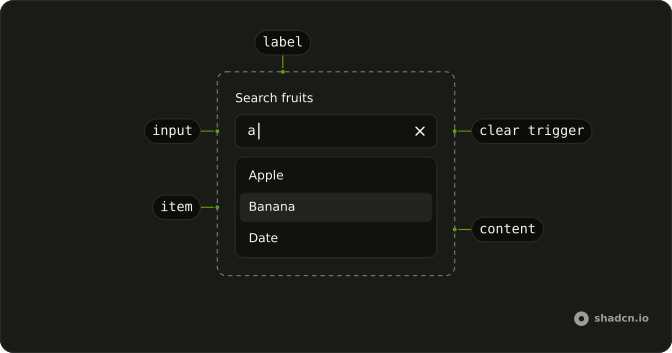
AutocompleteRoot
├── AutocompleteClearTrigger
├── AutocompleteContent
├── AutocompleteControl
├── AutocompleteInput
├── AutocompleteItem
│   ├── AutocompleteItemGroup
│   │   └── AutocompleteItemGroupLabel
│   ├── AutocompleteItemIndicator
│   └── AutocompleteItemText
├── AutocompleteLabel
├── AutocompleteList
├── AutocompletePositioner
└── AutocompleteTrigger
Usage
import { useListCollection } from "@ark-ui/solid/collection";
import { useFilter } from "@ark-ui/solid/locale";
import { Field, FieldLabel } from "@/components/ui/field";
import {
  Autocomplete, AutocompleteContent, AutocompleteEmpty,
  AutocompleteInput, AutocompleteItem, AutocompleteList,
} from "@/components/ui/autocomplete";
const AutocompleteDemo = () => {
const { contains } = useFilter({ sensitivity: "base" });
const { collection, filter } = useListCollection({
initialItems,
filter: contains,
});
return (
<Field class="w-full max-w-64">
<FieldLabel>Search fruits</FieldLabel>
<Autocomplete
collection={collection}
onInputValueChange={({ inputValue }) => filter(inputValue)}
>
<AutocompleteInput placeholder="e.g. Apple" showClear />
<AutocompleteContent>
<AutocompleteEmpty />
<AutocompleteList>
{collection.items.map((item) => (
<AutocompleteItem item={item} key={item.value}>
{item.label}
</AutocompleteItem>
))}
</AutocompleteList>
</AutocompleteContent>
</Autocomplete>
</Field>
);
};
const initialItems = [
{ label: "Apple", value: "apple" },
{ label: "Banana", value: "banana" },
{ label: "Cherry", value: "cherry" },
{ label: "Date", value: "date" },
];Accessibility
- Arrow Down
- Move down.
- Arrow Up
- Move up.
- Home
- Go to the start.
- End
- Go to the end.
- Enter
- Activate the focused item.
- Escape
- Dismiss.
- Space
- Activate the focused control.
Demos
Async
Movie titles are not bundled with the page. As the query changes, the list loads matches, waits briefly, and drops a response if that keystroke was already aborted, showing Searching while the request runs. Use this for a remote catalog, and keep both empty states: a prompt to start typing, and a plain miss when nothing matches.
Autohighlight
Set inputBehavior to autohighlight when the first match should be highlighted as someone types, without the field rewriting itself to finish their word. Enter can accept that row, and the text they actually typed stays until they do. The root otherwise completes the highlighted item in the input, which is the wrong contract for a search whose query may be submitted as typed.
Context
AutocompleteContext passes the live state into the markup inside it. The line above the field prints the selection, or None before anyone picks. Use it when a nearby line has to follow the field and you would rather not keep a second copy of the value yourself.
Controlled
Hold the selection in your own state with value and onValueChange. It starts at banana, and the line under the field reads that same value so something outside the popup stays bound to it. The value is an array even for one choice, so take the first entry.
Creatable
Bug, Feature, and Docs are the starting labels. When the typed text is not already one of them, the list offers a row to create it, and choosing that row stores the text as a real option. Use this for tags and other sets that are suggestions rather than a closed catalog, and skip the create row when the text is empty or a duplicate.
Custom Object
These options are countries: a flag, a name, and a code, not a flat label. itemToString points at the country so filtering sees the name, and itemToValue points at the code you store. Render the flag beside the name, and use this shape whenever the id and the visible text are different fields on a record.
Disabled
disabled on the root grays the field and refuses both typing and opening, so nothing in the list can be chosen. Use it when an earlier answer is still empty, or this person is not allowed to change the value. A dead input with only a placeholder looks broken, so say why nearby. The empty copy in the popup does not help until the field is enabled again.
Dynamic
The list is not a catalog you filter. Each keystroke builds three addresses from the text so far, one for gmail, one for yahoo, and one for this site, and the collection starts empty so nothing shows before that. Use it when suggestions are computed from the input, such as domains or prefixes, rather than looked up in a fixed set.
Group
Countries are grouped by continent. groupBy on the collection and a heading on each AutocompleteGroup let people scan North America, Europe, or Asia instead of one alphabetical pile. Use groups when the category is how someone looks, not metadata you could leave off the row, and keep filtering across the whole set.
Highlight
A few letters into a long name, the row can look like a random hit. The highlight marks the matching slice of each label from the live input, ignoring case, so the typed letters stand out wherever they sit. Use it when a contains match can land in the middle of a word and the reason for the row would otherwise be unclear.
Inline
By default the field completes the highlighted item as you type. This list only keeps animals whose names start with the letters so far, so a name like Dolphin can finish in place and a mid-word hit never shows up. Use starts-with for names and codes typed from the front, and contains when the match may sit anywhere in the word.
Invalid
invalid on the root turns on the error treatment: the list stays the same, and the border and focus ring change so the problem shows before the popup opens again. Pair it with a sentence about what failed, which is what the field section adds under the control. The state alone says something is wrong, not what.
Limit Results
Ten cities are loaded, and a limit of 5 keeps the popup to the first five matches. The rest stay searchable, so a tighter query can still find a city that missed the first screen. Limit a long catalog this way instead of slicing the array before the filter.
Links
Each suggestion is a link to a site, opened in a new tab. selectionBehavior set to preserve stops that choice from replacing the query with the label, so following the link does not fight the field. Use links when the list is destinations, a docs page or a tool, and a normal item when the choice should fill the input and be stored.
Multiple
multiple keeps every skill that gets picked, instead of replacing the last one. The chosen names render as chips above the input, read from context, and the line says nothing is selected until the first pick. Use it for tags and skills, where one answer is incomplete and the popup should stay up for the next.
Rehydrate
The field opens on C-3PO, then the character list arrives a moment later, the way a saved id shows up before its options. syncSelectedItems runs once the collection has rows, so the stored name lines up with a real item. Use it when the initial value is known before the list, or the selection never quite attaches.
Root Provider
useAutocomplete creates the state, and AutocompleteRootProvider shares it, which is how the button outside can call focus. Without that share, the button and the input cannot see each other. Use the provider when a toolbar has to open or focus the field, and pass the collection into the hook the same way you would pass it to the root.
Size Lg
size lg raises the input to the large height, with clear and the trigger both on. Use it when the autocomplete is the main control and the fields around it are large too. The popup stays the same size, so you are only changing the field, not the list.
Size Md
md is the default input height, shown here with clear and the trigger so the icons can be checked at the size most forms use. Match neighboring fields. If the rest of the form is medium, a different size is the one that looks accidental, and omitting size already gives you this height.
Size Sm
size sm is the short field, with clear and the trigger crowded into that height on purpose. Use it in a toolbar, a dialog, or a filter row where the default would dominate. Skip it for a primary search on a roomy page, since the value and the placeholder follow the small input's scale and can get tight.
With Clear Button
showClear is off unless you set it, so a search can still look like an ordinary text field. The default value here is apple, which is why the button is visible before anyone types. Add it when a stored value is common and clearing should be one click, especially where selecting the text and deleting it is awkward.
With Field
Country is a real form control, so it gets a Field: a label, a helper about shipping estimates, required, and a FieldError for the failure. The helper is the quiet instruction that stays, and the error is the line for when the value does not pass. Placeholder text is not a substitute, because it vanishes as soon as someone types.
With Start Icon
An apple icon sits at the start of the input, as an addon inside AutocompleteInput, hidden from assistive tech because the placeholder already says what to search. Use a start mark when the subject is faster to see than to read. It is decoration, not the accessible name, so a real label still has to exist on the field.
With Trigger
showTrigger adds the chevron that opens the whole list without a keystroke. Clear stays off here, so the arrow is the only extra control and the field still looks quiet. Turn the trigger on for a short list people also browse, and leave it off for a search box that should look like search. Both flags default to false.
FAQ
What is the difference between Autocomplete and Combobox?
The Autocomplete keeps whatever is typed and only suggests matches, like a search box. A Combobox makes the reader choose one of its options. Use the Autocomplete when free text is a valid answer, such as a city or a search query.
How do I filter Autocomplete suggestions as the user types in Solid?
Build the options with useListCollection and a filter from useFilter, then call filter with the typed text and render collection.items, as the Usage example does.
Call it from onInputValueChange, which receives { inputValue }.
How do I load Autocomplete suggestions from an API?
Fetch them as the input changes and build the collection from the result: the Async demo uses useAsyncList and shows a loading state while the request runs. Debounce the request so it doesn't fire on every keystroke.
How do I let users create a new option in the Autocomplete?
Typed text is already a valid value, since custom values are allowed. To offer it as an explicit option, add a Create item for the current text, as the Creatable demo does.
How do I limit the number of Autocomplete suggestions?
Pass limit to useListCollection, such as 5, to show only the first matches; the Limit Results demo does this. Keep the full list for filtering, so more specific text still finds everything.
How do I add a clear button or a dropdown arrow to the Autocomplete?
Set showClear or showTrigger on AutocompleteInput, as in the With Clear Button and With Trigger demos. Both are off by default, so the input looks like a plain text field.
Is the Ark UI Autocomplete accessible?
Yes. The input is a combobox that announces its suggestions: the arrow keys move through them, Enter picks one and Escape closes the list. Give it a visible label with a Field, as in the With Field demo, and keep AutocompleteEmpty for when nothing matches.
API Reference
Autocomplete
<div> data-slot="autocomplete"
inputValue?string
The controlled value of the combobox's input.
defaultInputValue?string
The initial value of the combobox's input when rendered. Use when you don't need to control the value of the combobox's input.
- Default
""
onInputValueChange?(details: InputValueChangeDetails) → void
Function called when the input's value changes.
- Type
(details: InputValueChangeDetails) → void- Parameters
details– { inputValue: string; reason?: InputValueChangeReason }- Returns
void
open?boolean
The controlled open state of the combobox.
defaultOpen?boolean
The initial open state of the combobox when rendered. Use when you don't need to control the open state of the combobox.
onOpenChange?(details: OpenChangeDetails) → void
Function called when the popup is opened.
- Type
(details: OpenChangeDetails) → void- Parameters
details– { open: boolean; reason?: OpenChangeReason; value: string[] }- Returns
void
value?string[]
The controlled value of the combobox's selected items.
defaultValue?string[]
The initial value of the combobox's selected items when rendered. Use when you don't need to control the value of the combobox's selected items.
- Default
[]
onValueChange?(details: ValueChangeDetails<T>) → void
Function called when a new item is selected.
- Type
(details: ValueChangeDetails<T>) → void- Parameters
details– ValueChangeDetails<T>- Returns
void
collectionListCollection<T>
The collection of items.
- Type
ListCollection<T>
allowCustomValue?boolean
Whether to allow typing custom values in the input.
alwaysSubmitOnEnter?boolean
Whether to always submit on Enter key press, even if popup is open. Useful for single-field autocomplete forms where Enter should submit the form.
- Default
false
autoFocus?boolean
Whether to autofocus the input on mount.
closeOnSelect?boolean
Whether to close the combobox when an item is selected.
composite?boolean
Whether the combobox is a composed with other composite widgets like tabs.
- Default
true
defaultHighlightedValue?string | null
The initial highlighted value of the combobox when rendered. Use when you don't need to control the highlighted value of the combobox.
- Type
string | null
dir?"ltr" | "rtl"
The document's text/writing direction.
- Type
"ltr" | "rtl"- Default
"ltr"
disabled?boolean
Whether the combobox is disabled.
disableLayer?boolean
Whether to disable registering this a dismissable layer.
form?string
The associate form of the combobox.
hideMode?"display-none" | "activity"
How to hide content when mounted but not present.
- display-none: HTML hidden attribute. Effects stay alive.
- activity: React 19 <Activity mode="hidden">. Effects pause. Requires React 19+.
- Type
"display-none" | "activity"- Default
"display-none"
highlightedValue?string | null
The controlled highlighted value of the combobox.
- Type
string | null
id?string
The unique identifier of the machine.
ids?object
The ids of the elements in the combobox. Useful for composition.
- Type
{ root?: string; label?: string; control?: string; input?: string; content?: string; trigger?: string; clearTrigger?: string; item?: (id: string, index?: number) → string; positioner?: string; itemGroup?: (id: string | number) → string; itemGroupLabel?: (id: string | number) → string }
inputBehavior?"autohighlight" | "autocomplete" | "none"
Defines the auto-completion behavior of the combobox.
- autohighlight: The first focused item is highlighted as the user types
- autocomplete: Navigating the listbox with the arrow keys selects the item and the input is updated Ark default: none.
- Type
"autohighlight" | "autocomplete" | "none"- Default
autocomplete
invalid?boolean
Whether the combobox is invalid.
lazyMount?boolean
Whether to enable lazy mounting.
- Default
false
loopFocus?boolean
Whether to loop the keyboard navigation through the items.
- Default
true
multiple?boolean
Whether to allow multiple selection.
**Good to know:** When multiple is true, the selectionBehavior is automatically set to clear.
It is recommended to render the selected items in a separate container.
name?string
The name attribute of the combobox's input. Useful for form submission.
navigate?((details: NavigateDetails) → void) | null
Function to navigate to the selected item.
- Type
((details: NavigateDetails) → void) | null- Parameters
(details– { value: string; node: HTMLAnchorElement; href: string }- Returns
void) | null
onFocusOutside?(event: FocusOutsideEvent) → void
Function called when the focus is moved outside the component.
- Type
(event: FocusOutsideEvent) → void- Parameters
event– FocusOutsideEvent- Returns
void
onHighlightChange?(details: HighlightChangeDetails<T>) → void
Function called when an item is highlighted using the pointer or keyboard navigation.
- Type
(details: HighlightChangeDetails<T>) → void- Parameters
details– HighlightChangeDetails<T>- Returns
void
onInteractOutside?(event: InteractOutsideEvent) → void
Function called when an interaction happens outside the component.
- Type
(event: InteractOutsideEvent) → void- Parameters
event– InteractOutsideEvent- Returns
void
onPointerDownOutside?(event: PointerDownOutsideEvent) → void
Function called when the pointer is pressed down outside the component.
- Type
(event: PointerDownOutsideEvent) → void- Parameters
event– PointerDownOutsideEvent- Returns
void
onSelect?(details: SelectionDetails) → void
Function called when an item is selected.
- Type
(details: SelectionDetails) → void- Parameters
details– { value: string[]; itemValue: string }- Returns
void
openOnChange?boolean | ((details: InputValueChangeDetails) → boolean)
Whether to show the combobox when the input value changes.
- Type
boolean | ((details: InputValueChangeDetails) → boolean)- Default
true
openOnClick?boolean
Whether to open the combobox popup on initial click on the input.
- Default
false
openOnKeyPress?boolean
Whether to open the combobox on arrow key press.
- Default
true
placeholder?string
The placeholder text of the combobox's input.
positioning?object
The positioning options to dynamically position the menu.
- Type
{ restoreStyles?: boolean; applyStyles?: boolean; hideWhenDetached?: boolean; strategy?: "absolute" | "fixed"; placement?: Placement; offset?: { mainAxis?: number; crossAxis?: number; }; gutter?: number; shift?: number; overflowPadding?: number; arrowPadding?: number; flip?: boolean | Placement[]; slide?: boolean; overlap?: boolean; sameWidth?: boolean; fitViewport?: boolean; sizeMiddleware?: boolean; boundary?: (() → Boundary) | Boundary | "clipping-ancestors"; listeners?: boolean | AutoUpdateOptions; onComplete?: (data: ComputePositionReturn) → void; onPositioned?: ((data: { placed: boolean; }) → void); getAnchorElement?: () → HTMLElement | VirtualElement | null; getAnchorRect?: (element: HTMLElement | VirtualElement | null) → AnchorRect | null; updatePosition?: ((data: { updatePosition: () → Promise<void>; floatingElement: HTMLElement | null; }) → void | Promise<void>) }- Default
{ placement: "bottom-start" }
readOnly?boolean
Whether the combobox is readonly. This puts the combobox in a "non-editable" mode but the user can still interact with it
required?boolean
Whether the combobox is required.
scrollToIndexFn?(details: ScrollToIndexDetails) → void
Function to scroll to a specific index.
- Type
(details: ScrollToIndexDetails) → void- Parameters
details– { index: number; immediate?: boolean; getElement: () → HTMLElement | null }- Returns
void
selectionBehavior?"clear" | "replace" | "preserve"
The behavior of the combobox input when an item is selected
- replace: The selected item string is set as the input value
- clear: The input value is cleared
- preserve: The input value is preserved
- Type
"clear" | "replace" | "preserve"- Default
"replace"
skipAnimationOnMount?boolean
Whether to allow the initial presence animation.
- Default
false
translations?object
Specifies the localized strings that identifies the accessibility elements and their states.
- Type
{ triggerLabel?: string; clearTriggerLabel?: string }
unmountOnExit?boolean
Whether to unmount on exit.
- Default
false
asChild?(props: ParentProps) => JSX.Element
Render your own element: a function that gets the part's props to spread on it.
- Type
(props: ParentProps) => JSX.Element
data-invalid?string
Present when invalid.
data-readonly?string
Present when read-only.
AutocompleteControl
data-slot="autocomplete-control"
asChild?(props: ParentProps) => JSX.Element
Render your own element: a function that gets the part's props to spread on it.
- Type
(props: ParentProps) => JSX.Element
data-invalid?string
Present when invalid is true.
data-readonly?string
Present when readOnly is true.
AutocompleteInput
data-slot="autocomplete-input"
disabled?boolean
Whether the control is disabled.
- Default
false
showClear?boolean
Whether to show the clear button.
- Default
false
showTrigger?boolean
Whether to show the trigger button. Ark default: true.
- Default
false
asChild?(props: ParentProps) => JSX.Element
Render your own element: a function that gets the part's props to spread on it.
- Type
(props: ParentProps) => JSX.Element
data-invalid?string
Present when invalid is true.
data-readonly?string
Present when readOnly is true.
AutocompleteGroupLabel
data-slot="autocomplete-group-label"
asChild?(props: ParentProps) => JSX.Element
Render your own element: a function that gets the part's props to spread on it.
- Type
(props: ParentProps) => JSX.Element
data-invalid?string
Present when invalid is true.
data-readonly?string
Present when readOnly is true.
AutocompleteItem
data-slot="autocomplete-item"
itemany
The item to render.
persistFocus?boolean
Whether hovering outside should clear the highlighted state.
showIndicator?boolean
Shows the selected item's check at the row's end, with room kept for it.
- Default
true
asChild?(props: ParentProps) => JSX.Element
Render your own element: a function that gets the part's props to spread on it.
- Type
(props: ParentProps) => JSX.Element
data-invalid?string
Present when invalid is true.
data-readonly?string
Present when readOnly is true.
AutocompleteContent
data-slot="autocomplete-content"
asChild?(props: ParentProps) => JSX.Element
Render your own element: a function that gets the part's props to spread on it.
- Type
(props: ParentProps) => JSX.Element
data-invalid?string
Present when invalid is true.
data-readonly?string
Present when readOnly is true.
AutocompleteTrigger
data-slot="autocomplete-trigger"
focusable?boolean
Whether the trigger is focusable.
asChild?(props: ParentProps) => JSX.Element
Render your own element: a function that gets the part's props to spread on it.
- Type
(props: ParentProps) => JSX.Element
data-invalid?string
Present when invalid is true.
data-readonly?string
Present when readOnly is true.
AutocompleteClear
data-slot="autocomplete-clear"
asChild?(props: ParentProps) => JSX.Element
Render your own element: a function that gets the part's props to spread on it.
- Type
(props: ParentProps) => JSX.Element
data-invalid?string
Present when invalid is true.
data-readonly?string
Present when readOnly is true.
AutocompleteGroup
data-slot="autocomplete-group"
heading?string | JSX.Element
The heading of the group.
- Type
string | JSX.Element
asChild?(props: ParentProps) => JSX.Element
Render your own element: a function that gets the part's props to spread on it.
- Type
(props: ParentProps) => JSX.Element
data-invalid?string
Present when invalid is true.
data-readonly?string
Present when readOnly is true.
AutocompleteEmpty
data-slot="autocomplete-empty"
asChild?(props: ParentProps) => JSX.Element
Render your own element: a function that gets the part's props to spread on it.
- Type
(props: ParentProps) => JSX.Element
data-invalid?string
Present when invalid is true.
data-readonly?string
Present when readOnly is true.
AutocompleteList
data-slot="autocomplete-list"
asChild?(props: ParentProps) => JSX.Element
Render your own element: a function that gets the part's props to spread on it.
- Type
(props: ParentProps) => JSX.Element
data-invalid?string
Present when invalid is true.
data-readonly?string
Present when readOnly is true.
AutocompleteCollection
data-slot="autocomplete-collection"
asChild?(props: ParentProps) => JSX.Element
Render your own element: a function that gets the part's props to spread on it.
- Type
(props: ParentProps) => JSX.Element
data-invalid?string
Present when invalid is true.
data-readonly?string
Present when readOnly is true.
AutocompleteSeparator
data-slot="autocomplete-separator"
orientation?"horizontal" | "vertical"
The orientation of the separator.
- Type
"horizontal" | "vertical"- Default
"horizontal"
asChild?(props: ParentProps) => JSX.Element
Render your own element: a function that gets the part's props to spread on it.
- Type
(props: ParentProps) => JSX.Element
data-invalid?string
Present when invalid is true.
data-readonly?string
Present when readOnly is true.
AutocompleteRootProvider
<div> data-slot="autocomplete"
valueUseComboboxReturn<T>
What useAutocomplete() returns: the state and API, made outside the component to control it.
- Type
UseComboboxReturn<T>
hideMode?"display-none" | "activity"
How to hide content when mounted but not present.
- display-none: HTML hidden attribute. Effects stay alive.
- activity: React 19 <Activity mode="hidden">. Effects pause. Requires React 19+.
- Type
"display-none" | "activity"- Default
"display-none"
lazyMount?boolean
Whether to enable lazy mounting.
- Default
false
skipAnimationOnMount?boolean
Whether to allow the initial presence animation.
- Default
false
unmountOnExit?boolean
Whether to unmount on exit.
- Default
false
asChild?(props: ParentProps) => JSX.Element
Render your own element: a function that gets the part's props to spread on it.
- Type
(props: ParentProps) => JSX.Element
data-invalid?string
Present when invalid is true.
data-readonly?string
Present when readOnly is true.
useAutocomplete
AutocompleteContext
With other components
Input
InputsThe text people type
Field
InputsLabel, hint, and error
Listbox
SelectionThe suggestions
Button
ButtonsClear the query
Popover
OverlaysThe list in a layer
Badge
FeedbackA chosen value as a chip
Related
Combobox
SelectionPick from a closed list
Command
OverlaysSearch actions, not values
Select
SelectionNo typing
Native Select
SelectionThe platform menu
Tags Input
InputsSeveral free values
Dropdown Menu
MenusA list of actions