Zalando Design System
Zalando's design system captured as a DESIGN.md file. Tiempos serif headlines, HelveticaNow sans utility labels, violet footer, zero rounding. Tokens for React, Next.js, and AI coding tools.
Add shadcn.io to your AI agent. · Pro It installs blocks, icons and templates in your design system from a prompt, with Pro.
Set up MCP- Primary
- #6328e0
- Typeface
- Tiempos
- Shape
- Sharp
- Base radius
- 0px
- Colors
- 4
- Type tokens
- 4
- Components
- 12
- Spacing values
- 3
About
About Zalando DESIGN.md
Curated by Dov Azencot · Updated May 19, 2026 · Source zalando.com (opens in a new tab)
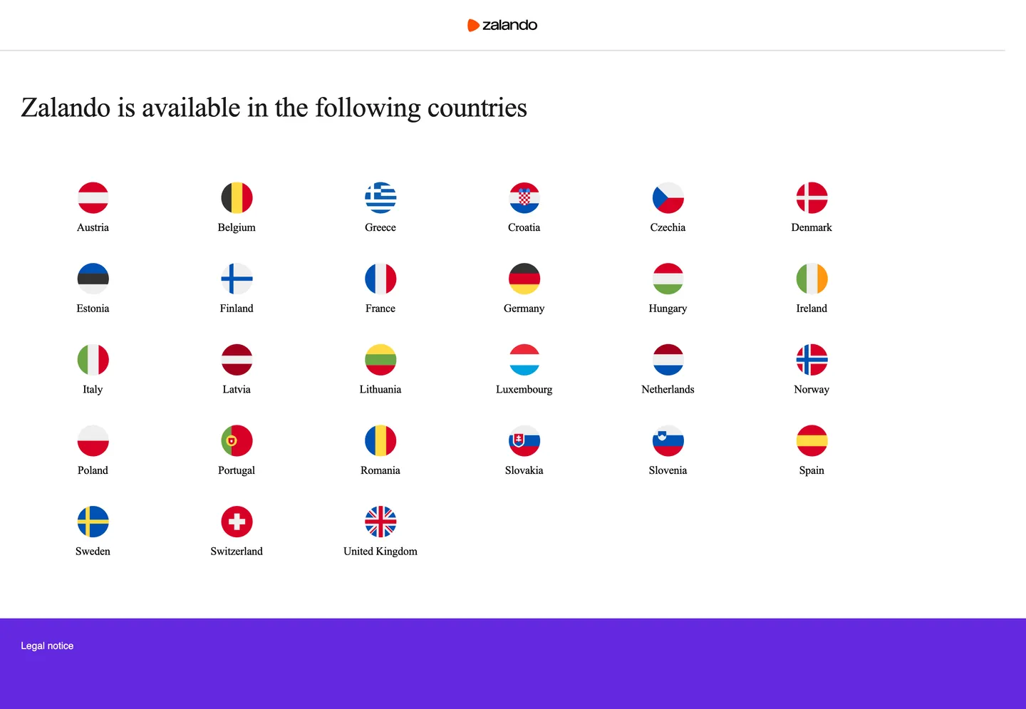
Zalando's geo-selector landing makes the category's standard typographic trade explicit in one screen. The page carries a single h1 in Tiempos — the editorial serif at 40px / weight 400 with -0.4px tracking — and then hands everything else to HelveticaNow sans at 14px / weight 400. No hybrid sizes, no overlapping of the two families. Tiempos belongs to the headline tier; HelveticaNow belongs to the utility tier. Where ZARA (Inditex's main European rival) goes further and strips the serif from every surface except campaign cover lettering, Zalando keeps the serif as a structural heading voice and reserves it for the largest typographic moment on the page. The result is a page that reads as retail-editorial rather than as pure fashion magazine — a distinction that reflects Zalando's broader-demographic positioning.
The DESIGN.md file packages the captured system into a machine-readable spec for React tooling. Inside: 4 colors tokens drawn from a near-monochrome structural palette plus a single brand-layer violet (#6328e0) used as the footer canvas fill. Typography resolves to 11 tokens spanning Tiempos at two display sizes (40px display, 16px body) and HelveticaNow at four utility sizes. The radius scale is single-value: 0px across every captured element. Spacing anchors on 8px. The component set covers the top-nav bar, the geo-selector h1, country-tile links, footer band, newsletter input, and primary CTA block — the surfaces visible in the extracted page.
Feed this file to Claude or Cursor to reproduce Zalando's captured moves — Tiempos serif reserved for the display tier, HelveticaNow sans for every utility surface, zero rounding, and the violet footer band as the single chromatic departure from an otherwise ink-on-white system. One structural caveat: the extractor landed on the geo-selector page rather than the main storefront, so the orange flame logo that Zalando's brand materials feature prominently lives in SVG and was not captured as a CSS token. The Known Gaps section flags what a storefront-page extraction would add.
What makes it distinct
5
- Serif-sans editorial splitTiempos carries the 40px geo-selector headline while HelveticaNow handles every 14px nav link and utility label, two voices dividing display from chrome
- Violet footer voltage#6328e0 fills the footer band as the sole brand-layer color on the captured page; the orange flame logo lives in SVG and sits outside the CSS token system
- Zero rounding systemno borderRadius value above 0px appears in the extraction; every CTA, country tile, and label block renders as a hard-edged rectangle
- 8px dominant spacingthe captured spacing list records 8px at 54 occurrences, making it the module that organizes the flag-grid rhythm and label padding
- Near-black ink ladder#000000 at frequency 164 and #1a1a1a at frequency 16 form a two-step text hierarchy; the near-black carries navigational and ancillary label roles
zalando.com
Live at zalando.com
A snapshot of the brand in production. Scroll the frame to see the whole page.
Colors
4 colors
Zalando's system runs on #6328e0 as its primary voltage, used in 1 of 12 components. Type is set in Tiempos across 4 tokens from 14px to 40px, weights 400–400. Shape language is sharp — components average 0px corner radius, favoring crisp rectangles.
Surface
Page and card backgrounds · 1
Text
Headlines, body, captions · 2
Other
Specialty colors · 1
Typography
4 type tokens
Set in Tiempos across 4 tokens, from 14px to 40px, weights 400–400. Shown in its own stack: where the font isn't installed, the fallback the file names stands in.
- display-xl40px · weight 400 · lh 48px · tracking -0.4pxThe quick brown fox jumps over the lazy dog
- body-md16px · weight 400 · lh 24px · tracking -0.16pxThe quick brown fox jumps over the lazy dog
- label-md14px · weight 400 · lh normal · tracking normalThe quick brown fox jumps over the lazy dog
- nav-link14px · weight 400 · lh normal · tracking normalThe quick brown fox jumps over the lazy dog
Layout
Radii and spacing
1 corner radii and 3 spacing values. Shape language: sharp.
Radii
- none0px
Spacing
- xs8px
- md30px
- xl64px
Components
12 components
Each rendered from its tokens (color, type, radius, padding) on Zalando's own canvas.
- Button Primarybutton-primaryButton Primary
- Button Secondarybutton-secondaryButton Secondary
- Top Navtop-navTop Nav
- Nav Linknav-linkNav Link
- Hero Headinghero-headingHero Heading
- Body Paragraphbody-paragraphBody Paragraph
- Country Tilecountry-tileCountry Tile
- CardcardCard
- Type here…text-inputText Input
- FooterfooterFooter
- Footer Linkfooter-linkFooter Link
- Section Headingsection-headingSection Heading
In use
The system, in use
Zalando's tokens on the kind of product it builds.
Build something people actually use.
A short paragraph of marketing copy that previews how the brand's display tier and body tier read together. Two sentences is usually enough.
FAQ
Zalando design system FAQ
Common questions about Zalando's tokens, components, and how to use this DESIGN.md in your project.
Read next
Related reading
Specs, directories, and component libraries that pair with this design system.
- Browse all design systemsThe full directory of DESIGN.md files on shadcn.io, with live mockups for each.shadcn.io
- Zalando — official siteZalando's public marketing site — the source of truth for the live tokens captured in this file.zalando.com (opens in a new tab)
- The DESIGN.md specificationGoogle Labs' open spec for machine-readable design system files — the format this page is built on.github.com (opens in a new tab)
Use it
Use Zalando in your project
One machine-readable file. Drop it into Claude, Cursor, or any AI tool that reads DESIGN.md.
Download the DESIGN.md
One machine-readable file: every color, type, radius, spacing, and component token of Zalando.
Feed it to your AI tool
Drop it into Claude, Cursor, or GitHub Copilot. The agent writes React components and Tailwind classes that match Zalando's visual language.
Reference the tokens directly
Or paste the values into your Tailwind config, CSS variables, or component library: every color, size and radius is a quoted, ready-to-copy value.
Read the full DESIGN.md: overview, rationale, do’s and don’ts
Overview
Zalando's geo-selector page is built around a single typographic argument. Serif-as-editorial-gate: Tiempos at 40px is the only element on the page that speaks with editorial authority — the h1 "Zalando is available in the following countries" — and every other text surface hands off to HelveticaNow sans at 14px. Where ZARA (Inditex's main European market rival) removes the serif from every marketing surface and goes pure Helvetica to signal fast-fashion directness, Zalando holds the serif for the structural page headline, signaling that the brand is in fashion-with-edit mode rather than in discount-retail mode. The two choices define a genuine positioning gap, visible at the typeface level.
The chromatic language on the captured page is nearly monochrome — black ink on a white canvas, with a single brand-layer violet filling the footer band. The Zalando orange flame logo appears in the top-left as an SVG mark and is not present in the CSS color system. This restraint on the geo-selector surface is consistent with the editorial fashion convention: the product photography on the main storefront does the chromatic work, and the chrome stays neutral.
Key Characteristics:
- Tiempos serif at 40px / weight 400 for h1 display; HelveticaNow sans at 14px for every utility surface — a strict two-voice system.
- Ink-on-white chrome: #000000 at frequency 164 (text 82, border 82) and #1a1a1a at frequency 16 (text 8, border 8) carry all text and dividers.
- Violet (#6328e0) fills the footer band — the single brand-layer color on the page, used as a background rather than a text or border tone.
- 0px corner radius across every captured element; the flag circles are photograph masks, not border-radius tokens.
- 8px base spacing (54 occurrences) organizing the flag grid and label padding; 30px and 64px handle section and container gaps.
- No weight 700 tier anywhere — Tiempos and HelveticaNow both run at weight 400, letting size and family shift do the hierarchy work.
- The orange flame logo sits in SVG outside the CSS system; this is an important gap for teams building from these tokens.
Colors
Structural
- Ink (
#000000): frequency 164. Used as text (82), border (82). The dominant ink — carries the h1 Tiempos headline, country-selector labels, and the nav divider hairline. Not pure decorative black; every occurrence is structural text or border. - Ink Soft (
#1a1a1a): frequency 16. Used as text (8), border (8). A near-black reserved for secondary navigational roles and the hero heading text color in the component extraction. One step lighter than ink, not distinguishable at reading distances but used consistently for a secondary layer. - Canvas (
#ffffff): frequency 2. The page floor — the white background the geo-selector and country grid sit on. Low extraction count because it's the default page background, not declared repeatedly on child elements.
Brand
- Violet (
#6328e0): frequency 1. Used as background (1). The footer fill — the sole brand-layer color on the captured surface. Marked layer: brand by the extractor. The violet footer is the one chromatic departure from the ink-on-white monochrome above. The Zalando orange flame logo is not captured here — it renders as SVG.
Typography
Font Families
The system runs two families with a hard editorial split. Tiempos (Klim Type Foundry, a contemporary editorial serif) handles the display and body tiers. HelveticaNow (Monotype's update to Helvetica Neue) handles every utility surface — nav links, country labels, footer copy. Fallbacks follow each family's standard chain: Times New Roman for Tiempos, Helvetica for HelveticaNow.
The two-voice split is the typographic positioning move. Tiempos reads editorial; HelveticaNow reads functional. Using HelveticaNow (not Arial or Inter) for the utility tier signals brand budget — HelveticaNow is a licensed typeface with a specific width and weight distribution that plain Helvetica or system-ui doesn't fully replicate.
Hierarchy
| Token | Size | Weight | Tracking | Use |
|---|---|---|---|---|
{typography.display-xl} | 40px | 400 | -0.4px | H1 "Zalando is available in the following countries" |
{typography.body-md} | 16px | 400 | -0.16px | Body paragraph (Tiempos) |
{typography.label-md} | 14px | 400 | normal | Country labels, CTAs, footer links (HelveticaNow) |
{typography.nav-link} | 14px | 400 | normal | Top-nav links (HelveticaNow) |
Note on Font Substitutes
Tiempos is a licensed family. GT Sectra or Freight Display at weight 400 approximate the editorial serif feel at display sizes; at 16px body, Lora or Palatino are serviceable fallbacks. For HelveticaNow, Inter at weight 400 is the most common open-source substitute — the cap heights are close and the width is compatible.
Layout
Spacing System
- Base unit: 8px — the dominant spacing value (54 occurrences), organizing flag-grid gaps and label padding.
- Tokens:
{spacing.xs}8px ·{spacing.md}30px ·{spacing.xl}64px. - Flag grid: six-column layout of circular flag icons with country labels beneath. Column gaps use the 8px base; row padding uses 8px vertically.
- Container: the flag grid sits on a wide white canvas with left-aligned text; the h1 Tiempos headline runs full-width at the container's left edge.
Grid & Container
The geo-selector page is single-column editorial above (h1 full-width at ~1380px container) with a six-column icon grid below. The country flags use circular images at ~64px diameter with 8px gap between columns. The footer is full-bleed violet with left-aligned "Legal notice" text.
Rhythm
The page is short — one h1, one flag grid, one footer. The rhythm is not the measure of a full marketing page; it reflects the geo-selector's utility nature. Spacing decisions here are minimal and functional rather than editorial.
Elevation
The captured page has no shadow tier. Surfaces are flat — the white canvas floor, the flag grid on it, the violet footer beneath. No cards with elevation, no dropdown shadows visible in the extraction. The system's elevation model on the main storefront (where product card hover states exist) is not represented in this capture.
Shapes
The radius scale is zero. No borderRadius value above 0px appeared in the extraction. Country selector tiles, any CTA blocks, and all text frames render at 0px. The circular country flags are image masks applied to circular <img> containers — the circle comes from the SVG/raster flag artwork, not from a CSS border-radius token. This rectilinear geometry is consistent with the European fashion-retail convention (ZARA: 2px single-step, SSENSE: 0px / 10px on avatar chips only) and positions Zalando firmly in the editorial-retail register.
Components
button-primary — Black fill, white text, HelveticaNow 14px, 0px radius, 8×16px padding. The primary action CTA renders as a pure-rectangle black block.
button-secondary — White fill, black text, 1px black border, 0px radius, 8×16px padding. Used for outlined secondary actions.
top-nav — White canvas surface, ink text in HelveticaNow 14px, 0px radius. Houses the Zalando wordmark/flame SVG logo and navigation links.
nav-link — Transparent background, ink text, HelveticaNow 14px, 8×8px padding. Country and category navigation links.
hero-heading — Transparent background, ink-soft (#1a1a1a) text in Tiempos 40px / weight 400 / -0.4px tracking. The h1 display tier.
body-paragraph — Transparent background, ink text in Tiempos 16px / weight 400.
country-tile — Transparent background, ink text in HelveticaNow 14px. Country name label beneath the circular flag image; 8px padding.
card — White canvas, ink text in Tiempos body-md, 1px ink border, 0px radius, 8px padding.
text-input — White canvas, ink text in HelveticaNow 14px, 1px ink border, 0px radius, 8px padding.
footer — Violet (#6328e0) fill, white text in HelveticaNow 14px, 30px padding.
footer-link — Transparent background, white text in HelveticaNow 14px, 8px padding.
section-heading — Transparent background, ink text in Tiempos 40px.
Do's and Don'ts
Do use Tiempos exclusively for the display and body-text tiers and HelveticaNow exclusively for every utility surface (nav, label, CTA, footer). Mixing the families — using Tiempos at 14px for a label, or HelveticaNow at 40px for a heading — collapses the editorial-vs-functional voice split that gives the system its character.
Do keep corners at 0px. The system is rectilinear by convention; adding even a 4px radius to a country tile or CTA block would push the surface toward generic e-commerce tile territory rather than the editorial-retail register.
Do treat the violet (#6328e0) footer as a zone-delimiter rather than an accent voltage. It appears once on the page as a background fill, not as a button or link color. Using it as a CTA fill or inline link color would misread its role in the system.
Do let the 8px base unit drive all micro-spacing. The 54-occurrence dominance of 8px in the extraction means every label padding, grid gap, and inline margin should resolve to 8px or a multiple of it.
Don't use #1a1a1a for high-prominence text in place of #000000. The near-black is documented in the extraction as a secondary ink layer (frequency 16 vs. 164 for pure black) — using it for the h1 or primary nav labels would soften text that should read at maximum contrast.
Don't add a border-radius to the flag circles using a CSS token. The circles are image masks — they should be expressed as border-radius: 50% on the image container, not as a rounded token in the design system. Treating the circular flag as a {rounded.full} token would imply a general rounded-pill system that doesn't exist here.
Don't assume the orange flame logo color is a CSS token. The orange does not appear in the extraction; it is part of the SVG logomark. Using it as a CTA fill or link accent color without a confirmed CSS token would be inventing a token the spec does not support.
Don't weight-bump either typeface. Neither Tiempos nor HelveticaNow appears above weight 400 in the captured surfaces. Bumping to 600 or 700 for emphasis would import the fintech/enterprise convention into a system that relies on size and family differentiation instead.
Known Gaps
- Geo-selector vs. storefront: the extractor landed on the country-selector page rather than the main shopping experience. The main storefront likely exposes an orange CTA button (matching the flame logo SVG), sale chips, product-card hover states, and a richer color palette — none of which are represented here.
- Orange flame logo: Zalando's brand mark is a distinctive orange flame icon. It appears in the screenshot as an SVG at top-left but was not captured as a CSS token. Any spec built from this file should supplement with the brand orange for CTA surfaces.
- Component-level detail: the extractor returned null for primaryButton, h2, bodyText, navLink, and input on the captured page. Only the h1 heroHeading was extracted. Component specs are inferred from the typography and color tokens.
- Dark mode: no dark surface was visible in the extraction. Zalando's app surfaces may carry a dark mode not exposed on the geo-selector page.
- Main storefront typography at scale: the main shopping experience likely uses Tiempos and HelveticaNow at more size/weight tiers than the two captured here. The product grid, sale-chip labels, size-selector, cart drawer, and checkout would add additional hierarchy levels.
- Motion and interactive states: no hover state, focus ring, or transition was captured from the static geo-selector page.
E-commerce & Retail
More systems like this
More DESIGN.md files in E-commerce & Retail.
Pricing
Build it with Pro
The DESIGN.md files are free. Pro adds 6,000+ blocks, premium templates and the MCP server, so your AI editor builds in your system for you.
4.9/5 out of 5 · 150+ reviewsfrom 150+ founders and developers.
Billing
Billed once a year in USD. Cancel anytime.
- How many people can use the license.
- Client work, SaaS products and anything you charge for.
- Production-ready React sections: hero, pricing, features, dashboards and more.
- Complete multi-page sites you can ship as they are.
- React icons from every major library, installable with one command.
- Presets that restyle every block, in light and dark.
- Lets your AI editor search, preview and install blocks for you.
- Priority requests are answered first.
Individual
For personal projects & open source
$32instead of $49/mo
$389 billed yearly
- Seats: 1 seat
- Commercial use: Personal & open source only
- Pro blocks: 6,000+ blocks
- Templates: All 14 templates
- React icons: 294k+ icons
- Themes: All 59 themes
- MCP server: Basic usage
- Support: Standard
Team
Most popularFor freelancers, agencies & startups
$66instead of $99/mo
$789 billed yearly · ≈ $13/dev/mo
- Seats: Up to 5 seats
- Commercial use: Included
- Pro blocks: 6,000+ blocks
- Templates: All 14 templates
- React icons: 294k+ icons
- Themes: All 59 themes
- MCP server: High usage
- Support: Priority
Organization
For companies with larger teams
$132instead of $199/mo
$1,589 billed yearly
- Seats: Unlimited seats
- Commercial use: Included
- Pro blocks: 6,000+ blocks
- Templates: All 14 templates
- React icons: 294k+ icons
- Themes: All 59 themes
- MCP server: Unlimited usage
- Support: Priority
Billed once a year in USD. Cancel anytime.
Individual
For personal projects & open source
$32instead of $49/mo
$389 billed yearly
- How many people can use the license.Seats: 1 seat
- Client work, SaaS products and anything you charge for.Commercial use: Personal & open source only
- Production-ready React sections: hero, pricing, features, dashboards and more.Pro blocks: 6,000+ blocks
- Complete multi-page sites you can ship as they are.Templates: All 14 templates
- React icons from every major library, installable with one command.React icons: 294k+ icons
- Presets that restyle every block, in light and dark.Themes: All 59 themes
- Lets your AI editor search, preview and install blocks for you.MCP server: Basic usage
- Priority requests are answered first.Support: Standard
Team
Most popularFor freelancers, agencies & startups
$66instead of $99/mo
$789 billed yearly · ≈ $13/dev/mo
Everything in Individual, plus
- How many people can use the license.Seats: Up to 5 seats
- Client work, SaaS products and anything you charge for.Commercial use: Included
- Lets your AI editor search, preview and install blocks for you.MCP server: High usage
- Priority requests are answered first.Support: Priority
Organization
For companies with larger teams
$132instead of $199/mo
$1,589 billed yearly
Everything in Team, plus
- How many people can use the license.Seats: Unlimited seats
- Lets your AI editor search, preview and install blocks for you.MCP server: Unlimited usage
- Secure checkout via Stripe
- Code lives in your repo
- Keep what you've shipped if you cancel
- License terms
Your system, built for you
Every block, template and icon, installed by your AI agent in your design system. The DESIGN.md files stay free.