xAI Design System
xAI's design system as a DESIGN.md file. Canvas #0a0a0a, Universal Sans + Geist Mono, 18 colors, 23 components. For React, Next.js, and AI tools.
Add shadcn.io to your AI agent. · Pro It installs blocks, icons and templates in your design system from a prompt, with Pro.
Set up MCP- Primary
- #ffffff
- Typeface
- universalSans
- Shape
- Mixed
- Base radius
- 8px
- Colors
- 18
- Type tokens
- 11
- Components
- 23
- Spacing values
- 9
About
About xAI DESIGN.md
Curated by Dov Azencot · Updated May 12, 2026 · Source x.ai (opens in a new tab)
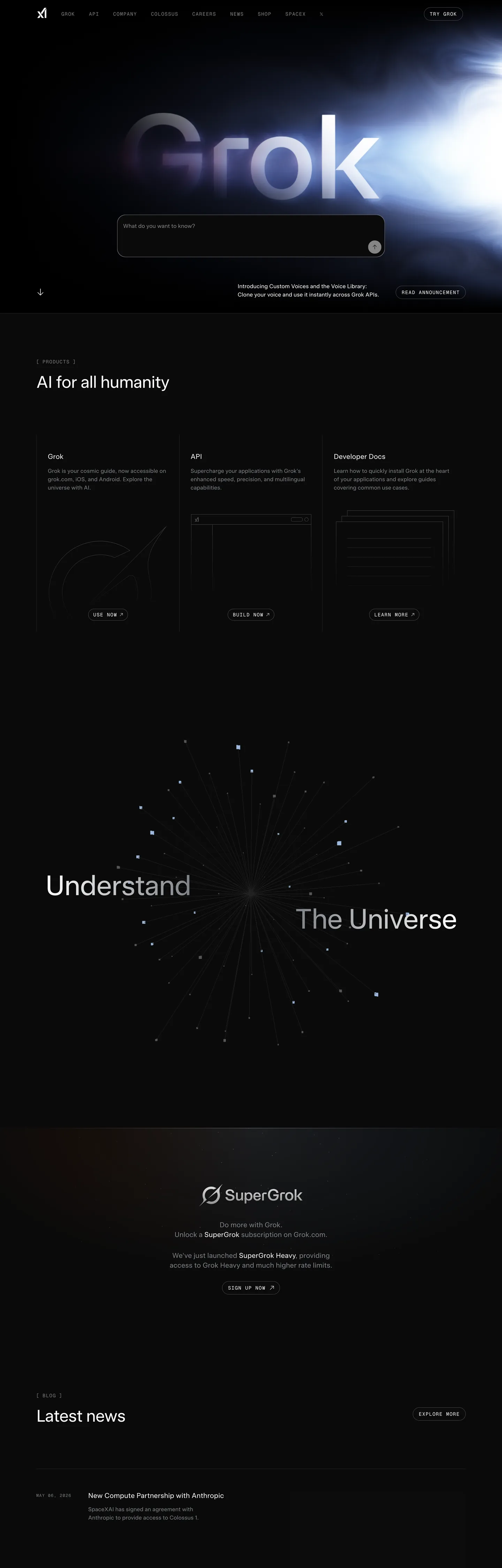
xAI is Elon Musk's frontier-AI lab, and the marketing surface wears that posture with engineered restraint. The base canvas is a single near-black #0a0a0a edge-to-edge, broken only by white outline pills and the occasional warm sunset-orange or dusk-purple accent inside product illustrations. There is no gradient hero, no atmospheric backdrop, no product screenshot — the site reads as a research lab announcing its work rather than a SaaS marketing page. The shape language is even more austere than the palette: every interactive element is a 9999px pill with a 1px translucent-white border, and cards are tight 8px rectangles in #191919 with hairline #212327 dividers. No shadows exist in the system. Display headlines render in Universal Sans at weight 400 with aggressive -2.4px tracking at 96px, while uppercase Geist Mono carries every section eyebrow at 14px with positive 1.4px tracking. The two-face contrast is the brand voice.
This page packages the system into a single DESIGN.md file in the Google Labs format. Inside: 18 colors tokens grouped into surface, text, hairline, and a muted accent palette (sunset #ff7a17, dusk #7c3aed, twilight #c4b5fd, breeze #a0c3ec, midnight #0d1726); 11 typography tokens covering display-xl through caption-mono-sm at one weight (400); a 4-step radius scale (0, 8px, 9999px pill, 9999px full); a 9-step spacing system from 2px to 64px; and 23 components covering buttons, cards, inputs, navigation, hero/content bands, and 10 illustrative example surfaces (pricing tiers, app shell rows, data-table cells, auth cards, modals, toasts). Every value is quoted, every reference uses the DESIGN.md token-substitution syntax.
Feed the file to Claude, Cursor, or GitHub Copilot and the agent reproduces xAI's restraint — the dark canvas, the outline pills, the weight-400 display with negative tracking — rather than generating a generic dark theme with bolded headings and filled buttons. Reference the tokens directly in Tailwind config or CSS variables when you want the engineered-cosmic posture without the chrome of a conventional SaaS marketing site. The system is worth studying because it commits hard to one shape (the pill), one weight (400), and one surface (#0a0a0a) — the discipline of refusing every easy decorative escape hatch is what makes the brand read as a research lab.
What makes it distinct
5
- Single near-black canvas#0a0a0a edge-to-edge, with no light-mode counterpart anywhere on the marketing surface
- Pill is the entire interactive shapeevery button uses rounded 9999px with a 1px translucent-white border
- Display sits at weight 400 with -2.4px tracking at 96pxthe brand never bolds anywhere in the type ladder
- Two-face contrastUniversal Sans sentence-case display paired with Geist Mono uppercase eyebrows at 1.4px tracking
- Hairline borders carry all elevationno drop shadows exist anywhere in the 28-component system
x.ai
Live at x.ai
A snapshot of the brand in production. Scroll the frame to see the whole page.
Colors
18 colors
xAI's system runs on #ffffff as its primary voltage, used in 2 of 23 components. Type is set in universalSans across 11 tokens from 12px to 96px, weights 400–400. Shape language is mixed across 23 components, blending pills, soft rounds, and squarer corners.
Brand & Accent
Sparing, CTA-only voltage · 7
Surface
Page and card backgrounds · 4
Text
Headlines, body, captions · 5
Borders & Hairlines
Dividers, outlines, rules · 1
Other
Specialty colors · 1
Typography
11 type tokens
Set in universalSans across 11 tokens, from 12px to 96px, weights 400–400. Shown in its own stack: where the font isn't installed, the fallback the file names stands in.
- display-xl96px · weight 400 · lh 96px · tracking -2.4pxThe quick brown fox jumps over the lazy dog
- display-lg72px · weight 400 · lh 72px · tracking -1.8pxThe quick brown fox jumps over the lazy dog
- display-md48px · weight 400 · lh 48px · tracking -1.2pxThe quick brown fox jumps over the lazy dog
- display-sm32px · weight 400 · lh 36px · tracking -0.6pxThe quick brown fox jumps over the lazy dog
- display-xs20px · weight 400 · lh 28pxThe quick brown fox jumps over the lazy dog
- body-lg18px · weight 400 · lh 28pxThe quick brown fox jumps over the lazy dog
- body-md16px · weight 400 · lh 24pxThe quick brown fox jumps over the lazy dog
- body-sm14px · weight 400 · lh 20pxThe quick brown fox jumps over the lazy dog
- caption-mono14px · weight 400 · lh 20px · tracking 1.4pxThe quick brown fox jumps over the lazy dog
- caption-mono-sm12px · weight 400 · lh 16px · tracking 1.2pxThe quick brown fox jumps over the lazy dog
- button-md14px · weight 400 · lh 20pxThe quick brown fox jumps over the lazy dog
Layout
Radii and spacing
4 corner radii and 9 spacing values. Shape language: mixed.
Radii
- none0px
- sm8px
- pill9999px
- full9999px
Spacing
- xxs2px
- xs4px
- sm8px
- md12px
- lg16px
- xl24px
- 2xl32px
- 3xl48px
- 4xl64px
Components
23 components
Each rendered from its tokens (color, type, radius, padding) on xAI's own canvas.
- Nav Barnav-barNav Bar
- Nav Linknav-linkNav Link
- Button Primarybutton-primaryButton Primary
- Button Outline On Darkbutton-outline-on-darkButton Outline On Dark
- Button Outline Smbutton-outline-smButton Outline Sm
- Type here…text-inputText Input
- Card Contentcard-contentCard Content
- Card Feature Productcard-feature-productCard Feature Product
- Hero Bandhero-bandHero Band
- Content Bandcontent-bandContent Band
- Eyebrow Monoeyebrow-monoEyebrow Mono
- Divider Hairlinedivider-hairlineDivider Hairline
- FooterfooterFooter
- Ex Pricing Tierex-pricing-tierEx Pricing Tier
- Ex Pricing Tier Featuredex-pricing-tier-featuredEx Pricing Tier Featured
- Ex Product Selectorex-product-selectorEx Product Selector
- Ex Cart Drawerex-cart-drawerEx Cart Drawer
- Ex App Shell Rowex-app-shell-rowEx App Shell Row
- Ex Data Table Cellex-data-table-cellEx Data Table Cell
- Ex Auth Form Cardex-auth-form-cardEx Auth Form Card
- Ex Modal Cardex-modal-cardEx Modal Card
- Ex Empty State Cardex-empty-state-cardEx Empty State Card
- Ex Toastex-toastEx Toast
In use
The system, in use
xAI's tokens on the kind of product it builds.
Build something people actually use.
A short paragraph of marketing copy that previews how the brand's display tier and body tier read together. Two sentences is usually enough.
FAQ
xAI design system FAQ
Common questions about xAI's tokens, components, and how to use this DESIGN.md in your project.
Read next
Related reading
Specs, directories, and component libraries that pair with this design system.
Use it
Use xAI in your project
One machine-readable file. Drop it into Claude, Cursor, or any AI tool that reads DESIGN.md.
Download the DESIGN.md
One machine-readable file: every color, type, radius, spacing, and component token of xAI.
Feed it to your AI tool
Drop it into Claude, Cursor, or GitHub Copilot. The agent writes React components and Tailwind classes that match xAI's visual language.
Reference the tokens directly
Or paste the values into your Tailwind config, CSS variables, or component library: every color, size and radius is a quoted, ready-to-copy value.
Read the full DESIGN.md: overview, rationale, do’s and don’ts
Overview
xAI is Elon Musk's frontier-AI lab, and the website wears that posture with engineered restraint: a near-black canvas {colors.canvas} (#0a0a0a) edge-to-edge, white outline pills as every interactive element, and a single proprietary geometric sans Universal Sans carrying every display headline at weight 400. There is no gradient hero, no atmospheric backdrop, no product screenshot. The brand reads as confidently sparse — a research lab announcing its work rather than a SaaS marketing site.
Type is the second decisive voice. Universal Sans carries every display at weight 400 (regular) with aggressive negative tracking (-2.4px at 96px, scaling down through the display ladder). For technical labels, eyebrows, and metric counters, the brand pairs Geist Mono (uppercase, 1.4px positive tracking) — every section eyebrow reads as a code comment more than a marketing label.
Every interactive element is a pill ({rounded.pill} 9999px) with a 1px white-translucent border rgba(255, 255, 255, 0.25). The button shape never varies — the same translucent-white pill carries "Try Grok", "Read announcement", "Custom Voices", "Sign up now", and every "Read" anchor. The pill is the entire shape system.
Key Characteristics:
- A single near-black canvas (
{colors.canvas}#0a0a0a) with white outline pills as the entire interactive vocabulary. - Universal Sans weight 400 for display, Geist Mono uppercase tracked for labels — the two-face contrast IS the brand voice.
- Every button is a
{rounded.pill}outline with translucent-white border. The brand never uses filled CTAs except for one variant (white-filled pill on Sign Up). - Cards are tight
{rounded.sm}8px rectangles in a slightly-lighter{colors.canvas-card}(#191919) fill with hairline border. No shadows. - A muted accent palette of sunset-orange
#ff7a17/ dusk-purple#7c3aed/ twilight-violet#c4b5fd/ breeze-blue#a0c3eclives in the design tokens but appears rarely on the main marketing surface — reserved for product illustrations / icons. - Massive negative letter-spacing on display headlines (
-2.4pxat 96px) gives the typography a precise, gathered look.
Colors
Brand & Accent
- White (
{colors.primary}—#ffffff): The brand's primary "color" — used as button outline, button-primary fill, all display text. The brand's signature is white-on-near-black. - Sunset Orange (
{colors.accent-sunset}—#ff7a17): A warm orange used inside product illustrations and accent moments. - Sunset Soft (
{colors.accent-sunset-soft}—#ffc285): The lighter variant of the sunset accent. - Dusk Purple (
{colors.accent-dusk}—#7c3aed): Deep purple used inside product illustrations. - Twilight (
{colors.accent-twilight}—#c4b5fd): Soft violet — illustrative accent. - Breeze Blue (
{colors.accent-breeze}—#a0c3ec): Soft blue — illustrative accent. - Midnight (
{colors.accent-midnight}—#0d1726): Deep blue-black for illustrative backgrounds.
Surface
- Canvas (
{colors.canvas}—#0a0a0a): The default near-black page background. The brand's only true surface. - Canvas Soft (
{colors.canvas-soft}—#1a1c20): A slightly lighter dark fill used for hovered nav items and tooltips. - Canvas Card (
{colors.canvas-card}—#191919): The charcoal card fill used inside product-feature cards. - Canvas Mid (
{colors.canvas-mid}—#363a3f): A mid-dark used for nested surfaces and code mockup backgrounds. - Hairline (
{colors.hairline}—#212327): 1px solid dividers on dark surfaces.
Text
- Ink (
{colors.ink}—#ffffff): Default text on canvas — pure white. - Ink Hover (
{colors.ink-hover}—#fafaf7): Slightly off-white used for hover states (filtered out per no-hover policy in component specs). - Body (
{colors.body}—#dadbdf): Secondary body text — supporting copy in lighter weight. - Body Mid / Mute (
{colors.body-mid}—#7d8187): Mid-emphasis body and mute text — captions, fine print.
Semantic
The brand doesn't surface a separate semantic palette on the marketing site. Validation cues use the white-on-canvas hierarchy.
Typography
Font Family
Two faces ladder the system:
- universalSans — proprietary geometric sans used for every display, body, button, and link role. Weight 400 only on the marketing surface (the brand's restraint is part of the voice). Negative letter-spacing at display sizes is the visual signature.
- GeistMono — used for uppercase section eyebrows, label captions, and metric counters. Positive tracking (1.2 – 1.4px) at 12 – 14px.
Hierarchy
| Token | Size | Weight | Line Height | Letter Spacing | Use |
|---|---|---|---|---|---|
{typography.display-xl} | 96px | 400 | 96px | -2.4px | Maximum hero scale. |
{typography.display-lg} | 72px | 400 | 72px | -1.8px | Sub-hero displays. |
{typography.display-md} | 48px | 400 | 48px | -1.2px | Section headlines. |
{typography.display-sm} | 32px | 400 | 36px | -0.6px | Card-cluster headings. |
{typography.display-xs} | 20px | 400 | 28px | 0 | Inline displays. |
{typography.body-lg} | 18px | 400 | 28px | 0 | Lead paragraphs. |
{typography.body-md} | 16px | 400 | 24px | 0 | Default body. |
{typography.body-sm} | 14px | 400 | 20px | 0 | Secondary body. |
{typography.caption-mono} | 14px | 400 | 20px | 1.4px | Section eyebrow (GeistMono uppercase). |
{typography.caption-mono-sm} | 12px | 400 | 16px | 1.2px | Small mono labels. |
{typography.button-md} | 14px | 400 | 20px | 0 | Button label. |
Principles
- Weight 400 for everything. The brand never bolds. Negative tracking + size hierarchy do the emphasis work.
- Tight negative tracking on display sizes. Reverting to neutral tracking loses the precision feel.
- GeistMono uppercase for eyebrows. Tracked positively (1.4px) to make the mono read as a code comment.
Note on Font Substitutes
universalSans is proprietary. Open-source substitutes:
- Display + body — Inter weight 400 with
-0.04emto-0.02emletter-spacing at display sizes comes closest. Geist is the second-best option. - Mono — Geist Mono is the documented brand companion; JetBrains Mono or IBM Plex Mono are alternates.
Layout
Spacing System
- Base unit: 4px.
- Tokens:
{spacing.xxs}2px ·{spacing.xs}4px ·{spacing.sm}8px ·{spacing.md}12px ·{spacing.lg}16px ·{spacing.xl}24px ·{spacing.2xl}32px ·{spacing.3xl}48px ·{spacing.4xl}64px. - Section padding: hero / content bands at
{spacing.4xl}64px on desktop. - Card interior padding:
{spacing.xl}24px.
Grid & Container
- Marketing content centres at ~1200px.
- Product / announcement card grid: 2-up at desktop, 1-up at mobile.
Responsive Strategy
Breakpoints
| Name | Width | Key Changes |
|---|---|---|
| Mobile | < 768px | Hero scales 96 → 48px; grids 1-up; hamburger nav. |
| Desktop | ≥ 768px | Full hero + 2-up grids. |
Touch Targets
Buttons render ~32 – 40px tall (8 vertical padding + 20 line). Mobile inflates touch area to meet WCAG 44 × 44px.
Image Behavior
The brand uses sparse SVG illustrations for product moments (Grok, Voice, API). No photography on the marketing surface.
Elevation & Depth
| Level | Treatment | Use |
|---|---|---|
| Level 0 — Flat | No shadow, no border. | Default. |
| Level 1 — Hairline | 1px solid {colors.hairline} border. | Card chrome, button outlines (with translucent white). |
The brand uses no shadows. Hairline borders carry all elevation cues.
Shapes
Border Radius Scale
| Token | Value | Use |
|---|---|---|
{rounded.none} | 0px | Full-bleed bands. |
{rounded.sm} | 8px | Card chrome (the brand's --radius value). |
{rounded.pill} | 9999px | Every button — the brand's universal interactive shape. |
{rounded.full} | 9999px | Circular icon containers. |
Components
Buttons
button-primary — the rare white-filled pill (used on a single Sign Up CTA).
- Background
{colors.primary}white#ffffff, text{colors.on-primary}near-black#0a0a0a, 1px solid white border, label{typography.button-md}, padding{spacing.xs} {spacing.md}, shape{rounded.pill}9999px.
button-outline-on-dark — the canonical white-outline pill, used for every non-primary CTA.
- Background
{colors.canvas}(transparent in practice —rgba(0,0,0,0)), text{colors.ink}white, 1px solid{colors.hairline}#212327border (translucent white at runtime), same typography / padding scale / shape.
button-outline-sm — the smaller outline pill used in card-cluster CTAs.
- Same as
button-outline-on-darkwith tighter padding{spacing.xs} {spacing.md}.
Cards & Containers
card-content — the default content card.
- Background
{colors.canvas-card}(#191919), text{colors.ink}, 1px solid{colors.hairline}border, padding{spacing.xl}, shape{rounded.sm}8px.
card-feature-product — the product-feature card (Grok / Voice / API).
- Same chrome as
card-content. Hosts an SVG illustration + headline + body + outline pill CTA.
Inputs & Forms
text-input — the standard text input on dark.
- Background
{colors.canvas-soft}#1a1c20, text{colors.ink}, 1px solid{colors.hairline}, body in{typography.body-md}, padding{spacing.md} {spacing.lg}, shape{rounded.sm}8px.
Navigation
nav-bar — the sticky top nav.
- Background
{colors.canvas}, text{colors.ink}, padding{spacing.md} {spacing.xl}.
nav-link — link items inside nav.
- Text
{colors.ink}, set in{typography.body-sm}.
footer — the footer band.
- Background
{colors.canvas}, text{colors.body}#dadbdf, padding{spacing.3xl} {spacing.xl}. Body in{typography.body-sm}.
Signature Components
hero-band — the dark hero with massive display headline.
- Background
{colors.canvas}, text{colors.ink}, padding{spacing.4xl} {spacing.xl}. Headline in{typography.display-xl}(96px weight 400 with-2.4pxtracking).
content-band — the standard content section.
- Background
{colors.canvas}, text{colors.ink}, padding{spacing.4xl} {spacing.xl}. Section headline in{typography.display-md}preceded by a{typography.caption-mono}UPPERCASE GeistMono eyebrow.
eyebrow-mono — the uppercase tracked GeistMono label above every section headline.
- Text
{colors.ink}, set in{typography.caption-mono}. The brand's signature label style.
divider-hairline — the 1px line between section bands.
- 1px solid
{colors.hairline}#212327.
Examples (illustrative)
Auto-derived kit-mirror demonstration surfaces (
scripts/derive-examples-block.mjs). Eachex-*entry references brand-native primitives so downstream consumers (/preview-design,/generate-kit) re-skin the same 10 surfaces consistently.
ex-pricing-tier — Default Pricing tier card. Re-uses feature-card chrome with brand canvas-soft surface.
- Properties:
backgroundColor,textColor,borderColor,rounded,padding
ex-pricing-tier-featured — Featured/highlighted tier — polarity-flipped surface (dark fill + light text in light mode, light fill + dark text in dark mode).
- Properties:
backgroundColor,textColor,rounded,padding
ex-product-selector — What's Included summary card — re-purposed for SaaS / B2B verticals (NOT a literal product gallery).
- Properties:
backgroundColor,rounded,padding
ex-cart-drawer — Subscription summary — re-purposed for SaaS / B2B (line items per add-on, not literal cart).
- Properties:
backgroundColor,rounded,padding,item-divider
ex-app-shell-row — Sidebar nav row inside the App Shell example. Active state uses brand primary as the indicator.
- Properties:
backgroundColor,activeIndicator,rounded,padding
ex-data-table-cell — Default data-table th + td chrome. Header uses mono-caps eyebrow typography; body uses body-sm.
- Properties:
headerBackground,headerTypography,bodyTypography,cellPadding,rowBorder
ex-auth-form-card — Sign-in / sign-up card. Re-uses feature-card chrome with text-input primitives inside.
- Properties:
backgroundColor,rounded,padding
ex-modal-card — Modal dialog surface — same chrome as feature-card with elevated shadow.
- Properties:
backgroundColor,rounded,padding
ex-empty-state-card — Empty-state illustration frame.
- Properties:
backgroundColor,rounded,padding,captionTypography
ex-toast — Toast notification surface — feature-card shape + medium shadow.
- Properties:
backgroundColor,rounded,padding,typography
Do's and Don'ts
Do
- Reserve
{colors.canvas}(#0a0a0a) as the only page surface. The brand is dark-canvas only. - Set hero headlines in
{typography.display-xl}Universal Sans weight 400 with-2.4pxtracking. The precision IS the voice. - Use
{rounded.pill}9999px on every interactive element. The pill is the brand. - Pair Universal Sans (sentence-case) with GeistMono UPPERCASE (eyebrows, labels, metric counters).
- Use white-translucent borders for outline buttons — the brand never uses solid white borders on its outline pill.
Don't
- Don't introduce a light-mode counterpart. xAI is dark-canvas only.
- Don't bold display headlines. Weight 400 is the entire scale.
- Don't use filled buttons broadly. The brand uses outline pills almost exclusively; one Sign Up white-filled pill is the rare exception.
- Don't drop a drop-shadow on cards. Hairline borders carry elevation.
- Don't substitute Universal Sans with a generic geometric sans without adjusting letter-spacing. The negative tracking is part of the brand.
Known Gaps
- Runtime border color: the spec stores
{colors.hairline}#212327for outline-pill borders, but the live site renders translucent whitergba(255, 255, 255, 0.25)at runtime — the file does not document the alpha-channel translation. - Gradient illustration stops: the sunset-to-dusk gradients used inside product illustrations (Grok, Voice) are not captured token-by-token; only the discrete accent colors (
{colors.accent-sunset},{colors.accent-dusk}) are documented. - Loading states / skeleton screens: not captured from the marketing surface.
- Universal Sans variable-font axes: the proprietary face supports more weight axes than the marketing site exposes; only weight 400 is documented because that's the only weight the brand uses publicly.
- Focus rings: text-input and button focus-ring treatment is not visible on the captured surfaces. The brand likely uses a 1px white outline at full opacity, but precise extraction was not reliable.
- Nested product canvases: the Grok chat interface, API console, and developer documentation surfaces likely extend the system with code-block and tool-display primitives that this spec does not capture.
AI & LLM Platforms
More systems like this
More DESIGN.md files in AI & LLM Platforms.
Pricing
Build it with Pro
The DESIGN.md files are free. Pro adds 6,000+ blocks, premium templates and the MCP server, so your AI editor builds in your system for you.
4.9/5 out of 5 · 150+ reviewsfrom 150+ founders and developers.
Billing
Billed once a year in USD. Cancel anytime.
- How many people can use the license.
- Client work, SaaS products and anything you charge for.
- Production-ready React sections: hero, pricing, features, dashboards and more.
- Complete multi-page sites you can ship as they are.
- React icons from every major library, installable with one command.
- Presets that restyle every block, in light and dark.
- Lets your AI editor search, preview and install blocks for you.
- Priority requests are answered first.
Individual
For personal projects & open source
$32instead of $49/mo
$389 billed yearly
- Seats: 1 seat
- Commercial use: Personal & open source only
- Pro blocks: 6,000+ blocks
- Templates: All 14 templates
- React icons: 294k+ icons
- Themes: All 59 themes
- MCP server: Basic usage
- Support: Standard
Team
Most popularFor freelancers, agencies & startups
$66instead of $99/mo
$789 billed yearly · ≈ $13/dev/mo
- Seats: Up to 5 seats
- Commercial use: Included
- Pro blocks: 6,000+ blocks
- Templates: All 14 templates
- React icons: 294k+ icons
- Themes: All 59 themes
- MCP server: High usage
- Support: Priority
Organization
For companies with larger teams
$132instead of $199/mo
$1,589 billed yearly
- Seats: Unlimited seats
- Commercial use: Included
- Pro blocks: 6,000+ blocks
- Templates: All 14 templates
- React icons: 294k+ icons
- Themes: All 59 themes
- MCP server: Unlimited usage
- Support: Priority
Billed once a year in USD. Cancel anytime.
Individual
For personal projects & open source
$32instead of $49/mo
$389 billed yearly
- How many people can use the license.Seats: 1 seat
- Client work, SaaS products and anything you charge for.Commercial use: Personal & open source only
- Production-ready React sections: hero, pricing, features, dashboards and more.Pro blocks: 6,000+ blocks
- Complete multi-page sites you can ship as they are.Templates: All 14 templates
- React icons from every major library, installable with one command.React icons: 294k+ icons
- Presets that restyle every block, in light and dark.Themes: All 59 themes
- Lets your AI editor search, preview and install blocks for you.MCP server: Basic usage
- Priority requests are answered first.Support: Standard
Team
Most popularFor freelancers, agencies & startups
$66instead of $99/mo
$789 billed yearly · ≈ $13/dev/mo
Everything in Individual, plus
- How many people can use the license.Seats: Up to 5 seats
- Client work, SaaS products and anything you charge for.Commercial use: Included
- Lets your AI editor search, preview and install blocks for you.MCP server: High usage
- Priority requests are answered first.Support: Priority
Organization
For companies with larger teams
$132instead of $199/mo
$1,589 billed yearly
Everything in Team, plus
- How many people can use the license.Seats: Unlimited seats
- Lets your AI editor search, preview and install blocks for you.MCP server: Unlimited usage
- Secure checkout via Stripe
- Code lives in your repo
- Keep what you've shipped if you cancel
- License terms
Your system, built for you
Every block, template and icon, installed by your AI agent in your design system. The DESIGN.md files stay free.