Windsurf Design System
Windsurf's marketing system uses a warm sand canvas, Tomato Grotesk display headlines at weight 400, DM Mono uppercase metadata, and a saturated mint-aqua CTA. Tokens for React, Next.js, and AI coding tools.
Add shadcn.io to your AI agent. · Pro It installs blocks, icons and templates in your design system from a prompt, with Pro.
Set up MCP- Primary
- #34e8bb
- Typeface
- DM Sans
- Shape
- Mixed
- Base radius
- 6px
- Colors
- 13
- Type tokens
- 10
- Components
- 13
- Spacing values
- 10
About
About Windsurf DESIGN.md
Curated by Dov Azencot · Updated May 18, 2026 · Source windsurf.com (opens in a new tab)
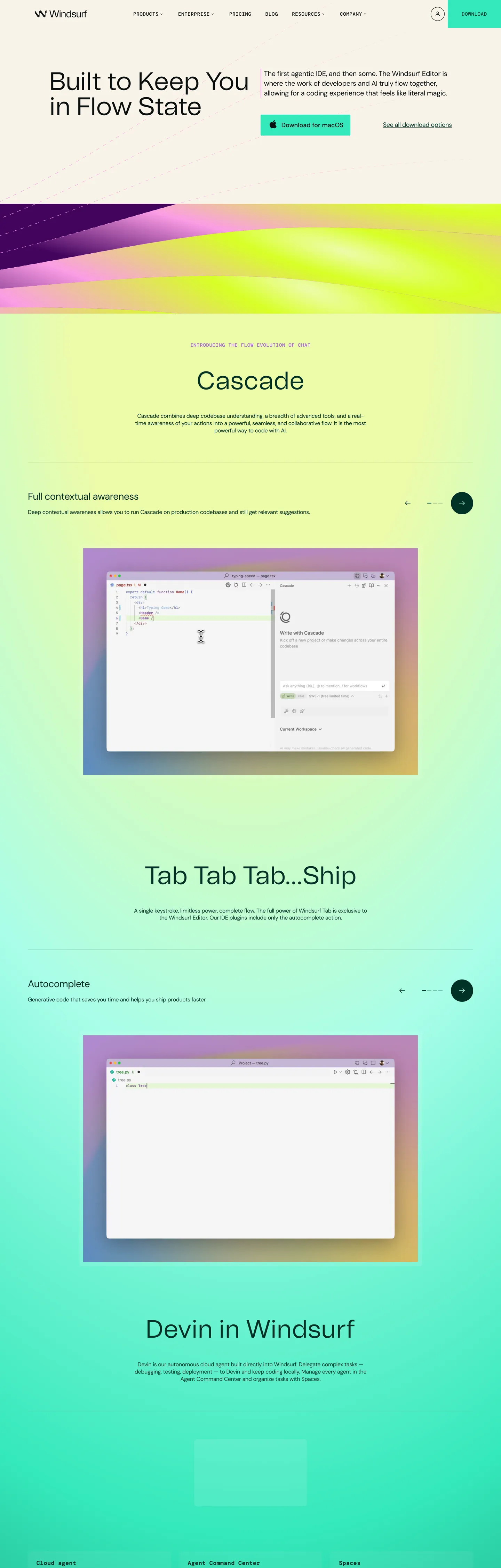
Windsurf's post-rebrand marketing site does something rare in the AI-IDE category. Where Cursor, Replit, and Bolt all open on dark surfaces with cool blue accents, Windsurf paints its landing in a warm sand cream, sets a 72px Tomato Grotesk headline in near-black ink ("Built to Keep You in Flow State"), and reserves a saturated mint aqua for a single Download pill in the top nav. The headline weight is 400, not 700. The kicker above the next section reads "Introducing the flow evolution of chat" in violet uppercase DM Mono. Between sections, a holographic aurora gradient sweeps through magenta, chartreuse, and aqua — a literal surfboard-lacquer reference that other dev-tools brands would consider too playful to ship.
The DESIGN.md file packages the system into a machine-readable spec for React tooling. Inside: 13 colors tokens drawn from the `--sk-*` (Surf Kit) custom-property family Codeium ships post-rebrand — a brand-voltage tier (mint aqua, deep emerald, surf indigo, sun-up chartreuse, dusk pink), a structural tier of warm sand canvas and ivory cards, ink black for text and an off-white inverse for buttons; 10 typography tokens running Tomato Grotesk in three display sizes plus DM Sans body and DM Mono eyebrow / button tiers; a 2px / 6px / 8px / pill radius scale; and 13 components definitions covering the mint Download pill, the deep-emerald CTA text, the cream cards, the eyebrow strip, and the IDE-mockup window chrome.
Feed this file to Claude or Cursor and it reproduces Windsurf's specific moves: warm sand canvas instead of cool gray or black, mint aqua as a single saturated voltage held back for one button, Tomato Grotesk display at modest weight 400, DM Mono uppercase metadata threaded through every eyebrow position, and the holographic aurora gradient as a literal section divider rather than a background tile. The one move worth borrowing only if your product has a real metaphor to ground it: the aurora bands work because Windsurf's name is itself a wave reference; lifting them onto a brand without that throughline would feel decorative rather than earned.
What makes it distinct
5
- Warm sand canvasthe page floor sits on a cream sand rather than the cool grays or pure-black backgrounds that Cursor, Replit, and JetBrains use for IDE marketing
- Mint aqua as single voltagethe Download CTA is filled with a saturated mint that comes straight from surfboard lacquer, paired with a deep emerald text color for contrast
- Tomato Grotesk at weight 400the 72px hero hits a custom display sans at regular weight, not the heavy 700 most AI tools reach for
- DM Mono as supporting voiceevery eyebrow label, section kicker, and the primary CTA itself runs in uppercase DM Mono with positive 0.7px tracking
- Holographic aurora bandsthe inter-section dividers render a magenta-to-chartreuse-to-aqua gradient sweep, a tactile reference to the editor's own surf wave imagery
windsurf.com
Live at windsurf.com
A snapshot of the brand in production. Scroll the frame to see the whole page.
Colors
13 colors
Windsurf's system runs on #34e8bb as its primary voltage, used in 1 of 13 components. Type is set in DM Sans across 10 tokens from 12px to 80px, weights 400–500. Shape language is mixed across 13 components, blending pills, soft rounds, and squarer corners.
Brand & Accent
Sparing, CTA-only voltage · 7
Surface
Page and card backgrounds · 2
Text
Headlines, body, captions · 2
Borders & Hairlines
Dividers, outlines, rules · 1
Other
Specialty colors · 1
Typography
10 type tokens
Set in DM Sans across 10 tokens, from 12px to 80px, weights 400–500. Shown in its own stack: where the font isn't installed, the fallback the file names stands in.
- display-xl80px · weight 400 · lh 80pxThe quick brown fox jumps over the lazy dog
- display-lg72px · weight 400 · lh 72pxThe quick brown fox jumps over the lazy dog
- display-md48px · weight 400 · lh 48px · tracking -0.56pxThe quick brown fox jumps over the lazy dog
- display-sm40px · weight 400 · lh 40px · tracking -0.48pxThe quick brown fox jumps over the lazy dog
- body-lg18px · weight 400 · lh 28px · tracking -0.4pxThe quick brown fox jumps over the lazy dog
- body-md16px · weight 400 · lh 20.8px · tracking -0.32pxThe quick brown fox jumps over the lazy dog
- body-sm14px · weight 400 · lh 18.2px · tracking -0.288pxThe quick brown fox jumps over the lazy dog
- heading-md20px · weight 500 · lh 26px · tracking -0.4pxThe quick brown fox jumps over the lazy dog
- button-mono14px · weight 500 · lh 16.8px · tracking 0.704pxThe quick brown fox jumps over the lazy dog
- eyebrow-mono12px · weight 500 · lh 14.4px · tracking 0.608pxThe quick brown fox jumps over the lazy dog
Layout
Radii and spacing
5 corner radii and 10 spacing values. Shape language: mixed.
Radii
- none0px
- xs2px
- md6px
- lg8px
- pill9999px
Spacing
- hairline1px
- xs4px
- sm8px
- md12px
- base16px
- lg20px
- xl24px
- 2xl32px
- 3xl56px
- 4xl80px
Components
13 components
Each rendered from its tokens (color, type, radius, padding) on Windsurf's own canvas.
- Button Primarybutton-primaryButton Primary
- Button Secondarybutton-secondaryButton Secondary
- Top Navtop-navTop Nav
- Nav Linknav-linkNav Link
- Hero Headinghero-headingHero Heading
- Section Headingsection-headingSection Heading
- Stat Headingstat-headingStat Heading
- Body Paragraphbody-paragraphBody Paragraph
- EyebroweyebrowEyebrow
- CardcardCard
- Type here…text-inputText Input
- Editor Windoweditor-windowEditor Window
- FooterfooterFooter
In use
The system, in use
Windsurf's tokens on the kind of product it builds.
Build something people actually use.
A short paragraph of marketing copy that previews how the brand's display tier and body tier read together. Two sentences is usually enough.
import { build } from "./build"

export async function main() {
  const result = await build()
  console.log("done", result)
}
FAQ
Windsurf design system FAQ
Common questions about Windsurf's tokens, components, and how to use this DESIGN.md in your project.
Read next
Related reading
Specs, directories, and component libraries that pair with this design system.
- Browse all design systemsThe full directory of DESIGN.md files on shadcn.io, with live mockups for each.shadcn.io
- Windsurf — official siteWindsurf's public marketing site — the source of truth for the live tokens captured in this file.windsurf.com (opens in a new tab)
- The DESIGN.md specificationGoogle Labs' open spec for machine-readable design system files — the format this page is built on.github.com (opens in a new tab)
Use it
Use Windsurf in your project
One machine-readable file. Drop it into Claude, Cursor, or any AI tool that reads DESIGN.md.
Download the DESIGN.md
One machine-readable file: every color, type, radius, spacing, and component token of Windsurf.
Feed it to your AI tool
Drop it into Claude, Cursor, or GitHub Copilot. The agent writes React components and Tailwind classes that match Windsurf's visual language.
Reference the tokens directly
Or paste the values into your Tailwind config, CSS variables, or component library: every color, size and radius is a quoted, ready-to-copy value.
Read the full DESIGN.md: overview, rationale, do’s and don’ts
Overview
Windsurf's post-rebrand marketing site does something rare in the AI-IDE category. Warm-sand inversion. Where Cursor, Replit, and Bolt all open on dark surfaces with cool blue accents, Windsurf paints its landing in a warm sand cream, sets a 72px Tomato Grotesk headline in near-black ink ("Built to Keep You in Flow State"), and reserves a saturated mint aqua for a single Download pill in the top nav. The headline weight is 400, not 700. The kicker above the next section reads "Introducing the flow evolution of chat" in violet uppercase DM Mono. Between sections, a holographic aurora gradient sweeps through magenta, chartreuse, and aqua — a literal surfboard-lacquer reference that other dev-tools brands would consider too playful to ship.
The system's chromatic restraint reinforces the move. There is exactly one flat-fill brand voltage — mint aqua ({colors.primary} — #34e8bb) — and it appears only on the Download CTA fill, with a deep emerald ({colors.primary-dark} — #003326) for the button text. The secondary palette in the Surf Kit ({colors.accent-dusk}, {colors.accent-indigo}, {colors.accent-sea}, {colors.accent-purple}) appears almost exclusively inside the holographic aurora gradient bands between sections, never as a flat brand fill. This is the opposite of the chromatic spread you see on Replit's avatar wall or Cursor's neon callouts — the Windsurf palette is wide but disciplined; the wide colors live inside a gradient instead of multiplying across surfaces.
Typography stacks three families by role. Tomato Grotesk (a custom display sans) carries every display moment at modest weight 400 — the 72px hero, the 80px stat numbers, the 48px section headings. DM Sans (open source) carries body and navigation. DM Mono (open source) handles every eyebrow label and the primary CTA in uppercase with positive 0.704px tracking. The DM Mono CTA treatment is the system's tonal signature — most brands reserve uppercase mono for technical labels, but Windsurf puts it on the most important button on the page.
Key Characteristics:
- Warm sand canvas (
{colors.canvas}— #f9f3e9), not the cool grays or near-blacks that dominate dev-tools marketing — pulls the whole page into the surf-beach metaphor. - Mint-aqua single voltage (
{colors.primary}) reserved for the Download CTA fill above the fold, with deep emerald ({colors.primary-dark}) for the text-on-mint contrast. - Tomato Grotesk for display at weight 400 — modest, editorial, the opposite of the heavy 700 SaaS hero shout.
- DM Mono uppercase eyebrows and CTA labels with positive 0.7px tracking — a technical-typography move applied to brand-voice surfaces, not just code.
- Holographic aurora gradient bands (magenta → chartreuse → aqua) sweep between major page sections instead of sitting as static decoration — they are page rhythm, not wallpaper.
- Six-pixel default radius on most cards, 8px on larger feature cards, fully-rounded pill on avatar chips — and a 0px rectangular Download CTA inside a rounded wrapper, a custom non-standard treatment.
- Ivory card surface (
{colors.surface-1}— #ffffff) lifts off the warm sand canvas by ~3 points of warmth; depth comes from contrast against the cream floor plus a hairline gray border.
Colors
Brand
- Aqua Primary (
{colors.primary}— #34e8bb): frequency 6. Used as background (2), border (3), gradient stop (1). The Download CTA fill — the single flat-fill brand moment on the page. Declared in Surf Kit as--sk-aqua. - Aqua Shade (
{colors.primary-dark}— #003326): frequency 25. Used as text (21), background (3), gradient stop (1). The button text on the mint CTA and the deep teal accent on emphasis labels. Declared as--sk-aqua-shade. - Aqua Tint (
{colors.primary-tint}— #a8fde8): frequency 10. Used as text (3), background (6), gradient stop (1). The lighter mint variant for hover states and gradient highlights. Declared as--sk-aqua-tint. - Dusk Pink (
{colors.accent-dusk}— #fb9ce5): frequency 8. Used as text (2), background (4), border (1), shadow (1). The pink stop in the holographic aurora bands and a few callout chips. Declared as--sk-dusk. - Indigo Shade (
{colors.accent-indigo}— #43045e): frequency 8. Used as text (4), background (4). The deep purple-violet on the "Introducing the flow evolution of chat" eyebrow and dark accent surfaces. Declared as--sk-indigo-shade. - Sea Tint (
{colors.accent-sea}— #70d6ff): frequency 5. Used as text (2), background (3). The blue stop in gradient bands and the secondary callout fill. Declared as--sk-sea-tint. - Sea Shade (
{colors.accent-purple}— #011c42): frequency 7. Used as text (4), background (2), gradient (1). The deep navy stop in the aurora gradient. Declared as--sk-sea-shade.
Surface
- Canvas (
{colors.canvas}— #f9f3e9): frequency 21 as background. The warm sand page floor, wired as--sk-sand. The single most distinctive choice in the system — pulls the whole page warmer than any dev-tools peer. - Surface-1 (
{colors.surface-1}— #ffffff): frequency 150 across text (114), background (24), border (12). The ivory card surface, also the text color for the Download button's hover-flip state and the inverse contrast against dark blocks.
Text
- Ink (
{colors.ink}— #0b100f): frequency 382 across text (368), background (12), border (2). The dominant text color. Near-black with a slight green tilt, declared as--sk-black. - Ink Soft (
{colors.ink-soft}— #5c0047): frequency 18. Used as text (17), background (1). The deep magenta-plum used for the 70M+ stat headlines and emphasis numerics. Declared as--sk-dusk-shade.
Hairlines
- Hairline (
{colors.hairline}— #c0c1c6): frequency 541 as border — the dominant border tone. A cool gray that reads softly against both the warm sand canvas and the ivory cards.
Semantic / Shadow
- Shadow (
{colors.shadow}— #000000): frequency 21. Used as shadow (20), text (1). Pure black used only inside drop-shadows on the editor-window mockups and a small set of hover states.
Typography
Font Family
The system runs three families. Tomato Grotesk (custom proprietary, declared as --tomato-grotesk-font) carries every display moment at weight 400. DM Sans (open source, declared as --font-dm-sans) carries body, paragraphs, and navigation. DM Mono (open source, declared as --font-dm-mono) handles every eyebrow label and the primary CTA in uppercase with positive tracking. The three-family split is unusual for a dev-tools brand — most stick to two — and the mono-as-CTA move is the system's tonal signature.
Hierarchy
| Token | Size | Weight | Line Height | Use |
|---|---|---|---|---|
{typography.display-xl} | 80px | 400 | 80px | Stat headlines ("70M+") |
{typography.display-lg} | 72px | 400 | 72px | Hero h1 ("Built to Keep You in Flow State") |
{typography.display-md} | 48px | 400 | 48px | Section headings ("Cascade", "Tab Tab Tab...Ship") |
{typography.display-sm} | 40px | 400 | 40px | Sub-section feature headings |
{typography.body-lg} | 18px | 400 | 28px | Body emphasis, lead paragraphs |
{typography.body-md} | 16px | 400 | 20.8px | Default running text |
{typography.body-sm} | 14px | 400 | 18.2px | Nav links, default paragraph |
{typography.heading-md} | 20px | 500 | 26px | Feature sub-headings |
{typography.button-mono} | 14px | 500 | 16.8px | Download CTA (uppercase, 0.704px tracking) |
{typography.eyebrow-mono} | 12px | 500 | 14.4px | Section kickers ("Introducing the flow evolution of chat") |
Principles
Display weight tops out at 400, not 700. The 72px Tomato Grotesk hero at weight 400 is the loudest typographic moment in the system — deliberately editorial rather than promotional. Body sits at weight 400 across DM Sans; weight 500 is reserved for sub-headings and the mono tier. The mono CTA at 14px / 500 / 0.704px tracking / uppercase is the tonal anchor — every button label and every eyebrow runs the same DM Mono treatment, threading a technical typographic voice through what is otherwise a warm editorial system.
Note on Font Substitutes
Tomato Grotesk is proprietary. The closest open-source substitute is Geist Sans (Vercel) or Söhne (commercial). DM Sans and DM Mono are both on Google Fonts under open licenses — no substitute needed. If you cannot license Tomato Grotesk, set the display tier to DM Sans at weight 500 and accept a slightly less editorial cap height; the 0.7px tracking on the mono tier and the warm-sand canvas will still carry the brand voice.
Layout
Spacing System
- Base unit: 4px (with 8px and 20px as the dominant modules).
- Tokens:
{spacing.hairline}1px ·{spacing.xs}4px ·{spacing.sm}8px ·{spacing.md}12px ·{spacing.base}16px ·{spacing.lg}20px ·{spacing.xl}24px ·{spacing.2xl}32px ·{spacing.3xl}56px ·{spacing.4xl}80px. - Frequency: 1px is the most-used value (24 occurrences) on hairline borders, followed by 20px (22), 16px (21), 8px (21), 24px (21), 12px (18).
- Section padding (vertical): ~80px between major bands.
- Card internal padding:
{spacing.xl}(24px) on feature cards,{spacing.lg}(20px) on smaller content tiles. - Hero padding: 20px horizontal on the centered headline stack.
Grid & Container
- Hero layout: two-column at desktop — the 72px display headline on the left, the 18px sub-paragraph and Download CTA on the right, with a dashed-line decorative motif behind both.
- Section width: content sits within roughly 1200px max with generous 80px section padding.
- Editor mockup: the Cascade and Autocomplete IDE screenshots render with a rounded aurora-tinted frame around the actual macOS window — the gradient frame is part of the page rhythm, not just decoration on the screenshot.
- Eyebrow strip: uppercase DM Mono kickers always sit 24-32px above their section heading, never inline.
Rhythm
The page alternates between warm-sand editorial bands (typography and CTA against the cream floor) and holographic aurora dividers (full-bleed gradient sweeps that transition between sections). Below the aurora bands, the surface flips momentarily to a chartreuse-tinted variant for the Cascade introduction before returning to warm sand. The aurora bands are not background tiles — they are page-rhythm devices that mark major narrative turns.
Elevation
The system uses two elevation tiers beyond the flat canvas:
- Flat (no shadow): body, hero, eyebrow strips, the warm sand canvas itself — most of the marketing surface.
- Hairline-bordered cards:
{colors.surface-1}ivory cards with a 1px{colors.hairline}border at #c0c1c6. The most-used elevation by far (541 border occurrences in the extraction). No shadow, just a hairline outline that lifts cards off the cream canvas. - Drop shadow on editor mockups: the IDE window screenshots carry a real
{colors.shadow}(#000000) drop shadow (20 shadow occurrences), giving them a tangible "object on a surface" feel that the rest of the page deliberately avoids. The shadow is reserved for product screenshots only — not for cards, modals, or buttons.
Shapes
The radius scale is a small-step ladder plus pill:
{rounded.none}0px — the Download CTA itself (a perfect rectangle inside a rounded wrapper).{rounded.xs}2px — input field corners, divider strokes (8 occurrences).{rounded.md}6px — default radius on most cards and surfaces (49 occurrences, the most-used tier).{rounded.lg}8px — larger feature cards and modal surfaces (37 occurrences).{rounded.pill}9999px — circular avatar chips and the secondary icon buttons (12 occurrences).
The scale is tighter than Spline's generous 16px default and slightly softer than Vercel's 4-8px range. The 0px Download CTA is the genuinely unusual move — most brands round their primary button; Windsurf renders it as a perfect rectangle and lets the wrapper geometry do the visual softening.
Components
button-primary — The signature CTA. Mint aqua {colors.primary} fill, deep emerald {colors.primary-dark} text, {rounded.none} 0px radius (rectangular), 0x40 padding, 64px height. Renders the word "Download" in uppercase DM Mono at 14px / 500 / 0.704px tracking. Sits in the top-right of the nav above the fold — the most important button on the page.
button-secondary — Transparent fill with ink text and a 1px ink border. Same 64px height and uppercase DM Mono treatment as the primary; used for tertiary CTAs deeper in the page ("See all download options" appears as an underlined text variant rather than a bordered button on the hero, but the secondary pattern is the bordered variant).
top-nav — Warm sand {colors.canvas} surface flush with the page floor, 20px vertical padding. Houses the Windsurf wordmark on the left, the product-nav links (Products, Enterprise, Pricing, Blog, Resources, Company) in the center, and the right-aligned avatar + Download cluster.
nav-link — Transparent background, ink text in {typography.body-md} (16px / 400 / DM Sans), 8x12 padding. No hover background visible in the captured surface.
hero-heading — Ink text on the warm sand canvas, {typography.display-lg} (72px / 400 / Tomato Grotesk). The two-line "Built to Keep You / in Flow State" reads with the modest weight of an editorial cover headline.
section-heading — Ink text, {typography.display-md} (48px / 400 / Tomato Grotesk). Used for "Cascade," "Tab Tab Tab...Ship," "Devin in Windsurf," and the feature-section h2s.
stat-heading — Deep magenta-plum {colors.ink-soft} (#5c0047) text, {typography.display-xl} (80px / 400 / Tomato Grotesk). Used for stat numbers like "70M+" — the only place a hero-scale display moment is colored.
body-paragraph — Default ink text at {typography.body-md} (16px / 400 / DM Sans). The hero sub-paragraph and section leads.
eyebrow — Deep indigo {colors.accent-indigo} text at {typography.eyebrow-mono} (12px / 500 / DM Mono / uppercase / 0.608px tracking). Sits 24-32px above each section heading. "Introducing the flow evolution of chat" is the canonical instance.
card — Ivory {colors.surface-1} fill, ink text, {rounded.lg} 8px radius, 24px internal padding, 1px {colors.hairline} border. The default content card on the warm sand canvas.
text-input — Ivory {colors.surface-1} fill, ink text, {rounded.md} 6px radius, 12x16 padding, 48px height, hairline border. The form field treatment.
editor-window — Ivory fill, hairline border, {rounded.lg} 8px radius, surrounded by a holographic gradient frame at the section level. The IDE mockup screenshots (Cascade panel, tree.py autocomplete) render inside this chrome — the only place a real {colors.shadow} drop shadow appears on the page.
footer — Warm sand {colors.canvas} fill (continues the page floor), ink text, 56x24 padding. No surface contrast against the canvas — the footer just continues the cream.
Do's and Don'ts
Do treat the mint aqua as a single scarce voltage. The system has exactly one flat-fill Download pill above the fold; multiplying mint into multiple buttons or fills would dilute the only chromatic brand signal on the page.
Do keep the secondary palette ({colors.accent-dusk}, {colors.accent-indigo}, {colors.accent-sea}, {colors.accent-purple}) inside the holographic aurora gradients. They are gradient stops, not standalone brand fills — using them as button backgrounds or card backgrounds would turn the page into a candy shop.
Do keep display weight at 400. The hero h1 at 72px / 400 is the loudest typographic moment in the system. Bumping to 700 turns the editorial dek into a generic SaaS shout and undercuts the warm-sand-flow-state mood.
Do thread DM Mono through every eyebrow label and the primary CTA. The uppercase mono treatment with positive 0.704px tracking is the tonal signature; replacing it with DM Sans on the buttons would lose the technical-warmth contrast that defines the brand voice.
Don't swap the warm sand canvas for pure white or near-black. The cream floor is the move that distinguishes Windsurf from every other AI-IDE brand — going to white feels sterile against the saturated mint, going to dark would compete with the editor screenshots and erase the surf-beach metaphor.
Don't put a drop shadow on cards or buttons. The shadow tier exists only for the editor-window mockups; using it on chrome surfaces flattens the visual hierarchy that distinguishes "page content" from "product object."
Don't round the Download CTA. The 0px rectangle inside a rounded wrapper is intentional — rounding the button itself would lose the custom non-standard treatment that signals "this is not a generic CTA."
Don't drop the aurora gradient bands or replace them with a static color block. They are page rhythm, not background — without them the surface loses the surf-wave metaphor that justifies the rest of the system's chromatic playfulness.
Known Gaps
- Hover and focus states: the primary CTA hover state is not exposed on the captured marketing surface. The link-hover treatment (mint underline) is visible but disabled, error, and focus rings are not documented.
- Form input error states: the text-input treatment carries the resting state; error and validation styling lives inside the editor product and is not exposed in marketing.
- Dark mode: the captured marketing surface is light-only. The editor itself is dark (the IDE screenshots show a dark editor chrome), but the marketing site does not ship a dark variant.
- Motion: the aurora gradient bands continuously shift and the editor screenshots autoplay short interaction loops, but the spec captures end-state values only.
- Mobile breakpoints: the captured surface is desktop-only; the responsive token system (breakpoints, mobile spacing, mobile typography scale) is not exposed in the page CSS.
- Pricing and enterprise pages: this DESIGN.md captures the editor landing only. The Enterprise page carries additional gradient blocks and a comparison table treatment not represented here.
- Cookie consent modal: the system ships a CookieConsent library with its own
--cc-*variable set; those tokens (--cc-btn-primary-bg,--cc-overlay-bg, etc.) are vendor chrome and not captured in this spec.
Developer Tools & IDEs
More systems like this
More DESIGN.md files in Developer Tools & IDEs.
Pricing
Build it with Pro
The DESIGN.md files are free. Pro adds 6,000+ blocks, premium templates and the MCP server, so your AI editor builds in your system for you.
4.9/5 out of 5 · 150+ reviewsfrom 150+ founders and developers.
Billing
Billed once a year in USD. Cancel anytime.
- How many people can use the license.
- Client work, SaaS products and anything you charge for.
- Production-ready React sections: hero, pricing, features, dashboards and more.
- Complete multi-page sites you can ship as they are.
- React icons from every major library, installable with one command.
- Presets that restyle every block, in light and dark.
- Lets your AI editor search, preview and install blocks for you.
- Priority requests are answered first.
Individual
For personal projects & open source
$32instead of $49/mo
$389 billed yearly
- Seats: 1 seat
- Commercial use: Personal & open source only
- Pro blocks: 6,000+ blocks
- Templates: All 14 templates
- React icons: 294k+ icons
- Themes: All 59 themes
- MCP server: Basic usage
- Support: Standard
Team
Most popularFor freelancers, agencies & startups
$66instead of $99/mo
$789 billed yearly · ≈ $13/dev/mo
- Seats: Up to 5 seats
- Commercial use: Included
- Pro blocks: 6,000+ blocks
- Templates: All 14 templates
- React icons: 294k+ icons
- Themes: All 59 themes
- MCP server: High usage
- Support: Priority
Organization
For companies with larger teams
$132instead of $199/mo
$1,589 billed yearly
- Seats: Unlimited seats
- Commercial use: Included
- Pro blocks: 6,000+ blocks
- Templates: All 14 templates
- React icons: 294k+ icons
- Themes: All 59 themes
- MCP server: Unlimited usage
- Support: Priority
Billed once a year in USD. Cancel anytime.
Individual
For personal projects & open source
$32instead of $49/mo
$389 billed yearly
- How many people can use the license.Seats: 1 seat
- Client work, SaaS products and anything you charge for.Commercial use: Personal & open source only
- Production-ready React sections: hero, pricing, features, dashboards and more.Pro blocks: 6,000+ blocks
- Complete multi-page sites you can ship as they are.Templates: All 14 templates
- React icons from every major library, installable with one command.React icons: 294k+ icons
- Presets that restyle every block, in light and dark.Themes: All 59 themes
- Lets your AI editor search, preview and install blocks for you.MCP server: Basic usage
- Priority requests are answered first.Support: Standard
Team
Most popularFor freelancers, agencies & startups
$66instead of $99/mo
$789 billed yearly · ≈ $13/dev/mo
Everything in Individual, plus
- How many people can use the license.Seats: Up to 5 seats
- Client work, SaaS products and anything you charge for.Commercial use: Included
- Lets your AI editor search, preview and install blocks for you.MCP server: High usage
- Priority requests are answered first.Support: Priority
Organization
For companies with larger teams
$132instead of $199/mo
$1,589 billed yearly
Everything in Team, plus
- How many people can use the license.Seats: Unlimited seats
- Lets your AI editor search, preview and install blocks for you.MCP server: Unlimited usage
- Secure checkout via Stripe
- Code lives in your repo
- Keep what you've shipped if you cancel
- License terms
Your system, built for you
Every block, template and icon, installed by your AI agent in your design system. The DESIGN.md files stay free.