Weaviate Design System
Weaviate's marketing site as a DESIGN.md file. A vivid emerald-green grid hero with 72px Anton condensed display, graffiti wordmark, candy-pastel sticker tiles, indigo ink. Tokens for React, Next.js, and AI coding tools.
Add shadcn.io to your AI agent. · Pro It installs blocks, icons and templates in your design system from a prompt, with Pro.
Set up MCP- Primary
- #00a142
- Typeface
- Plus Jakarta Sans
- Shape
- Mixed
- Base radius
- 10px
- Colors
- 14
- Type tokens
- 12
- Components
- 14
- Spacing values
- 9
About
About Weaviate DESIGN.md
Curated by Dov Azencot · Updated May 19, 2026 · Source weaviate.io (opens in a new tab)
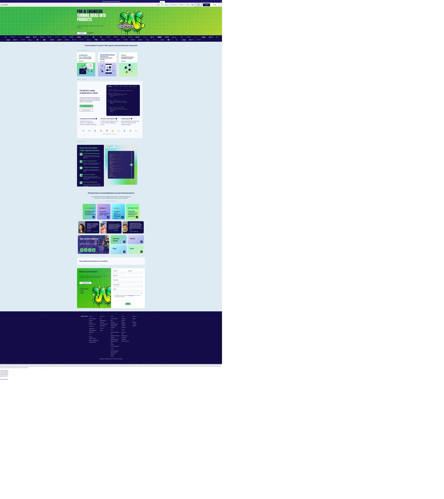
Weaviate's marketing site looks unlike any peer in the AI-database rail. The above-fold hero is a saturated emerald-green field with a regular grid pattern stamped over it, a 72px Anton condensed-grotesk headline ("FOR AI ENGINEERS turning ideas into products") set in deep indigo, and a graffiti-style "AI native DATABASE" sticker — complete with a hand-drawn airbrushed "W" wordmark, drip shadows, and the kind of marker-pen flourish you would expect on a skateboard graphic, not on a vector-database landing page. Where Pinecone sits on sterile black, Chroma keeps its hero minimal, and Qdrant runs corporate red on white, Weaviate paints the page green and tags it.
The DESIGN.md file packages the system into a machine-readable spec. Inside: 14 colors tokens covering the emerald voltage, two indigo ink tones, a small "candy" palette for the pastel feature tiles, plus a Night Owl syntax-highlighting set for the embedded code samples below the fold. Eleven typography tokens span Anton at 72px / 400 for the single hero display moment, Plus Jakarta Sans at 28-32px / 600-800 for section h2-h3, Inter at 16-18px / 400-500 for body and nav, and Menlo for code. Six radius steps centered on 20px give every card the same generous-soft shoulder. Fourteen component definitions cover the hero, the candy-tile feature cards, the dark navy code-sample panel, and the bottom-of-page "Ready to get started?" form block on a green panel.
Feed this file to Claude or Cursor and the agent will reproduce Weaviate's specific moves: emerald grid hero, indigo ink instead of pure black, Anton condensed for one display moment paired with a humanist Jakarta Sans for all other headings, 20px default radius across every card surface, and candy-tile feature blocks. The single move worth borrowing only if your brand has the courage for it is the graffiti hero — most B2B-infra brands need an interstitial layer of typographic restraint, but Weaviate's "AI native DATABASE" sticker reads as confident rather than gimmicky because the typography ladder below the fold returns immediately to a quiet humanist sans.
What makes it distinct
5
- Graffiti grotesk72px Anton condensed in deep indigo paints the hero, paired with a hand-drawn airbrushed 'W' wordmark and a tagged 'AI native DATABASE' graphic
- Emerald green canvasthe brand voltage covers the entire above-fold hero as a grid texture, then recedes to CTA fills and inline link color below the fold
- Three-typeface stackAnton for the hero display moment, Plus Jakarta Sans for every section heading, Inter for body, plus Menlo mono inside code samples
- Candy-tile feature gridpastel mint, lavender, lilac, and lime cards with 20px rounding sit on a white canvas below the fold, each holding a feature pictogram
- Indigo ink, not blackevery text surface uses deep indigo (declared as `--ink` and `--darkColor`), softer than pure black against the saturated emerald hero
weaviate.io
Live at weaviate.io
A snapshot of the brand in production. Scroll the frame to see the whole page.
Colors
14 colors
Weaviate's system runs on #00a142 as its primary voltage, used in 2 of 14 components. Type is set in Plus Jakarta Sans across 12 tokens from 14px to 72px, weights 400–700. Shape language is mixed across 14 components, blending pills, soft rounds, and squarer corners.
Brand & Accent
Sparing, CTA-only voltage · 3
Surface
Page and card backgrounds · 3
Text
Headlines, body, captions · 4
Other
Specialty colors · 4
Typography
12 type tokens
Set in Plus Jakarta Sans across 12 tokens, from 14px to 72px, weights 400–700. Shown in its own stack: where the font isn't installed, the fallback the file names stands in.
- display-xl72px · weight 400 · lh 72pxThe quick brown fox jumps over the lazy dog
- display-lg32px · weight 600 · lh 44.8pxThe quick brown fox jumps over the lazy dog
- display-md28px · weight 700 · lh 39.2pxThe quick brown fox jumps over the lazy dog
- heading-md22.4px · weight 600 · lh 29.12pxThe quick brown fox jumps over the lazy dog
- heading-sm20px · weight 600 · lh 26pxThe quick brown fox jumps over the lazy dog
- body-lg19.2px · weight 400 · lh 31.68pxThe quick brown fox jumps over the lazy dog
- body-md18px · weight 400 · lh 25.2pxThe quick brown fox jumps over the lazy dog
- body-sm14px · weight 400 · lh 19.6pxThe quick brown fox jumps over the lazy dog
- label-md16px · weight 500 · lh 25.12pxThe quick brown fox jumps over the lazy dog
- button-md14px · weight 600 · lh 23.1px · tracking 0.7pxThe quick brown fox jumps over the lazy dog
- nav-link16px · weight 400 · lh 26.4pxThe quick brown fox jumps over the lazy dog
- mono-sm14px · weight 400 · lh 21pxThe quick brown fox jumps over the lazy dog
Layout
Radii and spacing
7 corner radii and 9 spacing values. Shape language: mixed.
Radii
- none0px
- xs5px
- sm8px
- md10px
- lg16px
- xl20px
- full9999px
Spacing
- xs4px
- sm8px
- md10px
- base16px
- lg20px
- xl32px
- 2xl40px
- 3xl48px
- 4xl60px
Components
14 components
Each rendered from its tokens (color, type, radius, padding) on Weaviate's own canvas.
- Hero Sectionhero-sectionHero Section
- Hero Headinghero-headingHero Heading
- Section Headingsection-headingSection Heading
- Sub Headingsub-headingSub Heading
- Body Paragraphbody-paragraphBody Paragraph
- Body Paragraph Mutedbody-paragraph-mutedBody Paragraph Muted
- Button Primarybutton-primaryButton Primary
- Button Secondarybutton-secondaryButton Secondary
- Top Navtop-navTop Nav
- Nav Linknav-linkNav Link
- Candy Tilecandy-tileCandy Tile
- Card Pastelcard-pastelCard Pastel
- Code Panelcode-panelCode Panel
- Type here…text-inputText Input
In use
The system, in use
Weaviate's tokens on the kind of product it builds.
Build something people actually use.
A short paragraph of marketing copy that previews how the brand's display tier and body tier read together. Two sentences is usually enough.
FAQ
Weaviate design system FAQ
Common questions about Weaviate's tokens, components, and how to use this DESIGN.md in your project.
Read next
Related reading
Specs, directories, and component libraries that pair with this design system.
- Browse all design systemsThe full directory of DESIGN.md files on shadcn.io, with live mockups for each.shadcn.io
- Weaviate — official siteWeaviate's public marketing site — the source of truth for the live tokens captured in this file.weaviate.io (opens in a new tab)
- The DESIGN.md specificationGoogle Labs' open spec for machine-readable design system files — the format this page is built on.github.com (opens in a new tab)
Use it
Use Weaviate in your project
One machine-readable file. Drop it into Claude, Cursor, or any AI tool that reads DESIGN.md.
Download the DESIGN.md
One machine-readable file: every color, type, radius, spacing, and component token of Weaviate.
Feed it to your AI tool
Drop it into Claude, Cursor, or GitHub Copilot. The agent writes React components and Tailwind classes that match Weaviate's visual language.
Reference the tokens directly
Or paste the values into your Tailwind config, CSS variables, or component library: every color, size and radius is a quoted, ready-to-copy value.
Read the full DESIGN.md: overview, rationale, do’s and don’ts
Overview
Weaviate's marketing site looks unlike any peer in the AI-database rail. Graffiti grotesk. The above-fold hero is a saturated emerald field ({colors.primary} — #00a142) overlaid with a regular grid pattern, a 72px Anton condensed-grotesk headline ("FOR AI ENGINEERS turning ideas into products") set in deep indigo, and a graffiti-style "AI native DATABASE" sticker complete with a hand-drawn airbrushed "W" wordmark, drip shadows, and a marker-pen flourish. Where Pinecone keeps its hero on sterile black, Chroma runs a minimalist white canvas, and Qdrant leans on a corporate red-on-white system, Weaviate paints the page green and tags it.
The chromatic discipline below the fold reverses the move. The canvas switches from saturated emerald to plain white ({colors.canvas} — #ffffff), and the emerald recedes to a single CTA fill, inline link color, and the bottom-of-page form-block panel. In its place the page introduces a "candy" palette — mint ({colors.primary-soft} — #61d384), lavender ({colors.pill-lavender} — #7487ec), and lilac ({colors.pill-lilac} — #c8a8e7) — used as the background tints of the six-up feature-tile grid. The pastels appear only inside that grid; outside it the page returns to white and indigo. The result is a two-mode chromatic system: saturated voltage above the fold, pastel sticker book below, with no middle tier of muted brand greens.
Typography runs three families on purpose. Anton at 72px / 400 carries the hero h1 and the embedded sticker wordmark — a free condensed display grotesk that reads closer to a record-sleeve typeface than to a SaaS hero. Plus Jakarta Sans at 28-32px / 600-700 carries every section h2-h3 below the fold; its humanist counters soften the page after Anton's industrial display moment. Inter at 14-18px / 400-500 handles body and nav. The pairing — display grotesk + humanist sans + neutral sans — is closer to an editorial system than to a typical dev-infrastructure landing page.
Key Characteristics:
- Emerald green (
{colors.primary}— #00a142) fills the entire above-fold hero as a grid-textured canvas, then recedes to CTAs and inline link color below — 102 total occurrences, declared as--site-primaryand--ifm-link-color. - Indigo ink across all text —
{colors.ink-soft}(#1c1468) dominates at 530 occurrences,{colors.ink}(#130c49) handles display headings — neither is pure black. - Three-typeface stack — Anton for the single hero display moment, Plus Jakarta Sans for every section heading, Inter for body and nav, plus Menlo mono inside code samples.
- Candy-tile feature grid using pastel fills (
{colors.primary-soft}mint,{colors.pill-lavender}lavender,{colors.pill-lilac}lilac) on a white below-fold canvas — 20px rounding, internal pictogram per card. - Generous-soft radius scale centered on 20px (
{rounded.xl}) for cards, 10px ({rounded.md}) for buttons and pill chips, 50% ({rounded.full}) for circular icon containers — no 4px tight tier. - Indigo code-sample panel — the embedded API example sits inside a deep-indigo block (
{colors.ink}background) with white mono text, Night-Owl-style syntax highlighting using{colors.syntax-orange}and{colors.syntax-lime}. - Hairline-only cards on the white below-fold canvas —
{colors.surface-1}(#ebedf0) and{colors.surface-2}(#d6deeb) carry every non-pastel card border. - Graffiti wordmark — the "AI native DATABASE" sticker beside the hero headline is an illustration, not a typographic element, and exists nowhere else in the system.
Colors
Brand
- Emerald Primary (
{colors.primary}— #00a142): frequency 102. Used as text (51), border (51). The single brand voltage — fills the hero canvas as a grid pattern, the primary CTA button, the bottom-of-page form panel, and every inline link across body copy. Wired in CSS as--site-primary,--site-font-accent-color,--ifm-link-color,--ifm-link-hover-color, and--ifm-navbar-link-active-color. - Primary Soft (
{colors.primary-soft}— #61d384): frequency 16. Used as background (3), text (6), border (6). The pastel mint that fills the first column of the candy-tile feature grid and the bottom "Easy start, boundless scale" panel. Wired as--ifm-color-success-lightestand--pill2. - Accent Mint (
{colors.accent-mint}— #61bd73): frequency 22, all as text or border. Wired as--accent. A secondary mid-saturation green used on small chips and inline icons that need to read as Weaviate-coded without competing with the primary emerald.
Text
- Ink (
{colors.ink}— #130c49): frequency 104, 48 as text, 9 as background, 47 as border. The deepest indigo — used as the code-sample panel background and as display-heading text color. Wired as--ink,--darkColor, and--docs-header-color. - Ink Soft (
{colors.ink-soft}— #1c1468): frequency 530, 265 as text, 264 as border. The dominant indigo across the page — body running text, navigation hover state, dropdown link color. Wired as--ifm-font-color-base,--site-font-main-color, and--site-base-color. - Ink Muted (
{colors.ink-muted}— #2c3854): frequency 16. Used as the top-nav inactive label color and as sub-heading text. Wired as--ifm-heading-color,--ifm-navbar-link-color, and--site-font-header-color. - Muted (
{colors.muted}— #8396b1): frequency 20. Tertiary text — figure captions, "View all" links, footer category labels. Wired as--muted,--inkSub, and--ifm-color-emphasis-600.
Surface
- Canvas (
{colors.canvas}— #ffffff): the page floor below the fold. Frequency 143 across text / background / border roles — the dominant surface color outside the hero band. Wired as--ifm-background-surface-color,--paper, and--docs-body-bg. - Surface-1 (
{colors.surface-1}— #ebedf0): frequency 165. The footer background and dropdown/menu panels. Wired as--ifm-footer-background-color,--panel, and--ifm-color-gray-100. - Surface-2 (
{colors.surface-2}— #d6deeb): frequency 90. Hairline border on cards, input outlines, blockquote rules. Wired as--ifm-color-emphasis-300,--ifm-toc-border-color, and--ifm-table-border-color.
Candy Tiles
- Pill Lavender (
{colors.pill-lavender}— #7487ec): frequency 4. Used as background tint and gradient stop on the lavender column of the candy-tile feature grid. Wired as--pill1. - Pill Lilac (
{colors.pill-lilac}— #c8a8e7): frequency 3, all inside gradients. The lilac tile in the candy-tile feature grid.
Syntax (code panel)
- Syntax Orange (
{colors.syntax-orange}— #f78c6c) and Syntax Lime ({colors.syntax-lime}— #addb67): used inside the embedded API code sample. These are Night-Owl palette values borrowed for the syntax-highlighted snippet — not part of the brand chrome elsewhere.
Typography
Font Families
The system runs three sans families on the captured surface. Anton is a free condensed display grotesk from Google Fonts; Weaviate uses it for exactly one moment — the 72px hero h1 in all caps with a 0 letter-spacing — and the airbrushed graffiti wordmark beside it. Plus Jakarta Sans carries every section h2-h3 from 19.2px through 32px in weights 600-800; it is the humanist counterweight to Anton's industrial display. Inter at 14-19.2px / 400-700 handles all body, nav, button-secondary, and metadata. SFMono-Regular / Menlo carries the embedded code blocks.
The CSS layer wires the heading family as --site-font-heading-family set to "Plus Jakarta Sans", ui-monospace, SFMono-Regular, ... — Jakarta first, with a mono safety stack — and the body family as --site-font-base-family set to Inter. Anton is referenced directly on the hero h1 rather than through a custom property.
Hierarchy
| Token | Family | Size | Weight | Line Height | Use |
|---|---|---|---|---|---|
{typography.display-xl} | Anton | 72px | 400 | 72px | Hero h1 — the single display moment |
{typography.display-lg} | Plus Jakarta | 32px | 600 | 44.8px | Section h3 / h4 — feature-block titles |
{typography.display-md} | Plus Jakarta | 28px | 700 | 39.2px | Section h2 — "One foundation for search, RAG…" |
{typography.heading-md} | Plus Jakarta | 22.4px | 600 | 29.12px | Sub-heading inside cards |
{typography.heading-sm} | Plus Jakarta | 20px | 600 | 26px | h5 — candy-tile card titles |
{typography.body-lg} | Inter | 19.2px | 400 | 31.68px | Section lead paragraphs |
{typography.body-md} | Inter | 18px | 400 | 25.2px | Default body paragraph |
{typography.body-sm} | Inter | 14px | 400 | 19.6px | Caption rows, footnote text |
{typography.label-md} | Inter | 16px | 500 | 25.12px | Inline link labels, emphasized spans |
{typography.button-md} | Plus Jakarta | 14px | 600 | 23.1px | CTA labels — uppercase with 0.7px tracking |
{typography.nav-link} | Inter | 16px | 400 | 26.4px | Top-nav link labels |
{typography.mono-sm} | Menlo | 14px | 400 | 21px | Embedded code samples |
Principles
Anton appears once. The 72px hero h1 is the loudest typographic moment in the system, and the typeface does not repeat elsewhere — even the airbrushed wordmark beside it is a hand-drawn illustration rather than an Anton glyph. This restraint is the typographic move worth preserving: graffiti display works because the rest of the page returns immediately to a quiet humanist sans.
Plus Jakarta Sans does the entire heading job below the fold at weight 600-800 with no italic, no condensed variant, no light cut. Button labels use Plus Jakarta at 14px / 600 in uppercase with 0.7px tracking — the only place letter-spacing modifiers appear in the system.
Note on Font Substitutes
Anton ships free on Google Fonts. The closest open-source substitute if Anton is unavailable is Oswald at weight 500 — slightly less condensed, comparable cap height. Bebas Neue is condensed-grotesk-adjacent but reads more art-deco. For Plus Jakarta Sans, the closest free substitute is Manrope at the same weights; for Inter, the official Inter family is open-source. The pairing translates cleanly to other stacks as long as the three-typeface principle is maintained.
Layout
Spacing System
- Base unit: 8px, with 16px and 20px as the dominant module values (33 and 29 captured occurrences respectively).
- Tokens:
{spacing.xs}4px ·{spacing.sm}8px ·{spacing.md}10px ·{spacing.base}16px ·{spacing.lg}20px ·{spacing.xl}32px ·{spacing.2xl}40px ·{spacing.3xl}48px ·{spacing.4xl}60px. - Section padding (vertical): ~60-90px between major bands on the white canvas, ~120px on the hero.
- Card internal padding:
{spacing.lg}(20px) on the candy-tile feature cards,{spacing.xl}(32px) on the larger surface blocks,{spacing.3xl}(48px) on the code-sample panel. - Top-nav padding:
{spacing.md}(12px) vertical,{spacing.xl}(32px) horizontal.
Grid & Container
- Max content width: ~1080px on body text, ~1280px on the candy-tile feature grid and the customer-logo wall.
- Hero block: full-bleed emerald canvas with the headline + sticker pair anchored left at ~720px max-width, leaving room on the right for the graffiti "W" wordmark illustration.
- Candy-tile grid: 3-column at desktop, 2-column at tablet, 1-column at mobile. Each tile holds a header text block stacked above a pictogram block.
- Customer-logo wall: Multi-row scrolling marquee of monochrome logos (Intel, Deel, MNG, Factset, Siemens) — every logo flattens to ink color regardless of source brand.
- Code-sample panel: 2-column split on the "Production-ready AI applications, faster" block — text column on the left, dark code panel on the right.
Rhythm
The page alternates between saturated and neutral bands rather than holding one tempo. The hero is saturated (full emerald canvas, 120px vertical padding). The features grid is neutral (white canvas, pastel candy-tile inserts). The customer-logo wall is dense neutral. The code-sample block returns to saturated (deep-indigo panel). The bottom CTA is saturated again (emerald-green form panel). The rhythm reads as poster-style: bright band, quiet band, bright band.
Elevation
The system has essentially no shadow tier. There are 4 captured occurrences of pure black used as shadow ink — almost all of them confined to subtle 1px halos under cards. A single low-saturation aqua-shadow tone (6 shadow occurrences, a desaturated teal) gives the candy tiles a faint colored drop, but the effect is barely perceptible.
- Flat (no shadow): hero, candy tiles, customer-logo wall, footer — 99% of surfaces.
- Hairline lift:
{colors.surface-2}(#d6deeb) borders carry the elevation work that shadows would do on a typical dashboard product. - Aqua tint shadow: the candy-tile feature cards carry a barely-visible 0-4-12 colored shadow tinted toward the brand color, anchoring them to the white canvas without competing with the saturated emerald hero above.
Shapes
The radius scale is generous-soft, centered on 20px:
{rounded.none}0px — only on full-bleed sections (the hero, the customer-logo wall).{rounded.xs}5px — small chips and inline meta labels (7 captured occurrences).{rounded.sm}8px — input field corners, dropdown items (1 captured occurrence).{rounded.md}10px — primary and secondary buttons, pill chips (10 captured occurrences).{rounded.lg}16px — the larger surface blocks (3 captured occurrences).{rounded.xl}20px — the dominant value (17 captured occurrences); used on candy tiles, large cards, and the bottom CTA panel.{rounded.full}9999px / 50% — circular icon containers and avatars (4 captured occurrences).
There is no 4px tier. The 20px-as-default move is unusual for a B2B-infrastructure system; most dev-infra brands sit at 8-12px. The 20px softness is what lets the candy-tile aesthetic sit beside the saturated emerald hero without friction — every shape feels approachable rather than industrial.
Components
hero-section — Full-bleed emerald {colors.primary} canvas with a grid-pattern texture stamped over it, 60×32 padding, no radius. Holds the 72px Anton hero h1 in {colors.ink} indigo, a sub-paragraph at {typography.body-lg}, the primary CTA pill, and the graffiti "W" wordmark illustration on the right.
hero-heading — Indigo {colors.ink} text on the emerald canvas, Anton 72px / 400 in all caps. The single display moment in the system.
section-heading — Indigo {colors.ink} text on the white canvas, Plus Jakarta Sans 28px / 700 — used for "One foundation for search, RAG, agents…" and similar section h2s.
sub-heading — Plus Jakarta Sans 22.4px / 600 in {colors.ink-muted} — used for h3-h4 inside feature blocks.
body-paragraph — Inter 18px / 400 in {colors.ink-soft} indigo — the workhorse paragraph style.
body-paragraph-muted — Inter 14px / 400 in {colors.muted} — caption rows and footnote text.
button-primary — Emerald {colors.primary} fill, white {colors.canvas} text, Plus Jakarta Sans uppercase 14px / 600 with 0.7px tracking, {rounded.md} 10px radius, 8×16 padding, 40px height. "Try Weaviate Cloud" is the canonical instance.
button-secondary — White {colors.canvas} fill, indigo {colors.ink-soft} text, 1px {colors.surface-2} border, same Plus Jakarta uppercase tracked label, {rounded.md} 10px radius. Used for "Get Started" and the secondary "Become Guidance" CTA inside the code-sample block.
top-nav — White {colors.canvas} surface, ink-muted {colors.ink-muted} text, 60px height, 1px {colors.surface-1} bottom hairline. Houses the airbrushed wordmark left, Products / Solutions / Pricing / Resources / Developers / Company links center, Login / Try Free / Contact right.
nav-link — Transparent background, {colors.ink-muted} text in {typography.nav-link} (16px / 400 Inter), 8×12 padding. The active state switches to the brand emerald.
candy-tile — Mint {colors.primary-soft} fill, indigo {colors.ink} text, {rounded.xl} 20px radius, 20px internal padding. The signature feature-tile treatment — each tile holds a 4-word feature title at {typography.heading-sm} over a Plus Jakarta sub-label, with a pictogram in the lower half.
card-pastel — Lilac {colors.pill-lilac} fill on the same {rounded.xl} 20px tile geometry — used for the third feature column ("Knowledge-base agents & agentic workflows"). The candy-tile component repeats with a different pastel for each column.
code-panel — Deep-indigo {colors.ink} fill, white text, {rounded.lg} 16px radius, 32×48 padding. Holds the embedded API sample using {typography.mono-sm} Menlo with {colors.syntax-orange} and {colors.syntax-lime} for syntax highlighting.
text-input — White {colors.canvas} fill, indigo {colors.ink-soft} text, 1px {colors.surface-2} border, {rounded.md} 10px radius, 8×16 padding, 40px height. Used in the bottom "Stay updated" and "Ready to get started?" newsletter / lead-capture forms.
Do's and Don'ts
Do treat the hero emerald {colors.primary} (#00a142) as a full-canvas voltage, not a held-in-reserve accent. The brand statement is the saturated grid-textured hero; reducing the green to a small CTA fill would destroy the page's most distinctive move.
Do use indigo ({colors.ink} #130c49 or {colors.ink-soft} #1c1468) for every text surface. Pure black against the saturated emerald hero reads as too harsh; the indigo softens the contrast without sacrificing readability.
Do scope Anton to the single hero h1. Letting the condensed display family creep into section h2s or body labels destroys the typographic restraint that makes the graffiti hero feel deliberate rather than gimmicky.
Do use the candy palette ({colors.primary-soft}, {colors.pill-lavender}, {colors.pill-lilac}) only inside the feature-tile grid. Outside that block the pastels read as random secondary accents and weaken the binary "saturated above the fold, neutral below" rhythm.
Don't swap the 20px default radius for a tighter 8px tier. The generous-soft 20px ({rounded.xl}) is what binds the candy-tile aesthetic to the rest of the chrome; tightening the corners would push the page toward a dev-infra system look (Vercel, Linear) that contradicts the sticker-book feature grid.
Don't raise display weight above 700. Plus Jakarta Sans at 700 is the heaviest typographic moment below the fold; bumping to 900 turns the editorial section heads into shouts and undercuts the warm humanist feel.
Don't introduce a fourth typeface. The three-family stack (Anton + Plus Jakarta + Inter) is already unusual for a SaaS landing page; adding a serif or a second display would tip the system into poster-design territory and away from product readability.
Don't mix the brand emerald with the mint {colors.accent-mint} (#61bd73) inside the same composition. The two greens occupy adjacent slots in the OKLCH space and read as a near-miss rather than a deliberate harmony — {colors.primary-soft} (#61d384) is the pastel pair that works.
Known Gaps
- Hover and focus states: the captured marketing surface does not expose explicit hover / press / disabled states on
{component.button-primary}or{component.button-secondary}. CSS variables exist for--ifm-color-primary-darkand other dev-tools-derived hover tones, but those are Docusaurus defaults rather than rendered marketing values. - Form input validation:
{component.text-input}carries the resting state from the newsletter and lead-capture forms; error / success styling is not exposed on the captured marketing surface. - Dark mode: the captured page is light-only. A dark mode exists in the Docusaurus-powered docs section (
weaviate.io/docs) but is not represented in the marketing tokens here. - Motion: the graffiti hero animates on scroll-into-view, and the candy tiles carry a subtle hover lift, but the spec captures end-state values only. Easing curves and durations live in the live site CSS animations.
- Product surfaces: this DESIGN.md captures the marketing site only. The Weaviate Cloud Console, the docs site (
weaviate.io/docs), and the Weaviate Cluster Manager carry their own surface tokens and component sets that are not represented here. - Customer-logo wall styling: the captured page shows ~30 customer logos in a scrolling marquee, all rendered in monochrome indigo. The marquee speed, gap rhythm, and pause-on-hover behavior are not captured here.
- Graffiti illustration system: the airbrushed "W" wordmark beside the hero headline is part of a broader hand-illustrated asset library (also visible on the customer-tile mascots and the "Ready to get started?" panel). The illustration style is not parameterizable from this token spec.
AI & LLM Platforms
More systems like this
More DESIGN.md files in AI & LLM Platforms.
Pricing
Build it with Pro
The DESIGN.md files are free. Pro adds 6,000+ blocks, premium templates and the MCP server, so your AI editor builds in your system for you.
4.9/5 out of 5 · 150+ reviewsfrom 150+ founders and developers.
Billing
Billed once a year in USD. Cancel anytime.
- How many people can use the license.
- Client work, SaaS products and anything you charge for.
- Production-ready React sections: hero, pricing, features, dashboards and more.
- Complete multi-page sites you can ship as they are.
- React icons from every major library, installable with one command.
- Presets that restyle every block, in light and dark.
- Lets your AI editor search, preview and install blocks for you.
- Priority requests are answered first.
Individual
For personal projects & open source
$32instead of $49/mo
$389 billed yearly
- Seats: 1 seat
- Commercial use: Personal & open source only
- Pro blocks: 6,000+ blocks
- Templates: All 14 templates
- React icons: 294k+ icons
- Themes: All 59 themes
- MCP server: Basic usage
- Support: Standard
Team
Most popularFor freelancers, agencies & startups
$66instead of $99/mo
$789 billed yearly · ≈ $13/dev/mo
- Seats: Up to 5 seats
- Commercial use: Included
- Pro blocks: 6,000+ blocks
- Templates: All 14 templates
- React icons: 294k+ icons
- Themes: All 59 themes
- MCP server: High usage
- Support: Priority
Organization
For companies with larger teams
$132instead of $199/mo
$1,589 billed yearly
- Seats: Unlimited seats
- Commercial use: Included
- Pro blocks: 6,000+ blocks
- Templates: All 14 templates
- React icons: 294k+ icons
- Themes: All 59 themes
- MCP server: Unlimited usage
- Support: Priority
Billed once a year in USD. Cancel anytime.
Individual
For personal projects & open source
$32instead of $49/mo
$389 billed yearly
- How many people can use the license.Seats: 1 seat
- Client work, SaaS products and anything you charge for.Commercial use: Personal & open source only
- Production-ready React sections: hero, pricing, features, dashboards and more.Pro blocks: 6,000+ blocks
- Complete multi-page sites you can ship as they are.Templates: All 14 templates
- React icons from every major library, installable with one command.React icons: 294k+ icons
- Presets that restyle every block, in light and dark.Themes: All 59 themes
- Lets your AI editor search, preview and install blocks for you.MCP server: Basic usage
- Priority requests are answered first.Support: Standard
Team
Most popularFor freelancers, agencies & startups
$66instead of $99/mo
$789 billed yearly · ≈ $13/dev/mo
Everything in Individual, plus
- How many people can use the license.Seats: Up to 5 seats
- Client work, SaaS products and anything you charge for.Commercial use: Included
- Lets your AI editor search, preview and install blocks for you.MCP server: High usage
- Priority requests are answered first.Support: Priority
Organization
For companies with larger teams
$132instead of $199/mo
$1,589 billed yearly
Everything in Team, plus
- How many people can use the license.Seats: Unlimited seats
- Lets your AI editor search, preview and install blocks for you.MCP server: Unlimited usage
- Secure checkout via Stripe
- Code lives in your repo
- Keep what you've shipped if you cancel
- License terms
Your system, built for you
Every block, template and icon, installed by your AI agent in your design system. The DESIGN.md files stay free.