Walmart Design System
Walmart's marketing system as a DESIGN.md file. Walmart Blue carrying every primary action, Spark Yellow as the alt CTA, EverydaySans across 12 size steps, brand-bold navy top nav. For React, Next.js, and AI tools.
Add shadcn.io to your AI agent. · Pro It installs blocks, icons and templates in your design system from a prompt, with Pro.
Set up MCP- Primary
- #0053e2
- Typeface
- EverydaySans
- Shape
- Soft
- Base radius
- 8px
- Colors
- 16
- Type tokens
- 12
- Components
- 20
- Spacing values
- 8
About
About Walmart DESIGN.md
Curated by Dov Azencot · Updated May 19, 2026 · Source walmart.com (opens in a new tab)
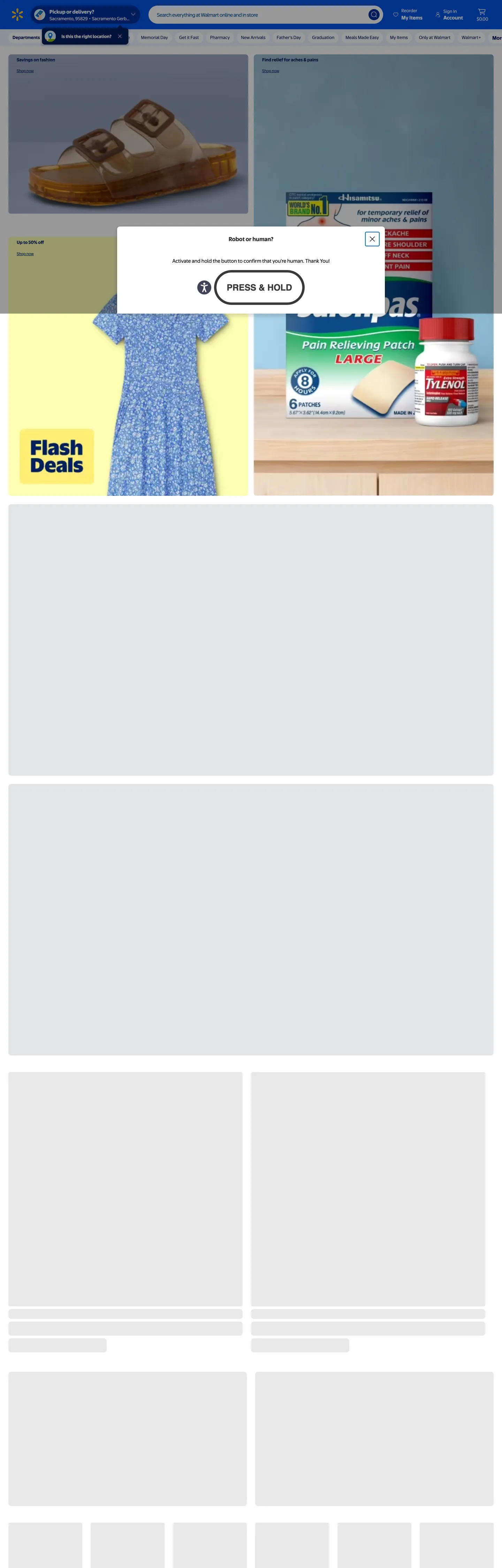
Walmart's homepage opens with a persistent navy top-nav band (Walmart brand-bold #001e60) carrying white "Pickup or delivery?", a full-width search bar, and the right-aligned utility cluster (Reorder, Sign In, Cart) — and below that a secondary navy strip with white category links (Departments, Memorial Day, Get it Fast, Pharmacy, New Arrivals, Father's Day, Graduation, Meals Made Easy, My Items, Only at Walmart, Walmart+). The above-fold canvas alternates between hero offer tiles ("Savings on fashion", "Find relief for aches & pains") at 8px corners on cream-and-color backdrops, with the yellow "Flash Deals" badge as the only spark moment in the captured frame. Where Target paints the hero in a single saturated red and Nordstrom commits to one editorial photograph, Walmart anchors on a navy chrome band and lets the tile grid below it carry seasonal merchandise photography on tinted product-color backgrounds.
The DESIGN.md file packages the system into a machine-readable spec for React and AI coding tools. Inside: 16 colors tokens drawn from the Walmart Living Design System (LDS) tokens exposed under the `--ld-*` and `--wcp-*` CSS custom-property prefixes — Walmart Blue brand voltage, the Spark Yellow alt-CTA tier, brand-bold navy for chrome bands, charcoal ink for body chrome, and a small set of semantic colors for confidence (info-blue), urgency, and savings signals. 12 typography tokens run EverydaySans — Walmart's proprietary face shipped with Helvetica Neue / Helvetica / Arial fallbacks. 20 components cover the navy top-nav band, the secondary nav strip, the Walmart-Blue primary CTA, the Spark Yellow alt CTA, the search-input pill, the 8px offer tile, the category-scroller pill tab, and the bottom-nav fill (mobile shelf).
Feed this file to Claude or Cursor and it will reproduce Walmart's specific moves: navy brand-bold top-nav band with white category links, two-tier action voltage (blue primary, yellow alt), EverydaySans across the chrome, and the binary radius split between 8px tile rounding and 9999px pill on every tappable input. The tokens resolve cleanly without invention. Treat it as a reference: the move worth borrowing only if you have the brand permission Walmart has is the two-tier CTA — letting a saturated blue carry the primary action while a yellow spark carries the savings-emphasis CTA, with intentional text-on-yellow rendered in brand-bold navy rather than white.
What makes it distinct
5
- Walmart Blue as primary action#0053e2 wired into --ld-semantic-color-fill-brand and --ld-semantic-color-action-fill-primary, the load-bearing CTA fill across the Living Design System
- Spark Yellow as alt-CTA#ffc220 wired into --wcp-semantic-color-action-fill-primary-alt with text intentionally rendered in brand-bold navy #001e60 rather than white
- Brand-bold navy top nav#001e60 fills the persistent top-nav band with white text, while #002e99 carries the bottom-nav band for mobile app surfaces
- EverydaySans across the systemWalmart ships a proprietary Helvetica Neue metric clone with no secondary display, serif, or monospace voice
- Two-tier radius system8px on offer cards and tile grids; 9999px fully-rounded pill on the search input, category tabs, and bottom-nav buttons
walmart.com
Live at walmart.com
A snapshot of the brand in production. Scroll the frame to see the whole page.
Colors
16 colors
Walmart's system runs on #0053e2 as its primary voltage, used in 5 of 20 components. Type is set in EverydaySans across 12 tokens from 12px to 24px, weights 400–700. Shape language is soft — components average 20px corner radius, with no sharp interactive edges.
Brand & Accent
Sparing, CTA-only voltage · 6
Surface
Page and card backgrounds · 3
Text
Headlines, body, captions · 4
Other
Specialty colors · 3
Typography
12 type tokens
Set in EverydaySans across 12 tokens, from 12px to 24px, weights 400–700. Shown in its own stack: where the font isn't installed, the fallback the file names stands in.
- display-md24px · weight 700 · lh 28pxThe quick brown fox jumps over the lazy dog
- heading-lg20px · weight 700 · lh 24pxThe quick brown fox jumps over the lazy dog
- heading-md18px · weight 700 · lh 24pxThe quick brown fox jumps over the lazy dog
- body-lg16px · weight 400 · lh 24pxThe quick brown fox jumps over the lazy dog
- body-bold16px · weight 700 · lh 24pxThe quick brown fox jumps over the lazy dog
- body-md14px · weight 400 · lh 20pxThe quick brown fox jumps over the lazy dog
- label-md14px · weight 700 · lh 17.5pxThe quick brown fox jumps over the lazy dog
- label-sm14px · weight 700 · lh 15.4pxThe quick brown fox jumps over the lazy dog
- caption12px · weight 400 · lh 16pxThe quick brown fox jumps over the lazy dog
- nav-link14px · weight 400 · lh 20pxThe quick brown fox jumps over the lazy dog
- nav-utility14px · weight 700 · lh 17.5pxThe quick brown fox jumps over the lazy dog
- button-md16px · weight 700 · lh 24pxThe quick brown fox jumps over the lazy dog
Layout
Radii and spacing
6 corner radii and 8 spacing values. Shape language: soft.
Radii
- none0px
- sm4px
- md8px
- lg32px
- pill100px
- full9999px
Spacing
- xs4px
- sm8px
- md12px
- base16px
- lg24px
- xl32px
- 2xl48px
- 3xl64px
Components
20 components
Each rendered from its tokens (color, type, radius, padding) on Walmart's own canvas.
- Top Navtop-navTop Nav
- Category Navcategory-navCategory Nav
- Nav Linknav-linkNav Link
- Search Inputsearch-inputSearch Input
- Search Submitsearch-submitSearch Submit
- Location Pilllocation-pillLocation Pill
- Hero Headinghero-headingHero Heading
- Section Headingsection-headingSection Heading
- Body Paragraphbody-paragraphBody Paragraph
- Body Paragraph Mutedbody-paragraph-mutedBody Paragraph Muted
- Button Primarybutton-primaryButton Primary
- Button Primary Hoverbutton-primary-hoverButton Primary Hover
- Button Sparkbutton-sparkButton Spark
- Button Spark Hoverbutton-spark-hoverButton Spark Hover
- Button Secondarybutton-secondaryButton Secondary
- Card Offercard-offerCard Offer
- Card Sparkcard-sparkCard Spark
- Badge Flash Dealsbadge-flash-dealsBadge Flash Deals
- Link Shop Nowlink-shop-nowLink Shop Now
- FooterfooterFooter
In use
The system, in use
Walmart's tokens on the kind of product it builds.
Build something people actually use.
A short paragraph of marketing copy that previews how the brand's display tier and body tier read together. Two sentences is usually enough.
FAQ
Walmart design system FAQ
Common questions about Walmart's tokens, components, and how to use this DESIGN.md in your project.
Read next
Related reading
Specs, directories, and component libraries that pair with this design system.
- Browse all design systemsThe full directory of DESIGN.md files on shadcn.io, with live mockups for each.shadcn.io
- Walmart — official siteWalmart's public marketing site — the source of truth for the live tokens captured in this file.walmart.com (opens in a new tab)
- The DESIGN.md specificationGoogle Labs' open spec for machine-readable design system files — the format this page is built on.github.com (opens in a new tab)
Use it
Use Walmart in your project
One machine-readable file. Drop it into Claude, Cursor, or any AI tool that reads DESIGN.md.
Download the DESIGN.md
One machine-readable file: every color, type, radius, spacing, and component token of Walmart.
Feed it to your AI tool
Drop it into Claude, Cursor, or GitHub Copilot. The agent writes React components and Tailwind classes that match Walmart's visual language.
Reference the tokens directly
Or paste the values into your Tailwind config, CSS variables, or component library: every color, size and radius is a quoted, ready-to-copy value.
Read the full DESIGN.md: overview, rationale, do’s and don’ts
Overview
Walmart's marketing chrome does what no other US mass-market retailer does at the same saturation. Double-navy nav band. The persistent top of every page carries two stacked dark-blue strips: the brand-bold navy ({colors.brand-bold} — #001e60) wired as --ld-semantic-color-fill-brand-bold runs the utility band with white "Pickup or delivery?" + the full-width search input + the right-aligned Reorder/Sign In/Cart cluster, and a second strip just beneath it at the pressed-state navy ({colors.primary-pressed} — #002e99, wired as --wcp-semantic-color-bottom-nav-fill-brand) carries the white category links (Departments, Memorial Day, Pharmacy, New Arrivals, Father's Day, Graduation, Meals Made Easy, Walmart+). Where Target uses a thin red utility strip atop a white nav, and Nordstrom uses a single white nav with charcoal text, Walmart commits to a 100px-tall navy header that stays present at every scroll position — a visual shelf-edge that anchors the page in brand voltage from the top.
The CTA system runs on two-tier action voltage. Walmart Blue ({colors.primary} — #0053e2) is the load-bearing primary action — wired as --ld-semantic-color-fill-brand, --ld-semantic-color-action-fill-primary, --ld-semantic-color-border-brand. Spark Yellow ({colors.spark} — #ffc220) is the secondary alt-CTA — wired as --wcp-semantic-color-action-fill-primary-alt and --ld-semantic-color-fill-accent-spark. The yellow is the brand's "savings" signal — it appears on Flash Deals badges, Walmart+ membership callouts, and rollback price tags. Critically, the text on the Spark Yellow CTA is rendered in brand-bold navy ({colors.brand-bold}, via --wcp-semantic-color-action-text-on-fill-primary-alt), not in white — the yellow-and-white contrast is too low to meet AA, so the LDS pairs every yellow surface with a deep-navy text token by default. This pairing is the system's signature accessibility-design move.
Typography is EverydaySans monoculture — a proprietary face shipped with the fallback chain EverydaySans, "Helvetica Neue", Helvetica, Arial, sans-serif. EverydaySans is Walmart's commissioned metric clone of Helvetica Neue, designed for brand ownership across digital and in-store signage. Weight 400 carries body and longer copy; weight 700 carries every nav link, button, heading, and savings flag. There is no second display family, no serif, no monospace voice.
Key Characteristics:
- Walmart Blue (
{colors.primary}— #0053e2) is the primary action voltage — wired across--ld-semantic-color-fill-brand,--ld-semantic-color-action-fill-primary,--ld-semantic-color-border-brand,--ld-semantic-color-text-brand. The single load-bearing CTA fill. - Spark Yellow (
{colors.spark}— #ffc220) is the alt-CTA / savings voltage — wired as--wcp-semantic-color-action-fill-primary-alt. Text on yellow renders in brand-bold navy, never white. - Brand-bold navy (
{colors.brand-bold}— #001e60) carries the top-nav band fill, the brand-text-bold token, and the footer surface. Frequency 53 captured. - Pressed-state navy (
{colors.primary-pressed}— #002e99,--wcp-semantic-color-bottom-nav-fill-brand) carries the secondary category-nav strip beneath the utility band. - EverydaySans across 12 size steps with binary weights (400 body / 700 everything else). No middle weight, no second family.
- Two-tier radius scale:
{rounded.md}8px on offer cards and tile grids (frequency 32);{rounded.full}9999px and{rounded.pill}100px on the search input, location confirm pill, and category scrollers (frequency 13 / 3). - Charcoal ink (
{colors.ink}— #2e2f32) for body chrome and headings — wired as--ld-semantic-color-input-border-activated-hoveredand--ld-semantic-color-action-text-on-fill-secondary-hovered. Never pure black for body text. - Brand-subtle surface (
{colors.brand-subtle}— #e9f1fe,--ld-semantic-color-fill-brand-subtle) for the focused/hovered states on filter chips and the confidence-message backgrounds.
Colors
Brand
- Walmart Blue (
{colors.primary}— #0053e2): the load-bearing primary action voltage. Wired across--ld-semantic-color-action-fill-primary,--ld-semantic-color-fill-brand,--ld-semantic-color-border-brand,--ld-semantic-color-text-brand, and--color-core-blue-100. Every primary CTA fill, the "Shop now" inline links, the search-submit button, the focused-input border, and the filter-chip border-activated state. - Primary Hover (
{colors.primary-hover}— #114ab6): the hover/focus state on primary CTAs. Wired as--ld-semantic-color-action-fill-primary-hoveredand--ld-semantic-color-action-fill-primary-focused. A step deeper into navy. - Primary Pressed (
{colors.primary-pressed}— #002e99): frequency 2 — the pressed-state navy. Wired as--ld-semantic-color-action-fill-primary-pressedand--wcp-semantic-color-bottom-nav-fill-brand. Carries the secondary category-nav band fill below the brand-bold utility band. - Brand Bold (
{colors.brand-bold}— #001e60): frequency 53 — used as text (27), border (25), background (1). The chrome companion to Walmart Blue, wired as--ld-semantic-color-fill-brand-bold,--ld-semantic-color-text-brand-bold,--ld-semantic-color-border-brand-bold, and--color-core-blue-160. Carries the top-nav band fill, the text-on-yellow-CTA token, and the footer surface. - Brand Max (
{colors.brand-max}— #002d58): the deepest navy tier. Wired as--color-primary-max. Used only on the most contrast-intense brand-coded text surfaces.
Spark
- Spark Yellow (
{colors.spark}— #ffc220): the alt-CTA / savings voltage. Wired as--wcp-semantic-color-action-fill-primary-alt,--ld-semantic-color-fill-accent-spark,--ld-semantic-color-fill-warning,--wcp-semantic-color-rating-fill-activated, and--color-core-spark-100. The yellow that appears on Flash Deals badges, Walmart+ callouts, rollback flags, and review-star fills. Always paired with brand-bold-navy text, never white. - Spark Hover (
{colors.spark-hover}— #ffc836): the hover-state lighter spark. Wired as--wcp-semantic-color-action-fill-primary-alt-hoveredand--color-core-spark-90. One step lighter. - Spark Pressed (
{colors.spark-pressed}— #e6a31d): the pressed-state deeper spark. Wired as--wcp-semantic-color-action-fill-primary-alt-pressedand--color-core-spark-110. A step deeper into amber.
Ink
- Ink (
{colors.ink}— #2e2f32): frequency 2 — text (1), border (1). The charcoal chrome text color, wired as--ld-semantic-color-input-border-activated-hovered,--ld-semantic-color-action-border-secondary, and--ld-semantic-color-action-text-on-fill-secondary-hovered. Body text and section headings on the white floor. - Ink Deep (
{colors.ink-deep}— #000000): frequency 328 — text (159), border (163). Reserved for--ld-semantic-color-action-border-transparent-focused,--ld-semantic-color-action-fill-transparent-focused, and the--color-core-transparenttoken base. The high captured frequency reflects the LDS's heavy use of transparent-state borders that resolve to #000000 on the page. - Text Subdued (
{colors.text-subdued}— #767676): secondary metadata, "Shop now" sub-labels, footer copy. Wired as--ld-semantic-color-text-accent-gray,--ld-semantic-color-fill-accent-gray, and--ld-semantic-color-bottom-nav-text-on-fill-hovered.
Surface
- Canvas (
{colors.canvas}— #ffffff): frequency 138 — text (51), background (40), border (47). The body floor below the navy nav. Pure white — Walmart does not soften it. - Surface Subtle (
{colors.surface-subtle}— #e3e4e5): frequency 2 — the disabled-input background and the bottom-nav separator. Wired as--ld-semantic-color-loading-subtle,--ld-semantic-color-action-fill-tertiary-pressed, and--ld-semantic-color-bottom-nav-separator. - Surface Brand Subtle (
{colors.surface-brand-subtle}— #e6f1fc): frequency 7 — text (1), background (4), border (2). The brand-tinted background for filter chips in active/focus states. Wired as--wcp-semantic-color-fill-confidence-subtle,--ld-semantic-color-page-nav-fill-activated, and--ld-semantic-color-page-nav-fill-focused. - Brand Subtle (
{colors.brand-subtle}— #e9f1fe): the soft brand-tinted background wired as--ld-semantic-color-fill-brand-subtleand--ld-semantic-color-surface-brand. Carries the confidence-message backgrounds and the brand-subtle button-fill resting state.
Semantic
- Link Legacy (
{colors.link-legacy}— #0000ee): frequency 10 — text (5), border (5). The browser-default link color, surfaced on a handful of legacy inline links that have not yet been migrated to the LDS brand-text token. Not a brand token — a fallback artefact.
Typography
Font Family
The system runs EverydaySans for every typographic surface — Walmart's proprietary face shipped via WOFF with the fallback chain EverydaySans, "Helvetica Neue", Helvetica, Arial, sans-serif. EverydaySans is a metric clone of Helvetica Neue commissioned for brand consistency between digital surfaces and in-store signage. The fallback chain is a safety net for the custom font's failed-load case. There is no secondary serif, no display family, no monospace voice.
Hierarchy
| Token | Size | Weight | Line Height | Use |
|---|---|---|---|---|
{typography.display-md} | 24px | 700 | 28px | Page-level display moments (section headers on landing tiles) |
{typography.heading-lg} | 20px | 700 | 24px | Category-shelf headings ("Summer essentials", "Top picks for you") |
{typography.heading-md} | 18px | 700 | 24px | Tile titles, modal headings |
{typography.body-lg} | 16px | 400 | 24px | Default running text in tiles and tile copy |
{typography.body-bold} | 16px | 700 | 24px | "Shop now" inline links, button labels in 16px tier |
{typography.body-md} | 14px | 400 | 20px | Secondary tile metadata, descriptive copy |
{typography.label-md} | 14px | 700 | 17.5px | Savings flags, Flash Deals labels |
{typography.label-sm} | 14px | 700 | 15.4px | Compact tile labels, badge captions |
{typography.caption} | 12px | 400 | 16px | Fine print, footnotes, legal disclosures |
{typography.nav-link} | 14px | 400 | 20px | Category-nav links in the white-on-navy second band |
{typography.nav-utility} | 14px | 700 | 17.5px | Top-nav utility labels (Reorder, Sign In, Cart) |
{typography.button-md} | 16px | 700 | 24px | Primary and Spark CTA button labels |
Principles
Weight contrast is binary: 400 for prose, 700 for everything tappable or scannable. There is no 500/600 middle tier. The captured frame does not expose a 38px-plus hero display moment the way Target's does — Walmart's homepage is tile-heavy rather than display-led, and the typographic "loudest moment" sits at 24px display in the rare landing-band heading. Letter-spacing is uniformly normal; there is no tight tracking on display.
Note on Font Substitutes
EverydaySans is proprietary. The closest open-source substitute is Inter at the same weights — the x-height and counter widths transfer cleanly. For a closer metric match to the Helvetica Neue fallback that the stack will reach if the custom font fails, Roboto at weight 700 is the safer substitute. Arial at weight 700 reproduces the final fallback exactly — useful for testing the Walmart system's graceful-degradation behavior.
Layout
Spacing System
- Base unit: 4px. The dominant offer-tile padding is 6×12px (frequency 13 in the captured frame).
- Tokens:
{spacing.xs}4px ·{spacing.sm}8px ·{spacing.md}12px ·{spacing.base}16px ·{spacing.lg}24px ·{spacing.xl}32px ·{spacing.2xl}48px ·{spacing.3xl}64px. - Top-nav padding: 12×24px vertical/horizontal; the navy band sits at ~56px height with the search input centered.
- Category-nav padding: 8×24px; the secondary navy band sits at ~44px height.
- Card internal padding:
{spacing.base}(16px) on offer tiles,{spacing.md}(12px) on smaller savings badges.
Grid & Container
- Max content width: ~1280px on the offer-tile grids below the navy nav band; the nav bands themselves run full-bleed edge-to-edge.
- Nav bands: stacked full-bleed — the brand-bold navy utility band on top, the pressed-state navy category strip beneath. Together ~100px tall.
- Hero offer-tile grid: 2-column at desktop ("Savings on fashion", "Find relief for aches & pains") with full-bleed product photography on tinted-color backgrounds.
- Below-fold rows: 4-up and 6-up tile grids with savings labels, product thumbnails, and price strings stacked vertically.
Rhythm
The page's rhythm is navy header + tile shelves. The persistent navy nav band sets the tempo, and the body below is a stack of horizontal product shelves — each anchored on a heading and a horizontal scroll of product tiles, separated by 24-32px vertical gaps. The cadence is less editorial than Nordstrom's photograph-inventory-photograph and tighter than Target's offer-band-campaign-tile alternation — Walmart prioritizes inventory density over visual breathing.
Elevation
The system has essentially no shadow tier on the captured marketing chrome.
- Flat (no shadow): body, nav, offer tiles, savings cards — 99% of surfaces.
- Hairline outlines:
{colors.surface-subtle}(#e3e4e5) on disabled controls and the bottom-nav separator. - Tonal lift: the navy nav bands sit at
{colors.brand-bold}and{colors.primary-pressed}against the white body floor — the deep-saturation gap reads as elevation without a drawn shadow. - Focus indicators: the focused-input border thickens to
{colors.primary}(#0053e2) at 2px — wired as--ld-semantic-color-field-border-magicand--ld-semantic-color-filter-border-activated-hovered. The system uses border-color shift rather than a soft glow.
Shapes
The radius scale is mixed, with two distinct surface tiers:
{rounded.none}0px — the full-bleed nav bands, hero offer-tile backgrounds (square tiles).{rounded.sm}4px (frequency 12) — small chips, secondary badges, savings flags.{rounded.md}8px (frequency 32) — the dominant content-surface radius. Offer cards, product cards, savings badges, modal corners.{rounded.lg}32px (frequency 4) — the primary CTA buttons and nav-link rounded-pill states (a 32px radius on a 44-52px-tall surface reads as fully rounded).{rounded.pill}100px (frequency 3) — the category-scroller chip pills.{rounded.full}9999px (frequency 13) — the search-input field and the location-confirm pill ("Is this the right location?"). The fully-rounded pill is reserved for input surfaces.
The split is intentional: the search input is the warmest, most-tappable surface in the system and gets the full pill; content cards get the workhorse 8px rounding; primary CTAs sit at 32px (close to pill at button height).
Components
top-nav — Brand-bold navy {colors.brand-bold} (#001e60) fill, white text, 56px height, 12×24px padding. Houses the spark-yellow Walmart sun-logo flush left, the "Pickup or delivery?" address pill, the full-width search input, and the right-aligned Reorder / Sign In / Cart utility cluster.
category-nav — Pressed-state navy {colors.primary-pressed} (#002e99) fill, white text, 44px height. The secondary persistent strip beneath the top-nav band, carrying the category links (Departments, Memorial Day, Pharmacy, New Arrivals, Father's Day, Graduation, Meals Made Easy, My Items, Only at Walmart, Walmart+, More). Wired as --wcp-semantic-color-bottom-nav-fill-brand.
nav-link — Transparent fill on the navy strips, white text in {typography.nav-link} (14px / 400), 4×16×4×12px padding, 52px height. The hover state applies a 32px rounded pill background at white-low-alpha.
search-input — White {colors.canvas} fill, ink text, {rounded.full} 9999px corners, 0×24px padding, 48px height. The system's most-tappable surface — fully-rounded pill, dominating the top-nav band.
search-submit — Walmart Blue {colors.primary} fill, white search-glass icon, {rounded.full} 9999px corners, 40px height. The blue circle anchored to the right edge of the search input — the primary brand-voltage moment in the persistent nav.
location-pill — White {colors.canvas} fill, ink text, 1px {colors.primary} border, {rounded.full} 9999px corners, 6×12px padding, 40px height. The "Is this the right location?" confirm pill that floats over the Departments menu.
hero-heading — Ink {colors.ink} text at {typography.display-md} (24px / 700). The largest typographic moment on the captured frame.
section-heading — Ink text at {typography.heading-lg} (20px / 700). The shelf headings above each product-tile row.
body-paragraph — Default ink running-text at {typography.body-lg} — the workhorse paragraph in tile copy.
body-paragraph-muted — Text-subdued {colors.text-subdued} (#767676) variant at {typography.body-md} for secondary metadata.
button-primary — The signature CTA. Walmart Blue {colors.primary} fill, white text, {rounded.lg} 32px corners (renders as fully-rounded on the 44px button height), 0×24px padding, 44px height, weight 700. No border. "Shop now" inline CTAs and the primary checkout flow.
button-primary-hover — Background deepens to {colors.primary-hover} (#114ab6). Same dimensions as the resting state.
button-spark — Spark Yellow {colors.spark} (#ffc220) fill, brand-bold navy {colors.brand-bold} text, {rounded.lg} 32px corners, 0×24px padding, 44px height, weight 700. The alt-CTA — Flash Deals, Walmart+ membership, rollback callouts. The yellow-on-navy text pairing is the system's accessibility-design move; yellow-on-white would fail AA contrast.
button-spark-hover — Background lifts to {colors.spark-hover} (#ffc836) — a step lighter, not darker. The hover-direction reverses the Walmart Blue's deepen-on-hover convention.
button-secondary — White {colors.canvas} fill, Walmart Blue text, 1px Walmart Blue border, {rounded.lg} 32px corners. Used for tertiary actions that need to signal brand affiliation without claiming primary-action voltage.
card-offer — White {colors.canvas} surface, ink text, 1px {colors.surface-subtle} border, {rounded.md} 8px corners, 16px padding. The default offer-tile that carries product imagery + savings label + price.
card-spark — Spark Yellow {colors.spark} fill, brand-bold navy text, {rounded.md} 8px corners, 8×12px padding. The savings-emphasis card for Flash Deals callouts.
badge-flash-deals — The compact Spark Yellow flag that overlays offer tiles. Yellow fill, brand-bold navy text in {typography.label-md}, {rounded.md} 8px corners, 4×8px padding. Visible in the captured frame as the "Flash Deals" badge on the dress/fashion tile.
link-shop-now — Walmart Blue {colors.primary} text at {typography.body-bold}, no fill or border. The default inline-link treatment beneath every offer tile ("Shop now").
footer — Brand-bold navy {colors.brand-bold} (#001e60) surface, white text, 32×24px padding. The mega-footer carries the brand voltage from the top of the page through to the bottom — a chrome continuity move that Walmart applies more aggressively than any other US mass-market retailer.
Do's and Don'ts
Do keep the top-nav band filled with brand-bold navy {colors.brand-bold} (#001e60) and the secondary category strip filled with pressed-state navy {colors.primary-pressed} (#002e99). The double-navy chrome is the system's most distinctive structural move — replacing either strip with white loses the shelf-edge effect.
Do render Spark Yellow {colors.spark} CTA text in brand-bold navy {colors.brand-bold}, never white. The yellow-on-white pairing fails WCAG AA contrast; the LDS pairs yellow surfaces with a deep-navy text token by default and the discipline must be preserved.
Do use the binary radius split — {rounded.md} 8px on content surfaces, {rounded.full} 9999px on input surfaces. The search input is the warmest, most-tappable element on the page; rounding it to 8px reads as a generic form field rather than as the brand's primary affordance.
Do treat Walmart Blue {colors.primary} as the primary action voltage and Spark Yellow {colors.spark} as the alt voltage — never the inverse. The blue carries Add to Cart, Shop Now, Sign In; the yellow carries Flash Deals, Walmart+, rollback savings. Switching the semantics breaks every customer's learned affordance.
Don't use {colors.brand-bold} (#001e60) for primary CTAs. It is the chrome-and-text companion to Walmart Blue, not a stand-in for it; primary actions use {colors.primary} (#0053e2) instead.
Don't introduce a third action voltage. The system is two-tier — blue primary, yellow alt. Adding a red or green CTA reads as borrowed from another retailer's palette and dilutes the savings-vs-cart semantic.
Don't soften {colors.canvas} (#ffffff) to a cream below the navy nav. The contrast between the deep navy header and the bright-white body floor is the page's primary structural device; tinting the canvas warms the page in a way that conflicts with the navy chrome's signal of inventory directness.
Don't use the legacy {colors.link-legacy} (#0000ee) anywhere new. It is a fallback artefact on a handful of unmigrated links; new inline links use {colors.primary} via the LDS --ld-semantic-color-text-brand token.
Known Gaps
- Hero typography: Walmart's homepage does not currently expose a 38px-plus display hero moment the way Target's "HELLO SUMMER SAVINGS" does. The captured display tier sits at 24/700; larger seasonal banners exist on category landing pages but are not represented here.
- Bot block: the extraction triggered Walmart's Akamai bot-protection "Press & hold" CAPTCHA, so the captured screenshot shows the challenge overlay rather than the full homepage tile grid. Token data was recovered from the LDS CSS custom-property exposure even with the overlay visible. The component descriptions above were composed from public knowledge of the Walmart marketing chrome.
- Hover and focus states: documented for
{component.button-primary-hover}and{component.button-spark-hover}; the full LDS state matrix (focused, pressed, disabled, error) lives in the--ld-semantic-color-action-*token family but is not exercised across every component above. - Dark mode: the captured surface is light-only. The LDS exposes
--ld-semantic-color-surface-overlay-inverseand a handful of inverse tokens but no full dark-mode primary surface is rendered on the marketing site. - Motion: the offer-tile grid animates on scroll-into-view and the search-input expands on focus; the spec captures end-state values only. Easing curves and durations live in the live React components.
- Bottom-nav surfaces: the mobile-app bottom nav uses a separate
--wcp-semantic-color-bottom-nav-*token family that is not represented in the components above; this DESIGN.md captures the desktop marketing chrome only. - Walmart+ + Sam's Club subbrands: Walmart+ membership pages and the Sam's Club site (
samsclub.com) carry their own design systems with different brand voltages (membership-gold for +, navy-and-gold for Sam's) that are not represented here. - Spark logo: the Walmart sun-spark logo in the top-nav uses six radiating Spark Yellow strokes around a circle; the asset is treated as a brand SVG rather than a composable token.
E-commerce & Retail
More systems like this
More DESIGN.md files in E-commerce & Retail.
Pricing
Build it with Pro
The DESIGN.md files are free. Pro adds 6,000+ blocks, premium templates and the MCP server, so your AI editor builds in your system for you.
4.9/5 out of 5 · 150+ reviewsfrom 150+ founders and developers.
Billing
Billed once a year in USD. Cancel anytime.
- How many people can use the license.
- Client work, SaaS products and anything you charge for.
- Production-ready React sections: hero, pricing, features, dashboards and more.
- Complete multi-page sites you can ship as they are.
- React icons from every major library, installable with one command.
- Presets that restyle every block, in light and dark.
- Lets your AI editor search, preview and install blocks for you.
- Priority requests are answered first.
Individual
For personal projects & open source
$32instead of $49/mo
$389 billed yearly
- Seats: 1 seat
- Commercial use: Personal & open source only
- Pro blocks: 6,000+ blocks
- Templates: All 14 templates
- React icons: 294k+ icons
- Themes: All 59 themes
- MCP server: Basic usage
- Support: Standard
Team
Most popularFor freelancers, agencies & startups
$66instead of $99/mo
$789 billed yearly · ≈ $13/dev/mo
- Seats: Up to 5 seats
- Commercial use: Included
- Pro blocks: 6,000+ blocks
- Templates: All 14 templates
- React icons: 294k+ icons
- Themes: All 59 themes
- MCP server: High usage
- Support: Priority
Organization
For companies with larger teams
$132instead of $199/mo
$1,589 billed yearly
- Seats: Unlimited seats
- Commercial use: Included
- Pro blocks: 6,000+ blocks
- Templates: All 14 templates
- React icons: 294k+ icons
- Themes: All 59 themes
- MCP server: Unlimited usage
- Support: Priority
Billed once a year in USD. Cancel anytime.
Individual
For personal projects & open source
$32instead of $49/mo
$389 billed yearly
- How many people can use the license.Seats: 1 seat
- Client work, SaaS products and anything you charge for.Commercial use: Personal & open source only
- Production-ready React sections: hero, pricing, features, dashboards and more.Pro blocks: 6,000+ blocks
- Complete multi-page sites you can ship as they are.Templates: All 14 templates
- React icons from every major library, installable with one command.React icons: 294k+ icons
- Presets that restyle every block, in light and dark.Themes: All 59 themes
- Lets your AI editor search, preview and install blocks for you.MCP server: Basic usage
- Priority requests are answered first.Support: Standard
Team
Most popularFor freelancers, agencies & startups
$66instead of $99/mo
$789 billed yearly · ≈ $13/dev/mo
Everything in Individual, plus
- How many people can use the license.Seats: Up to 5 seats
- Client work, SaaS products and anything you charge for.Commercial use: Included
- Lets your AI editor search, preview and install blocks for you.MCP server: High usage
- Priority requests are answered first.Support: Priority
Organization
For companies with larger teams
$132instead of $199/mo
$1,589 billed yearly
Everything in Team, plus
- How many people can use the license.Seats: Unlimited seats
- Lets your AI editor search, preview and install blocks for you.MCP server: Unlimited usage
- Secure checkout via Stripe
- Code lives in your repo
- Keep what you've shipped if you cancel
- License terms
Your system, built for you
Every block, template and icon, installed by your AI agent in your design system. The DESIGN.md files stay free.