Vox Design System
Vox's editorial design system as a DESIGN.md file. Yellow #fff200, ink #131313, Balto + Harriet + Roboto Mono, 19 colors, 20 components. For React and AI tools.
Add shadcn.io to your AI agent. · Pro It installs blocks, icons and templates in your design system from a prompt, with Pro.
Set up MCP- Primary
- #fff200
- Typeface
- Balto
- Shape
- Mixed
- Base radius
- 0px
- Colors
- 19
- Type tokens
- 14
- Components
- 20
- Spacing values
- 9
About
About Vox DESIGN.md
Curated by Dov Azencot · Updated May 13, 2026 · Source vox.com (opens in a new tab)
Vox runs an editorial news surface where the entire brand voltage is concentrated into one move: a hazard-yellow band (#fff200) that pins the masthead to the top of every page and reappears as the "Join now" CTA fill, the "Future Perfect" feature tile, and a handful of pull-quote highlights. Below the yellow strip, the page is a strict ink-on-paper editorial — near-black headlines at #131313, paragraphs in Harriet serif at 14–20px, eyebrow labels in Roboto Mono at 11–12px UPPERCASE with 1.1px letter-spacing — that reads like a printed magazine ported to the web. There is no atmospheric gradient, no decorative chrome, no secondary accent — the only non-grayscale hex on the page besides yellow is a single sky-blue (#6aaae4) used once for the small "vox.com" dot above the masthead.
This DESIGN.md file captures the system as a single machine-readable spec: 19 colors tokens grouped into brand, ink, surface, and overlay families; 12 typography tokens spanning Balto display (22–70px weight 700, -0.7px tracking), Harriet serif body (14–20px weight 400), Roboto Mono UPPERCASE eyebrows (11–12px), and three navigation registers; a 4-step radius scale (1px, 2px, 100px, 50%) where square corners are the rule and circles the exception; a 9-step spacing scale built on a 4–10px micro-base; and 20 components specifications covering the yellow masthead band, "Join now" pill CTA, story cards, recommendation rail, byline rows, search and account orbs, newsletter input, and the "Most Popular" yellow-bullet list. The format follows the Google Labs DESIGN.md specification.
Feed the file to Claude, Cursor, or GitHub Copilot and the agent reproduces Vox's editorial voice — yellow hazard band, ink-on-paper headlines, three-family type stack, square 1px corners, and the signature Roboto Mono kicker label that carries every "Recommended for You" and "Future Perfect" eyebrow. Or paste tokens directly into Tailwind config or CSS variables. The system is worth studying because almost no other general-interest news site commits this hard to a single accent moment — most editorial brands run two or three competing colors. Vox bets that one saturated yellow strip plus three working typefaces can carry an entire news product, and the math works.
What makes it distinct
5
- Single-voltage yellow masthead#fff200 used in just 14 paint events across the page, never as a text color or border
- Three-family editorial voiceBalto 700 display, Harriet 400 serif body, Roboto Mono 500/700 UPPERCASE eyebrows with 1.1px tracking
- Near-black ink hierarchy#131313 carries 1000 paint events as text and 1px hairlines; pure #000000 is reserved for the wordmark and nav links
- Square 1–2px corner geometryevery CTA renders at 1px radius and every input at 2px radius, with circular 50% only on the search and account orbs
- Zero shadows, zero gradientsdepth is carried by the yellow masthead band and #e9e9e9 hairlines, not by elevation
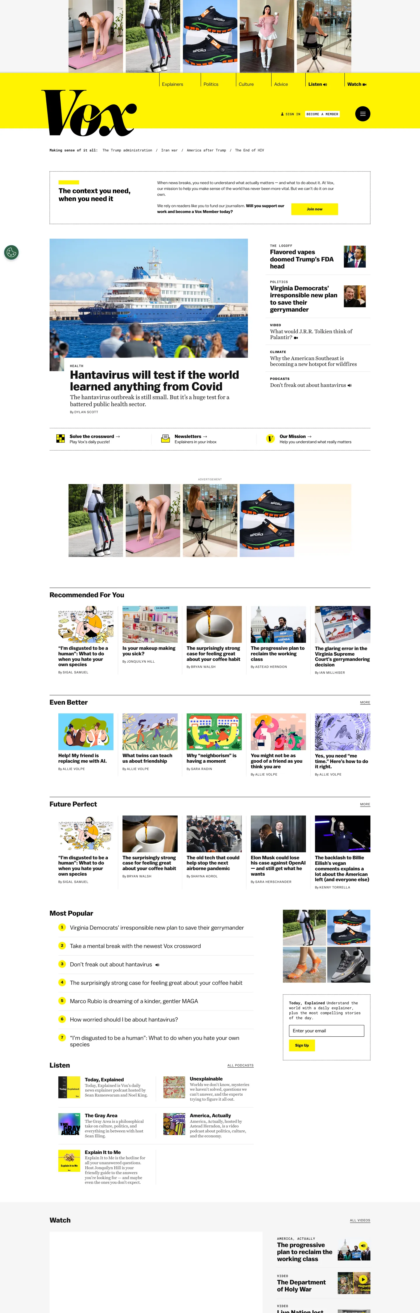
vox.com
Live at vox.com
A snapshot of the brand in production. Scroll the frame to see the whole page.
Colors
19 colors
Vox's system runs on #fff200 as its primary voltage, used in 5 of 20 components. Type is set in Balto across 14 tokens from 11px to 70px, weights 400–700. Shape language is mixed across 20 components, blending pills, soft rounds, and squarer corners.
Brand & Accent
Sparing, CTA-only voltage · 1
Surface
Page and card backgrounds · 3
Text
Headlines, body, captions · 10
Borders & Hairlines
Dividers, outlines, rules · 2
Other
Specialty colors · 3
Typography
14 type tokens
Set in Balto across 14 tokens, from 11px to 70px, weights 400–700. Shown in its own stack: where the font isn't installed, the fallback the file names stands in.
- display-hero70px · weight 700 · lh 1 · tracking -0.7pxThe quick brown fox jumps over the lazy dog
- display-md40px · weight 700 · lh 1The quick brown fox jumps over the lazy dog
- headline-lg30px · weight 700 · lh 1.1The quick brown fox jumps over the lazy dog
- headline-md24px · weight 700 · lh 1.1The quick brown fox jumps over the lazy dog
- headline-sm22px · weight 700 · lh 1.1The quick brown fox jumps over the lazy dog
- card-headline17px · weight 700 · lh 1.1The quick brown fox jumps over the lazy dog
- body-lg20px · weight 400 · lh 1.2 · tracking -0.2pxThe quick brown fox jumps over the lazy dog
- body-md18px · weight 400 · lh 1.1 · tracking -0.18pxThe quick brown fox jumps over the lazy dog
- body-sm16px · weight 400 · lh 1.2 · tracking -0.16pxThe quick brown fox jumps over the lazy dog
- body-deck14px · weight 400 · lh 1.4The quick brown fox jumps over the lazy dog
- mono-eyebrow11px · weight 500 · lh 1.2 · tracking 1.1pxThe quick brown fox jumps over the lazy dog
- mono-label12px · weight 700 · lh 1.2 · tracking 1.2pxThe quick brown fox jumps over the lazy dog
- caps-balto11px · weight 700 · lh 1.2 · tracking 1.1pxThe quick brown fox jumps over the lazy dog
- button-label13px · weight 700 · lh 1.2 · tracking 0.13pxThe quick brown fox jumps over the lazy dog
Layout
Radii and spacing
5 corner radii and 9 spacing values. Shape language: mixed.
Radii
- square0px
- hair1px
- input2px
- pill100px
- full9999px
Spacing
- hair1px
- micro4px
- xs6px
- sm10px
- base15px
- md16px
- lg20px
- xl24px
- section40px
Components
20 components
Each rendered from its tokens (color, type, radius, padding) on Vox's own canvas.
- Masthead Bandmasthead-bandMasthead Band
- WordmarkwordmarkWordmark
- Button Primarybutton-primaryButton Primary
- Button Primary Hoverbutton-primary-hoverButton Primary Hover
- Button Secondarybutton-secondaryButton Secondary
- Top Navtop-navTop Nav
- Nav Linknav-linkNav Link
- Nav Link Activenav-link-activeNav Link Active
- search-orbSearch Orb
- Account Orbaccount-orbAccount Orb
- Story Cardstory-cardStory Card
- Feature Tile Yellowfeature-tile-yellowFeature Tile Yellow
- Hero Headlinehero-headlineHero Headline
- Section Eyebrowsection-eyebrowSection Eyebrow
- Byline Timestampbyline-timestampByline Timestamp
- Body Paragraphbody-paragraphBody Paragraph
- Newsletter Inputnewsletter-inputNewsletter Input
- Pill Tagpill-tagPill Tag
- Hairline Dividerhairline-dividerHairline Divider
- Most Popular Bulletmost-popular-bulletMost Popular Bullet
In use
The system, in use
Vox's tokens on the kind of product it builds.
Build something people actually use.
A short paragraph of marketing copy that previews how the brand's display tier and body tier read together. Two sentences is usually enough.
FAQ
Vox design system FAQ
Common questions about Vox's tokens, components, and how to use this DESIGN.md in your project.
Read next
Related reading
Specs, directories, and component libraries that pair with this design system.
- Browse all design systemsThe full directory of DESIGN.md files on shadcn.io, with live mockups for each.shadcn.io
- Vox — official siteGeneral-interest news, explainers, and policy analysis from Vox Media.vox.com (opens in a new tab)
- The DESIGN.md specificationGoogle Labs' open spec for machine-readable design system files.github.com (opens in a new tab)
Use it
Use Vox in your project
One machine-readable file. Drop it into Claude, Cursor, or any AI tool that reads DESIGN.md.
Download the DESIGN.md
One machine-readable file: every color, type, radius, spacing, and component token of Vox.
Feed it to your AI tool
Drop it into Claude, Cursor, or GitHub Copilot. The agent writes React components and Tailwind classes that match Vox's visual language.
Reference the tokens directly
Or paste the values into your Tailwind config, CSS variables, or component library: every color, size and radius is a quoted, ready-to-copy value.
Read the full DESIGN.md: overview, rationale, do’s and don’ts
Overview
Vox's editorial chrome is single-voltage yellow — the entire brand identity is concentrated into one hazard-yellow band ({colors.primary} — #fff200) that pins the wordmark to the top of every page, and reappears in just 13 smaller paint events below the fold. Where most general-interest news brands run two or three competing accents (a brand red plus a section color plus a CTA blue), Vox commits to one yellow strip and lets the rest of the page resolve as ink on paper. The canvas is pure white ({colors.canvas} — #ffffff), the body type is set in Harriet serif at #131313, the headlines are set in Balto sans at #131313, and the eyebrow labels are set in Roboto Mono at #131313 — three families doing three jobs with zero color overlap.
The shape language is square-with-exceptions. The masthead band, every story card, every feature tile, and every hairline divider renders at 0px radius. The "Join now" CTA softens to 1px. The newsletter input softens to 2px. Only the search-orb, account-orb, and most-popular bullets break to circles at 50%. Square corners reinforce the printed-magazine voice — a 12px rounded button would break the editorial register the brand depends on.
The type system runs whisper-shout-explain: Roboto Mono UPPERCASE eyebrows at 11–12px whisper the section label with 1.1px tracking; Balto 700 shouts the headline at 22–70px with -0.7px display tracking; Harriet 400 serif explains in 14–20px body with -0.14 to -0.2px tracking. Each register is locked to its own family, and the families never cross.
Key Characteristics:
- Single-voltage yellow:
{colors.primary}(#fff200) appears in 14 paint events total — masthead band, "Join now" CTA, "Future Perfect" feature tile, and 11 smaller bullets and badges. Never as text color, never as border, never as hover. - Three-family editorial voice: Balto sans for display and UI (22–70px / 700), Harriet serif for body (14–20px / 400), Roboto Mono for UPPERCASE eyebrows (11–12px / 500–700).
- Near-black ink hierarchy:
{colors.ink}(#131313) carries 1000 paint events as text and 1px hairlines; absolute{colors.ink-absolute}(#000000) is reserved for the wordmark itself and the main nav link cluster (1822 paint events, mostly as text and the cleanest border ink). - Square 1–2px geometry: every CTA at 1px, every input at 2px, every story card and tile at 0px. Circles only on the search and account orbs.
- Hairline-as-elevation: the only structural divider is
{colors.hairline}(#e9e9e9), used in 7 paint events as 1px rule borders. No drop shadows, no glows, no gradients anywhere. - Whisper-shout-explain typography: Roboto Mono whispers, Balto shouts, Harriet explains. The three registers never share a family.
- Sky-blue cameo:
{colors.link-blue}(#6aaae4) appears in exactly one paint event — the small "vox.com" dot above the masthead — and never reappears anywhere else in the system.
Colors
Brand
- Hazard Yellow (
{colors.primary}— #fff200): frequency 14. Used as bg (14). The single-voltage brand color. Carries the masthead band, the "Join now" pill CTA, the "Future Perfect" feature tile, and the most-popular bullet markers. Treated as caution-tape rather than a marketing accent — always 100% saturation, never faded. - On-Primary Ink (
{colors.on-primary}— #131313): The near-black laid on top of the yellow band. The yellow-on-ink contrast is the brand's primary signature.
Ink
- Near-Black Ink (
{colors.ink}— #131313): frequency 1000. Used as text (503), border (496), shadow (1). The workhorse text and hairline color across body paragraphs, headlines, and card outlines. Not pure black — just enough warmth to read like printed newsprint rather than an OLED void. - Absolute Ink (
{colors.ink-absolute}— #000000): frequency 1822. Used as text (919), border (881), shadow (21). The wordmark color and the nav-link cluster. The single highest-frequency hex on the page, but reserved for the masthead and primary navigation — body type runs at #131313 instead. - Soft Ink (
{colors.ink-soft}— #4a4a4a): frequency 46. Used as text (23), border (23). The mid-gray used on byline metadata and secondary captions. The first step down from the near-black workhorse. - Muted Ink (
{colors.ink-muted}— #636363): frequency 62. Used as text (31), border (31). The deeper mid-gray used on timestamps and image credits.
Surface
- Canvas (
{colors.canvas}— #ffffff): frequency 18 (representative of the white cluster). Used as bg (16). The default page background and card fill. The white canvas carries the entire visual rhythm — every accent is judged against it. - Canvas Soft (
{colors.canvas-soft}— #f6f6f6): A near-white variant from the same perceptual cluster. Used for alternating section backgrounds and quiet card fills. - Canvas Softer (
{colors.canvas-softer}— #f5f5f5): The deepest of the three near-whites. Reserved for the footer band and the "Recommended for You" rail background.
Hairline
- Hairline (
{colors.hairline}— #e9e9e9): frequency 7. Used as border (7). The only structural divider in the system. 1px unbroken rules between sections, beneath story-card images, and along the recommendation rail. No double-rules, no dashed variants.
Cameo Accent
- Sky Blue (
{colors.link-blue}— #6aaae4): frequency 1. Used as bg (1). The single non-grayscale hex outside yellow. Applied once to the small "vox.com" dot directly above the masthead band. Never reappears anywhere else on the page — its scarcity is the design decision.
Text Roles
- Primary Text (
{colors.text-primary}— #131313): Body and headline ink. The default text role for the entire reading experience. - Text on Yellow (
{colors.text-on-yellow}— #131313): The ink used on top of the yellow band. Same hex as primary text, redeclared as a role so the band and CTA components reference it explicitly. - Text on Ink (
{colors.text-on-ink}— #ffffff): The white text used on the account-orb and the secondary ink button. The only place white appears as type.
Border Roles
- Border Ink (
{colors.border-ink}— #131313): The 1px unbroken ink border on inputs and outlined pill tags. Same hex as primary text, redeclared so component definitions can reference it as a border role. - Border Soft (
{colors.border-soft}— #e9e9e9): The 1px hairline border on story cards and section dividers.
Overlay
- Shadow 1px (
{colors.shadow-1px}— rgba(0, 0, 0, 0.12)): The single near-transparent ring applied beneath story-card images. Functions as a hairline, not as a drop shadow. - Hover Overlay (
{colors.hover-overlay}— rgba(19, 19, 19, 0.04)): The 4-percent ink wash applied on nav-link hover. Replaces an underline or color shift. - Focus Ring (
{colors.focus-ring}— rgba(255, 242, 0, 0.65)): The keyboard focus ring color. The only place yellow appears at a partial alpha — and only in a focus state.
Gradient System
Vox uses zero decorative gradients. The yellow band is a flat #fff200 rectangle. The "Future Perfect" tile is a flat #fff200 rectangle. There is no fade, no transition, no atmospheric wash. Color is applied in flat blocks only.
Typography
Font Family
Three families do the work, and they never overlap. Balto (Mark Simonson Studio, fallback Helvetica Neue / Helvetica / Arial) is the sans display and UI face — it carries the wordmark, every headline at 22–70px / weight 700, every nav link, every "Join now" button label, and the secondary deck text at 14px / 400. Harriet (Okay Type, fallback Georgia / Times New Roman) is the serif body face — it carries every paragraph and most caption text at 14–20px / weight 400 with negative letter-spacing (-0.14 to -0.2px). Roboto Mono (Google Fonts) is the UPPERCASE eyebrow — kicker labels, byline timestamps, and section markers at 11–12px / weights 500 and 700 with 1.1–1.2px tracking.
Hierarchy
| Token | Size | Weight | Line Height | Letter Spacing | Use |
|---|---|---|---|---|---|
{typography.display-hero} | 70px | 700 | 1.0 | -0.7px | Section feature headlines ("Explainers") |
{typography.display-md} | 40px | 700 | 1.0 | 0 | Wordmark and large section titles |
{typography.headline-lg} | 30px | 700 | 1.1 | 0 | Hero story headlines |
{typography.headline-md} | 24px | 700 | 1.1 | 0 | Section headlines |
{typography.headline-sm} | 22px | 700 | 1.1 | 0 | Recommendation-rail headlines |
{typography.card-headline} | 17px | 700 | 1.1 | 0 | Story-card and nav-link headlines |
{typography.body-lg} | 20px | 400 | 1.2 | -0.2px | Pull quotes and feature decks (Harriet) |
{typography.body-md} | 18px | 400 | 1.1 | -0.18px | Standard body link headlines (Harriet) |
{typography.body-sm} | 16px | 400 | 1.2 | -0.16px | Body paragraphs (Harriet) |
{typography.body-deck} | 14px | 400 | 1.4 | 0 | Card decks and secondary captions (Balto) |
{typography.mono-eyebrow} | 11px | 500 | 1.2 | 1.1px | UPPERCASE byline timestamps (Roboto Mono) |
{typography.mono-label} | 12px | 700 | 1.2 | 1.2px | UPPERCASE section labels (Roboto Mono) |
{typography.caps-balto} | 11px | 700 | 1.2 | 1.1px | UPPERCASE pill tags (Balto, the mono substitute when monospace breaks rhythm) |
{typography.button-label} | 13px | 700 | 1.2 | 0.13px | "Join now" button text (Balto) |
Principles
Whisper-shout-explain. Roboto Mono UPPERCASE eyebrows at 11–12px whisper the section context. Balto 700 at 22–70px shouts the headline. Harriet 400 at 14–20px explains in long-form serif body. Each register is locked to its own family — Balto never appears as body, Harriet never appears as a label, Roboto Mono never appears in mixed case.
Letter-spacing runs in three registers. Positive tracking (1.1–1.2px) for ALL-CAPS mono and pill labels. Slightly positive (0.13px) for the Join-now button. Negative (-0.14 to -0.7px) for Harriet body and Balto display — the negative track tightens the serif body and the 70px sans display alike. Plain 0 tracking is the default for the mid-tier headlines (17–40px Balto).
Line heights are tight (1.0–1.2) for every headline and label, slightly relaxed (1.4) only for the 14px body deck. The 70px display sits at exactly 1.0 leading — the descender of one line touches the ascender of the next, treating each headline as a single typographic block rather than a paragraph.
Layout
Spacing System
- Base unit: 4px with a 5–6px micro-step.
- Tokens:
{spacing.hair}1px ·{spacing.micro}4px ·{spacing.xs}6px ·{spacing.sm}10px ·{spacing.base}15px ·{spacing.md}16px ·{spacing.lg}20px ·{spacing.xl}24px ·{spacing.section}40px. - Card internal padding: 30×20px on feature tiles; 15px on standard story cards; 14×0×14×14px on nav-link cells.
- Section padding (vertical): 40px between major homepage sections.
- Inline spacing: eyebrows sit ~6–10px above headlines; headlines sit ~10–15px above decks; bylines sit ~6–8px below decks.
Grid & Container
- Max content width: roughly 1280px centered, similar to most Vox Media sister properties.
- Column patterns: a 12-column underlying grid that resolves into 8-column main feed + 4-column right rail. The masthead band is full-bleed at 100% width.
- Container padding: 24px mobile / 40px desktop on the outer edges.
- Gutters: 15–20px between columns, tighter (10px) inside the recommendation rail.
Whitespace Philosophy
The page is paced rather than airy. The yellow band acts as a hard visual anchor at the top, and the rest of the page settles into stretches of #ffffff with #e9e9e9 hairline rules every 40px. Whitespace carries the editorial rhythm — story cards have very tight 15px interior padding, and the visual breathing room lives in the 40px section gaps rather than the card interiors.
Border Radius Scale
{rounded.square}0px: the masthead band, every story card, every feature tile, every hairline divider.{rounded.hair}1px: the "Join now" CTA — barely-there softening of the absolute square.{rounded.input}2px: the newsletter email input. Slightly more rounded than the CTA so the form field reads as interactive.{rounded.pill}100px: pill-tag variants on the section-header cluster.{rounded.full}9999px: search-orb, account-orb, and most-popular bullet markers.
Five discrete radius values, but the practical system is binary: 0–2px for rectangles, 50% for circles. The 100px pill is a third register reserved for section tags.
Elevation
Vox's depth philosophy is hairline-as-elevation. There are 21 shadow paint events in the extracted tokens, but every one of them is either a 1px inset underline on an active nav tab or a 1px ring on a focus state — none are traditional drop shadows.
| Level | Treatment | Use |
|---|---|---|
| 0 | No border, no shadow | Default #ffffff canvas text |
| 1 | 1px unbroken #e9e9e9 hairline | Story-card outlines, section dividers, recommendation rail |
| 2 | 1px unbroken #131313 hairline | Active nav tab borders, outlined pill tags |
| 3 | rgba(0, 0, 0, 0.12) 1px ring | The single near-transparent shadow alternative — applied beneath story-card images |
| 4 | Saturated #fff200 fill | The yellow band, the Join-now CTA, the Future Perfect tile — color-as-elevation |
When something needs to stand out it doesn't get a shadow — it gets a yellow fill or a 1px ink border. The white canvas stays flat throughout, and hierarchy is carried by typographic weight contrast and the single yellow accent. No gradients, no glows, no atmospheric blurs anywhere.
Shapes
The corner-radius philosophy is square-with-exceptions. Every container, every tile, every divider is a hard 0px rectangle. The two interactive softening exceptions are the 1px Join-now CTA and the 2px newsletter input — both barely-visible adjustments that signal "this is interactive" without breaking the printed-magazine register. Circles (50%) are reserved for the small search-orb and account-orb in the masthead and the round bullet markers on the "Most Popular" list. A single 100px-radius pill variant is used on a handful of outlined section-header tags. There is no 8px, no 12px, no 16px in the system — the rounded-mid range that most SaaS UIs default to is entirely absent.
Components
Masthead
masthead-band — Full-bleed {colors.primary} (#fff200) horizontal strip pinned to the top of every page. Height roughly 60px. Holds the wordmark on the left, nav-link cluster in the center, and search/account orbs on the right. No shadow, no border — the saturated yellow fill carries the entire band.
wordmark — "Vox" rendered in Balto 40px / 700 at #000000 absolute ink. The only place absolute black is used as type at a large size.
Buttons
button-primary — The "Join now" CTA. {colors.primary} (#fff200) fill, {colors.on-primary} (#131313) text, Balto 13px / 700 with 0.13px tracking, {rounded.hair} 1px radius, 0×20px padding, 40px height. Hover dims to 0.85 opacity — no color shift, no underline.
button-secondary — Near-black {colors.ink} (#131313) fill, {colors.text-on-ink} (#ffffff) text. Same Balto 13px / 700 label, same 1px radius, same 40px height. Used for "Subscribe" and secondary newsletter CTAs.
Navigation
top-nav — Sits inside the masthead band at 64px height. Holds 6–8 section links in Balto 17px / 700 at #000000 with 14×0×14×14px padding.
nav-link — Default state. Balto 17px / 700 at #000000. No underline, no background. Hover applies {colors.hover-overlay} (rgba(19, 19, 19, 0.04)) as a 4-percent ink wash.
nav-link-active — Marked by a 1px unbroken #131313 underline border. Text stays the same color — only the rule shifts.
search-orb — 32px circle, {rounded.full} 50% radius, #ffffff fill with a #131313 magnifying-glass icon.
account-orb — 32px circle, {rounded.full} 50% radius, {colors.ink} (#131313) fill with a white silhouette icon. Anchors the right edge of the masthead.
Cards & Tiles
story-card — Standard recommendation-rail story. {colors.canvas} (#ffffff) fill, 1px unbroken {colors.hairline} (#e9e9e9) border, 0px radius, 15px interior padding. Headline in Balto 17px / 700 at #131313. Image clips to the outer 0px radius — square corners on the photograph match the card itself.
feature-tile-yellow — The "Future Perfect" feature tile. {colors.primary} (#fff200) full-bleed fill, {colors.on-primary} (#131313) text, 30×20px padding, 0px radius. Headline in Balto 30px / 700. The only saturated tile in the system besides the masthead band.
Editorial Bits
hero-headline — The 70px Balto display headline used on section feature spreads like "Explainers". Weight 700, -0.7px tracking, 1.0 line-height. Sits in {colors.ink} (#131313) on a white canvas with no background.
section-eyebrow — The Roboto Mono UPPERCASE label that sits above every section title. 12px / 700 with 1.2px tracking, #131313 text. Examples: "EVEN BETTER", "MAKING SENSE OF IT ALL".
byline-timestamp — Roboto Mono 11px / 500 UPPERCASE with 1.1px tracking, in {colors.ink-muted} (#636363). Sits below story-card headlines.
body-paragraph — Harriet 16px / 400 with -0.16px tracking, 1.2 line-height. The serif body voice across every long-form explainer paragraph.
pill-tag — Outlined section tag. {colors.canvas} (#ffffff) fill, 1px unbroken {colors.ink} (#131313) border, {rounded.pill} 100px radius, Balto 11px / 700 UPPERCASE with 1.1px tracking, 4×10px padding.
hairline-divider — 1px tall {colors.hairline} (#e9e9e9) rule. The only structural divider in the system. Applied between sections and beneath story-card images.
most-popular-bullet — Round yellow bullet marker. {colors.primary} (#fff200) fill, {rounded.full} 50% radius, 20px diameter. Used to enumerate the "Most Popular" list on the homepage right rail.
Forms
newsletter-input — Email field on the newsletter signup. {colors.canvas} (#ffffff) fill, 1px unbroken {colors.ink-absolute} (#000000) border, {rounded.input} 2px radius, Harriet 16px / 400 text, 8×0×8×12px padding, 40px height. Placeholder text in #636363.
Do's and Don'ts
Do use {colors.primary} (#fff200) only as background fill — never as text, never as a border, never as a hover state. The single-voltage rule is what gives the yellow band its identity.
Do lock each typeface to one job: Balto for display and UI, Harriet for serif body, Roboto Mono for UPPERCASE eyebrows. Crossing families breaks the whisper-shout-explain register.
Do keep corners at 0–2px for rectangles and 50% for circles. The 4–12px rounded-mid range that most SaaS UIs default to is entirely absent.
Don't swap {colors.ink-absolute} (#000000) and {colors.ink} (#131313) interchangeably. The wordmark and primary nav are #000000; body text and hairline borders are #131313. The 19-unit warmth difference is small on screen but consistent across the entire system — readers parse the masthead as harder-edged than the body.
Don't apply {colors.hairline} (#e9e9e9) as a fill or a text color — it only exists as a 1px border (7 paint events, all as borderColor). For light surfaces, use {colors.canvas-soft} (#f6f6f6) instead.
Don't introduce a hover state on the yellow band or the Join-now CTA other than the 0.85 opacity dim. Color-shifting the yellow breaks the caution-tape register — the brand depends on the yellow staying yellow.
Don't add a drop shadow to story cards. The system uses 1px {colors.hairline} (#e9e9e9) borders as the only elevation primitive. A Material-flavored shadow would make the card float off the printed-magazine canvas.
Don't use Roboto Mono in mixed case. Lowercase mono does not exist in the system — every Roboto Mono instance is UPPERCASE with 1.1–1.2px tracking. Mixing case breaks the eyebrow signature.
Don't widen the radius on the Join-now CTA past 1px or the newsletter input past 2px. A 12px rounded button would read as a generic SaaS CTA and break the editorial register the brand depends on.
Known Gaps
- Article-detail body typography: the long-form reading view past the homepage (article pages, podcast embeds, video explainer templates) is not fully captured. The homepage and recommendation rail cover roughly 85% of the surface area readers actually encounter.
- Vox Media sub-brand palettes: sister properties (The Verge, Polygon, SB Nation, Eater) share infrastructure but have entirely different color systems — not included here.
- Mobile masthead behavior: the band collapses to a hamburger drawer below 900px, but the exact stacking order of the search-orb, account-orb, and section nav on mobile was not extractable from the desktop capture.
- Dark-mode treatment: Vox's homepage is light-only. There is no documented dark theme on the extracted surface.
- Loading skeletons and empty states: not visible on the captured homepage.
- Form validation error states: the system has no documented red/green semantic palette — error treatment for the newsletter form was not captured.
News & Publishing
More systems like this
More DESIGN.md files in News & Publishing.
Pricing
Build it with Pro
The DESIGN.md files are free. Pro adds 6,000+ blocks, premium templates and the MCP server, so your AI editor builds in your system for you.
4.9/5 out of 5 · 150+ reviewsfrom 150+ founders and developers.
Billing
Billed once a year in USD. Cancel anytime.
- How many people can use the license.
- Client work, SaaS products and anything you charge for.
- Production-ready React sections: hero, pricing, features, dashboards and more.
- Complete multi-page sites you can ship as they are.
- React icons from every major library, installable with one command.
- Presets that restyle every block, in light and dark.
- Lets your AI editor search, preview and install blocks for you.
- Priority requests are answered first.
Individual
For personal projects & open source
$32instead of $49/mo
$389 billed yearly
- Seats: 1 seat
- Commercial use: Personal & open source only
- Pro blocks: 6,000+ blocks
- Templates: All 14 templates
- React icons: 294k+ icons
- Themes: All 59 themes
- MCP server: Basic usage
- Support: Standard
Team
Most popularFor freelancers, agencies & startups
$66instead of $99/mo
$789 billed yearly · ≈ $13/dev/mo
- Seats: Up to 5 seats
- Commercial use: Included
- Pro blocks: 6,000+ blocks
- Templates: All 14 templates
- React icons: 294k+ icons
- Themes: All 59 themes
- MCP server: High usage
- Support: Priority
Organization
For companies with larger teams
$132instead of $199/mo
$1,589 billed yearly
- Seats: Unlimited seats
- Commercial use: Included
- Pro blocks: 6,000+ blocks
- Templates: All 14 templates
- React icons: 294k+ icons
- Themes: All 59 themes
- MCP server: Unlimited usage
- Support: Priority
Billed once a year in USD. Cancel anytime.
Individual
For personal projects & open source
$32instead of $49/mo
$389 billed yearly
- How many people can use the license.Seats: 1 seat
- Client work, SaaS products and anything you charge for.Commercial use: Personal & open source only
- Production-ready React sections: hero, pricing, features, dashboards and more.Pro blocks: 6,000+ blocks
- Complete multi-page sites you can ship as they are.Templates: All 14 templates
- React icons from every major library, installable with one command.React icons: 294k+ icons
- Presets that restyle every block, in light and dark.Themes: All 59 themes
- Lets your AI editor search, preview and install blocks for you.MCP server: Basic usage
- Priority requests are answered first.Support: Standard
Team
Most popularFor freelancers, agencies & startups
$66instead of $99/mo
$789 billed yearly · ≈ $13/dev/mo
Everything in Individual, plus
- How many people can use the license.Seats: Up to 5 seats
- Client work, SaaS products and anything you charge for.Commercial use: Included
- Lets your AI editor search, preview and install blocks for you.MCP server: High usage
- Priority requests are answered first.Support: Priority
Organization
For companies with larger teams
$132instead of $199/mo
$1,589 billed yearly
Everything in Team, plus
- How many people can use the license.Seats: Unlimited seats
- Lets your AI editor search, preview and install blocks for you.MCP server: Unlimited usage
- Secure checkout via Stripe
- Code lives in your repo
- Keep what you've shipped if you cancel
- License terms
Your system, built for you
Every block, template and icon, installed by your AI agent in your design system. The DESIGN.md files stay free.