Voltagent Inspired Design System
Voltagent's design system as a DESIGN.md file. Electric green #00d992, Inter + SF Mono, 13 colors, 25 components. For React, Next.js, and AI tools.
Add shadcn.io to your AI agent. · Pro It installs blocks, icons and templates in your design system from a prompt, with Pro.
Set up MCP- Primary
- #00d992
- Typeface
- Inter
- Shape
- Mixed
- Base radius
- 8px
- Colors
- 13
- Type tokens
- 16
- Components
- 25
- Spacing values
- 11
About
About Voltagent Inspired DESIGN.md
Curated by Dov Azencot · Updated May 12, 2026 · Source voltagent.dev (opens in a new tab)
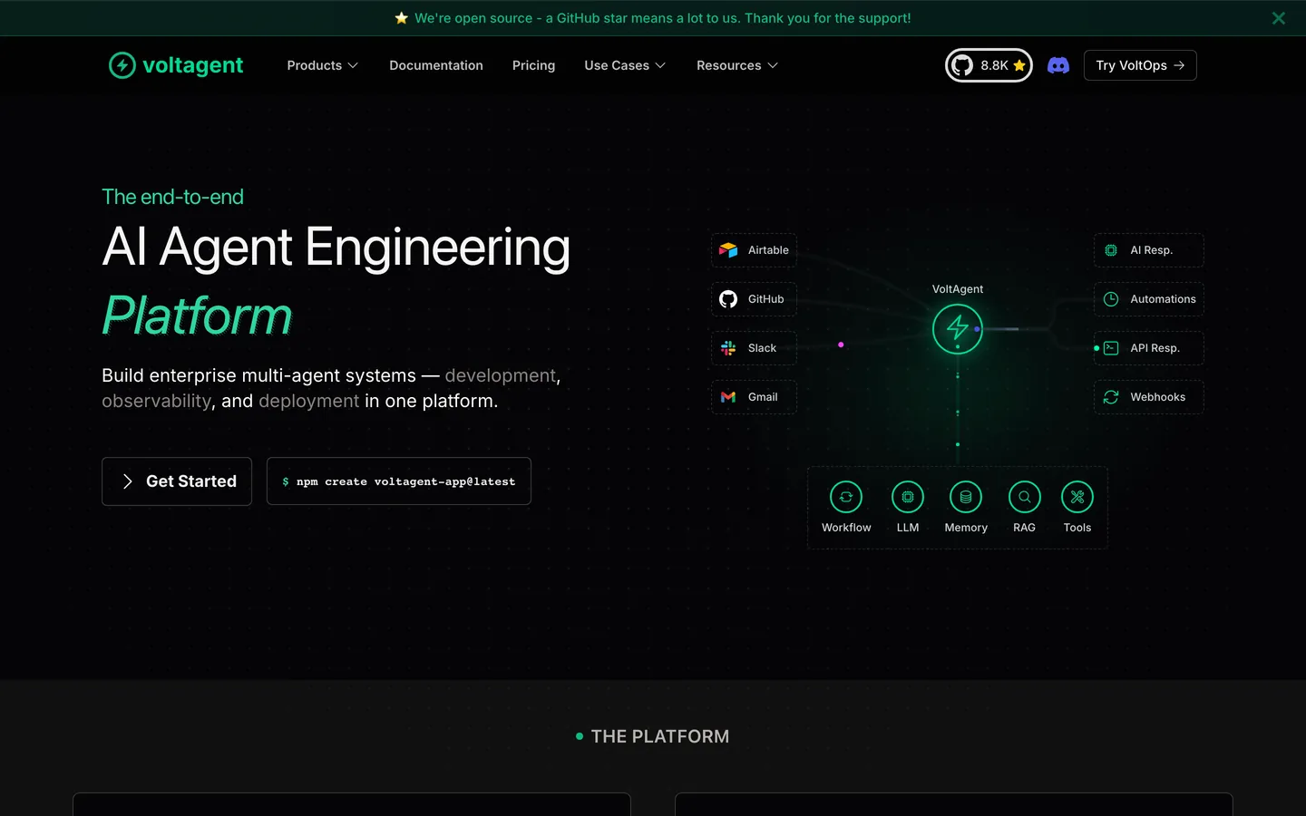
Voltagent is an AI agent engineering platform that wears its developer audience proudly. The marketing surface looks like polished documentation that decided to also sell something: a near-black #101010 canvas runs edge-to-edge with no light-mode rhythm, a single electric-green #00d992 carries every CTA and the lightning logo, and hairline-bordered feature cards replace material shadows. The hero headline sits at 60px Inter in regular weight 400 with -0.65px tracking, deliberately calm against AI marketing's tendency to shout. Code-editor mockups, copy-to-clipboard chips, and monospace metric counters anchor the brand's engineered voice.
This page packages the full system into a single DESIGN.md file built on Google Labs' open spec. Inside: 13 colors tokens grouped into brand, surface, text, and semantic ranges, 17 typography styles across Inter and SF Mono, 6 corner-radius tokens, 11 spacing values from 2px to 64px, and 25 components covering buttons, cards, code mockups, hero bands, and 11 illustrative example surfaces. Every hex is quoted, every padding traces back to a spacing token, and every component references its primitives by name.
Feed the file to Claude, Cursor, or GitHub Copilot and the agent reproduces Voltagent's restraint — single accent, hairline elevation, two-face type pair — rather than a generic dark-mode SaaS theme. Or paste the tokens straight into Tailwind config and CSS variables. The system rewards study for one reason: it shows how to make a dark, developer-facing brand feel engineered rather than edgy, using typography and hairlines instead of glow and gradient.
What makes it distinct
5
- Single electric-green accent#00d992 carries every CTA, status pill, and the lightning glyph, never a body fill
- Dark canvas only#101010 page surface with no light-mode counterpart, broken only by hairline-bordered feature cards
- Hairline elevation system1px #3d3a39 borders replace shadows; depth comes from precise rectangles, not material lift
- Two-face type pairingInter at calm 400-weight 60px display next to SF Mono 13px for code chips and command snippets
- Tight 6px button radiusbuttons stay rectangular at rounded.sm; only inline status tags use the 9999px pill
voltagent.dev
Live at voltagent.dev
A snapshot of the brand in production. Scroll the frame to see the whole page.
Colors
13 colors
Voltagent Inspired's system runs on #00d992 as its primary voltage, used in 3 of 25 components. Type is set in Inter across 16 tokens from 12px to 60px, weights 400–700. Shape language is mixed across 25 components, blending pills, soft rounds, and squarer corners.
Brand & Accent
Sparing, CTA-only voltage · 3
Surface
Page and card backgrounds · 3
Text
Headlines, body, captions · 4
Borders & Hairlines
Dividers, outlines, rules · 2
Other
Specialty colors · 1
Typography
16 type tokens
Set in Inter across 16 tokens, from 12px to 60px, weights 400–700. Shown in its own stack: where the font isn't installed, the fallback the file names stands in.
- display-xl60px · weight 400 · lh 60px · tracking -0.65pxThe quick brown fox jumps over the lazy dog
- display-lg36px · weight 400 · lh 40px · tracking -0.9pxThe quick brown fox jumps over the lazy dog
- display-md24px · weight 700 · lh 32px · tracking -0.6pxThe quick brown fox jumps over the lazy dog
- display-sm20px · weight 600 · lh 28pxThe quick brown fox jumps over the lazy dog
- eyebrow-mono14px · weight 600 · lh 20px · tracking 2.52pxThe quick brown fox jumps over the lazy dog
- eyebrow-uppercase18px · weight 600 · lh 28px · tracking 0.45pxThe quick brown fox jumps over the lazy dog
- body-lg18px · weight 400 · lh 28pxThe quick brown fox jumps over the lazy dog
- body-md16px · weight 400 · lh 26pxThe quick brown fox jumps over the lazy dog
- body-md-strong16px · weight 600 · lh 24pxThe quick brown fox jumps over the lazy dog
- body-sm14px · weight 400 · lh 20pxThe quick brown fox jumps over the lazy dog
- body-sm-strong14px · weight 600 · lh 23pxThe quick brown fox jumps over the lazy dog
- caption12px · weight 400 · lh 16pxThe quick brown fox jumps over the lazy dog
- caption-strong12px · weight 500 · lh 16pxThe quick brown fox jumps over the lazy dog
- code13px · weight 400 · lh 18pxThe quick brown fox jumps over the lazy dog
- code-strong13px · weight 550 · lh 16pxThe quick brown fox jumps over the lazy dog
- button-md16px · weight 600 · lh 24pxThe quick brown fox jumps over the lazy dog
Layout
Radii and spacing
6 corner radii and 11 spacing values. Shape language: mixed.
Radii
- none0px
- xs4px
- sm6px
- md8px
- pill9999px
- full9999px
Spacing
- xxs2px
- xs4px
- sm8px
- md12px
- lg16px
- xl20px
- 2xl24px
- 3xl32px
- 4xl40px
- 5xl48px
- 6xl64px
Components
25 components
Each rendered from its tokens (color, type, radius, padding) on Voltagent's own canvas.
- Nav Barnav-barNav Bar
- Nav Linknav-linkNav Link
- Button Primarybutton-primaryButton Primary
- Button Outline On Darkbutton-outline-on-darkButton Outline On Dark
- Button Ghost Greenbutton-ghost-greenButton Ghost Green
- Button Pill Tagbutton-pill-tagButton Pill Tag
- Type here…text-inputText Input
- Card Featurecard-featureCard Feature
- Card Feature Emphasizedcard-feature-emphasizedCard Feature Emphasized
- Code Mockupcode-mockupCode Mockup
- Code Inline Chipcode-inline-chipCode Inline Chip
- Hero Bandhero-bandHero Band
- Content Bandcontent-bandContent Band
- Green Divider Bandgreen-divider-bandGreen Divider Band
- FooterfooterFooter
- Ex Pricing Tierex-pricing-tierEx Pricing Tier
- Ex Pricing Tier Featuredex-pricing-tier-featuredEx Pricing Tier Featured
- Ex Product Selectorex-product-selectorEx Product Selector
- Ex Cart Drawerex-cart-drawerEx Cart Drawer
- Ex App Shell Rowex-app-shell-rowEx App Shell Row
- Ex Data Table Cellex-data-table-cellEx Data Table Cell
- Ex Auth Form Cardex-auth-form-cardEx Auth Form Card
- Ex Modal Cardex-modal-cardEx Modal Card
- Ex Empty State Cardex-empty-state-cardEx Empty State Card
- Ex Toastex-toastEx Toast
In use
The system, in use
Voltagent's tokens on the kind of product it builds.
Build something people actually use.
A short paragraph of marketing copy that previews how the brand's display tier and body tier read together. Two sentences is usually enough.
FAQ
Voltagent Inspired design system FAQ
Common questions about Voltagent's tokens, components, and how to use this DESIGN.md in your project.
Read next
Related reading
Specs, directories, and component libraries that pair with this design system.
Use it
Use Voltagent Inspired in your project
One machine-readable file. Drop it into Claude, Cursor, or any AI tool that reads DESIGN.md.
Download the DESIGN.md
One machine-readable file: every color, type, radius, spacing, and component token of Voltagent Inspired.
Feed it to your AI tool
Drop it into Claude, Cursor, or GitHub Copilot. The agent writes React components and Tailwind classes that match Voltagent Inspired's visual language.
Reference the tokens directly
Or paste the values into your Tailwind config, CSS variables, or component library: every color, size and radius is a quoted, ready-to-copy value.
Read the full DESIGN.md: overview, rationale, do’s and don’ts
Overview
Voltagent is an AI agent engineering platform built for developers, and the brand wears that audience proudly: a near-black {colors.canvas} (#101010) page background that runs edge-to-edge with no light-mode counterpart, a single electric-green accent ({colors.primary} #00d992) reserved for CTAs, status pills, and the brand lightning glyph, and a typography system that pairs sentence-case Inter with SF Mono for inline code and command snippets. The whole page reads like polished documentation that decided to also sell something.
The decorative system is restrained. There is no gradient mesh, no atmospheric backdrop, no illustration suite. Instead, the brand uses small typographic moments — a green code chip (npx voltagent ...), a 3-px outlined feature card sitting against the same near-black canvas, a green hairline divider between section bands — to mark its identity. The result is a page that feels engineered: every card has a hairline border, every snippet has a copy-to-clipboard button, every metric is rendered in a numeric monospace.
Type stays calm. Hero display sits at 60 px in regular weight with -0.65 px tracking — not a billboard headline, more like a documentation H1. Section headings step down to 36 px / 24 px in similar weights. Body copy is 16 px Inter at line-height 1.65 for the kind of legibility long-form devs expect. Uppercase eyebrows are common — EVERYTHING YOU NEED style mono-cap labels above section headlines — and they use Inter at weight 600 with wide positive tracking (2.52 px at 14 px).
Key Characteristics:
- A single electric-green accent
{colors.primary}(#00d992) carries every CTA, every status pill, and the brand's lightning logo. No second accent. - Dark canvas (
{colors.canvas}#101010) is the only page surface — there is no light-mode rhythm; the entire site reads as one continuous dark surface broken by feature-card boundaries. - Hairline-bordered feature cards (
{colors.hairline}#3d3a39, 1 px solid) are the brand's primary chrome — no shadows, no fills, just precise hairline rectangles. - A signature dashed-border accent (
1px dashed rgba(79, 93, 117, 0.4)) appears between sections as a quiet rhythm cue — the brand's only ornamental line. - Inter + SF Mono pair carries every typographic role. SF Mono is reserved for code blocks, inline command snippets, and metric counters.
- Buttons are tight 6 px rounded rectangles (not pills); only inline status tags use the 9999 px full pill.
Known Gaps
- Semantic palette: the brand doesn't surface a separate error / warning palette on marketing pages — the underlying Docusaurus default semantic palette exists in the design system but is reserved for in-product / docs contexts. Validation cues on the marketing surface use the primary green for success and a muted body grey for missing states.
- Hover-state treatments: the inset-glow elevation tier (
0 0 15px rgba(92, 88, 85, 0.2)) is documented, but the precise hover ramp for individual feature cards and buttons isn't captured at the token level. - Loading skeletons: not visible on the extracted marketing surfaces.
- In-product app-shell chrome: the sidebar nav row and data-table cell tokens are included as illustrative
ex-*entries, but the full in-product application shell (top bar, breadcrumb, command palette) lives outside the marketing scope captured here. - Modal stack: the Level 3 modal shadow (
0 20px 60px rgba(0,0,0,0.7), 0 0 0 1px rgba(148,163,184,0.1) inset) is documented but only appears inside in-product dialog surfaces — not exercised on marketing pages. - Font licensing: SF Mono is Apple-system and isn't redistributable; downstream consumers need to substitute JetBrains Mono or Geist Mono when self-hosting.
AI & LLM Platforms
More systems like this
More DESIGN.md files in AI & LLM Platforms.
Pricing
Build it with Pro
The DESIGN.md files are free. Pro adds 6,000+ blocks, premium templates and the MCP server, so your AI editor builds in your system for you.
4.9/5 out of 5 · 150+ reviewsfrom 150+ founders and developers.
Billing
Billed once a year in USD. Cancel anytime.
- How many people can use the license.
- Client work, SaaS products and anything you charge for.
- Production-ready React sections: hero, pricing, features, dashboards and more.
- Complete multi-page sites you can ship as they are.
- React icons from every major library, installable with one command.
- Presets that restyle every block, in light and dark.
- Lets your AI editor search, preview and install blocks for you.
- Priority requests are answered first.
Individual
For personal projects & open source
$32instead of $49/mo
$389 billed yearly
- Seats: 1 seat
- Commercial use: Personal & open source only
- Pro blocks: 6,000+ blocks
- Templates: All 14 templates
- React icons: 294k+ icons
- Themes: All 59 themes
- MCP server: Basic usage
- Support: Standard
Team
Most popularFor freelancers, agencies & startups
$66instead of $99/mo
$789 billed yearly · ≈ $13/dev/mo
- Seats: Up to 5 seats
- Commercial use: Included
- Pro blocks: 6,000+ blocks
- Templates: All 14 templates
- React icons: 294k+ icons
- Themes: All 59 themes
- MCP server: High usage
- Support: Priority
Organization
For companies with larger teams
$132instead of $199/mo
$1,589 billed yearly
- Seats: Unlimited seats
- Commercial use: Included
- Pro blocks: 6,000+ blocks
- Templates: All 14 templates
- React icons: 294k+ icons
- Themes: All 59 themes
- MCP server: Unlimited usage
- Support: Priority
Billed once a year in USD. Cancel anytime.
Individual
For personal projects & open source
$32instead of $49/mo
$389 billed yearly
- How many people can use the license.Seats: 1 seat
- Client work, SaaS products and anything you charge for.Commercial use: Personal & open source only
- Production-ready React sections: hero, pricing, features, dashboards and more.Pro blocks: 6,000+ blocks
- Complete multi-page sites you can ship as they are.Templates: All 14 templates
- React icons from every major library, installable with one command.React icons: 294k+ icons
- Presets that restyle every block, in light and dark.Themes: All 59 themes
- Lets your AI editor search, preview and install blocks for you.MCP server: Basic usage
- Priority requests are answered first.Support: Standard
Team
Most popularFor freelancers, agencies & startups
$66instead of $99/mo
$789 billed yearly · ≈ $13/dev/mo
Everything in Individual, plus
- How many people can use the license.Seats: Up to 5 seats
- Client work, SaaS products and anything you charge for.Commercial use: Included
- Lets your AI editor search, preview and install blocks for you.MCP server: High usage
- Priority requests are answered first.Support: Priority
Organization
For companies with larger teams
$132instead of $199/mo
$1,589 billed yearly
Everything in Team, plus
- How many people can use the license.Seats: Unlimited seats
- Lets your AI editor search, preview and install blocks for you.MCP server: Unlimited usage
- Secure checkout via Stripe
- Code lives in your repo
- Keep what you've shipped if you cancel
- License terms
Your system, built for you
Every block, template and icon, installed by your AI agent in your design system. The DESIGN.md files stay free.