Skip to content

VICE Design System

VICE's homepage as a DESIGN.md file. Pure black on pure white, no chromatic accent, VICE Grotesk display at weight 900, Source Code Pro UPPERCASE metadata. Tokens for React, Next.js, and AI tools.

Add shadcn.io to your AI agent. · Pro It installs blocks, icons and templates in your design system from a prompt, with Pro.

Set up MCP
Primary
#e8e8e8
Typeface
VICE Grotesk
Shape
Sharp
Base radius
4px
Colors
8
Type tokens
11
Components
14
Spacing values
8

About

About VICE DESIGN.md

Curated by Dov Azencot · Updated May 19, 2026 · Source vice.com (opens in a new tab)

VICE's homepage looks like a print zine ported to desktop scale and refusing every web-native softening move. The canvas is pure white, the ink is pure black, and the page ships zero saturated brand color anywhere in the captured chrome — no orange, no red, no electric blue, no held-in-reserve accent. Hero section titles run at 50px VICE Grotesk weight 900, the heaviest weight in the proprietary grotesk's variable axis; h2 article headlines drop to 40px / 700; navigation labels sit at 16px weight 900 UPPERCASE. The metadata layer — every timestamp, byline, and category tag — runs in Source Code Pro at 11px UPPERCASE, the same monospace that VICE has used since the early-2010s magazine site. The brand voice is grotesk-weight authority paired with monospace metadata, and the chromatic restraint is so absolute it borders on confrontational.

The DESIGN.md file packages the system into a structured spec. Inside: 8 colors tokens organized around pure-ink black, paper white, a single graphite gray for muted body text, a hairline neutral, and a handful of declared-but-absent WordPress preset accents (vivid purple, luminous orange, vivid red) that exist in the CSS but never render on the marketing surface; 11 typography tokens running VICE Grotesk at three weights (500, 700, 900) plus Source Code Pro at 11px and a single Helvetica Neue 19px tier for body promo strips; a 2-step radius scale (0px on every card, 9999px only on the Members-only pill); a 10/40px spacing rhythm; and 14 components definitions covering the print-zine card, the UPPERCASE category-tab row, the heavy 6x6 block-offset shadow, and the inverted black promo band.

Feed this file to Claude, Cursor, or any AI coding agent that reads structured tokens and it reproduces VICE's specific moves: ink-on-paper monochrome chrome with photography carrying every chromatic moment, VICE Grotesk at weight 900 for display authority, Source Code Pro UPPERCASE metadata, zero corner radius on cards, and a single hard 6x6 block-offset shadow as the only elevation tier. The one disciplined move worth borrowing only if your editorial voice can support it: the willingness to ship a marketing surface with no brand accent color at all. VICE gets away with it because the photography is the brand; on a SaaS site it would read as undecorated rather than confrontational.

What makes it distinct

5

  1. No chromatic voltageVICE's marketing surface ships zero saturated brand color; ink black and paper white carry every chrome element, with photography doing all chromatic work
  2. VICE Grotesk display at weight 900the proprietary grotesk runs at the heaviest weight available in the family, the inverse of editorial-weight-500 restraint at Cloudflare or Spline
  3. Source Code Pro UPPERCASE metadata11px monospace at 96 occurrences carries every timestamp, byline, and category tag — VICE's typographic fingerprint
  4. Print-zine gridevery card has zero corner radius, pills appear only on the Members-only flag at 9999px, and a hard 6x6 block-offset shadow appears as the only elevation move
  5. Helvetica Neue as a third voicebody running text shifts from VICE Grotesk to Helvetica Neue at 19px / 500 inside the Members promo strip, the only place a system-sans appears

vice.com

Live at vice.com

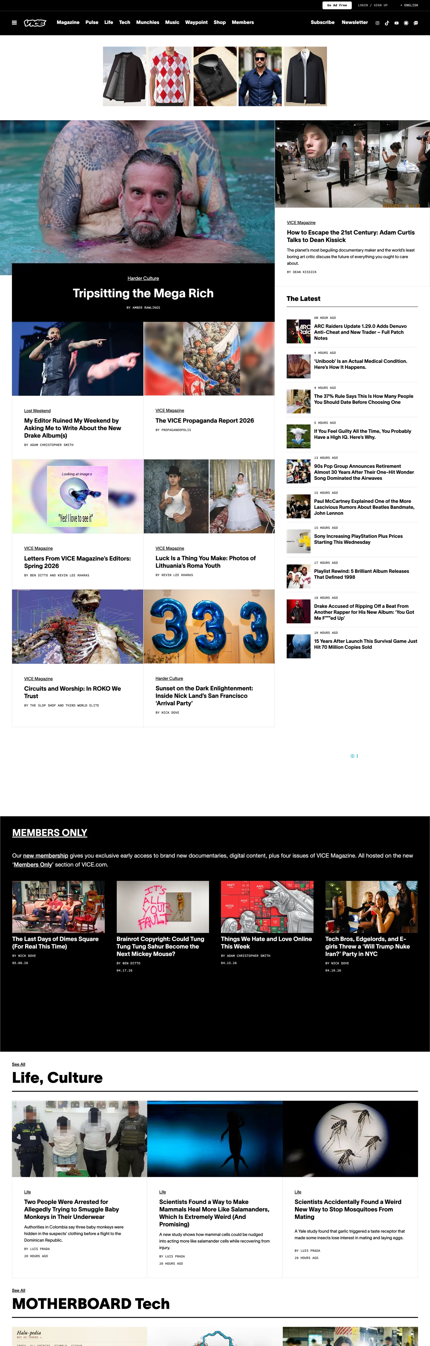
A snapshot of the brand in production. Scroll the frame to see the whole page.

VICE's website at vice.com

Colors

8 colors

VICE's system runs on #e8e8e8 as its primary voltage, used in 1 of 14 components. Type is set in VICE Grotesk across 11 tokens from 11px to 50px, weights 400–900. Shape language is sharp — components average 0px corner radius, favoring crisp rectangles.

Surface

Page and card backgrounds · 2

Text

Headlines, body, captions · 4

Borders & Hairlines

Dividers, outlines, rules · 2

Typography

11 type tokens

Set in VICE Grotesk across 11 tokens, from 11px to 50px, weights 400–900. Shown in its own stack: where the font isn't installed, the fallback the file names stands in.

  • display-xl50px · weight 900 · lh 56.25pxThe quick brown fox jumps over the lazy dog
  • display-lg40px · weight 700 · lh 45pxThe quick brown fox jumps over the lazy dog
  • display-md32px · weight 700 · lh 36pxThe quick brown fox jumps over the lazy dog
  • heading-md22px · weight 900 · lh 24.75pxThe quick brown fox jumps over the lazy dog
  • heading-sm20px · weight 700 · lh 25pxThe quick brown fox jumps over the lazy dog
  • body-md14px · weight 400 · lh 22.12pxThe quick brown fox jumps over the lazy dog
  • body-md-medium14px · weight 500 · lh 22.12pxThe quick brown fox jumps over the lazy dog
  • body-promo19px · weight 400 · lh 30.02pxThe quick brown fox jumps over the lazy dog
  • nav-link16px · weight 900 · lh 16pxThe quick brown fox jumps over the lazy dog
  • mono-sm11px · weight 400 · lh 13.75pxThe quick brown fox jumps over the lazy dog
  • mono-sm-bold11px · weight 700 · lh 17.38pxThe quick brown fox jumps over the lazy dog

Layout

Radii and spacing

3 corner radii and 8 spacing values. Shape language: sharp.

Radii

  • none0px
  • sm4px
  • full9999px

Spacing

  • xs4px
  • sm8px
  • base10px
  • md12px
  • lg16px
  • xl24px
  • 2xl30px
  • 3xl40px

Components

14 components

Each rendered from its tokens (color, type, radius, padding) on VICE's own canvas.

  • Hero Heading
    hero-headingHero Heading
  • Section Heading
    section-headingSection Heading
  • Section Heading Inverted
    section-heading-invertedSection Heading Inverted
  • Body Paragraph
    body-paragraphBody Paragraph
  • Body Paragraph Promo
    body-paragraph-promoBody Paragraph Promo
  • Mono Caption
    mono-captionMono Caption
  • Mono Caption Inverted
    mono-caption-invertedMono Caption Inverted
  • Button Primary
    button-primaryButton Primary
  • Button Secondary
    button-secondaryButton Secondary
  • Top Nav
    top-navTop Nav
  • Nav Link
    nav-linkNav Link
  • Card
    cardCard
  • Card Inverted
    card-invertedCard Inverted
  • Members Pill
    members-pillMembers Pill

In use

The system, in use

VICE's tokens on the kind of product it builds.

Build something people actually use.

A short paragraph of marketing copy that previews how the brand's display tier and body tier read together. Two sentences is usually enough.

Get startedLearn more
Marketing heroHeadline, sub-copy, primary CTA — the universal homepage opener.
Reporting · 14 min read

The quiet collapse of an old idea

For decades the consensus held that the system would correct itself. Then it didn't. This is the inside story of what changed, told by the people who watched it unravel.

"Nobody noticed because the failure was indistinguishable from progress."

By Sam Reporter · Updated 2 hours ago

Editorial articleMagazine-style longform with display headline.

FAQ

VICE design system FAQ

Common questions about VICE's tokens, components, and how to use this DESIGN.md in your project.

Read next

Specs, directories, and component libraries that pair with this design system.

Use it

Use VICE in your project

One machine-readable file. Drop it into Claude, Cursor, or any AI tool that reads DESIGN.md.

Download DESIGN.md
  1. Download the DESIGN.md

    One machine-readable file: every color, type, radius, spacing, and component token of VICE.

  2. Feed it to your AI tool

    Drop it into Claude, Cursor, or GitHub Copilot. The agent writes React components and Tailwind classes that match VICE's visual language.

  3. Reference the tokens directly

    Or paste the values into your Tailwind config, CSS variables, or component library: every color, size and radius is a quoted, ready-to-copy value.

Read the full DESIGN.md: overview, rationale, do’s and don’ts

Overview

VICE's homepage refuses every web-native softening move that the rest of the news-publishing category accepts. Ink-on-paper monochrome. Where Cloudflare paints its hero in a saturated brand orange and The Atlantic reserves a hazard red for the Subscribe pill, VICE ships a marketing surface with zero saturated brand color anywhere in the chrome. The canvas is pure white ({colors.canvas} — #ffffff, 288 occurrences), the ink is pure black ({colors.ink} — #000000, 1942 occurrences — the single dominant token by an enormous margin), and the only other rendered colors are a graphite muted-text gray and a faint hairline neutral. Every chromatic moment on the page comes from editorial photography — Hawaiian-shirt portraits, action stills, magazine covers — and the chrome's job is to stay out of the way.

The typographic system is grotesk-weight authority paired with monospace metadata. VICE Grotesk runs at weight 900 for hero section titles (50px) and at weight 700 for h2 article headlines (40px), the heaviest weight available in the proprietary grotesk family. This is the inverse of the editorial-weight-500 restraint Cloudflare and Spline run; VICE wants its display to read as ink-stamped print rather than as quiet magazine dek. The supporting voice is Source Code Pro at 11px UPPERCASE, appearing 96 times across timestamps, byline credits, and category tags — the typographic fingerprint that has carried over from VICE Magazine's print era.

The shape language is print-zine binary: zero corner radius on every card, photograph, and button, with the pill geometry reserved exclusively for the Members-only badge at 9999px. There is no 4px, 8px, or 12px middle tier. Elevation is a single hard 6x6 block-offset shadow (declared in CSS as --wp--preset--shadow--crisp, value 6px 6px 0px rgb(0, 0, 0)) that drops a black block-shadow under specific photo lockups — the inverse of the soft-blur drop shadow most digital products use.

Key Characteristics:

  • Zero saturated brand voltage anywhere in the chrome — VICE refuses the held-in-reserve accent convention. Editorial photography carries every chromatic moment.
  • Ink black ({colors.ink} — #000000) dominates: 1942 total occurrences, the highest concentration in any system in the directory.
  • VICE Grotesk at weight 900 for display — the heaviest weight in the family, the inverse of editorial-restraint-500 systems.
  • Source Code Pro at 11px UPPERCASE as the metadata fingerprint — 96 occurrences across timestamps, bylines, category tags.
  • Zero corner radius on every card. Pills only on the Members-only badge at 9999px. No middle tier exists.
  • Hard 6x6 block-offset shadow (6px 6px 0px rgb(0, 0, 0)) as the only elevation move — a black block-shadow, not a soft-blur drop.
  • Inverted black promo bands carry Members-only content with Helvetica Neue 19px / 400 body copy — the only place a non-VICE-Grotesk sans appears.
  • UPPERCASE category navigation in 16px VICE Grotesk weight 900 — the navigation reads as a row of ink-stamped print labels.

Colors

Text

  • Ink ({colors.ink} — #000000): frequency 1942 — the single dominant token in the system. Used as text (991), border (945), background (6). Pure black on pure white is the entire chrome voice. Declared in 11 separate CSS custom-property names (--wp--custom--color--text--base, --wp--custom--color--border--base, --wp--custom--color--bg--dark, etc.) — the WordPress base treats ink black as text, border, background-dark, and primary all at once.
  • Ink Muted ({colors.ink-muted} — #909090): frequency 18. Used as text (9), border (9). A graphite gray used sparingly for timestamp captions and secondary metadata where pure ink would feel too heavy. Declared as --wp--custom--color--neutral--60 and --wp--preset--color--gray.
  • Ink Soft ({colors.ink-soft} — #333333): declared as --wp--custom--color--neutral--20 and --wp--custom--color--text--medium. Present in the CSS but not actively rendered on the captured marketing surface.
  • Ink Light ({colors.ink-light} — #4d4d4d): declared as --wp--custom--color--neutral--30 and --wp--custom--color--text--light. Reserved for tertiary text tiers that do not appear in the rendered page.

Surface

  • Canvas ({colors.canvas} — #ffffff): frequency 288 — the second-most-occurring token. Used as text (143, where it renders white against the inverted black promo bands), border (142), and background (3). Declared as --wp--custom--color--bg--base, --wp--custom--color--white, and --wp--custom--color--neutral--100. The page floor and every primary card surface.
  • Surface Medium ({colors.surface-medium} — #757575): declared as --wp--custom--color--bg--medium and --wp--custom--color--border--medium. Present in the CSS preset but absent from the rendered surface.

Hairline

  • Hairline Light ({colors.hairline-light} — #e8e8e8): frequency 34, all as border. The faint cool-gray hairline rule used to divide specific card lockups where pure-black borders would feel too heavy. Declared as --wp--custom--color--border--light, --wp--custom--color--neutral--90, and --wp--preset--color--light-gray.
  • Border Dark ({colors.border-dark} — #1a1a1a): declared as --wp--custom--color--neutral--10 and --wp--custom--color--border--dark. Reserved for dark-mode border duty; absent from the captured light surface.

Declared but Absent (WordPress presets)

The CSS exposes a WordPress preset color palette — vivid purple, luminous orange, vivid red, cyan blue, luminous amber, vivid green, pale pink — that the brand inherits from the underlying CMS. None of these accents render on the captured marketing surface; they exist as theme-fallback options for editor-block styling but the live site refuses every one of them.

Typography

Font Families

The system runs VICE Grotesk (the proprietary in-house grotesk, declared as --wp--preset--font-family--vice-grotesk) for every spoken surface — display, heading, body, navigation, button. Fallbacks walk to Helvetica, Arial, sans-serif. Source Code Pro (declared as --wp--preset--font-family--source-code-pro) carries every UPPERCASE timestamp, byline, and category tag at 11px. A third voice, Helvetica Neue (declared as --wp--custom--typography--font-family--primary), appears in exactly one scope: the Members-only promo strip body copy at 19px / 400.

The pairing is the typographic fingerprint of the brand. VICE Grotesk at weight 900 paired with Source Code Pro UPPERCASE is the move that distinguishes VICE from any other photo-led publication — the grotesk weight is heavier than the editorial-magazine convention, and the monospace metadata is closer to a documentation site than to a youth-culture marketing surface.

Hierarchy

TokenSizeWeightLine HeightUse
{typography.display-xl}50px90056.25pxHero section title ("Life, Culture", "MOTHERBOARD Tech")
{typography.display-lg}40px70045pxh2 article headline ("Tripsitting the Mega Rich")
{typography.display-md}32px70036pxInline strong-tag headline lockups
{typography.heading-md}22px90024.75pxInverted-band section headings
{typography.heading-sm}20px70025pxStandard story card headlines
{typography.body-md}14px40022.12pxDefault running text
{typography.body-md-medium}14px50022.12pxEmphasis running text
{typography.body-promo}19px40030.02pxMembers-only promo strip body copy (Helvetica Neue)
{typography.nav-link}16px90016pxTop-nav category labels
{typography.mono-sm}11px40013.75pxUPPERCASE timestamps, bylines, category tags
{typography.mono-sm-bold}11px70017.38pxUPPERCASE button labels and emphasis metadata

Principles

Display weight tops out at 900 — the heaviest weight available in the VICE Grotesk variable axis. Hero titles at 50px / 900 are the loudest typographic moment on the page; the navigation runs at the same weight 900 at 16px, treating category labels as ink-stamped print marks rather than soft web links. Body running text drops to weight 400, but the swing from 900 display to 400 body is intentional — there is no 500 / 600 / 700 middle authority tier in the body grid.

The Source Code Pro monospace voice does the work that an UPPERCASE-tracked sans label tier would do in a SaaS system. There is no tracked-caps sans in the VICE chrome; the monospace owns metadata duty exclusively at 11px UPPERCASE.

Note on Font Substitutes

VICE Grotesk is proprietary. The closest open-source substitute is Space Grotesk at weights 700 and 900 (the proportions transfer cleanly, though Space Grotesk's apertures read slightly more contemporary). Hanken Grotesk is the secondary fallback at the same weights with a slightly tighter cap height. For Source Code Pro, the original is open source — use it directly via Google Fonts or the GitHub mirror. Helvetica Neue substitutes to system-ui or Helvetica without adjustment at 19px / 400.

Layout

Spacing System

  • Base unit: 10px — the dominant gap value, appearing 50 times in the captured page. The 10/40px ladder anchors most card-and-section work, with a 12/24 secondary rhythm for inline gaps.
  • Tokens: {spacing.xs} 4px · {spacing.sm} 8px · {spacing.base} 10px · {spacing.md} 12px · {spacing.lg} 16px · {spacing.xl} 24px · {spacing.2xl} 30px · {spacing.3xl} 40px.
  • Section padding (vertical): ~40px between major story bands; the inverted Members-only black promo strip uses 40px internal padding.
  • Card internal padding: {spacing.2xl} (30px) horizontal on standard story cards; {spacing.3xl} (40px) on the inverted Members promo card.
  • Top-nav padding: {spacing.base} (10px) vertical, {spacing.3xl} (40px) horizontal.

Grid & Container

  • Max content width: ~1360px on the hero band and standard story grid.
  • Hero block: a single full-bleed photograph at the top with an inverted overlay headline (white VICE Grotesk on the photo) and a Source Code Pro mono caption below.
  • Story grid: alternating 3-up and 2-up rows separated by the hard 6x6 block-offset shadow on specific photo lockups; standard cards sit with no shadow at all.
  • Members promo band: a full-bleed inverted-black band running the Members-only message in Helvetica Neue body copy with a single black-on-white pill CTA.
  • Section ladder: each major section (Life Culture, MOTHERBOARD Tech, Magazine) opens with a 50px VICE Grotesk weight 900 title left-aligned, followed by a story grid below.

Rhythm

The page alternates between standard light grid and inverted black promo bands in a deliberate cadence. Three story-grid sections in white run between two inverted black sections (Members-only, MOTHERBOARD Tech). The inverted bands carry the editorial-emphasis work that a brand-accent color would do in another system — black-on-white flips to white-on-black instead of white-on-orange or white-on-red.

Elevation

The system has a single hard shadow tier, distinct from the soft drop-shadow convention every other system in the directory uses.

  • Block-offset shadow (declared as --wp--preset--shadow--crisp, value 6px 6px 0px rgb(0, 0, 0)): a hard 6x6 black block-shadow with no blur, no spread. Applied to specific photo lockups inside the standard story grid. The shadow reads as ink-stamped offset rather than as elevation, quoting print-zine layout where photos sit on a paper page with a printer-error offset.
  • Sharp shadow (declared as --wp--preset--shadow--sharp: 6px 6px 0px rgba(0, 0, 0, 0.2)): a softened variant at 20% opacity, used for hover-state lifts on the same photo lockups.
  • Deep shadow (declared as --wp--preset--shadow--deep: 12px 12px 50px rgba(0, 0, 0, 0.4)): a large soft-blur shadow declared in CSS but absent from the captured marketing surface — reserved for modal/dialog surfaces in the article-detail view.
  • Outlined shadow (declared as --wp--preset--shadow--outlined): a double-layer outline-shadow effect, also declared but not rendered.
  • No standard drop-shadow tier: the soft Material-style blur shadow that defines most web product UIs does not exist on the captured surface.

Shapes

The radius scale is binary, the smallest in the directory:

  • {rounded.none} 0px — every card, every photograph, every button, every section block. The dominant value (zero corner radius on every captured surface).
  • {rounded.sm} 4px — declared in CSS but appears only once in the rendered page on a single tag chip.
  • {rounded.full} 9999px — used exclusively on the Members-only pill badge (8 occurrences). The only rounded shape in the chrome.

There is no 8px, 12px, or 16px tier. The decision is print-zine: square cards, square photos, square buttons. The pill geometry on the Members-only badge is the single softening move on the page, and it reads as the warmest, most-tappable element precisely because nothing else carries a curve.

Components

hero-heading — VICE Grotesk at 50px weight 900, rendered in ink black on the white canvas. The signature display moment — used for section titles like "Life, Culture" and "MOTHERBOARD Tech".

section-heading — VICE Grotesk at 40px weight 700. The h2 article-headline tier inside story cards.

section-heading-inverted — Same 40px / 700 typography rendered in {colors.canvas} (white) on the inverted black promo bands.

body-paragraph — VICE Grotesk at 14px weight 400. Default running text on the light grid.

body-paragraph-promo — {colors.canvas} (white) text at 19px / 400 — but rendered in Helvetica Neue rather than VICE Grotesk. This is the only place a non-VICE-Grotesk sans appears in the system; the Members-only promo strip body copy uses Helvetica Neue intentionally to feel like institutional copy rather than VICE editorial copy.

mono-caption — Source Code Pro at 11px weight 400, used for UPPERCASE timestamps, bylines, and category tags below every photograph in the story grid.

mono-caption-inverted — Same mono caption typography rendered in white on the inverted black promo bands.

button-primary — Black {colors.ink} fill, white text, 0 corner radius, 16px padding, 48px height. The canonical instance is "Open Menu" in the top-nav. Note: no border, no hover-lift, no rounded corner — the button reads as a flat ink-stamped block.

button-secondary — White fill, ink text, 1px ink border, 0 radius, 12x20 padding, 44px height. The inverse of the primary — used for tertiary actions below the fold.

top-nav — White surface, 56px height, 1px bottom ink border, 10x40 padding. Holds the VICE wordmark on the left and a row of UPPERCASE category links (Magazine, News, Tech, Music, etc.) in {typography.nav-link} (16px / 900 UPPERCASE).

nav-link — Transparent background, ink text in {typography.nav-link} (16px / 900). 10px padding, 34px height. The labels read as ink-stamped print marks rather than soft web links.

card — White surface, 0 corner radius, optional 1px {colors.hairline-light} border, 0x30 padding. The default story card holds a photograph at the top, a Source Code Pro mono caption (category + date), a 20px headline, and a byline row.

card-inverted — Ink black {colors.ink} fill, white text, 0 corner radius, 40px internal padding. The inverted Members-only and MOTHERBOARD promo band — full-bleed black with Helvetica Neue 19px body copy and a single black-on-white pill CTA.

members-pill — Ink black fill, white Source Code Pro UPPERCASE text at 11px / 700, 9999px radius, 4x16 padding, 24px height. The single use of pill geometry on the page; reserved exclusively for the Members-only badge.

Do's and Don'ts

Do ship the chrome with zero saturated brand accent. The move that defines this system is VICE's refusal of the held-in-reserve accent convention — every chromatic moment on the page comes from editorial photography, and any brand-accent fill on a CTA or kicker would compete with the imagery. The CSS declares vivid purple, luminous orange, and vivid red as WordPress preset fallbacks; none of them render. Adding a hazard-red Subscribe pill in the style of The Atlantic would dilute VICE's specific monochrome-refusal voice.

Do use Source Code Pro at 11px UPPERCASE for every timestamp, byline, and category tag. The monospace metadata is VICE's typographic fingerprint — 96 occurrences in the captured page. Reaching for an UPPERCASE-tracked sans label tier instead would push the system toward magazine-editorial convention (The Atlantic, Bloomberg) and lose the print-zine voice.

Do set display headlines in VICE Grotesk at weight 900. The grotesk's heaviest weight is what reads as ink-stamped authority — bumping down to weight 700 for hero tiles would soften the chrome toward editorial-magazine restraint and undercut the confrontational identity.

Do treat the inverted black promo band ({component.card-inverted}) as the system's emphasis device instead of a color accent. Members-only content, Motherboard Tech, and special editorial features all use the black flip rather than a brand-accent fill — the monochrome flip is the rhythm device.

Don't add an 8px or 12px corner radius to any card. The system runs 0px on every card and 9999px only on the Members-only pill — adding a middle radius tier would shift the page from print-zine to consumer-SaaS. If you need to soften a surface, increase its hairline-border weight rather than rounding the corner.

Don't introduce a soft-blur drop shadow. The system uses a single hard 6px 6px 0px rgb(0, 0, 0) block-offset shadow as the only elevation move — a black block-shadow with no blur. Switching to a Material-style soft-blur 0 4px 12px rgba(0,0,0,0.08) would replace the print-zine offset with web-product elevation and lose the ink-stamped paper feel.

Don't mix Helvetica Neue into VICE Grotesk lockups in the standard story grid. The 19px Helvetica Neue body copy is scoped exclusively to the Members-only promo strip, where it intentionally reads as institutional rather than editorial. Using Helvetica Neue inside a story-card body would dilute the VICE Grotesk + Source Code Pro pairing that defines the brand.

Don't use {colors.hairline-light} (#e8e8e8) as a background fill. It is a border-only token (34 of 34 occurrences are borders). For a light surface, use {colors.canvas} (#ffffff). The system has no secondary-surface tier — the canvas is white and the inverted surface is pure ink.

Known Gaps

  • Hover and focus states: the resting states of {component.button-primary} and {component.nav-link} are captured; hover backgrounds, focus rings, and disabled tints are not exposed on the marketing surface.
  • Form input error states: no text input is exposed on the captured homepage — VICE's subscribe flow and Members-only signup live on a separate surface with their own input chrome.
  • Dark mode: the captured surface is light-only. The WordPress base CSS declares dark-mode variants ({colors.border-dark} — #1a1a1a, {colors.surface-medium} — #757575) but none of them render on the live homepage.
  • Motion: the homepage video-promo blocks animate but the spec captures end-state values only. Easing curves, autoplay timing, and parallax behavior are not represented.
  • Article-detail and video-detail surfaces: this DESIGN.md captures the homepage only. The article-detail view runs a different type ladder (longer body measure, drop-cap on lead paragraphs, pull-quote chrome) and the VICE Studios video surfaces carry their own player chrome — neither is included here.
  • Members-only product chrome: the gated subscriber experience runs on a separate authenticated surface with its own component vocabulary not represented here.
  • WordPress preset colors: the CSS exposes a full WordPress preset palette (vivid purple, luminous orange, vivid red, cyan blue, etc.) inherited from the underlying CMS. These tokens are reachable from the editor-block surface but the live marketing site refuses every one of them — the gap is the documented absence of these accents from the rendered chrome.

News & Publishing

More systems like this

More DESIGN.md files in News & Publishing.

Pricing

Build it with Pro

The DESIGN.md files are free. Pro adds 6,000+ blocks, premium templates and the MCP server, so your AI editor builds in your system for you.

4.9/5 out of 5 · 150+ reviewsfrom 150+ founders and developers.

Billed once a year in USD. Cancel anytime.

Individual

For personal projects & open source

$32instead of $49/mo

$389 billed yearly

  • How many people can use the license.Seats: 1 seat
  • Client work, SaaS products and anything you charge for.Commercial use: Personal & open source only
  • Production-ready React sections: hero, pricing, features, dashboards and more.Pro blocks: 6,000+ blocks
  • Complete multi-page sites you can ship as they are.Templates: All 14 templates
  • React icons from every major library, installable with one command.React icons: 294k+ icons
  • Presets that restyle every block, in light and dark.Themes: All 59 themes
  • Lets your AI editor search, preview and install blocks for you.MCP server: Basic usage
  • Priority requests are answered first.Support: Standard

Team

Most popular

For freelancers, agencies & startups

$66instead of $99/mo

$789 billed yearly · ≈ $13/dev/mo

Everything in Individual, plus

  • How many people can use the license.Seats: Up to 5 seats
  • Client work, SaaS products and anything you charge for.Commercial use: Included
  • Lets your AI editor search, preview and install blocks for you.MCP server: High usage
  • Priority requests are answered first.Support: Priority

Organization

For companies with larger teams

$132instead of $199/mo

$1,589 billed yearly

Everything in Team, plus

  • How many people can use the license.Seats: Unlimited seats
  • Lets your AI editor search, preview and install blocks for you.MCP server: Unlimited usage
  • Secure checkout via Stripe
  • Code lives in your repo
  • Keep what you've shipped if you cancel
  • License terms

Your system, built for you

Every block, template and icon, installed by your AI agent in your design system. The DESIGN.md files stay free.

Get Pro