Verizon Design System
Verizon's marketing-site design system as a DESIGN.md file. Black primary buttons, Verizon NHG DS at weight 700, neon-yellow deal badges, 15 tokens. For React, Next.js, and AI tools.
Add shadcn.io to your AI agent. · Pro It installs blocks, icons and templates in your design system from a prompt, with Pro.
Set up MCP- Primary
- #ee001e
- Typeface
- Verizon-NHG-DS
- Shape
- Soft
- Base radius
- 16px
- Colors
- 15
- Type tokens
- 11
- Components
- 14
- Spacing values
- 8
About
About Verizon DESIGN.md
Curated by Dov Azencot · Updated May 19, 2026 · Source verizon.com (opens in a new tab)
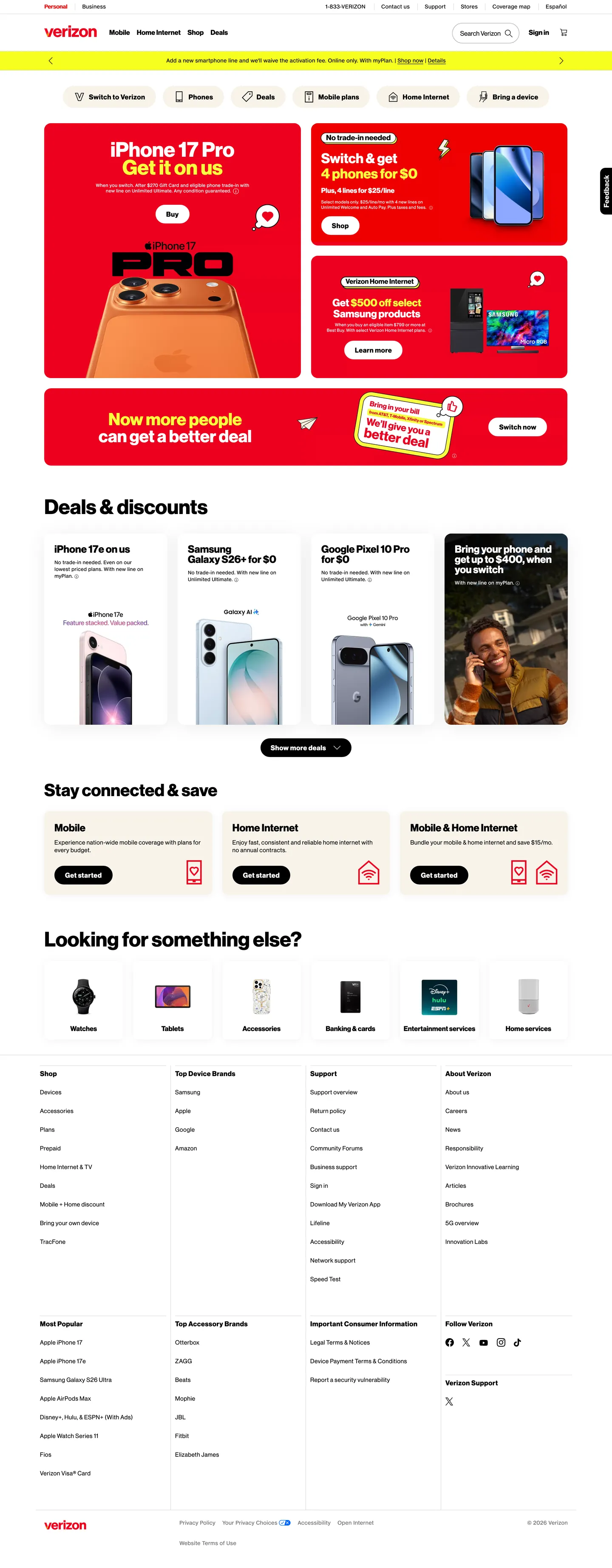
Verizon's marketing site is a retail machine dressed in black ink and white — a system where every primary CTA is a pure-black pill button, every hero headline is white text on a photographic background, and the entire below-fold canvas is white with black text. It is not a brand-first page; it is a deal-first page. The hero panel carries the product hero image (iPhone 17 Pro in a copper-orange finish) behind a black overlay, with a 48px weight-700 headline, and a cream-background pill CTA that reads "Switch to Verizon." Where T-Mobile runs on a magenta canvas and AT&T surrounds its deals with mid-blue, Verizon holds to achromatic authority: the brand speaks through the depth of the retail offer, not through a chromatic brand moment above the fold.
The DESIGN.md file captures 15 colors tokens from the achromatic core — ink black, canvas white, the warm cream (#f8f3e9) used in the hero CTA, the cool mid-gray (#6f7171) used for secondary labels, the neon-yellow (#f8ff3c) used for deal-badge fills, and the brand-registered crimson (#ee001e) that appears on active tab indicators and inline brand marks. Typography tokens span three font families: Verizon NHG DS for body, display, and headings (all at weight 700), BrandFont-Display for nav links and CTA labels (weight 700, 0.5px tracking), and Verizon NHG eTX for fine-print legal captions (11px / 400). Twelve components cover the pill primary button, the black secondary ghost button, the product card, the category-tab strip, the deal-badge chip, and the text input.
Feed this file to Claude or Cursor and it reproduces Verizon's specific moves: black primary buttons instead of colored CTAs, 44px full-pill rounding on the primary action only, weight-700 display across every heading tier without exception, and the neon-yellow deal badge reserved for promotional emphasis. The system is worth studying because its achromatic discipline is commercially precise — black conveys authority and network scale; the cream hero CTA inverts cleanly against the photographic background; the neon-yellow badge cannot be missed in a grid of device cards. Each color decision has a conversion reason.
What makes it distinct
5
- Black-binary canvaspure black ink on white canvas for every primary surface; the brand color is reserved for tab indicators and inline marks, not CTAs
- Neon-yellow deal badgeelectric yellow appears on promotional chips and sale flags, the loudest color on an otherwise achromatic retail page
- 44px pill buttonsthe primary CTA sits at a fully-rounded 44px pill, the softest shape in a retail grid where everything else has sharp or minimal rounding
- Weight-700 everywhereVerizon NHG DS runs at 700 across display (48px), section headings (40px), and sub-headings (24px); no light-weight display tier exists
- Three-font splitNHG DS for headings and body, BrandFont-Display for nav and CTA labels, BrandFont-Text for legal fine print
verizon.com
Live at verizon.com
A snapshot of the brand in production. Scroll the frame to see the whole page.
Colors
15 colors
Verizon's system runs on #ee001e as its primary voltage, used in 1 of 14 components. Type is set in Verizon-NHG-DS across 11 tokens from 10px to 48px, weights 400–700. Shape language is soft — components average 16px corner radius, with no sharp interactive edges.
Brand & Accent
Sparing, CTA-only voltage · 1
Surface
Page and card backgrounds · 1
Text
Headlines, body, captions · 2
Borders & Hairlines
Dividers, outlines, rules · 2
Semantic
Status, errors, success, links · 6
Other
Specialty colors · 3
Typography
11 type tokens
Set in Verizon-NHG-DS across 11 tokens, from 10px to 48px, weights 400–700. Shown in its own stack: where the font isn't installed, the fallback the file names stands in.
- display-xl48px · weight 700 · lh 42pxThe quick brown fox jumps over the lazy dog
- display-lg40px · weight 700 · lh 40pxThe quick brown fox jumps over the lazy dog
- heading-md32px · weight 700 · lh 36pxThe quick brown fox jumps over the lazy dog
- heading-sm24px · weight 700 · lh 28pxThe quick brown fox jumps over the lazy dog
- body-lg16px · weight 700 · lh 20px · tracking 0.5pxThe quick brown fox jumps over the lazy dog
- body-md14px · weight 400 · lh 18px · tracking 0.5pxThe quick brown fox jumps over the lazy dog
- brand-nav14px · weight 400 · lh 20px · tracking 0.5pxThe quick brown fox jumps over the lazy dog
- brand-button16px · weight 700 · lh 20px · tracking 0.5pxThe quick brown fox jumps over the lazy dog
- brand-label12px · weight 400 · lh 16pxThe quick brown fox jumps over the lazy dog
- legal-sm11px · weight 400 · lh 16pxThe quick brown fox jumps over the lazy dog
- legal-xs10px · weight 400 · lh 12pxThe quick brown fox jumps over the lazy dog
Layout
Radii and spacing
7 corner radii and 8 spacing values. Shape language: soft.
Radii
- none0px
- xs2px
- sm12px
- md16px
- lg24px
- pill44px
- full9999px
Spacing
- xs4px
- sm8px
- md12px
- base16px
- lg24px
- xl32px
- 2xl48px
- 3xl64px
Components
14 components
Each rendered from its tokens (color, type, radius, padding) on Verizon's own canvas.
- Button Primarybutton-primaryButton Primary
- Button Primary Herobutton-primary-heroButton Primary Hero
- Button Secondarybutton-secondaryButton Secondary
- Top Navtop-navTop Nav
- Nav Linknav-linkNav Link
- Hero Headinghero-headingHero Heading
- Section Headingsection-headingSection Heading
- Body Paragraphbody-paragraphBody Paragraph
- CardcardCard
- Deal Badge Chipdeal-badge-chipDeal Badge Chip
- Category Tabcategory-tabCategory Tab
- Category Tab Activecategory-tab-activeCategory Tab Active
- Type here…text-inputText Input
- Legal Captionlegal-captionLegal Caption
In use
The system, in use
Verizon's tokens on the kind of product it builds.
Build something people actually use.
A short paragraph of marketing copy that previews how the brand's display tier and body tier read together. Two sentences is usually enough.
FAQ
Verizon design system FAQ
Common questions about Verizon's tokens, components, and how to use this DESIGN.md in your project.
Read next
Related reading
Specs, directories, and component libraries that pair with this design system.
- Browse all design systemsThe full directory of DESIGN.md files on shadcn.io, with live mockups for each.shadcn.io
- Verizon — official siteVerizon's public marketing site — the source of truth for the live tokens captured in this file.verizon.com (opens in a new tab)
- The DESIGN.md specificationGoogle Labs' open spec for machine-readable design system files — the format this page is built on.github.com (opens in a new tab)
Use it
Use Verizon in your project
One machine-readable file. Drop it into Claude, Cursor, or any AI tool that reads DESIGN.md.
Download the DESIGN.md
One machine-readable file: every color, type, radius, spacing, and component token of Verizon.
Feed it to your AI tool
Drop it into Claude, Cursor, or GitHub Copilot. The agent writes React components and Tailwind classes that match Verizon's visual language.
Reference the tokens directly
Or paste the values into your Tailwind config, CSS variables, or component library: every color, size and radius is a quoted, ready-to-copy value.
Read the full DESIGN.md: overview, rationale, do’s and don’ts
Overview
Verizon's marketing site operates on a retail axiom that most telecom brands abandon: Achromatic authority. The entire primary surface — buttons, nav, product headings, card borders — runs in pure black and white. The brand-registered crimson is held so far in reserve that only active tab indicators carry it. Where T-Mobile saturates the above-fold hero in magenta and AT&T tints its whole canvas in a middle blue, Verizon treats color as a scarcity and lets the retail offer carry the weight.
The one exception is the deal-badge system. Electric neon-yellow (#f8ff3c) appears on promotional chips, savings callouts, and limited-time-offer banners — the single chromatic signal in a page otherwise built on black ink and white canvas. The yellow reads instantly against any context precisely because every other surface has surrendered color. This is not accidental; it is a conversion mechanism. The neon badge says "savings" in a retail page without needing a label.
Typography is a single-weight statement: weight 700 runs from the 48px hero headline down to the 16px button label without pause. Verizon NHG DS at 700 is the page's voice — confident, unhesitating, commercial. There is no light-weight display tier, no weight-300 magazine moment. Three font families divide labor: NHG DS for everything that needs to be read, BrandFont-Display for everything that needs to be clicked, and the legal NHG eTX for fine print.
Key Characteristics:
- Pure ink black (#000000) dominates with 933 occurrences — 472 as text, 443 as border.
- 44px fully-rounded pill geometry on primary CTAs — the warmest shape in an otherwise sharp retail grid.
- Electric neon-yellow (#f8ff3c) deal badge — the only chromatic element in a black-and-white marketing system, reserved for savings callouts.
- Crimson (#ee001e) restricted to active tab indicators and inline brand marks — 6 total occurrences, none on CTAs.
- Three proprietary font families: NHG DS (headings + body), BrandFont-Display (nav + buttons), NHG eTX (legal fine print).
- Weight-700 from 48px display down to 16px buttons — no lighter display weight exists on the page.
- 1232px content well with 24px gutters; product cards 4-up with 1px black hairline borders.
- Hero CTA uses warm cream fill (#f8f3e9) — a deliberate inversion against the photographic background.
Colors
Brand
- Crimson (
{colors.primary}— #ee001e): frequency 6. Used as background (4), text (1), border (1). The registered Verizon brand mark — appears on active tab indicators in the nav strip. Not used on primary CTAs or hero elements. Wired as--vui-theme-color-element-brandand--vui-theme-color-tabs-indicator-highlight-selected. The rarity is the discipline.
Surface
- Ink (
{colors.ink}— #000000): frequency 933. Used as text (472), border (443), background (5), shadow (13). The dominant color across the entire page — primary button fill, card borders, all body text, focus rings. Wired across 15 CSS custom properties including--vui-theme-color-button-primary-backgroundand--vui-theme-color-element-primary. Not near-black or charcoal: pure #000000. - Canvas (
{colors.canvas}— #ffffff): frequency 130. Used as text (55), background (24), border (51). Page floor, primary button text color, icon fills. Wired as--vui-theme-color-surfaceand--background-color. - Hero CTA Fill (
{colors.hero-cta-fill}— #f8f3e9): frequency 15. A warm cream — the background and border color of the hero CTA pill button, providing contrast against the photographic hero background. Wired as--vz-gpt-gradient-header. Not used on any below-fold elements.
Accent
- Deal Badge (
{colors.deal-badge}— #f8ff3c): frequency 11. Used as text (4), background (3), border (4). The neon-yellow promotional accent — deal badges, savings chips, limited-time-offer banners. The sole chromatic element in an achromatic system. Its high chroma reads across all device contexts without being tied to any brand narrative except "save money now."
Supporting
- Ink Secondary (
{colors.ink-secondary}— #6f7171): frequency 14. Used as text (7) and border (7). Secondary labels, scrubber controls, footnote text. Wired as--vui-theme-color-element-secondaryand--scrubber-color. A cool mid-gray — not warm, not blue-gray. - Hairline (
{colors.hairline}— #d8dada): wired as--border-color. The system's light-hairline variant, used for subtle dividers and table row backgrounds. - Disabled BG (
{colors.disabled-bg}— #cccccc): low-contrast fill for disabled button surfaces.
Semantic
- Success (
{colors.success}— #008331): wired as--vui-theme-color-feedback-element-successand--vui-theme-color-element-savings. Used for savings and success feedback states. - Info (
{colors.info}— #006fc0): wired as--vui-theme-color-feedback-element-information. Information states. - Error Element (
{colors.error-element}— #b95319): wired as--vui-theme-color-feedback-element-error. Error states. - Warning Element (
{colors.warning-element}— #ffcd27): wired as--vui-theme-color-feedback-element-warning. Warning states. - Feedback Success Tonal (
{colors.feedback-success-tonal}— #a4e6bd): light background tint for success feedback banners. - Feedback Warning Tonal (
{colors.feedback-warning-tonal}— #ffe797): light background tint for warning feedback banners.
Typography
Font Families
The system runs three proprietary families. Verizon NHG DS (New Heritage Grotesque Display Standard) is the primary text voice — used for display headings (48px), section headings (40px / 32px / 24px), body text (14-16px), and any text that needs to be read at length. BrandFont-Display handles every interactive label: nav links (14px), button labels (16px), and UI-chrome text where tracking matters. Verizon NHG eTX (Extended Text) handles fine-print legal disclaimers at 10-11px / weight 400 — the only light-weight tier in the entire system.
Hierarchy
| Token | Family | Size | Weight | Use |
|---|---|---|---|---|
{typography.display-xl} | NHG DS | 48px | 700 | Hero h1 ("iPhone 17 Pro") |
{typography.display-lg} | NHG DS | 40px | 700 | Section h2 ("Deals & discounts") |
{typography.heading-md} | NHG DS | 32px | 700 | Section sub-headlines |
{typography.heading-sm} | NHG DS | 24px | 700 | Card headings, h3 |
{typography.body-lg} | NHG DS | 16px | 700 | Link text, emphasized body |
{typography.body-md} | NHG DS | 14px | 400 | Running body text, card descriptions |
{typography.brand-nav} | BrandFont-Display | 14px | 400 | Top-nav link labels |
{typography.brand-button} | BrandFont-Display | 16px | 700 | Button labels |
{typography.brand-label} | BrandFont-Text | 12px | 400 | Fine labels, badge text |
{typography.legal-sm} | NHG eTX | 11px | 400 | Disclaimer text |
{typography.legal-xs} | NHG eTX | 10px | 400 | Footnote characters |
Principles
Weight 700 is the system's only significant weight for anything displayed above 12px. This is not an oversight — it is a retail strategy. Bold text reads faster in a scanning environment. The 0.5px letter-spacing on nav and button labels is a micro-detail that tightens BrandFont-Display at its display sizes. Inter at weight 700 with 0.5px tracking is the closest open-source substitute for both NHG DS and BrandFont-Display in their primary roles.
Layout
- Content well: 1232px max-width (--vui-root-content-well-max-width), with 24px gutters (--vui-root-content-well-margin).
- Full-bleed max: 1600px (--vui-root-max-bleed-max-width) for the hero band.
- Base unit: 8px. Major spacing values: 12px (button padding vertical), 16px (card internal), 24px (section gap), 64px (section rhythm).
- Product card grid: 4-up at desktop, each card at 12px corner radius and 1px black hairline border, 16px internal padding.
- Hero: full-bleed photographic background, content centered, headline white at 48px / 700.
Elevation
The system uses essentially no shadow tier. The 13 #000000 shadow occurrences are concentrated on the black inset-shadow that defines the focus ring treatment (--vui-theme-color-interactive-focusring). Product cards use 1px black hairline borders rather than elevation shadows — a hard-line retail convention that makes the grid feel like a printed circular rather than a floating SaaS dashboard.
Shapes
The radius scale is asymmetric: extremely soft on interactive controls (44px pill), sharply minimized on data surfaces.
{rounded.none}0px — hero section, full-bleed bands.{rounded.xs}2px — the system's minimum rounding, used 10 times (deal badges, form inputs).{rounded.sm}12px — product cards, modal dialogs.{rounded.md}16px — image thumbnails, larger content tiles.{rounded.lg}24px — feature callout tiles.{rounded.pill}44px — primary and secondary CTA buttons, the dominant radius on the page (13 occurrences).{rounded.full}9999px / 50% — avatar circles and icon buttons.
The 44px pill on CTAs sits above a 2px deal badge and a 12px card in the same layout — the contrast is intentional. The pill says "tap me" in an environment where everything else signals "read me."
Components
button-primary — Pure-black fill (#000000), white text, BrandFont-Display at 16px / 700, 44px full-pill radius, 11×24px padding. Used for all below-fold primary actions ("Shop now," "See all phones").
button-primary-hero — Warm-cream (#f8f3e9) fill, black text, same pill and padding geometry as the primary. Used in the hero panel only — the cream contrasts cleanly against the photographic background where a pure-black fill would merge with the device shadow.
button-secondary — Transparent fill, black ink text, 1px black border, same pill radius. The ghost treatment — used for secondary CTAs paired beside a primary.
top-nav — White canvas, 56px height, brand-red "verizon" wordmark at left, product nav links in the center, cart / search / account icons right. 1px black bottom rule divides nav from hero.
nav-link — Transparent background, black text at BrandFont-Display 14px / 400 / 0.5px tracking, 8×12px padding. No hover fill visible in the captured surface.
hero-heading — White text on the photographic hero background, NHG DS at 48px / 700. 0 border-radius, 16px bottom padding separating headline from sub-copy.
section-heading — Black text, NHG DS at 40px / 700. Used for "Deals & discounts," "Stay connected & save," "Looking for something else?"
body-paragraph — Black text at NHG DS 14px / 400 / 0.5px tracking. Running card descriptions and section sub-copy.
card — White surface, 1px black hairline border, 12px corner radius, 16px internal padding. Holds the product device image, pricing headline, and a primary CTA. No shadow.
deal-badge-chip — Neon-yellow (#f8ff3c) fill, black text at BrandFont-Text 12px / 400, 2px radius, 4×8px padding. The page's single chromatic element — appears only on promotional savings callouts.
category-tab — Transparent background, black text at BrandFont-Display 14px, 12px bottom padding, no bottom border in resting state.
category-tab-active — Crimson text (#ee001e) and a 2px crimson underline border. The brand color's only visible appearance in the page chrome.
text-input — White surface, black text at NHG DS 14px / 400, 2px radius, 12×16px padding, 44px height, 1px black border.
legal-caption — NHG eTX at 11px / 400, ink-secondary (#6f7171) text, no background. Used for pricing disclaimers under promotional offers.
Do's and Don'ts
Do use pure #000000 — not a near-black or charcoal — for the primary button fill. The system's conviction is total black: 933 occurrences of the same hex, zero near-duplicates. A softer off-black reads as indecision in this context.
Do reserve the neon-yellow (#f8ff3c) exclusively for savings and promotional content. It is the page's single chromatic interruption; placing it on nav, headings, or general UI elements removes its ability to signal "deal" in a scanning context.
Do hold the crimson (#ee001e) to the tab-indicator role only. Using it on buttons or hero elements breaks the achromatic authority that makes the system distinctive; it would read as a standard telco rather than as a confident network brand.
Do use the warm cream (#f8f3e9) for the hero-context CTA only. Against the photographic background it reads as an inverted primary; on the white canvas below the fold it would disappear.
Don't use a rounded corner value between 2px and 12px. The radius scale jumps from 2px (inputs and badges) to 12px (cards) — nothing in between. Introducing a 6px or 8px value softens the retail-grid aesthetic without the warmth of the pill.
Don't use weight 400 for any heading above 14px. The system runs weight 700 at every heading tier without exception; introducing a lighter weight above the body level would read as a design inconsistency against the 933-occurrence ink-black authority.
Don't use {colors.deal-badge} (#f8ff3c) as a text color at small sizes (below 14px). The neon-yellow has insufficient contrast against white at body text sizes; its 11 page occurrences are all as background fills or large-format badge text.
Don't add a tinted shadow to product cards. The 1px black hairline border is the entire elevation system — adding a box-shadow competes with the border and softens the retail-circular aesthetic the brand uses to signal "this is a deal page, not a lifestyle brand."
Known Gaps
- Hover and focus states: only the focus-ring token is captured (
--vui-theme-color-interactive-focusring: #000000). Full hover, active-press, and disabled states are not exposed on the captured marketing surface. - Dark mode: the captured page is light-only. The
--vui-theme-color-buttonicon-highcontrast-background-elevatedand related elevated tokens suggest a dark-surface context exists in the product app but does not appear on the marketing site. - Motion and carousel: the product-card carousel (with previous/next arrow icons baked into CSS custom properties) animates on interaction; easing curves and duration are not captured.
- Icon library: Verizon ships its own SVG icon set via CSS custom properties (right-caret, left-caret, checkmark, warning, info, error, close, left-arrow, right-arrow). These are base64-encoded inline SVGs in the CSS variables — not external icon font references.
- Sub-brand surfaces: My Verizon dashboard, the Fios internet sub-site, and the Business section carry their own surface tokens not captured in the marketing site extraction.
- Responsive breakpoints: tablet and mobile layouts compress the 4-up card grid and collapse the top-nav to a hamburger; those breakpoint-specific changes are not captured here.
Consumer Electronics
More systems like this
More DESIGN.md files in Consumer Electronics.
Pricing
Build it with Pro
The DESIGN.md files are free. Pro adds 6,000+ blocks, premium templates and the MCP server, so your AI editor builds in your system for you.
4.9/5 out of 5 · 150+ reviewsfrom 150+ founders and developers.
Billing
Billed once a year in USD. Cancel anytime.
- How many people can use the license.
- Client work, SaaS products and anything you charge for.
- Production-ready React sections: hero, pricing, features, dashboards and more.
- Complete multi-page sites you can ship as they are.
- React icons from every major library, installable with one command.
- Presets that restyle every block, in light and dark.
- Lets your AI editor search, preview and install blocks for you.
- Priority requests are answered first.
Individual
For personal projects & open source
$32instead of $49/mo
$389 billed yearly
- Seats: 1 seat
- Commercial use: Personal & open source only
- Pro blocks: 6,000+ blocks
- Templates: All 14 templates
- React icons: 294k+ icons
- Themes: All 59 themes
- MCP server: Basic usage
- Support: Standard
Team
Most popularFor freelancers, agencies & startups
$66instead of $99/mo
$789 billed yearly · ≈ $13/dev/mo
- Seats: Up to 5 seats
- Commercial use: Included
- Pro blocks: 6,000+ blocks
- Templates: All 14 templates
- React icons: 294k+ icons
- Themes: All 59 themes
- MCP server: High usage
- Support: Priority
Organization
For companies with larger teams
$132instead of $199/mo
$1,589 billed yearly
- Seats: Unlimited seats
- Commercial use: Included
- Pro blocks: 6,000+ blocks
- Templates: All 14 templates
- React icons: 294k+ icons
- Themes: All 59 themes
- MCP server: Unlimited usage
- Support: Priority
Billed once a year in USD. Cancel anytime.
Individual
For personal projects & open source
$32instead of $49/mo
$389 billed yearly
- How many people can use the license.Seats: 1 seat
- Client work, SaaS products and anything you charge for.Commercial use: Personal & open source only
- Production-ready React sections: hero, pricing, features, dashboards and more.Pro blocks: 6,000+ blocks
- Complete multi-page sites you can ship as they are.Templates: All 14 templates
- React icons from every major library, installable with one command.React icons: 294k+ icons
- Presets that restyle every block, in light and dark.Themes: All 59 themes
- Lets your AI editor search, preview and install blocks for you.MCP server: Basic usage
- Priority requests are answered first.Support: Standard
Team
Most popularFor freelancers, agencies & startups
$66instead of $99/mo
$789 billed yearly · ≈ $13/dev/mo
Everything in Individual, plus
- How many people can use the license.Seats: Up to 5 seats
- Client work, SaaS products and anything you charge for.Commercial use: Included
- Lets your AI editor search, preview and install blocks for you.MCP server: High usage
- Priority requests are answered first.Support: Priority
Organization
For companies with larger teams
$132instead of $199/mo
$1,589 billed yearly
Everything in Team, plus
- How many people can use the license.Seats: Unlimited seats
- Lets your AI editor search, preview and install blocks for you.MCP server: Unlimited usage
- Secure checkout via Stripe
- Code lives in your repo
- Keep what you've shipped if you cancel
- License terms
Your system, built for you
Every block, template and icon, installed by your AI agent in your design system. The DESIGN.md files stay free.