Vans Design System
Vans's marketing-site design system as a DESIGN.md file. Pure black borders at 522 occurrences, near-white canvas, FannDoren Condensed display at 64px, no accent color. Tokens for React, Next.js, and AI tools.
Add shadcn.io to your AI agent. · Pro It installs blocks, icons and templates in your design system from a prompt, with Pro.
Set up MCP- Primary
- #1c1c1c
- Typeface
- FannDorenGrotesque
- Shape
- Sharp
- Base radius
- 5px
- Colors
- 7
- Type tokens
- 9
- Components
- 15
- Spacing values
- 6
About
About Vans DESIGN.md
Curated by Vans · Updated May 19, 2026 · Source vans.com (opens in a new tab)
Vans's marketing site does what no other lifestyle-footwear brand attempts. The chrome is reduced to two colors: a near-white body floor #f3f3f3 and a pure-black hairline #000000 that carries 522 of the 535 captured border occurrences on the page. There is no accent voltage. There is no brand color in the nav, the buttons, the filters, or the footer. The wordmark sits inside the photographic hero — not above it as a separate brand chip — and every chromatic statement on the page comes from the product imagery and the photography of skaters wearing the product. Where Nike paints its hero in red-and-volt and where Adidas leans on the three-stripe black-blue, Vans gives the photographs the entire chromatic budget and leaves the chrome to disappear.
The DESIGN.md file packages the system into a machine-readable spec for React tooling. Inside: 7 colors tokens drawn from the 8 raw values rendered on the captured page — pure black, near-black ink #262424 (482 occurrences), pure white, near-white canvas #f3f3f3 (48 occurrences), plus a light-mode focus-ring blue #93c5fd that ships in the CSS but never renders chromatic against a black-and-white surface; 9 typography tokens running FannDoren Condensed at 24-64px in weight 500 for display and FannDoren Grotesque at 12-20px in weight 400-500 for everything else; a severe 4-step radius scale of 2 / 4 / 5 / 9999px; and 15 components definitions covering the photographic-hero banner, the filter-chip pill row, the product-card grid, the email-signup band, and the two-column footer.
Feed this file to Claude or Cursor and it reproduces Vans's specific moves: black-and-near-white chrome with no accent voltage, edge-to-edge photographic hero with the wordmark inside the image, FannDoren Condensed reserved for editorial display, severe 2px card rounding, and the 9999px filter-pill exception. The one move worth borrowing only if you have a strong photography pipeline and a real-world brand: the willingness to give the chrome no chromatic voice at all. Most consumer brands cannot resist a CTA accent — Vans can, because the rubber-soled shoe on the page does all the work the chrome would otherwise do.
What makes it distinct
5
- Pure-black border discipline#000000 carries 522 of 535 captured border occurrences with no second hairline tone; the system draws every card outline in 1px black
- No accent color in chromechromatic work happens entirely inside product photography; the wordmark, nav, filters, and footer share the same two-color black-and-near-white voice
- Two-family FannDoren splitCondensed at 64px / weight 500 for editorial display, Grotesque at 12-16px / weight 400-500 for body and metadata
- Severe 2px radius35 of 43 captured surfaces sit at 2px; the only escape is a 9999px pill for filter chips and CTAs, a 4-5px middle on inputs
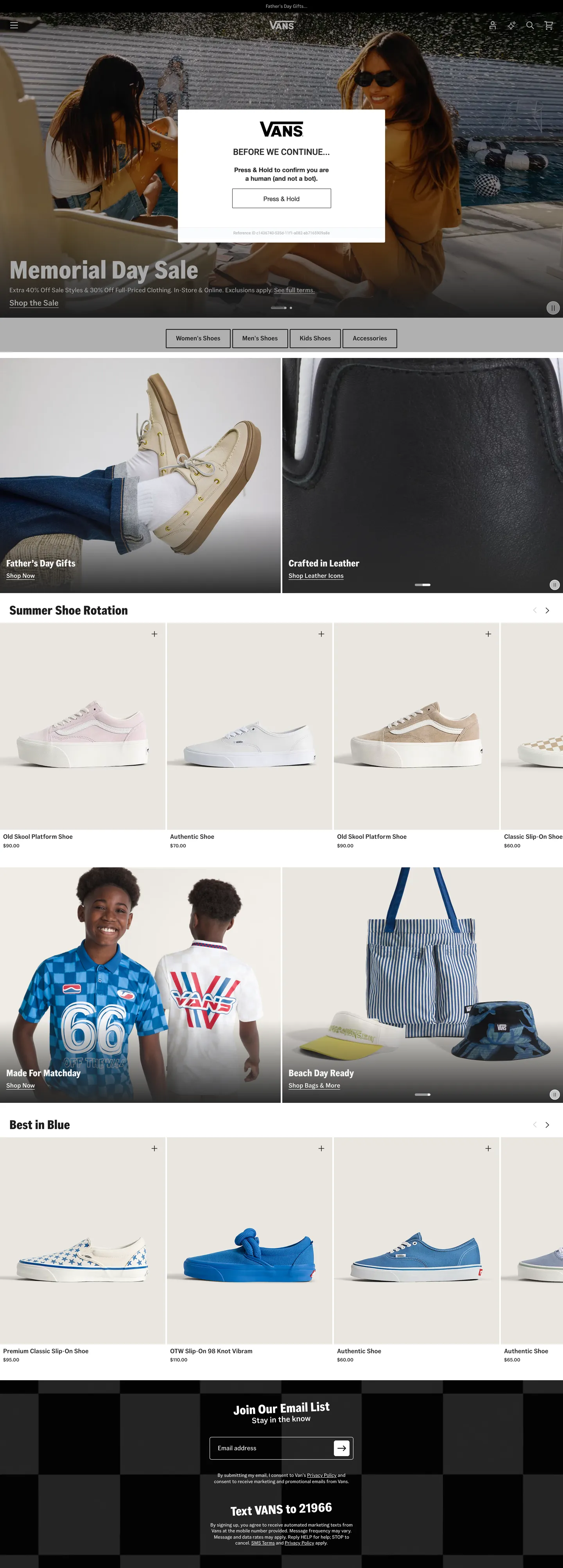
- Edge-to-edge photograph herothe Memorial Day Sale banner spans the full viewport with overlaid wordmark and CTA; product imagery does every chromatic job the chrome refuses
vans.com
Live at vans.com
A snapshot of the brand in production. Scroll the frame to see the whole page.
Colors
7 colors
Vans's system anchors on #1c1c1c (ink-secondary) as its primary color. Type is set in FannDorenGrotesque across 9 tokens from 12px to 64px, weights 400–500. Shape language is sharp — components average 2px corner radius, favoring crisp rectangles.
Surface
Page and card backgrounds · 2
Text
Headlines, body, captions · 3
Borders & Hairlines
Dividers, outlines, rules · 1
Other
Specialty colors · 1
Typography
9 type tokens
Set in FannDorenGrotesque across 9 tokens, from 12px to 64px, weights 400–500. Shown in its own stack: where the font isn't installed, the fallback the file names stands in.
- display-xl64px · weight 500 · lh 64pxThe quick brown fox jumps over the lazy dog
- display-md32px · weight 500 · lh 32pxThe quick brown fox jumps over the lazy dog
- display-sm24px · weight 500 · lh 24pxThe quick brown fox jumps over the lazy dog
- heading-md20px · weight 500 · lh 25.6pxThe quick brown fox jumps over the lazy dog
- body-md16px · weight 400 · lh 24pxThe quick brown fox jumps over the lazy dog
- body-input16px · weight 400 · lh 16pxThe quick brown fox jumps over the lazy dog
- label-md16px · weight 500 · lh 20.48pxThe quick brown fox jumps over the lazy dog
- caption12px · weight 500 · lh 15.36pxThe quick brown fox jumps over the lazy dog
- caption-light12px · weight 400 · lh 15.36pxThe quick brown fox jumps over the lazy dog
Layout
Radii and spacing
5 corner radii and 6 spacing values. Shape language: sharp.
Radii
- none0px
- sharp2px
- sm4px
- md5px
- full9999px
Spacing
- xs2px
- sm4px
- base8px
- md12px
- lg16px
- xl24px
Components
15 components
Each rendered from its tokens (color, type, radius, padding) on Vans's own canvas.
- Button Primarybutton-primaryButton Primary
- Button Cta Pillbutton-cta-pillButton Cta Pill
- Button Secondarybutton-secondaryButton Secondary
- Filter Chipfilter-chipFilter Chip
- Top Navtop-navTop Nav
- Nav Linknav-linkNav Link
- Photo Herophoto-heroPhoto Hero
- Hero Headinghero-headingHero Heading
- Section Headingsection-headingSection Heading
- Body Paragraphbody-paragraphBody Paragraph
- Product Cardproduct-cardProduct Card
- Product Card Labelproduct-card-labelProduct Card Label
- Email Signup Bandemail-signup-bandEmail Signup Band
- Type here…text-inputText Input
- FooterfooterFooter
In use
The system, in use
Vans's tokens on the kind of product it builds.
Build something people actually use.
A short paragraph of marketing copy that previews how the brand's display tier and body tier read together. Two sentences is usually enough.
FAQ
Vans design system FAQ
Common questions about Vans's tokens, components, and how to use this DESIGN.md in your project.
Read next
Related reading
Specs, directories, and component libraries that pair with this design system.
- Browse all design systemsThe full directory of DESIGN.md files on shadcn.io, with live mockups for each.shadcn.io
- Vans — official siteVans's public marketing site — the source of truth for the live tokens captured in this file.vans.com (opens in a new tab)
- The DESIGN.md specificationGoogle Labs' open spec for machine-readable design system files — the format this page is built on.github.com (opens in a new tab)
Use it
Use Vans in your project
One machine-readable file. Drop it into Claude, Cursor, or any AI tool that reads DESIGN.md.
Download the DESIGN.md
One machine-readable file: every color, type, radius, spacing, and component token of Vans.
Feed it to your AI tool
Drop it into Claude, Cursor, or GitHub Copilot. The agent writes React components and Tailwind classes that match Vans's visual language.
Reference the tokens directly
Or paste the values into your Tailwind config, CSS variables, or component library: every color, size and radius is a quoted, ready-to-copy value.
Read the full DESIGN.md: overview, rationale, do’s and don’ts
Overview
Vans's marketing site does what no other lifestyle-footwear brand attempts. Chrome-less brand voice. The page reduces its UI vocabulary to two colors — a near-white body floor {colors.canvas} (#f3f3f3) and a pure-black hairline {colors.hairline} (#000000) that carries 522 of the 535 captured border occurrences. There is no accent voltage. There is no brand color in the nav, the buttons, the filters, or the footer. The Vans wordmark sits inside the photographic hero — not above it as a separate brand chip — and every chromatic statement on the page comes from the product imagery and the photography of skaters wearing the product. Where Nike paints its hero in red-and-volt and Adidas leans on the three-stripe black-blue, Vans gives the photographs the entire chromatic budget and leaves the chrome to disappear.
The discipline runs across every UI atom. The primary CTA pill is black-on-white. The filter chips are 1px-black-bordered with a pure-white fill. The product cards are 1px-black-bordered with a pure-white fill. The email-signup band at the bottom of the page is the only inverse moment — a full-bleed pure-black canvas with white text and a white-bordered email field, used once. The footer continues that pure-black canvas under the email-signup band. Every other surface stays on {colors.canvas} (#f3f3f3) or {colors.canvas-pure} (#ffffff) with black ink and black borders. A light-mode focus-ring blue {colors.focus-ring} (#93c5fd) ships in the CSS as the UnoCSS --un-ring-color utility variable but never renders chromatic against the captured surface — the system declares it as an accessibility affordance and then keeps it invisible.
Typography is FannDoren split across two families. FannDoren Condensed at 24–64px in weight 500 carries editorial display ("Memorial Day Sale" at 64px in the hero, "Summer Shoe Rotation" at 32px on section headers, "Best in Blue" at 32px on category-row labels). FannDoren Grotesque at 12–20px in weight 400–500 carries every nav link, product-card metadata, body paragraph, and footer label. The system never reaches for weight 700 — even the loud display headlines at 64px hold at weight 500, a deliberately editorial-magazine restraint that pairs with the no-accent-color chrome to give the page a printed-catalog feel rather than an e-commerce-template feel.
Key Characteristics:
- No accent color in chrome — every brand surface stays in black-and-near-white; chromatic work happens only inside product photography.
- Pure-black hairline
{colors.hairline}(#000000) at 522 of 535 captured border occurrences; the system has essentially no second hairline tone. - Near-white body canvas
{colors.canvas}(#f3f3f3) instead of pure white — the warmth keeps the high-contrast geometry from reading sterile. - Two-family FannDoren split: Condensed for display at 24-64px / weight 500, Grotesque for body and metadata at 12-20px / weight 400-500.
- Severe 4-step radius scale — 2 / 4 / 5 / 9999px. No 8 / 12 / 16 / 20px middle tier; either essentially square or full pill.
- 9999px pill reserved for filter chips and the email-signup CTA — the only "soft" surfaces on the page.
- Pure-black
{colors.hairline}doubles as the email-signup band and footer canvas fill — the only inverse-mode surfaces. - 4px base spacing unit. Tokens cluster at 4 / 8 / 16 / 24px with a 2px micro-step for tight metadata rows.
Colors
Text
- Ink (
{colors.ink}— #262424): frequency 482 — 442 as text, 29 as background, 5 as border. The near-black ink color of the system. Sits one step warmer and one step lighter than pure black. Carries every product-card title, every nav link, every body paragraph. The text-dominant value. - Ink Secondary (
{colors.ink-secondary}— #1c1c1c): frequency 4 as text. The slightly-darker text variant used for the email-signup body copy on the pure-black band — sits between the near-black ink and pure black for readability against the black canvas. - Ink Tertiary (
{colors.ink-tertiary}— #cfcfcf): frequency 6 — 4 as text, 2 as background. A pale-gray secondary tone used for disabled-state product-card overlays and small caption rows.
Surface
- Canvas (
{colors.canvas}— #f3f3f3): frequency 48 — 33 as text, 12 as gradient, 2 as background. The near-white body floor and the dominant white-on-black text color (used as the email-signup band text fill). Not pure white; the warmth softens the high-contrast geometry of the black-bordered cards. - Canvas Pure (
{colors.canvas-pure}— #ffffff): frequency 71 — 50 as text, 14 as background, 6 as border. Pure white. Used inside product cards, filter chips, and the top-nav surface where the warmth of{colors.canvas}would compete with photographic content.
Hairline
- Hairline (
{colors.hairline}— #000000): frequency 528 — 522 as border, 2 as background, 2 as shadow, 1 as text, 1 as gradient. The dominant border tone — wired in the CSS as--un-default-border-color(UnoCSS default). The structural value that does every elevation, divider, and outline job in the system. Also functions as the full-bleed background of the email-signup band and the footer canvas.
Accessibility
- Focus Ring (
{colors.focus-ring}— #93c5fd): a pale-blue focus-ring color declared in the CSS as--un-ring-color(UnoCSS utility default) but never rendered in the captured page. Reserved as an accessibility affordance for keyboard-focus states on form inputs and tabbable surfaces. The single chromatic value in the entire token set, deliberately invisible against the page chrome.
Typography
Font Families
The system runs two families from the FannDoren foundry set. FannDoren Condensed at 24-64px in weight 500 carries editorial display: "Memorial Day Sale" at 64px in the photographic hero, "Summer Shoe Rotation" and "Best in Blue" at 32px on section headers, smaller display tier at 24px on category-row labels. FannDoren Grotesque at 12-20px in weight 400-500 carries every nav link, product-card metadata, body paragraph, and footer label. Arial is the declared fallback for both: FannDorenCondensed, Arial, sans-serif and FannDorenGrotesque, Arial, sans-serif. The two families share the same weight discipline — both stay at weight 400-500, never above.
Hierarchy
| Token | Size | Weight | Line Height | Use |
|---|---|---|---|---|
{typography.display-xl} | 64px | 500 | 64px | Photographic-hero h2 ("Memorial Day Sale") |
{typography.display-md} | 32px | 500 | 32px | Section h2 ("Summer Shoe Rotation", "Best in Blue") |
{typography.display-sm} | 24px | 500 | 24px | Smaller category-row labels (Condensed) |
{typography.heading-md} | 20px | 500 | 25.6px | Sub-section titles (Grotesque) |
{typography.body-md} | 16px | 400 | 24px | Default running text, paragraph body |
{typography.body-input} | 16px | 400 | 16px | Email-signup input text |
{typography.label-md} | 16px | 500 | 20.48px | Nav links, button labels, CTA text |
{typography.caption} | 12px | 500 | 15.36px | Product-card metadata, footer category labels |
{typography.caption-light} | 12px | 400 | 15.36px | Disclaimer copy, micro-fine print |
Principles
The split between Condensed and Grotesque carries the page's vertical hierarchy. Condensed signals "editorial / display" — section headers and the hero use it exclusively. Grotesque signals "interface / metadata" — every nav link, button label, and product-card caption uses it. The display weight stays at 500 across all sizes, even at 64px; the system never reaches for 700+ weight. Where Nike's display tier sits at 800-900 black weight and Adidas hits weight 700 on hero h1s, Vans's editorial restraint at weight 500 reads more printed-catalog than e-commerce-template.
Note on Font Substitutes
FannDoren is a licensed foundry family. The closest open-source substitute for FannDoren Condensed is Oswald at weight 500 or Roboto Condensed at the same weights — both transfer the narrow-stem display feel. For FannDoren Grotesque, Inter or Manrope at weight 400-500 transfer cleanly at body sizes. Arial is already the declared fallback in the CSS, so the system degrades gracefully without any substitution work. The weight discipline — never above 500 — is the move to preserve regardless of which family you swap in.
Layout
Spacing System
- Base unit: 4px — the dominant gap value, appearing 83 times in the captured page; 8px is the next most-common at 51 occurrences.
- Tokens:
{spacing.xs}2px ·{spacing.sm}4px ·{spacing.base}8px ·{spacing.md}12px ·{spacing.lg}16px ·{spacing.xl}24px. - Section padding (vertical): 24px between major bands; the photographic hero and product-grid rows sit edge-to-edge with no outer padding.
- Card internal padding: the product cards use no internal padding — the image fills the card edge-to-edge with the caption row sitting beneath, padded at 4px.
- Top-nav padding: 12x24 (
{spacing.md}vertical,{spacing.xl}horizontal).
Grid & Container
- Max content width: the page runs near full-bleed at desktop — product grids span ~1440px without a centered container, and the photographic hero and email-signup bands extend edge-to-edge.
- Photographic hero: full-bleed
{colors.hairline}background with a photograph of skaters overlaid; the Vans wordmark sits inside the photograph rather than above it, and the "Memorial Day Sale" headline overlays the bottom-left of the image at 64px. - Filter row: horizontal scroll-strip of pill chips ("Sneakers / Slip-Ons / Authentic / Old Skool / Sk8-Hi") just below the hero — each chip is 1px-black-bordered with a pure-white fill at 9999px radius.
- Product grid: 2-up rows on the captured surface (collapsing to 4-up at wider viewports), each product card holding a hero image, title in
{typography.caption}, and price row. - Email-signup band: full-bleed pure-black canvas with white text reading "Join Our Email List" plus an email input and submit pill, sits just above the footer.
- Footer: continues the pure-black canvas with white category labels in 2-column layout.
Rhythm
The page alternates between edge-to-edge photographic content (the hero, product-card image rows) and typography-led band breaks (section headers in {typography.display-md}). There is essentially no horizontal padding rhythm — the layout trusts the photography to fill the viewport and uses the section headers as the visual chapter breaks. The only padded surfaces are the email-signup band and the footer, both of which sit on the inverse pure-black canvas.
Elevation
The system has essentially no shadow tier. Pure-black {colors.hairline} 1px borders carry every elevation job the page asks for. The captured shadow occurrences (2 instances of #000000 as shadow, 1 instance of #ffffff as shadow) are confined to declared but-unrendered focus-state tokens (--un-shadow, --un-ring-offset-shadow) from the UnoCSS utility set — neither renders chromatically on the captured surface.
- Flat (no shadow): every body card, every filter chip, every product tile, the email-signup band, the footer — 100% of captured surfaces.
- Border outline:
{colors.hairline}(#000000) at 1px is the only elevation device. Cards, filter chips, and input fields all share the same hairline. - Inverse surfaces: the email-signup band and footer use pure-black
{colors.hairline}as a full-bleed canvas — depth comes from the canvas-color flip rather than from any layered shadow.
Shapes
The radius scale is severe and binary: essentially-square cards plus a full-pill exception, with no middle tier.
{rounded.none}0px — used on the photographic-hero canvas and on the section dividers.{rounded.sharp}2px (35 occurrences — the dominant value) — used on every product card, image tile, filter chip, and section block. Sharp enough to read as zero from a distance.{rounded.sm}4px (2 occurrences) — search and small utility inputs.{rounded.md}5px (3 occurrences) — the email-signup text input.{rounded.full}9999px (3 occurrences) — filter chips and the email-signup submit pill. The only soft surfaces on the page.
There is no 8 / 12 / 16 / 20px middle tier. Either a surface is essentially square or it goes fully round. The choice reinforces the printed-catalog feel: square-cornered cards in a grid, with the only "soft" surfaces being the chips and CTAs.
Components
button-primary — Near-white {colors.canvas} (#f3f3f3) fill, ink text, {rounded.sharp} (2px), 4x16 padding, 32px height. The "Skip to Main Content" accessibility CTA and the small in-content secondary buttons. The captured page favors this near-white-on-black-text variant for body-content CTAs.
button-cta-pill — Pure-black {colors.hairline} fill, pure-white text, {rounded.full} 9999px pill, 12x24 padding, 48px height. The hero CTA and the email-signup submit affordance — the only fully-rounded buttons in the system.
button-secondary — Pure-white {colors.canvas-pure} fill, ink text, 1px black border, {rounded.sharp} 2px radius. The outline alternative used inside cards and below product images.
filter-chip — Pure-white {colors.canvas-pure} fill, ink text, 1px black border, {rounded.full} 9999px pill, 8x12 padding, 32px height. The filter strip below the hero (Sneakers / Slip-Ons / Authentic / Old Skool / Sk8-Hi). The only soft-edge surface in the body content.
top-nav — Pure-white surface, 56px height, ink text. Vans wordmark flush left in pure-black, primary nav links (Shoes / Clothing / Accessories / Customs / Sale) center, right-aligned account / cart icons. The wordmark is the only "logo" instance on the page — every other Vans mark sits inside product photography.
nav-link — Transparent background, ink text in {typography.label-md} (16px / 500), 8x12 padding. No hover background visible in the captured surface.
photo-hero — Pure-black {colors.hairline} background fill with photographic content overlay, edge-to-edge with no radius and no padding. The hero spans the full viewport; the Vans wordmark and 64px Condensed display headline overlay the photograph at the bottom-left.
hero-heading — Near-white {colors.canvas} text on the photographic-hero overlay, {typography.display-xl} (64px / 500). The "Memorial Day Sale" tier — FannDoren Condensed at the loudest display step.
section-heading — Ink text, {typography.display-md} (32px / 500). Used for "Summer Shoe Rotation," "Best in Blue," "Made for Skating" category-row headers — FannDoren Condensed at the section step.
body-paragraph — Default ink running-text at {typography.body-md} (16px / 400).
product-card — Pure-white {colors.canvas-pure} fill, ink text, 1px black border, {rounded.sharp} 2px radius, 0 padding. The image fills the card edge-to-edge with the caption row sitting beneath at 4px padding. Used in every product grid on the page.
product-card-label — Transparent background, ink text in {typography.caption} (12px / 500), 4px padding. The product title and price row sitting beneath the card image.
email-signup-band — Full-bleed pure-black {colors.hairline} canvas, white text, 24px padding, no radius. Holds a heading reading "Join Our Email List," a one-line lead paragraph, an email-input field with white-border on transparent fill, and a pure-black CTA pill. The single inverse moment on the page.
text-input — Transparent fill, pure-white text, {rounded.md} 5px radius, 4px 64px 4px 16px padding (right-padded to leave room for an inline submit icon), 56px height. White border on the pure-black email-signup band. The only text-input variant captured.
footer — Pure-black {colors.hairline} canvas continuing under the email-signup band, white category labels in {typography.caption}, 24px padding. Multi-column site-map block with category headings in pure-white and links in the same.
Do's and Don'ts
Do keep chrome chromatically silent. Every button, chip, card outline, nav link, and footer label should stay in {colors.ink} (#262424), {colors.canvas-pure} (#ffffff), or {colors.hairline} (#000000). The system's identity comes from refusing every accent color that retail e-commerce defaults to; introducing a brand voltage to the CTA breaks the whole move.
Do use {colors.hairline} (#000000) — not a near-black or near-neutral hairline — for every card and chip outline. The system has 522 captured border occurrences and they are all the same pure-black value; any tonal variation in the hairline breaks the catalog-page rhythm.
Do keep display weight at {typography.display-xl} (64px / 500), never higher. The editorial restraint at weight 500 is what gives the page its skate-zine voice; bumping to 700+ on a 64px headline turns the layout into a generic athletic-brand hero.
Do put the Vans wordmark inside the photographic hero, not above it as a separate chip. The hero composition has the wordmark and the display headline overlaid on the photograph at the bottom-left — treating the wordmark as a separate logo bar collapses the "product is the brand" framing the hero depends on.
Don't introduce an 8 / 12 / 16 / 20px middle radius tier. The system is binary — {rounded.sharp} (2px) on every card and chip plus {rounded.full} (9999px) on filter chips and CTAs. Adding a middle tier softens the visual contrast between the square product grid and the soft pill surfaces.
Don't use {colors.focus-ring} (#93c5fd) as a brand color, link color, or button background. It is declared in the CSS as the UnoCSS --un-ring-color utility default — an accessibility affordance for keyboard focus, not a chromatic brand value. Letting it surface as a body color would introduce the only non-black-and-white voltage in the system.
Don't invert the product-card border to {colors.ink} (#262424) or any near-black. The 1px black {colors.hairline} is uniform across every card in the page; near-black variants would read as "almost the same" rather than as a deliberate hairline choice and would muddy the visual rhythm.
Don't add internal padding to the product card — the image must fill the card edge-to-edge with the caption row sitting beneath at 4px. Padding the image away from the border creates a "framed" feel that breaks the catalog-grid layout.
Known Gaps
- Hover and focus states: the captured page renders resting-state values only; the
--un-ring-color(#93c5fd) focus-ring blue and--un-ring-offset-color(#ffffff) are declared as UnoCSS utility variables but no focus / hover / active state is visible on the captured surface. - Form input error states: the only captured input is the email-signup field on the pure-black band; error and validation styling is not exposed on the marketing site.
- Dark mode: the page does not expose a separate dark-mode variant — the email-signup band and footer already invert to pure-black canvas as an editorial move rather than as a mode switch.
- Motion: the photographic hero and product carousels animate (autoplay slide transitions, scroll-triggered fades) but transition timing, easing, and duration are not exposed as CSS tokens.
- Product surfaces: this DESIGN.md captures the marketing site only. The Vans product-detail pages (
/shoes/old-skool), the shopping cart, the customs configurator (/customs), and the account portal carry their own token systems that are not represented here. - Photography palette: the page's chromatic load comes entirely from product imagery — the actual color palette of the shoe / clothing / accessory photography is not in scope for this spec.
- Mobile / responsive: the captured surface is the 1440-wide desktop render. The mobile-collapsed hamburger nav, the single-column product grid, and the touch-targeted filter row are not represented in component tokens here.
E-commerce & Retail
More systems like this
More DESIGN.md files in E-commerce & Retail.
Pricing
Build it with Pro
The DESIGN.md files are free. Pro adds 6,000+ blocks, premium templates and the MCP server, so your AI editor builds in your system for you.
4.9/5 out of 5 · 150+ reviewsfrom 150+ founders and developers.
Billing
Billed once a year in USD. Cancel anytime.
- How many people can use the license.
- Client work, SaaS products and anything you charge for.
- Production-ready React sections: hero, pricing, features, dashboards and more.
- Complete multi-page sites you can ship as they are.
- React icons from every major library, installable with one command.
- Presets that restyle every block, in light and dark.
- Lets your AI editor search, preview and install blocks for you.
- Priority requests are answered first.
Individual
For personal projects & open source
$32instead of $49/mo
$389 billed yearly
- Seats: 1 seat
- Commercial use: Personal & open source only
- Pro blocks: 6,000+ blocks
- Templates: All 14 templates
- React icons: 294k+ icons
- Themes: All 59 themes
- MCP server: Basic usage
- Support: Standard
Team
Most popularFor freelancers, agencies & startups
$66instead of $99/mo
$789 billed yearly · ≈ $13/dev/mo
- Seats: Up to 5 seats
- Commercial use: Included
- Pro blocks: 6,000+ blocks
- Templates: All 14 templates
- React icons: 294k+ icons
- Themes: All 59 themes
- MCP server: High usage
- Support: Priority
Organization
For companies with larger teams
$132instead of $199/mo
$1,589 billed yearly
- Seats: Unlimited seats
- Commercial use: Included
- Pro blocks: 6,000+ blocks
- Templates: All 14 templates
- React icons: 294k+ icons
- Themes: All 59 themes
- MCP server: Unlimited usage
- Support: Priority
Billed once a year in USD. Cancel anytime.
Individual
For personal projects & open source
$32instead of $49/mo
$389 billed yearly
- How many people can use the license.Seats: 1 seat
- Client work, SaaS products and anything you charge for.Commercial use: Personal & open source only
- Production-ready React sections: hero, pricing, features, dashboards and more.Pro blocks: 6,000+ blocks
- Complete multi-page sites you can ship as they are.Templates: All 14 templates
- React icons from every major library, installable with one command.React icons: 294k+ icons
- Presets that restyle every block, in light and dark.Themes: All 59 themes
- Lets your AI editor search, preview and install blocks for you.MCP server: Basic usage
- Priority requests are answered first.Support: Standard
Team
Most popularFor freelancers, agencies & startups
$66instead of $99/mo
$789 billed yearly · ≈ $13/dev/mo
Everything in Individual, plus
- How many people can use the license.Seats: Up to 5 seats
- Client work, SaaS products and anything you charge for.Commercial use: Included
- Lets your AI editor search, preview and install blocks for you.MCP server: High usage
- Priority requests are answered first.Support: Priority
Organization
For companies with larger teams
$132instead of $199/mo
$1,589 billed yearly
Everything in Team, plus
- How many people can use the license.Seats: Unlimited seats
- Lets your AI editor search, preview and install blocks for you.MCP server: Unlimited usage
- Secure checkout via Stripe
- Code lives in your repo
- Keep what you've shipped if you cancel
- License terms
Your system, built for you
Every block, template and icon, installed by your AI agent in your design system. The DESIGN.md files stay free.