Van Cleef & Arpels Design System
Van Cleef & Arpels' marketing-site design system as DESIGN.md. Near-black ink on sage-green and ivory canvas, Janson Text display serif, Maison Neue uppercase labels, 13 colors tokens, 14 components. For React, Next.js, and AI tools.
Add shadcn.io to your AI agent. · Pro It installs blocks, icons and templates in your design system from a prompt, with Pro.
Set up MCP- Primary
- #757575
- Typeface
- Maison Neue
- Shape
- Sharp
- Base radius
- 4px
- Colors
- 13
- Type tokens
- 12
- Components
- 14
- Spacing values
- 9
About
About Van Cleef & Arpels DESIGN.md
Curated by Dov Azencot · Updated May 19, 2026 · Source vancleefarpels.com (opens in a new tab)
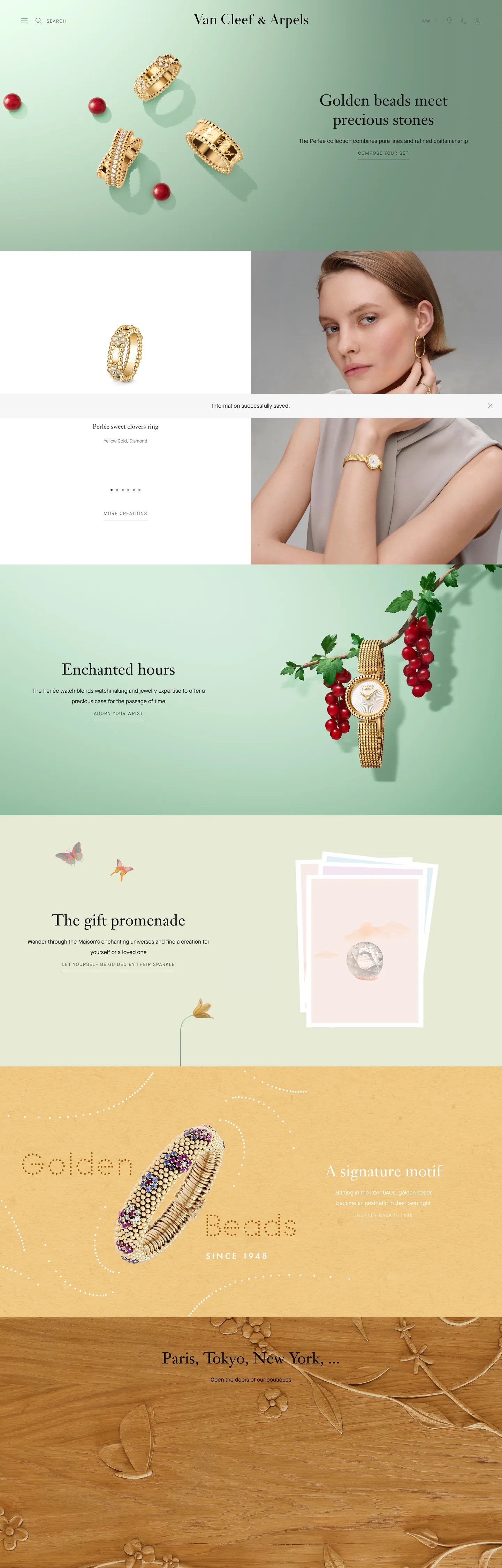
Van Cleef & Arpels' marketing site operates on a discipline almost no other luxury brand holds: the page itself has no color. Navigation, labels, CTAs, and section headings are rendered in near-black ink on white or sage-green canvas — the only chromatic statements anywhere on the page are the jewelry pieces themselves. Where Cartier uses a deep bordeaux red and Tiffany uses a signature robin-egg blue as persistent brand voltage, Van Cleef & Arpels withholds every chromatic UI element and forces the eye toward the objects being sold. The sage-green section bands — a muted, grey-inflected green visible in the "Enchanted hours" editorial panel — are the closest thing to a brand color the page declares, and even these read as a neutral backdrop for product photography rather than as a brand signal.
The DESIGN.md file packages the system into machine-readable tokens for React and AI tools. Inside: 13 colors tokens drawn from a rigorously monochromatic chrome — near-black ink at two densities, a mid-grey muted tone, hairline greys, and canvas tones including the sage-green editorial surface. Ten typography tokens span two families — Janson Text, a classical book serif running at 26–45px in weight 400 for every display moment; and Maison Neue, a geometric sans that handles every functional surface (nav, CTA, label, body) at 10–16px in weight 400 with uppercase and 1.5px tracking as the primary emphasis treatment. Fourteen components cover the editorial display pattern, the uppercase-label CTA, the hairline-bordered text input, and the product-photography showcase card.
Feed this file to Claude or Cursor and it will reproduce Van Cleef & Arpels' specific restraint: achromatic UI chrome, Janson Text serif at modest weight for display, Maison Neue uppercase for every action surface, and a radius vocabulary that is essentially zero everywhere. The one disciplined move worth studying here is the total refusal to declare a button color — a choice that only works when product photography is rich enough to carry all visual energy. For most teams this spec functions as an extreme reference point for type-and-spacing restraint rather than a direct clone target.
What makes it distinct
5
- Achromatic brand chromezero brand voltage color; all chromatic interest comes from jewelry photography, not UI elements
- Janson Text at weight 400a classical book serif holds every display headline at 30–45px with no weight variation, no bold tier
- Maison Neue uppercase labels10–13px uppercase tracking at 1.5px letter-spacing appears 37+ times across nav, CTAs, and category chips
- Sage-green editorial canvassection bands alternate between near-white, sage-green, and warm ivory rather than a single flat background
- Hairline-only interaction modelno filled button exists on the captured surface; every CTA is an underlined or uppercase text link with a 1px border
vancleefarpels.com
Live at vancleefarpels.com
A snapshot of the brand in production. Scroll the frame to see the whole page.
Colors
13 colors
Van Cleef & Arpels's system runs on #757575 as its primary voltage, used in 2 of 14 components. Type is set in Maison Neue across 12 tokens from 10px to 45px, weights 400–400. Shape language is sharp — components average 0px corner radius, favoring crisp rectangles.
Surface
Page and card backgrounds · 2
Text
Headlines, body, captions · 7
Borders & Hairlines
Dividers, outlines, rules · 2
Other
Specialty colors · 2
Typography
12 type tokens
Set in Maison Neue across 12 tokens, from 10px to 45px, weights 400–400. Shown in its own stack: where the font isn't installed, the fallback the file names stands in.
- display-xl45px · weight 400 · lh 55pxThe quick brown fox jumps over the lazy dog
- display-lg35px · weight 400 · lh 45pxThe quick brown fox jumps over the lazy dog
- display-md30px · weight 400 · lh 40pxThe quick brown fox jumps over the lazy dog
- heading-md26px · weight 400 · lh 34pxThe quick brown fox jumps over the lazy dog
- heading-sm18px · weight 400 · lh 25pxThe quick brown fox jumps over the lazy dog
- body-md16px · weight 400 · lh 30pxThe quick brown fox jumps over the lazy dog
- body-sm14px · weight 400 · lh 25pxThe quick brown fox jumps over the lazy dog
- label-md13px · weight 400 · lh 20px · tracking 1.5pxThe quick brown fox jumps over the lazy dog
- label-sm12px · weight 400 · lh 20px · tracking 1.5pxThe quick brown fox jumps over the lazy dog
- caption13px · weight 400 · lh 20pxThe quick brown fox jumps over the lazy dog
- button-md10px · weight 400 · lh 30px · tracking 1pxThe quick brown fox jumps over the lazy dog
- nav-link13px · weight 400 · lh 20px · tracking 1.5pxThe quick brown fox jumps over the lazy dog
Layout
Radii and spacing
3 corner radii and 9 spacing values. Shape language: sharp.
Radii
- none0px
- sm4px
- full9999px
Spacing
- xs5px
- sm10px
- md15px
- base20px
- lg25px
- xl30px
- 2xl40px
- 3xl60px
- 4xl80px
Components
14 components
Each rendered from its tokens (color, type, radius, padding) on Van Cleef & Arpels's own canvas.
- Button Primarybutton-primaryButton Primary
- Button Secondarybutton-secondaryButton Secondary
- Top Navtop-navTop Nav
- Nav Linknav-linkNav Link
- Hero Headinghero-headingHero Heading
- Section Headingsection-headingSection Heading
- Body Paragraphbody-paragraphBody Paragraph
- Body Paragraph Mutedbody-paragraph-mutedBody Paragraph Muted
- Editorial Headingeditorial-headingEditorial Heading
- Card Productcard-productCard Product
- Card Editorialcard-editorialCard Editorial
- Type here…text-inputText Input
- Label Uppercaselabel-uppercaseLabel Uppercase
- FooterfooterFooter
In use
The system, in use
Van Cleef & Arpels's tokens on the kind of product it builds.
Build something people actually use.
A short paragraph of marketing copy that previews how the brand's display tier and body tier read together. Two sentences is usually enough.
FAQ
Van Cleef & Arpels design system FAQ
Common questions about Van Cleef & Arpels's tokens, components, and how to use this DESIGN.md in your project.
Read next
Related reading
Specs, directories, and component libraries that pair with this design system.
- Browse all design systemsThe full directory of DESIGN.md files on shadcn.io, with live mockups for each.shadcn.io
- Van Cleef & Arpels — official siteVan Cleef & Arpels' public marketing site — the source of truth for the live tokens captured in this file.vancleefarpels.com (opens in a new tab)
- The DESIGN.md specificationGoogle Labs' open spec for machine-readable design system files — the format this page is built on.github.com (opens in a new tab)
Use it
Use Van Cleef & Arpels in your project
One machine-readable file. Drop it into Claude, Cursor, or any AI tool that reads DESIGN.md.
Download the DESIGN.md
One machine-readable file: every color, type, radius, spacing, and component token of Van Cleef & Arpels.
Feed it to your AI tool
Drop it into Claude, Cursor, or GitHub Copilot. The agent writes React components and Tailwind classes that match Van Cleef & Arpels's visual language.
Reference the tokens directly
Or paste the values into your Tailwind config, CSS variables, or component library: every color, size and radius is a quoted, ready-to-copy value.
Read the full DESIGN.md: overview, rationale, do’s and don’ts
Overview
Van Cleef & Arpels' marketing site operates on a discipline that separates it from every other luxury fashion and jewelry brand in the directory. Colorless chrome. Where Cartier holds a deep bordeaux and Tiffany holds a robin-egg blue as persistent brand signals, Van Cleef & Arpels declares no voltage color at all — no filled button, no accent icon, no chromatic CTA. The entire UI is achromatic: near-black ink on white, warm ivory, or sage-green canvas. Every chromatic element visible on the page is a jewelry piece, not a UI element. This is not monochrome minimalism in the Linear or Vercel sense — it is a deliberate editorial decision that positions product photography as the only permitted source of color.
The typographic system reinforces the choice. Display moments use Janson Text, a classical book serif at weight 400 running from 26px through 45px — the same weight across all sizes, no bold tier. Supporting surfaces use Maison Neue, a geometric sans at weight 400, where uppercase with 1.5px letter-spacing serves as the single emphasis treatment. The pairing is closer to a print editorial magazine than to any luxury e-commerce peer: the serif holds the showcase copy while the sans annotates and navigates, each family constrained to one weight.
Key Characteristics:
- Achromatic brand chrome: no brand color, no filled button, no colored CTA — 511 ink occurrences and zero brand-voltage background fills.
- Janson Text book serif at weight 400 across every display tier (26–45px) — no semibold or bold headline anywhere.
- Maison Neue in 13px uppercase with 1.5px tracking appears 37+ times as the primary emphasis signal for navigation, labels, and CTAs.
- Section bands alternate between near-white, sage-green, and warm ivory rather than a uniform canvas — color is a photographic staging decision, not a brand token.
- Zero primary button fill: every CTA is either a hairline-bordered text button or an underlined link.
- Near-zero radius vocabulary: only one 4px rounded token exists on the captured surface; all other UI elements are sharp-cornered.
- Generous vertical rhythm: major section padding at 60–90px vertical; body line-height at 30px on 16px body text (1.875 ratio).
Colors
Text
- Ink (
{colors.ink}— #222222): frequency 511. Used as text (260), border (251). The dominant tone across every heading, paragraph, nav label, and hairline. Near-black rather than pure black — the distinction from #000000 is deliberate at the body reading sizes. - Ink Secondary (
{colors.ink-secondary}— #757575): frequency 152. Used as text (77), border (75). Mid-grey tone for secondary labels, subcategory chips, and secondary navigation elements. Clustered from two near-duplicate hex values in the extraction. - Ink Deep (
{colors.ink-deep}— #111111): frequency 42. Used as text (21), border (21). A slightly deeper near-black appearing on h2 display moments and strong-weight label text. - Ink Black (
{colors.ink-black}— #000000): frequency 16. Used as text (8), border (8). Pure black, appearing sparingly on the most authoritative heading instances and select hairlines. - Ink Mid (
{colors.ink-mid}— #666666): frequency 4. Used as text (2), border (2). An intermediate grey used sparsely for footnote-level metadata. - Ink Faint (
{colors.ink-faint}— #454545): frequency 2. Used as text (1), border (1). Input field text color.
Canvas
- Canvas (
{colors.canvas}— #ffffff): frequency 16. Used as background (2). The primary page floor for the above-fold hero and editorial sections. Clustered from two near-white hex values in the extraction. - Canvas Warm (
{colors.canvas-warm}— #f9f9f9): the declared themeColor — a near-white warm canvas for the page<meta>theme. Not a distinct rendered surface but the intent color for system UI. - Sage Canvas (
{colors.sage-canvas}— #a8b89a): the muted grey-green editorial backdrop visible in the "Enchanted hours" watch section. Not a declared CSS variable — applied directly as section background. The only chromatic canvas tone on the page; functions as a photographic backdrop rather than a brand accent. - Ivory Canvas (
{colors.ivory-canvas}— #f5e9d8): the warm cream-beige surface visible in the "Golden Beads" and lower editorial bands. Creates the warm alternating-band rhythm below the fold.
Hairlines
- Hairline (
{colors.hairline}— #e6e6e6): frequency 16. Used as text (8), border (8). The lighter border tone — used on form fields, section dividers, and product card outlines.
Typography
Font Families
The system runs two families. Janson Text is a licensed classical book serif (from Linotype) serving every display and editorial headline at 26–45px, exclusively in weight 400 with normal letter-spacing. Maison Neue (by Milieu Grotesque) is a geometric sans handling navigation, body copy, CTAs, labels, and captions at 10–16px, also exclusively in weight 400 — with uppercase and 1.5px letter-spacing as the primary emphasis treatment. There is no semibold, no bold, no 700+ moment anywhere on the page.
Hierarchy
| Token | Size | Weight | Line Height | Use |
|---|---|---|---|---|
{typography.display-xl} | 45px | 400 | 55px | h2 hero display ("Paris, Tokyo, New York…") |
{typography.display-lg} | 35px | 400 | 45px | Sub-section display headlines |
{typography.display-md} | 30px | 400 | 40px | Editorial section headlines |
{typography.heading-md} | 26px | 400 | 34px | h2 section titles |
{typography.heading-sm} | 18px | 400 | 25px | h3 category headings |
{typography.body-md} | 16px | 400 | 30px | Default running text |
{typography.body-sm} | 14px | 400 | 25px | Secondary body copy |
{typography.label-md} | 13px | 400 | 20px | Nav labels, category chips (uppercase, 1.5px tracking) |
{typography.label-sm} | 12px | 400 | 20px | Small labels (uppercase, 1.5px tracking) |
{typography.caption} | 13px | 400 | 20px | Body captions, metadata (no tracking) |
{typography.button-md} | 10px | 400 | 30px | CTA buttons (uppercase, 1px tracking) |
{typography.nav-link} | 13px | 400 | 20px | Top-nav links (uppercase, 1.5px tracking) |
Principles
Weight 400 across the entire system is the defining typographic discipline. No bold headline, no semibold subheading — the serif's own optical weight at large sizes does every display job, and Maison Neue uppercase spacing does every emphasis job. The 1.875 line-height ratio on body text (30px on 16px) is unusually generous, giving paragraphs a breathing quality that matches the wide, open page layout.
Note on Font Substitutes
Janson Text is a licensed serif. EB Garamond or Cormorant Garamond at the same weights are close open-source substitutes at display sizes; at body sizes, Lora or Spectral carry the same calligraphic weight. For Maison Neue, DM Sans or Inter at the same weights transfer cleanly; the uppercase tracking is a CSS property that carries regardless of family.
Layout
Spacing System
- Base rhythm: 5px micro-unit, with 10px as the primary module.
- Tokens:
{spacing.xs}5px ·{spacing.sm}10px ·{spacing.md}15px ·{spacing.base}20px ·{spacing.lg}25px ·{spacing.xl}30px ·{spacing.2xl}40px ·{spacing.3xl}60px ·{spacing.4xl}80px. - Section padding: 60–90px vertical between major editorial bands; the "60px 0px 90px" pattern appears 7 times.
- Card internal padding: 15–20px on product cards; 60px on large editorial panels.
- Max content width: ~1320px for body text paragraphs; editorial imagery bleeds full-width.
Grid & Container
- Hero: full-bleed image with headline and sub-copy overlaid at center.
- Below-fold: alternating single-column editorial panels with full-bleed photography on the right and constrained text on the left, typically ~50/50 split.
- Product grid: 3–4 column product card grid with hairline dividers; each card is product image + small uppercase label + serif product name.
- Section bands: alternating near-white / sage-green / warm ivory — the canvas change signals a new editorial chapter rather than a new product category.
Rhythm
The page breathes at a magazine pace — wide leading, generous section margins, no band is shorter than ~400px. The alternating canvas tones create rhythm without requiring heading hierarchy to do the structural work.
Elevation
The system has essentially no shadow tier. No captured shadow values appear in the extraction — zero shadow occurrences. Depth is achieved entirely through canvas-tone contrast: the sage-green bands are lifted against the white floor by their background-color difference alone. Product photography provides the only three-dimensional depth signal on the page. The single 4px {rounded.sm} token suggests a rare pop-over or tooltip; the marketing surface itself is uniformly flat.
Shapes
The radius vocabulary is near-zero: a single 4px value appears once in the extraction (1 occurrence total). Every other UI element — nav, buttons, inputs, product cards, editorial panels, image frames — is sharp-cornered. The flat-corner geometry gives the page its architectural precision; soft rounding would introduce warmth the system deliberately withholds.
Components
button-primary — Transparent fill, near-black {colors.ink} text in {typography.button-md} (10px / 400 uppercase), 1px {colors.ink} hairline border, no radius. The "action" surface on Van Cleef & Arpels is a bordered label, not a filled block.
button-secondary — Transparent fill, ink text in uppercase label tracking. Used for underlined anchor CTAs where no border is appropriate.
top-nav — White canvas, near-black text, uppercase Maison Neue labels at 13px / 1.5px tracking. The VCA wordmark sits centered with sparse nav links flanking it. 60px height.
nav-link — Transparent, ink text at {typography.nav-link} (uppercase, 1.5px tracking). Spacing: 10×0px — horizontally tight, vertically breathed.
hero-heading — Pure-black text on transparent background at {typography.display-xl} (45px / 400 Janson Text). No padding — the heading floats over imagery.
section-heading — Ink text at {typography.display-md} (30px / 400 Janson Text). Used for editorial band headlines like "Enchanted hours" and "The gift promenade."
body-paragraph — Ink text at {typography.body-md} (16px / 400, 30px leading). The generous line-height is the defining body-text quality of the system.
body-paragraph-muted — Mid-grey {colors.ink-secondary} text at {typography.caption} for secondary metadata and subcategory annotations.
editorial-heading — Ink text at {typography.heading-md} (26px Janson Text) — the editorial subheading size used for jewelry category titles.
card-product — White canvas, no border radius, 20px padding. Holds product image + uppercase Maison Neue label + serif product name in {typography.heading-sm}.
card-editorial — Sage-green {colors.sage-canvas} canvas, generous 60×40px padding, sharp corners. The full-bleed editorial section format for showcase chapters.
text-input — Transparent background, ink-faint text, 13px Maison Neue, zero radius, 1px bottom border in {colors.ink}. Used in newsletter signup — a borderless field with only the bottom edge marked.
label-uppercase — The nav chip and category label pattern: transparent, 13px Maison Neue uppercase with 1.5px tracking, 5×10px padding.
footer — White canvas, mid-grey text in small uppercase Maison Neue. 40px vertical padding.
Do's and Don'ts
Do use Janson Text at weight 400 for every display moment. The system has no bold headline — Janson's optical weight at 45px on a sparse white canvas carries the full display job. Introducing weight 700 would shift the editorial register toward fashion retail rather than haute joaillerie.
Do use the uppercase tracking treatment (text-transform: uppercase; letter-spacing: 1.5px) on Maison Neue as the single emphasis signal. It substitutes for semibold weight in a system that runs exclusively at 400. Use it on every navigation label, CTA, and category chip.
Do alternate canvas tones between sections — near-white, sage-green, warm ivory — to create editorial rhythm. The canvas variation is a structural device, not a decoration; it signals chapter breaks between product categories.
Do keep the body line-height at 30px on 16px text (1.875 ratio). The generous leading is a precision setting that matches the wide, sparse page layout — reducing it to 1.5 or 1.6 makes the body copy feel compressed against the open display moments.
Don't introduce a filled button with a background color. The captured surface has zero filled CTA elements — the single move that most inverts the convention of luxury e-commerce. Adding a burgundy or gold fill button would introduce a voltage color that competes with jewelry photography. Use {colors.ink} hairline-bordered text buttons instead.
Don't use {colors.sage-canvas} (#a8b89a) as a text color or icon fill. It appears exclusively as a section background (canvas tone), never as a foreground element. For text on the sage canvas, use {colors.ink}.
Don't use {colors.ink-secondary} (#757575) for display or heading text — it is a metadata and secondary-label tone, never a headline color. At 45px, #757575 reads as disabled or faded rather than as a deliberate design choice.
Don't add border-radius to product cards or editorial panels. The near-zero radius vocabulary is the geometric signature of the system; rounding product cards would make them read as e-commerce commodity tiles rather than as jewelry display cases.
Known Gaps
- Primary hero content: the extractor captured a cookie-consent overlay and a post-fold state; the top hero band, primary navigation structure, and main hero imagery are not fully captured in the extracted component samples.
- Product page tokens: this DESIGN.md captures the home/marketing surface only. Product detail pages (PDP), jewelry configurators, and the L'École des Arts Joailliers educational section likely expose additional typography and layout tokens.
- Dark mode: no dark-mode variant exists in the captured surface — VCA's marketing is light-only.
- Animation and scroll behaviors: the page uses scroll-triggered fade reveals for editorial panels and the product carousel uses Swiper.js (the only CSS variable captured is a Swiper default theme color — a library default, not a brand token). Motion timing and easing are not represented here.
- Logged-in states: the wishlist, cart, and account surfaces expose an interaction model not visible in the public marketing capture.
- International canvas variations: the extracted URL is the English/global version; regional sites may vary typography and section ordering.
E-commerce & Retail
More systems like this
More DESIGN.md files in E-commerce & Retail.
Pricing
Build it with Pro
The DESIGN.md files are free. Pro adds 6,000+ blocks, premium templates and the MCP server, so your AI editor builds in your system for you.
4.9/5 out of 5 · 150+ reviewsfrom 150+ founders and developers.
Billing
Billed once a year in USD. Cancel anytime.
- How many people can use the license.
- Client work, SaaS products and anything you charge for.
- Production-ready React sections: hero, pricing, features, dashboards and more.
- Complete multi-page sites you can ship as they are.
- React icons from every major library, installable with one command.
- Presets that restyle every block, in light and dark.
- Lets your AI editor search, preview and install blocks for you.
- Priority requests are answered first.
Individual
For personal projects & open source
$32instead of $49/mo
$389 billed yearly
- Seats: 1 seat
- Commercial use: Personal & open source only
- Pro blocks: 6,000+ blocks
- Templates: All 14 templates
- React icons: 294k+ icons
- Themes: All 59 themes
- MCP server: Basic usage
- Support: Standard
Team
Most popularFor freelancers, agencies & startups
$66instead of $99/mo
$789 billed yearly · ≈ $13/dev/mo
- Seats: Up to 5 seats
- Commercial use: Included
- Pro blocks: 6,000+ blocks
- Templates: All 14 templates
- React icons: 294k+ icons
- Themes: All 59 themes
- MCP server: High usage
- Support: Priority
Organization
For companies with larger teams
$132instead of $199/mo
$1,589 billed yearly
- Seats: Unlimited seats
- Commercial use: Included
- Pro blocks: 6,000+ blocks
- Templates: All 14 templates
- React icons: 294k+ icons
- Themes: All 59 themes
- MCP server: Unlimited usage
- Support: Priority
Billed once a year in USD. Cancel anytime.
Individual
For personal projects & open source
$32instead of $49/mo
$389 billed yearly
- How many people can use the license.Seats: 1 seat
- Client work, SaaS products and anything you charge for.Commercial use: Personal & open source only
- Production-ready React sections: hero, pricing, features, dashboards and more.Pro blocks: 6,000+ blocks
- Complete multi-page sites you can ship as they are.Templates: All 14 templates
- React icons from every major library, installable with one command.React icons: 294k+ icons
- Presets that restyle every block, in light and dark.Themes: All 59 themes
- Lets your AI editor search, preview and install blocks for you.MCP server: Basic usage
- Priority requests are answered first.Support: Standard
Team
Most popularFor freelancers, agencies & startups
$66instead of $99/mo
$789 billed yearly · ≈ $13/dev/mo
Everything in Individual, plus
- How many people can use the license.Seats: Up to 5 seats
- Client work, SaaS products and anything you charge for.Commercial use: Included
- Lets your AI editor search, preview and install blocks for you.MCP server: High usage
- Priority requests are answered first.Support: Priority
Organization
For companies with larger teams
$132instead of $199/mo
$1,589 billed yearly
Everything in Team, plus
- How many people can use the license.Seats: Unlimited seats
- Lets your AI editor search, preview and install blocks for you.MCP server: Unlimited usage
- Secure checkout via Stripe
- Code lives in your repo
- Keep what you've shipped if you cancel
- License terms
Your system, built for you
Every block, template and icon, installed by your AI agent in your design system. The DESIGN.md files stay free.