Val Town Design System
Val Town's marketing system runs IBM Plex Sans on pure white with ink-black text and iA Writer Mono for every code sample. Tokens for React, Next.js, and AI coding tools.
Add shadcn.io to your AI agent. · Pro It installs blocks, icons and templates in your design system from a prompt, with Pro.
Set up MCP- Primary
- #3b82f6
- Typeface
- IBM Plex Sans
- Shape
- Mixed
- Base radius
- 8px
- Colors
- 5
- Type tokens
- 13
- Components
- 14
- Spacing values
- 9
About
About Val Town DESIGN.md
Curated by Dov Azencot · Updated May 18, 2026 · Source val.town (opens in a new tab)
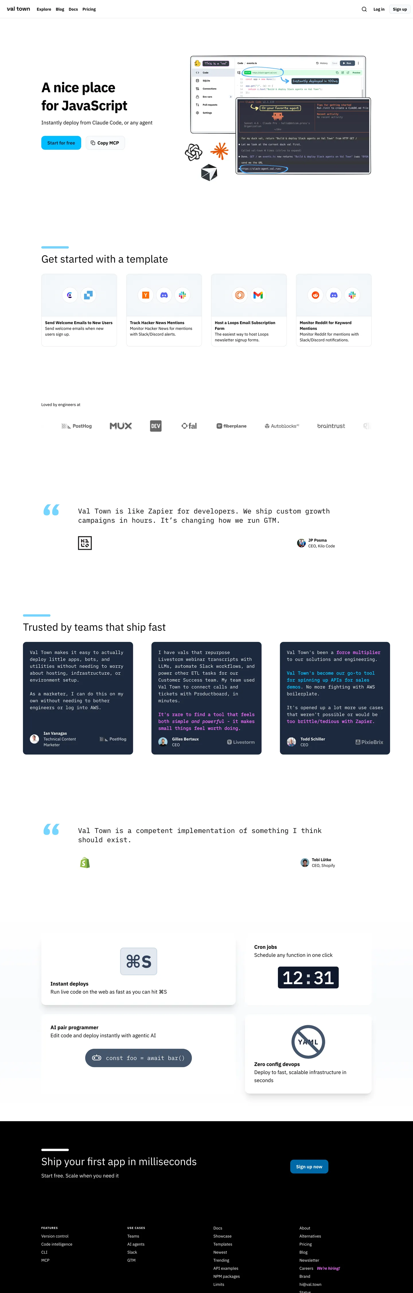
Val Town's marketing site does the unfashionable thing for a developer platform: it renders in pure black on pure white. No warm cream, no Vercel-style matte canvas, no Linear violet-graphite gradient. The hero headline "A nice place for JavaScript" sits at 48px in IBM Plex Sans weight 400, flush-left in the same paper-white container as the rest of the page. The right side of the band carries a stacked screenshot of two iA Writer Mono editor panels with a cobalt-blue "Start for free" pill CTA underneath — the only chromatic moment above the fold. Where Bun runs all-mono on a cream block and Vercel runs all-sans on matte black, Val Town runs sans-plus-mono on white paper and trusts the editor screenshot to do every bit of decorative work.
The DESIGN.md file packages the system into a machine-readable spec for React and AI tools. Inside: 5 colors tokens — ink black, paper white, a cobalt-blue CTA fill, and a single navy testimonial card — because the extraction surfaces only two structural colors (black and white) and the cobalt is recovered from the rendered CTA. 11 typography tokens span IBM Plex Sans across display, heading, body, button, and a 10px uppercase tracked-wide label tier, plus iA Writer Mono in three sizes for code samples, editor frames, and emphasis runs (the system uses mono for the `<strong>` and `<em>` tags themselves, not just inside `<code>` blocks). 5 radius tokens centered on a 12px button radius. 14 components definitions covering the cobalt pill, the transparent secondary, the template card, the navy quote block, and the dark "Ship your first app" footer band.
Feed this file to Claude or Cursor and it reproduces Val Town's specific moves: pure-white canvas, single cobalt CTA, IBM Plex Sans for prose and iA Writer Mono for evidence, and the editor-screenshot-as-hero composition that lets the product do the talking. The one move worth borrowing only if your product is itself a code editor: mono-as-emphasis. Most teams should stick to bold-as-emphasis; Val Town gets away with it because every reader of the page is already fluent in monospace.
What makes it distinct
5
- Editor-as-evidence herothe right half of the above-fold band is a stacked screenshot of two iA Writer Mono editor panels, with the headline flush left rather than centered over a gradient
- True black on true whitetext sits at pure ink-black on pure paper-white, no warm cream and no near-black softening anywhere in the marketing chrome
- Single cobalt pillone rounded blue CTA carries the only chromatic moment above the fold, paired with a transparent secondary
- IBM Plex Sans plus iA Writer Monosans for every spoken surface, mono for every editor frame, every emphasis treatment, and every inline highlight
- Quote-card chromatic blockthe lone color appearance below the fold is a navy testimonial card with cobalt highlights inside the IBM Plex Sans body copy
val.town
Live at val.town
A snapshot of the brand in production. Scroll the frame to see the whole page.
Colors
5 colors
Val Town's system runs on #3b82f6 as its primary voltage, used in 1 of 14 components. Type is set in IBM Plex Sans across 13 tokens from 10px to 48px, weights 400–700. Shape language is mixed across 14 components, blending pills, soft rounds, and squarer corners.
Brand & Accent
Sparing, CTA-only voltage · 1
Surface
Page and card backgrounds · 1
Text
Headlines, body, captions · 1
Borders & Hairlines
Dividers, outlines, rules · 1
Other
Specialty colors · 1
Typography
13 type tokens
Set in IBM Plex Sans across 13 tokens, from 10px to 48px, weights 400–700. Shown in its own stack: where the font isn't installed, the fallback the file names stands in.
- display-xl48px · weight 700 · lh 62.4px · tracking -1.2pxThe quick brown fox jumps over the lazy dog
- display-md36px · weight 400 · lh 40pxThe quick brown fox jumps over the lazy dog
- heading-md24px · weight 700 · lh 32px · tracking 2.4pxThe quick brown fox jumps over the lazy dog
- body-lg18px · weight 400 · lh 28pxThe quick brown fox jumps over the lazy dog
- body-md14px · weight 400 · lh 20pxThe quick brown fox jumps over the lazy dog
- body-sm12px · weight 400 · lh 16pxThe quick brown fox jumps over the lazy dog
- label-uppercase10px · weight 700 · lh 16px · tracking 1pxThe quick brown fox jumps over the lazy dog
- button-md14px · weight 700 · lh 20pxThe quick brown fox jumps over the lazy dog
- nav-link14px · weight 700 · lh 20pxThe quick brown fox jumps over the lazy dog
- mono-lg24px · weight 400 · lh 32pxThe quick brown fox jumps over the lazy dog
- mono-md20px · weight 400 · lh 28pxThe quick brown fox jumps over the lazy dog
- mono-sm16px · weight 400 · lh 24pxThe quick brown fox jumps over the lazy dog
- mono-emphasis16px · weight 700 · lh 24pxThe quick brown fox jumps over the lazy dog
Layout
Radii and spacing
7 corner radii and 9 spacing values. Shape language: mixed.
Radii
- none0px
- xs2px
- sm4px
- md8px
- lg12px
- xl16px
- full9999px
Spacing
- xs4px
- sm8px
- md12px
- base16px
- lg24px
- xl32px
- 2xl48px
- 3xl64px
- 4xl96px
Components
14 components
Each rendered from its tokens (color, type, radius, padding) on Val Town's own canvas.
- Button Primarybutton-primaryButton Primary
- Button Secondarybutton-secondaryButton Secondary
- Top Navtop-navTop Nav
- Nav Linknav-linkNav Link
- Hero Headinghero-headingHero Heading
- Section Headingsection-headingSection Heading
- Body Paragraphbody-paragraphBody Paragraph
- Body Paragraph Lgbody-paragraph-lgBody Paragraph Lg
- Label Uppercaselabel-uppercaseLabel Uppercase
- CardcardCard
- Template Cardtemplate-cardTemplate Card
- Testimonial Cardtestimonial-cardTestimonial Card
- Type here…text-inputText Input
- Footer Bandfooter-bandFooter Band
In use
The system, in use
Val Town's tokens on the kind of product it builds.
Build something people actually use.
A short paragraph of marketing copy that previews how the brand's display tier and body tier read together. Two sentences is usually enough.
import { build } from "./build"

export async function main() {
  const result = await build()
  console.log("done", result)
}
FAQ
Val Town design system FAQ
Common questions about Val Town's tokens, components, and how to use this DESIGN.md in your project.
Read next
Related reading
Specs, directories, and component libraries that pair with this design system.
- Browse all design systemsThe full directory of DESIGN.md files on shadcn.io, with live mockups for each.shadcn.io
- Val Town — official siteVal Town's public marketing site — the source of truth for the live tokens captured in this file.val.town (opens in a new tab)
- The DESIGN.md specificationGoogle Labs' open spec for machine-readable design system files — the format this page is built on.github.com (opens in a new tab)
Use it
Use Val Town in your project
One machine-readable file. Drop it into Claude, Cursor, or any AI tool that reads DESIGN.md.
Download the DESIGN.md
One machine-readable file: every color, type, radius, spacing, and component token of Val Town.
Feed it to your AI tool
Drop it into Claude, Cursor, or GitHub Copilot. The agent writes React components and Tailwind classes that match Val Town's visual language.
Reference the tokens directly
Or paste the values into your Tailwind config, CSS variables, or component library: every color, size and radius is a quoted, ready-to-copy value.
Read the full DESIGN.md: overview, rationale, do’s and don’ts
Overview
Val Town's marketing site runs the unfashionable trick: pure ink on pure paper. Editor-as-evidence. The above-fold band splits flush-left, with the hero headline "A nice place for JavaScript" rendered at 48px IBM Plex Sans weight 400 in {colors.ink} (#000000) on a pure white {colors.canvas} (#ffffff) — and a stacked screenshot of two iA Writer Mono editor panels carrying the right side. Where Vercel paints its hero matte black and trusts a gradient halo to do the work, and where Bun lays a single all-caps mono headline on cream, Val Town runs sans-plus-mono on white paper and treats the editor screenshot itself as the only decoration. The cobalt-blue pill CTA "Start for free" is the single chromatic moment above the fold; "Copy MCP" sits next to it as a transparent secondary.
The chromatic restraint is absolute. The extraction surfaces only two structural colors — black (208 occurrences) and white (107) — even though the page CSS exposes the full Tailwind v4 palette as custom properties (--color-blue-500, --color-orange-500, --color-emerald-500, etc.). Every Tailwind tone is loaded into the document but none of them render in the marketing chrome. The cobalt pill CTA and the lone navy testimonial card carry the only color voltage on the page, and both are recovered from the rendered screenshot rather than from any captured CSS variable. Compared to Cloudflare's voltage-as-canvas or Spline's single-cobalt-on-black move, Val Town's restraint is more extreme: not voltage-in-reserve, but voltage-essentially-absent until two specific UI moments demand it.
The typographic split is the real signature. IBM Plex Sans runs every spoken surface — display, heading, body, button, nav, and a 10px tracked-wide uppercase label tier — while iA Writer Mono runs every editor frame and, unusually, every emphasis treatment. The <strong> and <em> tags in testimonial body copy render in mono at 16px / 700 rather than in sans bold, treating every emphasized word as if it were code. iA Writer Mono also carries the larger 20-24px headlines inside the editor screenshots and the cobalt-highlighted phrases inside the navy quote card.
Key Characteristics:
- Pure paper-white
{colors.canvas}(#ffffff) carries the entire marketing surface — no cream, no matte gray, no off-white softening anywhere in the chrome. - Pure ink
{colors.ink}(#000000) carries every text token; the contrast against the canvas is uncompromising, matching iA Writer's posture more than a typical SaaS marketing page. - Single cobalt pill
{colors.primary}{component.button-primary}carries the only chromatic moment above the fold; a single navy quote card carries the only color block below the fold. - IBM Plex Sans for every spoken surface, iA Writer Mono for every editor frame and every emphasis treatment — the mono-as-emphasis substitution is the typographic signature.
- 10px uppercase tracked-wide labels (
{typography.label-uppercase}) carry section dividers and category chips — the "TRUSTED BY" and "LOVED BY ENGINEERS AT" strips. - Hairline-only template cards:
{colors.hairline}carries the 1px borders on the 4-up template grid below the hero. - Generous-soft button radius — the primary and secondary CTAs are fully-rounded pills (
{rounded.full}); template cards use 12px ({rounded.lg}). - 96×48px section padding on major editorial bands; the testimonial row sits in a 64px vertical rhythm.
Colors
Brand
- Cobalt Primary (
{colors.primary}— #3b82f6): the single chromatic moment above the fold. Fills the "Start for free" pill CTA and appears as inline highlight color inside the navy testimonial card. Recovered from the rendered screenshot — the page CSS loads the full Tailwind v4 blue palette as custom properties but does not apply any of them on the captured surfaces, so the cobalt is held entirely in reserve for these two UI moments.
Surface
- Canvas (
{colors.canvas}— #ffffff): frequency 107 — used as text (89), background (18). Wired as--color-whiteand--color-background. The page floor — pure paper-white, no cream warming, no matte softening. Carries the entire above-fold band, every template card, and the inside of the navy footer's negative space. - Hairline (
{colors.hairline}— #e5e7eb): used as the 1px border tone on template cards and form inputs. Recovered from the rendered card outlines; the extraction merges several near-equivalent gray-100 / slate-200 tokens into a single hairline.
Text
- Ink (
{colors.ink}— #000000): frequency 208 — used as text (199), background (3), shadow (6). Wired as--color-blackand--color-text. The dominant and essentially only text color across every tier — there is no muted variant for secondary copy on the captured marketing page, and no near-black softening. The footer band inverts the contrast (white text on ink fill) but uses the same exact ink value.
Accent
- Testimonial Background (
{colors.testimonial-bg}— #1e3a8a): the navy fill of the lone "Trusted by teams that ship fast" quote card. Recovered from the rendered card — the only color block on the page besides the cobalt pill, and the only surface where iA Writer Mono renders cobalt-highlighted phrases inside the body copy.
Typography
Font Families
The system pairs two voices: IBM Plex Sans for every spoken surface (display, heading, body, button, nav, uppercase label) and iA Writer Mono for every annotated surface (editor frames, code samples, the body-emphasis <strong> and <em> tags). Fallbacks walk -apple-system, sans-serif and Menlo, Consolas, ui-monospace, monospace respectively. Wired in CSS as --font-mono and the default mono family.
The pairing is uncommon for developer-platform marketing — most peers commit to a single voice (Vercel's Geist, Linear's Inter, Bun's all-mono). Val Town's split treats prose and code as equally important typographic citizens.
Hierarchy
| Token | Size | Weight | Line Height | Letter Spacing | Use |
|---|---|---|---|---|---|
{typography.display-xl} | 48px | 700 | 62.4px | -1.2px | Hero h1 ("A nice place for JavaScript") |
{typography.display-md} | 36px | 400 | 40px | 0 | Section h2 ("Get started with a template", "Ship your first app in milliseconds") |
{typography.heading-md} | 24px | 700 | 32px | 2.4px | Tracked-wide sub-section emphasis |
{typography.body-lg} | 18px | 400 | 28px | 0 | Hero sub-paragraph, testimonial copy |
{typography.body-md} | 14px | 400 | 20px | 0 | Default running text, template-card descriptions |
{typography.body-sm} | 12px | 400 | 16px | 0 | Caption rows, footer links |
{typography.label-uppercase} | 10px | 700 | 16px | 1px | Section dividers ("TRUSTED BY", "LOVED BY ENGINEERS AT") |
{typography.button-md} | 14px | 700 | 20px | 0 | Primary and secondary CTA labels |
{typography.nav-link} | 14px | 700 | 20px | 0 | Top-nav link labels |
{typography.mono-lg} | 24px | 400 | 32px | 0 | Largest mono moment — editor-frame headlines |
{typography.mono-md} | 20px | 400 | 28px | 0 | Editor-panel code samples, the "12:31" cron display |
{typography.mono-sm} | 16px | 400 | 24px | 0 | Inline code, the const foo = await bar() snippet |
{typography.mono-emphasis} | 16px | 700 | 24px | 0 | Body emphasis <strong> / <em> tags inside testimonial cards |
Principles
The hero h1 at 48px / 700 with -1.2px tracking is the loudest typographic moment — the only weight 700 sans on the page outside of nav labels and button labels. Body copy sits at weight 400 with no muted variant, so emphasis falls entirely to the mono substitution. The 10px uppercase tracked-wide label tier carries section dividers across the page, replacing the "small-caps sans" convention that most peers reach for.
The mono-as-emphasis convention is the single most distinctive typographic move. Inside testimonial cards, the bolded phrases inside body copy render in iA Writer Mono at 16px / 700, not in IBM Plex Sans bold. The substitution reinforces the brand's positioning — every emphasized word reads as code — and only works because the audience is already fluent in monospace.
Note on Font Substitutes
IBM Plex Sans is open-source (SIL OFL) and ships everywhere — no substitute needed. For iA Writer Mono, JetBrains Mono or IBM Plex Mono are the closest open-source alternatives; both transfer cleanly at 14-24px sizes and preserve the slightly-narrower glyph proportions that distinguish iA Writer Mono from generic monospace stacks.
Layout
Spacing System
- Base unit: 4px (with 8px and 16px as the dominant modules).
- Tokens:
{spacing.xs}4px ·{spacing.sm}8px ·{spacing.md}12px ·{spacing.base}16px ·{spacing.lg}24px ·{spacing.xl}32px ·{spacing.2xl}48px ·{spacing.3xl}64px ·{spacing.4xl}96px. - Section padding (vertical): ~96px between major editorial bands, with the major 96×48px block appearing 7 times in the captured page.
- Card internal padding:
{spacing.base}(16px) on template cards;{spacing.lg}(24px) on the navy testimonial card. - Hero padding: generous 96px top / bottom with the headline anchored flush-left rather than centered.
Grid & Container
- Max content width: ~1152px on the section h2 and the 4-up template grid; the hero band sits inside a narrower ~720px text column with the editor screenshot floated right.
- Hero: 2-column split — 50/50 flush-left text block paired with a stacked screenshot of two editor panels on the right.
- Template grid: 4-column row of hairline-bordered cards below the hero ("Send Welcome Emails to New Users / Track Hacker News Mentions / Host a Loops Email Subscription Form / Monitor Reddit for Keyword Mentions").
- Trust strip: 6-column monochrome logo wall ("PostHog, MUX, DEV, fal, fiberplane, AutoBlocks, brainTrust").
- Testimonial row: 3-column grid of equal-width navy cards below the editorial quote.
- Feature row: 2x2 grid of hairline-bordered cards ("Instant deploys / Cron jobs / AI pair programmer / Zero config devops").
Rhythm
The page alternates between edge-anchored editorial (the flush-left hero, the section h2 anchored at the same horizontal line) and centered grid bands (the 4-up template row, the 3-up testimonial row, the 2x2 feature grid). The dark "Ship your first app in milliseconds" footer band sits at the page bottom in inverted contrast — white text on ink fill — as the only chromatic-inversion moment on the page.
Elevation
The system has essentially no shadow tier. The canvas is pure white and the cards are pure white, so depth comes from hairline borders rather than from drop shadows. The extraction captures 6 occurrences of #000000 used as shadow ink — likely the faint resting elevation under the cobalt pill CTA and on the editor screenshot stack.
- Flat (no shadow): template cards, testimonial cards, feature cards, top-nav, footer — 99% of surfaces.
- Hairline outlines:
{colors.hairline}(#e5e7eb) carries the 1px borders on every card and form input — the only mechanism for separating same-color surfaces on the pure-white canvas. - Editor screenshot stack: the two stacked editor panels in the hero carry a faint resting drop shadow to read as overlapping windows rather than as a single composite.
Shapes
The radius scale is generous-soft + pill, centered on 12px for cards and full-pill for buttons:
{rounded.none}0px — only on the dark footer band.{rounded.xs}2px — declared in CSS (--radius-xs) but not rendered above the fold.{rounded.sm}4px —--radius-smfor small UI surfaces; rare on the marketing chrome.{rounded.md}8px —--radius-md; carries the nav-link hover state and some editor-frame corners.{rounded.lg}12px —--radius-lg; the default card radius (template cards, testimonial cards, feature cards).{rounded.xl}16px —--radius-2xl; the larger feature-card variant.{rounded.full}9999px — the cobalt pill CTA and the transparent secondary; renders as3.35544e+07pxin the captured CSS (effectively a fully-rounded pill).
The pill treatment is reserved for the two CTAs in the hero; everything else sits at 12px or 8px. The system skips the 20-24px middle tier that brands like Spline lean on.
Components
button-primary — The signature CTA. Cobalt {colors.primary} fill, white text, {typography.button-md} (14px / 700), fully-rounded {rounded.full} pill, 8x16px padding, 32px height. "Start for free" is the canonical instance, sitting flush against the hero headline rather than centered.
button-secondary — Transparent fill with ink text and a 1px {colors.hairline} border. {rounded.full} pill, 8x16px padding, 32px height. "Copy MCP" is the canonical instance, paired directly beside the primary CTA in the hero.
top-nav — Pure white {colors.canvas} surface, 64px height, 16x24px padding. Val Town wordmark flush left, product nav links (Explore / Blog / Docs / Pricing) center, "Log in / Sign up" cluster flush right. No bottom border — the nav floats above the hero band.
nav-link — Transparent background, ink text in {typography.nav-link} (14px / 700), 0x8px padding. Carries a subtle {rounded.md} hover pill on interaction.
hero-heading — Ink text on the transparent hero canvas, {typography.display-xl} (48px / 700) with -1.2px tracking. The single weight-700 sans display moment on the page.
section-heading — Ink text, {typography.display-md} (36px / 400). Used for "Get started with a template" and "Ship your first app in milliseconds."
body-paragraph — Default ink running-text at {typography.body-md} (14px / 400). The workhorse paragraph style.
body-paragraph-lg — Ink text at {typography.body-lg} (18px / 400). Used for the hero sub-paragraph and the section lead beneath the editorial quote.
label-uppercase — Ink text at {typography.label-uppercase} (10px / 700 / 1px tracking, uppercase). Carries the "TRUSTED BY" and "LOVED BY ENGINEERS AT" section dividers.
card — White {colors.canvas} fill, ink text, 1px {colors.hairline} border, {rounded.lg} 12px radius, 16px internal padding. The default content card on the marketing surface.
template-card — White fill, ink text, 1px hairline border, 12px radius, 16px padding. Each tile holds a small icon row across the top, a title in {typography.body-md} weight 700, and a 1-2 line description beneath.
testimonial-card — Navy {colors.testimonial-bg} fill, white text, {rounded.lg} 12px radius, 24px padding. The single chromatic block below the fold — carries body copy with iA Writer Mono emphasis runs in cobalt.
text-input — White surface, ink text, 1px hairline border, {rounded.md} 8px radius, 8x12px padding, 40px height.
footer-band — Ink-black {colors.ink} fill with white text, 64x48px padding. The "Ship your first app in milliseconds" closing band — the only chromatic-inversion moment on the page, sitting between the editorial closing and the muted-link footer rows.
Do's and Don'ts
Do keep the canvas pure white {colors.canvas} (#ffffff) and the text pure black {colors.ink} (#000000). The contrast posture is the system's signature — softening either tone to a cream or near-black undermines the paper-and-ink discipline.
Do reserve the cobalt {colors.primary} voltage for exactly the primary CTA and the testimonial highlight color. The system has no other chromatic moments above the fold; multiplying the cobalt into accent borders or inline links would dilute the single voltage.
Do use iA Writer Mono for the body-emphasis <strong> and <em> tags inside testimonial copy. The mono-as-emphasis convention is the typographic signature — substituting a sans bold variant turns the page into a generic developer-platform marketing site.
Do render the trust-strip logos (PostHog, MUX, DEV, fal, fiberplane, AutoBlocks, brainTrust) in monochrome at uniform size. Each logo in its native brand color would create competing chromatic voices on a system that holds voltage to a single pill and a single quote card.
Don't introduce a warm cream or matte off-white background surface. The page CSS exposes both options as custom properties but uses neither in the marketing chrome; adopting them would muddy the paper-white posture that distinguishes Val Town from peers like Cloudflare and Vercel.
Don't apply any of the Tailwind v4 palette colors (--color-orange-500, --color-emerald-500, --color-purple-500, etc.) to the marketing chrome. The full palette is loaded into the document but every single token is held in reserve — the only colors that appear are ink, paper, cobalt, and navy.
Don't use a heavy display weight 800 or 900 on the hero. The system sits at 700 with -1.2px tracking; pushing heavier turns the editorial dek into a generic SaaS shout and breaks the paper-and-ink restraint.
Don't wrap the testimonial cards in a hairline border instead of a navy fill. The navy {colors.testimonial-bg} block is the only chromatic moment below the fold and carries the second mono-emphasis run — softening it to a white-on-hairline card erases the lone color voice on the page.
Known Gaps
- Dark mode: the captured marketing surface is light-only. A dark variant exists in the Val Town product editor itself but is not represented in this DESIGN.md.
- Hover and focus states: the captured page does not surface hover states for the primary or secondary buttons; the full state matrix (focus rings, disabled tints, error states) lives inside the product editor.
- Form input error states:
{component.text-input}carries the resting state only; error and validation styling are not exposed on the captured marketing surface. - Motion: the editor screenshot stack does not animate on the captured page, but the live product editor carries a richer motion language (hover-reveal panels, cron-trigger flashes) that is not represented here.
- Product surfaces: this DESIGN.md captures the marketing site only. The Val Town editor itself (
val.town/{user}/{val}) carries a richer token system — left-rail file tree, monaco editor panel, secrets manager, environment panel — that is not represented. - The full loaded palette: the page CSS exposes the entire Tailwind v4 color system as custom properties (every shade of every named color from gray to fuchsia, slate-50 through slate-950), but none of those tokens render on the marketing chrome. The unused palette is preserved in case future marketing pages reach for it.
- Emphasis-tag substitution scope: the mono-as-emphasis convention is captured inside testimonial cards but may extend to other body-copy surfaces (blog posts, documentation) that are not part of the marketing-page extraction.
Developer Tools & IDEs
More systems like this
More DESIGN.md files in Developer Tools & IDEs.
Pricing
Build it with Pro
The DESIGN.md files are free. Pro adds 6,000+ blocks, premium templates and the MCP server, so your AI editor builds in your system for you.
4.9/5 out of 5 · 150+ reviewsfrom 150+ founders and developers.
Billing
Billed once a year in USD. Cancel anytime.
- How many people can use the license.
- Client work, SaaS products and anything you charge for.
- Production-ready React sections: hero, pricing, features, dashboards and more.
- Complete multi-page sites you can ship as they are.
- React icons from every major library, installable with one command.
- Presets that restyle every block, in light and dark.
- Lets your AI editor search, preview and install blocks for you.
- Priority requests are answered first.
Individual
For personal projects & open source
$32instead of $49/mo
$389 billed yearly
- Seats: 1 seat
- Commercial use: Personal & open source only
- Pro blocks: 6,000+ blocks
- Templates: All 14 templates
- React icons: 294k+ icons
- Themes: All 59 themes
- MCP server: Basic usage
- Support: Standard
Team
Most popularFor freelancers, agencies & startups
$66instead of $99/mo
$789 billed yearly · ≈ $13/dev/mo
- Seats: Up to 5 seats
- Commercial use: Included
- Pro blocks: 6,000+ blocks
- Templates: All 14 templates
- React icons: 294k+ icons
- Themes: All 59 themes
- MCP server: High usage
- Support: Priority
Organization
For companies with larger teams
$132instead of $199/mo
$1,589 billed yearly
- Seats: Unlimited seats
- Commercial use: Included
- Pro blocks: 6,000+ blocks
- Templates: All 14 templates
- React icons: 294k+ icons
- Themes: All 59 themes
- MCP server: Unlimited usage
- Support: Priority
Billed once a year in USD. Cancel anytime.
Individual
For personal projects & open source
$32instead of $49/mo
$389 billed yearly
- How many people can use the license.Seats: 1 seat
- Client work, SaaS products and anything you charge for.Commercial use: Personal & open source only
- Production-ready React sections: hero, pricing, features, dashboards and more.Pro blocks: 6,000+ blocks
- Complete multi-page sites you can ship as they are.Templates: All 14 templates
- React icons from every major library, installable with one command.React icons: 294k+ icons
- Presets that restyle every block, in light and dark.Themes: All 59 themes
- Lets your AI editor search, preview and install blocks for you.MCP server: Basic usage
- Priority requests are answered first.Support: Standard
Team
Most popularFor freelancers, agencies & startups
$66instead of $99/mo
$789 billed yearly · ≈ $13/dev/mo
Everything in Individual, plus
- How many people can use the license.Seats: Up to 5 seats
- Client work, SaaS products and anything you charge for.Commercial use: Included
- Lets your AI editor search, preview and install blocks for you.MCP server: High usage
- Priority requests are answered first.Support: Priority
Organization
For companies with larger teams
$132instead of $199/mo
$1,589 billed yearly
Everything in Team, plus
- How many people can use the license.Seats: Unlimited seats
- Lets your AI editor search, preview and install blocks for you.MCP server: Unlimited usage
- Secure checkout via Stripe
- Code lives in your repo
- Keep what you've shipped if you cancel
- License terms
Your system, built for you
Every block, template and icon, installed by your AI agent in your design system. The DESIGN.md files stay free.