v0 Design System
v0's marketing system makes the prompt input the hero — monochrome chrome on a near-white canvas with GeistSans across every tier and a pill CTA. Tokens for React, Next.js, and AI tools.
Add shadcn.io to your AI agent. · Pro It installs blocks, icons and templates in your design system from a prompt, with Pro.
Set up MCP- Primary
- #000000
- Typeface
- GeistSans
- Shape
- Mixed
- Base radius
- 8px
- Colors
- 5
- Type tokens
- 11
- Components
- 16
- Spacing values
- 7
About
About v0 DESIGN.md
Curated by Dov Azencot · Updated May 18, 2026 · Source v0.app (opens in a new tab)
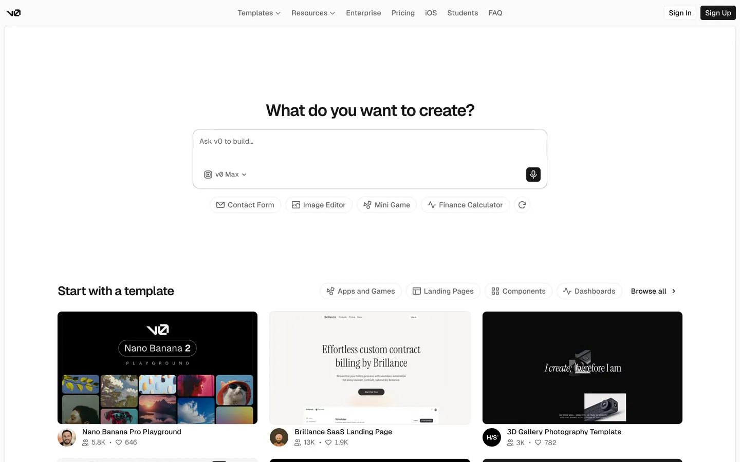
v0's marketing site makes one move and trusts it absolutely: the prompt input IS the hero. Above the fold sits a 48px GeistSans display headline reading "What do you want to create?" with a single oversized text-input field anchored beneath it — placeholder text "Ask v0 to build…", a model selector chip on the left (showing v0 Max), a microphone icon on the right, and a 12px corner radius on the field outline. Below the input, four suggested-prompt pills (Contact Form, Image Editor, Mini Game, Finance Calculator) sit on a row with a refresh icon. There is no headline gradient, no rotating tagline, no decorative chrome above or below the input. The entire above-fold composition is the question, the field, and the suggestions — the simplest possible expression of "type here and we'll build it."
The DESIGN.md file packages the system into a machine-readable spec for React tooling. Inside: 5 colors tokens, all structural — ink black `#000000` carrying 154 occurrences (1 as text, 153 across the declared variable tree), a single hairline gray `#e4e4e7` for the input outline and template-card borders, and a near-white canvas tone matching the captured theme-color value. Seven typography tokens running GeistSans at 13, 14, 16, 20, 24, 32, and 48px in weights 400 / 500 / 600, plus a single 10px GeistMono tier for caption labels (5 occurrences). Six corner-radius tokens including the dominant maximum-pill (91 occurrences) and the 12px input rounding. Sixteen component definitions covering the prompt input, the filled-ink CTA pill, the white Sign In pill, the suggested-prompt chip, the template-category tab, the template card, and the top-nav.
Feed this file to Claude or Cursor and it reproduces v0's specific moves: monochrome chrome rather than the Vercel-house pink-and-cyan gradient, a single oversized prompt input as the entire above-fold conversion surface, pill CTAs at maximum rounding, GeistSans + GeistMono as the only two typographic voices, and template thumbnails carrying the only chromatic moments below the fold. The one move worth borrowing is the discipline of letting the input field do the marketing work — v0 trusts that anyone landing on the page already knows what v0 is, so the page is built as the first turn of a conversation rather than as a sales pitch. For a brand selling tools to people who have never heard of them, this would feel underused.
What makes it distinct
5
- Prompt input as herothe single 12px-rounded input field anchored under a 48px display headline is the entire above-fold composition
- Monochrome chrome by disciplineink-on-near-white carries every rendered tone; Vercel's Geist palette of pink and cyan is declared but never rendered above the fold
- GeistSans + GeistMono as the only two voicessans at 13-48px in weights 400 / 500 / 600 for spoken surfaces, mono at 10px for the rare label
- Maximum-radius pill on every buttonSign In, Sign Up, template-category tabs, and the suggested-prompt chips all render at full pill rounding (91 occurrences)
- Vercel-derived black-on-white treatmentthe filled Sign Up CTA is a pill of pure ink with white text, the only conventional voltage surrogate on the page
v0.app
Live at v0.app
A snapshot of the brand in production. Scroll the frame to see the whole page.
Colors
5 colors
v0's system runs on #000000 as its primary voltage, used in 14 of 16 components. Type is set in GeistSans across 11 tokens from 10px to 48px, weights 400–600. Shape language is mixed across 16 components, blending pills, soft rounds, and squarer corners.
Surface
Page and card backgrounds · 2
Text
Headlines, body, captions · 2
Borders & Hairlines
Dividers, outlines, rules · 1
Typography
11 type tokens
Set in GeistSans across 11 tokens, from 10px to 48px, weights 400–600. Shown in its own stack: where the font isn't installed, the fallback the file names stands in.
- display-xl48px · weight 600 · lh 56px · tracking -2.88pxThe quick brown fox jumps over the lazy dog
- display-lg32px · weight 600 · lh 40px · tracking -1.28pxThe quick brown fox jumps over the lazy dog
- heading-md24px · weight 600 · lh 32px · tracking -0.96pxThe quick brown fox jumps over the lazy dog
- heading-sm20px · weight 600 · lh 26px · tracking -0.4pxThe quick brown fox jumps over the lazy dog
- body-md16px · weight 400 · lh 24pxThe quick brown fox jumps over the lazy dog
- body-sm14px · weight 400 · lh 20pxThe quick brown fox jumps over the lazy dog
- label-md14px · weight 500 · lh 20pxThe quick brown fox jumps over the lazy dog
- meta-sm13px · weight 400 · lh 13pxThe quick brown fox jumps over the lazy dog
- button-md14px · weight 500 · lh 20pxThe quick brown fox jumps over the lazy dog
- nav-link14px · weight 500 · lh 20pxThe quick brown fox jumps over the lazy dog
- mono-xs10px · weight 400 · lh 15pxThe quick brown fox jumps over the lazy dog
Layout
Radii and spacing
7 corner radii and 7 spacing values. Shape language: mixed.
Radii
- none0px
- xs4px
- sm6px
- md8px
- lg12px
- xl16px
- full9999px
Spacing
- xs4px
- sm6px
- base8px
- md12px
- lg16px
- xl24px
- 2xl32px
Components
16 components
Each rendered from its tokens (color, type, radius, padding) on v0's own canvas.
- Button Primarybutton-primaryButton Primary
- Button Secondarybutton-secondaryButton Secondary
- Top Navtop-navTop Nav
- Nav Linknav-linkNav Link
- WordmarkwordmarkWordmark
- Hero Headinghero-headingHero Heading
- Section Headingsection-headingSection Heading
- Body Paragraphbody-paragraphBody Paragraph
- Prompt Inputprompt-inputPrompt Input
- Model Selector Chipmodel-selector-chipModel Selector Chip
- Mic Buttonmic-buttonMic Button
- Suggested Chipsuggested-chipSuggested Chip
- Category Tabcategory-tabCategory Tab
- Template Cardtemplate-cardTemplate Card
- Meta Rowmeta-rowMeta Row
- FooterfooterFooter
In use
The system, in use
v0's tokens on the kind of product it builds.
Build something people actually use.
A short paragraph of marketing copy that previews how the brand's display tier and body tier read together. Two sentences is usually enough.
FAQ
v0 design system FAQ
Common questions about v0's tokens, components, and how to use this DESIGN.md in your project.
Read next
Related reading
Specs, directories, and component libraries that pair with this design system.
- Browse all design systemsThe full directory of DESIGN.md files on shadcn.io, with live mockups for each.shadcn.io
- v0 — official sitev0's public marketing site — the source of truth for the live tokens captured in this file.v0.app (opens in a new tab)
- The DESIGN.md specificationGoogle Labs' open spec for machine-readable design system files — the format this page is built on.github.com (opens in a new tab)
Use it
Use v0 in your project
One machine-readable file. Drop it into Claude, Cursor, or any AI tool that reads DESIGN.md.
Download the DESIGN.md
One machine-readable file: every color, type, radius, spacing, and component token of v0.
Feed it to your AI tool
Drop it into Claude, Cursor, or GitHub Copilot. The agent writes React components and Tailwind classes that match v0's visual language.
Reference the tokens directly
Or paste the values into your Tailwind config, CSS variables, or component library: every color, size and radius is a quoted, ready-to-copy value.
Read the full DESIGN.md: overview, rationale, do’s and don’ts
Overview
v0's marketing site makes one move and trusts it absolutely. Prompt input as hero. Above the fold sits a 48px GeistSans display headline ("What do you want to create?") with a single oversized text-input field anchored beneath it — placeholder text "Ask v0 to build…", a model selector chip on the left, a microphone icon on the right, and a 12px corner radius on the field outline. Below the input, four suggested-prompt pills (Contact Form, Image Editor, Mini Game, Finance Calculator) sit in a single row beside a refresh icon. There is no headline gradient, no rotating tagline, no decorative chrome above or below the input. Where Cursor sits on a charcoal canvas with code-snippet animations and Anthropic Claude leans on a cream editorial frame, v0 builds the marketing page as the first turn of a conversation. The page assumes anyone arriving already knows what v0 is.
The chromatic restraint is structural, not editorial. The captured page renders {colors.ink} (black) 154 times across the variable tree but only once as actual text on the page, and {colors.hairline} (#e4e4e7) once as a border tone on the prompt-input outline. The Vercel-house Geist palette — pink, magenta, cyan, teal, electric blue — is declared in the inherited token system but renders 0 times on the captured marketing surface. The filled-ink Sign Up pill at the top-right is the only conventional voltage surrogate; everywhere else, monochrome discipline carries the visual identity. This is the inverse of single-voltage discipline at Cloudflare or Spline: instead of holding one accent in reserve, v0 holds nothing in reserve and lets the template thumbnails below the fold supply the only color.
Typography is a two-voice split: GeistSans for every spoken surface and GeistMono for the rare 10px label tier. The display tier sits at 48px / 600 with -2.88px letter-spacing — tight tracking, weight 600 not 700, the typographic confidence Vercel's house aesthetic relies on. The body tier shares weight 400, the label tier weight 500, and the nav-link tier weight 500. There is no second display family, no serif moment, and no all-caps treatment outside the rare mono caption.
Key Characteristics:
- Prompt input as the entire above-fold composition — a 12px-rounded text-input field at
{component.prompt-input}anchored under the display headline; no secondary CTA, no feature list, no logo wall. - Monochrome chrome —
{colors.ink}text on a{colors.canvas}near-white floor, with{colors.hairline}providing the single border tone. - Vercel Geist palette declared but never rendered — magenta, cyan, electric blue exist in the inherited CSS but carry 0 above-fold occurrences.
- GeistSans + GeistMono as the only two typographic voices — sans across every spoken tier in weights 400 / 500 / 600, mono at 10px for the meta-caption.
- Maximum-radius pill (
{rounded.full}— 91 occurrences) on every button, chip, and tappable rectangle — Sign In, Sign Up, suggested-prompt chips, category tabs all share the same full-pill silhouette. - Filled-ink Sign Up pill (
{component.button-primary}) at 32px height — the only conventional voltage surrogate on the page; the Sign In pill is white-with-hairline. - Template thumbnails below the fold supply the only chromatic moments — Nano Banana 2 playground (black with film-still grid), Brillance landing page (cream with editorial type), 3D Gallery (deep slate with white sculpture).
- Section padding tightens to 16px between the template-grid rows; the page is dense once you scroll past the input rather than running on a generous hero rhythm.
Colors
The system has no brand-layer color rendered above the fold. The Vercel Geist palette (#ff0080, #f81ce5, #0070f3, #00dfd8, #00e7c1) is declared in the inherited CSS variable tree but carries 0 background, 0 border, and 0 text occurrences on the captured marketing surface. The system runs entirely on the structural tier.
Text
- Ink (
{colors.ink}): frequency 154 in the CSS variable tree (1 as text on the page itself). The single dominant text tone — every headline, body paragraph, nav label, and button label renders in pure black. Wired across--geist-console-text-color-default,--color-v0-alpha-700,--v0-alpha-300, and dozens of theme tokens. The filled-ink Sign Up pill ({component.button-primary}) and the inline mic button both use this tone as a fill rather than as text. - Ink Muted (
{colors.ink-muted}): the meta-row tone for template-card sub-labels ("5.8K · 646", "13K · 1.9K"), wired as--geist-secondaryin the Vercel design tree. Used inside{component.meta-row}and footer copy.
Surface
- Canvas (
{colors.canvas}): the near-white page floor, matching the capturedtheme-colorvalue. Wired across--geist-background,--geist-page-background, and the alpha-800 token tier. The top-nav, the body bands, and the footer all sit on this tone. - Surface-1 (
{colors.surface-1}): pure white, used inside the prompt-input field, the template cards, and the Sign In pill. The 2-step lightness gap between{colors.canvas}and{colors.surface-1}provides the only surface contrast in the system.
Hairline
- Hairline (
{colors.hairline}): frequency 1 as border — the input-outline tone and the template-card border tone. Wired as--color-zinc-200,--geist-secondary-lighter, and--geist-violet-background-tertiary. The system is mono-hairline; there is no second divider tone above the fold.
Typography
Font Families
The system runs two voices from Vercel's open-source Geist family. GeistSans carries every spoken surface — display, heading, body, button, nav, label. GeistMono carries a single 10px tier used for meta-captions inside template cards (5 occurrences in the captured page). Both faces ship under the geist-font npm package and Vercel's marketing surfaces share the same two-voice split.
Fallbacks walk to ui-sans-serif, system-ui, sans-serif and ui-monospace, SFMono-Regular, Menlo, monospace. There is no Inter or system-ui safety stack declared as a primary fallback — GeistSans is the asserted face.
Hierarchy
| Token | Size | Weight | Line Height | Letter Spacing | Use |
|---|---|---|---|---|---|
{typography.display-xl} | 48px | 600 | 56px | -2.88px | Hero h3 ("Prompt. Build. Publish.") |
{typography.display-lg} | 32px | 600 | 40px | -1.28px | Secondary display, h1 ("What do you want to create?") |
{typography.heading-md} | 24px | 600 | 32px | -0.96px | Section h2 ("Start with a template") |
{typography.heading-sm} | 20px | 600 | 26px | -0.4px | Sub-section h3 |
{typography.body-md} | 16px | 400 | 24px | 0 | Default running paragraph |
{typography.body-sm} | 14px | 400 | 20px | 0 | Default link tier, template-card body |
{typography.label-md} | 14px | 500 | 20px | 0 | Button label, nav link, emphasis label |
{typography.meta-sm} | 13px | 400 | 13px | 0 | Template-card meta row ("5.8K · 646") |
{typography.button-md} | 14px | 500 | 20px | 0 | Pill button label |
{typography.nav-link} | 14px | 500 | 20px | 0 | Top-nav link labels |
{typography.mono-xs} | 10px | 400 | 15px | 0 | Meta caption inside template cards (GeistMono) |
Principles
Display weight sits at 600 with tight negative letter-spacing — the typographic confidence Vercel's house aesthetic depends on. The 48px hero heading at -2.88px tracking is the loudest typographic moment in the system; the 32px h1 with -1.28px tracking is the working display tier for content rows. Weight 500 is the system's emphasis treatment, distinct from the 600 heading weight, used uniformly across buttons, nav links, and label cells.
The mono tier is reserved for one specific job: the 10px caption inside template cards (the dimensions, the price tag, the secondary identifier). Mono never appears in headings, body, or buttons.
Note on Font Substitutes
GeistSans and GeistMono are Vercel's open-source faces, available under the OFL via the geist-font npm package. Inter at the same weights is the closest non-Vercel substitute for GeistSans but reads slightly narrower at the 48px display tier — adjust to weight 700 to compensate, or use General Sans (also open-source) for closer letterform geometry. JetBrains Mono or IBM Plex Mono at 10px transfer cleanly for the GeistMono caption tier. Tight letter-spacing at the display tier (-2.88px at 48px) is the move to preserve regardless of which substitute carries the type.
Layout
Spacing System
- Base unit: 4px —
{spacing.xs}carries the smallest gap. - Tokens:
{spacing.xs}4px ·{spacing.sm}6px ·{spacing.base}8px ·{spacing.md}12px ·{spacing.lg}16px ·{spacing.xl}24px ·{spacing.2xl}32px. - Section padding: the hero band runs ~80px between nav and the display headline, ~32px between the input field and the suggested-prompt row, then ~96px before the "Start with a template" h2.
- Card internal padding: the template card uses 0 padding (artwork fills the card); the author / meta row beneath sits at 12px below the card edge.
- Top-nav padding:
{spacing.md}(12px) vertical,{spacing.xl}(24px) horizontal.
Grid & Container
- Max content width: ~720px on the prompt input field, ~1200px on the template grid.
- Hero block: centered prompt input column at ~720px, with the suggested-prompt chip row sitting at the same width directly beneath.
- Template grid: 3-column at desktop showing the latest community templates (Nano Banana 2 Playground, Brillance SaaS Landing Page, 3D Gallery Photography Template), each card carrying the artwork thumbnail above an author / metadata row.
- Category-tab strip: single horizontal row above the template grid, with the section h2 ("Start with a template") flush left and the category pills (Apps and Games, Landing Pages, Components, Dashboards) flush right.
Rhythm
The page is generous at the hero, dense below. Above the fold runs at 80-96px section padding around the prompt input. Below the fold tightens to 16px between template-grid rows and 8px between meta elements inside each card. The transition from generous to dense happens at the "Start with a template" h2, signaling the shift from conversation-mode to catalog-mode.
Elevation
The system has essentially no shadow tier rendered on the captured surface. Depth comes entirely from hairline-bordered surfaces ({colors.hairline} outlines on the prompt input, template cards, and chip rows) and from the 2-step lightness gap between {colors.canvas} and {colors.surface-1}. There is no card-lift drop-shadow, no nav drop-shadow, no hover-elevation.
- Flat (no shadow): every chrome surface — nav, hero, template grid, footer.
- Hairline-bordered: prompt input, template cards, suggested-prompt chips, category tabs —
{colors.hairline}does the elevation work. - Tonal lift:
{colors.surface-1}(pure white) inside cards and inputs sits on the{colors.canvas}near-white floor; the 2-step lightness gap reads as quiet elevation without a shadow being drawn.
Shapes
The radius scale is binary: maximum-pill plus small-step. The dominant value is the maximum representable border-radius (rendered in CSS as 33554432px, effectively a full pill, 91 occurrences). The supporting tiers are tight: 4-16px on every other rounded surface.
- Pill:
{rounded.full}— Sign In / Sign Up buttons, suggested-prompt chips, category tabs. Every tappable rectangle that needs to read as a button uses this radius. - Small-step:
{rounded.xs}4px (22 occurrences — small chips),{rounded.sm}6px (10 — nav-link hover surface),{rounded.md}8px (23 — template cards, model-selector chip),{rounded.lg}12px (19 — prompt input, suggested controls),{rounded.xl}16px (10 — larger cards and feature blocks). - No middle: the scale skips 20 / 24px entirely. Either a surface goes to a full pill or sits in the 4-16px tight tier.
The binary mirrors the Vercel house pattern: tappable surfaces are pills, structural surfaces are tight rectangles. There is no rounded-but-not-pill option.
Components
button-primary — The Sign Up pill at the top-right of the nav. Ink {colors.ink} fill, white {colors.surface-1} text, {typography.button-md} (GeistSans 14px / 500), {rounded.full} pill, 4×12 padding, 32px height. The only conventional voltage surrogate on the page; the only filled-ink chrome surface above the fold.
button-secondary — The Sign In pill, immediately adjacent. White {colors.surface-1} fill, ink text, 1px {colors.hairline} border, same {rounded.full} pill and 32px height. The pair frames the right-hand nav cluster.
top-nav — Near-white {colors.canvas} surface, 56px height, 12×24 padding. Houses the v0 wordmark flush left, the product menu (Templates, Resources, Enterprise, Pricing, iOS, Students, FAQ) center-flush, and the Sign In / Sign Up pill pair right-flush. No bottom-hairline rule; the nav floats on the canvas.
nav-link — Transparent background, ink text in {typography.nav-link} (14px / 500), 4×8 padding, 28px height, {rounded.sm} 6px on the hover-state pill. The dropdown indicators on Templates / Resources carry a small chevron glyph.
wordmark — Ink text in the v0 glyph at {typography.label-md} (14px / 500). The brand mark — a stylized v0 that reads as a folded-paper shape; sits flush left in the nav.
hero-heading — Ink text on the canvas at {typography.display-xl} (48px / 600, -2.88px tracking). The hero h3 ("Prompt. Build. Publish.") wired in the captured page as h3 rather than h1; the h1 ("What do you want to create?") sits at {typography.display-lg} 32px below it.
section-heading — Ink text at {typography.heading-md} (24px / 600, -0.96px tracking). Used for "Start with a template" above the template grid and similar catalog-band headers.
body-paragraph — Ink text at {typography.body-md} (16px / 400, 24px line-height). The default running-text tier; reads as quiet documentation copy.
prompt-input — White {colors.surface-1} fill, ink text, 1px {colors.hairline} border, {rounded.lg} 12px radius, 16px padding, 104px height (multi-line capable). The single defining element on the page; placeholder reads "Ask v0 to build…". Houses the model-selector chip and the mic button at the bottom of the field.
model-selector-chip — Transparent fill, ink text in {typography.body-sm}, 1px {colors.hairline} border, {rounded.md} 8px radius, 4×8 padding, 28px height. Houses the model-icon glyph and the "v0 Max" label with a dropdown chevron. Sits at the bottom-left of the prompt input.
mic-button — Ink fill, white mic glyph, {rounded.md} 8px radius, 0 padding, 32×32 dimensions. The single icon-only ink button on the page; sits at the bottom-right of the prompt input. The only filled-ink surface outside the Sign Up pill.
suggested-chip — White fill, ink text in {typography.button-md}, 1px hairline border, {rounded.full} pill, 4×12 padding, 32px height. The four suggested-prompt chips (Contact Form, Image Editor, Mini Game, Finance Calculator) that sit beneath the prompt input. Each chip carries a small leading glyph (envelope, image, gamepad, chart).
category-tab — Same pattern as {component.suggested-chip} but used above the template grid for filtering (Apps and Games, Landing Pages, Components, Dashboards). The pair is functionally identical; only the context differs.
template-card — White fill, hairline border, {rounded.md} 8px radius, 0 internal padding (the thumbnail image fills the card edge-to-edge). The author / metadata row sits below the card at 12px gap rather than inside the card itself.
meta-row — Transparent background, muted-ink text in {typography.meta-sm} (13px / 400). The "5.8K · 646" engagement-count row beneath each template card; renders the participant-count icon, the count, a dot separator, the heart icon, and the like count.
footer — Canvas-toned surface, muted-ink text at {typography.body-sm}, 32×24 padding. No surface contrast against the page floor.
Do's and Don'ts
Do treat the prompt input as the entire above-fold composition. The single defining move of this system is anchoring the page on the input rather than on a feature grid; surrounding it with feature cards or testimonial logos undercuts the conversation-mode pattern.
Do keep the chrome monochrome. The Vercel Geist palette of pink, magenta, electric blue, and cyan is declared in the inherited CSS but rendered 0 times above the fold; introducing any of those tones into chrome surfaces would break the discipline that lets the template thumbnails carry the only color.
Do use the full pill {rounded.full} for every tappable rectangle — Sign In, Sign Up, suggested-prompt chips, category tabs. The binary radius scale depends on this consistency; mixing pill-buttons with 8px-rounded-rectangle buttons reads as a system fault.
Do reserve {typography.mono-xs} for the template-card meta-row only. GeistMono has exactly one job in this system — the 10px caption — and reaching for it on labels or chips dilutes the two-voice typographic split.
Don't add a Vercel-house gradient to the hero. The page deliberately avoids the pink-to-blue marketing gradient Vercel uses on its own landing page; v0's hero is white, the input is white, the chrome is monochrome. Introducing a gradient ruins the conversation-mode framing.
Don't invert the Sign Up pill to a colored fill. The filled-ink pill is the only conventional voltage surrogate in the system; switching it to a magenta or cyan brand color makes the Vercel-house palette suddenly competitive with the template thumbnails below and breaks the figure-ground inversion.
Don't introduce a 20px or 24px middle radius tier. The system is binary — full pill on tappable surfaces, 4-16px tight tier on structural surfaces. Adding a middle softens the contrast between buttons and cards.
Don't render display headlines at weight 700. The system sits at weight 600 with tight negative tracking; bumping to weight 700 loses the quiet-confidence display treatment Vercel relies on and tips the page toward a generic SaaS aesthetic.
Known Gaps
- Hover and focus states: the captured page exposes only resting states. Nav-link hover surfaces, pill-button hover ink, prompt-input focus ring, and template-card hover lift are not represented as discrete tokens.
- Dark mode: the captured marketing surface is light-only on the near-white canvas. A dark variant exists in the v0 product surface (
v0.app/chat/*) but is not represented here. - Form input error states:
{component.prompt-input}carries the resting state only; error / validation styling lives inside the product editor and is not exposed on the marketing surface. - Streaming / generation states: the live product surface renders streaming code generation with syntax highlighting, progress indicators, and stop-button states; none of these surfaces appear above the fold on the marketing page.
- Geist palette in product: the wider Vercel Geist palette (magenta, electric blue, cyan, teal) likely appears inside the product surface for status indicators and syntax highlighting. The captured marketing surface does not render any of them.
- Product surfaces: this DESIGN.md captures the marketing site only. The v0 chat surface (
v0.app/chat), the project preview surface, and the user dashboard carry their own token systems that are not represented here. - Pricing and Enterprise pages: the captured surface is the landing page only. Pricing / Enterprise sub-pages may expose feature-comparison tables, plan-card tiers, and CTA voltage that are not present in the landing-page chrome.
AI & LLM Platforms
More systems like this
More DESIGN.md files in AI & LLM Platforms.
Pricing
Build it with Pro
The DESIGN.md files are free. Pro adds 6,000+ blocks, premium templates and the MCP server, so your AI editor builds in your system for you.
4.9/5 out of 5 · 150+ reviewsfrom 150+ founders and developers.
Billing
Billed once a year in USD. Cancel anytime.
- How many people can use the license.
- Client work, SaaS products and anything you charge for.
- Production-ready React sections: hero, pricing, features, dashboards and more.
- Complete multi-page sites you can ship as they are.
- React icons from every major library, installable with one command.
- Presets that restyle every block, in light and dark.
- Lets your AI editor search, preview and install blocks for you.
- Priority requests are answered first.
Individual
For personal projects & open source
$32instead of $49/mo
$389 billed yearly
- Seats: 1 seat
- Commercial use: Personal & open source only
- Pro blocks: 6,000+ blocks
- Templates: All 14 templates
- React icons: 294k+ icons
- Themes: All 59 themes
- MCP server: Basic usage
- Support: Standard
Team
Most popularFor freelancers, agencies & startups
$66instead of $99/mo
$789 billed yearly · ≈ $13/dev/mo
- Seats: Up to 5 seats
- Commercial use: Included
- Pro blocks: 6,000+ blocks
- Templates: All 14 templates
- React icons: 294k+ icons
- Themes: All 59 themes
- MCP server: High usage
- Support: Priority
Organization
For companies with larger teams
$132instead of $199/mo
$1,589 billed yearly
- Seats: Unlimited seats
- Commercial use: Included
- Pro blocks: 6,000+ blocks
- Templates: All 14 templates
- React icons: 294k+ icons
- Themes: All 59 themes
- MCP server: Unlimited usage
- Support: Priority
Billed once a year in USD. Cancel anytime.
Individual
For personal projects & open source
$32instead of $49/mo
$389 billed yearly
- How many people can use the license.Seats: 1 seat
- Client work, SaaS products and anything you charge for.Commercial use: Personal & open source only
- Production-ready React sections: hero, pricing, features, dashboards and more.Pro blocks: 6,000+ blocks
- Complete multi-page sites you can ship as they are.Templates: All 14 templates
- React icons from every major library, installable with one command.React icons: 294k+ icons
- Presets that restyle every block, in light and dark.Themes: All 59 themes
- Lets your AI editor search, preview and install blocks for you.MCP server: Basic usage
- Priority requests are answered first.Support: Standard
Team
Most popularFor freelancers, agencies & startups
$66instead of $99/mo
$789 billed yearly · ≈ $13/dev/mo
Everything in Individual, plus
- How many people can use the license.Seats: Up to 5 seats
- Client work, SaaS products and anything you charge for.Commercial use: Included
- Lets your AI editor search, preview and install blocks for you.MCP server: High usage
- Priority requests are answered first.Support: Priority
Organization
For companies with larger teams
$132instead of $199/mo
$1,589 billed yearly
Everything in Team, plus
- How many people can use the license.Seats: Unlimited seats
- Lets your AI editor search, preview and install blocks for you.MCP server: Unlimited usage
- Secure checkout via Stripe
- Code lives in your repo
- Keep what you've shipped if you cancel
- License terms
Your system, built for you
Every block, template and icon, installed by your AI agent in your design system. The DESIGN.md files stay free.