UNIQLO Design System
UNIQLO US storefront tokenized as a DESIGN.md file. Helvetica Neue + UniqloProRegular, black #000000, red #ee0000, 20 colors, 19 components. For React and AI tools.
Add shadcn.io to your AI agent. · Pro It installs blocks, icons and templates in your design system from a prompt, with Pro.
Set up MCP- Primary
- #3e3e3e
- Typeface
- Helvetica Neue
- Shape
- Soft
- Base radius
- 0px
- Colors
- 20
- Type tokens
- 11
- Components
- 19
- Spacing values
- 9
About
About UNIQLO DESIGN.md
Curated by Dov Azencot · Updated May 13, 2026 · Source uniqlo.com (opens in a new tab)
UNIQLO's US storefront pushes black-on-white retail to its limit. The page paints pure `#000000` ink — not a warm graphite, not a soft charcoal — 645 times across text (324), borders (320), and a single gradient stop, sitting on `#ffffff` canvas with no warm tint, no off-white, no cream. The iconic Logo Red (`#ee0000`) is held to 16 appearances total: 8 as text, 8 as border, never as a background fill on a button. The red lives in the wordmark, the small UT tile in the category grid, the sale-flag corner on portrait photography, and the shipping-promo dismiss. Where most fast-fashion retailers paint primary CTAs in a saturated brand voltage and scatter accent pigments across the catalogue, UNIQLO commits to a 11:1 ink-to-canvas ratio and refuses to let any chromatic accent compete with the garment.
This page packages the storefront into a DESIGN.md file built on the Google Labs open specification. Inside: 20 colors tokens organized into ink, surface, hairline, brand-red, and a dormant accent layer carrying 12 :root-declared swatches that don't paint on the homepage (accent-blue `#005db5`, success-green `#00ab0f`, deep-red `#870000`, navy `#002955`, plus a 10-step grey ramp); 11 typography roles split between the Helvetica Neue stack and UniqloProRegular; a one-tier radius scale (`999px` for four taxonomic pills, `0px` everywhere else); a `4px` / `8px` / `16px` / `24px` / `32px` spacing rhythm extracted directly from the homepage's computed paddings (26 occurrences of `8px`, 23 of `4px`, 22 of `16px`); and 19 components entries covering the top nav, search input, category chip, hero overlay card, UT tile, sale-flag corner badge, product portrait, and the four-column footer.
Feed the file to Claude, Cursor, or GitHub Copilot and the agent reproduces UNIQLO's chromatic discipline — square corners, Helvetica labels, a single red mark reserved for sale flags and the UT badge, photography-led portraits with corner-pinned price flags — rather than a generic apparel template. Reference `{component.button-primary}`, `{component.ut-tile}`, or `{component.price-flag}` directly in your prompts and the output stays inside the system's voice. Where most direct-to-consumer fashion brands soften corners to 8px and scatter accent pigments to signal warmth, UNIQLO holds every interactive surface at `0px`, lets the photograph supply every color note, and the result reads like a Tokyo print catalog rendered for the web.
What makes it distinct
5
- Single-voltage red`#ee0000` (UNIQLO Logo Red) appears 16 times total, 8 as text and 8 as border, never as a primary button fill
- Absolute black chrome`#000000` carries 645 occurrences against 57 of `#ffffff`, a 11:1 ink-to-canvas ratio that no other global fashion retailer pushes that far
- Two-typeface splitHelvetica Neue stack at weight 400 for every catalogue label; UniqloProRegular at `0.36px` uppercase tracking for the wordmark, hero overlays, and the UT mark
- One-tier radius`999px` reserved for four taxonomic pills; every button, card, hero overlay, and product tile holds at hard `0px` corners
- Dormant atlas of 60 :root CSS variablesaccent-blue `#005db5`, success-green `#00ab0f`, deep-red `#870000`, and a 10-step grey ramp declared but unused on the homepage
uniqlo.com
Live at uniqlo.com
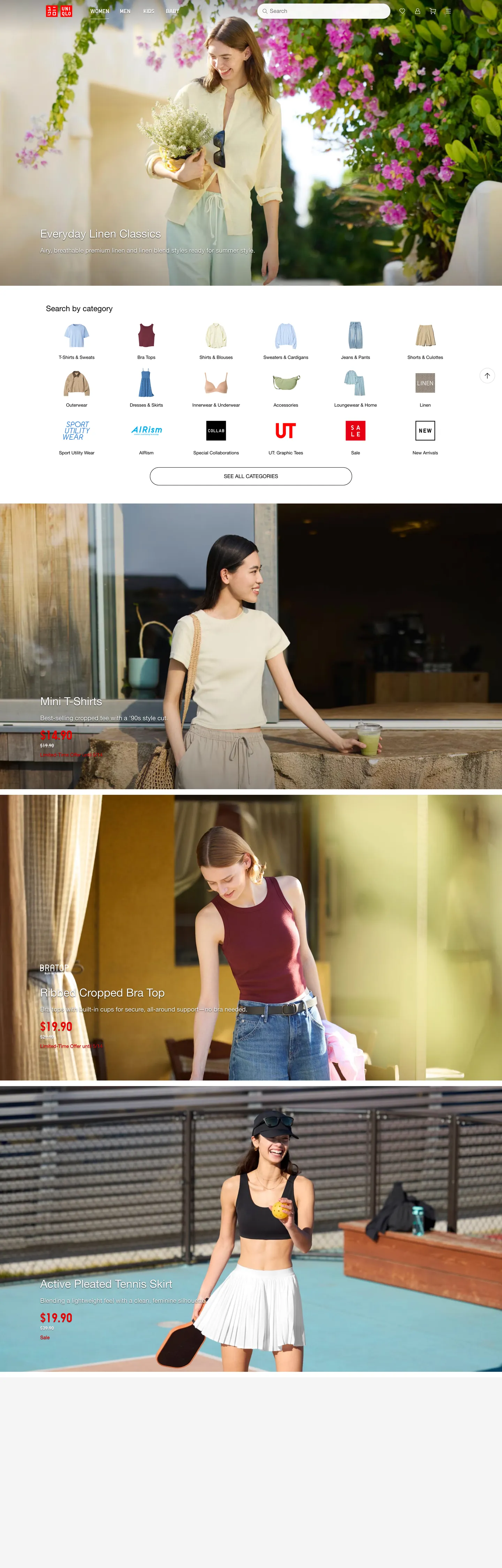
A snapshot of the brand in production. Scroll the frame to see the whole page.
Colors
20 colors
UNIQLO's system anchors on #3e3e3e (ink-mid) as its primary color. Type is set in Helvetica Neue across 11 tokens from 13px to 36px, weights 400–400. Shape language is soft — components average 56px corner radius, with no sharp interactive edges.
Brand & Accent
Sparing, CTA-only voltage · 7
Surface
Page and card backgrounds · 2
Text
Headlines, body, captions · 7
Borders & Hairlines
Dividers, outlines, rules · 1
Semantic
Status, errors, success, links · 3
Typography
11 type tokens
Set in Helvetica Neue across 11 tokens, from 13px to 36px, weights 400–400. Shown in its own stack: where the font isn't installed, the fallback the file names stands in.
- display-overlay32px · weight 400 · lh 1.2The quick brown fox jumps over the lazy dog
- display-uniqlo-pro36px · weight 400 · lh 1.2 · tracking 0.36pxThe quick brown fox jumps over the lazy dog
- heading-md22px · weight 400 · lh 1.2The quick brown fox jumps over the lazy dog
- heading-sm18px · weight 400 · lh 1.3The quick brown fox jumps over the lazy dog
- body-lg17px · weight 400 · lh 1.2 · tracking 0.36pxThe quick brown fox jumps over the lazy dog
- body-md16px · weight 400 · lh 1.2The quick brown fox jumps over the lazy dog
- body-sm15px · weight 400 · lh 1.4The quick brown fox jumps over the lazy dog
- body-uniqlo-pro15px · weight 400 · lh 1.2 · tracking 0.36pxThe quick brown fox jumps over the lazy dog
- body-default14px · weight 400 · lh 1.3The quick brown fox jumps over the lazy dog
- caption13px · weight 400 · lh 1.3The quick brown fox jumps over the lazy dog
- micro-uppercase15px · weight 400 · lh 1.2The quick brown fox jumps over the lazy dog
Layout
Radii and spacing
2 corner radii and 9 spacing values. Shape language: soft.
Radii
- none0px
- full999px
Spacing
- xxs2px
- xs4px
- sm8px
- base12px
- md16px
- lg24px
- xl32px
- 2xl48px
- 3xl96px
Components
19 components
Each rendered from its tokens (color, type, radius, padding) on UNIQLO's own canvas.
- Top Navtop-navTop Nav
- Wordmark Chipwordmark-chipWordmark Chip
- Nav Linknav-linkNav Link
- Type here…text-inputText Input
- Button Primarybutton-primaryButton Primary
- Button Primary Hoverbutton-primary-hoverButton Primary Hover
- Button Secondarybutton-secondaryButton Secondary
- Button Text Linkbutton-text-linkButton Text Link
- Category Chipcategory-chipCategory Chip
- Category Tilecategory-tileCategory Tile
- Ut Tileut-tileUt Tile
- Price Flagprice-flagPrice Flag
- Product Portraitproduct-portraitProduct Portrait
- Hero Overlay Cardhero-overlay-cardHero Overlay Card
- Hero Overlay Captionhero-overlay-captionHero Overlay Caption
- Announcement Barannouncement-barAnnouncement Bar
- Hairline Rulehairline-ruleHairline Rule
- FooterfooterFooter
- Badge Salebadge-saleBadge Sale
In use
The system, in use
UNIQLO's tokens on the kind of product it builds.
Build something people actually use.
A short paragraph of marketing copy that previews how the brand's display tier and body tier read together. Two sentences is usually enough.
FAQ
UNIQLO design system FAQ
Common questions about UNIQLO's tokens, components, and how to use this DESIGN.md in your project.
Read next
Related reading
Specs, directories, and component libraries that pair with this design system.
- Browse all design systemsThe full directory of DESIGN.md files on shadcn.io, with live mockups for each.shadcn.io
- UNIQLO US — official siteThe UNIQLO US storefront this DESIGN.md was extracted from on 2026-05-13.uniqlo.com (opens in a new tab)
- The DESIGN.md specificationGoogle Labs' open spec for machine-readable design system files — the format this page is built on.github.com (opens in a new tab)
Use it
Use UNIQLO in your project
One machine-readable file. Drop it into Claude, Cursor, or any AI tool that reads DESIGN.md.
Download the DESIGN.md
One machine-readable file: every color, type, radius, spacing, and component token of UNIQLO.
Feed it to your AI tool
Drop it into Claude, Cursor, or GitHub Copilot. The agent writes React components and Tailwind classes that match UNIQLO's visual language.
Reference the tokens directly
Or paste the values into your Tailwind config, CSS variables, or component library: every color, size and radius is a quoted, ready-to-copy value.
Read the full DESIGN.md: overview, rationale, do’s and don’ts
Overview
UNIQLO's US storefront is the most absolute black-on-white retail chrome in fast fashion — #000000 ink against #ffffff canvas, an 11:1 occurrence ratio (645 to 57) that no other global apparel retailer pushes that far. The Logo Red ({colors.brand-red} — #ee0000) is held to 16 appearances total across the homepage: 8 as text, 8 as border, and zero as a button background. Where most fast-fashion brands paint a saturated primary CTA in their brand voltage and scatter accent pigments across the catalogue, UNIQLO scopes the red to four jobs only — the wordmark chip, the UT tile in the category grid, the corner sale-flag pinned to portrait photography, and the dismiss control on the shipping-promo announcement bar. Every primary button on the page is #000000 ink with #ffffff text and 0px corners.
The type system runs two faces, one weight. The Helvetica Neue, Helvetica, Arial system stack paints every catalogue label from the 32px white hero overlay down to the 13px footer caption (18 occurrences). The proprietary UniqloProRegular face appears at 36px, 17px uppercase, and 15px with 0.36px letter-spacing — reserved for the wordmark, hero campaign overlays, and the UT mark. Both faces sit at weight 400 only — no 500, no 600, no 700, no italic on the homepage. The whole catalogue is rendered in a single body weight; emphasis comes from size, casing, and color inversion, never from a heavier glyph.
Print-catalog discipline: UNIQLO inherits from the Japanese fast-fashion catalog tradition where the photograph is the page and the chrome whispers the price beneath it. The interface mirrors the philosophy. Where most direct-to-consumer apparel storefronts soften corners to 8px and chase warmth with cream surfaces and beige accents, UNIQLO holds every interactive surface at 0px, paints the canvas in pure white with no warm tint, and lets the portrait photography (a model in a Linen tunic, a model with a tennis skirt, a model in a leopard-print top) carry every chromatic note. The result reads like a folded Tokyo catalog rendered for the browser.
Key Characteristics:
- Absolute black ink (
{colors.ink}— #000000) used 645 times across text (324), borders (320), and a single gradient stop. Declared across 65 :root variables including--black,--textPrimaryDefault,--borderPrimaryDefault, and the entire--blackOpacity10through--blackOpacity95opacity scale. - Logo Red (
{colors.brand-red}— #ee0000) appears 16 times total, never as a button fill. Scoped to the wordmark chip, the UT tile, the sale-flag corner, and the announcement-bar dismiss. - One-tier radius:
{rounded.full}(999px, 4 occurrences) for category chips;{rounded.none}(0px) for every other surface — buttons, hero overlays, product portraits, the UT tile, search input, footer columns. - Helvetica Neue stack at weight 400 only — no medium, no demi, no bold, no italic on the homepage chrome.
- UniqloProRegular at
0.36pxuppercase tracking — three appearances at 36px / 17px / 15px, reserved for the wordmark and campaign overlays. 4px/8px/16pxrhythm dominates the spacing system (23 + 26 + 22 occurrences).24pxand32pxhandle band-level breathing.- 60 raw colors clustered to 22 perceptual tokens; the dormant atlas of accent swatches (
#005db5accent-blue,#00ab0fsuccess-green,#870000deep-red,#ffce8aorange200, plus a 10-step grey ramp) is declared on:rootbut does not paint on the homepage. - Photography (portrait models in seasonal collections, square category icons in thin-line illustration) carries every emotional moment. The chrome stays out of the way.
Colors
Ink
- Absolute Black (
{colors.ink}— #000000): frequency 645. Used as text (324), border (320), gradient (1). The dominant token by an order of magnitude — every body label, every 1px rule, every nav link, every primary-button fill, every chip border sits on this exact value. Declared across 65 :root variables. Not warm graphite, not soft charcoal — pure black, which against pure white reads as a print-catalog page rather than a screen interface. - Soft Black (
{colors.ink-soft}— #2a2a2a): frequency 0 on the homepage, but declared as--gray800and the entireprimaryHovertoken cascade (--primaryHoverBackgroundColor,--primaryHoverTextColor,--textPrimaryHover). Reserved for primary-button hover lift. - Mid Ink (
{colors.ink-mid}— #3e3e3e): declared as--gray700and theprimaryPressedcascade — the pressed-state inversion for the primary CTA. - Quiet Ink (
{colors.ink-quiet}— #6a6a6a): frequency 14. Used as text (7) and border (7). The secondary-text tone declared as--gray500,--textSecondaryDefault,--secondaryDefaultTextColor. Sub-rail meta, breadcrumbs, and category-row caption text. - Tertiary Ink (
{colors.ink-tertiary}— #767676): frequency 5. Used as text (3) and border (2). The placeholder-text tone declared as--text-placeholder-colorand--textTertiaryDefault. Surfaces on the search input and inactive-state form labels. - Disabled Ink (
{colors.ink-disabled}— #ababab): declared as--gray300,--text-disabled-color,--display1-color-disabled. The full disabled-button text cascade — used on out-of-stock states and inactive filter chips.
Surface
- Canvas (
{colors.canvas}— #ffffff): frequency 57. Used as background (3), text (24 — on dark surfaces), border (30). The default page floor — declared as--white,--backgroundNeutralDefault,--text-primary-light-color. Pure white, no warm tint. - Surface Secondary (
{colors.surface-secondary}— #f4f4f4): frequency 6. Used as background (6). The announcement-bar tinted band, declared as--ui-global-background-color,--backgroundNeutralHover,--gray100,--blue50,--red50,--green50,--orange50,--pink50. The neutral wash that lifts a section without introducing a hairline.
Hairline
- Hairline (
{colors.hairline}— #dadada): frequency 2. Used as border (2). The 1px rule under product portraits, between footer columns, and around the search input. Declared as--gray200,--ui-global-border-color,--border-lines-color,--borderTertiaryDefault. The system's only divider tone.
Brand
- Logo Red (
{colors.brand-red}— #ee0000): frequency 16. Used as text (8), border (8), background (0). The single brand-layer voltage — declared as--red500,--attentionDefaultBackgroundColor,--errorDefaultBackgroundColor,--backgroundAttentionDefault,--text-promotional-color. Scoped to the wordmark chip, the UT tile, the corner sale-flag, the price-flag callout on portrait photography, and the shipping-promo dismiss. Never a button fill. - Deep Red (
{colors.brand-red-deep}— #870000): declared as--red800and--font-weight-extra-bold. Reserved for sale-flag hover or text-emphasis over light surfaces. - Soft Red (
{colors.brand-red-soft}— #ff7a7a): declared as--attentionPressedBackgroundColor,--selectedHeartPressedBorderColor. The pressed-state lift for heart and wishlist icons. - Mist Red (
{colors.brand-red-mist}— #ff728d): declared as--red300,--pink300,--attentionPressedBackgroundColor,--borderAttentionPressed. A softer pink-red for attention-state outlines.
Accent (dormant)
- Accent Blue (
{colors.accent-blue}— #005db5): declared as--blue700,--accentDefaultBackgroundColor,--border-focus-color,--text-noticeable-blue-color. The focus-ring color — dormant on the homepage chrome. - Accent Blue Pressed (
{colors.accent-blue-press}— #007aff): declared as--blue500,--accentPressedBackgroundColor,--blueOpacity90. The pressed-state for the accent-blue. - Navy (
{colors.accent-navy}— #002955): declared as--blue900. Reserved for deep editorial overlays — does not paint on the catalogue. - Link Blue (
{colors.link-blue}— #0000ee): frequency 3. Used as text (3). The browser-default link color — surfaces on a small set of footer hyperlinks that bypass the design-token cascade. - Success Green (
{colors.success-green}— #00ab0f): declared as--green500,--backgroundPositiveDefault,--iconPositiveDefault. Reserved for in-stock and order-confirmation states. - Success Mint (
{colors.success-mint}— #34bc3f): declared as--greenand a positive-state lift. The softer success tone for non-modal confirmations. - Warning Orange (
{colors.warning-orange}— #ffce8a): declared as--orange200. The shipping-delay and back-in-stock notification tone.
Typography
Font Family
The system runs two faces. The Helvetica Neue stack ("Twemoji Country Flags", "Helvetica Neue", Helvetica, Arial, system-ui, -apple-system, sans-serif) paints every catalogue label — body, captions, nav links, prices, footer. The proprietary UniqloProRegular face is reserved for three jobs: the wordmark chip, hero campaign overlays, and the UT mark in the category grid. The Twemoji Country Flags family at the head of the stack is the emoji-font prefix that pulls flag glyphs from the system rather than the typographic stack.
The weight system is single-mode. Every label on the homepage runs at weight 400. No 300, no 500, no 600, no 700, no italic on the catalogue chrome. The decision to refuse any heavier weight is the system's strongest typographic constraint — emphasis comes from size, casing (UniqloProRegular uppercase), and color inversion (white on black hero overlay), never from a heavier glyph.
Hierarchy
| Token | Family | Size | Weight | Line Height | Letter Spacing | Use |
|---|---|---|---|---|---|---|
{typography.display-overlay} | Helvetica Neue | 32px | 400 | 1.2 | 0 | White text over portrait hero photography (8 occurrences) |
{typography.display-uniqlo-pro} | UniqloProRegular | 36px | 400 | 1.2 | 0.36px | Hero campaign tagline (4 occurrences) |
{typography.heading-md} | Helvetica Neue | 22px | 400 | 1.2 | 0 | The lone h2 — "Search by category" (1 occurrence) |
{typography.heading-sm} | Helvetica Neue | 18px | 400 | 1.3 | 0 | Section sub-heads inside rails (8 occurrences) |
{typography.body-lg} | UniqloProRegular | 17px | 400 | 1.2 | 0.36px uppercase | The UT tile mark and a small set of uppercase callouts |
{typography.body-md} | Helvetica Neue | 16px | 400 | 1.2 | 0 | Nav-link rows and category-tile labels |
{typography.body-sm} | Helvetica Neue | 15px | 400 | 1.4 | 0 | Footer link rows |
{typography.body-uniqlo-pro} | UniqloProRegular | 15px | 400 | 1.2 | 0.36px | Wordmark text and hero caption (4 occurrences) |
{typography.body-default} | Helvetica Neue | 14px | 400 | 1.3 | 0 | Default running text (17 occurrences) |
{typography.caption} | Helvetica Neue | 13px | 400 | 1.3 | 0 | Caption, breadcrumbs, footer fine-print (18 occurrences) |
{typography.micro-uppercase} | Helvetica Neue | 15px | 400 | 1.2 | 0 uppercase | Announcement-bar shipping promo (1 occurrence) |
Principles
UNIQLO's type system never enters the medium-weight band. Weight 400 carries every label, and the absence of any 500–700 weight is the strongest editorial position in the chrome — most fashion retailers use a 600 or 700 display tier for hero copy. UNIQLO holds the 32px white overlay at weight 400 and lets the casing (uppercase via UniqloProRegular) and the contrast (white on full-bleed portrait) supply the emphasis a heavier glyph would otherwise carry.
Letter-spacing stays at zero across the Helvetica Neue stack; the 0.36px tracking is reserved exclusively for UniqloProRegular at its three sizes (36px / 17px / 15px). Line-heights run tight at 1.2 for headings and overlays, loose at 1.3–1.4 for body and caption — the rhythm reads as a printed Japanese catalogue rather than a Western marketing page. If UniqloProRegular is unavailable, Inter or Söhne at weight 500 with 0.36px tracking approximate the optical weight; preserve the uppercase casing exactly.
Layout
Spacing System
- Base unit: 4px.
- Tokens:
{spacing.xxs}2px ·{spacing.xs}4px ·{spacing.sm}8px ·{spacing.base}12px ·{spacing.md}16px ·{spacing.lg}24px ·{spacing.xl}32px ·{spacing.2xl}48px ·{spacing.3xl}96px. - Dominant rhythm:
8px(26 occurrences) and4px(23) — the icon-to-label and chip-internal gap units.16px(22) handles tile-internal padding. - Section padding:
24pxand32px(11 + 10 occurrences) between catalogue rails — calibrated for the dense portrait-rail rhythm where four portraits stack with8pxgutters. - Asymmetric
96px 0px 0px: 18 occurrences — the top-offset padding for hero-overlay text positioning over portrait photography. The hero text drops 96px from the top of the photo to clear the model's face. - Margin shorthand
0px 16px 0px 0px: 17 occurrences — the dominant icon-to-label horizontal gap inside top-nav and category-tile rows.
Grid & Container
- Max content width: ~1440px centered (matches the homepage capture width).
- Category grid: 8-up at desktop (the row of square-tile icons under the hero — Tops, Bottoms, Outerwear, etc., plus the UT tile), 4-up at tablet, 2-up at mobile.
- Portrait rail: Full-bleed stacked photographs with overlay text and corner-pinned price-flag in
#ee0000. - Footer: 4-column link cluster with hairline-rule dividers between regions.
Whitespace Philosophy
The pure-white canvas + 0px corners + dense portrait photography create a print-catalog pacing — UNIQLO reads as a folded Tokyo shop catalog rather than a marketing storefront. Section gaps stay narrow (24–32px) so the eye scans multiple portrait bands without leaving the fold; internal tile padding stays generous (16px) so the photograph breathes inside its hairline frame. The dominant horizontal margin shorthand 0px 16px 0px 0px ensures icon-to-label gaps stay consistent across the category grid and nav cluster.
Elevation & Depth
| Level | Treatment | Use |
|---|---|---|
| Flat | No shadow, no border | Body sections, top nav, hero overlay, product portraits |
| Hairline | 1px {colors.hairline} (#dadada) border | Category tiles, text inputs, footer column dividers, announcement-bar bottom rule |
| Surface lift | {colors.surface-secondary} (#f4f4f4) backdrop | Announcement-bar tinted band, hover-state surface for category chips |
| Inverse fill | {colors.ink} (#000000) full-bleed | Primary CTA, UT tile, footer dark-mode panels (not on homepage) |
| Drop shadow | None on homepage chrome | Reserved for modals and the cart drawer — outside catalogue capture |
The elevation philosophy is hairline as separator: a 1px #dadada rule replaces every drop shadow that another retailer would use to lift a card. No box-shadow on product portraits, no gradients (except a single #000000 gradient stop somewhere in the page), no faux-3D. The only depth in the system comes from the photograph itself — the model against a wall, the portrait against a textured floor, the corner sale-flag pinned over the model's shoulder. Photographic composition is the elevation language; the chrome stays flat against the canvas.
Shapes
Border Radius Scale
| Token | Value | Use |
|---|---|---|
{rounded.none} | 0px | Buttons, nav, hero overlay, product portraits, UT tile, price-flag, footer columns, search input, announcement bar |
{rounded.full} | 999px | Category-chip pills (4 occurrences) |
The system splits radius into one categorical decision: a surface is either a fully-rounded taxonomic pill (the category chip) or a hard rectangle (everything else). The 4 pills in the homepage extraction sit beneath the search input as filter taxonomy — "Tops", "Bottoms", "Outerwear" etc. — and signal "this is a tag, not a button". Every other interactive and presentational surface holds at 0px, including the primary button, the UT tile, the price-flag corner, the product portrait, the search input, and the footer columns. There is no 4px, no 8px, no 12px intermediate radius anywhere in the chrome.
Photography
UNIQLO's photography is the brand's load-bearing visual asset:
- Portrait models in seasonal collections — a model in Linen tunic with floral backdrop, a model with tennis skirt against blue court flooring, a model in leopard-print top against a sunset
- Square-format category icons in thin-line illustration — Tops, Bottoms, Outerwear, Innerwear, Loungewear, plus the red UT tile and the yellow-bg Linen tile
- Corner-pinned price-flag in
#ee0000over portrait photography — the sale signal - Full-bleed hero photography with white 32px overlay text at the top-left (96px from the top edge)
When photography is absent, the system falls back to surface-secondary ({colors.surface-secondary} — #f4f4f4) or pure white canvas. Photography is never decorative — every shot carries a model wearing a product or a square category icon.
Components
Top Navigation
top-nav — White nav bar pinned to the top of every page. 64px tall, {colors.canvas} background, no border. Carries the UNIQLO wordmark chip at left, a primary horizontal menu (Women / Men / Kids / Baby / StyleHint / UT / IDLF), and a search input plus account / cart cluster at right.
nav-link — Individual top-nav item. Transparent background, {colors.ink} text, {typography.body-md} (Helvetica Neue 16px / weight 400). Note the captured height: 121px on the nav-link extraction — the category-grid icon row that doubles as nav has tall tap regions for the icon plus label.
wordmark-chip — The UNIQLO logo. Background {colors.brand-red} (#ee0000), text {colors.canvas} (#ffffff), {typography.body-uniqlo-pro} (UniqloProRegular 15px / 0.36px tracking), 0px corners, padding 4px 8px, height 32px. The only place the red appears as a background fill on the page.
Inputs
text-input — Search field at the top of the nav. Background {colors.canvas}, text {colors.ink-tertiary} (#767676 placeholder), 1px {colors.hairline} (#dadada) border, 0px corners, padding 8px 12px, height 40px.
Buttons
button-primary — The category-entry CTA on portrait photography. Background {colors.ink} (#000000), text {colors.canvas} (#ffffff), {typography.body-md} (Helvetica Neue 16px / weight 400), padding 12px 24px, height 44px, 0px corners, no border. The system's load-bearing interactive surface.
button-primary-hover — Hover state lifts to {colors.ink-soft} (#2a2a2a), declared on :root as the primaryHover cascade.
button-secondary — Outlined variant. Background {colors.canvas}, text {colors.ink}, 1px {colors.ink} border, 0px corners, same padding and height as primary.
button-text-link — Inline text button, no background. Text {colors.link-blue} (#0000ee) — the browser-default hyperlink color that surfaces on a small set of footer links bypassing the design-token cascade.
Category Grid
category-chip — Fully-rounded taxonomic chip. Background {colors.canvas}, text {colors.ink}, 1px {colors.hairline} border, {typography.caption} (Helvetica Neue 13px), padding 4px 12px, {rounded.full} (999px). The only 999px radius on the page.
category-tile — Square tile in the 8-up category grid under the search input. Background {colors.canvas}, {colors.ink} thin-line icon centered, label below in {typography.caption}, 1px {colors.hairline} border, 0px corners, padding 8px.
ut-tile — The UT (graphic tee sub-brand) square in the category grid. Background {colors.ink} (#000000), text {colors.canvas} (#ffffff), {typography.body-uniqlo-pro} (UniqloProRegular 15px / 0.36px uppercase tracking), 0px corners. The dark-mode invert inside an otherwise white catalogue.
Hero & Photography
hero-overlay-card — Transparent text frame positioned over full-bleed portrait photography. Text {colors.canvas} (#ffffff), {typography.display-overlay} (Helvetica Neue 32px / weight 400 / 1.2 line-height), padding 24px, top-offset 96px 0px 0px to clear the model's face.
hero-overlay-caption — The smaller UniqloProRegular caption beneath the hero text. Text {colors.canvas} (#ffffff), {typography.display-uniqlo-pro} (UniqloProRegular 36px / 0.36px tracking).
product-portrait — Full-bleed stacked portrait of a model wearing a featured product. Background {colors.canvas}, no border, 0px corners. Carries a corner-pinned price-flag and a hero-overlay-card with the product name in white.
price-flag — Corner-pinned sale callout over portrait photography. Background {colors.brand-red} (#ee0000), text {colors.canvas}, {typography.body-md} (Helvetica Neue 16px), 0px corners, padding 4px 8px, height 24px. The system's load-bearing pricing signal.
badge-sale — Smaller sale-flag for product rails. Same #ee0000 background with 13px caption text instead of 16px body-md.
Announcement & Promo
announcement-bar — Top promotional band. Background {colors.surface-secondary} (#f4f4f4), text {colors.ink}, {typography.caption} (Helvetica Neue 13px), 0px corners, padding 8px 16px, height 32px. Carries free-shipping copy and a #ee0000 dismiss-arrow icon.
Decoration
hairline-rule — 1px horizontal rule in {colors.hairline} (#dadada). Replaces every place a drop shadow would normally separate sections.
Footer
footer — White-canvas footer with 4-column link cluster. Background {colors.canvas}, text {colors.ink}, 1px top border in {colors.hairline}, padding 32px 16px. Column heads in {typography.body-md} (Helvetica Neue 16px / weight 400), link rows in {typography.body-default} (Helvetica Neue 14px / weight 400). The footer never inverts — UNIQLO refuses the dark-footer convention.
Do's and Don'ts
Do
- Anchor every page on pure white canvas
{colors.canvas}(#ffffff). No warm tint, no off-white, no cream — UNIQLO commits to absolute white because the photography supplies every warmth note. - Use
{colors.ink}(#000000) for body text and primary CTA fills. The 11:1 ink-to-canvas ratio is the system's strongest editorial position. - Render every interactive surface at
{rounded.none}(0px). The hard rectangle inherits from print-catalog geometry. - Reserve
{rounded.full}(999px) for taxonomic chips only. The 4 pills on the homepage are category-filter tags — never apply a 999px radius to a button. - Reserve
{colors.brand-red}(#ee0000) for the wordmark chip, the UT tile, the corner price-flag, and the announcement-bar dismiss. The red is a pricing-signal voltage, not a decorative accent. - Use Helvetica Neue at weight 400 only. Skip every 500–700 weight on the catalogue chrome.
- Reserve UniqloProRegular for the wordmark, hero campaign overlays, and the UT mark. Preserve the
0.36pxletter-spacing exactly.
Don't
- Don't paint primary buttons in
{colors.brand-red}(#ee0000). The CTA in this system is{colors.ink}(#000000) with white text. Painting the button red would compete with the corner price-flag — the load-bearing pricing signal on the page — and dilute the wordmark's iconic recognition. - Don't substitute a custom typeface for the Helvetica Neue stack on catalogue chrome. The decision to refuse a brand font for body text (while keeping UniqloProRegular for the wordmark) is the system's editorial split — replacing Helvetica with Inter or Söhne shifts UNIQLO from print-catalog to designed-app.
- Don't use the
{colors.success-green}(#00ab0f) or{colors.warning-orange}(#ffce8a) swatches on the homepage. They're declared on:rootfor cart, order, and form-validation states — surfacing them on the catalogue breaks the black-on-white discipline. - Don't introduce a 4px or 8px middle radius. The one-tier scale is categorical —
0pxfor catalogue chrome,999pxfor chips, nothing else. A 4px corner immediately shifts the brand toward generic Western e-commerce. - Don't use a warm off-white tint convention for the canvas. UNIQLO commits to pure
#ffffffbecause the warmth comes from the portrait photography, not from a tinted canvas — drifting toward a cream background shifts the brand from print-catalog to direct-to-consumer apparel template. - Don't apply
box-shadowto product portraits or category tiles. The system uses 1px hairline borders for separation; shadows immediately read as Material-Design. - Don't use medium-weight (500 / 600) Helvetica Neue on the catalogue. The weight-400-only constraint is the type system's strongest signal — an intermediate weight softens the emphasis transition and dilutes the catalogue voice.
- Don't invert the footer to dark. UNIQLO's footer is white-on-white with hairline dividers because the brand refuses the e-commerce convention of dark-footer chrome.
Responsive Behavior
Breakpoints
| Name | Width | Key Changes |
|---|---|---|
| Mobile | < 768px | Hamburger nav; hero portrait stacks; category grid 8-up → 4-up; footer 4 cols → 1 |
| Tablet | 768–1024px | Top nav stays horizontal; category grid 4-up; product portraits stack |
| Desktop | 1024–1440px | Full top-nav with all menu items; category grid 8-up; full-bleed hero portrait |
| Wide | > 1440px | Same as desktop with more outer breathing room; content caps at 1440px |
Touch Targets
{component.button-primary}at 44px height — meets WCAG 44px exactly.{component.text-input}at 40px height — slightly below WCAG with compensating internal padding.{component.category-chip}at ~24px height — well below 44px and used inside parent-level tap regions.{component.category-tile}and{component.product-portrait}are fully tappable; effective tap area >> 44px.
Collapsing Strategy
- Top nav collapses to a hamburger sheet at < 768px; the red wordmark chip stays visible.
- Hero portrait full-bleed photograph stacks beneath the overlay text on mobile.
- Category grid reduces from 8-up to 4-up at tablet and 2-up at mobile — UNIQLO keeps two columns on phone to preserve the catalog-grid density.
- Product portraits stack vertically on mobile with the corner-pinned price-flag maintaining its top-left position.
- Footer columns collapse 4 → 1 on mobile with hairline-rule dividers between groups.
Known Gaps
- The dormant
:rootatlas of accent swatches (#005db5accent-blue,#00ab0fsuccess-green,#870000deep-red,#002955navy,#ffce8aorange200,#34bc3fmint,#ff7a7aand#ff728dpink-red) is captured but mostly dormant on the homepage — those tokens paint on cart, account, order-confirmation, and form-validation states outside the catalogue capture. - Product detail pages carry size pickers, color-swatch grids, fabric callouts, fit guides, and review modules with their own component variants not present in the landing capture.
- The UNIQLO IQ recommendation engine, the StyleHint editorial pages, and the Find a Store map each carry their own surface treatments outside the catalogue chrome.
- Motion (hover-fade product portraits, drawer-slide cart, banner carousel, sticky-nav scroll transitions) is undocumented.
- Dark mode is not present on the US storefront — UNIQLO runs a single light theme. The
--blackOpacity95through--blackOpacity10opacity cascade is declared on:rootbut used for overlay scrims rather than a dark-mode inversion. - The UniqloProRegular face is a proprietary licensed font — desktop and web-font availability are platform-dependent. The Helvetica Neue stack covers catalogue chrome on any platform, but the wordmark and UT-tile rendering depend on UniqloProRegular being loaded.
- The cookie banner and geo-selector modals were not captured (the extractor logged "no cookie banner dismissed") and may carry component variants outside the documented chrome.
E-commerce & Retail
More systems like this
More DESIGN.md files in E-commerce & Retail.
Pricing
Build it with Pro
The DESIGN.md files are free. Pro adds 6,000+ blocks, premium templates and the MCP server, so your AI editor builds in your system for you.
4.9/5 out of 5 · 150+ reviewsfrom 150+ founders and developers.
Billing
Billed once a year in USD. Cancel anytime.
- How many people can use the license.
- Client work, SaaS products and anything you charge for.
- Production-ready React sections: hero, pricing, features, dashboards and more.
- Complete multi-page sites you can ship as they are.
- React icons from every major library, installable with one command.
- Presets that restyle every block, in light and dark.
- Lets your AI editor search, preview and install blocks for you.
- Priority requests are answered first.
Individual
For personal projects & open source
$32instead of $49/mo
$389 billed yearly
- Seats: 1 seat
- Commercial use: Personal & open source only
- Pro blocks: 6,000+ blocks
- Templates: All 14 templates
- React icons: 294k+ icons
- Themes: All 59 themes
- MCP server: Basic usage
- Support: Standard
Team
Most popularFor freelancers, agencies & startups
$66instead of $99/mo
$789 billed yearly · ≈ $13/dev/mo
- Seats: Up to 5 seats
- Commercial use: Included
- Pro blocks: 6,000+ blocks
- Templates: All 14 templates
- React icons: 294k+ icons
- Themes: All 59 themes
- MCP server: High usage
- Support: Priority
Organization
For companies with larger teams
$132instead of $199/mo
$1,589 billed yearly
- Seats: Unlimited seats
- Commercial use: Included
- Pro blocks: 6,000+ blocks
- Templates: All 14 templates
- React icons: 294k+ icons
- Themes: All 59 themes
- MCP server: Unlimited usage
- Support: Priority
Billed once a year in USD. Cancel anytime.
Individual
For personal projects & open source
$32instead of $49/mo
$389 billed yearly
- How many people can use the license.Seats: 1 seat
- Client work, SaaS products and anything you charge for.Commercial use: Personal & open source only
- Production-ready React sections: hero, pricing, features, dashboards and more.Pro blocks: 6,000+ blocks
- Complete multi-page sites you can ship as they are.Templates: All 14 templates
- React icons from every major library, installable with one command.React icons: 294k+ icons
- Presets that restyle every block, in light and dark.Themes: All 59 themes
- Lets your AI editor search, preview and install blocks for you.MCP server: Basic usage
- Priority requests are answered first.Support: Standard
Team
Most popularFor freelancers, agencies & startups
$66instead of $99/mo
$789 billed yearly · ≈ $13/dev/mo
Everything in Individual, plus
- How many people can use the license.Seats: Up to 5 seats
- Client work, SaaS products and anything you charge for.Commercial use: Included
- Lets your AI editor search, preview and install blocks for you.MCP server: High usage
- Priority requests are answered first.Support: Priority
Organization
For companies with larger teams
$132instead of $199/mo
$1,589 billed yearly
Everything in Team, plus
- How many people can use the license.Seats: Unlimited seats
- Lets your AI editor search, preview and install blocks for you.MCP server: Unlimited usage
- Secure checkout via Stripe
- Code lives in your repo
- Keep what you've shipped if you cancel
- License terms
Your system, built for you
Every block, template and icon, installed by your AI agent in your design system. The DESIGN.md files stay free.