UGREEN Design System
UGREEN's marketing-site design system as a DESIGN.md file. Pure black on white, Metropolis single-family type, pill buttons at 50px, 15 colors tokens, 16 components. For React, Next.js, and AI tools.
Add shadcn.io to your AI agent. · Pro It installs blocks, icons and templates in your design system from a prompt, with Pro.
Set up MCP- Primary
- #c8c8c8
- Typeface
- Metropolis
- Shape
- Soft
- Base radius
- 14px
- Colors
- 15
- Type tokens
- 10
- Components
- 16
- Spacing values
- 9
About
About UGREEN DESIGN.md
Curated by Dov Azencot · Updated May 19, 2026 · Source ugreen.com (opens in a new tab)
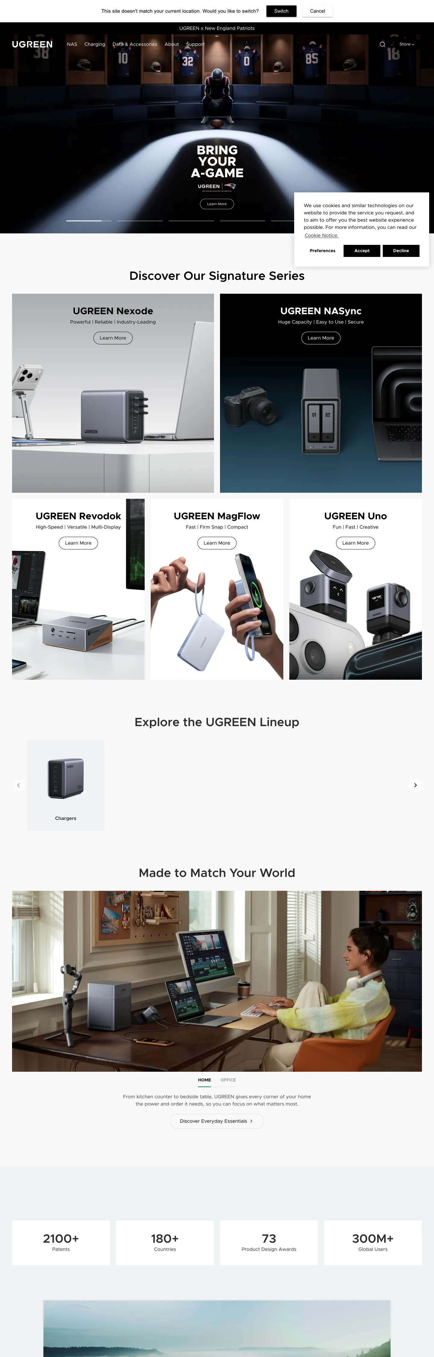
UGREEN's marketing site is built on a single design conviction: the product is the color. Every hero, product-showcase grid, and feature strip renders against a white canvas with ink-black text and borders, giving the silver-aluminum chargers, slate-blue NAS enclosures, and gold USB-C connectors the visual field to carry all chromatic weight. Where brands like Anker or Belkin reach for accent colors to signal technology or trust, UGREEN holds the chrome at pure black-and-white and trusts the hardware photography to do every expressive job. The effect is closer to a product catalog than a marketing site — editorial and restrained, with the product objects as the only interruption.
The DESIGN.md file packages the system into a machine-readable spec for React and AI tools. Inside: 15 colors tokens drawn from a two-tone palette — pure black (#000000) as ink, border, CTA fill, and primary button background; pure white (#ffffff) as canvas, button text, and input background; plus a light gray (#dadada) for input borders, a near-white (#f2f4f8) for background gradient bands, and a handful of semantic tokens (error, success, stock status). Ten typography tokens span Metropolis at weights 400 through 700 — display tops out at 56px / weight 700 for product-name callouts, with heading at 48px / weight 600 for section leads. 16 components cover the pill-button CTAs, the product-card grid, the variant-picker chip, and the dark hero section.
Feed this file to Claude or Cursor and it reproduces UGREEN's specific moves: pure ink-on-white instead of a tech-blue accent, pill-geometry buttons at 50px radius, Metropolis at controlled weights, and product imagery as the sole chromatic voice. The one move worth borrowing only if you are comfortable with total chromatic restraint is the decision to put zero brand color in the marketing chrome — it forces every pixel of brand differentiation into the industrial design quality of the hardware itself. For most SaaS teams this would read as unfinished. For a hardware brand with strong product photography, it reads like confidence.
What makes it distinct
5
- Chromatic restraintzero accent colors in the marketing chrome; every brand moment is a black fill, a black border, or a black text heading on pure white
- Metropolis single-familydisplay at 48–56px weight 600, body at 14–16px weight 400, buttons at 14px weight 700, no second typeface
- Pill-dominant radius50px on buttons and badges is the primary rounding; 12px on cards; 14px on variant-pickers; the scale skips 4–8px entirely
- Product-photography voltageall chromatic energy (silver chargers, blue NAS enclosures, gold connectors) lives in the product images, not the brand chrome
- 20px base spacingthe dominant gap throughout the page, appearing 25 times in extracted spacing, anchoring the product-grid cadence
ugreen.com
Live at ugreen.com
A snapshot of the brand in production. Scroll the frame to see the whole page.
Colors
15 colors
UGREEN's system anchors on #c8c8c8 (hairline-soft) as its primary color. Type is set in Metropolis across 10 tokens from 14px to 56px, weights 400–700. Shape language is soft — components average 19px corner radius, with no sharp interactive edges.
Brand & Accent
Sparing, CTA-only voltage · 2
Surface
Page and card backgrounds · 3
Text
Headlines, body, captions · 3
Borders & Hairlines
Dividers, outlines, rules · 2
Semantic
Status, errors, success, links · 2
Other
Specialty colors · 3
Typography
10 type tokens
Set in Metropolis across 10 tokens, from 14px to 56px, weights 400–700. Shown in its own stack: where the font isn't installed, the fallback the file names stands in.
- display-xl56px · weight 700 · lh 1The quick brown fox jumps over the lazy dog
- display-lg48px · weight 600 · lh 52.8pxThe quick brown fox jumps over the lazy dog
- display-md40px · weight 600 · lh 44pxThe quick brown fox jumps over the lazy dog
- heading-md32px · weight 700 · lh 38.4pxThe quick brown fox jumps over the lazy dog
- heading-sm28px · weight 600 · lh 36.4pxThe quick brown fox jumps over the lazy dog
- subheading18px · weight 600 · lh 27pxThe quick brown fox jumps over the lazy dog
- body-md16px · weight 400 · lh 24pxThe quick brown fox jumps over the lazy dog
- body-sm14px · weight 400 · lh 22.4pxThe quick brown fox jumps over the lazy dog
- label-md14px · weight 600 · lh 21pxThe quick brown fox jumps over the lazy dog
- button-md14px · weight 700 · lh 1The quick brown fox jumps over the lazy dog
Layout
Radii and spacing
7 corner radii and 9 spacing values. Shape language: soft.
Radii
- none0px
- xs2px
- sm12px
- md14px
- lg20px
- pill50px
- full9999px
Spacing
- xs4px
- sm8px
- md12px
- base16px
- lg20px
- xl24px
- 2xl28px
- 3xl32px
- 4xl40px
Components
16 components
Each rendered from its tokens (color, type, radius, padding) on UGREEN's own canvas.
- Button Primarybutton-primaryButton Primary
- Button Primary Hoverbutton-primary-hoverButton Primary Hover
- Button Secondarybutton-secondaryButton Secondary
- Top Navtop-navTop Nav
- Nav Linknav-linkNav Link
- Hero Sectionhero-sectionHero Section
- Hero Headinghero-headingHero Heading
- Section Headingsection-headingSection Heading
- Body Paragraphbody-paragraphBody Paragraph
- Body Paragraph Mutedbody-paragraph-mutedBody Paragraph Muted
- Product Cardproduct-cardProduct Card
- Variant Chipvariant-chipVariant Chip
- Variant Chip Activevariant-chip-activeVariant Chip Active
- Type here…text-inputText Input
- Stat Badgestat-badgeStat Badge
- FooterfooterFooter
In use
The system, in use
UGREEN's tokens on the kind of product it builds.
Build something people actually use.
A short paragraph of marketing copy that previews how the brand's display tier and body tier read together. Two sentences is usually enough.
FAQ
UGREEN design system FAQ
Common questions about UGREEN's tokens, components, and how to use this DESIGN.md in your project.
Read next
Related reading
Specs, directories, and component libraries that pair with this design system.
- Browse all design systemsThe full directory of DESIGN.md files on shadcn.io, with live mockups for each.shadcn.io
- UGREEN — official siteUGREEN's public marketing site — the source of truth for the live tokens captured in this file.ugreen.com (opens in a new tab)
- The DESIGN.md specificationGoogle Labs' open spec for machine-readable design system files — the format this page is built on.github.com (opens in a new tab)
Use it
Use UGREEN in your project
One machine-readable file. Drop it into Claude, Cursor, or any AI tool that reads DESIGN.md.
Download the DESIGN.md
One machine-readable file: every color, type, radius, spacing, and component token of UGREEN.
Feed it to your AI tool
Drop it into Claude, Cursor, or GitHub Copilot. The agent writes React components and Tailwind classes that match UGREEN's visual language.
Reference the tokens directly
Or paste the values into your Tailwind config, CSS variables, or component library: every color, size and radius is a quoted, ready-to-copy value.
Read the full DESIGN.md: overview, rationale, do’s and don’ts
Overview
UGREEN's marketing site is built around a single disciplined bet. Photography as the palette: the brand declines to place any chromatic element in the marketing chrome — no accent blue, no tech-orange, no gradient — and instead renders everything in pure black and pure white, so the product photography can carry all expressive weight. Where Anker layers a saturated blue voltage over its product grid and Belkin uses a teal accent to signal connectivity technology, UGREEN holds the chrome at ink-on-canvas. The result forces every brand differentiation into the industrial design quality of the hardware itself.
The typographic system is Metropolis across every tier — a geometric open-source sans based on Gotham and Futura proportions. Weight 700 appears at display sizes (48–56px), weight 600 at section headings (40–48px), weight 400 at body. The system does not use a "light" or weight-300 display treatment; confidence comes from weight, not restraint. This is the opposite move from Stripe or Cloudflare's editorial weight-500 system — UGREEN's display headings are assertive, heavy, and purely informational ("Nexode & MagFlow Air Editions").
Key Characteristics:
- Pure ink-on-canvas — no chromatic accent in the marketing chrome; product photography provides all color.
- Metropolis single-family across every tier, weight 400 (body) to 700 (display callouts).
- Dark hero above the fold — the hero section is pure black with a product spotlight and the display headline in white.
- Pill-first radius scale (50px) on buttons and badges; 12px on product cards; 2px on input fields.
- Product-card grid with 1.03x hover-scale and a black-with-opacity border on hover — no shadow.
- 20px base spacing dominant throughout the page (25 occurrences in extracted spacing).
- Semantic stock-status tokens declared in CSS: instock green, lowstock amber, outofstock gray — a nod to the brand's e-commerce depth.
- Stat bar at the page bottom ("2100+ products, 180+ countries, 73 awards, 300M+ users") uses heavy display weights on a white band to signal scale.
Colors
Text and Ink
- Ink (
{colors.ink}— #000000): frequency 673. Used as text (329), border (327), background (8), shadow (9). The load-bearing black — every heading, body paragraph, button fill, and card border runs through this single token. Wired as--color-primary,--color-black,--color-foreground-heading,--color-primary-button-background,--color-border. - Ink Soft (
{colors.ink-soft}— #333333): frequency 1. The hover state for the primary button background — one shade off pure black, wired as--color-primary-button-hover-backgroundand--color-input-text. Also used for secondary-button hover text and border. - Ink Muted (
{colors.ink-muted}— #404040): frequency 4. A secondary text tone for sub-labels and muted body copy, appearing in borders and text.
Canvas and Surface
- Canvas (
{colors.canvas}— #ffffff): frequency 554. Used as text (265), border (259), background (29). The page floor and the inverse of the ink system — every element that reads "light" or "inverted" on the dark hero uses this token. - Surface-1 (
{colors.surface-1}— #f2f4f8): frequency 24. A faint blue-gray used for background gradient bands behind the product-feature sections. The only surface tone in the system besides pure white. - Surface-2 (
{colors.surface-2}— #e5e9f0): frequency 6. Used inside gradient transitions between sections. Wired as--color-variant-hover-border.
Hairlines
- Hairline (
{colors.hairline}— #dadada): frequency 43. Used as text (20), border (23). Input field borders and secondary dividers. Wired as--color-input-border. - Hairline Soft (
{colors.hairline-soft}— #c8c8c8): declared as--color-outofstock— the out-of-stock state color for product swatches, not rendered in the marketing chrome at scale.
Semantic
- Error (
{colors.error}— #8b0000): declared as--color-error. Not visible in the captured marketing surface; scoped to form validation. - Success (
{colors.success}— #006400): declared as--color-success. Not visible in the captured marketing surface; scoped to success states. - Instock (
{colors.instock}— #3ed660): declared as--color-instock. A saturated green for in-stock badges. - Lowstock (
{colors.lowstock}— #ee9441): declared as--color-lowstock. An amber for low-stock warnings. - Outofstock (
{colors.outofstock}— #c8c8c8): declared as--color-outofstock. A gray for sold-out swatches.
Campaign Colors (rare)
- Brand Blue (
{colors.brand-blue}— #1975b7): frequency 2, both as background. Appears in the hero as a spotlight or campaign graphic element — not a recurring accent. - Brand Red (
{colors.brand-red}— #c30000): frequency 1, as background. Appears in a single promotional badge or campaign graphic.
Typography
Font Family
The system runs Metropolis as its single typeface — a geometric sans-serif by Chris Simpson, released under SIL OFL and available via Fontsource. The fallback stack is system-ui. There is no second typeface for display or serif accents; Metropolis handles display at 56px weight 700 through to captions at 12px weight 400. The design relies on weight variation (400 → 600 → 700) rather than family variation to create hierarchy.
Hierarchy
| Token | Size | Weight | Line Height | Use |
|---|---|---|---|---|
{typography.display-xl} | 56px | 700 | 1 | Hero callout above fold (white on black) |
{typography.display-lg} | 48px | 600 | 52.8px | Section leads ("Nexode & MagFlow Air Editions") |
{typography.display-md} | 40px | 600 | 44px | Category headings ("Discover Our Signature Series") |
{typography.heading-md} | 32px | 700 | 38.4px | Product-stat numbers (2100+, 180+) |
{typography.heading-sm} | 28px | 600 | 36.4px | Sub-category title links |
{typography.subheading} | 18px | 600 | 27px | Feature-row headings, product tag |
{typography.body-md} | 16px | 400 | 24px | Default body paragraphs, nav links |
{typography.body-sm} | 14px | 400 | 22.4px | Product meta, card captions, footer links |
{typography.label-md} | 14px | 600 | 21px | Product card titles, section labels |
{typography.button-md} | 14px | 700 | 1 | Button labels |
Principles
UGREEN's type uses weight 700 at display sizes — a heavier hand than editorial systems like Stripe or Cloudflare. Body sits at weight 400 with no italic or light variants visible in the marketing surface. Letter-spacing is 0 (normal) across all tiers; there is no tracked-uppercase treatment. The display weight of 700 is a confidence move: it reads assertive and direct, matching the industrial-design aesthetic of the hardware catalog.
Note on Font Substitutes
Metropolis is freely available (SIL OFL) on GitHub and Fontsource. If unavailable: Montserrat at the same weights is the closest geometric substitute; Inter is a looser, more neutral option. Avoid substituting with thin or extralight weights — the system's personality is in the heaviness at display sizes.
Layout
Spacing System
- Base unit: 4px, but the dominant module in practice is 20px (25 occurrences in extracted spacing).
- Tokens:
{spacing.xs}4px ·{spacing.sm}8px ·{spacing.md}12px ·{spacing.base}16px ·{spacing.lg}20px ·{spacing.xl}24px ·{spacing.2xl}28px ·{spacing.3xl}32px ·{spacing.4xl}40px. - Card internal padding:
{spacing.lg}(20px) is the dominant card padding. - Hero padding: top 120px, then the product spotlight fills edge-to-edge.
- Nav link padding: 22.4px vertical, 12px horizontal — a generous nav height at 72px.
Grid & Container
- Max content width: ~1280px on the product grid; hero is full-bleed black.
- Hero: full-bleed black canvas with a centered spotlight photo and the display headline in white.
- Signature Series: 2-column large-card layout for the featured product pair.
- Product lineup: 4-column equal grid (Nexode · MagFlow · Revodok · Uno) with product name + brief copy + CTA per cell.
- Stat bar: 4-column number grid at page bottom (2100+ products, 180+ countries, 73 awards, 300M+ users).
Rhythm
The page alternates between the black hero canvas and the white body bands, with gradient surface bands ({colors.surface-1}) as transitional zones. The grid cadence is built on 20px — card padding, column gaps, and section spacing all resolve to multiples of 20px.
Elevation
The system uses no shadow tier for the primary page surface. Product cards rest on the white canvas with a {colors.hairline} border; hover state adds a black-with-opacity border (rgba(0,0,0,0.3)) and a 1.03x scale transform — depth comes from the scale animation rather than from a layered shadow. The drawer and popover menus declared in the CSS use 0px 4px 20px rgba(0,0,0,0.15) — a soft neutral elevation.
Shapes
The radius scale is pill-first with sharp fallback:
{rounded.none}0px — input fields, the hero section edge, footer. Flat geometry is the default for form chrome.{rounded.xs}2px — small inline chips, swatch tiles.{rounded.sm}12px — product cards, larger surface tiles.{rounded.md}14px — variant-picker buttons (color/size chips). Wired as--style-border-radius-buttons-primaryand--variant-picker-button-radius.{rounded.lg}20px — larger promotional cards.{rounded.pill}50px — primary CTA buttons, promotional badges. The dominant form at 13 captured occurrences.
The pill is the warmest geometric signal in an otherwise flat, sharp system — it makes the "Buy Now" and "Shop Now" CTAs feel distinct from every other rectangular surface on the page.
Components
button-primary — Pure ink {colors.ink} fill, white text, {rounded.pill} 50px radius, 12×32px padding, 44px height. "Buy Now" and "Shop Now" are the canonical instances; no border, no shadow. The pill shape is the only rounding indulgence in the chrome.
button-primary-hover — Background shifts to {colors.ink-soft} (#333333) — one step off pure black. A subtle confirmation that the button is interactive, without any color transition.
button-secondary — Transparent fill, ink text, 1px ink border, {rounded.pill} 50px. Used for "Learn More" and category navigation CTAs. Lighter visual weight than the primary.
top-nav — Pure black {colors.ink} surface, white text and links, 72px height. Houses the UGREEN wordmark flush left, product-category links (NAS, Chargers, Power Banks, Cables, Hubs), and a search icon flush right.
nav-link — White text on black nav surface, {typography.body-md} (16px / 400), 22.4px vertical padding, 12px horizontal. No hover pill or background — only text-color change on hover.
hero-section — Full-bleed black canvas, 120px top padding, edge-to-edge product spotlight photo, white display headline. The single dark surface on the page — everything below the hero is white canvas.
hero-heading — White text, {typography.display-xl} (56px / 700). The brand tagline ("BRING YOUR A-GAME") rendered in all-caps white at maximum weight.
section-heading — Ink text, {typography.display-md} (40px / 600). Used for "Discover Our Signature Series," "Explore the UGREEN Lineup," "Made to Match Your World."
body-paragraph — Ink text, {typography.body-md} (16px / 400). Standard running text in product descriptions and feature copy.
body-paragraph-muted — Ink-muted text, {typography.body-sm} (14px / 400). Used for secondary meta, sub-labels under product names.
product-card — White surface, ink text, {rounded.sm} 12px radius, 20px internal padding, 1px hairline border. Hover: border intensifies to rgba(0,0,0,0.3) and the card scales 1.03x. No shadow.
variant-chip — White surface, ink text, {rounded.md} 14px radius, 8×20px padding, 36px height, 1px ink border. Used for color and size selectors on product pages.
variant-chip-active — Black fill, white text, same geometry. Selected state for the active variant.
text-input — White surface, ink text, {rounded.none} 0px (no rounding), 16×28px padding, 54px height, 1px hairline border. Input outline tightens to a second hairline on focus.
stat-badge — Off-white surface-1 background, ink text, {rounded.none} 0px, 20px internal padding. Holds the four large stat numbers (2100+, 180+, 73, 300M+) with {typography.heading-md} (32px / 700) numerals.
footer — Black canvas, white text, 40×20px padding. Continues the hero's black surface — the page opens and closes on the same dark floor.
Do's and Don'ts
Do let the product photography carry all chromatic weight. The system has zero accent color in the marketing chrome; any introduction of a blue, orange, or tech-green button will immediately look mismatched against the ink-on-white grid.
Do use {rounded.pill} 50px radius for every primary CTA button. The pill shape is the system's one rounding indulgence — applying a 4px or 8px radius instead makes the button look like a generic Bootstrap component, not UGREEN.
Do use {colors.ink} (#000000) as the hero background, not a dark gray or charcoal. The hero-to-body contrast relies on pure black against pure white; a softened near-black dark gray would lose the visual punch.
Do apply the 1.03x hover scale to product cards instead of shadows. The system has no shadow on product cards at rest; the scale animation is the interaction signal.
Don't use {colors.brand-blue} (#1975b7) or {colors.brand-red} (#c30000) as recurring accent colors — they appear only 2 and 1 times respectively in the captured marketing surface and function as campaign-specific graphic elements, not a brand accent. Wiring either into nav links, section headings, or card borders would break the monochromatic discipline.
Don't apply rounding to the text input ({component.text-input}). The input uses {rounded.none} 0px deliberately; adding 4px or 8px rounding creates a visual inconsistency between the form field and the otherwise flat-edged form chrome.
Don't render display headings at weight 400 or 500. The system's display tier sits at weight 600–700; dropping to a lighter weight turns the product-name callouts into editorial deks and loses the hardware catalog's direct, assertive character.
Don't use {colors.surface-1} (#f2f4f8) as a card background. It is a gradient background-band color for section transitions, not a card surface. For card backgrounds, use {colors.canvas} (#ffffff) with a {colors.hairline} border.
Known Gaps
- Dark mode: the captured marketing surface is light-mode (dark hero + white body). The CSS does not expose a
@media (prefers-color-scheme: dark)variable set in the extracted surface. - Hover and focus states: documented for
{component.button-primary-hover}and{component.product-card}(hover scale + border); the full state matrix for form inputs, variant chips, and nav dropdowns is not captured. - Product-image treatment: the hero spotlight and product-card images use CSS
object-fit: coverwith a1.03xscale on hover but the exact image-aspect-ratio rules and transition easing (cubic-bezier(0.32, 0.72, 0, 1)) are not represented as token values. - Mobile nav: the captured surface is desktop-only (1440px). The mobile drawer uses
--drawer-width: 100vwand--drawer-height: 100dvhbut the full mobile layout is not represented here. - Campaign colors: the steel blue (#1975b7) and deep red (#c30000) visible in the hero graphic appear to be campaign-specific and may change with each product launch cycle.
- Localization surface: the
country-selector-display: flexCSS variable suggests a country/region switcher in the nav; its specific component styling is not captured.
E-commerce & Retail
More systems like this
More DESIGN.md files in E-commerce & Retail.
Pricing
Build it with Pro
The DESIGN.md files are free. Pro adds 6,000+ blocks, premium templates and the MCP server, so your AI editor builds in your system for you.
4.9/5 out of 5 · 150+ reviewsfrom 150+ founders and developers.
Billing
Billed once a year in USD. Cancel anytime.
- How many people can use the license.
- Client work, SaaS products and anything you charge for.
- Production-ready React sections: hero, pricing, features, dashboards and more.
- Complete multi-page sites you can ship as they are.
- React icons from every major library, installable with one command.
- Presets that restyle every block, in light and dark.
- Lets your AI editor search, preview and install blocks for you.
- Priority requests are answered first.
Individual
For personal projects & open source
$32instead of $49/mo
$389 billed yearly
- Seats: 1 seat
- Commercial use: Personal & open source only
- Pro blocks: 6,000+ blocks
- Templates: All 14 templates
- React icons: 294k+ icons
- Themes: All 59 themes
- MCP server: Basic usage
- Support: Standard
Team
Most popularFor freelancers, agencies & startups
$66instead of $99/mo
$789 billed yearly · ≈ $13/dev/mo
- Seats: Up to 5 seats
- Commercial use: Included
- Pro blocks: 6,000+ blocks
- Templates: All 14 templates
- React icons: 294k+ icons
- Themes: All 59 themes
- MCP server: High usage
- Support: Priority
Organization
For companies with larger teams
$132instead of $199/mo
$1,589 billed yearly
- Seats: Unlimited seats
- Commercial use: Included
- Pro blocks: 6,000+ blocks
- Templates: All 14 templates
- React icons: 294k+ icons
- Themes: All 59 themes
- MCP server: Unlimited usage
- Support: Priority
Billed once a year in USD. Cancel anytime.
Individual
For personal projects & open source
$32instead of $49/mo
$389 billed yearly
- How many people can use the license.Seats: 1 seat
- Client work, SaaS products and anything you charge for.Commercial use: Personal & open source only
- Production-ready React sections: hero, pricing, features, dashboards and more.Pro blocks: 6,000+ blocks
- Complete multi-page sites you can ship as they are.Templates: All 14 templates
- React icons from every major library, installable with one command.React icons: 294k+ icons
- Presets that restyle every block, in light and dark.Themes: All 59 themes
- Lets your AI editor search, preview and install blocks for you.MCP server: Basic usage
- Priority requests are answered first.Support: Standard
Team
Most popularFor freelancers, agencies & startups
$66instead of $99/mo
$789 billed yearly · ≈ $13/dev/mo
Everything in Individual, plus
- How many people can use the license.Seats: Up to 5 seats
- Client work, SaaS products and anything you charge for.Commercial use: Included
- Lets your AI editor search, preview and install blocks for you.MCP server: High usage
- Priority requests are answered first.Support: Priority
Organization
For companies with larger teams
$132instead of $199/mo
$1,589 billed yearly
Everything in Team, plus
- How many people can use the license.Seats: Unlimited seats
- Lets your AI editor search, preview and install blocks for you.MCP server: Unlimited usage
- Secure checkout via Stripe
- Code lives in your repo
- Keep what you've shipped if you cancel
- License terms
Your system, built for you
Every block, template and icon, installed by your AI agent in your design system. The DESIGN.md files stay free.