Skip to content

Trader Joe's Design System

Trader Joe's marketing system as a DESIGN.md file — serif editorial layout, Kalam hand-lettered accents, illustrated food mosaics, and a desaturated nautical blue hero. Tokens for React, Next.js, and AI coding tools.

Add shadcn.io to your AI agent. · Pro It installs blocks, icons and templates in your design system from a prompt, with Pro.

Set up MCP
Primary
#445e83
Typeface
freight-text-pro
Shape
Soft
Base radius
0px
Colors
12
Type tokens
13
Components
13
Spacing values
9

About

About Trader Joe's DESIGN.md

Curated by Dov Azencot · Updated May 19, 2026 · Source traderjoes.com (opens in a new tab)

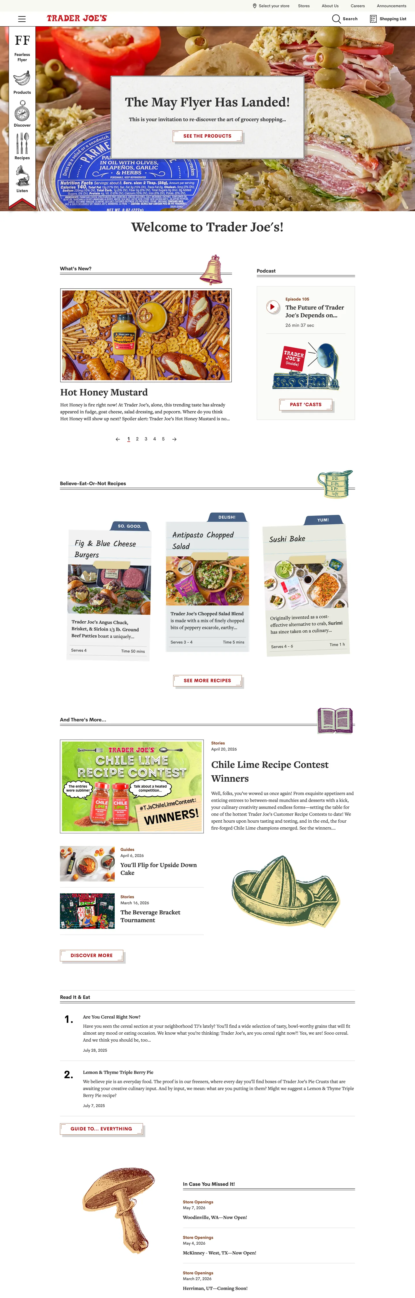
Trader Joe's marketing site looks like a printed newsletter that learned HTML. The above-fold composition opens with a tiled overhead-shot food photograph — hot honey mustard, sliced peppers, charcuterie, fresh bread — running edge-to-edge as a textured backdrop. A desaturated nautical blue rectangle sits on top of it carrying the white serif headline "The May Flyer Has Landed!" in 48px freight-text-pro at weight 700, with a tight all-caps Cerebri Sans CTA ("CHECK OUT THE FLYER") beneath. Below the fold the page returns to a near-white floor: recipe-contest illustrations, a "Welcome to Trader Joe's!" serif greeting, illustrated package cut-outs of Hot Honey Mustard, Fig & Olive Linzer Cookies, Antipasto Chopped Salad, and Sushi Rolls. Where Whole Foods runs minimal-modernist white space with stock food photography and Aldi paints corporate orange-and-blue with product-tile cards, Trader Joe's reads as a Hawaiian-shirt printed flyer transcribed into a CMS.

The DESIGN.md file packages the system into a machine-readable spec for React tooling. Inside: 12 colors tokens dominated by near-black ink at frequency 841 (#212529 wired into the Bootstrap-derived `--dark` family) and a near-white canvas at frequency 65; a single nautical-blue brand voltage (#445e83) appearing 3 times as the hero block fill; and a deep crimson accent (#af0006) used 94 times as headline emphasis and inline link text. 14 typography tokens span freight-text-pro at three serif sizes (48px hero h1, 35px section h3, 22px sub-section), Cerebri Sans across body and button tiers in 12-17px range, and Kalam — a handwritten Indic-script family from Indian Type Foundry — at 27px / weight 100 for the printed-card annotation moments. 13 components definitions cover the serif hero block, the all-caps Cerebri button, illustrated product cards, the recipe-contest poster strip, and the editorial-newsletter-style top-nav.

Feed this file to an AI coding tool and it reproduces Trader Joe's specific moves: serif editorial display in freight-text-pro at weight 700, hand-lettered Kalam script for printed-card accents, tight uppercase Cerebri Sans buttons with 0.9px letter-spacing, illustrated package cut-outs floating on near-white, and the single desaturated nautical-blue hero rectangle. The one thing worth borrowing only if your brand has the editorial discipline to commit: no logo lockups, no influencer photography, no marketing illustration. Trader Joe's runs entirely on printed-flyer-style typesetting and the photographer's hand. Most teams reach for stock imagery before they earn that restraint.

What makes it distinct

5

  1. Serif-led grocery editorialfreight-text-pro carries the 48px hero h1 down to 17px body, the only US grocery brand running a serif display tier
  2. Hand-drawn Kalam script accentsinformal handwritten script appears 3 times for printed-recipe-card style annotations on the product mosaics
  3. Illustrated package cut-outsproducts render as photographed package shots floating on white, never as rendered tiles or stock photography
  4. Nautical blue hero rectanglehex 445e83 carries the single chromatic statement, a desaturated blue that reads as a fearless flyer printed-newsletter cover
  5. Tight uppercase Cerebri Sans CTAs12px weight-700 with 0.9px letter-spacing in all-caps, breaking the serif editorial voice with a small-caps button voice

traderjoes.com

Live at traderjoes.com

A snapshot of the brand in production. Scroll the frame to see the whole page.

Trader Joe's's website at traderjoes.com

Colors

12 colors

Trader Joe's's system runs on #445e83 as its primary voltage, used in 2 of 13 components. Type is set in freight-text-pro across 13 tokens from 12px to 48px, weights 100–700. Shape language is soft — components average 20px corner radius, with no sharp interactive edges.

Brand & Accent

Sparing, CTA-only voltage · 2

Surface

Page and card backgrounds · 3

Text

Headlines, body, captions · 4

Borders & Hairlines

Dividers, outlines, rules · 1

Other

Specialty colors · 2

Typography

13 type tokens

Set in freight-text-pro across 13 tokens, from 12px to 48px, weights 100–700. Shown in its own stack: where the font isn't installed, the fallback the file names stands in.

  • display-xl48px · weight 700 · lh 60pxThe quick brown fox jumps over the lazy dog
  • display-md35px · weight 700 · lh 48pxThe quick brown fox jumps over the lazy dog
  • display-sm22px · weight 700 · lh 27pxThe quick brown fox jumps over the lazy dog
  • lead19px · weight 700 · lh 29pxThe quick brown fox jumps over the lazy dog
  • body-serif17px · weight 700 · lh 24pxThe quick brown fox jumps over the lazy dog
  • body-serif-md17px · weight 400 · lh 24pxThe quick brown fox jumps over the lazy dog
  • heading-sans17px · weight 700 · lh 22pxThe quick brown fox jumps over the lazy dog
  • body-md16px · weight 700 · lh 24pxThe quick brown fox jumps over the lazy dog
  • body-sm14px · weight 400 · lh 18pxThe quick brown fox jumps over the lazy dog
  • body-sm-bold14px · weight 700 · lh 17.5pxThe quick brown fox jumps over the lazy dog
  • button-md12px · weight 700 · lh 18px · tracking 0.9pxThe quick brown fox jumps over the lazy dog
  • button-lg16px · weight 700 · lh 24px · tracking 0.9pxThe quick brown fox jumps over the lazy dog
  • hand-script27px · weight 100 · lh 40pxThe quick brown fox jumps over the lazy dog

Layout

Radii and spacing

3 corner radii and 9 spacing values. Shape language: soft.

Radii

  • none0px
  • lg23px
  • full9999px

Spacing

  • xs2px
  • sm4px
  • base6px
  • md8px
  • lg10px
  • xl14px
  • 2xl16px
  • 3xl30px
  • 4xl80px

Components

13 components

Each rendered from its tokens (color, type, radius, padding) on Trader Joe's's own canvas.

  • Button Primary
    button-primaryButton Primary
  • Button On Blue
    button-on-blueButton On Blue
  • Button Outline
    button-outlineButton Outline
  • Top Nav
    top-navTop Nav
  • Nav Link
    nav-linkNav Link
  • Hero Rectangle
    hero-rectangleHero Rectangle
  • Hero Heading
    hero-headingHero Heading
  • Section Heading
    section-headingSection Heading
  • Body Paragraph
    body-paragraphBody Paragraph
  • Card Product
    card-productCard Product
  • Card Recipe
    card-recipeCard Recipe
  • Hand Annotation
    hand-annotationHand Annotation
  • Accent Link
    accent-linkAccent Link

In use

The system, in use

Trader Joe's's tokens on the kind of product it builds.

Build something people actually use.

A short paragraph of marketing copy that previews how the brand's display tier and body tier read together. Two sentences is usually enough.

Get startedLearn more
Marketing heroHeadline, sub-copy, primary CTA — the universal homepage opener.
Reporting · 14 min read

The quiet collapse of an old idea

For decades the consensus held that the system would correct itself. Then it didn't. This is the inside story of what changed, told by the people who watched it unravel.

"Nobody noticed because the failure was indistinguishable from progress."

By Sam Reporter · Updated 2 hours ago

Editorial articleMagazine-style longform with display headline.

FAQ

Trader Joe's design system FAQ

Common questions about Trader Joe's's tokens, components, and how to use this DESIGN.md in your project.

Read next

Specs, directories, and component libraries that pair with this design system.

Use it

Use Trader Joe's in your project

One machine-readable file. Drop it into Claude, Cursor, or any AI tool that reads DESIGN.md.

Download DESIGN.md
  1. Download the DESIGN.md

    One machine-readable file: every color, type, radius, spacing, and component token of Trader Joe's.

  2. Feed it to your AI tool

    Drop it into Claude, Cursor, or GitHub Copilot. The agent writes React components and Tailwind classes that match Trader Joe's's visual language.

  3. Reference the tokens directly

    Or paste the values into your Tailwind config, CSS variables, or component library: every color, size and radius is a quoted, ready-to-copy value.

Read the full DESIGN.md: overview, rationale, do’s and don’ts

Overview

Trader Joe's marketing site does what no other US grocery brand attempts. Printed-flyer typesetting. The above-fold composition opens with a tiled overhead-shot food photograph running edge-to-edge — hot honey mustard, sliced peppers, charcuterie, fresh bread — and a desaturated nautical-blue rectangle ({colors.primary} — #445e83) sits on top carrying the white serif headline "The May Flyer Has Landed!" in 48px freight-text-pro at weight 700. A tight uppercase Cerebri Sans CTA ("CHECK OUT THE FLYER") sits beneath, set in 12px weight-700 with 0.9px tracking. Where Whole Foods runs minimal-modernist white space with stock food photography and Aldi paints corporate orange-and-blue with product-tile cards, Trader Joe's reads as a Hawaiian-shirt printed flyer transcribed into a CMS. The Fearless Flyer — the brand's in-store printed newsletter — is the source aesthetic; the site preserves that voice rather than translating it into SaaS-marketing chrome.

The system runs three typographic voices rather than the conventional one-or-two. freight-text-pro (a Joshua Darden display serif) carries every serif tier from the 48px hero h1 down to 17px serif body; Cerebri Sans (a Latinotype geometric sans) handles body, button, and nav at 12-17px; Kalam (an Indian Type Foundry handwritten script) appears 3 times at 27px / weight 100 for printed-recipe-card annotation moments. The serif-led grocery editorial is unique in the category — every major US grocer runs sans-serif. The Kalam script accents are unique across the entire marketing-design directory: handwritten faces appear in luxury-fashion editorials and bakery branding, almost never on a chain-grocery marketing site.

The chromatic system is binary-with-accents. Near-black ink ({colors.ink} — #212529, frequency 841) and white canvas ({colors.canvas}, frequency 65) carry every text and surface job; a deep crimson red ({colors.accent} — #af0006, frequency 94) handles inline emphasis and link text; the desaturated nautical blue ({colors.primary}) appears 3 times as the single hero-rectangle fill. The system inherits the Bootstrap 4 utility palette as CSS custom properties (--blue, --red, --green, --yellow, --indigo), but the marketing chrome never renders the full Bootstrap accent set — only the near-black, near-white, crimson, and nautical-blue are visible. This is unusual for a Bootstrap-derived site; Trader Joe's overrides the framework defaults aggressively.

Key Characteristics:

  • Serif editorial display in freight-text-pro at weight 700 (Joshua Darden / Garage Fonts) — the only US grocery brand running a serif display tier above 22px.
  • Hand-lettered Kalam script (Indian Type Foundry) at 27px / weight 100 for printed-recipe-card annotation — appears 3 times on product mosaics, the move no other grocery brand makes.
  • Tight uppercase Cerebri Sans CTAs at 12px / weight 700 with 0.9px letter-spacing — small-caps button voice breaks the serif editorial body, signaling "press here" against the printed-flyer chrome.
  • Single nautical-blue hero rectangle ({colors.primary} — #445e83, 3 background occurrences) — the only chromatic statement on the page; never appears as text or border.
  • Deep crimson ({colors.accent} — #af0006, 94 total occurrences) carries every accent role — inline links, badge text, "Sale" tags, recipe-card titles. The legacy pricing-tag red translated to the web.
  • Near-black ink ({colors.ink} — #212529, frequency 841) dominates every text and divider surface — wired through the Bootstrap --dark family but always rendered at this specific dark slate.
  • Illustrated package cut-outs rather than rendered product tiles — every product card shows the photographed package floating on white, never a CGI render or stock photo.
  • 23px rounding dominates with 26 occurrences across cards, banners, and CTAs — a Bootstrap-3-era inherited value the site never modernized, now reading as a deliberate printed-card edge.

Colors

Brand

  • Nautical Blue ({colors.primary} — #445e83): frequency 3 — all as background. The single hero-rectangle fill. Desaturated, slightly slate-leaning, reading as a printed-newsletter cover ink rather than a saturated brand voltage. Never appears as text, never as border, never below the hero block.
  • Crimson Accent ({colors.accent} — #af0006): frequency 94 — 80 as text, 14 as border. The deep red carrying inline link text, sale-tag emphasis, recipe-card titles, and the "What's New" section headlines. The legacy in-store pricing-tag red translated to the web; not wired through Bootstrap's default --red which the site declares but never renders.

Text

  • Ink ({colors.ink} — #212529): frequency 841 — 429 as text, 412 as border. The dominant text and divider tone. Wired through the Bootstrap --dark family but always rendered at this specific dark-slate value. Near-black, slightly cool.
  • Ink Soft ({colors.ink-soft} — #2c2c2c): frequency 557 — 274 as text, 260 as border, 23 as shadow. The secondary running-text and hairline tone. Used on display headlines and editorial body copy.
  • Ink Muted ({colors.ink-muted} — #545454): frequency 28 — 14 as text, 14 as border. Tertiary text on date stamps, recipe-card metadata, and disabled-state labels.
  • Ink Deep ({colors.ink-deep} — #000000): frequency 75 — 32 as text, 43 as border. Pure black, used on hairline rules and the rare full-contrast text moment.

Surface

  • Canvas ({colors.canvas} — #ffffff): frequency 65 — 6 as text, 51 as background, 6 as border. The page floor and primary surface. Wired as Bootstrap --white. Includes a small set of near-whites — barely perceptible cream and stone variants — clustered into the same token.
  • Surface Cream ({colors.surface-cream} — #e8eadf): frequency 3 as background. A pale cream-gray tint used on recipe-card and editorial-callout surfaces — the warmth softens the photographic mosaics.
  • Surface Pale ({colors.surface-pale} — #f2f2f2): frequency 1 as background. A faint gray used on inactive carousel-dot states.

Hairline & Earth

  • Hairline ({colors.hairline} — #d8d8d8): frequency 14 — 14 as border. The dominant divider tone, used between sections and inside product-card chrome.
  • Earth ({colors.earth} — #834427): frequency 40 — 20 as text, 20 as border. A warm brown used on hand-illustrated icon strokes and ingredient labels — the "Hawaiian-shirt" undertone.
  • Earth Light ({colors.earth-light} — #a5684d): frequency 22 as border. The softer brown variant — used on illustrated-card borders and woodcut-style accent strokes.

Typography

Font Families

The system runs three voices:

  1. freight-text-pro — a Joshua Darden display serif from Garage Fonts, with a tall x-height and slightly condensed proportions. Carries every serif tier from the 48px hero h1 down to 17px serif body.
  2. "Cerebri Sans" — a Latinotype geometric sans, fallbacks walk Helvetica, sans-serif. Carries body, button, and nav at 12-17px in weights 400 and 700.
  3. Kalam — an Indian Type Foundry handwritten script (Latin and Devanagari), fallbacks walk Helvetica, sans-serif. Appears 3 times at 27px / weight 100 for printed-recipe-card annotation.

The three-voice split is the system's most distinctive move. No other US grocery brand runs a serif display tier; almost none use a handwritten font. The pairing reads as printed-flyer chrome translated to the web.

Hierarchy

TokenFamilySizeWeightLine HeightLetter SpacingUse
{typography.display-xl}freight-text-pro48px70060px0Hero h1 ("The May Flyer Has Landed!")
{typography.display-md}freight-text-pro35px70048px0Section h3 ("Welcome to Trader Joe's!")
{typography.display-sm}freight-text-pro22px70027px0Product-card titles, sub-section headings
{typography.lead}freight-text-pro19px70029px0Lead paragraph beneath section displays
{typography.body-serif}freight-text-pro17px70024px0Serif emphasis spans
{typography.body-serif-md}freight-text-pro17px40024px0Serif running text
{typography.heading-sans}Cerebri Sans17px70022px0Sans-serif sub-section heads
{typography.body-md}Cerebri Sans16px70024px0Editorial sans body
{typography.body-sm}Cerebri Sans14px40018px0Default running text
{typography.body-sm-bold}Cerebri Sans14px70017.5px0Nav labels, inline emphasis
{typography.button-md}Cerebri Sans12px70018px0.9pxPrimary CTA label (all-caps)
{typography.button-lg}Cerebri Sans16px70024px0.9pxLarger CTA label (all-caps)
{typography.hand-script}Kalam27px10040px0Printed-recipe-card annotation

Principles

The serif tier holds at weight 700 across every size, with no weight 500 or 600 intermediate tier — the system reads as a printed-flyer display set rather than a web-font ladder. The Cerebri Sans body tier sits at weight 700 for emphasis and 400 for running text; nav labels are weight 700 at 14px, which is heavier than most marketing-nav systems use and gives the top-band a newsletter-masthead voice.

The 0.9px letter-spacing on uppercase Cerebri CTAs is the small-caps signature. At 12px / weight 700 / 0.9px / all-caps, the button voice signals "interactive element" against the editorial serif body — the same role a uppercase-tracked label plays inside a magazine spread.

Kalam at weight 100 is calibrated thin. At 27px / 40px line-height the handwritten weight reads as a margin note rather than a headline — the printed-recipe-card annotation effect requires the weight to feel literally hand-pressed.

Note on Font Substitutes

freight-text-pro is a licensed Garage Fonts family. The closest open-source substitute is Source Serif Pro at the same weights, though freight-text-pro's slightly taller x-height gives editorial bands a more compressed reading rhythm. Cerebri Sans is a Latinotype family; the closest open-source substitute is Inter at the same weights, with a slight aperture difference. Kalam is open-source via Google Fonts — use it directly. Caveat is a softer-weight alternative if Kalam's Devanagari support is unnecessary.

Layout

Spacing System

  • Base unit: 2px with 8px and 10px as dominant modules (31 and 27 occurrences respectively).
  • Tokens: {spacing.xs} 2px · {spacing.sm} 4px · {spacing.base} 6px · {spacing.md} 8px · {spacing.lg} 10px · {spacing.xl} 14px · {spacing.2xl} 16px · {spacing.3xl} 30px · {spacing.4xl} 80px.
  • Section padding (vertical): ~80px between editorial bands; ~30px between product-card rows.
  • Card internal padding: {spacing.2xl} (16px) on {component.card-product} and {component.card-recipe}.
  • Top-nav padding: 10x16 — the nav band is unusually tall at 116px because it stacks two rows: the utility row (store locator, sign in, cart) and the primary-product row.

Grid & Container

  • Max content width: ~1280px on editorial bands and product mosaics.
  • Hero block: the tiled food photograph runs edge-to-edge; the nautical-blue rectangle sits centered above with ~600px max-width.
  • Product mosaic: 4-column grid below the fold showing Hot Honey Mustard, Fig & Olive Linzer Cookies, Antipasto Chopped Salad, Sushi Rolls — each cell is a photographed package floating on white with serif title beneath.
  • Recipe-contest band: 2-up split between the "Chile Lime Recipe Contest Winners" illustrated banner and the recipe-card list.

Rhythm

The page alternates between photographic mosaic bands (the edge-to-edge food collage above the hero rectangle, the recipe-contest illustration band) and editorial-newsletter bands (the product mosaic on white, the "What's New" recipe list, the footer information columns). The rhythm reads as printed-flyer page-turn — every band is either an image-heavy poster or a typography-heavy editorial column. There are no atmospheric gradients, no soft transitions; the surface either is photographic, or is typographic.

Elevation

The system has essentially no shadow tier on body chrome:

  • Flat (no shadow): every editorial band, every product card, the nav, the footer — 99% of surfaces.
  • Soft shadow on cards: {colors.ink-soft} (#2c2c2c) appears 23 times as shadow ink — used on the product-card hover treatments and the recipe-poster band. The shadow is calibrated low-alpha (~10-15%) and short-distance, reading as a printed-postcard lift rather than a SaaS drop shadow.
  • Hairline rules: {colors.hairline} (#d8d8d8) carries the work that shadows would carry — section dividers, card edges, nav-row separation.

Shapes

The radius scale is binary-with-circles — there is no small-step tier:

  • {rounded.none} 0px — the top-nav and the photographic mosaics that run edge-to-edge.
  • {rounded.lg} 23px — frequency 26. Every product card, recipe banner, editorial tile, CTA pill, and the nautical-blue hero rectangle. The single dominant rounding.
  • {rounded.full} 9999px (declared as 50% and 100% in extraction) — frequency 2. Used on the rare circular avatar and the full-pill chip.

The 23px is a Bootstrap-3-era inherited value that the site never modernized. The consistency reads as deliberate at this point — every card sits at the same generous-soft radius, giving the page a printed-postcard rhythm. The discipline is unusual for a chain-grocery e-commerce surface, where 4-8px rounding is the category default.

Components

button-primary — The signature CTA. Crimson {colors.accent} (#af0006) fill, white text, {rounded.lg} 23px radius, 8x30 padding, 36px height. Label set in {typography.button-md} (12px / weight 700 / 0.9px tracking, all-caps). "CHECK OUT THE FLYER" / "SEE ALL RECIPES" are the canonical instances.

button-on-blue — White {colors.canvas} fill with nautical-blue text. Used on the hero rectangle as the inverse CTA against the blue surface.

button-outline — Transparent fill with crimson text and a 1px crimson border. {rounded.lg} 23px radius. Used for secondary actions like "VIEW DETAILS" on product cards.

top-nav — White {colors.canvas} surface with {colors.hairline} bottom border, 116px height, 10x16 padding. Stacks a utility row (store locator, weekly ad, sign in, cart) above the primary-product row. The double-height nav band signals "newsletter masthead" rather than minimal SaaS navigation.

nav-link — Transparent background, ink-soft text in {typography.body-sm-bold} (14px / 700), 8x14 padding. Nav labels at weight 700 are heavier than most marketing-nav systems use.

hero-rectangle — Nautical-blue {colors.primary} fill, white text, {rounded.lg} 23px radius, 30px padding. Sits over the edge-to-edge food-photograph backdrop carrying the serif h1 and the white-on-blue CTA.

hero-heading — White text on the nautical-blue rectangle, freight-text-pro 48px / 700.

section-heading — Ink-soft text on white, {typography.display-md} (35px / freight-text-pro / 700). Used for "Welcome to Trader Joe's!" and "What's New" section h3s.

body-paragraph — Ink-soft text at {typography.body-serif-md} (17px / freight-text-pro / 400). The serif running-text style — unusual for an e-commerce site to use serif body, but consistent with the printed-flyer voice.

card-product — White surface with 1px hairline border, {rounded.lg} 23px radius, 16px internal padding. Holds a photographed package cut-out, a serif title in {typography.display-sm}, and an inline crimson accent link.

card-recipe — Cream {colors.surface-cream} (#e8eadf) fill, ink-soft text, {rounded.lg} 23px radius, 16px padding. Used on the "Chile Lime Recipe Contest Winners" band — the warm cream tint distinguishes recipe content from product content.

hand-annotation — Transparent background, ink-soft text in {typography.hand-script} (Kalam / 27px / weight 100). The printed-recipe-card annotation moment — appears 3 times across the page on illustrated mosaics.

accent-link — Transparent background, crimson {colors.accent} text, {typography.body-sm-bold} (Cerebri Sans / 14px / 700). The inline link treatment across editorial bands.

Do's and Don'ts

Do keep the serif display tier in freight-text-pro at weight 700. The serif-led editorial voice is the system's most distinctive signature; substituting a sans display (Inter / Geist) for the 48px hero h1 collapses the printed-flyer aesthetic and the page reads as generic chain-grocery e-commerce.

Do render every CTA in uppercase Cerebri Sans at 12px / weight 700 / 0.9px tracking. The small-caps button voice is the typographic interaction signal against the serif editorial body — sentence-case buttons or larger sans labels would break the printed-newsletter chrome.

Do use illustrated package cut-outs for product imagery — photographed packages floating on white, never rendered tiles or stock food photography. The cut-out style is the brand's photographic discipline; rendered product tiles read as Amazon-marketplace chrome.

Do keep the chromatic system binary near-black-and-white with the crimson {colors.accent} for inline emphasis. The Bootstrap utility palette (--blue, --green, --yellow, --pink, --purple, --teal) is declared but never rendered on the marketing surface — using those accents flattens the printed-flyer voice into a generic Bootstrap site.

Don't modernize the 23px {rounded.lg} radius to a 12px or 16px middle tier. The value is a Bootstrap-3-era inherited radius that has become a load-bearing brand signal at this point — every card sits at 23px and softening it breaks the printed-postcard rhythm.

Don't replace the Kalam handwritten script with a heavier dress-script (Caveat at weight 700, or Pacifico). The Kalam at weight 100 is calibrated to read as literally hand-pressed; heavier weights read as decorative-script chrome and undercut the margin-note effect.

Don't introduce a soft drop shadow on the hero rectangle or the product cards. The flat-on-white treatment is the printed-postcard discipline; adding shadow halos pulls the page into SaaS-marketing chrome.

Don't use {colors.accent} (#af0006) as a background fill on large surfaces. The crimson is calibrated for 14-17px inline emphasis and small chip backgrounds; a hero-rectangle-sized crimson fill would overpower the nautical-blue brand statement.

Known Gaps

  • E-commerce surfaces: this DESIGN.md captures the marketing site only. Trader Joe's does not currently operate a full e-commerce checkout, so the cart, checkout, and order-summary chrome that other grocery brands expose are absent here by design — the product cards link to in-store pickup information rather than to a transactional flow.
  • Hover and focus states: the captured marketing surface exposes resting states only; CTA hover and focus rings are not declared in the inherited Bootstrap 4 utility palette.
  • Form input styles: the marketing surface does not render a primary text input above the fold; search-input styling lives in the store-locator and weekly-ad flows not captured here.
  • Dark mode: the marketing site is light-only.
  • Motion: the food-photograph mosaic carries no motion in the captured surface; carousel chrome animates on the recipe-contest band but the spec captures end-state values only.
  • Sub-brand surfaces: the Trader Joe's podcast (Inside Trader Joe's), the print Fearless Flyer, and the in-store signage system each carry distinct typographic chrome (heavier serif weights, more aggressive woodcut illustration) that the web marketing surface does not fully reflect.
  • The full Bootstrap utility palette (--blue, --green, --yellow, --pink, --purple, --teal, --orange, --cyan) is declared on :root but never renders on the marketing chrome — included in the extraction for completeness but omitted from the spec.

E-commerce & Retail

More systems like this

More DESIGN.md files in E-commerce & Retail.

Pricing

Build it with Pro

The DESIGN.md files are free. Pro adds 6,000+ blocks, premium templates and the MCP server, so your AI editor builds in your system for you.

4.9/5 out of 5 · 150+ reviewsfrom 150+ founders and developers.

Billed once a year in USD. Cancel anytime.

Individual

For personal projects & open source

$32instead of $49/mo

$389 billed yearly

  • How many people can use the license.Seats: 1 seat
  • Client work, SaaS products and anything you charge for.Commercial use: Personal & open source only
  • Production-ready React sections: hero, pricing, features, dashboards and more.Pro blocks: 6,000+ blocks
  • Complete multi-page sites you can ship as they are.Templates: All 14 templates
  • React icons from every major library, installable with one command.React icons: 294k+ icons
  • Presets that restyle every block, in light and dark.Themes: All 59 themes
  • Lets your AI editor search, preview and install blocks for you.MCP server: Basic usage
  • Priority requests are answered first.Support: Standard

Team

Most popular

For freelancers, agencies & startups

$66instead of $99/mo

$789 billed yearly · ≈ $13/dev/mo

Everything in Individual, plus

  • How many people can use the license.Seats: Up to 5 seats
  • Client work, SaaS products and anything you charge for.Commercial use: Included
  • Lets your AI editor search, preview and install blocks for you.MCP server: High usage
  • Priority requests are answered first.Support: Priority

Organization

For companies with larger teams

$132instead of $199/mo

$1,589 billed yearly

Everything in Team, plus

  • How many people can use the license.Seats: Unlimited seats
  • Lets your AI editor search, preview and install blocks for you.MCP server: Unlimited usage
  • Secure checkout via Stripe
  • Code lives in your repo
  • Keep what you've shipped if you cancel
  • License terms

Your system, built for you

Every block, template and icon, installed by your AI agent in your design system. The DESIGN.md files stay free.

Get Pro