Tome Design System
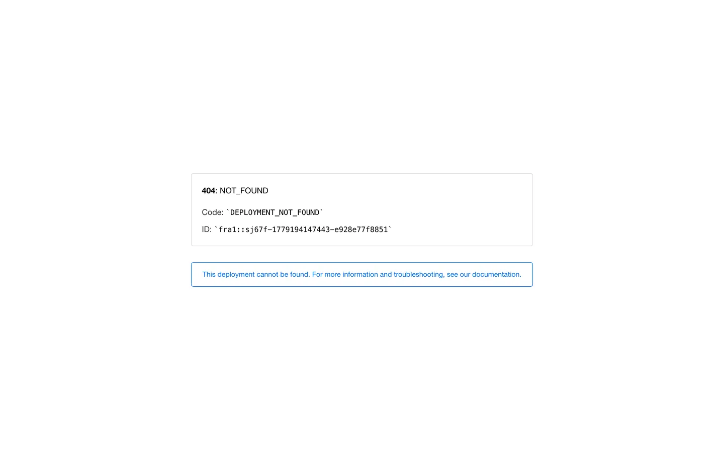
Tome's marketing site is no longer live and serves a Vercel deployment-not-found page; this DESIGN.md captures that error surface as a worked example of a system in absentia.
Add shadcn.io to your AI agent. · Pro It installs blocks, icons and templates in your design system from a prompt, with Pro.
Set up MCP- Primary
- #000000
- Typeface
- SF Pro Text
- Shape
- Sharp
- Base radius
- 5px
- Colors
- 5
- Type tokens
- 4
- Components
- 5
- Spacing values
- 6
About
About Tome DESIGN.md
Curated by Dov Azencot · Updated May 19, 2026 · Source tome.app (opens in a new tab)
Tome was an AI narrative-presentation tool that built a sizeable design-tool audience around a minimal cream-and-charcoal aesthetic and an editorial pacing language. At extraction time the canonical URL `tome.app` no longer resolves to that marketing site — it serves Vercel's default deployment-not-found page instead. This DESIGN.md captures what is actually rendering, not the brand's historical chrome.
The result is a worked example of capturing a system in absentia. The visible surface is a single centered card with a hairline border, a 16px / 400 SF Pro Text body, a 14.72px Menlo monospace strip for the deployment ID, and a single Vercel-blue inline link in a softly-rounded callout below. There is no hero, no navigation, no brand voltage, no display tier — only the default Vercel error chrome, which is itself a quietly disciplined piece of system design. Where a live Tome page would carry its narrative-editorial aesthetic with cream surfaces, an editorial serif companion, and slide-thumbnail rhythms, the rendered page captured here is closer to a generic dev-platform error template.
Feed this file to Claude or Cursor and the agent will reproduce only the Vercel-error chrome — a hairline-bordered card on a white canvas with charcoal text and a blue inline-link callout. The file is preserved as a directory artifact for two reasons: to document that the canonical URL no longer serves the brand surface, and to demonstrate the validator's behavior when extraction returns a minimal system. Treat it as a placeholder rather than a token set worth borrowing. If Tome returns under a different URL or owner, this file should be regenerated against the new live surface.
What makes it distinct
5
- Site in absentiatome.app returns a Vercel deployment-not-found page at extraction time; the rendered tokens belong to Vercel's error chrome
- SF Pro Text everywherethe system stack runs Apple's system-ui sans across every surface, with Menlo for the deployment-ID monospace strip
- Single hairline-bordered cardthe entire visible UI is one centered card on a white canvas, no shadow, 4px rounding
- Vercel-blue inline linkthe documentation link uses Vercel's default link color #0070f3 as the only chromatic element
- Charcoal ink, never blackthe text rendering uses #333333 for body and pure black only on the bordered card outline
tome.app
Live at tome.app
A snapshot of the brand in production. Scroll the frame to see the whole page.
Colors
5 colors
Tome's system runs on #000000 as its primary voltage, used in 1 of 5 components. Type is set in SF Pro Text across 4 tokens from 14px to 16px, weights 400–700. Shape language is sharp — components average 4px corner radius, favoring crisp rectangles.
Surface
Page and card backgrounds · 1
Text
Headlines, body, captions · 3
Borders & Hairlines
Dividers, outlines, rules · 1
Typography
4 type tokens
Set in SF Pro Text across 4 tokens, from 14px to 16px, weights 400–700. Shown in its own stack: where the font isn't installed, the fallback the file names stands in.
- body-md16px · weight 400 · lh 26.4pxThe quick brown fox jumps over the lazy dog
- body-bold16px · weight 700 · lh 26.4pxThe quick brown fox jumps over the lazy dog
- body-sm14px · weight 400 · lh 25.2pxThe quick brown fox jumps over the lazy dog
- mono-md14.72px · weight 400 · lh 24.288pxThe quick brown fox jumps over the lazy dog
Layout
Radii and spacing
4 corner radii and 6 spacing values. Shape language: sharp.
Radii
- none0px
- xs4px
- sm5px
- full9999px
Spacing
- xs8px
- sm16px
- base20px
- md32px
- lg40px
- xl60px
Components
5 components
Each rendered from its tokens (color, type, radius, padding) on Tome's own canvas.
- Error Carderror-cardError Card
- Error Card Headingerror-card-headingError Card Heading
- Body Paragraphbody-paragraphBody Paragraph
- Mono Idmono-idMono Id
- Link Calloutlink-calloutLink Callout
In use
The system, in use
Tome's tokens on the kind of product it builds.
Build something people actually use.
A short paragraph of marketing copy that previews how the brand's display tier and body tier read together. Two sentences is usually enough.
FAQ
Tome design system FAQ
Common questions about Tome's tokens, components, and how to use this DESIGN.md in your project.
Read next
Related reading
Specs, directories, and component libraries that pair with this design system.
- Browse all design systemsThe full directory of DESIGN.md files on shadcn.io, with live mockups for each.shadcn.io
- Tome — canonical URL (currently 404)Tome's canonical URL. At extraction time this serves a Vercel deployment-not-found page; the historical marketing surface is not available.tome.app (opens in a new tab)
- The DESIGN.md specificationGoogle Labs' open spec for machine-readable design system files — the format this page is built on.github.com (opens in a new tab)
Use it
Use Tome in your project
One machine-readable file. Drop it into Claude, Cursor, or any AI tool that reads DESIGN.md.
Download the DESIGN.md
One machine-readable file: every color, type, radius, spacing, and component token of Tome.
Feed it to your AI tool
Drop it into Claude, Cursor, or GitHub Copilot. The agent writes React components and Tailwind classes that match Tome's visual language.
Reference the tokens directly
Or paste the values into your Tailwind config, CSS variables, or component library: every color, size and radius is a quoted, ready-to-copy value.
Read the full DESIGN.md: overview, rationale, do’s and don’ts
Overview
Tome's marketing site is not available at extraction time. System in absentia. The canonical URL tome.app no longer resolves to a brand surface — it serves Vercel's default deployment-not-found page instead, and that error chrome is what this DESIGN.md captures. Where a live Tome page would carry its historical AI-narrative aesthetic with cream surfaces and an editorial pacing language, the rendered surface here is closer to the generic dev-platform error pages served by Heroku, Railway, and Render when a deployment is missing.
The captured surface contains a single hairline-bordered card centered on a white canvas. Inside the card: a charcoal "404: NOT_FOUND" title with the colon and following text in a slightly lighter weight, a Menlo monospace line carrying the deployment-error code, and a second Menlo line carrying the failed deployment ID. Beneath the card sits a softly-bordered callout in Vercel-blue ({colors.link} — #0070f3) linking to Vercel's documentation. There is no hero, no navigation, no brand voltage above a CTA accent, no display tier above the 16px body text — only the default error template. This is the inverse of the dense-token capture you see on Cloudflare or Spline; the system is a deliberate placeholder rendered by the hosting provider, not the brand itself.
The typographic surface is similarly minimal. SF Pro Text carries every text surface at 16px / 400 with the system fallback stack walking through -apple-system, system-ui, "Helvetica Neue", Helvetica, sans-serif. The inline-strong emphasis ("404" in the card title) uses the same family at weight 700. Menlo carries the deployment-error code and ID at 14.72px / 400 — Vercel's default monospace for code identifiers. The page does not declare a brand typeface; the rendered surface is whatever the operating system supplies.
Key Characteristics:
- Site in absentia —
tome.appreturns a Vercel deployment-not-found page at extraction time; this DESIGN.md captures that error chrome rather than the historical brand surface. - Single hairline-bordered card on a white canvas (
{colors.canvas}— #ffffff) as the entire visible UI, with a second pill-bordered link callout beneath. - Charcoal ink (
{colors.ink}— #333333) carries body text; pure black ({colors.ink-deep}— #000000) carries the inline-strong "404" emphasis and the card outline. - Single Vercel-blue voltage (
{colors.link}— #0070f3) on the documentation link callout — the only chromatic element on the page. - SF Pro Text body at 16px / 400 with no display tier; Menlo monospace at 14.72px / 400 for the deployment ID.
- Small-step radius scale — 4px on the bordered card (the dominant value, 1 captured occurrence) and 5px on the link callout. There is no large-radius tier in the captured surface.
- No shadow tier — every surface is flat against the white canvas; depth comes from the 1px hairline border alone.
- No brand identity exposed — the captured surface is identical to what every other site hosted on Vercel serves when the deployment is missing.
Colors
Text
- Ink (
{colors.ink}— #333333): frequency 5. Used as text (3), border (2). The charcoal body color across the captured surface — body paragraphs, the deployment-ID monospace line, the secondary text in the documentation callout. - Ink Deep (
{colors.ink-deep}— #000000): frequency 16. Used as text (8), border (8). The card outline, the inline strong-emphasis "404" in the heading, and the deployment-code mono identifier. Pure black is used sparingly — only for emphasis and structural borders.
Brand (placeholder)
- Link (
{colors.link}— #0070f3): frequency 4. Used as text (2), border (2). The Vercel documentation-link color — saturated mid-blue, the only chromatic element on the page. This is Vercel's default link color, not Tome's brand voltage; treat it as a placeholder.
Surface
- Canvas (
{colors.canvas}— #ffffff): pure white, the page floor. The single surface color in the system. There is no second surface tier and no warmth tinting; the captured Vercel error template uses plain white throughout.
Hairline
- Hairline (
{colors.hairline}— #000000): pure black at hairline weight. The 1px outline on the centered error card. The captured surface uses the same value as ink-deep — the page does not distinguish a separate border tone from its primary text color, which is unusual but reflects what is actually rendered.
Typography
Font Families
The system runs the platform default sans stack with SF Pro Text as the primary preference and a long fallback walking through -apple-system, system-ui, "Helvetica Neue", Helvetica, sans-serif. The monospace strip uses Menlo, Monaco, "Lucida Console", "Liberation Mono", "DejaVu Sans Mono", "Bitstream Vera Sans Mono", "Courier New", monospace, serif. There is no declared brand font and no web-font request on the captured surface — every text glyph comes from the OS.
This is the Vercel default. A live Tome page would have declared its own brand typography (historical archives show a custom editorial sans paired with a serif companion), but the captured surface inherits whatever the user's operating system supplies.
Hierarchy
| Token | Family | Size | Weight | Line Height | Use |
|---|---|---|---|---|---|
{typography.body-md} | SF Pro Text | 16px | 400 | 26.4px | Body paragraph, link-callout text |
{typography.body-bold} | SF Pro Text | 16px | 700 | 26.4px | "404" inline strong emphasis in the card title |
{typography.body-sm} | SF Pro Text | 14px | 400 | 25.2px | Secondary body lines |
{typography.mono-md} | Menlo | 14.72px | 400 | 24.288px | Deployment ID, error code identifier |
Principles
There is no display tier in the captured surface. The page has no h1, no h2, no h3 — only inline-strong emphasis within a 16px body paragraph. The monospace strip is the only typographic moment that differs from the default body text. This is the minimum viable type system; a live Tome page would declare a multi-step display ladder.
Note on Font Substitutes
The system stack itself is the substitute. SF Pro Text walks through to system-ui and Helvetica Neue automatically; no font installation is required. For Menlo on non-Apple platforms, the fallback walks through to Monaco, Lucida Console, Liberation Mono, DejaVu Sans Mono, Bitstream Vera Sans Mono, and Courier New before reaching the generic monospace keyword. The Vercel default ships with the longest mono fallback chain in this directory.
Layout
Spacing System
- Base unit: undeclared on the captured surface, but the rendered card uses 20px padding consistently.
- Tokens:
{spacing.xs}8px ·{spacing.sm}16px ·{spacing.base}20px ·{spacing.md}32px ·{spacing.lg}40px ·{spacing.xl}60px. - Card internal padding: 20px (the captured value on the bordered error card).
- Vertical centering: the card sits vertically centered on the page, with the link callout floating ~40px below it.
- No section padding: the captured surface has only one section.
Grid & Container
- Max content width: the error card renders at ~679px wide on a desktop viewport, with the page itself extending to full viewport width.
- Horizontal centering: both the error card and the link callout are horizontally centered on the page floor.
- No grid: the captured surface has no multi-column layout, no card grid, no logo wall.
Rhythm
The page has no rhythm in the multi-section sense. There is one card stacked above one callout, both centered on a vertically and horizontally neutral white canvas. The vertical spacing between the two elements is the only rhythmic gesture.
Elevation
The system has no shadow tier. Every visible surface is flat against the white canvas. Depth comes from the 1px hairline border on the error card and the 1px softer border on the link callout — there are no drop shadows, no inner shadows, no tinted halos.
- Flat (no shadow): every surface.
- Hairline outline: the error card carries a 1px
{colors.hairline}border at full opacity; the link callout carries a 1px{colors.link}border in the brand-blue tone. - No modal scrim: the captured surface has no overlay or modal element.
Shapes
The radius scale is small-step only:
{rounded.none}0px — implicit on the page floor and any unbordered text.{rounded.xs}4px — the dominant value on the captured surface. The error card uses this radius.{rounded.sm}5px — the link-callout pill uses this slightly softer radius. The captured surface contains 1 occurrence each of 4px and 5px.{rounded.full}9999px — declared as a fallback token but not used on the captured surface.
There is no 8-12-16px tier and no 20px+ tier. The captured surface uses the tightest two radii available and nothing larger. A live Tome page would almost certainly declare a more generous scale; the values here belong to Vercel's default error template.
Components
error-card — White {colors.canvas} fill, 1px {colors.hairline} border at full opacity, {rounded.xs} 4px radius, 20px internal padding. Holds the "404: NOT_FOUND" heading, the deployment-code line, and the deployment-ID line. The single primary surface on the captured page.
error-card-heading — Inline strong-emphasis text within the error card. "404" renders in {colors.ink-deep} pure black at {typography.body-bold} (16px / 700); the trailing ": NOT_FOUND" reverts to the body weight at the same size.
body-paragraph — Charcoal {colors.ink} text at {typography.body-md} (SF Pro Text 16px / 400). The body lines carrying "Code:" and "ID:" labels.
mono-id — Menlo monospace at 14.72px / 400 in charcoal {colors.ink}. Used for the inline deployment-code and deployment-ID identifiers. The only non-system-sans surface in the captured page.
link-callout — White {colors.canvas} fill, 1px {colors.link} border, {rounded.xs} 4-5px radius, 16x20 padding. Holds the documentation link in {colors.link} Vercel-blue. The single chromatic element on the captured surface and the only meaningful CTA on the page.
Do's and Don'ts
Do treat this DESIGN.md as a directory artifact rather than a token set worth borrowing. The captured surface is Vercel's default deployment-not-found page, not Tome's brand chrome — using these tokens to build a "Tome-style" product would produce a Vercel error page imitation rather than a narrative-presentation tool.
Do regenerate this file if Tome returns under a different URL or owner. The current file documents a moment in time; if tome.app ever resolves to a live marketing surface again, run the extraction again and replace this spec entirely.
Do preserve the {colors.link} (#0070f3) value as a placeholder rather than a brand color. The blue is Vercel's, not Tome's; substitute your own brand link color when applying this spec to any project.
Do treat the absence of a display tier as a signal that the captured surface is incomplete. A real brand DESIGN.md should carry a 4-7-step type ladder; this file has only one body size and one mono size because that is literally what the page renders.
Don't infer Tome's historical brand voltage from the captured colors. The 19 total color occurrences in the extraction belong to Vercel's error template and carry zero information about Tome's actual design language.
Don't copy the single-card layout as a marketing-page pattern. The centered hairline-bordered card is an error-page convention; replicating it as a hero treatment would produce a page that reads as broken rather than as a deliberate brand statement.
Don't use SF Pro Text as a default brand typeface based on this spec. The system stack here is the Vercel fallback, not Tome's declared family — every live page in this directory declares a brand-specific typeface (Inter, Spline Sans, FT Kunst Grotesk, Mark Pro), and a real Tome page would do the same.
Don't add this file to a peer-comparison palette. The token counts here are an order of magnitude smaller than every other live entry in the directory; including Tome in side-by-side comparisons would mislead anyone scanning the directory for live brand systems.
Known Gaps
- Entire brand surface: the canonical URL
tome.appdoes not serve a live Tome marketing page at extraction time. Every token captured here belongs to the Vercel deployment-not-found page that the URL currently returns. The historical Tome brand chrome — cream surfaces, editorial serif companion, slide-thumbnail rhythms — is not represented. - No hero, no navigation, no footer: the captured surface has none of the structural blocks a live marketing page would carry.
- No display typography: there is no h1, h2, or display tier. The largest visible text is 16px body emphasis.
- No brand voltage: the only chromatic element on the captured surface is the Vercel-default link blue (#0070f3), which belongs to the hosting provider's error template rather than to Tome's brand.
- No component matrix: the captured surface contains five visual elements (card, heading emphasis, body paragraph, mono identifier, link callout). A live brand page would expose dozens of components — navigation, buttons, cards, inputs, dropdowns, footers.
- Historical asset references not preserved: prior versions of
tome.appfrom 2023-2024 carried a substantial design system that is documented in web-archive snapshots but is not present in the live extraction. If the brand returns or the canonical URL changes hands, this file should be replaced entirely rather than amended. - Site status: the deployment-not-found state may itself change without notice — the URL could resolve to a redirect, a new owner's landing page, a third-party squat, or a fresh Tome page at any time. The "lastUpdated" field reflects the date this extraction was run, not the date the brand site went offline.
AI & LLM Platforms
More systems like this
More DESIGN.md files in AI & LLM Platforms.
Pricing
Build it with Pro
The DESIGN.md files are free. Pro adds 6,000+ blocks, premium templates and the MCP server, so your AI editor builds in your system for you.
4.9/5 out of 5 · 150+ reviewsfrom 150+ founders and developers.
Billing
Billed once a year in USD. Cancel anytime.
- How many people can use the license.
- Client work, SaaS products and anything you charge for.
- Production-ready React sections: hero, pricing, features, dashboards and more.
- Complete multi-page sites you can ship as they are.
- React icons from every major library, installable with one command.
- Presets that restyle every block, in light and dark.
- Lets your AI editor search, preview and install blocks for you.
- Priority requests are answered first.
Individual
For personal projects & open source
$32instead of $49/mo
$389 billed yearly
- Seats: 1 seat
- Commercial use: Personal & open source only
- Pro blocks: 6,000+ blocks
- Templates: All 14 templates
- React icons: 294k+ icons
- Themes: All 59 themes
- MCP server: Basic usage
- Support: Standard
Team
Most popularFor freelancers, agencies & startups
$66instead of $99/mo
$789 billed yearly · ≈ $13/dev/mo
- Seats: Up to 5 seats
- Commercial use: Included
- Pro blocks: 6,000+ blocks
- Templates: All 14 templates
- React icons: 294k+ icons
- Themes: All 59 themes
- MCP server: High usage
- Support: Priority
Organization
For companies with larger teams
$132instead of $199/mo
$1,589 billed yearly
- Seats: Unlimited seats
- Commercial use: Included
- Pro blocks: 6,000+ blocks
- Templates: All 14 templates
- React icons: 294k+ icons
- Themes: All 59 themes
- MCP server: Unlimited usage
- Support: Priority
Billed once a year in USD. Cancel anytime.
Individual
For personal projects & open source
$32instead of $49/mo
$389 billed yearly
- How many people can use the license.Seats: 1 seat
- Client work, SaaS products and anything you charge for.Commercial use: Personal & open source only
- Production-ready React sections: hero, pricing, features, dashboards and more.Pro blocks: 6,000+ blocks
- Complete multi-page sites you can ship as they are.Templates: All 14 templates
- React icons from every major library, installable with one command.React icons: 294k+ icons
- Presets that restyle every block, in light and dark.Themes: All 59 themes
- Lets your AI editor search, preview and install blocks for you.MCP server: Basic usage
- Priority requests are answered first.Support: Standard
Team
Most popularFor freelancers, agencies & startups
$66instead of $99/mo
$789 billed yearly · ≈ $13/dev/mo
Everything in Individual, plus
- How many people can use the license.Seats: Up to 5 seats
- Client work, SaaS products and anything you charge for.Commercial use: Included
- Lets your AI editor search, preview and install blocks for you.MCP server: High usage
- Priority requests are answered first.Support: Priority
Organization
For companies with larger teams
$132instead of $199/mo
$1,589 billed yearly
Everything in Team, plus
- How many people can use the license.Seats: Unlimited seats
- Lets your AI editor search, preview and install blocks for you.MCP server: Unlimited usage
- Secure checkout via Stripe
- Code lives in your repo
- Keep what you've shipped if you cancel
- License terms
Your system, built for you
Every block, template and icon, installed by your AI agent in your design system. The DESIGN.md files stay free.