Together AI Inspired Design System
Together AI's design system as a DESIGN.md file. #010120 canvas, The Future + PP Neue Montreal Mono, 13 colors, 35 components. For React, Next.js, and AI tools.
Add shadcn.io to your AI agent. · Pro It installs blocks, icons and templates in your design system from a prompt, with Pro.
Set up MCP- Primary
- #000000
- Typeface
- The Future
- Shape
- Sharp
- Base radius
- 8px
- Colors
- 13
- Type tokens
- 14
- Components
- 35
- Spacing values
- 12
About
About Together AI Inspired DESIGN.md
Curated by Dov Azencot · Updated May 12, 2026 · Source together.ai (opens in a new tab)
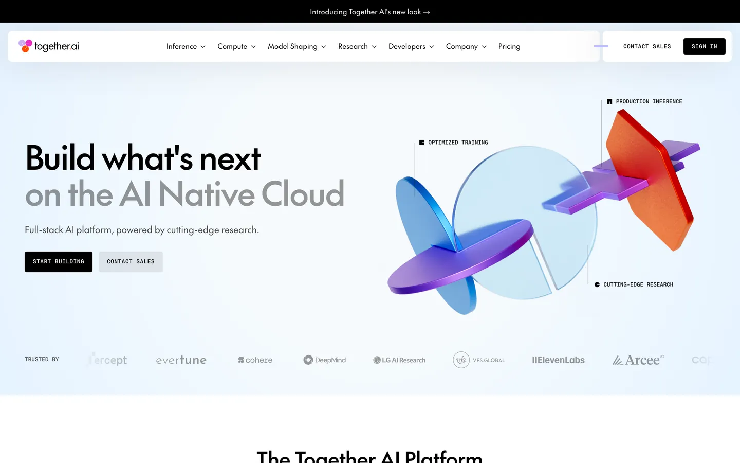
Together AI sells AI cloud infrastructure — GPU clusters, model inference, fine-tuning, the plumbing that lets developer teams ship LLM products. The brand's web surface mirrors that posture with a near-black hero on top, a long white technical body in the middle, and exactly one piece of decorative chrome: a three-color orange-magenta-periwinkle gradient ribbon that does the entire job of declaring "we are not another grey enterprise SaaS." No illustration system, no spot art, no secondary accent — the gradient carries the brand alone. Type is the second decisive voice. A custom geometric sans (The Future) sets every headline at weight 500 with tight negative letter-spacing, and an uppercase monospace eyebrow (PP Neue Montreal Mono) labels every section, every button, and every table-header cell at 11–16px.
This page packages the whole system into a single DESIGN.md file built to the Google Labs open spec. Inside: 13 colors tokens grouped across brand gradient (#fc4c02, #ef2cc1, #bdbbff, plus a mint #c8f6f9), surface (#010120 canvas-dark, #ffffff canvas, #ebebeb hairline, #313641 surface-dark-soft), and text (#000000 ink, #999999 body, #ffffff on-dark). Typography spans 14 tokens from display-xxl at 64px down to mono-caption at 10px. The spacing scale runs 12 steps from 2px to an 80px section rhythm, the radius scale stops at 5 tokens topping out at full pill 9999px, and the component manifest defines 44 surfaces from the hero band down to the footer wordmark banner.
Feed the file to Claude, Cursor, or GitHub Copilot and the agent reproduces Together's specific restraint — dual-surface alternation, monospace eyebrows, gradient-as-chrome — rather than spitting out a generic AI-platform theme with neon accents and glass cards. Reference the tokens directly in Tailwind config or CSS variables. The system rewards study for one reason in particular: it shows what an infrastructure brand looks like when it commits to two fonts, one gradient, and a strict polarity flip between dark and light, with absolutely nothing else in the decorative budget.
What makes it distinct
5
- Dual surface modepages alternate #010120 dark bands and #ffffff white bands with zero mid-grey transitions
- Two-face type systemThe Future display sans at 64px / 500 paired with PP Neue Montreal Mono eyebrows at 11px / 500
- Single decorative elementa three-stop #fc4c02 to #ef2cc1 to #bdbbff gradient ribbon is the entire visual identity
- Universal 4px radiusevery card, button, and badge uses {rounded.sm}; only the chat orb gets {rounded.full}
- 35 components tokens with one black #000000 CTA pill carrying every conversion target across the entire site
together.ai
Live at together.ai
A snapshot of the brand in production. Scroll the frame to see the whole page.
Colors
13 colors
Together AI Inspired's system runs on #000000 as its primary voltage, used in 3 of 35 components. Type is set in The Future across 14 tokens from 10px to 64px, weights 400–500. Shape language is sharp — components average 4px corner radius, favoring crisp rectangles.
Brand & Accent
Sparing, CTA-only voltage · 5
Surface
Page and card backgrounds · 3
Text
Headlines, body, captions · 4
Borders & Hairlines
Dividers, outlines, rules · 1
Typography
14 type tokens
Set in The Future across 14 tokens, from 10px to 64px, weights 400–500. Shown in its own stack: where the font isn't installed, the fallback the file names stands in.
- display-xxl64px · weight 500 · lh 70.4px · tracking -1.92pxThe quick brown fox jumps over the lazy dog
- display-xl40px · weight 500 · lh 48px · tracking -0.8pxThe quick brown fox jumps over the lazy dog
- display-lg28px · weight 500 · lh 32.2px · tracking -0.42pxThe quick brown fox jumps over the lazy dog
- display-md22px · weight 500 · lh 25.3px · tracking -0.22pxThe quick brown fox jumps over the lazy dog
- body-lg18px · weight 400 · lh 23.4px · tracking -0.18pxThe quick brown fox jumps over the lazy dog
- body-lg-strong18px · weight 500 · lh 23.4px · tracking -0.18pxThe quick brown fox jumps over the lazy dog
- body-md16px · weight 400 · lh 20.8px · tracking -0.16pxThe quick brown fox jumps over the lazy dog
- body-md-strong16px · weight 500 · lh 20.8px · tracking -0.16pxThe quick brown fox jumps over the lazy dog
- caption14px · weight 400 · lh 19.6pxThe quick brown fox jumps over the lazy dog
- caption-strong14px · weight 500 · lh 19.6pxThe quick brown fox jumps over the lazy dog
- mono-caps-button16px · weight 500 · lh 16px · tracking 0.08pxThe quick brown fox jumps over the lazy dog
- mono-caps-eyebrow11px · weight 500 · lh 11px · tracking 0.55pxThe quick brown fox jumps over the lazy dog
- mono-caps-label11px · weight 500 · lh 15.4px · tracking 0.055pxThe quick brown fox jumps over the lazy dog
- mono-caption10px · weight 400 · lh 14px · tracking 0.05pxThe quick brown fox jumps over the lazy dog
Layout
Radii and spacing
5 corner radii and 12 spacing values. Shape language: sharp.
Radii
- none0px
- xs3.25px
- sm4px
- md8px
- full9999px
Spacing
- xxs2px
- xs4px
- sm8px
- md12px
- lg16px
- xl20px
- 2xl24px
- 3xl32px
- 4xl44px
- 5xl48px
- 6xl55.2px
- section80px
Components
35 components
Each rendered from its tokens (color, type, radius, padding) on Together AI's own canvas.
- Nav Barnav-barNav Bar
- Nav Linknav-linkNav Link
- Button Primarybutton-primaryButton Primary
- Button Secondary Mintbutton-secondary-mintButton Secondary Mint
- Button Secondary Whitebutton-secondary-whiteButton Secondary White
- Button Ghost On Darkbutton-ghost-on-darkButton Ghost On Dark
- Button Outlinebutton-outlineButton Outline
- button-icon-circularButton Icon Circular
- Type here…text-inputText Input
- Badge Neutralbadge-neutralBadge Neutral
- Badge Subtle On Darkbadge-subtle-on-darkBadge Subtle On Dark
- Hero Band Darkhero-band-darkHero Band Dark
- Research Band Darkresearch-band-darkResearch Band Dark
- Feature Tab Pillfeature-tab-pillFeature Tab Pill
- Pricing Sub Tabpricing-sub-tabPricing Sub Tab
- Stats Card Tintedstats-card-tintedStats Card Tinted
- Research Cardresearch-cardResearch Card
- Testimonial Cardtestimonial-cardTestimonial Card
- Article Cardarticle-cardArticle Card
- Code Editor Mockupcode-editor-mockupCode Editor Mockup
- Data Table Rowdata-table-rowData Table Row
- Data Table Headerdata-table-headerData Table Header
- Toggle Pill Grouptoggle-pill-groupToggle Pill Group
- FooterfooterFooter
- Footer Wordmark Bannerfooter-wordmark-bannerFooter Wordmark Banner
- Ex Pricing Tierex-pricing-tierEx Pricing Tier
- Ex Pricing Tier Featuredex-pricing-tier-featuredEx Pricing Tier Featured
- Ex Product Selectorex-product-selectorEx Product Selector
- Ex Cart Drawerex-cart-drawerEx Cart Drawer
- Ex App Shell Rowex-app-shell-rowEx App Shell Row
- Ex Data Table Cellex-data-table-cellEx Data Table Cell
- Ex Auth Form Cardex-auth-form-cardEx Auth Form Card
- Ex Modal Cardex-modal-cardEx Modal Card
- Ex Empty State Cardex-empty-state-cardEx Empty State Card
- Ex Toastex-toastEx Toast
In use
The system, in use
Together AI's tokens on the kind of product it builds.
Build something people actually use.
A short paragraph of marketing copy that previews how the brand's display tier and body tier read together. Two sentences is usually enough.
FAQ
Together AI Inspired design system FAQ
Common questions about Together AI's tokens, components, and how to use this DESIGN.md in your project.
Read next
Related reading
Specs, directories, and component libraries that pair with this design system.
Use it
Use Together AI Inspired in your project
One machine-readable file. Drop it into Claude, Cursor, or any AI tool that reads DESIGN.md.
Download the DESIGN.md
One machine-readable file: every color, type, radius, spacing, and component token of Together AI Inspired.
Feed it to your AI tool
Drop it into Claude, Cursor, or GitHub Copilot. The agent writes React components and Tailwind classes that match Together AI Inspired's visual language.
Reference the tokens directly
Or paste the values into your Tailwind config, CSS variables, or component library: every color, size and radius is a quoted, ready-to-copy value.
Read the full DESIGN.md: overview, rationale, do’s and don’ts
Overview
Together AI is an AI cloud-infrastructure platform — model inference, GPU clusters, fine-tuning, all the plumbing that makes "the AI native cloud" deliverable to a developer team — and the brand's web surface signals exactly that posture: a near-black hero on top, a long ribbon of white technical content in the middle, and a single recurring piece of brand chrome — a three-color orange-magenta-periwinkle gradient ribbon — that does the entire job of "we are not just another grey enterprise SaaS." There is no other illustration system. The gradient is the brand.
Type is the second decisive voice. Two faces carry every page: a custom geometric display sans (extracted as The Future) for headlines and body, set at weight 500 with tight, slightly-negative letter-spacing so 64-pixel hero type feels poured rather than typed; and an uppercase monospace eyebrow (PP Neue Montreal Mono) that labels every section, every button, and every cell header. Headlines are sentence-case; everything technical is uppercase mono. That contrast is the brand's tonal joke — the platform is serious enough to use a monospace label, modern enough to not put the headline in it.
Surfaces alternate aggressively: a {colors.canvas-dark} (#010120) band for hero / research / "Grounded in cutting-edge research" — followed by {colors.canvas} (white) for product, pricing, and testimonials, with {colors.hairline} reserved for table-header rows and toggle backgrounds. Pastel {colors.accent-mint} tinted stat tiles break up the white middle. Cards are universally lightly rounded ({rounded.sm} 4 px) with hairline borders — never floating with shadows.
Key Characteristics:
- A single black
{colors.primary}CTA pill carries every conversion target across pricing, footer, sign-in. The mint{colors.accent-mint}and white pill variants are reserved for hero contexts only. - A three-color brand gradient (
{colors.accent-orange}→{colors.accent-magenta}→{colors.accent-periwinkle}) is the entire decorative system — used as the hero ribbon graphic and never reduced to a swatch elsewhere. - All-caps mono eyebrows and button labels in
{typography.mono-caps-eyebrow}/{typography.mono-caps-button}everywhere — section titles, model row headers, "ON-DEMAND" labels in pricing tables. - Lightly rounded card chrome at
{rounded.sm}4 px; one off{rounded.xs}3.25 px appears inside pricing-tab pills as a tighter system;{rounded.full}only for the floating chat-launcher orb. - Dual surface mode — alternating
{colors.canvas-dark}and{colors.canvas}bands; no in-between greys. The single soft surface{colors.hairline}exists only to mark table-header rows. - A massive
together.aiwordmark banner at the very bottom of every page, set in{typography.display-xxl}and tinted nearly-into-the-canvas ({colors.hairline}), as a "we are here" sign-off that doubles as a footer separator.
Known Gaps
- Semantic palette: the brand does not maintain a documented error / success / warning color set in its public surface; validation cues rely on the primary black or the brand gradient depending on context. No explicit error red, success green, or warning yellow is captured here — adopting framework defaults is appropriate.
- Hover states: precise hover token definitions for the black CTA, the ghost-on-dark button, and data-table rows were not captured. The brand likely uses subtle opacity shifts rather than explicit hover colors.
- Loading skeletons: not visible on the extracted marketing surfaces; specific shimmer / skeleton treatments for the model-pricing table and dashboard tiles are not documented.
- In-product dashboard chrome: only the public marketing and pricing surfaces are captured. The signed-in console (model deployments, billing, API key management) has its own surface treatment that lives outside this spec.
- Mobile nav drawer details: the spec notes the nav collapses to a full-overlay drawer at mobile widths, but specific entry / exit animation timing and drawer interior chrome are not captured.
- Code-editor mockup syntax theme: the dark code-editor mockup inside the product band uses a specific syntax-highlight palette (keyword / string / comment tints) that is not enumerated here.
AI & LLM Platforms
More systems like this
More DESIGN.md files in AI & LLM Platforms.
Pricing
Build it with Pro
The DESIGN.md files are free. Pro adds 6,000+ blocks, premium templates and the MCP server, so your AI editor builds in your system for you.
4.9/5 out of 5 · 150+ reviewsfrom 150+ founders and developers.
Billing
Billed once a year in USD. Cancel anytime.
- How many people can use the license.
- Client work, SaaS products and anything you charge for.
- Production-ready React sections: hero, pricing, features, dashboards and more.
- Complete multi-page sites you can ship as they are.
- React icons from every major library, installable with one command.
- Presets that restyle every block, in light and dark.
- Lets your AI editor search, preview and install blocks for you.
- Priority requests are answered first.
Individual
For personal projects & open source
$32instead of $49/mo
$389 billed yearly
- Seats: 1 seat
- Commercial use: Personal & open source only
- Pro blocks: 6,000+ blocks
- Templates: All 14 templates
- React icons: 294k+ icons
- Themes: All 59 themes
- MCP server: Basic usage
- Support: Standard
Team
Most popularFor freelancers, agencies & startups
$66instead of $99/mo
$789 billed yearly · ≈ $13/dev/mo
- Seats: Up to 5 seats
- Commercial use: Included
- Pro blocks: 6,000+ blocks
- Templates: All 14 templates
- React icons: 294k+ icons
- Themes: All 59 themes
- MCP server: High usage
- Support: Priority
Organization
For companies with larger teams
$132instead of $199/mo
$1,589 billed yearly
- Seats: Unlimited seats
- Commercial use: Included
- Pro blocks: 6,000+ blocks
- Templates: All 14 templates
- React icons: 294k+ icons
- Themes: All 59 themes
- MCP server: Unlimited usage
- Support: Priority
Billed once a year in USD. Cancel anytime.
Individual
For personal projects & open source
$32instead of $49/mo
$389 billed yearly
- How many people can use the license.Seats: 1 seat
- Client work, SaaS products and anything you charge for.Commercial use: Personal & open source only
- Production-ready React sections: hero, pricing, features, dashboards and more.Pro blocks: 6,000+ blocks
- Complete multi-page sites you can ship as they are.Templates: All 14 templates
- React icons from every major library, installable with one command.React icons: 294k+ icons
- Presets that restyle every block, in light and dark.Themes: All 59 themes
- Lets your AI editor search, preview and install blocks for you.MCP server: Basic usage
- Priority requests are answered first.Support: Standard
Team
Most popularFor freelancers, agencies & startups
$66instead of $99/mo
$789 billed yearly · ≈ $13/dev/mo
Everything in Individual, plus
- How many people can use the license.Seats: Up to 5 seats
- Client work, SaaS products and anything you charge for.Commercial use: Included
- Lets your AI editor search, preview and install blocks for you.MCP server: High usage
- Priority requests are answered first.Support: Priority
Organization
For companies with larger teams
$132instead of $199/mo
$1,589 billed yearly
Everything in Team, plus
- How many people can use the license.Seats: Unlimited seats
- Lets your AI editor search, preview and install blocks for you.MCP server: Unlimited usage
- Secure checkout via Stripe
- Code lives in your repo
- Keep what you've shipped if you cancel
- License terms
Your system, built for you
Every block, template and icon, installed by your AI agent in your design system. The DESIGN.md files stay free.