The Verge Design System
The Verge's 2024 redesign as a DESIGN.md file. Canvas #131313, Jelly Mint #3cffd0, Manuka up to 107px, 30+ components. For React, Next.js, and AI tools.
Add shadcn.io to your AI agent. · Pro It installs blocks, icons and templates in your design system from a prompt, with Pro.
Set up MCP- Primary
- #3cffd0
- Typeface
- PolySans
- Shape
- Soft
- Base radius
- 3px
- Colors
- 25
- Type tokens
- 21
- Components
- 28
- Spacing values
- 13
About
About The Verge DESIGN.md
Curated by Dov Azencot · Updated May 12, 2026 · Source theverge.com (opens in a new tab)
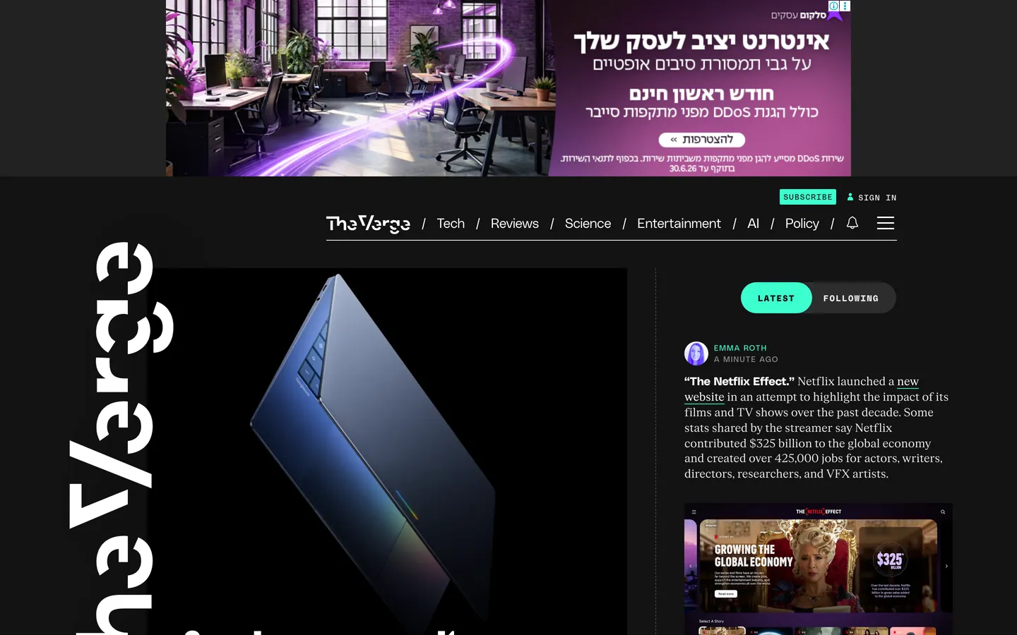
The Verge's 2024 redesign reads like a Condé Nast magazine wired to a chiptune soundboard. The canvas is almost-black (#131313 — not pure black, with just enough warmth to feel like a printed newsprint negative), and the whole page is peppered with acid-mint #3cffd0 and ultraviolet #5200ff that behave less like brand colors and more like hazard tape. Display headlines crash in at 107px in Manuka 900, a brutally heavy industrial sans from Klim Type Foundry. There is no light mode on the homepage. Story tiles are not quiet gray cards but saturated full-bleed color blocks in mint, purple, yellow, pink, and orange that feel like pasted-up rave flyers arranged into a timeline. The mood is serious enough to cover a congressional hearing, loud enough to review a synthesizer.
This DESIGN.md file packages the entire system into a single machine-readable spec. Inside: 25 colors tokens organized into hazards, surfaces, neutrals, and semantics; 21 typography tokens spanning Manuka display (60–107px), PolySans body and label work, PolySans Mono for every UPPERCASE moment, and FK Roman Standard for rare print-voice excerpts; 8 corner-radius values from 2px typewriter tags to 40px outlined CTA pills; a 14-step spacing scale built on an 8px unit; and 30+ component specifications covering the StoryStream timeline, color-block tiles, navigation, buttons, forms, and image frames. The format follows the Google Labs DESIGN.md specification.
Feed the file to Claude, Cursor, or GitHub Copilot and the agent reproduces The Verge's hazard-tape voice — dark canvas, mint and ultraviolet as neon safety paint, Manuka shouting above thin-weight PolySans whispers, pill-cornered everything, color-as-elevation in place of shadows. Reference the tokens directly to paste hex values into Tailwind config or CSS variables. The system is worth studying because almost no other mainstream editorial site commits this hard to a single aesthetic — most news publishers play it safe with white-on-black serifs and a single brand accent. The Verge bet that loud, opinionated chrome could outlast a year of trend cycles, and it has.
What makes it distinct
5
- Dual-hazard accent systemJelly Mint #3cffd0 and Verge Ultraviolet #5200ff used as neon safety paint, never background washes
- Manuka 900 at 107px display headlines, the single loudest type move in mainstream tech publishing
- Color-as-elevationzero traditional box-shadows, hierarchy carried by 1px hazard borders and saturated tile fills
- Eight discrete radius values (2/3/4/20/24/30/40px plus 50%)square corners break the voice entirely
- StoryStream timeline rail with PolySans Mono 11px UPPERCASE timestamps replaces the traditional magazine grid
theverge.com
Live at theverge.com
A snapshot of the brand in production. Scroll the frame to see the whole page.
Colors
25 colors
The Verge's system runs on #3cffd0 as its primary voltage, used in 3 of 28 components. Type is set in PolySans across 21 tokens from 10px to 107px, weights 300–900. Shape language is soft — components average 20px corner radius, with no sharp interactive edges.
Brand & Accent
Sparing, CTA-only voltage · 2
Surface
Page and card backgrounds · 2
Text
Headlines, body, captions · 7
Borders & Hairlines
Dividers, outlines, rules · 1
Other
Specialty colors · 13
Typography
21 type tokens
Set in PolySans across 21 tokens, from 10px to 107px, weights 300–900. Shown in its own stack: where the font isn't installed, the fallback the file names stands in.
- display-hero107px · weight 900 · lh 0.8 · tracking 1.07pxThe quick brown fox jumps over the lazy dog
- display-secondary90px · weight 900 · lh 0.8The quick brown fox jumps over the lazy dog
- display-tertiary60px · weight 900 · lh 0.8The quick brown fox jumps over the lazy dog
- headline-lg34px · weight 700 · lh 1The quick brown fox jumps over the lazy dog
- heading-wide32px · weight 400 · lh 1.1 · tracking 0.32pxThe quick brown fox jumps over the lazy dog
- heading-md24px · weight 700 · lh 1The quick brown fox jumps over the lazy dog
- heading-sm20px · weight 700 · lh 1The quick brown fox jumps over the lazy dog
- thin-capitalized19px · weight 300 · lh 1.2 · tracking 1.9pxThe quick brown fox jumps over the lazy dog
- caps-label-xl18px · weight 400 · lh 1.1 · tracking 1.8pxThe quick brown fox jumps over the lazy dog
- body-bold16px · weight 700 · lh 1The quick brown fox jumps over the lazy dog
- body-relaxed16px · weight 500 · lh 1.6The quick brown fox jumps over the lazy dog
- inline-label15px · weight 400 · lh 1.2 · tracking 0.15pxThe quick brown fox jumps over the lazy dog
- body-compact13px · weight 400 · lh 1.6The quick brown fox jumps over the lazy dog
- eyebrow-caps12px · weight 400 · lh 1.3 · tracking 1.8pxThe quick brown fox jumps over the lazy dog
- tag-label12px · weight 400 · lh 1.2 · tracking 0.72pxThe quick brown fox jumps over the lazy dog
- caption-micro11px · weight 400 · lh 1.2 · tracking 1.1pxThe quick brown fox jumps over the lazy dog
- meta-nano10px · weight 500 · lh 1.4 · tracking 1.5pxThe quick brown fox jumps over the lazy dog
- mono-button12px · weight 600 · lh 2 · tracking 1.5pxThe quick brown fox jumps over the lazy dog
- mono-timestamp11px · weight 500 · lh 1.2 · tracking 1.1pxThe quick brown fox jumps over the lazy dog
- serif-body16px · weight 400 · lh 1.3 · tracking -0.16pxThe quick brown fox jumps over the lazy dog
- serif-caption20px · weight 400 · lh 1.2The quick brown fox jumps over the lazy dog
Layout
Radii and spacing
8 corner radii and 13 spacing values. Shape language: soft.
Radii
- xs2px
- sm3px
- base4px
- pill20px
- feature24px
- promo30px
- cta40px
- full9999px
Spacing
- micro2px
- xxs4px
- xs5px
- sm6px
- md8px
- base10px
- lg12px
- xl16px
- xxl20px
- section24px
- section-lg32px
- section-xl48px
- section-xxl64px
Components
28 components
Each rendered from its tokens (color, type, radius, padding) on The Verge's own canvas.
- Button Primarybutton-primaryButton Primary
- Button Primary Hoverbutton-primary-hoverButton Primary Hover
- Button Primary Activebutton-primary-activeButton Primary Active
- Button Primary Focusbutton-primary-focusButton Primary Focus
- Button Secondarybutton-secondaryButton Secondary
- Button Tertiary Outlinedbutton-tertiary-outlinedButton Tertiary Outlined
- Button Ultraviolet Outlinedbutton-ultraviolet-outlinedButton Ultraviolet Outlined
- Pill Tagpill-tagPill Tag
- Storystream Tilestorystream-tileStorystream Tile
- Storystream Tile Featurestorystream-tile-featureStorystream Tile Feature
- Storystream Tile Mintstorystream-tile-mintStorystream Tile Mint
- Storystream Tile Violetstorystream-tile-violetStorystream Tile Violet
- Storystream Railstorystream-railStorystream Rail
- Type here…text-inputText Input
- Type here…text-input-focusText Input Focus
- Top Navtop-navTop Nav
- Wordmark Herowordmark-heroWordmark Hero
- Nav Linknav-linkNav Link
- Nav Link Activenav-link-activeNav Link Active
- Category Tagcategory-tagCategory Tag
- Kicker Eyebrowkicker-eyebrowKicker Eyebrow
- BylinebylineByline
- TimestamptimestampTimestamp
- Image Frameimage-frameImage Frame
- Avatar Circleavatar-circleAvatar Circle
- icon-button-circleIcon Button Circle
- Serif Pull Quoteserif-pull-quoteSerif Pull Quote
- Thin Whisper Headlinethin-whisper-headlineThin Whisper Headline
In use
The system, in use
The Verge's tokens on the kind of product it builds.
Build something people actually use.
A short paragraph of marketing copy that previews how the brand's display tier and body tier read together. Two sentences is usually enough.
FAQ
The Verge design system FAQ
Common questions about The Verge's tokens, components, and how to use this DESIGN.md in your project.
Read next
Related reading
Specs, directories, and component libraries that pair with this design system.
Use it
Use The Verge in your project
One machine-readable file. Drop it into Claude, Cursor, or any AI tool that reads DESIGN.md.
Download the DESIGN.md
One machine-readable file: every color, type, radius, spacing, and component token of The Verge.
Feed it to your AI tool
Drop it into Claude, Cursor, or GitHub Copilot. The agent writes React components and Tailwind classes that match The Verge's visual language.
Reference the tokens directly
Or paste the values into your Tailwind config, CSS variables, or component library: every color, size and radius is a quoted, ready-to-copy value.
Read the full DESIGN.md: overview, rationale, do’s and don’ts
Overview
The Verge is the canonical example of a maximalist editorial tech-tabloid system. The base canvas is Canvas Black ({colors.canvas} — #131313) with Hazard White ({colors.text-primary} — #ffffff) for headlines and body, and two hazard accents — Jelly Mint ({colors.primary} — #3cffd0) and Verge Ultraviolet ({colors.ultraviolet} — #5200ff) — that behave like neon safety paint rather than brand colors. There is no light mode on the homepage. The only time the palette inverts is when a single story tile takes a mint, yellow, or white fill, which functions as an editorial spotlight on that tile.
Type runs four families. Manuka 900 (Klim Type Foundry) carries display at 60–107px, the single loudest type move in mainstream tech publishing — anything smaller is treated as a bug. PolySans (PanGram Pangram) is the UI workhorse across weights 300/500/700, including the signature thin-weight 19px capitalized eyebrows with 1.9px tracking that whisper above the 107px Manuka shout. PolySans Mono handles every UPPERCASE label, timestamp, kicker, and button — lowercase mono does not exist in the system. FK Roman Standard appears sparingly for print-voice review excerpts.
The shape language is pill-rounded. Eight discrete radius values run from 2px typewriter tags on inputs to 40px outlined CTA pills, with 20px standard cards and 24px feature tiles in between. Story tiles are either #131313 with a 1px hairline border or fully saturated accent fills (mint, purple, yellow, pink, orange, white) that function as color-block elevation. Depth is carried by color saturation rather than shadow — there are 14 shadow entries in the extracted tokens but all of them are 1px inset underlines or near-transparent 1px rings, never traditional drop shadows.
Key Characteristics:
- Dual-hazard accent system:
{colors.primary}(#3cffd0 — "Jelly Mint") and{colors.ultraviolet}(#5200ff — "Verge Ultraviolet") carry every CTA, active border, and saturated tile fill. Used as neon safety paint, never as background washes. - Four-family type stack: Manuka 900 display (60–107px), PolySans 300/500/700 UI, PolySans Mono UPPERCASE labels, FK Roman Standard for rare print-voice moments.
- Massive wordmark masthead: the "The Verge" logo runs at hero scale in Manuka 107px, treated as a feature element rather than a 32px corner mark.
- StoryStream timeline: a vertical feed where pill-cornered rectangles stack on a 1px dashed or solid rule (
{colors.ultraviolet-rule}— #3d00bf or white) with PolySans Mono 11px UPPERCASE timestamps on the left rail. - Color-block tile system: saturated story tiles in mint, violet, yellow, pink, orange, and white that "break" the timeline rhythm for emphasis. Image inside each tile inherits the parent radius.
- Color-as-elevation: zero traditional box-shadows. Hierarchy carried by 1px hazard-color borders and saturated tile fills. The #131313 canvas stays perfectly flat throughout.
- Eight radius values: 2/3/4/20/24/30/40px plus 50% circles. Every component announces its hierarchy through its corners.
- No gradients anywhere: the hazard-tape aesthetic would dissolve if anything faded softly. Color is applied in solid blocks only.
- Universal link hover: every link, regardless of base color, transitions to
{colors.link-hover}(#3860be — "Deep Link Blue") with no underline. Color-only response.
Colors
Brand Hazards
- Jelly Mint (
{colors.primary}— #3cffd0): The signature acid-mint accent. Used as CTA fill, link underlines, active tab borders, and high-attention story-tile backgrounds. Visual equivalent of neon safety paint — applied sparingly to the most important element on screen. - Verge Ultraviolet (
{colors.ultraviolet}— #5200ff): The complementary brand hazard. Used for secondary color-block tiles, promotional spans, and outlined buttons. Often applied at 0.9 alpha to soften its cathode intensity. - Console Mint Border (
{colors.primary-border}— #309875): A darker mint variant used on card outlines and button borders where pure mint would over-saturate. - Purple Rule (
{colors.ultraviolet-rule}— #3d00bf): A darker ultraviolet variant used as the vertical rail on StoryStream items.
Surface
- Canvas Black (
{colors.canvas}— #131313): The default dark surface for the entire homepage. Almost-but-not-quite pure black — just enough warmth to feel like a printed newsprint negative rather than an OLED void. - Surface Slate (
{colors.surface-slate}— #2d2d2d): Secondary card background used when a story tile doesn't need to be a saturated color block. - Image Frame (
{colors.image-frame}— #313131): The 1px border that wraps inline imagery. - Hazard White (
{colors.hazard-white}— #ffffff): Story-tile fill, button border, and primary text. When white appears as a large block, it's an editorial decision — a spotlight on that tile. - Absolute Black (
{colors.absolute-black}— #000000): Reserved for text on the mint, yellow, and white tiles — the only place pure black appears.
Text
- Primary Text (
{colors.text-primary}— #ffffff): Headlines and display text on the canvas. - Secondary Text (
{colors.text-secondary}— #949494): Bylines, timestamps, photo credits. The mid-gray that anchors the metadata layer. - Muted Text (
{colors.text-muted}— #e9e9e9): Button text on dark slate buttons. Slightly off-white to reduce screen glare. - Inverted Text (
{colors.text-inverted}— #131313): Used only on accent tiles (mint, yellow, white) to keep contrast legible.
Interactive States
- Link Hover (
{colors.link-hover}— #3860be): The universal link hover color. Replaces mint, white, or black on hover across every link style. The only moment blue appears on the site. - Focus Cyan (
{colors.focus-cyan}— #1eaedb): Reserved for keyboard focus rings. Never shown outside a focus state. - Pressed Gray (
{colors.pressed-gray}— #8c8c8c): The "pressed down" state ring color on active buttons. - Border Strong (
{colors.border-strong}— #c2c2c2): 1px hover ring shadow on buttons.
Overlay
- Hover Overlay (
{colors.hover-overlay}— rgba(255, 255, 255, 0.2)): The translucent white invert applied on button hover. - Press Overlay (
{colors.press-overlay}— rgba(140, 140, 140, 0.87)): The pressed-state background overlay. - Atmospheric Ring (
{colors.overlay-black}— rgba(0, 0, 0, 0.33)): The single quiet "shadow alternative" — a 1px ring applied to stacked cards.
Tile Palette
- Tile Mint (
{colors.tile-mint}— #3cffd0), Tile Violet ({colors.tile-violet}— #5200ff), Tile White ({colors.tile-white}— #ffffff): The three documented tile fills. The live homepage also rotates yellow, pink, and orange variants — these are editorial choices made per story rather than tokenized colors.
Gradient System
The Verge uses zero decorative gradients. The only gradient-like treatment is the transition from a saturated accent story tile back to the #131313 canvas between rows. Color is applied in solid blocks, not as washes. This is deliberate — the hazard-tape identity would dissolve if anything faded.
Typography
Font Family
Four families do the work. Manuka (Klim Type Foundry, fallback Impact / Helvetica) carries display headlines and the wordmark at 60–107px, never smaller. PolySans (PanGram Pangram, fallback Helvetica / Arial) covers weights 300/500/700 across the UI — kicker captions through body decks. PolySans Mono (fallback Courier New / Courier) is used exclusively for ALL-CAPS labels: kickers, timestamps, category tags, button labels. FK Roman Standard (Florian Karsten, fallback Georgia) is the editorial serif exception, reserved for print-voice review excerpts and certain pull quotes.
Hierarchy
| Token | Size | Weight | Line Height | Letter Spacing | Use |
|---|---|---|---|---|---|
{typography.display-hero} | 107px | 900 | 0.80 | 1.07px | The Verge wordmark and feature headlines |
{typography.display-secondary} | 90px | 900 | 0.80 | 0 | Section-level feature headlines |
{typography.display-tertiary} | 60px | 900 | 0.80 | 0 | Inline feature callouts |
{typography.headline-lg} | 34px | 700 | 1.00 | 0 | Section and module headlines |
{typography.heading-wide} | 32px | 400 | 1.10 | 0.32px | Sub-heroes and promotional units |
{typography.heading-md} | 24px | 700 | 1.00 | 0 | Story tile headlines in the main feed |
{typography.heading-sm} | 20px | 700 | 1.00 | 0 | Compact tile headlines |
{typography.thin-capitalized} | 19px | 300 | 1.20 | 1.9px | Thin-weight capitalized eyebrows — the signature Verge whisper |
{typography.caps-label-xl} | 18px | 400 | 1.10 | 1.8px | UPPERCASE section kickers |
{typography.body-bold} | 16px | 700 | 1.00 | 0 | Emphasis within decks |
{typography.body-relaxed} | 16px | 500 | 1.60 | 0 | Long-form reading body |
{typography.inline-label} | 15px | 400 | 1.20 | 0.15px | UI labels and secondary headlines |
{typography.body-compact} | 13px | 400 | 1.60 | 0 | Secondary captions and decks |
{typography.eyebrow-caps} | 12px | 400 | 1.30 | 1.8px | UPPERCASE kicker above tile headlines |
{typography.tag-label} | 12px | 400 | 1.20 | 0.72px | UPPERCASE category tag |
{typography.caption-micro} | 11px | 400 | 1.20 | 1.1px | UPPERCASE bylines |
{typography.meta-nano} | 10px | 500 | 1.40 | 1.5px | UPPERCASE timestamp microtext |
{typography.mono-button} | 12px | 600 | 2.00 | 1.5px | UPPERCASE button text, very open leading |
{typography.mono-timestamp} | 11px | 500/600 | 1.20 | 1.1–1.8px | UPPERCASE StoryStream timestamps |
{typography.serif-body} | 16px | 400 | 1.30 | -0.16px | Review decks and print-voice excerpts |
{typography.serif-caption} | 20px | 400 | 1.20 | 0 | Magazine-style pull quotes |
Principles
Manuka is always the hero, never the UI. Anything below 60px in Manuka is a bug — it exists to shout the brand, not to label a button. PolySans Mono is always UPPERCASE. Lowercase mono doesn't exist in this system. Thin-weight capitalized headlines at 19–20px weight 300 with 1.9px tracking are the signature Verge "fashion magazine whisper" that contrasts with the 107px Manuka shout — whisper-vs-shout is the typographic fingerprint.
Letter-spacing runs in two registers. Positive tracking (0.72–1.9px) for ALL-CAPS mono and sans labels. Slightly positive (0.32px, 1.07px) for massive display. Negative (-0.16px) for the rare serif appearances. Plain 0 tracking is rare. Line heights are tight (0.80–1.30) for every display and label, relaxed (1.60–2.00) only for reading body and mono button labels — the leading jump gives the page a telegraph-ticker rhythm.
Note on Font Substitutes
The 0.80 line-height on Manuka display (107px, 90px, 60px) assumes the proprietary Manuka face from Klim Type Foundry, which has aggressively tight vertical metrics designed for athletic stance at large sizes. If you substitute with Anton, Oswald, Bebas Neue, or Archivo Black, loosen display line-heights by approximately +0.10 to +0.15 to prevent ascender/descender collisions (e.g., 0.80 → 0.95). PolySans substitutes (Space Grotesk, DM Sans, Hanken Grotesk) work at the token values without adjustment. PolySans Mono substitutes (Space Mono, JetBrains Mono) and FK Roman substitutes (Newsreader, Literata) also work without adjustment.
Layout
Spacing System
- Base unit: 8px with 2px micro-step.
- Tokens:
{spacing.micro}2px ·{spacing.xxs}4px ·{spacing.xs}5px ·{spacing.sm}6px ·{spacing.md}8px ·{spacing.base}10px ·{spacing.lg}12px ·{spacing.xl}16px ·{spacing.xxl}20px ·{spacing.section}24px ·{spacing.section-lg}32px ·{spacing.section-xl}48px ·{spacing.section-xxl}64px. - Section padding (vertical): 32–64px between major feed sections. StoryStream items themselves are tighter — 12–16px gaps.
- Card internal padding: 20–32px interior on standard tiles; feature cards expand to 40–48px.
- Inline spacing: kickers sit ~6–10px above headlines; headlines sit ~10–14px above decks; timestamps sit ~6–8px below decks.
Grid & Container
- Max content width: ~1280–1300px centered.
- Column patterns: a 12-column underlying grid that resolves into 3-column hero + 1-column StoryStream rail + feature panels. The homepage feels freeform because color-block tiles frequently span 2–3 columns on a whim.
- Container padding: 24px mobile / 48px desktop on the outer edges.
- Gutters: 16–24px between columns, tighter (8–12px) inside StoryStream items.
Whitespace Philosophy
The Verge treats whitespace like a club DJ treats silence — a dramatic reset between loud moments. The canvas is so dark and the accents are so saturated that even 32px of empty #131313 between two tiles acts as a palette cleanser. The page is not airy like Apple or Stripe; it is paced, with loud hazard-color blocks interrupting stretches of near-black. Whitespace carries the rhythm, not the elegance.
Border Radius Scale
{rounded.xs}2px: inputs and small badges (typewriter-tag feel){rounded.sm}3px: inline images (just enough to soften against the canvas){rounded.base}4px: nested card images and small button variants{rounded.pill}20px: standard pill cards and color-block tiles{rounded.feature}24px: feature tile radius and primary button pill{rounded.promo}30px: large promotional buttons{rounded.cta}40px: outlined CTA pills (the loudest pill in the system){rounded.full}50%: avatar circles, icon buttons, round badges
Eight discrete radius values is deliberate. The rhythm between 2px typewriter tags, 20px pill cards, and 40px outlined buttons creates a nested-scale feel where every component announces its hierarchy through its corners.
Elevation
The Verge's depth philosophy is color-as-elevation. There are 14 shadow entries in the extracted tokens, but all of them are either 1px inset underlines or near-transparent 1px rings — none are traditional elevation shadows.
| Level | Treatment | Use |
|---|---|---|
| 0 | No border, no shadow | Default #131313 canvas text |
| 1 | 1px solid #ffffff or #313131 hairline | Image frames and quiet card outlines |
| 2 | 1px solid #3cffd0 hairline | Active button outlines, focused story tiles |
| 3 | 1px solid #5200ff hairline | Promotional/alternate state outlines |
| 4 | rgba(0, 0, 0, 0.33) 0px 0px 0px 1px | The single atmospheric ring — applied to layered cards |
| 5 | 0px -1px 0px 0px inset (mint/black/white) | Active tab underline — a signature Verge move |
| 6 | Saturated accent fill (#3cffd0, #5200ff, white, yellow, pink) | Story-tile elevation via color, not shadow |
When something needs to stand out, it doesn't get a shadow — it gets a mint fill or a 1px hazard-color border. The #131313 canvas stays perfectly flat throughout, and hierarchy is carried by color saturation. No gradients, no glows, no atmospheric blurs anywhere.
Components
Buttons
button-primary — Jelly Mint (#3cffd0) fill, black text, PolySans Mono 12px / 600 UPPERCASE with 1.5px tracking, {rounded.feature} 24px radius, 10×24px padding. The most common CTA across the system: "Subscribe", "Read more". Hover state shifts to rgba(255, 255, 255, 0.2) translucent white background with a 1px #c2c2c2 ring shadow, 180ms ease.
button-primary-active — Press state. Background flips to rgba(140, 140, 140, 0.87), opacity 0.5, ring shadow #8c8c8c.
button-primary-focus — Keyboard focus. Background #1eaedb, white text, 1px solid #0500ff border.
button-secondary — Surface Slate (#2d2d2d) fill, Muted Text (#e9e9e9) PolySans 16px / 400, {rounded.feature} 24px radius, 10×24px padding. Hover matches the primary button — translucent white invert with black text.
button-tertiary-outlined — Transparent fill with Jelly Mint (#3cffd0) text and a 1px solid mint border, {rounded.cta} 40px radius — the loudest pill in the system. PolySans Mono 12px / 600 UPPERCASE with 1.5px tracking. Hover inverts to mint fill with black text.
button-ultraviolet-outlined — Transparent fill with Verge Ultraviolet (#5200ff) text and 1px solid ultraviolet border, {rounded.promo} 30px radius. Used for "Subscribe" and "Join the Stream" promotional callouts.
pill-tag — Non-interactive saturated accent tag. Mint, ultraviolet, or yellow fill with black or white text, {rounded.pill} 20px radius (tighter than buttons — this is the text pill), PolySans Mono 11px / 600 UPPERCASE with 1.8px tracking, ~4×10px padding.
Cards & Containers
storystream-tile — Standard StoryStream item. Canvas Black (#131313) fill with a 1px white border, {rounded.pill} 20px radius, 24px interior padding. Headline in PolySans 24px / 700. Hover: no lift, no scale — the headline color transitions from white to #3860be (Deep Link Blue) over 150ms.
storystream-tile-feature — Top-of-feed feature card. Same Canvas fill with 1px hairline border, {rounded.feature} 24px radius, 32px+ padding. Image inside clips to the outer radius (3px or 4px inner radius when nested).
storystream-tile-mint — Color-block accent tile. Jelly Mint (#3cffd0) full-bleed fill, black text, {rounded.pill} 20px radius. Often interleaved with the standard tiles to break the timeline rhythm for emphasis. No border — the saturated fill carries the elevation.
storystream-tile-violet — Verge Ultraviolet (#5200ff) full-bleed fill at 0.9 alpha to soften the cathode intensity, white text, {rounded.pill} 20px radius.
storystream-rail — The timeline spine. A 1px dashed or solid rule in #3d00bf (Purple Rule) or white runs along the left edge of each StoryStream item. Timestamps sit on the left rail in PolySans Mono 11px / 500 UPPERCASE with 1.1px tracking. Each entry separated by 12–16px vertical gap.
Navigation
top-nav — Thin Canvas Black bar at 64px height with the wordmark left-aligned, a search icon and UPPERCASE mono category links centered (PolySans Mono 12–14px with 1.5–1.8px tracking), and a single Jelly Mint pill CTA (usually "Subscribe") pinned right.
wordmark-hero — The "The Verge" logo at 107px Manuka 900 with 1.07px tracking and 0.80 line-height. Treated as a hero element on the homepage, not a 32px corner mark.
nav-link — Hover transitions from white to #3860be (Deep Link Blue) with no underline. Color-only response.
nav-link-active — Marked by a 1px mint underline via inset box-shadow 0px -1px 0px 0px inset #3cffd0.
category-tag — UPPERCASE category label in PolySans 12px / 400 with 0.72px tracking, {rounded.pill} 20px radius, 4×10px padding.
Editorial Bits
kicker-eyebrow — UPPERCASE eyebrow above a tile headline. PolySans 12px / 400 with 1.8px tracking, colored Jelly Mint (#3cffd0) or white depending on tile fill.
thin-whisper-headline — The signature Verge typographic move. PolySans 19px / 300 UPPERCASE with 1.9px tracking — a "fashion magazine whisper" that contrasts with the 107px Manuka shout. Often paired together in the same headline cluster.
byline — PolySans 11px / 400 UPPERCASE with 1.1px tracking, in Secondary Text (#949494).
timestamp — PolySans Mono 11px / 500 UPPERCASE with 1.1px tracking, on the StoryStream left rail.
serif-pull-quote — FK Roman Standard 20px / 400. Reserved for print-voice review excerpts — never used in UI.
Forms
text-input — Canvas Black fill, 1px solid white or #949494 border, {rounded.xs} 2px radius (tight typewriter-form feel), PolySans 15px text in white, placeholder in #949494. On focus, border transitions to Jelly Mint (#3cffd0) with optional 1px solid #5200ff inner ring on deep focus. No glow. Error state turns the border ultraviolet (#5200ff — used as alert accent here, not the usual red). 150ms ease on border-color.
Image Treatment
image-frame — 1px #313131 or #ffffff hairline around photography. Aspect ratios: 16:9 dominates for hero and feature images, 4:3 for mid-feed, 1:1 for thumbnails and author avatars. Corners always rounded to match the parent card ({rounded.sm} 3px, {rounded.base} 4px, or inheriting 20/24px). Hover is static — no zoom, no scale, no opacity shift.
avatar-circle — 50% radius circle, Surface Slate (#2d2d2d) fallback fill. Typically 1:1 aspect-ratio at 32–44px diameter.
icon-button-circle — 50% radius circle at 40–44px, touch-friendly. Canvas Black fill, white icon.
Responsive Behavior
| Name | Width | Key Changes |
|---|---|---|
| Small Mobile | < 400px | Single column, Manuka hero scales down to ~48–54px, StoryStream rail collapses to inline timestamps |
| Mobile | 400–549px | Single column, color-block tiles stack full-width, nav is a hamburger drawer |
| Large Mobile | 550–767px | Still single column but padding opens up, tile radii stay at 20px |
| Tablet | 768–1023px | 2-column StoryStream with feature card spanning, wordmark shrinks ~50% |
| Small Desktop | 1024–1179px | Full 3–4 column editorial grid, mint pill CTA restored to nav |
| Desktop | 1180–1299px | Max padding, Manuka wordmark at full hero scale |
| Large Desktop | ≥ 1300px | Container caps at ~1280–1300px, whitespace expands at the margins |
The dembrandt sweep detected 26 intermediate breakpoints between 320 and 1300px — The Verge tunes its grid at virtually every major device boundary, an unusually aggressive responsive strategy.
Touch Targets
- Primary pill buttons are ~44px minimum height (10px vertical padding + 16px text + 2px border) — meets WCAG AA.
- Mono uppercase nav links are smaller (~28–32px tall) — for derivative work, pad to 44px on mobile.
- Circle icon buttons are 40–44px circles, touch-friendly.
Collapsing Strategy
- Nav: wordmark scales from hero (Manuka 60–107px) to ~24–32px on mobile. Category links collapse to a hamburger drawer below 900px.
- Grid: 4-col → 3-col → 2-col → 1-col. Feature cards that span 2 columns on desktop reflow to full-width single-column on mobile.
- Spacing: section padding tightens from 64px → 32px → 20px. Tile interior padding tightens from 32px → 20px.
- Type: Manuka hero scales from 107px to ~48–54px on mobile. PolySans headlines scale from 34px → 24px. Mono labels stay pinned at 11–12px (they don't shrink further or they become unreadable).
- Color tiles: accent story blocks never lose saturation on mobile — they just reflow to full width.
Known Gaps
- Article-detail body typography: the long-form reading view past the homepage (article pages, review templates) is not fully captured here. The homepage and StoryStream timeline cover ~90% of the surface area readers actually encounter.
- Video player and podcast embed components: The Verge ships custom-styled Vox Media video and audio players that are not in scope for this spec.
- Loading skeletons and empty states: not visible on the extracted surfaces.
- Full form validation error states: the ultraviolet (#5200ff) error border is documented, but helper-text styling and inline validation messaging combinations are not captured.
- Polygon and SB Nation sub-brand palettes: sister Vox Media properties share infrastructure with The Verge but have entirely different color systems — not included here.
- Hover state ramps on color-block tiles: the headline color shift to #3860be is documented, but precise background hover treatments on mint and ultraviolet tiles were not extractable from the captured surfaces.
News & Publishing
More systems like this
More DESIGN.md files in News & Publishing.
Pricing
Build it with Pro
The DESIGN.md files are free. Pro adds 6,000+ blocks, premium templates and the MCP server, so your AI editor builds in your system for you.
4.9/5 out of 5 · 150+ reviewsfrom 150+ founders and developers.
Billing
Billed once a year in USD. Cancel anytime.
- How many people can use the license.
- Client work, SaaS products and anything you charge for.
- Production-ready React sections: hero, pricing, features, dashboards and more.
- Complete multi-page sites you can ship as they are.
- React icons from every major library, installable with one command.
- Presets that restyle every block, in light and dark.
- Lets your AI editor search, preview and install blocks for you.
- Priority requests are answered first.
Individual
For personal projects & open source
$32instead of $49/mo
$389 billed yearly
- Seats: 1 seat
- Commercial use: Personal & open source only
- Pro blocks: 6,000+ blocks
- Templates: All 14 templates
- React icons: 294k+ icons
- Themes: All 59 themes
- MCP server: Basic usage
- Support: Standard
Team
Most popularFor freelancers, agencies & startups
$66instead of $99/mo
$789 billed yearly · ≈ $13/dev/mo
- Seats: Up to 5 seats
- Commercial use: Included
- Pro blocks: 6,000+ blocks
- Templates: All 14 templates
- React icons: 294k+ icons
- Themes: All 59 themes
- MCP server: High usage
- Support: Priority
Organization
For companies with larger teams
$132instead of $199/mo
$1,589 billed yearly
- Seats: Unlimited seats
- Commercial use: Included
- Pro blocks: 6,000+ blocks
- Templates: All 14 templates
- React icons: 294k+ icons
- Themes: All 59 themes
- MCP server: Unlimited usage
- Support: Priority
Billed once a year in USD. Cancel anytime.
Individual
For personal projects & open source
$32instead of $49/mo
$389 billed yearly
- How many people can use the license.Seats: 1 seat
- Client work, SaaS products and anything you charge for.Commercial use: Personal & open source only
- Production-ready React sections: hero, pricing, features, dashboards and more.Pro blocks: 6,000+ blocks
- Complete multi-page sites you can ship as they are.Templates: All 14 templates
- React icons from every major library, installable with one command.React icons: 294k+ icons
- Presets that restyle every block, in light and dark.Themes: All 59 themes
- Lets your AI editor search, preview and install blocks for you.MCP server: Basic usage
- Priority requests are answered first.Support: Standard
Team
Most popularFor freelancers, agencies & startups
$66instead of $99/mo
$789 billed yearly · ≈ $13/dev/mo
Everything in Individual, plus
- How many people can use the license.Seats: Up to 5 seats
- Client work, SaaS products and anything you charge for.Commercial use: Included
- Lets your AI editor search, preview and install blocks for you.MCP server: High usage
- Priority requests are answered first.Support: Priority
Organization
For companies with larger teams
$132instead of $199/mo
$1,589 billed yearly
Everything in Team, plus
- How many people can use the license.Seats: Unlimited seats
- Lets your AI editor search, preview and install blocks for you.MCP server: Unlimited usage
- Secure checkout via Stripe
- Code lives in your repo
- Keep what you've shipped if you cancel
- License terms
Your system, built for you
Every block, template and icon, installed by your AI agent in your design system. The DESIGN.md files stay free.