The North Face Design System
The North Face's marketing system uses expedition photography as the canvas and strips the chrome to charcoal, white, and a brick-red CTA pill. Tokens for React, Next.js, and AI tools.
Add shadcn.io to your AI agent. · Pro It installs blocks, icons and templates in your design system from a prompt, with Pro.
Set up MCP- Primary
- #000000
- Typeface
- HelveticaNeue
- Shape
- Sharp
- Base radius
- 0px
- Colors
- 12
- Type tokens
- 14
- Components
- 16
- Spacing values
- 8
About
About The North Face DESIGN.md
Curated by Dov Azencot · Updated May 18, 2026 · Source thenorthface.com (opens in a new tab)
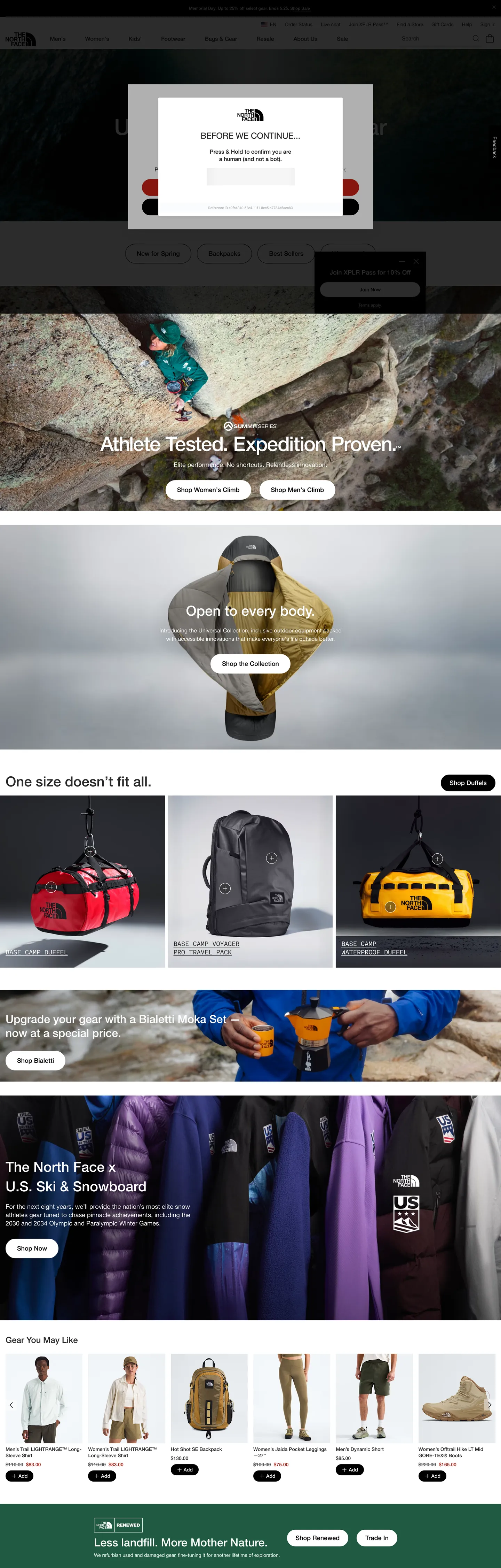
The North Face's marketing surface puts the work on the photography. The above-fold opens with a country-selector modal pinned to a dim charcoal field, then immediately drops the user into a full-bleed expedition image — a teal-jacketed climber pinned against a tan rock face, the headline "Athlete-Tested. Expedition-Proven." overlaid in white sans-serif weight 500 at 40px. Where Patagonia and REI both lean on similar expedition imagery but float their typography over a translucent dark scrim, The North Face places the white display directly on the photograph without any tonal buffer; the contrast is unmediated. Below the photograph, the chrome is binary — a black 9999px-rounded pill ("Shop Women") sits beside a white-stroked pill ("Shop Men"), and the brand returns to a minimal grayscale chrome until the next expedition image takes over.
The page repeats this rhythm — photograph, two-pill CTA strip, photograph, two-pill CTA strip — three more times. A close-up of a yellow expedition sleeping bag with "Open to every body." overlaid; a 3-up product grid of duffel bags rendered against light-gray studio backdrops; an "Upgrade your gear with a brand-new look" banner with a climber pulling on orange gloves. The chrome between bands is so quiet it almost disappears: the only chromatic moment in the entire captured page is a brick-red `#c22014` pill rendered around the "United States" country selector at the very top. No accent color decorates a CTA, no gradient warms a section, no second color of any kind appears in the marketing band.
The DESIGN.md file packages the system into a machine-readable spec. Inside: 12 colors tokens (just charcoal, white, pure black, a single brick-red, plus three muted graphite tones); 14 typography tokens running HelveticaNeue from 12px caption to 64px display with AkkuratMono appearing only on product-spec strips; a single-tier pill radius scale (9999px on every button and chip, 2px on a rare card); and 16 components definitions covering the photograph-led hero, the two-pill CTA cluster, the product-grid tile, and the dense top-nav band. The move worth reproducing is the trust-in-photography itself: the chrome only works if the image is strong enough to carry the entire chromatic load.
What makes it distinct
5
- Photography as canvasfull-bleed expedition-athlete imagery carries every above-fold band; the chrome supplies no surface color of its own
- Pill-or-nothing radius42 of 46 rounded values on the captured page are 9999px; the system has essentially one corner geometry across every CTA, product tile, and category chip
- Black-only borderspure #000000 carries 759 of the 763 border occurrences on the page; there is no second hairline tone in the system
- Single brick-red voltage#c22014 appears just once as the country-selector pill fill, the only chromatic moment in a chrome of charcoal, white, and grayscale
- AkkuratMono as supporting voice18px mono labels appear on technical product spec rows, the only typographic alternation in an otherwise single-family system
thenorthface.com
Live at thenorthface.com
A snapshot of the brand in production. Scroll the frame to see the whole page.
Colors
12 colors
The North Face's system runs on #000000 as its primary voltage, used in 4 of 16 components. Type is set in HelveticaNeue across 14 tokens from 12px to 64px, weights 400–500. Shape language is sharp — components average 0px corner radius, favoring crisp rectangles.
Surface
Page and card backgrounds · 1
Text
Headlines, body, captions · 3
Borders & Hairlines
Dividers, outlines, rules · 3
Other
Specialty colors · 5
Typography
14 type tokens
Set in HelveticaNeue across 14 tokens, from 12px to 64px, weights 400–500. Shown in its own stack: where the font isn't installed, the fallback the file names stands in.
- display-xl64px · weight 500 · lh 64pxThe quick brown fox jumps over the lazy dog
- display-lg40px · weight 500 · lh 56pxThe quick brown fox jumps over the lazy dog
- display-md32px · weight 500 · lh 40pxThe quick brown fox jumps over the lazy dog
- heading-md24px · weight 500 · lh 32pxThe quick brown fox jumps over the lazy dog
- heading-sm18px · weight 500 · lh 24pxThe quick brown fox jumps over the lazy dog
- body-lg18px · weight 400 · lh 24pxThe quick brown fox jumps over the lazy dog
- body-md16px · weight 400 · lh 24pxThe quick brown fox jumps over the lazy dog
- body-sm14px · weight 400 · lh 20pxThe quick brown fox jumps over the lazy dog
- label-md14px · weight 500 · lh 18pxThe quick brown fox jumps over the lazy dog
- caption12px · weight 500 · lh 24pxThe quick brown fox jumps over the lazy dog
- button-md18px · weight 500 · lh 24pxThe quick brown fox jumps over the lazy dog
- nav-link14px · weight 400 · lh 20pxThe quick brown fox jumps over the lazy dog
- mono-md18px · weight 400 · lh 24pxThe quick brown fox jumps over the lazy dog
- mono-sm16px · weight 400 · lh 24pxThe quick brown fox jumps over the lazy dog
Layout
Radii and spacing
3 corner radii and 8 spacing values. Shape language: sharp.
Radii
- none0px
- xs2px
- full9999px
Spacing
- xs4px
- sm8px
- md12px
- base16px
- lg24px
- xl32px
- 2xl40px
- 3xl48px
Components
16 components
Each rendered from its tokens (color, type, radius, padding) on The North Face's own canvas.
- Hero Sectionhero-sectionHero Section
- Hero Headinghero-headingHero Heading
- Section Headingsection-headingSection Heading
- Body Paragraphbody-paragraphBody Paragraph
- Body Paragraph Darkbody-paragraph-darkBody Paragraph Dark
- Spec Monospec-monoSpec Mono
- Button Primarybutton-primaryButton Primary
- Button Secondarybutton-secondaryButton Secondary
- Button Countrybutton-countryButton Country
- Top Navtop-navTop Nav
- Nav Linknav-linkNav Link
- Promo Barpromo-barPromo Bar
- Product Tileproduct-tileProduct Tile
- Category Chipcategory-chipCategory Chip
- Type here…text-inputText Input
- FooterfooterFooter
In use
The system, in use
The North Face's tokens on the kind of product it builds.
Build something people actually use.
A short paragraph of marketing copy that previews how the brand's display tier and body tier read together. Two sentences is usually enough.
FAQ
The North Face design system FAQ
Common questions about The North Face's tokens, components, and how to use this DESIGN.md in your project.
Read next
Related reading
Specs, directories, and component libraries that pair with this design system.
- Browse all design systemsThe full directory of DESIGN.md files on shadcn.io, with live mockups for each.shadcn.io
- The North Face — official siteThe North Face's public marketing site — the source of truth for the live tokens captured in this file.thenorthface.com (opens in a new tab)
- The DESIGN.md specificationGoogle Labs' open spec for machine-readable design system files — the format this page is built on.github.com (opens in a new tab)
Use it
Use The North Face in your project
One machine-readable file. Drop it into Claude, Cursor, or any AI tool that reads DESIGN.md.
Download the DESIGN.md
One machine-readable file: every color, type, radius, spacing, and component token of The North Face.
Feed it to your AI tool
Drop it into Claude, Cursor, or GitHub Copilot. The agent writes React components and Tailwind classes that match The North Face's visual language.
Reference the tokens directly
Or paste the values into your Tailwind config, CSS variables, or component library: every color, size and radius is a quoted, ready-to-copy value.
Read the full DESIGN.md: overview, rationale, do’s and don’ts
Overview
The North Face's marketing surface trusts photography to carry the page. Image-as-canvas. Every above-fold band on the captured page opens with a full-bleed expedition photograph — a climber pinned against tan rock, a yellow sleeping bag in a snowfield close-up, a 3-up duffel-bag product grid against a light-gray studio backdrop, a climber pulling on orange gloves — and the white display headline sits directly on top of the image without any darkening scrim or translucent buffer. Where Patagonia and REI both reach for similar imagery but float their typography over a darkened gradient, The North Face places ink directly on the photograph and lets the visual noise read through. The chrome between bands recedes to a stripped grayscale: charcoal {colors.ink} (#2a2a2a) running text, pure white CTA fills, pure black {colors.ink-pure} (#000000) outlines.
The chromatic restraint is unusually severe. The captured page renders only 12 raw colors, and the only saturated tone on the entire surface is a brick-red {colors.brick} (#c22014) pill containing the "United States" country selector at the top of the country-modal overlay — it appears just twice on the page (once as background, once as border). No accent color decorates a CTA. No tinted hairline carries a card edge. No gradient warms a section header. The brand voltage is the photography itself; the chrome supplies no surface color of its own.
The shape language is pill-or-nothing. 42 of the 46 captured radius values are 9999px — every CTA, every category chip, every product-tile action button. The remaining handful are 2px (rare product-card corners) and a single 900px outlier. There is no middle 8-12-16px option. Combined with the black-only border tone ({colors.hairline} carries 759 of 763 captured border occurrences), the result reads as catalogue-grade — every interactive element is a black-stroked or black-filled pill, every photograph terminates in a hard edge, every dividing rule is a 1px pure-black line.
Key Characteristics:
- Photography carries the chromatic load; every above-fold band is a full-bleed expedition image with the display headline placed directly on the photograph in white weight 500.
- Pill geometry on every interactive element — 42 of 46 captured rounded values are
{rounded.full}(9999px); no soft 8-12-16px middle tier exists. - Black-only borders —
{colors.hairline}(#000000) is the only border tone on the page (759 of 763 occurrences); there is no second hairline tier. - Single brick-red voltage (
{colors.brick}— #c22014) reserved for the country-selector pill; appears just twice on the page total, never as a CTA accent. - HelveticaNeue across every spoken tier with AkkuratMono appearing only on product-spec strips (5 occurrences in the captured page).
- Binary button system — black-fill
{component.button-primary}("Shop Women") paired with white-fill / black-stroke{component.button-secondary}("Shop Men") repeats across every band. - Promo bar pinned to the top of the page in pure-black canvas with caption-tier text ("Mirror card drop. Don't miss out. Limited edition…"), 32px tall.
- Footer flips the canvas to a forest-green
{colors.flag-green}(#205a41) — the only major surface color on the page that isn't part of the grayscale chrome.
Colors
Surface
- Canvas (
{colors.canvas}— #ffffff): frequency 196 (138 text, 41 bg, 16 border). Pure white — the body floor between expedition photographs, the top-nav surface, the white-pill CTA fill, and the display ink color when text sits over photography. The single light surface in the system. - Ink Pure (
{colors.ink-pure}— #000000): frequency 855 (67 text, 27 bg, 759 border). The promo-bar canvas, the black-pill CTA fill, and the universal 1px border tone. Wired as--un-default-border-color. Pure black carries 99.5% of the border work on the captured page.
Text
- Ink (
{colors.ink}— #2a2a2a): frequency 571 (551 text, 18 bg, 2 border). The dominant text tone — used on every body paragraph, every nav-link label, every product-card title rendered against white. Not pure black; a 16-point lift that reads softer than{colors.ink-pure}for running text. - Ink Muted (
{colors.ink-muted}— #525252): frequency 15 — secondary text tier for footer-metadata, product-spec rows, and small labels.
Border
- Hairline (
{colors.hairline}— #000000): same value as{colors.ink-pure}but reserved by role as the border-only token. 759 of 763 captured border occurrences. Every CTA outline, every product-card edge, every input stroke. - Hairline Soft (
{colors.hairline-soft}— #e1e1e1): frequency 3 — only used on internal product-grid dividers and small rule lines inside the footer. - Divider (
{colors.divider}— #9a9a9a): frequency 3 — a single dim graphite tone for vertical dividers between top-nav links and inactive chip outlines. - Chip Grey (
{colors.chip-grey}— #b8b8b8): frequency 1 — appears once as a border tone on an inactive chip variant.
Voltage
- Brick (
{colors.brick}— #c22014): frequency 2 (1 bg, 1 border). The only saturated color in the captured chrome — fills the "United States" country-selector pill at the top of the country-overlay modal and appears as its 1px outline. The single chromatic moment on the entire page. - Emergency Red (
{colors.emergency-red}— #a21a10): frequency 14, all as text. A slightly-darker red tone used inside the country-overlay modal for emergency-routing copy and the small "Mirror card drop" promo-bar message text.
Flag
- Flag Blue (
{colors.flag-blue}— #283e8d): frequency 2 (1 bg, 1 border). Used inside the country-selector modal for the US flag glyph and a country-name chip border. - Flag Green (
{colors.flag-green}— #205a41): frequency 1 — the forest-green footer canvas. The only non-grayscale major surface color on the page; signals the brand's outdoor heritage without competing with the photography chrome.
Typography
Font Family
The system runs HelveticaNeue across every spoken tier — display, heading, body, button, nav — with AkkuratMono as a second voice that appears only on product-spec strips. Fallbacks walk "HelveticaNeue Fallback: Arial", system-ui, sans-serif for the primary family. There is no display serif, no display sans alternate, no italic variant on the captured surface.
The Helvetica + AkkuratMono pairing is the outdoor-retail equivalent of Cloudflare's FT Kunst Grotesk + Apercu Mono Pro split — the sans speaks editorially while the mono carries technical annotation (sizes, weights, fabric specs). On The North Face the mono surface is sparse (just 5 occurrences across the page) but the role is clear.
Hierarchy
| Token | Size | Weight | Line Height | Use |
|---|---|---|---|---|
{typography.display-xl} | 64px | 500 | 64px | Hero-band display headline (full-bleed photograph overlay) |
{typography.display-lg} | 40px | 500 | 56px | "Open to every body." style band-overlay h2 |
{typography.display-md} | 32px | 500 | 40px | "One size doesn't fit all." section headers |
{typography.heading-md} | 24px | 500 | 32px | Sub-section heads, product-grid category labels |
{typography.heading-sm} | 18px | 500 | 24px | h2 / h3 inline title rows |
{typography.body-lg} | 18px | 400 | 24px | Hero-band body paragraph, lead copy |
{typography.body-md} | 16px | 400 | 24px | Default running text |
{typography.body-sm} | 14px | 400 | 20px | Caption rows, footer-metadata, nav-link labels |
{typography.label-md} | 14px | 500 | 18px | Top-nav link labels, category-chip text |
{typography.caption} | 12px | 500 | 24px | Promo-bar text, fine-print labels |
{typography.button-md} | 18px | 500 | 24px | Primary and secondary button labels |
{typography.nav-link} | 14px | 400 | 20px | "EN" / language-toggle links |
{typography.mono-md} | 18px | 400 | 24px | AkkuratMono inline labels on product-spec strips |
{typography.mono-sm} | 16px | 400 | 24px | AkkuratMono inline labels at the smaller tier |
Principles
Display weight stays at 500. The 64px hero h1 in HelveticaNeue 500 is the loudest typographic moment in the system — there is no 700+ tier anywhere on the captured page. The decision matters because the display sits directly on photography: a heavier weight would compete with the image's own visual weight; 500 reads as clear-without-shouting.
Body and label work at weight 400 or 500. The system has no italic and no condensed alternate. Every visible mark is upright HelveticaNeue or upright AkkuratMono.
Note on Font Substitutes
HelveticaNeue is a Mac system font that varies by license between projects. Inter at the same weights is the closest open-source substitute; the proportions track within ~1% at 16-18px body sizes. Helvetica Now (Monotype) is the licensed contemporary substitute if budget allows. For AkkuratMono, Berkeley Mono, JetBrains Mono, or IBM Plex Mono all transfer cleanly at the same sizes — AkkuratMono's signature feature is its slightly narrower 0/O distinction, which JetBrains Mono carries closely.
Layout
Spacing System
- Base unit: 4px — the dominant gap value, appearing 43 times in the captured page; secondary modules at 8px (29 occurrences) and 16px (29 occurrences).
- Tokens:
{spacing.xs}4px ·{spacing.sm}8px ·{spacing.md}12px ·{spacing.base}16px ·{spacing.lg}24px ·{spacing.xl}32px ·{spacing.2xl}40px ·{spacing.3xl}48px. - Hero band padding: 0px — every above-fold photograph is full-bleed edge-to-edge; the headline overlay is positioned with internal alignment, not padding.
- Primary button padding: 11x24px (7-15px vertical, 24-32px horizontal across variants).
- Top-nav padding: 15x32px — generous horizontal breathing room around the wordmark and category-link cluster.
- Footer padding: 32x48px on the forest-green band.
Grid & Container
- Max content width: full-bleed on hero bands and product-grid bands; ~1280px on text-only narrative bands.
- Hero photographs: 100vw, with the headline and dual-pill CTA stack pinned to the lower-left or lower-center safe zone.
- Product grid (duffel section): 3-column equal grid against a near-white studio backdrop, each tile holding a product photograph and a price label beneath.
- "You may like" carousel: 5-column equal grid of product thumbnails with no border treatment, model-shot product photography.
- Footer: 6-column link grid on the forest-green band, footer copy aligned baseline.
Rhythm
The page alternates between full-bleed photograph and product grid bands. Photograph (climber). Two-pill CTA. Photograph (sleeping bag). Two-pill CTA. Product grid (3 duffels). Photograph (orange gloves). Product carousel (5 thumbnails). Promo bar. Footer. The rhythm is metronomic — every photograph is followed by a CTA cluster, every product grid is bracketed by photographs. There is no editorial-text-only band on the captured page.
Elevation
The system has essentially no shadow tier. The captured page records only 4 shadow occurrences (2 on the country-modal overlay, 1 on the white pill, 1 on a dropdown). Hierarchy comes from the photograph-against-grayscale-chrome contrast — there is no surface-ladder of cards lifted over cards, and no tinted shadow layer of any kind.
- Flat (no shadow): every photograph band, the product grids, the promo bar, the top-nav, the footer — 99% of surfaces.
- Modal scrim: the country-overlay modal sits over a dim charcoal scrim; the single moment of layered elevation on the page.
- Hairline borders:
{colors.hairline}(#000000) at 1px does the work that a shadow would do in a dashboard product — every CTA outline reads as a hard rule rather than a soft elevation.
Shapes
The radius scale is pill-or-nothing:
{rounded.none}0px — every photograph, every body section, the top-nav, the promo bar, the product-grid tile.{rounded.xs}2px — 3 occurrences across the entire page, all on rare modal-corner edges and product-card thumbnails.{rounded.full}9999px — 42 occurrences. Every CTA, every category chip, every country-selector pill, every product-tile action button.
There is no 4 / 8 / 12 / 16 / 24px middle tier. The decision is structural: pills read soft against both the dark expedition photography and the white product-grid surfaces, and the universal black 1px stroke reads as a hard frame on every pill regardless of context. No middle radius is needed because no surface needs an intermediate softness.
Components
hero-section — Full-bleed photograph canvas with 0 padding. Holds the white display headline in {typography.display-lg} and a two-pill CTA stack ("Shop Women" black-fill + "Shop Men" white-fill / black-stroke) positioned at the lower safe zone.
hero-heading — White {colors.canvas} text on photography, HelveticaNeue 40px / 500. The 64px display-xl tier is reserved for the largest band; most photograph overlays use 40px to keep the text scaled to the image grain.
section-heading — Charcoal {colors.ink} text on white at {typography.display-md}. Used on "One size doesn't fit all.", "The North Face® U.S. Ski & Snowboard", and the "Gear You May Like" carousel header.
body-paragraph — White running text at {typography.body-lg} (18px / 400) over photography. Used for the lead paragraph beneath each band headline.
body-paragraph-dark — {colors.ink} running text at {typography.body-md} (16px / 400) over white surfaces. Used in editorial bands and footer narrative copy.
spec-mono — {colors.ink} AkkuratMono at {typography.mono-md} (18px / 400). Used on product-spec inline annotations — appears just 5 times in the captured page but carries the technical-product voice.
button-primary — Black {colors.ink-pure} fill, white text, {rounded.full} pill, 11x24 padding, 48px height. Border 0. "Shop Women" is the canonical instance; the black-fill pill repeats across every hero band as the primary CTA.
button-secondary — White {colors.canvas} fill, black {colors.ink-pure} text, 1px {colors.hairline} border, same {rounded.full} pill, same dimensions. "Shop Men" is the canonical instance; the white-fill pill always sits adjacent to the black-fill pill.
button-country — Brick-red {colors.brick} fill, white text, 1px brick-red border, {rounded.full} pill, same dimensions. The single rendered instance of this component is the "United States" country selector at the top of the country-overlay modal — the only chromatic CTA in the system.
top-nav — White {colors.canvas} surface, 64px height, 15x32 padding. Houses the brand wordmark, the category-link cluster (Men, Women, Kids, Sale, etc.), and the right-aligned "Account / Bag / Search" cluster. 1px black bottom rule separates it from the page below.
nav-link — Transparent background, {colors.ink} charcoal text in {typography.label-md} (14px / 500), 0x8 horizontal padding. No hover surface visible in the captured frame.
promo-bar — Pure-black {colors.ink-pure} canvas, white text at {typography.caption} (12px / 500), 32px tall, 0x16 padding. Pinned to the top of the page above the top-nav. Carries the persistent "Mirror card drop" promotional message.
product-tile — White {colors.canvas} surface, {rounded.xs} 2px radius, 0 padding (the product photograph fills the tile edge-to-edge). Used in the duffel-bag grid and the carousel.
category-chip — White fill, charcoal text, 1px black hairline border, {rounded.full} pill, 7x16 padding, 32px height. Used in the category-filter band beneath product grids.
text-input — White surface, charcoal text, 1px black border, {rounded.none} 0px radius, 12x16 padding, 48px height. The single non-pill input variant in the system; sharp 0px corners distinguish text inputs from button surfaces.
footer — Forest-green {colors.flag-green} (#205a41) canvas, white text at {typography.body-sm}, 32x48 padding. The only non-grayscale major surface color on the page — signals brand heritage without disrupting the photography chrome above.
Do's and Don'ts
Do trust full-bleed expedition photography to carry every above-fold band. The chrome only works because each photograph is strong enough to anchor the page without a typographic scrim or color overlay; replacing the photograph with a flat color fill removes the only chromatic engine the system has.
Do repeat the binary button system — black-fill {component.button-primary} paired with white-fill / black-stroke {component.button-secondary}. The two pills always sit together as a Women/Men or Shop/Learn pair; introducing a third hierarchy breaks the rhythm the page repeats across every band.
Do use pure {colors.ink-pure} (#000000) for every border. The black 1px stroke is the universal hairline; mixing in a softer #e0e0e0 hairline as a second border tier disrupts the catalogue-grade rule consistency that makes the system cohere.
Do keep {colors.brick} (#c22014) confined to the country-selector pill. The brick-red is the only saturated color on the page and it appears just twice; spreading it to general CTAs converts the held-in-reserve voltage into a default accent and the chromatic restraint disappears.
Don't introduce a soft hairline gray as a card-edge tone. The system has 759 captured borders and 754 of them are pure black; a soft hairline reads as a different design system entirely. If a surface needs to feel softer, drop the border, not the color.
Don't add an 8 / 12 / 16 / 24px middle radius tier. The system is binary — {rounded.none} on cards and {rounded.full} on every interactive element. A middle radius creates a third corner geometry that looks neither sharp nor pill.
Don't layer a translucent scrim over the hero photograph to soften the text contrast. The page deliberately places white display directly on the image without buffer; adding a 30% black overlay turns the chrome generic and matches every other outdoor retailer.
Don't swap {component.button-primary} from black-fill to brick-red-fill. The country-pill brick-red is structurally distinct from the CTA system; merging the two flattens the entire chromatic discipline and removes the reason the brick-red reads as special in the country overlay.
Known Gaps
- Hover and focus states: the captured surface exposes resting states only. Hover treatments on
{component.button-primary},{component.button-secondary}, and{component.nav-link}are not visible in the static capture. - Form input states:
{component.text-input}carries the resting state; error / validation styling is not exposed on the captured marketing page (live form validation lives inside the checkout flow). - Mega-menu surface: the top-nav uses a hover-triggered mega-menu (Men > Jackets > Down Jackets) that doesn't appear in the static capture.
- Product detail page: the captured surface is the homepage marketing band only. The product-detail page (PDP) carries a richer set of tokens — size chips, color-swatch dots, image-zoom controls — not represented here.
- Mobile breakpoint: the captured render is desktop-1440. The mobile layout collapses the dual-pill CTA cluster vertically and resizes display headlines to a 32px / 24px ladder; only the desktop ladder is represented here.
- Account / Bag / Wishlist surfaces: the authenticated dashboard surfaces (order history, address book, wishlist) are not represented in the marketing capture and likely use a different component set.
- The XPLR Pass loyalty program surfaces have their own visual treatment that occasionally invokes a separate accent color (typically a muted gold) — not visible on the captured homepage.
E-commerce & Retail
More systems like this
More DESIGN.md files in E-commerce & Retail.
Pricing
Build it with Pro
The DESIGN.md files are free. Pro adds 6,000+ blocks, premium templates and the MCP server, so your AI editor builds in your system for you.
4.9/5 out of 5 · 150+ reviewsfrom 150+ founders and developers.
Billing
Billed once a year in USD. Cancel anytime.
- How many people can use the license.
- Client work, SaaS products and anything you charge for.
- Production-ready React sections: hero, pricing, features, dashboards and more.
- Complete multi-page sites you can ship as they are.
- React icons from every major library, installable with one command.
- Presets that restyle every block, in light and dark.
- Lets your AI editor search, preview and install blocks for you.
- Priority requests are answered first.
Individual
For personal projects & open source
$32instead of $49/mo
$389 billed yearly
- Seats: 1 seat
- Commercial use: Personal & open source only
- Pro blocks: 6,000+ blocks
- Templates: All 14 templates
- React icons: 294k+ icons
- Themes: All 59 themes
- MCP server: Basic usage
- Support: Standard
Team
Most popularFor freelancers, agencies & startups
$66instead of $99/mo
$789 billed yearly · ≈ $13/dev/mo
- Seats: Up to 5 seats
- Commercial use: Included
- Pro blocks: 6,000+ blocks
- Templates: All 14 templates
- React icons: 294k+ icons
- Themes: All 59 themes
- MCP server: High usage
- Support: Priority
Organization
For companies with larger teams
$132instead of $199/mo
$1,589 billed yearly
- Seats: Unlimited seats
- Commercial use: Included
- Pro blocks: 6,000+ blocks
- Templates: All 14 templates
- React icons: 294k+ icons
- Themes: All 59 themes
- MCP server: Unlimited usage
- Support: Priority
Billed once a year in USD. Cancel anytime.
Individual
For personal projects & open source
$32instead of $49/mo
$389 billed yearly
- How many people can use the license.Seats: 1 seat
- Client work, SaaS products and anything you charge for.Commercial use: Personal & open source only
- Production-ready React sections: hero, pricing, features, dashboards and more.Pro blocks: 6,000+ blocks
- Complete multi-page sites you can ship as they are.Templates: All 14 templates
- React icons from every major library, installable with one command.React icons: 294k+ icons
- Presets that restyle every block, in light and dark.Themes: All 59 themes
- Lets your AI editor search, preview and install blocks for you.MCP server: Basic usage
- Priority requests are answered first.Support: Standard
Team
Most popularFor freelancers, agencies & startups
$66instead of $99/mo
$789 billed yearly · ≈ $13/dev/mo
Everything in Individual, plus
- How many people can use the license.Seats: Up to 5 seats
- Client work, SaaS products and anything you charge for.Commercial use: Included
- Lets your AI editor search, preview and install blocks for you.MCP server: High usage
- Priority requests are answered first.Support: Priority
Organization
For companies with larger teams
$132instead of $199/mo
$1,589 billed yearly
Everything in Team, plus
- How many people can use the license.Seats: Unlimited seats
- Lets your AI editor search, preview and install blocks for you.MCP server: Unlimited usage
- Secure checkout via Stripe
- Code lives in your repo
- Keep what you've shipped if you cancel
- License terms
Your system, built for you
Every block, template and icon, installed by your AI agent in your design system. The DESIGN.md files stay free.