Skip to content

The Information Design System

The Information's marketing site as a DESIGN.md file — magenta CTA on a black-on-white broadsheet canvas, four Suisse fonts pulling separate jobs, no rounded corners anywhere except the pro-tier pill.

Add shadcn.io to your AI agent. · Pro It installs blocks, icons and templates in your design system from a prompt, with Pro.

Set up MCP
Primary
#f32a52
Typeface
Suisse Works
Shape
Sharp
Base radius
0px
Colors
12
Type tokens
11
Components
16
Spacing values
8

About

About The Information DESIGN.md

Curated by Dov Azencot · Updated May 19, 2026 · Source theinformation.com (opens in a new tab)

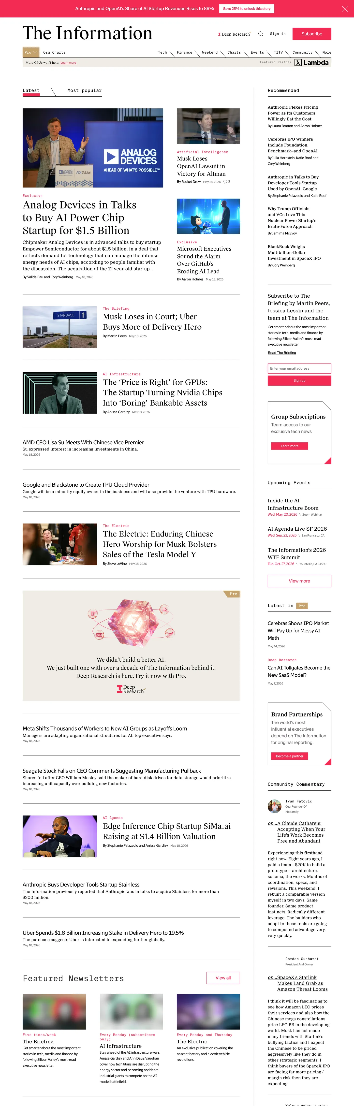
The Information's marketing site is composed like a printed broadsheet that happens to load in a browser. The above-fold band stacks a black masthead, a thin horizontal nav rendered entirely in mono small caps, and a three-column story grid: a lead story with a 40px Suisse Works display headline, a four-up cluster of secondary headlines in the same family, and a right rail of subscriber-only callouts in muted gray. Every column is divided from its neighbor by a 1px black rule. Where Bloomberg leans on its orange chrome bar and The Verge runs a neon palette, The Information holds the entire surface to black ink on white paper and lets a single saturated magenta — Primary Magenta, the Subscribe CTA color — do every brand-coded job.

The DESIGN.md file packages the system into a machine-readable spec. Inside: 12 colors tokens drawn from the seven-color CSS custom-property palette (--primary-black, --primary-magenta, --primary-pink, --grayscale-gray, --grayscale-charcoal, --grayscale-beige, plus a Pro Gold for subscriber chips), 11 typography tokens spanning the four-font Suisse family — Suisse Works for editorial display, Suisse Neue for dek paragraphs, Suisse Int'l for buttons and forms, Suisse Int'l Mono for nav links and timestamps — 2 corner radius tokens (0px everywhere, 9999px on the single PRO pill), 8 spacing values on a 4px base, and 16 components covering the magenta Subscribe button, the zero-radius story card, the mono nav link, the magenta-bordered text input, and the small-caps category tag.

Feed this file to an AI coding tool and it reproduces The Information's specific moves: pure white canvas instead of cream or off-white, hard-edged 0px geometry rather than the 8-12px corners the rest of the news category leans on, the four-font Suisse split where each face has a single editorial job, and the magenta-as-voltage discipline that keeps every other surface monochrome. The move worth borrowing for any publication site: assign each typeface ONE function and never let display borrow what mono is doing. Most editorial sites overload Inter or Söhne across every tier and lose the typographic signal that separates a body paragraph from a category label.

What makes it distinct

5

  1. Broadsheet on a screen40px Suisse Works headlines on white, 1px black column rules, magenta confined to the Subscribe CTA
  2. Four Suisse fonts, one labor splitWorks for display, Neue for dek, Int'l for forms, Int'l Mono for nav and timestamps
  3. Zero corner roundingevery card, button, and input renders at 0px radius; only the PRO pill uses 9999px
  4. Single magenta voltagethe Primary Magenta carries 79 occurrences across Subscribe buttons, input borders, and breaking-flag accents
  5. Newspaper density24px gaps between stories, story thumbnails at 80-120px wide, ten-up grid below the fold

theinformation.com

Live at theinformation.com

A snapshot of the brand in production. Scroll the frame to see the whole page.

The Information's website at theinformation.com

Colors

12 colors

The Information's system runs on #f32a52 as its primary voltage, used in 3 of 16 components. Type is set in Suisse Works across 11 tokens from 12px to 40px, weights 400–400. Shape language is sharp — components average 0px corner radius, favoring crisp rectangles.

Brand & Accent

Sparing, CTA-only voltage · 4

Surface

Page and card backgrounds · 2

Text

Headlines, body, captions · 3

Borders & Hairlines

Dividers, outlines, rules · 2

Other

Specialty colors · 1

Typography

11 type tokens

Set in Suisse Works across 11 tokens, from 12px to 40px, weights 400–400. Shown in its own stack: where the font isn't installed, the fallback the file names stands in.

  • display-xl40px · weight 400 · lh 52pxThe quick brown fox jumps over the lazy dog
  • display-md30px · weight 400 · lh 42pxThe quick brown fox jumps over the lazy dog
  • heading-md22px · weight 400 · lh 30.8pxThe quick brown fox jumps over the lazy dog
  • heading-sm22px · weight 400 · lh 30.8pxThe quick brown fox jumps over the lazy dog
  • body-lg18px · weight 400 · lh 27pxThe quick brown fox jumps over the lazy dog
  • body-md16px · weight 400 · lh 24pxThe quick brown fox jumps over the lazy dog
  • body-sm14px · weight 400 · lh 23.8pxThe quick brown fox jumps over the lazy dog
  • caption12px · weight 400 · lh 20.4pxThe quick brown fox jumps over the lazy dog
  • button-md18px · weight 400 · lh 24pxThe quick brown fox jumps over the lazy dog
  • nav-link14px · weight 400 · lh 18.2pxThe quick brown fox jumps over the lazy dog
  • mono-sm14px · weight 400 · lh 23.8pxThe quick brown fox jumps over the lazy dog

Layout

Radii and spacing

2 corner radii and 8 spacing values. Shape language: sharp.

Radii

  • none0px
  • full9999px

Spacing

  • xs4px
  • sm8px
  • md12px
  • base16px
  • lg24px
  • xl32px
  • 2xl48px
  • 3xl64px

Components

16 components

Each rendered from its tokens (color, type, radius, padding) on The Information's own canvas.

  • Button Primary
    button-primaryButton Primary
  • Button Secondary
    button-secondaryButton Secondary
  • Top Nav
    top-navTop Nav
  • Nav Link
    nav-linkNav Link
  • Hero Heading
    hero-headingHero Heading
  • Section Heading
    section-headingSection Heading
  • Body Paragraph
    body-paragraphBody Paragraph
  • Body Paragraph Muted
    body-paragraph-mutedBody Paragraph Muted
  • Story Card
    story-cardStory Card
  • Category Tag
    category-tagCategory Tag
  • Pro Pill
    pro-pillPro Pill
  • Breaking Flag
    breaking-flagBreaking Flag
  • Type here…
    text-inputText Input
  • Timestamp
    timestampTimestamp
  • Right Rail Card
    right-rail-cardRight Rail Card
  • Footer
    footerFooter

In use

The system, in use

The Information's tokens on the kind of product it builds.

Build something people actually use.

A short paragraph of marketing copy that previews how the brand's display tier and body tier read together. Two sentences is usually enough.

Get startedLearn more
Marketing heroHeadline, sub-copy, primary CTA — the universal homepage opener.
Reporting · 14 min read

The quiet collapse of an old idea

For decades the consensus held that the system would correct itself. Then it didn't. This is the inside story of what changed, told by the people who watched it unravel.

"Nobody noticed because the failure was indistinguishable from progress."

By Sam Reporter · Updated 2 hours ago

Editorial articleMagazine-style longform with display headline.

FAQ

The Information design system FAQ

Common questions about The Information's tokens, components, and how to use this DESIGN.md in your project.

Read next

Specs, directories, and component libraries that pair with this design system.

Use it

Use The Information in your project

One machine-readable file. Drop it into Claude, Cursor, or any AI tool that reads DESIGN.md.

Download DESIGN.md
  1. Download the DESIGN.md

    One machine-readable file: every color, type, radius, spacing, and component token of The Information.

  2. Feed it to your AI tool

    Drop it into Claude, Cursor, or GitHub Copilot. The agent writes React components and Tailwind classes that match The Information's visual language.

  3. Reference the tokens directly

    Or paste the values into your Tailwind config, CSS variables, or component library: every color, size and radius is a quoted, ready-to-copy value.

Read the full DESIGN.md: overview, rationale, do’s and don’ts

Overview

The Information's marketing site composes like a printed broadsheet that happens to load in a browser. Broadsheet on a screen. A black masthead sits at page top with the publication name set in Suisse Works at display size, beneath which a mono-small-caps nav band lists category labels (Org Charts, Pro, Subscribe). The above-fold band stacks a three-column story grid: a lead headline at {typography.display-xl} (40px Suisse Works / 400), a four-up secondary cluster in the main column, and a right rail of subscriber callouts in muted gray. Every column is divided from its neighbor by a 1px black rule. Where Bloomberg paints its chrome with the famous orange bar and The Verge runs a saturated neon palette, The Information holds the entire surface to black ink on white paper and lets a single saturated magenta — the {colors.primary} voltage — do every brand-coded job.

The chromatic restraint is the system's load-bearing decision. Primary Magenta {colors.primary} (#f32a52) appears exactly 79 times in the captured page; everything else above the fold is black-on-white, with {colors.ink-muted} (#6d686e) carrying the secondary text tier and {colors.surface-beige} (#f0ece5) appearing as a quiet sidebar fill on the right rail. The magenta is reserved for the Subscribe button background, the email-input border, and the inline breaking-news flag — three roles, all paywall-adjacent. This is the opposite of a publication-as-medium-platform move; The Information signals that the brand-coded color is also the buy-button color, and the rest of the page is the editorial product itself.

Typography is a four-Suisse split. Per-typeface job assignment is the principle: Suisse Works (the contemporary editorial sans) handles every display headline at 22-40px / 400; Suisse Neue carries dek paragraphs at 16-18px / 400 with 27px leading; Suisse Int'l does buttons and forms at 14-18px / 400; Suisse Int'l Mono runs every nav link, timestamp, and category label at 12-18px / 400. There are no second-job borrowings — display never appears in body, mono never sneaks into a button label. Where The Wall Street Journal runs Escrow Display alongside Retina, The Information meets the same editorial ambition with four contemporary sans faces rather than a serif tradition.

Key Characteristics:

  • Pure white canvas ({colors.canvas} — #ffffff), no cream undertone, no beige softening — black ink on white paper is the entire chromatic premise.
  • Single magenta voltage ({colors.primary} — #f32a52, frequency 79) reserved for Subscribe button, email-input border, and breaking-news flag.
  • Four Suisse fonts on a strict one-job-per-face split: Works for display, Neue for dek, Int'l for forms, Int'l Mono for nav and timestamps.
  • Zero corner radius across every surface — {rounded.none} (0px) is the only radius in use; the {rounded.full} 9999px pill is exclusive to the PRO subscriber-tier badge (6 occurrences).
  • 1px black column rules separate story cards rather than card backgrounds with shadow elevation — {colors.ink} doubles as both text and hairline (490 border occurrences).
  • Newspaper density above the fold — 14+ headlines visible at once, story thumbnails at 80-120px wide, no full-bleed hero photography.
  • Mono nav band with category labels rendered in Suisse Int'l Mono small caps — the band reads like the kicker row above a print masthead.
  • Right-rail subscriber callouts in {colors.surface-beige} (#f0ece5) — the only non-white surface tint, scoped to the paywall offers.

Colors

Brand

  • Primary Magenta ({colors.primary} — #f32a52): frequency 79. Used as text (35), border (40), background (4). Wired as --primary-magenta and --color-primary-magenta. The single chromatic moment on the page — the Subscribe button background, the email-input border ring, the breaking-news flag fill, and the underline on category-tag hover states. Reserved for paywall-adjacent surfaces only.
  • Primary Pink ({colors.primary-light} — #fec6cc): wired as --primary-pink and --color-primary-pink. A soft pink tint that doesn't render in the captured marketing surface; reserved for hover wash on the Subscribe CTA inside the product reader.
  • Pro Gold ({colors.pro-gold} — #c5a26d): frequency 2 — both as background. Wired as --color-pro-gold. The fill color of the rounded PRO pill that marks pro-tier exclusive stories. The only chromatic accent besides the magenta on the captured surface.

Surface

  • Canvas ({colors.canvas} — #ffffff): frequency 37. Pure white, the entire page floor. Wired as --white, --color-background-white, and --light-grayscale-gray. No off-white, no cream undertone — the printed-broadsheet metaphor needs maximum paper-white contrast against the black text.
  • Surface Beige ({colors.surface-beige} — #f0ece5): frequency 17 — used as background (2), border (7), text (8). Wired as --grayscale-beige and --light-grayscale-beige. The only non-white surface tint; scoped to right-rail subscriber callouts and the muted background of the "Featured Newsletters" strip.

Text

  • Ink ({colors.ink} — #000000): frequency 1029 — used as text (538), border (490), background (1). The dominant tone of the entire system. Wired as --primary-black and --color-primary-black. Double duty as text color and 1px column-rule color — the system has no separate hairline tone; black ink IS the rule.
  • Ink Soft ({colors.ink-soft} — #333333): frequency 13 — text (5), background (2), border (6). Wired as --grayscale-charcoal and --light-grayscale-charcoal. A near-black for secondary text where pure ink would feel too heavy.
  • Ink Muted ({colors.ink-muted} — #6d686e): frequency 153 — text (56), border (97). Wired as --grayscale-gray and --color-grayscale-gray. The dominant secondary text color — bylines, timestamps, story summaries in the right rail, footer copy.
  • Border Soft ({colors.border-soft} — #b4b0b5): wired as --light-grayscale-border. A pale gray hairline that appears inside the product reader but not on the captured marketing surface.

Accents (Reserved)

  • Accent Blue Mid ({colors.accent-blue-mid} — #2a54a3) and Accent Blue Dark ({colors.accent-blue-dark} — #05193f): wired as --secondary-blue-mid and --secondary-blue-dark. Declared as secondary palette accents but absent from the captured surface; reserved for occasional inline data visualizations and the company logo's blue accent on certain promotional banners.

Typography

Font Family

The system runs four Suisse fonts from the Swiss Typefaces foundry, each licensed for a single editorial job:

  • Suisse Works — display tier (22-40px / 400). Used on every story headline and section title. A contemporary humanist sans despite the name, with slightly elongated cap heights that read like an editorial display face.
  • Suisse Neue — dek and body tier (16-18px / 400). Used on lede paragraphs, story summaries, and longer body copy with looser 27px leading.
  • Suisse Int'l — interactive tier (14-18px / 400). Used on buttons, the Subscribe CTA, email inputs, and the modal subscribe form.
  • Suisse Int'l Mono — nav and metadata tier (12-18px / 400). Used on every nav link, category tag, timestamp, byline, and section label. The mono carries the "small caps" function the system never reaches for in sans.

Fallbacks for every face walk to ui-sans-serif, system-ui, -apple-system, Segoe UI, Roboto, Helvetica Neue, Arial, sans-serif.

Hierarchy

TokenSizeWeightLine HeightFamilyUse
{typography.display-xl}40px40052pxSuisse WorksLead story headline
{typography.display-md}30px40042pxSuisse WorksSection headlines, secondary lead
{typography.heading-md}22px40030.8pxSuisse WorksStory-card headlines
{typography.heading-sm}22px40030.8pxSuisse Screenh3 / sub-section titles
{typography.body-lg}18px40027pxSuisse NeueLede paragraphs, story dek
{typography.body-md}16px40024pxSuisse NeueRight-rail body copy
{typography.body-sm}14px40023.8pxSuisse ScreenDefault running text, captions
{typography.caption}12px40020.4pxSuisse ScreenTimestamps, byline metadata
{typography.button-md}18px40024pxSuisse Int'lSubscribe button, primary CTAs
{typography.nav-link}14px40018.2pxSuisse Int'l MonoTop-nav category labels
{typography.mono-sm}14px40023.8pxSuisse Int'l MonoCategory tags, kicker labels

Principles

Display weight stays at 400 across every tier — there is no 500 or 700 display moment anywhere on the captured page. The 40px Suisse Works headline at weight 400 is the loudest typographic moment in the system; bumping to 700 would push the page toward a SaaS hero treatment and away from the broadsheet metaphor. Confidence comes from face selection (a separate display family for display, a separate mono for metadata) rather than from weight escalation.

Note on Font Substitutes

The Suisse family is licensed. The closest open-source substitutes: Inter at the same weights for Suisse Neue (body/dek), Inter Display or Söhne for Suisse Works (the proportions transfer cleanly at 30-40px display sizes), and JetBrains Mono or IBM Plex Mono for Suisse Int'l Mono. If budget allows the licensed set, the strict per-face job assignment is the move worth preserving.

Layout

Spacing System

  • Base unit: 4px (frequency 52 — the most common gap value).
  • Tokens: {spacing.xs} 4px · {spacing.sm} 8px · {spacing.md} 12px · {spacing.base} 16px · {spacing.lg} 24px · {spacing.xl} 32px · {spacing.2xl} 48px · {spacing.3xl} 64px.
  • Section padding (vertical): 48px between major editorial bands (frequency 30 for 48px 0px); the masthead and footer use the same 48px rhythm.
  • Story-card padding: 0px on the card itself with 12px bottom padding before the 1px ink rule (0px 0px 12px — frequency 4).
  • Subscribe button padding: 12px / 36px (frequency 5) — the canonical pad on every primary CTA.

Grid & Container

  • Max content width: ~1280px on the editorial grid, with the lead story column at ~572px (the measured width of the hero headline).
  • Three-column above-fold: main story column (572px) flanked by a four-up secondary cluster and a 280-300px right rail of subscriber callouts.
  • Below-fold strips: ten-up newsletter grid, a six-up article cluster under "Featured Newsletters," and a footer link wall in five columns.
  • Right rail: persistent through the page, holds "Top Stories," "Most Popular," and pro-tier teasers.

Rhythm

The page runs a single tempo. Every editorial band has the same 48px vertical spacing, the same column rules, the same story-card dimensions. There are no marquee moments, no full-bleed photography, no atmospheric transitions between bands. The visual rhythm is constant — closer to a printed newspaper's grid than to a web product's pacing — and the reader is meant to scan dozens of stories per scroll, not stop on any single feature.

Elevation

The system has no shadow tier. The captured page registers zero shadow occurrences across the extraction. Hierarchy is built entirely through:

  • Column rules: 1px {colors.ink} (#000000) vertical dividers between editorial columns. Black ink doubles as both text color and the only hairline tone.
  • Surface tint: {colors.surface-beige} (#f0ece5) marks the right-rail subscriber callouts and the "Featured Newsletters" band — a quiet beige lift against the otherwise pure-white floor.
  • Type weight differentiation: the same 0px-corner rectangle reads differently depending on whether it holds a Suisse Works display headline (lead story) or a Suisse Int'l Mono caption (timestamp).

There is no card-with-shadow elevation pattern anywhere on the page. The broadsheet metaphor doesn't allow it — printed newspapers don't have drop shadows.

Shapes

The radius scale is binary: 0px or 9999px. There are no intermediate values.

  • {rounded.none} 0px — every button, card, input, nav band, and editorial surface on the page. Zero-radius geometry is the entire shape language.
  • {rounded.full} 9999px — used in exactly 6 instances, all on the PRO subscriber-tier pill. The pill is the only soft surface in the system.

The discipline is uncompromising. There is no 4px, 6px, 8px, 12px, or 16px middle tier. Adding even a single 8px-rounded button would visually break the broadsheet metaphor — printed mastheads have no rounded corners, and the marketing site holds that line.

Components

button-primary — The Subscribe CTA. Magenta {colors.primary} fill, white text, {rounded.none} 0px corners, 12x36px padding, 50px height. Suisse Int'l at 18px / 400. The single chromatic interactive element in the system; appears in the masthead, in the right rail, and in the footer subscribe prompt.

button-secondary — Transparent fill with white interior, ink text, 1px ink border, 0px corners. Used for "Sign In" and "Learn More" secondary actions; same 12x36px / 50px dimensions as the primary button.

top-nav — White canvas surface with 1px black bottom rule, 42px height, 12x8 padding. Houses the publication wordmark flush left, the mono category nav band centered, and the Sign In / Subscribe cluster flush right.

nav-link — Suisse Int'l Mono at {typography.nav-link} (14px / 400), black text on transparent background, 12x16 padding. No hover background; underline-on-hover is the only state cue.

hero-heading — Black text on transparent, {typography.display-xl} (40px Suisse Works / 400), 0 padding. The 572px-wide lead headline anchors the above-fold grid.

section-heading — Same Works family at {typography.display-md} (30px / 400). Used on category page headers ("Markets," "Org Charts," "Pro") and editorial section dividers.

body-paragraph — Black text at {typography.body-lg} (18px Suisse Neue / 400) with 27px leading. The lede-paragraph workhorse.

body-paragraph-muted — {colors.ink-muted} (#6d686e) variant at {typography.body-md} for right-rail summaries, bylines, and secondary copy.

story-card — White canvas, 0px corners, 0/0/12px padding, 1px black bottom rule. Holds a thumbnail (80-120px wide, optional), a Suisse Works headline at {typography.heading-md}, a dek paragraph, and a byline + timestamp row. The atomic unit of the editorial grid.

category-tag — Transparent background, black text in {typography.mono-sm} (14px Suisse Int'l Mono / 400), 0 corners. Sits above story headlines as a small-caps kicker ("MARKETS," "AI," "STARTUPS") rendered through the mono face — the system never uses sans uppercase tracking for this role.

pro-pill — Pro Gold {colors.pro-gold} (#c5a26d) fill, white text, {rounded.full} 9999px corners. 4x8 padding, 20px height. The ONLY rounded surface in the system; marks stories exclusive to the Pro subscriber tier (6 occurrences across the captured page).

breaking-flag — Magenta {colors.primary} fill, white text, 0px corners. 4x8 padding, 20px height. The inline flag that marks breaking-news headlines; same dimensions as the pro-pill but flat-cornered.

text-input — White fill, black text, {rounded.none} 0px corners, 8px padding, 41px height. 1px {colors.primary} magenta border (the only non-black border tone on the page) signals the email-signup affordance against the otherwise monochrome surface.

timestamp — {colors.ink-muted} text at {typography.caption} (12px / 400). Sits beneath story headlines or beside byline names; format is "Nov 19, 2025" rather than relative time strings.

right-rail-card — White canvas, 0px corners, 16x0 padding, 1px black top rule. Holds "Top Stories," "Most Popular," and Pro-tier teaser stacks in the right rail.

footer — White canvas, black text in {typography.body-sm}, 48x0 padding, 1px black top rule. Stacks a five-column link wall, social icons, and a final Subscribe CTA at the bottom.

Do's and Don'ts

Do assign each typeface a single editorial job and never let one face borrow another's tier. Suisse Works lives at display, Suisse Neue at body, Suisse Int'l at buttons, Suisse Int'l Mono at nav and metadata. If you reach for Suisse Works on a button label, the four-font signal collapses into "this site uses a lot of Suisse."

Do hold the magenta {colors.primary} (#f32a52) to paywall-adjacent surfaces only: the Subscribe CTA fill, the email-input border, the breaking-news flag. Spreading it to category tags or hover states dilutes the only chromatic brand moment on the page.

Do render every editorial divider as a 1px {colors.ink} (#000000) rule, not as a soft hairline gray. The system has no separate hairline tone — black ink doubles as both text and rule color. Substituting a pale-gray hairline tone would soften the broadsheet edge.

Do keep the Pro tier pill at {rounded.full} 9999px and let it be the ONLY rounded surface in the system. The pill is the visual cue for "subscriber-exclusive content"; multiplying rounded surfaces elsewhere makes the pill's signal disappear.

Don't introduce an 8px or 12px corner radius anywhere — even on the Subscribe button. The system is binary ({rounded.none} 0px or {rounded.full} 9999px); adding a middle tier turns the page into a SaaS marketing site and breaks the printed-broadsheet metaphor.

Don't swap pure {colors.canvas} (#ffffff) for a warm cream or off-white. The black-on-white contrast is intentional — softening the canvas would push the page toward editorial-magazine territory (Atlantic, Harper's) and away from "wire service" feel.

Don't add a shadow tier. The captured page has zero shadow occurrences; depth comes from 1px black rules and {colors.surface-beige} (#f0ece5) tints. Drop-shadowing story cards reads as borrowed from Substack and weakens the broadsheet identity.

Don't display the magenta on hover states for category tags or nav links. The captured surface uses underline-on-hover only; spilling the brand magenta into hover affordances dilutes its paywall-CTA semantics.

Known Gaps

  • Hover and focus states: the captured surface shows underline-on-hover for category tags and nav links; the full state matrix (focus rings, disabled tints, active press) was not visible.
  • Form input error states: {component.text-input} carries the resting state; error / validation styling lives inside the product reader's account flow and is not exposed on the marketing surface.
  • Dark mode: the captured marketing surface is light-only. A dark variant exists in the iOS reader app but is not represented here.
  • Article reading surface: this DESIGN.md captures the marketing / homepage only. The Information's article-reading template (paywall scrim, drop-cap treatment, pull-quote bars, inline chart styling) carries additional tokens not represented here.
  • Pro-tier callouts: {colors.pro-gold} (#c5a26d) and the rounded PRO pill mark exclusive content on the homepage; the full Pro subscriber surface (org charts, message-board threads, deal databases) has a richer chromatic system not captured here.
  • Motion: the page has minimal motion (story-card hover underline only); easing curves for the subscribe-modal slide-in live in the application surface, not the marketing site.
  • Newsletter brand sub-palette: the "Featured Newsletters" strip uses category-specific color swatches per newsletter brand; these are not represented as primary tokens.

News & Publishing

More systems like this

More DESIGN.md files in News & Publishing.

Pricing

Build it with Pro

The DESIGN.md files are free. Pro adds 6,000+ blocks, premium templates and the MCP server, so your AI editor builds in your system for you.

4.9/5 out of 5 · 150+ reviewsfrom 150+ founders and developers.

Billed once a year in USD. Cancel anytime.

Individual

For personal projects & open source

$32instead of $49/mo

$389 billed yearly

  • How many people can use the license.Seats: 1 seat
  • Client work, SaaS products and anything you charge for.Commercial use: Personal & open source only
  • Production-ready React sections: hero, pricing, features, dashboards and more.Pro blocks: 6,000+ blocks
  • Complete multi-page sites you can ship as they are.Templates: All 14 templates
  • React icons from every major library, installable with one command.React icons: 294k+ icons
  • Presets that restyle every block, in light and dark.Themes: All 59 themes
  • Lets your AI editor search, preview and install blocks for you.MCP server: Basic usage
  • Priority requests are answered first.Support: Standard

Team

Most popular

For freelancers, agencies & startups

$66instead of $99/mo

$789 billed yearly · ≈ $13/dev/mo

Everything in Individual, plus

  • How many people can use the license.Seats: Up to 5 seats
  • Client work, SaaS products and anything you charge for.Commercial use: Included
  • Lets your AI editor search, preview and install blocks for you.MCP server: High usage
  • Priority requests are answered first.Support: Priority

Organization

For companies with larger teams

$132instead of $199/mo

$1,589 billed yearly

Everything in Team, plus

  • How many people can use the license.Seats: Unlimited seats
  • Lets your AI editor search, preview and install blocks for you.MCP server: Unlimited usage
  • Secure checkout via Stripe
  • Code lives in your repo
  • Keep what you've shipped if you cancel
  • License terms

Your system, built for you

Every block, template and icon, installed by your AI agent in your design system. The DESIGN.md files stay free.

Get Pro