Skip to content

The Guardian Design System

The Guardian's editorial design system as a DESIGN.md file. Pure-white canvas, navy #052962 masthead, yellow #ffe500 callout, GH Guardian Headline serif at 17-28px, density-led card grid, section-coded color rules.

Add shadcn.io to your AI agent. · Pro It installs blocks, icons and templates in your design system from a prompt, with Pro.

Set up MCP
Primary
#052962
Typeface
GH Guardian Headline
Shape
Mixed
Base radius
12px
Colors
16
Type tokens
12
Components
18
Spacing values
8

About

About The Guardian DESIGN.md

Curated by Dov Azencot · Updated May 18, 2026 · Source theguardian.com (opens in a new tab)

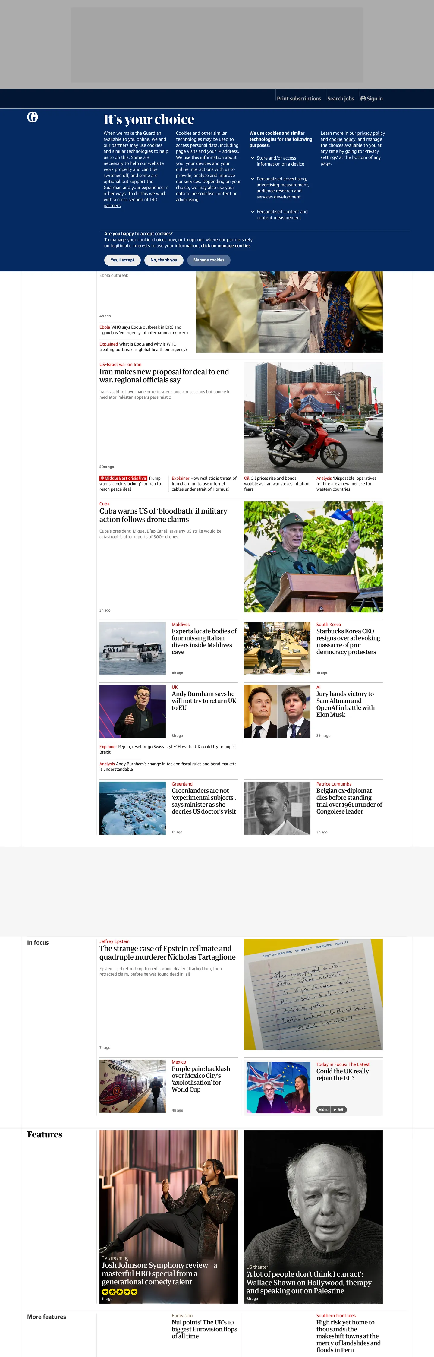
The Guardian's front page is what a newspaper looks like when it migrates to the browser without giving up the print grid. The page floor is pure white. The masthead is a deep navy band with the lowercase italic Guardian logotype in cream, the Egyptian-slab serif Headline family carries every kicker and standfirst, and the GuardianTextSans family carries every byline, timestamp, comment count, and live-tag chip. There is no hero image, no marketing band, no scrolling parallax — the first viewport is a section-coded card grid that packs three to five rows of story tiles, each tile rendered as a hairline-bordered cell with a category kicker in section color, a serif headline in ink charcoal, and a sans-serif metadata strip beneath. The captured render includes the privacy-consent banner ("It's your choice") that sits above the editorial grid as a navy block with two pill CTAs in saturated yellow.

The DESIGN.md file packages the system into a machine-readable spec for React tooling. Inside: sixteen color tokens covering the navy masthead, the yellow callout, the live red, four section-coded accents (Sport blue, Culture brown, Lifestyle magenta, Opinion orange-red), plus the structural ink / muted / hairline / canvas neutrals; twelve typography tokens spanning GH Guardian Headline serif at 17 / 20 / 24 / 28px in weights 500 and 700 plus GuardianTextSans at 12 / 14 / 15 / 17 / 20px in weights 400 and 700; a binary radius scale of 50% circular avatars plus 12 / 36 / 40px button pills; and sixteen component definitions covering the masthead, the section rule, the editorial card, the byline strip, the live-tag chip, the consent-banner pill, the section-tab tier, and the hairline-bordered comment count.

Feed this file to an AI coding tool and it reproduces The Guardian's specific moves: text-density-led editorial grid instead of a marketing hero, hairline-bordered cards with no surface fills, section-coded 1px top rules that paint only the section color and section title (never the card surface), two-family newspaper pairing with the serif carrying headlines and the sans carrying metadata, circular byline avatars at 50% radius, and the yellow callout reserved for masthead chrome and consent-banner CTAs. The token references resolve cleanly — `{colors.callout-yellow}` for the saturated rule, `{colors.masthead-navy}` for the band, `{typography.headline-lg}` for the standfirst tier. The one move worth borrowing is the section-coded rule pattern: it lets a single card template carry News, Sport, Culture, and Lifestyle without ever changing the card surface itself.

What makes it distinct

5

  1. Density over whitespacethe front page packs three to five card-grid rows per viewport, with 1px hairline dividers and no surface fills, the inverse of a SaaS marketing hero
  2. Two-family newspaper pairingGH Guardian Headline (the Egyptian-slab serif) for headlines and standfirsts, GuardianTextSans for metadata, kickers, and bylines
  3. Section-coded color rulesNews uses 1px navy section border, Sport navy blue, Culture warm brown, Lifestyle magenta, Opinion orange-red; the section color paints only the top rule and section title, never a surface
  4. Yellow callouta single saturated yellow rule at 38 background occurrences carries the masthead veggie-burger hover, byline backgrounds, callout highlights, and the age-warning badge
  5. Live reda saturated #c70000 marks live blogs, breaking links, byline anchors, and pulsing dot indicators; never used decoratively

theguardian.com

Live at theguardian.com

A snapshot of the brand in production. Scroll the frame to see the whole page.

The Guardian's website at theguardian.com

Colors

16 colors

The Guardian's system runs on #052962 as its primary voltage, used in 5 of 18 components. Type is set in GH Guardian Headline across 12 tokens from 12px to 28px, weights 400–700. Shape language is mixed across 18 components, blending pills, soft rounds, and squarer corners.

Surface

Page and card backgrounds · 3

Text

Headlines, body, captions · 9

Borders & Hairlines

Dividers, outlines, rules · 1

Other

Specialty colors · 3

Typography

12 type tokens

Set in GH Guardian Headline across 12 tokens, from 12px to 28px, weights 400–700. Shown in its own stack: where the font isn't installed, the fallback the file names stands in.

  • headline-xl28px · weight 700 · lh 32.2pxThe quick brown fox jumps over the lazy dog
  • headline-lg28px · weight 500 · lh 32.2pxThe quick brown fox jumps over the lazy dog
  • headline-md24px · weight 700 · lh 27.6pxThe quick brown fox jumps over the lazy dog
  • standfirst24px · weight 500 · lh 27.6pxThe quick brown fox jumps over the lazy dog
  • headline-sm20px · weight 500 · lh 23pxThe quick brown fox jumps over the lazy dog
  • card-headline17px · weight 500 · lh 19.55pxThe quick brown fox jumps over the lazy dog
  • section-h220px · weight 700 · lh 26pxThe quick brown fox jumps over the lazy dog
  • body-md17px · weight 400 · lh 19pxThe quick brown fox jumps over the lazy dog
  • meta-md15px · weight 400 · lh 15pxThe quick brown fox jumps over the lazy dog
  • meta-sm14px · weight 400 · lh 18.2pxThe quick brown fox jumps over the lazy dog
  • timestamp12px · weight 700 · lh 15.6pxThe quick brown fox jumps over the lazy dog
  • caption12px · weight 400 · lh 15.6pxThe quick brown fox jumps over the lazy dog

Layout

Radii and spacing

6 corner radii and 8 spacing values. Shape language: mixed.

Radii

  • none0px
  • md12px
  • lg36px
  • xl40px
  • half50%
  • full100%

Spacing

  • xs4px
  • sm8px
  • base10px
  • md12px
  • lg20px
  • xl24px
  • 2xl40px
  • 3xl98px

Components

18 components

Each rendered from its tokens (color, type, radius, padding) on The Guardian's own canvas.

  • Masthead
    mastheadMasthead
  • Button Primary
    button-primaryButton Primary
  • Button Secondary
    button-secondaryButton Secondary
  • Top Nav
    top-navTop Nav
  • Nav Link
    nav-linkNav Link
  • Veggie Burger
    veggie-burgerVeggie Burger
  • Hero Heading
    hero-headingHero Heading
  • Section Heading
    section-headingSection Heading
  • Card
    cardCard
  • Card Section Rule
    card-section-ruleCard Section Rule
  • Body Paragraph
    body-paragraphBody Paragraph
  • Byline Strip
    byline-stripByline Strip
  • Live Tag
    live-tagLive Tag
  • Callout Highlight
    callout-highlightCallout Highlight
  • Comment Count
    comment-countComment Count
  • Avatar
    avatarAvatar
  • Type here…
    text-inputText Input
  • Footer
    footerFooter

In use

The system, in use

The Guardian's tokens on the kind of product it builds.

Build something people actually use.

A short paragraph of marketing copy that previews how the brand's display tier and body tier read together. Two sentences is usually enough.

Get startedLearn more
Marketing heroHeadline, sub-copy, primary CTA — the universal homepage opener.
Reporting · 14 min read

The quiet collapse of an old idea

For decades the consensus held that the system would correct itself. Then it didn't. This is the inside story of what changed, told by the people who watched it unravel.

"Nobody noticed because the failure was indistinguishable from progress."

By Sam Reporter · Updated 2 hours ago

Editorial articleMagazine-style longform with display headline.

FAQ

The Guardian design system FAQ

Common questions about The Guardian's tokens, components, and how to use this DESIGN.md in your project.

Read next

Specs, directories, and component libraries that pair with this design system.

Use it

Use The Guardian in your project

One machine-readable file. Drop it into Claude, Cursor, or any AI tool that reads DESIGN.md.

Download DESIGN.md
  1. Download the DESIGN.md

    One machine-readable file: every color, type, radius, spacing, and component token of The Guardian.

  2. Feed it to your AI tool

    Drop it into Claude, Cursor, or GitHub Copilot. The agent writes React components and Tailwind classes that match The Guardian's visual language.

  3. Reference the tokens directly

    Or paste the values into your Tailwind config, CSS variables, or component library: every color, size and radius is a quoted, ready-to-copy value.

Read the full DESIGN.md: overview, rationale, do’s and don’ts

Overview

The Guardian's front page is what a newspaper looks like when it migrates to the browser without abandoning the print grid. Density over whitespace. The page floor is pure white. The masthead is a deep navy band carrying the lowercase italic Guardian logotype in cream and the saturated-yellow veggie-burger menu icon in the top-right corner. Where Bloomberg paints its homepage in dark chrome and The New York Times leans on a single 64px serif hero, The Guardian fills the first viewport with three to five rows of section-coded editorial cards, each rendered as a hairline-bordered cell with a 1px section-coded top rule, a small-caps section title, a serif headline at 17-28px, and a sans-serif byline / timestamp / comment-count strip beneath. The captured render shows the privacy-consent banner ("It's your choice") rendered as a navy block with two saturated-yellow pill CTAs at the top of the page.

The chromatic system is section-coded rules. Each section paints its own color on the 1px top border and the section title chip but never on the card surface itself. News stays ink charcoal (no chromatic accent). Sport uses navy blue {colors.section-sport} (#0077b6) wired as --section-border-sport. Culture uses warm brown {colors.section-culture} (#866d50). Lifestyle uses magenta {colors.section-lifestyle} (#bb3b80). Opinion uses orange-red {colors.section-opinion} (#c74600). Live blogs, breaking-news links, and the pulsing dot indicator render in saturated {colors.live-red} (#c70000) — distinct from the section accents and reserved for time-sensitive content. The yellow {colors.callout-yellow} (#ffe500) appears 38 times as background only: the masthead veggie-burger fill, callout highlights, byline backgrounds, the age-warning badge, and the consent-banner CTA pills.

Typography runs two custom families that split labor along print-newspaper lines. GH Guardian Headline — the Egyptian-slab serif developed in-house in 2005 with the Berliner format — carries every headline, standfirst, kicker title, and pull-quote. GuardianTextSans carries every byline, timestamp, comment count, live-tag chip, footer link, and metadata strip. There is no third family. The serif headlines sit at 17 / 20 / 24 / 28px in weights 500 and 700; the sans metadata sits at 12 / 14 / 15 / 17 / 20px in weights 400 and 700. The heaviest typographic moment on the page is a 28px / 700 standfirst — restrained by editorial-grid standards.

Key Characteristics:

  • Section-coded rules — Sport navy, Culture brown, Lifestyle magenta, Opinion orange-red, News ink — paint only the 1px top border and section title chip, never the card surface.
  • Two-family newspaper pairing — GH Guardian Headline serif for headlines and standfirsts, GuardianTextSans for every byline, timestamp, and chip.
  • Density-led editorial grid — three to five card rows per viewport, hairline-bordered cells, no surface fills, no marketing hero.
  • Three brand voltages, narrow roles — navy {colors.masthead-navy} (#052962) for the masthead and primary buttons, yellow {colors.callout-yellow} (#ffe500) for callouts and consent CTAs, live red {colors.live-red} (#c70000) for time-sensitive content.
  • Binary radius scale — 50% / 100% for circular avatars and hit-target buttons; 12 / 36 / 40px for medium pills; every card surface squared at 0px.
  • Live red used semantically — {colors.live-red} marks live blogs, breaking links, byline anchors, and the pulsing dot indicator; never decoratively.
  • Pure-white canvas — no warm cream, no slightly-blue neutral; the only off-white surface is the surface-cream {colors.surface-cream} (#e7d4b9) used inside print-replica chrome.
  • Default link tone {colors.link-blue} (#0000ee) — the browser default user-agent blue, preserved deliberately on the homepage logo anchor as a typographic honesty signal.

Colors

Brand

  • Masthead Navy ({colors.masthead-navy} — #052962): frequency 18 — used as background (15), text (1), border (1), gradient (1). Wired as --masthead-nav-background, --button-background-primary, --callout-submit-background, --newsletter-signup-submit-background, --staff-contributor-badge. The deep navy that carries the masthead band, the privacy-consent block, every primary submit button, and the page meta theme color. The single load-bearing brand voltage in the system.
  • Callout Yellow ({colors.callout-yellow} — #ffe500): frequency 39 — used as background (38), gradient (1). Wired as --callout-highlight-background, --masthead-veggie-burger-background, --byline-background, --age-warning-background, --apps-epic-border. Background only — the saturated yellow rule appears 38 times as a surface fill, never as text or border. The secondary voltage, reserved for callouts and the consent-banner CTA pills.
  • Live Red ({colors.live-red} — #c70000): frequency 107 — used as text (52), border (52), background (3). Wired as --kicker-background-live, --article-link-text, --byline-anchor, --branding-link-text. The third anchor — marks live blogs, breaking-news links, byline anchors, and the pulsing dot indicator. Distinct from the section-opinion orange-red and used only for time-sensitive editorial content.

Section Coded

  • Section Sport ({colors.section-sport} — #0077b6): frequency 37 — used as text (18), border (18), background (1). Wired as --section-border-sport, --article-section-title-sport, --uk-elections-conservative. The 1px top rule and section title chip for Sport cards.
  • Section Culture ({colors.section-culture} — #866d50): frequency 56 — used as text (28), border (28). Wired as --section-border-culture, --article-section-title-culture. The warm-brown rule for Culture cards.
  • Section Lifestyle ({colors.section-lifestyle} — #bb3b80): frequency 44 — used as text (22), border (22). Wired as --section-border-lifestyle, --article-section-title-lifestyle. The magenta rule for Lifestyle cards.
  • Section Opinion ({colors.section-opinion} — #c74600): frequency 18 — used as text (9), border (9). Wired as --article-section-title-opinion. The orange-red rule for Opinion cards. Slightly desaturated and warmer than the saturated {colors.live-red} — the two reds are deliberately distinct.

Text

  • Ink ({colors.ink} — #121212): frequency 5542 — used as text (2808), border (2725), background (9). Wired as --headline-colour, --article-text, --card-headline, --carousel-text, plus 60+ other text-role variables. The dominant text and border color across the entire system. Pure ink charcoal — distinct from pure black by seven luminance points.
  • Ink Soft ({colors.ink-soft} — #333333): frequency 54 — used as text (27), border (27). Wired as --section-border-primary, --section-border-news, --article-section-secondary-title, --branding-label-text. The secondary running-text and News section-rule tone.
  • Muted ({colors.muted} — #707070): frequency 460 — used as text (230), border (230). Wired as --bio-text-subdued, --card-trail-text, --caption-text, --card-footer-text. The dominant secondary tone — byline text, caption rows, comment-count labels, card footers.
  • Muted Soft ({colors.muted-soft} — #545454): frequency 4. Wired as --dateline, --live-block-datetime-text. Reserved for the dateline and live-block timestamp tone.
  • Link Blue ({colors.link-blue} — #0000ee): frequency 251 — used as text (126), border (125). The browser default user-agent blue — preserved deliberately on the homepage logo anchor and select chrome links as a typographic honesty signal. The Guardian is one of the few major publications that lets the default browser blue survive in production.

Surface

  • Canvas ({colors.canvas} — #ffffff): frequency 430 — used as background (69), text (180), border (175), gradient (6). The page floor. Pure white — no warm cream, no slightly-blue neutral. The masthead navy and the saturated yellow callouts read maximally against this surface.
  • Surface-1 ({colors.surface-1} — #ededed): frequency 14 — used as background (14). Wired as --code-block-background, --feature-card-background, --avatar-background. The single off-white surface tone — used for code blocks, the avatar placeholder fill, and feature-card chrome.
  • Surface Cream ({colors.surface-cream} — #e7d4b9): frequency 8 — used as text (4), border (4). A warm cream tone reserved for print-replica chrome.

Hairline

  • Hairline ({colors.hairline} — #dcdcdc): frequency 116 — used as border (79), background (13), text (21), gradient (3). Wired as --standfirst-border, --article-border, --card-border-supporting, --section-border, --footer-border. The dominant border tone — card outlines, section rules outside the section-coded set, footer borders. The system is essentially mono-hairline below the section accents.

Typography

Font Families

The system runs two licensed families that split labor along print-newspaper lines. GH Guardian Headline — the Egyptian-slab serif developed in-house in 2005 with the Berliner format redesign — carries every headline, standfirst, kicker title, and pull-quote. GuardianTextSans carries every byline, timestamp, comment count, live-tag chip, footer link, and metadata strip. Fallbacks walk "Guardian Egyptian Web", Georgia, serif for Headline and "Guardian Text Sans Web", "Helvetica Neue", Helvetica, Arial, "Lucida Grande", sans-serif for TextSans.

The pairing is the typographic signature: a custom Egyptian-slab serif for editorial display, paired with a custom humanist sans for chrome and metadata. The same pattern carries from the print edition to the browser without losing the section-flag hierarchy.

Hierarchy

TokenSizeWeightLine HeightFamilyUse
{typography.headline-xl}28px70032.2pxHeadlineLead-card headline (most prominent)
{typography.headline-lg}28px50032.2pxHeadlineLead-card headline (medium emphasis)
{typography.headline-md}24px70027.6pxHeadlineSecondary card headline
{typography.standfirst}24px50027.6pxHeadlineStandfirst paragraph beneath headline
{typography.headline-sm}20px50023pxHeadlineTertiary card headline
{typography.card-headline}17px50019.55pxHeadlineDefault editorial-card headline
{typography.section-h2}20px70026pxTextSansSection h2 ("News", "Sport", "Culture", "Lifestyle", "Opinion")
{typography.body-md}17px40019pxTextSansBody link text, in-card links
{typography.meta-md}15px40015pxTextSansCard metadata, nav links
{typography.meta-sm}14px40018.2pxTextSansByline rows, card trail text
{typography.timestamp}12px70015.6pxTextSansTimestamp pills, live-tag chips, kicker labels
{typography.caption}12px40015.6pxTextSansFootnotes, supporting metadata

Principles

The system uses serif for editorial, sans for chrome. Every story headline, standfirst, and pull-quote renders in the GH Guardian Headline serif at 17-28px in weight 500 or 700; every byline, timestamp, comment count, and section navigation label renders in GuardianTextSans at 12-20px in weights 400 and 700. The section h2 ("News", "Sport") is the one exception that uses TextSans in weight 700 at 20px — chrome rather than editorial.

The weight-500 / weight-700 split inside Headline does the work an italic tier would carry in a typical newspaper system. Weight 500 reads as the medium-emphasis headline; weight 700 as the lead-headline force. There is no Headline-Italic or Headline-Black on the captured surfaces.

Note on Font Substitutes

GH Guardian Headline and GuardianTextSans are licensed proprietary families. The closest open-source substitutes for Headline are PT Serif or Source Serif Pro at the same weights — both carry the wedge-slab serif silhouette. For TextSans, Source Sans Pro or Public Sans transfer cleanly at weights 400 and 700. The preserved move is the serif-headline-on-pure-white treatment — substituting in a sans for the headline tier flattens the system into a generic news-site grid.

Layout

Spacing System

  • Base unit: 4px — the spacing values cluster at 4 / 8 / 10 / 12 / 20 / 24 / 40px, with 10px as the dominant horizontal gutter (76 occurrences).
  • Tokens: {spacing.xs} 4px · {spacing.sm} 8px · {spacing.base} 10px · {spacing.md} 12px · {spacing.lg} 20px · {spacing.xl} 24px · {spacing.2xl} 40px · {spacing.3xl} 98px.
  • Section padding (vertical): ~98px between major front-page bands (News / Sport / Culture / Lifestyle).
  • Card internal padding: 0 horizontal, 0-12px vertical — cards are flush to the grid line, with the section-coded top rule sitting flush at the top edge.
  • Masthead padding: 0 vertical, 10px horizontal — the masthead is {spacing.base} (10px) inside its 52px-tall band.

Grid & Container

  • Max content width: ~1280px on the front-page card grid; ~640px on article surfaces.
  • Front-page grid: five-column at desktop, with lead cards spanning two or three columns and secondary cards spanning one. Section bands stack vertically with a section h2 ({typography.section-h2}) and a horizontal rule separating each.
  • Masthead: 52px-tall navy band with the cream Guardian logotype flush left, primary nav links flush right, veggie-burger yellow circle in the top-right corner.
  • Card cells: 1px section-coded top rule, section-title chip beneath, headline body, byline strip beneath, hairline {colors.hairline} 1px border around the entire cell.

Rhythm

The page alternates between dense editorial bands rather than holding generous whitespace. The first viewport carries three to five card rows. Section bands stack with a consistent 98px vertical gutter; inside each band, cards are flush to the grid line with no margins between siblings. The result is a page that maximizes story count per viewport rather than reading hierarchy through whitespace.

Elevation

The system has essentially no shadow tier. Hairline borders ({colors.hairline} — 1486+ occurrences across the captured surfaces) carry the elevation work that shadows would carry on a typical dashboard product. Depth comes from the 1px section-coded top rule plus the 1px hairline cell border — a print-newspaper pattern translated directly to the browser.

  • Flat (no shadow): every editorial card, every section band, the masthead, the footer — 100% of surfaces.
  • Hairline outlines: {colors.hairline} (#dcdcdc) carries every card border, every section divider, every footer rule.
  • Section-coded top rule: 1px filled rule in the section color painted at the top of every card. The single element that distinguishes a Sport card from a Culture card visually.
  • No tonal lift: there is no {colors.surface-1} card surface in the editorial grid; every card is pure {colors.canvas} (#ffffff) with the hairline border doing the elevation work.

Shapes

The radius scale is binary: circular avatars plus a medium-pill set.

  • {rounded.none} 0px — every editorial card surface, the masthead band, the footer band, the section-rule top border, the live-tag chip. The print-grid lineage is preserved.
  • {rounded.md} 12px — frequency 5 — the comment-count chip, the hairline-bordered metadata pill.
  • {rounded.lg} 36px — frequency 2 — medium pill surfaces (the share-button row).
  • {rounded.xl} 40px — frequency 10 — the pill CTAs (consent-banner buttons, newsletter signup submit, callout submit).
  • {rounded.half} 50% — frequency 51 — circular byline avatars, share-button icons, pulsing live-dot indicators.
  • {rounded.full} 100% — frequency 18 — fully circular hit-target buttons (the masthead veggie-burger, the share-button icons).

There is no 4 / 6 / 8px middle tier and no rounded-but-not-pill option for cards. The scale is binary circular versus medium pill, with every editorial card surface squared at 0px to honor the print grid.

Components

masthead — Navy {colors.masthead-navy} (#052962) fill, cream {colors.canvas} text in the lowercase italic Guardian logotype, 52px height, 10px horizontal padding. Holds the Guardian logotype flush left, the primary nav links flush right, and the saturated-yellow veggie-burger circle in the top-right corner.

top-nav — Same surface as the masthead but a 1px {colors.muted-soft} hairline rule separates it from the editorial grid below. Houses the section navigation (News / Sport / Culture / Lifestyle / Opinion).

nav-link — Cream text in {typography.section-h2} (20px / 700) — the section navigation labels. Capitalized, no underline, hover state flips text to {colors.callout-yellow}.

veggie-burger — Saturated {colors.callout-yellow} (#ffe500) fill, navy {colors.masthead-navy} icon strokes, {rounded.full} 100% radius, 40px diameter. The fully circular hit target in the top-right corner of the masthead. The single warmest element in the entire chrome — a brand affordance that signals the section menu.

button-primary — Navy {colors.masthead-navy} fill, cream {colors.canvas} text in {typography.meta-md}, {rounded.xl} 40px pill radius, 8 / 20px padding, 44px height. The primary submit CTA — used for newsletter signups, callout submits, and consent-banner accept buttons.

button-secondary — Saturated {colors.callout-yellow} (#ffe500) fill, ink {colors.ink} text, same pill geometry as primary. The consent-banner "It's your choice" CTAs render here — the yellow pill on navy block.

hero-heading — Ink {colors.ink} text in {typography.headline-xl} (28px / 700 / GH Guardian Headline serif). The largest typographic moment on the front page — the lead-card headline.

section-heading — Ink text in {typography.section-h2} (20px / 700 / GuardianTextSans). The "News", "Sport", "Culture", "Lifestyle", "Opinion" section titles that anchor each band. Padding 6 / 0 / 4px.

card — Pure white {colors.canvas} surface, 1px {colors.hairline} border, 0 radius, 0-12px padding. The default editorial card — holds a section-coded top rule, a section-title chip, a serif headline, an optional standfirst paragraph, and a byline strip. The card surface itself stays white regardless of section.

card-section-rule — A 1px filled rule painted in the section color (navy for Sport, brown for Culture, magenta for Lifestyle, orange-red for Opinion) at the top edge of every card. The single visual marker that differentiates section cards on the front page.

byline-strip — Muted {colors.muted} (#707070) text in {typography.meta-sm} (14px / 400). 4px top padding. Holds the byline name, the timestamp, and the comment-count chip beneath the card headline.

live-tag — Saturated {colors.live-red} (#c70000) fill, cream text in {typography.timestamp} (12px / 700), 0 radius, 0 / 4px padding, 20px height. The "Live" chip that marks live-blog cards — squared at 0px to read as a stamped print tag rather than a SaaS badge.

callout-highlight — Saturated {colors.callout-yellow} (#ffe500) fill, ink text, 0 radius, 8 / 12px padding. The yellow highlight rule used inside callout sections and timeline atoms.

comment-count — Transparent fill, live-red {colors.live-red} text in {typography.timestamp}, {rounded.md} 12px hairline-bordered chip. The single rounded chip inside the byline strip — sits flush right.

avatar — Surface-1 {colors.surface-1} (#ededed) placeholder fill, {rounded.half} 50% radius, 40px diameter. The byline avatar that sits to the left of the contributor name.

text-input — Pure white surface, ink text in {typography.body-md}, 1px hairline border, {rounded.md} 12px radius, 10 / 12px padding, 44px height. Used in newsletter signup forms and search chrome.

footer — Navy {colors.masthead-navy} (#052962) fill, cream text in {typography.meta-sm}, 40 / 10px padding. The footer band continues the masthead navy and houses the corporate / legal links, the trending topics, and the supporter ask.

Do's and Don'ts

Do paint section color only on the 1px top rule and the section-title chip. The single move that defines this system is the discipline of letting the card surface stay white while the section-coded rule does the categorical work. Painting the section color across the entire card surface destroys the print-grid lineage and turns the page into a SaaS dashboard.

Do use {colors.live-red} (#c70000) only for time-sensitive content — live blogs, breaking-news links, byline anchors, the pulsing dot indicator. Reusing live red for decorative chrome dilutes its semantic role and weakens reader trust in the badge.

Do keep the editorial card surface squared at 0px. The print-newspaper lineage is preserved by the right-angle card geometry; a 4 / 8 / 12px softened corner would turn the editorial grid into a generic content-feed.

Do let the serif carry every headline and the sans carry every byline. The two-family split is the typographic signature; reaching for the sans family on a headline (or the serif on a timestamp) breaks the print-versus-chrome discipline.

Don't use the saturated {colors.callout-yellow} (#ffe500) for text or for body surface fills. The token is a background-only rule (38 of 39 occurrences are background fills) — putting yellow on text or on a content surface destroys the masthead-veggie-burger and consent-banner CTA recognition.

Don't mix the {colors.live-red} (#c70000) and the {colors.section-opinion} (#c74600) in the same composition. The two reds are deliberately distinct — live red is saturated and time-sensitive; opinion orange-red is warmer and editorial — and placing them adjacent reads as a system fault.

Don't add drop shadows to the editorial cards. The system carries zero card shadows on the captured surfaces; depth comes from the 1px hairline border plus the section-coded top rule. A rendered shadow on top of the hairline border would read as a SaaS dashboard layer and break the print-grid lineage.

Don't introduce a small rounded chip tier (4 / 6 / 8px) for metadata. The system uses 12px and 40px pills only; adding a tight chip tier softens the card geometry and competes with the hairline-bordered comment-count chip that anchors the byline strip.

Known Gaps

  • Article-page chrome: the captured surface is the front-page card grid plus the privacy-consent banner. Article pages carry a richer set of tokens — pull-quotes, in-article rich links, embedded interactive atoms, comment trees — that are not represented here.
  • Hover and focus states: documented for none of the captured components. The full state matrix (focus rings, active press, hover tints) lives in the article and discussion surfaces and is not exposed on the front page.
  • Dark mode: the captured surfaces are light-only. A dark variant exists in the Guardian mobile app's reader mode and in the website's user-toggled dark setting but is not represented in the captured CSS variables.
  • Motion: live-blog cards carry a pulsing dot animation on the live-red dot indicator; the spec captures end-state values only. Easing curves and pulse rate live in the live-block runtime.
  • Section-coded accents beyond five: the CSS exposes additional section colors for World, Business, Tech, and the secondary "more" navigation strip; these were not rendered prominently on the captured front page and are not declared as primary tokens.
  • Football / cricket scoreboard chrome: the discussion surfaces carry a dedicated set of match-result tokens (--football-match-header-*, --cricket-scorecard-*) that constitute a sub-system not captured here.
  • Quiz and timeline atoms: the captured surfaces include the callout highlight tone but do not exercise the full set of quiz / timeline / explainer atoms that carry their own border, fill, and typography tokens.

News & Publishing

More systems like this

More DESIGN.md files in News & Publishing.

Pricing

Build it with Pro

The DESIGN.md files are free. Pro adds 6,000+ blocks, premium templates and the MCP server, so your AI editor builds in your system for you.

4.9/5 out of 5 · 150+ reviewsfrom 150+ founders and developers.

Billed once a year in USD. Cancel anytime.

Individual

For personal projects & open source

$32instead of $49/mo

$389 billed yearly

  • How many people can use the license.Seats: 1 seat
  • Client work, SaaS products and anything you charge for.Commercial use: Personal & open source only
  • Production-ready React sections: hero, pricing, features, dashboards and more.Pro blocks: 6,000+ blocks
  • Complete multi-page sites you can ship as they are.Templates: All 14 templates
  • React icons from every major library, installable with one command.React icons: 294k+ icons
  • Presets that restyle every block, in light and dark.Themes: All 59 themes
  • Lets your AI editor search, preview and install blocks for you.MCP server: Basic usage
  • Priority requests are answered first.Support: Standard

Team

Most popular

For freelancers, agencies & startups

$66instead of $99/mo

$789 billed yearly · ≈ $13/dev/mo

Everything in Individual, plus

  • How many people can use the license.Seats: Up to 5 seats
  • Client work, SaaS products and anything you charge for.Commercial use: Included
  • Lets your AI editor search, preview and install blocks for you.MCP server: High usage
  • Priority requests are answered first.Support: Priority

Organization

For companies with larger teams

$132instead of $199/mo

$1,589 billed yearly

Everything in Team, plus

  • How many people can use the license.Seats: Unlimited seats
  • Lets your AI editor search, preview and install blocks for you.MCP server: Unlimited usage
  • Secure checkout via Stripe
  • Code lives in your repo
  • Keep what you've shipped if you cancel
  • License terms

Your system, built for you

Every block, template and icon, installed by your AI agent in your design system. The DESIGN.md files stay free.

Get Pro