teenage engineering Design System
teenage engineering's site runs two proprietary bitmap fonts at weight 100 on a pure-black canvas with no chromatic brand chrome — the products supply every accent. Tokens for React, Next.js, and AI coding tools.
Add shadcn.io to your AI agent. · Pro It installs blocks, icons and templates in your design system from a prompt, with Pro.
Set up MCP- Primary
- #e5e5e5
- Typeface
- te-20
- Shape
- Sharp
- Base radius
- 0px
- Colors
- 16
- Type tokens
- 5
- Components
- 15
- Spacing values
- 7
About
About teenage engineering DESIGN.md
Curated by Dov Azencot · Updated May 19, 2026 · Source teenage.engineering (opens in a new tab)
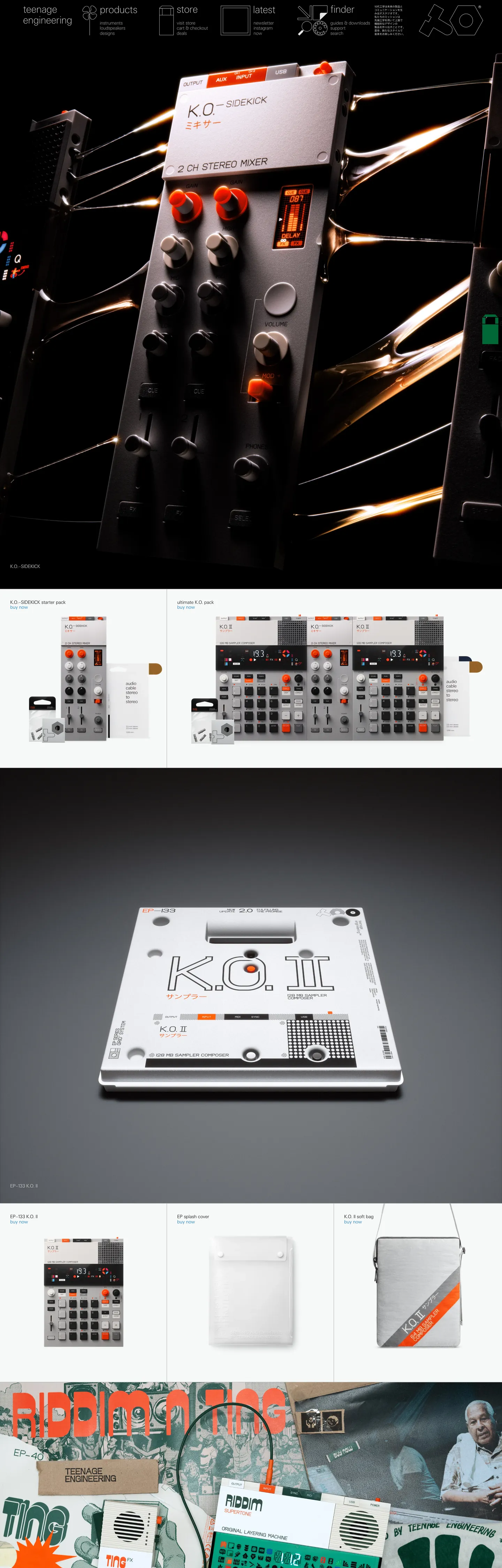
teenage engineering's marketing site is the rarest thing in consumer hardware: a page that refuses to sell. The hero is not a lifestyle shot with a gradient overlay and a centered CTA — it is a product photograph against a dark background, with a tiny lowercase wordmark in the upper corner and a navigation bar whose link text runs in weight 100 at roughly 23px. There is no primary CTA color. There is no accent. The interface chrome is black, white, and three greys. If the products themselves weren't so visually striking — the brushed-aluminum OP-1 field, the K.O. II's orange trigger buttons, the EP-133's bone-white rubber pads — the page would read as an engineering specification rather than a store.
The DESIGN.md file packages this system into ground-truth tokens: 16 colors tokens covering a pure-black canvas, five grey steps, a pale off-white product-background tone, and utility colors for error and success states — none with meaningful background usage in the marketing chrome. Two typography tokens represent the te-20 and te-40 families across four weight-and-size pairings (13px/300 for labels, 19px/100 for body, 23px/100 for nav links, 40px/300 for display). The entire spacing system is derived from CSS viewport-relative calc() expressions rather than fixed pixel values, and the radius system is empty: 0px everywhere.
Feed this file to an AI coding tool and it reproduces teenage engineering's specific restraint: no border radius on any surface, weight 100 type used where most brands would use weight 600, a canvas that's as dark as a hardware enclosure rather than a marketing gradient, and product photography trusted to carry 100% of the emotional and chromatic work. The one principle worth borrowing unconditionally: if your product is visually interesting, do not compete with it.
What makes it distinct
5
- Proprietary bitmap fontste-20 and te-40 are custom-drawn sans-serifs used at weight 100–300; no system font appears anywhere in the hierarchy
- Zero chromatic brand voltageevery color in the JSON is a structural grey or error-state utility; the cobalt, yellow, and orange product colors exist only in photography
- Viewport-relative type scalefont sizes are calc() expressions against 100vw, so type scales continuously with the browser width rather than jumping at breakpoints
- Flat zero-radius geometry--tile-border-radius and --field-border-radius are both 0; every surface meets at right angles with no rounding
- Black-on-white grid dividers1px grey lines bisect the product catalog grid, creating a technical-spec-sheet aesthetic rather than a card-and-shadow layout
teenage.engineering
Live at teenage.engineering
A snapshot of the brand in production. Scroll the frame to see the whole page.
Colors
16 colors
teenage engineering's system runs on #e5e5e5 as its primary voltage, used in 4 of 15 components. Type is set in te-20 across 5 tokens from 13px to 40px, weights 100–300. Shape language is sharp — components average 0px corner radius, favoring crisp rectangles.
Surface
Page and card backgrounds · 3
Text
Headlines, body, captions · 3
Borders & Hairlines
Dividers, outlines, rules · 2
Semantic
Status, errors, success, links · 2
Other
Specialty colors · 6
Typography
5 type tokens
Set in te-20 across 5 tokens, from 13px to 40px, weights 100–300. Shown in its own stack: where the font isn't installed, the fallback the file names stands in.
- display-xl40px · weight 300 · lh 44pxThe quick brown fox jumps over the lazy dog
- body-lg19px · weight 100 · lh 22pxThe quick brown fox jumps over the lazy dog
- body-sm13px · weight 300 · lh 15pxThe quick brown fox jumps over the lazy dog
- nav-link23px · weight 100 · lh 35pxThe quick brown fox jumps over the lazy dog
- label-sm13px · weight 300 · lh 15pxThe quick brown fox jumps over the lazy dog
Layout
Radii and spacing
2 corner radii and 7 spacing values. Shape language: sharp.
Radii
- none0px
- full9999px
Spacing
- xs5px
- sm10px
- md15px
- lg22px
- xl45px
- section66px
- gutter33px
Components
15 components
Each rendered from its tokens (color, type, radius, padding) on teenage engineering's own canvas.
- Button Primarybutton-primaryButton Primary
- Button Secondarybutton-secondaryButton Secondary
- Top Navtop-navTop Nav
- Nav Linknav-linkNav Link
- Hero Headinghero-headingHero Heading
- Body Paragraphbody-paragraphBody Paragraph
- Body Paragraph Mutedbody-paragraph-mutedBody Paragraph Muted
- CardcardCard
- Product Tileproduct-tileProduct Tile
- Type here…text-inputText Input
- Grid Dividergrid-dividerGrid Divider
- FooterfooterFooter
- Badge Errorbadge-errorBadge Error
- Badge Successbadge-successBadge Success
- Field Labelfield-labelField Label
In use
The system, in use
teenage engineering's tokens on the kind of product it builds.
Build something people actually use.
A short paragraph of marketing copy that previews how the brand's display tier and body tier read together. Two sentences is usually enough.
FAQ
teenage engineering design system FAQ
Common questions about teenage engineering's tokens, components, and how to use this DESIGN.md in your project.
Read next
Related reading
Specs, directories, and component libraries that pair with this design system.
- Browse all design systemsThe full directory of DESIGN.md files on shadcn.io, with live mockups for each.shadcn.io
- teenage engineering — official siteteenage engineering's public marketing and store site — the source of truth for the live tokens captured in this file.teenage.engineering (opens in a new tab)
- The DESIGN.md specificationGoogle Labs' open spec for machine-readable design system files — the format this page is built on.github.com (opens in a new tab)
Use it
Use teenage engineering in your project
One machine-readable file. Drop it into Claude, Cursor, or any AI tool that reads DESIGN.md.
Download the DESIGN.md
One machine-readable file: every color, type, radius, spacing, and component token of teenage engineering.
Feed it to your AI tool
Drop it into Claude, Cursor, or GitHub Copilot. The agent writes React components and Tailwind classes that match teenage engineering's visual language.
Reference the tokens directly
Or paste the values into your Tailwind config, CSS variables, or component library: every color, size and radius is a quoted, ready-to-copy value.
Read the full DESIGN.md: overview, rationale, do’s and don’ts
Overview
teenage engineering's marketing site runs one of the most disciplined monochrome systems in consumer electronics. Instrument-grade restraint. The brand treats its website the way Braun treated product packaging — the surface exists to frame the object, not to decorate it. Where Apple covers its dark canvas with oversized marketing prose and Sony layers gradient rectangles over lifestyle photography, teenage engineering puts a product photograph at 80% of the viewport and trusts that the object is interesting enough to carry the page.
The type system amplifies this. Two proprietary bitmap fonts — te-20 and te-40 — run exclusively at weights 100 and 300 across the entire site. At 100-weight, the 23px navigation links barely register as text; they read as dimension annotations rather than clickable affordances. The 40px display tier in te-40 at weight 300 is the loudest typographic moment in the system — measured against almost any other hardware brand, it would be considered understated. There are no heavy headlines, no 700-weight callouts, no gradient type effects. The products are allowed to be the loudest thing in the room.
The geometry enforces the same philosophy: every surface has a 0px border radius. Not 2px, not 4px — zero. Input fields, tiles, navigation items, dialogs: all right-angled. This is the inverse of the consumer-app convention where rounded corners signal friendliness. Right angles signal precision manufacturing.
Key Characteristics:
- Two proprietary fonts (te-20 / te-40) used at weights 100–300 only; no weight above 300 appears anywhere on the page.
- Pure-black canvas ( body background) with no atmospheric gradient or colour wash — the product photography provides all warmth.
- Zero corner radius on every surface: tiles, inputs, buttons, cards — the geometry is instrument-panel sharp.
- Viewport-relative type scale (calc() against 100vw) scales continuously rather than jumping at breakpoints.
- Five grey steps from to carry all structural chrome (borders, labels, muted text).
- Product accent colors (te-blue, te-yellow, te-orange) exist only in CSS variables; none appear in the marketing interface chrome.
- Grid dividers (1px lines in ) bisect the product catalog, creating a technical-spec-sheet composition.
Colors
Surface
- Canvas Body (
{colors.canvas-body}— ): frequency 4 bg. The page floor. Used as the main body background. The darkest possible canvas, chosen to maximize the photographic contrast of hardware products against it. - Canvas (
{colors.canvas}— ): frequency 10 total. Used as a near-black foreground text and border color for top-tier sections. Subtly warm black that appears in theme overrides. - Surface-1 (
{colors.surface-1}— ): frequency 34 bg. The off-white product-background tone, wired as --te-white / --product-background-color. Used in per-product detail sections (e.g., white-body accessories) to create a bright field around the hardware.
Text
- Ink (
{colors.ink}— ): frequency 178 text, 178 border. The dominant text and border color across all elements. Pure black on the off-white surface sections. - Ink Muted (
{colors.ink-muted}— ): frequency 4 text, 4 border. Used for disabled field labels and grid divider lines. Wired as --te-grey-300. - Ink Faint (
{colors.ink-faint}— ): frequency 57 text, 57 border. The primary text color on the dark canvas — a near-white rather than pure white, slightly warmer. Wired as --te-grey-100 and --theme-fct.
Structure
- Hairline (
{colors.hairline}— ): frequency 57 border. The dominant border color throughout the form and input system. - Hairline Dark (
{colors.hairline-dark}— ): frequency 4 border. The grid divider color, wired as --grid-divider-color. - Grey Mid (
{colors.grey-mid}— ): declared as --te-grey-600. Placeholder text and mid-grey labels. - Grey Deep (
{colors.grey-deep}— ): declared as --te-grey-900. Deep mid-grey for inactive states. - Grey Darkest (
{colors.grey-darkest}— ): declared as --te-grey-1000. The darkest structural grey, used for rich-text elements. - Grey Light (
{colors.grey-light}— ): declared as --te-grey-500. A slightly blue-grey mid-tone.
Utility
- Error (
{colors.error}— ): declared as --te-red / --error. The single chromatic status color with a semantic role in the interface. - Success (
{colors.success}— ): declared as --te-green / --success. Confirmation states only. - te-blue (
{colors.te-blue}— ): declared as --te-blue. Referenced in CSS but does not appear in the marketing chrome — lives in product color annotations. - te-yellow (
{colors.te-yellow}— ): declared as --te-yellow. Same — product reference only, not a brand chrome token.
Typography
Font Family
The system runs two proprietary families: te-20 for body, label, and nav-link tiers; te-40 for display headings. Both reference "Unicode" as a fallback, suggesting a broad character-set requirement for international product names. Neither is available on any public font CDN.
Hierarchy
| Token | Family | Size | Weight | Use |
|---|---|---|---|---|
{typography.display-xl} | te-40 | ~40px | 300 | Product name headers |
{typography.nav-link} | te-20 | ~23px | 100 | Primary navigation links |
{typography.body-lg} | te-20 | ~19px | 100 | Body paragraphs |
{typography.body-sm} | te-20 | ~13px | 300 | Small labels, form fields |
{typography.label-sm} | te-20 | ~13px | 300 | Category chips, metadata |
Principles
The weight ceiling is 300. No bold, no semibold, no medium — the heaviest moment in the type system is the 300-weight display tier at 40px. This is the typographic equivalent of speaking at a measured volume in a quiet room; the type never shouts. At 100-weight the navigation links are almost whispered.
All sizes in the CSS are calc() expressions against 100vw (e.g., calc(.0367347 * 100vw) for the 40px display at a 980px reference width). This creates continuous fluid scaling rather than breakpoint-driven size jumps.
Note on Font Substitutes
te-20 and te-40 are not publicly available. IBM Plex Mono at weights 100/300 is the closest open alternative — it carries the same instrument-panel seriousness and has a 100-weight that reads comparably at large sizes. DM Mono is a friendlier alternative if the IBM Plex Mono austerity is too severe for your context.
Layout
Spacing System
- Base reference width: 980px. All spacing is expressed as viewport percentages.
- Tokens (px at 980px base):
{spacing.xs}5px ·{spacing.sm}10px ·{spacing.md}15px ·{spacing.lg}22px ·{spacing.xl}45px. - Grid gutter:
{spacing.gutter}33px, used as the horizontal margin on product grid sections. - Section padding:
{spacing.section}66px, the canonical horizontal page margin. - Field internals: ~10px vertical padding inside form inputs.
Grid & Container
- Product grid: A variable-column tile grid separated by 1px grey dividers (not gutters or white space — the dividers are inked lines between cells).
- Hero: Full-bleed product photography with the wordmark and nav overlaid in the upper portion.
- Max content width: Derived from the 980px base design width but the site scales fluidly above this.
- No cards with drop shadows — every surface boundary is expressed as a hairline or a background-color change.
Rhythm
The page alternates between black-canvas sections (the hero and marketing prose) and off-white sections (product detail areas). There are no gradient transitions — each section terminates with a hard edge. The dividers and margins are the only whitespace management tool.
Elevation
The system has no shadow tier. Elevation is expressed exclusively through background-color contrast: off-white product tiles ({colors.surface-1}) against the pure-black canvas ({colors.canvas-body}). There are no box-shadow values anywhere in the extracted CSS. Cards and form fields use hairline borders rather than shadows to define their edges. This is the same strategy as the radius choice — avoiding any design move that reads as "app chrome" rather than "hardware documentation."
Shapes
Every surface has {rounded.none} (0px) border radius. This is the system's single most declarative geometric statement. The CSS declares --tile-border-radius: 0 and --field-border-radius: 0 as explicit zeroes — not defaults, but intentional values. The only exception in the declared variables is --round: 9999px, which exists as a utility for pill shapes on specific interactive states (not used in the main marketing chrome). The right-angle aesthetic extends from the page tiles to the input fields to the navigation items.
Components
button-primary — Black fill, off-white text, 0px radius, 10x20 padding, 40px height. There is no conventional CTA color — the "primary" button is a black rectangle. The absence of a colored button is the brand's confidence signal.
button-secondary — Transparent fill with a 1px black border, black text. Same geometry.
top-nav — Transparent background with off-white text in te-20 at weight 100 and 23px. The nav is not contained in a header bar — it floats above the hero photography.
nav-link — Same as top-nav styling. No hover background in the captured surface.
hero-heading — Off-white text, te-40 at 40px weight 300. No padding — the heading floats in the product photography.
body-paragraph — Off-white text at 19px weight 100. On the dark canvas sections this is the reading text.
body-paragraph-muted — Mid-grey text at 13px weight 300. Used for metadata beneath product tiles.
card — Off-white surface, black text, 0px radius, 10px internal padding. The product catalog tiles.
product-tile — Same surface tone as card, used for the individual product cells in the catalog grid.
text-input — Off-white surface, black text, 0px radius, 1px grey border, 10px internal padding, 40px height. Form inputs throughout the store and newsletter.
grid-divider — A 1px horizontal/vertical line in that separates catalog cells.
footer — Pure-black canvas, muted-grey text, 22x66 padding. No surface contrast against the page floor.
field-label — Transparent background, black text at 13px weight 300, with 15px top padding and 5px bottom padding above input fields.
Do's and Don'ts
Do keep type weights at 300 or below. The system's authority comes from weight restraint — weight 100 navigation at 23px is the brand's deliberate contrast with consumer-app conventions that use weight 600 for the same text.
Do use {colors.surface-1} as the product-tile background on dark-canvas pages. The off-white is the only "lifted" surface in the system — it reads as a physical product sitting on a dark work surface.
Do express borders as hairlines ({colors.hairline} — ) rather than shadows. The system has zero shadow usage; every boundary is a line, not a blur.
Do rely on product photography for all chromatic accent. The te-blue, te-yellow, and te-orange CSS variables exist as product-color documentation, not brand-chrome tokens — use them only in product annotation contexts, never as button fills or section headers.
Don't introduce any border radius. Even 2px on a button would read as borrowing from the consumer-app vocabulary that this brand explicitly rejects — the right-angle geometry is a literal design statement. Use {rounded.none} universally.
Don't use te-40 or te-20 as background fills or icon shapes. They are text-only families. Decorative uses of type-as-graphic fall outside this system's vocabulary.
Don't use ({colors.ink-faint}) as a background color — it is a text color on the dark canvas, wired as --theme-fct (foreground content text). Using it as a surface fill would collapse the on-dark contrast model. For light surfaces, use {colors.surface-1}.
Don't add a colored primary button. The {colors.ink} black rectangle is the system's CTA geometry; introducing a blue or orange fill would add a brand-chrome color that doesn't exist in this system and would compete with the product photography's accent colors.
Known Gaps
- Hover and focus states: no hover fills or focus rings are captured from the marketing surface; the form system declares --round for potential pill focus styles but nothing is rendered in the captured chrome.
- Mobile breakpoints: the viewport-relative type system adapts continuously, but mobile nav behavior (hamburger menu, collapsed grid) is not captured in the static extraction.
- Product-specific theme overrides: the CSS variable system includes --theme-bc, --theme-fc, --theme-fct, and --theme-mc which appear to support per-product color theming; the rules for these overrides are not captured here.
- Cart and checkout UI: the store checkout flow has its own typography and layout not represented in the marketing-surface extraction.
- Animation: product photography sections use subtle entrance animations not captured in the static token spec.
- Webshop-specific components: the add-to-cart button, quantity stepper, and size selector appear in the product pages but not in the marketing chrome captured here.
Consumer Electronics
More systems like this
More DESIGN.md files in Consumer Electronics.
Pricing
Build it with Pro
The DESIGN.md files are free. Pro adds 6,000+ blocks, premium templates and the MCP server, so your AI editor builds in your system for you.
4.9/5 out of 5 · 150+ reviewsfrom 150+ founders and developers.
Billing
Billed once a year in USD. Cancel anytime.
- How many people can use the license.
- Client work, SaaS products and anything you charge for.
- Production-ready React sections: hero, pricing, features, dashboards and more.
- Complete multi-page sites you can ship as they are.
- React icons from every major library, installable with one command.
- Presets that restyle every block, in light and dark.
- Lets your AI editor search, preview and install blocks for you.
- Priority requests are answered first.
Individual
For personal projects & open source
$32instead of $49/mo
$389 billed yearly
- Seats: 1 seat
- Commercial use: Personal & open source only
- Pro blocks: 6,000+ blocks
- Templates: All 14 templates
- React icons: 294k+ icons
- Themes: All 59 themes
- MCP server: Basic usage
- Support: Standard
Team
Most popularFor freelancers, agencies & startups
$66instead of $99/mo
$789 billed yearly · ≈ $13/dev/mo
- Seats: Up to 5 seats
- Commercial use: Included
- Pro blocks: 6,000+ blocks
- Templates: All 14 templates
- React icons: 294k+ icons
- Themes: All 59 themes
- MCP server: High usage
- Support: Priority
Organization
For companies with larger teams
$132instead of $199/mo
$1,589 billed yearly
- Seats: Unlimited seats
- Commercial use: Included
- Pro blocks: 6,000+ blocks
- Templates: All 14 templates
- React icons: 294k+ icons
- Themes: All 59 themes
- MCP server: Unlimited usage
- Support: Priority
Billed once a year in USD. Cancel anytime.
Individual
For personal projects & open source
$32instead of $49/mo
$389 billed yearly
- How many people can use the license.Seats: 1 seat
- Client work, SaaS products and anything you charge for.Commercial use: Personal & open source only
- Production-ready React sections: hero, pricing, features, dashboards and more.Pro blocks: 6,000+ blocks
- Complete multi-page sites you can ship as they are.Templates: All 14 templates
- React icons from every major library, installable with one command.React icons: 294k+ icons
- Presets that restyle every block, in light and dark.Themes: All 59 themes
- Lets your AI editor search, preview and install blocks for you.MCP server: Basic usage
- Priority requests are answered first.Support: Standard
Team
Most popularFor freelancers, agencies & startups
$66instead of $99/mo
$789 billed yearly · ≈ $13/dev/mo
Everything in Individual, plus
- How many people can use the license.Seats: Up to 5 seats
- Client work, SaaS products and anything you charge for.Commercial use: Included
- Lets your AI editor search, preview and install blocks for you.MCP server: High usage
- Priority requests are answered first.Support: Priority
Organization
For companies with larger teams
$132instead of $199/mo
$1,589 billed yearly
Everything in Team, plus
- How many people can use the license.Seats: Unlimited seats
- Lets your AI editor search, preview and install blocks for you.MCP server: Unlimited usage
- Secure checkout via Stripe
- Code lives in your repo
- Keep what you've shipped if you cancel
- License terms
Your system, built for you
Every block, template and icon, installed by your AI agent in your design system. The DESIGN.md files stay free.