TechCrunch Design System
TechCrunch's newsroom design as a DESIGN.md file. Canvas #edf1ef, Money Green #0a8935, Yellix display, 18 colors tokens, 20+ components for React and AI tools.
Add shadcn.io to your AI agent. · Pro It installs blocks, icons and templates in your design system from a prompt, with Pro.
Set up MCP- Primary
- #b5c0bc
- Typeface
- nb_international_proregular
- Shape
- Soft
- Base radius
- 0px
- Colors
- 18
- Type tokens
- 11
- Components
- 20
- Spacing values
- 8
About
About TechCrunch DESIGN.md
Curated by Dov Azencot · Updated May 13, 2026 · Source techcrunch.com (opens in a new tab)
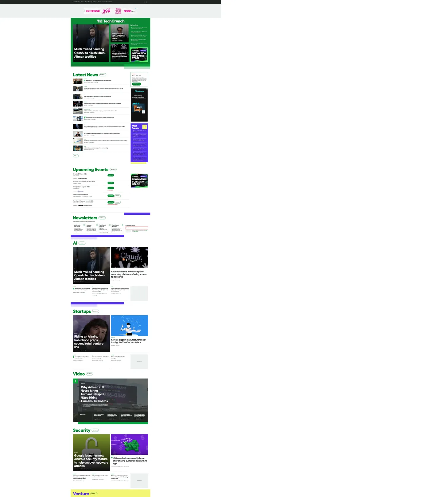
TechCrunch's homepage reads like a Bloomberg terminal rebuilt by a startup that cares about typography. The canvas is a pale hairline-gray (`#edf1ef` — almost white, but with enough green-leaning warmth to register as paper), and `#212623` near-black does the ink work. Money Green (`#0a8935`) paints every section masthead — "Latest News", "Startups", "AI", "Security", "Venture" — like a ticker indicator stamped above each editorial cluster, with a dark-green hover-rule sitting against it. Display headlines crash in at 83px in Yellix 700, a tightly drawn geometric sans by Type-O-Tones, while body and bylines run NB International Pro Regular from Nikolas Wrobel. Two scarcity accents — Founder Purple (`#5631ea`) and Highlighter Yellow (`#f2f673`) — surface only on newsletter and "Most Popular" tiles. The mood is serious enough to break a Series-B leak, energetic enough to host TechCrunch Disrupt.
This DESIGN.md file packages the homepage into a machine-readable spec built on the Google Labs format. Inside: 18 colors tokens grouped into ink, canvas, hairline-grays, Money Green semantics, dual scarcity accents, and one alert red (`#e21c1c`) reserved for newsletter form borders; 11 typography tokens spanning Yellix display (83px / 40px / weight 700) and NB International Pro across nine UI registers from 11px caption to 57px byline-hero; a 4-step radius scale from 2px input corners to 80px pill cards; an 8-step spacing scale built strictly on a 4px unit; and 20+ component specifications covering section mastheads, story cards, the upcoming-events register, newsletter subscription tiles, navigation, buttons, and form inputs.
Feed the file to Claude, Cursor, or GitHub Copilot and the agent reproduces TechCrunch's ticker-page voice — near-black ink on hairline canvas, Money Green section heads, Yellix shouting at 83px above NB International body, 80px pill cards, dual scarcity accents reserved for newsletters. Reference the tokens directly to paste hex values into Tailwind config or to align a CMS theme with the WordPress Gutenberg variable graph. The system is worth studying because TechCrunch picked a typographic stance the rest of tech media avoided: a geometric sans display where every competitor reaches for a serif, paired with the most extreme pill geometry of any mainstream newsroom.
What makes it distinct
5
- Money Green masthead system`#0a8935` paints every section heading ("Latest News", "Startups", "AI") like a stock-ticker glyph rather than a brand wash
- Yellix display at 83px / 700the masthead headline weight is a sharp geometric sans, not the convention-default serif that magazine sites still default to
- Two scarcity accentsFounder Purple `#5631ea` and Highlighter Yellow `#f2f673` together appear in fewer than 10 surfaces, reserved for newsletter and subscription tiles
- 80px pill radiistory cards round at the largest pill value in any mainstream news site, far outside the 8–12px editorial convention
- WordPress-stable token graph300 `:root` custom properties expose the Gutenberg theme.json contract directly to AI tools, making variable mapping deterministic
techcrunch.com
Live at techcrunch.com
A snapshot of the brand in production. Scroll the frame to see the whole page.
Colors
18 colors
TechCrunch's system anchors on #b5c0bc (hairline-strong) as its primary color. Type is set in nb_international_proregular across 11 tokens from 13px to 83px, weights 400–700. Shape language is soft — components average 66px corner radius, with no sharp interactive edges.
Surface
Page and card backgrounds · 2
Text
Headlines, body, captions · 5
Borders & Hairlines
Dividers, outlines, rules · 3
Other
Specialty colors · 8
Typography
11 type tokens
Set in nb_international_proregular across 11 tokens, from 13px to 83px, weights 400–700. Shown in its own stack: where the font isn't installed, the fallback the file names stands in.
- display-xl83px · weight 700 · lh 1.1 · tracking -0.5pxThe quick brown fox jumps over the lazy dog
- display-lg40px · weight 700 · lh 1 · tracking -0.5pxThe quick brown fox jumps over the lazy dog
- byline-hero57px · weight 700 · lh 1.1 · tracking -0.5pxThe quick brown fox jumps over the lazy dog
- heading-md40px · weight 700 · lh 1.2 · tracking -0.5pxThe quick brown fox jumps over the lazy dog
- heading-sm23px · weight 700 · lh 1.2 · tracking -0.5pxThe quick brown fox jumps over the lazy dog
- body-lg19px · weight 700 · lh 1.2 · tracking -0.5pxThe quick brown fox jumps over the lazy dog
- body-md16px · weight 400 · lh 1.4The quick brown fox jumps over the lazy dog
- body-sm13px · weight 400 · lh 1.4The quick brown fox jumps over the lazy dog
- nav-link16px · weight 700 · lh 1.4 · tracking 1pxThe quick brown fox jumps over the lazy dog
- eyebrow-caps13px · weight 400 · lh 1.3 · tracking 0.5pxThe quick brown fox jumps over the lazy dog
- caption-micro14px · weight 400 · lh 1.3 · tracking 1pxThe quick brown fox jumps over the lazy dog
Layout
Radii and spacing
4 corner radii and 8 spacing values. Shape language: soft.
Radii
- none0px
- xs2px
- pill80px
- full9999px
Spacing
- xxs2px
- xs4px
- sm8px
- md12px
- base16px
- lg24px
- xl40px
- 2xl56px
Components
20 components
Each rendered from its tokens (color, type, radius, padding) on TechCrunch's own canvas.
- Button Primarybutton-primaryButton Primary
- Button Primary Hoverbutton-primary-hoverButton Primary Hover
- Button Secondarybutton-secondaryButton Secondary
- Button Registerbutton-registerButton Register
- Button See Morebutton-see-moreButton See More
- Pill Tagpill-tagPill Tag
- Top Navtop-navTop Nav
- Nav Linknav-linkNav Link
- Section Mastheadsection-mastheadSection Masthead
- Section Masthead Rulesection-masthead-ruleSection Masthead Rule
- Story Cardstory-cardStory Card
- Story Card Featurestory-card-featureStory Card Feature
- Most Popular Tilemost-popular-tileMost Popular Tile
- Newsletter Tilenewsletter-tileNewsletter Tile
- Type here…text-inputText Input
- Category Eyebrowcategory-eyebrowCategory Eyebrow
- BylinebylineByline
- TimestamptimestampTimestamp
- Hairline Dividerhairline-dividerHairline Divider
- Avatar Circleavatar-circleAvatar Circle
In use
The system, in use
TechCrunch's tokens on the kind of product it builds.
Build something people actually use.
A short paragraph of marketing copy that previews how the brand's display tier and body tier read together. Two sentences is usually enough.
FAQ
TechCrunch design system FAQ
Common questions about TechCrunch's tokens, components, and how to use this DESIGN.md in your project.
Read next
Related reading
Specs, directories, and component libraries that pair with this design system.
- Browse all design systemsThe full directory of DESIGN.md files on shadcn.io, with live mockups for each.shadcn.io
- TechCrunch — official siteThe live newsroom whose tokens were extracted to build this file.techcrunch.com (opens in a new tab)
- The DESIGN.md specificationGoogle Labs' open spec for machine-readable design system files.github.com (opens in a new tab)
Use it
Use TechCrunch in your project
One machine-readable file. Drop it into Claude, Cursor, or any AI tool that reads DESIGN.md.
Download the DESIGN.md
One machine-readable file: every color, type, radius, spacing, and component token of TechCrunch.
Feed it to your AI tool
Drop it into Claude, Cursor, or GitHub Copilot. The agent writes React components and Tailwind classes that match TechCrunch's visual language.
Reference the tokens directly
Or paste the values into your Tailwind config, CSS variables, or component library: every color, size and radius is a quoted, ready-to-copy value.
Read the full DESIGN.md: overview, rationale, do’s and don’ts
Overview
TechCrunch's homepage is unmistakably a newsroom-as-ticker. The canvas is a paper-toned hairline gray ({colors.surface-paper} — #edf1ef) with {colors.ink} (#212623) doing every load-bearing text and border job, and Money Green ({colors.money-green} — #0a8935) painting every section masthead like a stock-ticker glyph. Two scarcity accents — Founder Purple ({colors.founder-purple} — #5631ea) and Highlighter Yellow ({colors.highlighter-yellow} — #f2f673) — surface only on the Most Popular tile and the newsletter banner. Where most tech-media homepages reach for a serif and a single red brand color, TechCrunch reaches for a geometric sans and a green-stamped editorial cue.
Section-as-ticker: Money Green is not a CTA color — it is the paint applied to every <h2> masthead on the page ("Latest News", "Startups", "AI", "Security", "Venture", "Video", "Newsletters"). The same green carries the underline rule beneath each masthead and the "Register Now" pill buttons on the upcoming-events register. The effect mimics a Bloomberg ticker indicator more than a marketing accent, and it is the single design move that defines the brand's voice.
Type runs two families. Yellix 700 (Type-O-Tones, fallback Inter / Manrope) carries display headlines at 83px and 40px with -0.5px tracking and 1.10 line-height — used for section mastheads only, never UI. NB International Pro Regular (Neubau Berlin, fallback Helvetica Neue / Arial) handles every other register across weights 400 / 500 / 700, from 57px feature deck down to 11px tag captions. The signature "1px UPPERCASE" treatment shows up on 13px and 16px eyebrows, where letter-spacing: 0.5–1px separates the editorial labels from headline type.
The shape language is outsize pill. Story cards round at 80px (the largest pill radius in any mainstream tech newsroom — The Verge tops out at 40px), while inputs and small chips drop to 2px typewriter-tag corners. Avatars and category dots use full circles. Depth is carried by hairline borders in {colors.hairline} (#d2dcd7) and {colors.hairline-strong} (#b5c0bc) rather than drop shadows — the extracted CSS contains shadow tokens like --wp--preset--shadow--natural but they go unused on the homepage. Hierarchy is communicated by container radius and ink contrast.
Key Characteristics:
- Money Green section heads:
{colors.money-green}(#0a8935) paints every<h2>masthead, with{colors.green-rule}(#012800) as the underline rule. The single load-bearing brand cue. - Two-family type stack: Yellix 700 at 83px / 40px for section mastheads, NB International Pro Regular across nine UI registers from 11px caption to 57px byline-hero.
- Outsize 80px pill cards: story containers, upcoming-events tiles, and the newsletter banner all round to 80px — far outside the 8–12px convention in editorial design.
- Dual scarcity accents:
{colors.founder-purple}(#5631ea) and{colors.highlighter-yellow}(#f2f673) appear in fewer than 10 surfaces combined, scoped to the Most Popular tile and newsletter highlight. - WordPress-stable token graph: 300
:rootcustom properties expose the Gutenberg theme.json contract directly. Color, spacing, and font tokens map 1:1 to--wp--custom--color--*variables. - Strict 4px spacing base: the spacing array is built strictly on multiples of 4 (4px, 8px, 12px, 16px, 24px, 40px, 56px). The 8px step alone appears 190 times on the homepage.
- Alert red scoped to newsletter forms:
{colors.alert-red}(#e21c1c) appears only as the 2px input border on the required-field newsletter signup — never as a CTA or background. - Color-as-status, not color-as-decoration: the palette behaves like a Bloomberg terminal. Green for editorial cue, red for alert, purple for promotional scarcity. Decorative accent is absent.
Colors
Brand
- Money Green (
{colors.money-green}—#0a8935): frequency 103. Used as text (41), border (44), background (18). The load-bearing brand voltage — paints every section masthead and the "Register Now" pill buttons. Acts as a ticker indicator rather than a CTA wash. - Green Rule (
{colors.green-rule}—#012800): frequency 36. Used as text (25), border (11). The darker green underline that sits beneath every section masthead and the active-link rule. - Founder Purple (
{colors.founder-purple}—#5631ea): frequency 6. Used as background (4), text (1), border (1). The scarcity accent reserved for the "Most Popular" tile and newsletter highlight. Mapped to--wp--custom--color--purple-500in the WordPress graph. - Highlighter Yellow (
{colors.highlighter-yellow}—#f2f673): frequency 2, background only. The 2-occurrence highlight tag inside the Most Popular module — used as a literal highlighter swatch.
Surface
- Canvas (
{colors.canvas}—#ffffff): frequency 665. Used as text (341) and border (320). The default white surface beneath story cards and inside the top-nav text. Most-frequent color in the extracted graph. - Surface Paper (
{colors.surface-paper}—#edf1ef): frequency 24, background only. The pale green-leaning gray that backs newsletter tiles and the upcoming-events register. Just enough warmth to read as paper rather than chrome. - Hairline (
{colors.hairline}—#d2dcd7): frequency 32, almost entirely border (30). The 1px rule that separates story cards from the surface beneath. - Hairline Strong (
{colors.hairline-strong}—#b5c0bc): frequency 88, all text + border. The slightly darker rule used on "See More" outline buttons and category dividers.
Ink & Text
- Ink (
{colors.ink}—#212623): frequency 1565 — the highest in the entire graph. Used as text (807), border (752). The near-black voltage that does every load-bearing text job. Not pure black — has a green-leaning warmth that ties to the Money Green accent. - Text Muted (
{colors.text-muted}—#6c7571): frequency 414. Used as text (207), border (207). The gray that anchors bylines, timestamps, and category eyebrows. - Text Secondary (
{colors.text-secondary}—#535554): frequency 7. The darker gray used for body in low-contrast contexts. - Absolute Black (
{colors.absolute-black}—#000000): frequency 26. Used as text (9), gradient (16). Reserved for text on Highlighter Yellow tiles and one footer gradient. - Near Black (
{colors.near-black}—#050505): frequency 3, background only. The darker variant used on the masthead band.
Semantic
- Alert Red (
{colors.alert-red}—#e21c1c): frequency 7. Used as text (3), border (4). Scoped narrowly to newsletter input borders and rarered-500tag chips. Never a CTA, never decorative. - Green Tint (
{colors.green-tint}—#68f176): frequency 7. Used as text (3), background (1), border (3). The lighter green variant used on small chips and active-state ticks. - Border Warm (
{colors.border-warm}—#b3b85b): frequency 8, border only. A warm olive border used on a handful of editorial cards.
Gradient System
TechCrunch uses zero decorative gradients on the homepage. The extracted CSS exposes 8 Gutenberg gradient presets (--wp--preset--gradient--electric-grass, --wp--preset--gradient--midnight, and friends), but none of them render on the live home surface. Color is applied in flat blocks, the way a stock ticker paints percentage cells. This is what gives the page its newsroom-terminal voice — a gradient would soften the editorial register.
Typography
Font Family
Two families do the work. Yellix (Type-O-Tones, fallback Inter / Manrope) carries display headlines at 83px and 40px with -0.5px tracking and 1.10 line-height — used exclusively for section mastheads. NB International Pro Regular (Neubau Berlin, fallback Helvetica Neue / Arial) covers weights 400 / 500 / 700 across every other register: 57px feature decks through 11px tag captions. NB International Pro Mono handles fixed-width registers in article bodies but doesn't surface on the home page. Where The Verge runs four families and Wired runs three, TechCrunch is a strict duet — a typographic stance that mirrors the duet of green-masthead-plus-black-ink in the color palette.
Hierarchy
| Token | Size | Weight | Line Height | Letter Spacing | Use |
|---|---|---|---|---|---|
{typography.display-xl} | 83px | 700 | 1.10 | -0.5px | Section mastheads ("Latest News", "Startups", "AI") |
{typography.display-lg} | 40px | 700 | 1.00 | -0.5px | Compact section heads ("Newsletters", "Most Popular") |
{typography.byline-hero} | 57px | 700 | 1.10 | -0.5px | Feature-story headlines inside hero cards |
{typography.heading-md} | 40px | 700 | 1.20 | -0.5px | Story-card headlines (sans variant) |
{typography.heading-sm} | 23px | 700 | 1.20 | -0.5px | Compact story-tile headlines |
{typography.body-lg} | 19px | 700 | 1.20 | -0.5px | Heavy-weight link text and deck emphasis |
{typography.body-md} | 16px | 400 | 1.40 | 0 | Long-form reading body |
{typography.body-sm} | 13px | 400 | 1.40 | 0 | Bylines, timestamps, secondary decks |
{typography.nav-link} | 16px | 700 | 1.40 | 1px | Top-nav category links |
{typography.eyebrow-caps} | 13px | 400 | 1.30 | 0.5px | UPPERCASE category eyebrows above headlines |
{typography.caption-micro} | 14px | 400 | 1.30 | 1px | UPPERCASE micro-captions on chips and tags |
Principles
Yellix is always the masthead, never the UI. Anything below 40px in Yellix is a bug — it exists to stamp section heads, not to label a button. NB International Pro Regular is always the body voice. A 16px nav link at weight 700 with 1px tracking is the same family as a 16px reading paragraph at weight 400 with 0 tracking — the family doesn't change, the typographic register does. Negative tracking on display is deliberate: every display register sits at -0.5px to tighten the geometric sans against the masthead green underline. Positive tracking (0.5–1px) belongs to UPPERCASE eyebrows and nav links, where the spacing reads like a ticker label.
Note on Font Substitutes
The proprietary Yellix face is a tightly drawn geometric sans with high x-height and even stroke contrast. If you substitute, Bricolage Grotesque, Sora, or Inter Display at weight 700 land closest — loosen line-height by approximately +0.05 (1.10 → 1.15) to prevent ascender collisions at 83px. NB International Pro substitutes (Inter, IBM Plex Sans, Hanken Grotesk) work at the token values without adjustment. Don't substitute a serif — the geometric-sans-as-display choice is the brand's typographic fingerprint.
Layout
Spacing System
- Base unit: strict 4px multiples. Every value in the extracted spacing array is a 4px multiple, with the 8px step (190 occurrences) and 4px step (166 occurrences) carrying most of the rhythm.
- Tokens:
{spacing.xxs}2px ·{spacing.xs}4px ·{spacing.sm}8px ·{spacing.md}12px ·{spacing.base}16px ·{spacing.lg}24px ·{spacing.xl}40px ·{spacing.2xl}56px. - Section padding (vertical): 40–56px between major editorial sections. Story-card stacks themselves run tighter — 8–12px gaps.
- Card internal padding: 14×16px interior on standard tiles; feature cards expand to 24–40px.
- Inline spacing: eyebrows sit ~4–6px above headlines; headlines sit ~8–12px above decks; timestamps sit ~6–8px below decks.
Grid & Container
- Max content width: ~1014px article default (
--wp--custom--content--width--default), expanding to ~1360px for wide content (--wp--custom--content--width--wide). - Column patterns: a 12-column underlying grid that resolves into a 2-column story-card stream with a 1-column sidebar on the right (carrying ads, the Most Popular purple tile, and newsletter banners). The grid feels editorial because tiles span 1, 2, or full-bleed depending on their feature weight.
- Container padding: 24px mobile / 48px desktop on the outer edges.
- Gutters: 16–24px between columns, tighter (8–12px) inside story-card stacks.
Whitespace Philosophy
TechCrunch paces whitespace the way a ticker paces price ticks — short, even, and rhythmic. The hairline canvas is restful enough that 24px of empty {colors.surface-paper} between two story cards acts as a palette cleanser, and the 80px pill radii at every story-container edge soften what would otherwise be a dense magazine-grid surface. Where the homepage feels open is in the section-masthead band: each <h2> in 83px Yellix green sits over 40–56px of vertical air, separating editorial clusters with the same authority a Bloomberg terminal gives to each pane.
Border Radius Scale
{rounded.none}0px: section underline rules, hairline dividers{rounded.xs}2px: text inputs, small badges, pill-tag chips (typewriter-tag scale){rounded.pill}80px: story cards, upcoming-events tiles, newsletter banners, the Most Popular tile (the largest pill in mainstream tech publishing){rounded.full}9999px / 50%: avatar circles, category dots, icon containers
Four radius values is deliberate. The 80px pill is so much larger than the 2px typewriter corner that the contrast between container and control reads as scale-jump rather than gradient — every story card feels like a rounded magazine spread, every input feels like a ticker stamp.
Elevation
TechCrunch's depth philosophy is hairline-over-shadow. The extracted Gutenberg CSS contains shadow tokens — --wp--preset--shadow--natural (6px 6px 9px rgba(0,0,0,0.2)), --wp--preset--shadow--sharp (6px 6px 0px rgba(0,0,0,0.2)), --wp--preset--shadow--deep, --wp--preset--shadow--outlined — but zero of them render on the live homepage. The brand declares the inventory and then refuses to use it.
| Level | Treatment | Use |
|---|---|---|
| 0 | No border, no shadow | Default {colors.surface-paper} canvas text |
| 1 | 1px hairline {colors.hairline} #d2dcd7 | Standard story-card outlines |
| 2 | 1px hairline {colors.hairline-strong} #b5c0bc | "See More" outline buttons, secondary cards |
| 3 | 2px rule {colors.money-green} #0a8935 | Active masthead underlines, focused-section rules |
| 4 | Saturated accent fill (#5631ea, #f2f673) | Most Popular and Highlighter elevation via color, not shadow |
When something needs to stand out, it doesn't get a shadow — it gets a hairline upgrade from gray to green, or it gets a saturated purple/yellow fill. The hairline canvas stays perfectly flat throughout, and hierarchy is carried by border weight and fill saturation. No blur, no glow, no decorative drop-shadow anywhere on the home surface.
Shapes
The shape vocabulary is a two-step contrast: outsize pill on containers, typewriter tag on controls. Every story card, upcoming-events tile, and newsletter banner rounds to 80px — a value that appears 21 times in the extracted radii frequency table, the dominant container shape in the system. Every input, badge, and small chip drops to 2px (the typewriter-tag radius that appears 5 times). Avatars, category dots, and icon containers go fully circular at 50% / 100%. There is no intermediate step — no 8px, no 12px, no 16px pill in between. The gap between the 80px outer container and the 2px inner control is the shape signature of the brand: a rounded magazine spread containing square-cornered ticker controls.
Components
Buttons
button-primary — Ink (#212623) fill, white text, NB International Pro 16px / 400, {rounded.pill} 80px radius, 12×16px padding, 44px height. The most common CTA across the system. Used as the "Sign In" and primary action button. Hover state shifts to {colors.green-rule} (#012800).
button-secondary — Money Green (#0a8935) fill, ink text, NB International Pro 16px / 400, {rounded.pill} 80px radius. Used as the "See More" action paired alongside section mastheads.
button-register — Money Green fill, white text, NB International Pro 13px / 400, {rounded.pill} 80px radius, 8×16px padding. The "Register Now" pill on every upcoming-events row.
button-see-more — Transparent fill with a 1px {colors.hairline-strong} outline, ink text, NB International Pro 13px / 400, {rounded.pill} 80px radius. The quiet outline alternative paired with each section masthead.
pill-tag — Non-interactive saturated accent tag. Highlighter Yellow (#f2f673) fill with absolute-black text, NB International Pro 13px / 400 UPPERCASE with 0.5px tracking, {rounded.xs} 2px radius (tighter than buttons), 4×8px padding. Used as the literal "highlighter" swatch inside the Most Popular module.
Cards & Containers
story-card — Standard editorial story tile. Canvas (#ffffff) fill with a 1px {colors.hairline} border, {rounded.pill} 80px radius, 24px interior padding. Headline in NB International Pro 23px / 700 (sans). Hover: no lift, no scale — the headline color transitions from ink to money-green over 150ms.
story-card-feature — Top-of-feed feature card. Ink (#212623) fill with white text, {rounded.pill} 80px radius, 40px+ padding. Image inside the tile clips to the outer radius. The single dark-canvas tile in an otherwise light surface.
most-popular-tile — Sidebar scarcity tile. Founder Purple (#5631ea) full-bleed fill, white text, {rounded.pill} 80px radius, 24px padding. One of only four surfaces where purple appears on the homepage — used to mark "Most Popular" with editorial spotlight.
newsletter-tile — Subscription banner. Surface Paper (#edf1ef) fill, ink text, {rounded.pill} 80px radius, 24px padding. Contains an email input with the 2px alert-red border and a primary CTA pill.
Navigation
top-nav — Ink Black band at 44px height. Wordmark left-aligned, UPPERCASE NB International Pro 16px / 700 category links centered with 1px tracking ("Latest", "Startups", "Venture", "Apple", "Security", "AI", "Apps", "Events", "Podcasts", "Newsletters"), and a single primary CTA pinned right.
nav-link — NB International Pro 16px / 700 with 1px tracking, white on the ink band. Hover transitions from white to money-green with no underline.
Editorial Bits
section-masthead — The signature Money Green <h2>. Yellix 83px / 700 with -0.5px tracking and 1.10 line-height, painted in {colors.money-green}. Sits above every editorial cluster on the homepage and acts as a stock-ticker indicator.
section-masthead-rule — The 2px Money Green horizontal underline that follows the masthead. Marks the editorial section boundary.
category-eyebrow — UPPERCASE category label above story headlines. NB International Pro 13px / 400 with 0.5px tracking, in text-muted gray (#6c7571).
byline — NB International Pro 13px / 400, in text-muted gray. Sits directly beneath the headline alongside the timestamp.
timestamp — NB International Pro 13px / 400, in text-muted gray. Paired with the byline using a vertical bar separator.
Forms
text-input — Canvas fill, 2px {colors.alert-red} border (the required-field state shown on the homepage newsletter signup), {rounded.xs} 2px radius, NB International Pro 16px / 400 in ink text, placeholder in text-muted gray. The narrow red border is a deliberate alert cue — most newsletter forms ship in a hairline-gray default state; TechCrunch elevates the field to a near-error register to drive subscription clicks.
Decoration
hairline-divider — A 1px Hairline (#d2dcd7) rule that separates story rows inside dense feed sections.
avatar-circle — 50% radius circle at 32px diameter. Hairline fill fallback, used for byline author avatars.
Do's and Don'ts
- Don't use Money Green (
#0a8935) as a primary CTA background. It is a section-masthead paint —41of its103occurrences are text fills on<h2>heads,44are border rules, only18are backgrounds (and all18are the "Register Now" pill on upcoming-events rows). Use Ink (#212623) for primary CTAs across the rest of the surface. - Don't use Founder Purple (
#5631ea) on any tile other than Most Popular or newsletter banners. It appears in only6surfaces total — turning it into a third color would dissolve the scarcity. For sidebar elevation, use surface-paper instead. - Don't use Highlighter Yellow (
#f2f673) as a background fill on text containers larger than ~120px wide. It is a 2-occurrence highlight swatch used as a literal highlighter mark inside the Most Popular module — scaling it up reads as "deprecated WordPress theme" rather than editorial accent. - Don't drop the
-0.5pxtracking on Yellix display headlines at 83px / 40px. The geometric sans relies on the negative tracking to read as a single typographic unit; remove it and the masthead loses its ticker-stamp authority. - Don't soften the 80px container radius below 40px. The shape signature of the brand is the contrast between 80px outer pill containers and 2px inner ticker-stamp controls — splitting the difference at 40px makes story cards look like generic SaaS marketing tiles.
- Don't introduce a drop shadow on any story card. The system declares 5 Gutenberg shadow tokens in CSS but uses zero of them on the live surface. Hierarchy is carried by hairline border weight (1px gray → 2px green) and fill saturation, not by layered elevation.
- Don't use the alert red (
#e21c1c) as a CTA color. It is scoped to newsletter input borders and a handful ofred-500tag chips —4border occurrences and3text occurrences in the entire graph. For destructive actions, treat the red as alert-only the way Bloomberg uses it on price tickers.
Known Gaps
- Article-detail body typography: the long-form reading view past the homepage (article pages, review templates, podcast episode pages) is not fully captured here. The homepage and the upcoming-events register cover the dominant surface area readers actually encounter.
- Hover and active state ramps: the static homepage capture documents the resting state of every component. Precise transition timing on story cards, navigation links, and "Register Now" pills could not be extracted from the static surface.
- Mobile navigation drawer: the hamburger drawer below 768px is not captured.
- Loading skeletons, empty states, and form validation: newsletter signup error-state styling beyond the resting 2px red border is not documented.
- TechCrunch+ subscription surfaces: the paywall, account management, and member-only article surfaces are gated behind authentication and not included in this extraction.
- Dark mode: TechCrunch's homepage is light-only — there is no documented dark theme. The ink-black band at the masthead is a single inverted register, not a full dark surface.
News & Publishing
More systems like this
More DESIGN.md files in News & Publishing.
Pricing
Build it with Pro
The DESIGN.md files are free. Pro adds 6,000+ blocks, premium templates and the MCP server, so your AI editor builds in your system for you.
4.9/5 out of 5 · 150+ reviewsfrom 150+ founders and developers.
Billing
Billed once a year in USD. Cancel anytime.
- How many people can use the license.
- Client work, SaaS products and anything you charge for.
- Production-ready React sections: hero, pricing, features, dashboards and more.
- Complete multi-page sites you can ship as they are.
- React icons from every major library, installable with one command.
- Presets that restyle every block, in light and dark.
- Lets your AI editor search, preview and install blocks for you.
- Priority requests are answered first.
Individual
For personal projects & open source
$32instead of $49/mo
$389 billed yearly
- Seats: 1 seat
- Commercial use: Personal & open source only
- Pro blocks: 6,000+ blocks
- Templates: All 14 templates
- React icons: 294k+ icons
- Themes: All 59 themes
- MCP server: Basic usage
- Support: Standard
Team
Most popularFor freelancers, agencies & startups
$66instead of $99/mo
$789 billed yearly · ≈ $13/dev/mo
- Seats: Up to 5 seats
- Commercial use: Included
- Pro blocks: 6,000+ blocks
- Templates: All 14 templates
- React icons: 294k+ icons
- Themes: All 59 themes
- MCP server: High usage
- Support: Priority
Organization
For companies with larger teams
$132instead of $199/mo
$1,589 billed yearly
- Seats: Unlimited seats
- Commercial use: Included
- Pro blocks: 6,000+ blocks
- Templates: All 14 templates
- React icons: 294k+ icons
- Themes: All 59 themes
- MCP server: Unlimited usage
- Support: Priority
Billed once a year in USD. Cancel anytime.
Individual
For personal projects & open source
$32instead of $49/mo
$389 billed yearly
- How many people can use the license.Seats: 1 seat
- Client work, SaaS products and anything you charge for.Commercial use: Personal & open source only
- Production-ready React sections: hero, pricing, features, dashboards and more.Pro blocks: 6,000+ blocks
- Complete multi-page sites you can ship as they are.Templates: All 14 templates
- React icons from every major library, installable with one command.React icons: 294k+ icons
- Presets that restyle every block, in light and dark.Themes: All 59 themes
- Lets your AI editor search, preview and install blocks for you.MCP server: Basic usage
- Priority requests are answered first.Support: Standard
Team
Most popularFor freelancers, agencies & startups
$66instead of $99/mo
$789 billed yearly · ≈ $13/dev/mo
Everything in Individual, plus
- How many people can use the license.Seats: Up to 5 seats
- Client work, SaaS products and anything you charge for.Commercial use: Included
- Lets your AI editor search, preview and install blocks for you.MCP server: High usage
- Priority requests are answered first.Support: Priority
Organization
For companies with larger teams
$132instead of $199/mo
$1,589 billed yearly
Everything in Team, plus
- How many people can use the license.Seats: Unlimited seats
- Lets your AI editor search, preview and install blocks for you.MCP server: Unlimited usage
- Secure checkout via Stripe
- Code lives in your repo
- Keep what you've shipped if you cancel
- License terms
Your system, built for you
Every block, template and icon, installed by your AI agent in your design system. The DESIGN.md files stay free.