Target Design System
Target's marketing system as a DESIGN.md file. Bullseye red carrying every CTA pill, Helvetica for Target across 11 size steps, fully-rounded 999px buttons. For React, Next.js, and AI tools.
Add shadcn.io to your AI agent. · Pro It installs blocks, icons and templates in your design system from a prompt, with Pro.
Set up MCP- Primary
- #cc0000
- Typeface
- Helvetica for Target
- Shape
- Soft
- Base radius
- 8px
- Colors
- 15
- Type tokens
- 11
- Components
- 19
- Spacing values
- 8
About
About Target DESIGN.md
Curated by Dov Azencot · Updated May 19, 2026 · Source target.com (opens in a new tab)
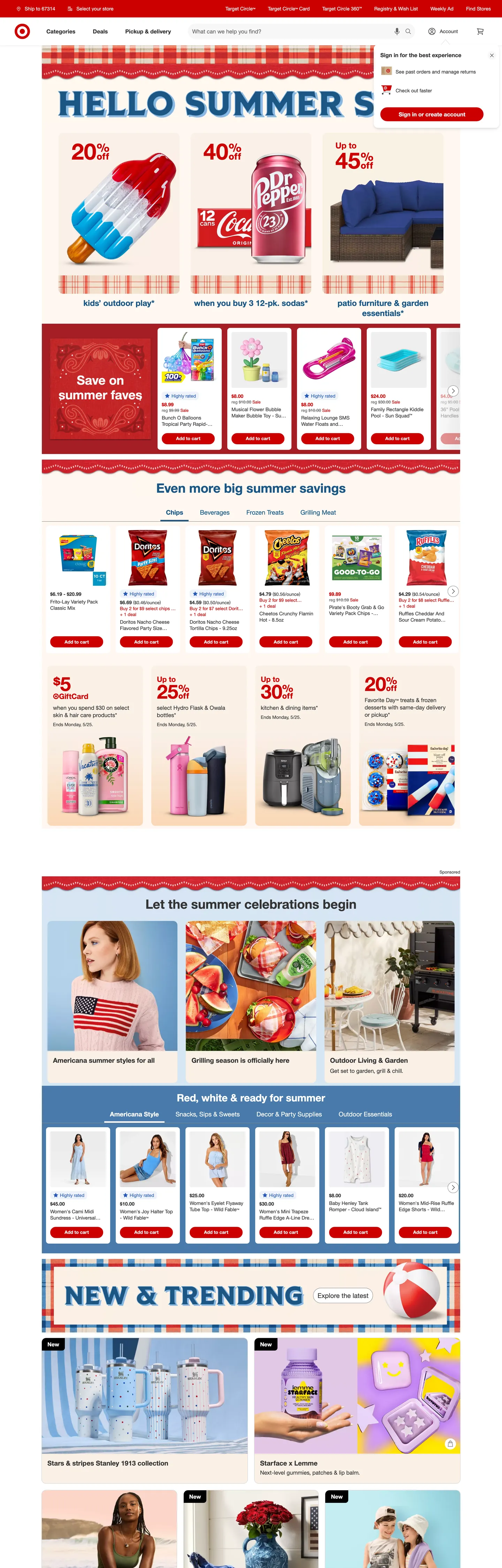
Target's homepage opens with a saturated red banner that says HELLO SUMMER SAVINGS in white over a row of stylized popsicle-and-Coca-Cola illustrations, with three offer percentages (20% / 40% / Up to 45%) inlined into the headline as larger glyphs. There is no editorial photograph above the fold; the page commits to a flat color block and lets the offer band do the typographic work. Where Nordstrom holds the chrome silent and lets fashion photography carry every chromatic decision, Target inverts the move entirely — the brand voltage is the canvas, the offers are the typography, and the merchandise photography sits below the fold as supporting evidence.
The DESIGN.md file packages the system into a machine-readable spec for React and AI coding tools. Inside: 15 colors tokens drawn from the 109 CSS custom properties Target exposes (under the `--color-` and `--_ref-color-` prefixes from their internal "Loungewear" or "Targetica" design system), organized into a Target Red brand-voltage tier, a charcoal ink/canvas chrome ladder, a small set of semantic colors for info/success/subdued states, and three soft cream-and-blue background tones for offer-tile backdrops. 11 typography tokens run "Helvetica for Target" — a custom HelveticaForTarget/Targetica metric clone that falls back to Helvetica Neue, with display at 38/700, body at 14/400, and small labels at 13/700. 19 components cover the red hero banner, the fully-rounded 999px CTA pill, the cream-tinted offer tile, the white circle-rewards button, the search input, and the bottom-rule top nav.
Feed this file to Claude or Cursor and it will reproduce Target's specific moves: a flat-red hero banner instead of a photograph, fully-rounded 999px CTA pills at 40px height across every action, charcoal ink (#333333) instead of pure black, and the dotted-rule divider treatment that distinguishes Target's offer flyers from generic e-commerce tile grids. The tokens resolve cleanly without invention. Treat it as a reference: the move worth borrowing is the discipline of letting one saturated red carry every CTA and active state, which only works when the brand has the cultural permission Target has to claim red as a primary surface.
What makes it distinct
5
- Bullseye voltage as canvasTarget Red #cc0000 fills the hero banner, every primary CTA, and every category-tab active state, appearing 211 times across the captured page
- Custom Targetica typefaceTarget ships a proprietary metric-compatible Helvetica clone with HelveticaForTarget and Targetica fallbacks before reaching Helvetica Neue
- Fully-rounded 999px pillsevery primary CTA, sign-in chip, and circle-rewards button uses a maximum-radius pill at 40px height, no rounded-rectangle middle tier
- Charcoal ink, never blackbody text and section headings render at #333333, with pure black reserved for a single small inverted surface
- Dotted-rule offer flyersTarget's offer-band dividers use thin red dotted hairlines instead of solid borders, echoing newspaper-circular and scissor-coupon conventions
target.com
Live at target.com
A snapshot of the brand in production. Scroll the frame to see the whole page.
Colors
15 colors
Target's system runs on #cc0000 as its primary voltage, used in 4 of 19 components. Type is set in Helvetica for Target across 11 tokens from 12px to 38px, weights 400–700. Shape language is soft — components average 502px corner radius, with no sharp interactive edges.
Brand & Accent
Sparing, CTA-only voltage · 4
Surface
Page and card backgrounds · 4
Text
Headlines, body, captions · 3
Borders & Hairlines
Dividers, outlines, rules · 2
Semantic
Status, errors, success, links · 2
Typography
11 type tokens
Set in Helvetica for Target across 11 tokens, from 12px to 38px, weights 400–700. Shown in its own stack: where the font isn't installed, the fallback the file names stands in.
- display-xl38px · weight 700 · lh 39.9pxThe quick brown fox jumps over the lazy dog
- display-md19px · weight 700 · lh 22.8pxThe quick brown fox jumps over the lazy dog
- heading-md18px · weight 400 · lh 25.2pxThe quick brown fox jumps over the lazy dog
- heading-sm16px · weight 700 · lh 22.4pxThe quick brown fox jumps over the lazy dog
- body-lg16px · weight 400 · lh 20.8pxThe quick brown fox jumps over the lazy dog
- body-md14px · weight 400 · lh 19.6pxThe quick brown fox jumps over the lazy dog
- body-bold14px · weight 700 · lh 18.2pxThe quick brown fox jumps over the lazy dog
- body-sm13px · weight 400 · lh 16.9pxThe quick brown fox jumps over the lazy dog
- label-sm13px · weight 700 · lh 13pxThe quick brown fox jumps over the lazy dog
- caption12px · weight 400 · lh 15.6pxThe quick brown fox jumps over the lazy dog
- button-md16px · weight 700 · lh 22.4pxThe quick brown fox jumps over the lazy dog
Layout
Radii and spacing
6 corner radii and 8 spacing values. Shape language: soft.
Radii
- none0px
- sm4px
- md8px
- lg12px
- pill999px
- full9999px
Spacing
- xs4px
- sm8px
- md12px
- base16px
- lg24px
- xl32px
- 2xl48px
- 3xl64px
Components
19 components
Each rendered from its tokens (color, type, radius, padding) on Target's own canvas.
- Hero Bannerhero-bannerHero Banner
- Hero Headinghero-headingHero Heading
- Section Headingsection-headingSection Heading
- Category Headingcategory-headingCategory Heading
- Body Paragraphbody-paragraphBody Paragraph
- Body Paragraph Mutedbody-paragraph-mutedBody Paragraph Muted
- Button Primarybutton-primaryButton Primary
- Button Primary Hoverbutton-primary-hoverButton Primary Hover
- Button Secondarybutton-secondaryButton Secondary
- Top Navtop-navTop Nav
- Nav Linknav-linkNav Link
- Category Tabcategory-tabCategory Tab
- Category Tab Activecategory-tab-activeCategory Tab Active
- Card Offercard-offerCard Offer
- Card Productcard-productCard Product
- Card Warmcard-warmCard Warm
- Type here…text-inputText Input
- Link Infolink-infoLink Info
- FooterfooterFooter
In use
The system, in use
Target's tokens on the kind of product it builds.
Build something people actually use.
A short paragraph of marketing copy that previews how the brand's display tier and body tier read together. Two sentences is usually enough.
FAQ
Target design system FAQ
Common questions about Target's tokens, components, and how to use this DESIGN.md in your project.
Read next
Related reading
Specs, directories, and component libraries that pair with this design system.
- Browse all design systemsThe full directory of DESIGN.md files on shadcn.io, with live mockups for each.shadcn.io
- Target — official siteTarget's public marketing site — the source of truth for the live tokens captured in this file.target.com (opens in a new tab)
- The DESIGN.md specificationGoogle Labs' open spec for machine-readable design system files — the format this page is built on.github.com (opens in a new tab)
Use it
Use Target in your project
One machine-readable file. Drop it into Claude, Cursor, or any AI tool that reads DESIGN.md.
Download the DESIGN.md
One machine-readable file: every color, type, radius, spacing, and component token of Target.
Feed it to your AI tool
Drop it into Claude, Cursor, or GitHub Copilot. The agent writes React components and Tailwind classes that match Target's visual language.
Reference the tokens directly
Or paste the values into your Tailwind config, CSS variables, or component library: every color, size and radius is a quoted, ready-to-copy value.
Read the full DESIGN.md: overview, rationale, do’s and don’ts
Overview
Target's marketing site does what almost no other large mass-market retailer does at the same saturation. Bullseye voltage as canvas. The above-fold hero is a flat block of Target Red {colors.brand} (#cc0000) running edge-to-edge with the headline "HELLO SUMMER SAVINGS" set in white at 38px / 700, three inline offer percentages (20% / 40% / Up to 45%) sized up as display glyphs, and a row of stylized popsicle and Coca-Cola illustrations underneath. Where Nordstrom commits to a single editorial photograph and lets fashion photography carry every chromatic decision, and where Walmart anchors on navy blue with a yellow spark accent, Target paints the hero with the brand color directly and lets the offer arithmetic do the typographic work.
The chromatic discipline reinforces the move. Target Red ({colors.brand} — #cc0000) appears 211 times across the captured page — 74 as text, 32 as background, 105 as border. It carries the hero band, every primary CTA pill, the active state on every category tab, the savings-banner ribbons that divide the offer grids, and the bullseye-logo fill itself. The hover-press variant is a deep crimson ({colors.brand-hover} — #a51e24) wired as --color-border-brand-hover for the darker pressed state. Outside the red voltage, the chrome runs on charcoal ink ({colors.ink} — #333333) at 2062 occurrences — never pure black, which sits at only 14 captured uses on a single inverted surface. The canvas is pure white ({colors.canvas} — #ffffff), and the soft cream surfaces ({colors.surface-cream} — #faf0e6 and {colors.surface-warm} — #f4e5d5) carry the offer-tile backdrops below the fold.
Typography is Helvetica for Target — a custom proprietary metric clone shipped under the fallback chain HelveticaForTarget, Targetica, "HelveticaNeue for Target", "Helvetica Neue", Helvetica, Arial, sans-serif. The stack is the brand's deliberate ownership move over the workhorse grotesk: Target commissioned a custom face that matches Helvetica Neue's metrics exactly so the layout never reflows when the custom font fails to load. Display sits at 38/700, body at 14-16/400, small labels at 13/700. There is no second display family, no serif, no monospace voice. The weight contrast is binary — 400 for prose, 700 for everything tappable.
Key Characteristics:
- Target Red (
{colors.brand}— #cc0000) carries the hero canvas, every primary CTA pill, every active category tab, and the bullseye logo fill — 211 captured occurrences. - Charcoal ink (
{colors.ink}— #333333) carries the chrome at 2062 occurrences; pure black sits at 14 captured uses, reserved for a single inverted surface and the bullseye-ring outline. - Helvetica for Target across 11 size steps, weighted 400 for prose and 700 for everything tappable — no middle weight, no second family.
- Fully-rounded 999px pills (
{rounded.pill}) on every CTA, secondary button, category tab, and search input. No rounded-rectangle middle tier between 12px and 999px. - Cream-tinted offer surfaces (
{colors.surface-cream}#faf0e6 and{colors.surface-warm}#f4e5d5) carry the offer tiles below the fold — never plain white, never the brand red. - Dotted-rule dividers: the offer-band rails between the hero and the tile grid use thin red dotted hairlines that read as scissor-cut savings flyers, not card boundaries.
- 4-up grocery-tile and 6-up offer-tile grids alternate down the page; the rhythm is denser than Nordstrom's catalog-pace and lighter than Walmart's tile-overload landing.
- Info blue (
{colors.info}— #2758b9) is a strictly-semantic tone for shipping notices and disclosure links; the deeper navy ({colors.info-deep}— #1b5684) appears on hover.
Colors
Brand
- Target Red (
{colors.brand}— #cc0000): frequency 211. Used as text (74), border (105), background (32). The load-bearing brand voltage — fills the hero banner, every primary CTA pill, the active category-tab fill, the bullseye-logo central ring, and the savings-band ribbons. Wired in CSS as--_ref-color-red-600,--color-circle-text-circle360mark, and--color-background-page-brand. Even the theme-color meta tag at the document level is set to #cc0000. - Brand Hover (
{colors.brand-hover}— #a51e24): frequency 2 — all as background. The pressed-state variant on primary CTAs and the category-tab active hover, a step deeper into crimson. Wired as--color-border-brand-hoverand--color-background-brand-contrast.
Ink
- Ink (
{colors.ink}— #333333): frequency 2062. Used as text (1039) and border (1023). The workhorse chrome color — nav labels, body copy, section headings, footer text, card outlines. Wired as--color-background-inverse,--color-text-base, and--_ref-color-gray-700. Charcoal — never pure black. - Ink Deep (
{colors.ink-deep}— #000000): frequency 14 — text (1), background (4), border (1). Reserved for the rare inverted surface that needs pure black contrast, the bullseye logo's outer ring outline, and the--color-text-always-blacktoken used on light surfaces that flip to dark variants. - Text Subdued (
{colors.text-subdued}— #666666): frequency 74. Secondary metadata — disclosure links, "starting at" sub-prices, sub-line product attributes. Wired as--color-icon-subdued,--color-text-subdued, and--_ref-color-opacity-gray-500-80.
Canvas
- Canvas (
{colors.canvas}— #ffffff): frequency 149. Pure white — the body floor, the top-nav surface, the product-card backgrounds, the white inset on the bullseye logo. Used everywhere the offer-tile cream is not. - Surface Cream (
{colors.surface-cream}— #faf0e6): frequency 25, all as background. The soft cream backdrop that carries the offer-tile grids below the fold. Wired (despite the name) as--_ref-color-blue-050and--color-background-success-subdued— the warm cream serves a "savings" semantic, not a "blue" one. - Surface Warm (
{colors.surface-warm}— #f4e5d5): frequency 7, all as background. A slightly more saturated warm-cream variant for the "New & Trending" featured-band card stack. Wired as--color-background-subdued-hoverand--_ref-color-gray-100. - Surface Brand Subtle (
{colors.surface-brand-subtle}— #f9a997): frequency 2 — all as background. A peach-coral tone used as the subdued-active state on category chips that share the brand color family.
Borders
- Border Subtle (
{colors.border-subtle}— #d6d6d6): frequency 10. The card-divider tone — between offer tiles, around product cards, beneath the top-nav band. Wired as--color-background-opacity-container-subduedand--color-border-subdued. - Border Base (
{colors.border-base}— #888888): frequency 7, all as border. The heavier outline used on form fields and secondary CTA pills. Wired as--color-border-base.
Semantic
- Info (
{colors.info}— #2758b9): frequency 20. Used as text (10) and border (10). The shipping-and-availability disclosure link color — "Delivery to 95823", "See more options", "Learn more". Wired as--color-icon-info,--color-text-info, and--color-border-info. - Info Deep (
{colors.info-deep}— #1b5684): frequency 16. The hover-state variant on info links — a deeper navy that signals the press. - Accent Blue (
{colors.accent-blue}— #487aaa): frequency 6, all as background. A mid-blue used on the "Red, white & cues for summer" Americana-themed campaign band — borrowed from the seasonal palette rather than the brand chrome. - Accent Blue Soft (
{colors.accent-blue-soft}— #d6e6f3): frequency 1, used as background. The lightest blue tier — the hover-state fill on circle-rewards subdued surfaces.
Typography
Font Family
The system runs Helvetica for Target for every typographic surface — a custom proprietary metric clone shipped via WOFF with a deep fallback chain: HelveticaForTarget, Targetica, "HelveticaNeue for Target", "Helvetica Neue", Helvetica, Arial, sans-serif. The Targetica name in the fallback is the brand's internal codename for the custom face; the rest of the chain is a safety net for the custom font's failed-load case. There is no secondary serif, no display family, no monospace voice.
Hierarchy
| Token | Size | Weight | Line Height | Use |
|---|---|---|---|---|
{typography.display-xl} | 38px | 700 | 39.9px | Hero h2 ("Deals: now just a text away", "Hello Summer Savings") |
{typography.display-md} | 19px | 700 | 22.8px | Category-strip headings ("Even more big summer savings") |
{typography.heading-md} | 18px | 400 | 25.2px | Sub-heading text in lighter weight |
{typography.heading-sm} | 16px | 700 | 22.4px | h2 ("Sign in for the best experience"), tile titles |
{typography.body-lg} | 16px | 400 | 20.8px | Default running text in tiles and offer copy |
{typography.body-md} | 14px | 400 | 19.6px | Secondary product/category text |
{typography.body-bold} | 14px | 700 | 18.2px | Nav links, "Shop now" inline calls, savings labels |
{typography.body-sm} | 13px | 400 | 16.9px | Tile metadata, disclosure text |
{typography.label-sm} | 13px | 700 | 13px | "Sponsored" tags, small UI labels |
{typography.caption} | 12px | 400 | 15.6px | Fine print, footnotes |
{typography.button-md} | 16px | 700 | 22.4px | Primary and secondary button labels |
Principles
Display weight stays at 700. The hero h2 at 38/700 is the loudest typographic moment in the system; the offer-percentage glyphs inside the hero ("20%", "40%", "Up to 45%") render at the same 38px / 700 inlined as display elements. Below the fold, the secondary headings step down to 19/700 and 16/700. Weight 400 carries body and longer descriptive copy; weight 700 carries every nav label, button, and offer flag. There is no 500/600 middle tier. Letter-spacing is uniformly normal across the system; there is no tight tracking on display (unlike Cloudflare's -1.4px move on its 56px display).
Note on Font Substitutes
Helvetica for Target is proprietary. The closest open-source substitute is Inter at the same weights with -0.5px letter-spacing on the 38px display tier; Inter's slightly more open counters read close enough to the Helvetica Neue metrics that the page reflow stays minimal. For a closer metric match to the Helvetica Neue fallback that the stack will reach if the custom font fails, Roboto at weight 700 is the cleanest substitute.
Layout
Spacing System
- Base unit: 4px (frequency 143). 12px is the dominant gap value (frequency 69), with 8px and 16px on either side.
- Tokens:
{spacing.xs}4px ·{spacing.sm}8px ·{spacing.md}12px ·{spacing.base}16px ·{spacing.lg}24px ·{spacing.xl}32px ·{spacing.2xl}48px ·{spacing.3xl}64px. - Hero padding: 32px vertical, 24px horizontal. Tighter than Cloudflare's 96px hero — Target packs the savings band closer to the edge.
- Card internal padding:
{spacing.base}(16px) on offer tiles,{spacing.lg}(24px) on the warm-card featured surfaces. - Section vertical rhythm: ~32-48px between major bands — much tighter than Nordstrom's 64px or Cloudflare's 96px. Target prioritizes inventory density over breathing room.
Grid & Container
- Max content width: ~1280px on the main offer grids; the hero band runs full-bleed edge-to-edge.
- Hero block: full-bleed red band with a left-aligned headline + offer-percentage stack on the left third and a row of stylized popsicle/Coca-Cola product illustrations on the right two-thirds.
- Offer-tile grids: 4-up, 5-up, and 6-up tile rows alternate down the page. The "Save on Summer faves" band runs 4 across, "Even more big summer savings" runs 5 across, and the "New & Trending" featured band runs 4 across with two larger cards stacked on the left.
- Featured campaign bands: 3-column landscape illustration cards with a "Shop now" pill anchored to each.
Rhythm
The page alternates between tight offer-tile grids (densely-packed product cards with savings labels) and larger featured-campaign cards (one or two big illustrated tiles per band). The cadence is offer-grid → campaign-tile → offer-grid → campaign-tile, repeated ~6 times before the footer. This rhythm is Target's structural signature — the page reads as a weekly circular flyer transposed into a web grid.
Elevation
The system has essentially no shadow tier. The captured page renders elevation through hairline borders, dotted dividers, and tonal contrast between the white canvas and the cream offer surfaces.
- Flat (no shadow): body, hero banner, offer tiles, campaign cards, footer — 99% of surfaces.
- Hairline outlines:
{colors.border-subtle}(#d6d6d6) on card boundaries,{colors.border-base}(#888888) on text inputs and secondary CTA outlines. - Dotted dividers: the offer-band rails between the hero and the "Save on summer faves" band use a thin red dotted hairline — a flyer-circular convention that distinguishes Target from generic e-commerce card grids.
- Tonal lift:
{colors.surface-cream}(#faf0e6) and{colors.surface-warm}(#f4e5d5) cards lift off the{colors.canvas}(#ffffff) body — the 4-8 point lightness shift reads as soft elevation without requiring a drawn shadow.
Shapes
The radius scale is mid-step plus pill:
{rounded.none}0px — the hero banner, full-bleed campaign bands, and inline savings ribbons.{rounded.sm}4px (frequency 29) — small chips, badges, savings flags.{rounded.md}8px (frequency 102) — the dominant radius on offer tiles, product cards, and campaign-card surfaces. The workhorse rounding.{rounded.lg}12px (frequency 29) — larger feature cards, the warm-cream "New & Trending" banner.{rounded.pill}999px (frequency 37) — every primary CTA, secondary button, category tab, and search input field. The fully-rounded pill is the system's distinguishing tappable shape.{rounded.full}9999px (frequency 4) — the bullseye-logo circle, the small icon-only badges.
There is no 16-24px middle-tier between the card-rounding (8-12px) and the full pill (999px). The system is binary: surfaces that hold content sit at 8-12px; surfaces meant to be tapped sit at 999px. This binary echoes Cloudflare's "small-step + pill" decision while picking a softer base radius.
Components
hero-banner — Full-bleed Target Red {colors.brand} canvas, white text, 32×24px padding, 0px radius. Holds the hero h2 at {typography.display-xl} and the inline offer-percentage glyphs.
hero-heading — White text on the brand-red canvas, Helvetica for Target 38px / 700. The display tier — left-aligned in the hero band, with savings percentages inlined as display.
section-heading — Ink {colors.ink} text at {typography.display-xl} (38px / 700). The section h2s below the fold reuse the same display token but render in charcoal on white.
category-heading — {typography.display-md} (19px / 700) — the smaller category-strip titles ("Even more big summer savings", "Let the summer celebrations begin").
body-paragraph — Default ink running-text at {typography.body-lg} — the workhorse paragraph in offer copy and product descriptions.
body-paragraph-muted — {colors.text-subdued} (#666666) variant at {typography.body-md} for secondary metadata.
button-primary — The signature CTA. Target Red {colors.brand} fill, white text, {rounded.pill} 999px corners, 0×16px padding, 40px height, weight 700. "Sign in or create account", "Shop now", "Add to cart" all use the same pill.
button-primary-hover — Background deepens to {colors.brand-hover} (#a51e24) — the pressed-state crimson. Same dimensions as the resting state.
button-secondary — White {colors.canvas} fill, ink text, 1px {colors.border-base} outline, {rounded.pill} 999px corners. Same pill geometry as the primary — the only difference is the fill/outline inversion.
top-nav — White {colors.canvas} surface, 56px height, 10px vertical padding, 1px {colors.border-subtle} bottom rule. Houses the bullseye logo flush left, the category nav center (Categories, Deals, What's New, Pickup & Delivery, Registry), the search-input pill flush center-right, and the utility cluster (Sign In, Cart, Your Items) flush right.
nav-link — White text on the persistent red top utility band at {typography.body-bold} ("Target Circle™", "Easy Returns", "Free shipping"), with 8×16px padding. The labels inside this band invert to white on the red band; the labels in the main nav below are ink on white.
category-tab — White {colors.canvas} fill, ink text, 1px {colors.border-base} outline, {rounded.pill} 999px corners, 8×16px padding, 40px height. The inactive category chip in the filter row above the offer grids.
category-tab-active — Target Red {colors.brand} fill, white text, same pill geometry as the inactive. The active filter — the brand voltage carrying the selected state.
card-offer — Cream {colors.surface-cream} (#faf0e6) surface, ink text, 1px red {colors.brand} border, {rounded.md} 8px corners, 16px padding. The offer-tile that carries the savings-percentage label and the product thumbnail.
card-product — White {colors.canvas} surface, ink text, 1px {colors.border-subtle} outline, {rounded.md} 8px corners, 0px internal padding (the product photograph fills the tile). Used in the product-grid tiles.
card-warm — Warm cream {colors.surface-warm} (#f4e5d5) surface, ink heading text, {rounded.md} 8px corners, 24px padding. The larger featured-band tile ("Red, white & cues for summer") that breaks up the offer-tile grids.
text-input — White surface, ink text, 1px {colors.border-base} outline, {rounded.pill} 999px corners, 0×16px padding, 40px height. The search-input field — a pill, not a square. Target's form fields share the same pill geometry as the CTAs.
link-info — Info-blue {colors.info} (#2758b9) text at {typography.body-md}. Used for shipping-and-availability disclosure links throughout the page ("Delivery to 95823", "See more options").
footer — White surface, ink text, 32×16px padding, 1px hairline top rule. The standard mega-footer with category columns, customer-service links, and the Target Circle / Cartwheel program callouts.
Do's and Don'ts
Do let Target Red {colors.brand} (#cc0000) carry the hero canvas AND every primary CTA. The system's identity comes from using one saturation for both moves — softening the CTAs to a lighter red or a brand-secondary tone breaks the voltage discipline and tips the brand into mid-market generic territory.
Do use {colors.ink} (#333333) — never pure #000000 — for chrome text and body copy. The 51-point lightness shift from true black is consistent across 2062 occurrences and lets the saturated red read as the loudest element without competition.
Do keep every tappable surface at {rounded.pill} (999px). The fully-rounded pill is Target's signature tappable shape — echoing the bullseye logo's circle. Rounding CTAs to 8-12px shifts the page into Walmart's rectangle-CTA territory.
Do use the cream surface tones ({colors.surface-cream} #faf0e6, {colors.surface-warm} #f4e5d5) for offer-tile backdrops, never the bright canvas white. The warm undertone softens the red voltage and distinguishes the offer-grid bands from the standard product-card grids.
Don't use {colors.brand-hover} (#a51e24) anywhere outside button-press states. It's a hover-only deepening of the primary red; static brand surfaces use #cc0000.
Don't introduce a 16-24px middle-tier corner radius. The system is binary — content surfaces sit at 4-12px, tappable surfaces sit at 999px pill. A 20px-rounded button reads as borrowed from another category.
Don't swap pure white {colors.canvas} (#ffffff) for the cream {colors.surface-cream} on the body floor. The cream is reserved for offer-tile backdrops and the savings-band rails; using it as the page background loses the contrast that makes the offer tiles read as inserted callouts.
Don't mix {colors.info} (#2758b9) with the seasonal {colors.accent-blue} (#487aaa) in the same composition. The info blue is a strictly-semantic shipping/disclosure tone; the accent blue is borrowed from the seasonal Americana palette. Placing them adjacent reads as a brand-tone confusion.
Known Gaps
- Hover and focus states: documented for
{component.button-primary-hover}only; the full state matrix (focus rings, disabled tints, error outlines) lives in the broader Loungewear design system and is not exposed on the captured marketing surface. - Form input error states:
{component.text-input}carries the resting state; error / validation styling lives inside the checkout and account-management flows. - Dark mode: the captured marketing surface is light-only. A
--color-text-always-blacktoken suggests at least partial dark-mode tokenization, but the inverse surface is not exposed on the homepage. - Motion: the hero auto-rotates between several seasonal banners (currently "HELLO SUMMER SAVINGS"); the spec captures end-state values only. Easing curves and rotation cadence live in the live React components.
- Product surfaces: this DESIGN.md captures the homepage only. The category landing pages, product-detail pages, Target Circle rewards portal, and pharmacy/grocery flows carry their own token extensions.
- Subbrand systems: Target's owned brands (Cat & Jack, Threshold, Good & Gather, A New Day, Favorite Day) each carry their own packaging palettes and typography that are not represented in the marketing chrome.
- Bullseye logo: the bullseye is treated as a brand-asset SVG rather than a composable token — its outer-ring black and inner-ring red are inlined in the SVG, not declared in the color tokens above.
E-commerce & Retail
More systems like this
More DESIGN.md files in E-commerce & Retail.
Pricing
Build it with Pro
The DESIGN.md files are free. Pro adds 6,000+ blocks, premium templates and the MCP server, so your AI editor builds in your system for you.
4.9/5 out of 5 · 150+ reviewsfrom 150+ founders and developers.
Billing
Billed once a year in USD. Cancel anytime.
- How many people can use the license.
- Client work, SaaS products and anything you charge for.
- Production-ready React sections: hero, pricing, features, dashboards and more.
- Complete multi-page sites you can ship as they are.
- React icons from every major library, installable with one command.
- Presets that restyle every block, in light and dark.
- Lets your AI editor search, preview and install blocks for you.
- Priority requests are answered first.
Individual
For personal projects & open source
$32instead of $49/mo
$389 billed yearly
- Seats: 1 seat
- Commercial use: Personal & open source only
- Pro blocks: 6,000+ blocks
- Templates: All 14 templates
- React icons: 294k+ icons
- Themes: All 59 themes
- MCP server: Basic usage
- Support: Standard
Team
Most popularFor freelancers, agencies & startups
$66instead of $99/mo
$789 billed yearly · ≈ $13/dev/mo
- Seats: Up to 5 seats
- Commercial use: Included
- Pro blocks: 6,000+ blocks
- Templates: All 14 templates
- React icons: 294k+ icons
- Themes: All 59 themes
- MCP server: High usage
- Support: Priority
Organization
For companies with larger teams
$132instead of $199/mo
$1,589 billed yearly
- Seats: Unlimited seats
- Commercial use: Included
- Pro blocks: 6,000+ blocks
- Templates: All 14 templates
- React icons: 294k+ icons
- Themes: All 59 themes
- MCP server: Unlimited usage
- Support: Priority
Billed once a year in USD. Cancel anytime.
Individual
For personal projects & open source
$32instead of $49/mo
$389 billed yearly
- How many people can use the license.Seats: 1 seat
- Client work, SaaS products and anything you charge for.Commercial use: Personal & open source only
- Production-ready React sections: hero, pricing, features, dashboards and more.Pro blocks: 6,000+ blocks
- Complete multi-page sites you can ship as they are.Templates: All 14 templates
- React icons from every major library, installable with one command.React icons: 294k+ icons
- Presets that restyle every block, in light and dark.Themes: All 59 themes
- Lets your AI editor search, preview and install blocks for you.MCP server: Basic usage
- Priority requests are answered first.Support: Standard
Team
Most popularFor freelancers, agencies & startups
$66instead of $99/mo
$789 billed yearly · ≈ $13/dev/mo
Everything in Individual, plus
- How many people can use the license.Seats: Up to 5 seats
- Client work, SaaS products and anything you charge for.Commercial use: Included
- Lets your AI editor search, preview and install blocks for you.MCP server: High usage
- Priority requests are answered first.Support: Priority
Organization
For companies with larger teams
$132instead of $199/mo
$1,589 billed yearly
Everything in Team, plus
- How many people can use the license.Seats: Unlimited seats
- Lets your AI editor search, preview and install blocks for you.MCP server: Unlimited usage
- Secure checkout via Stripe
- Code lives in your repo
- Keep what you've shipped if you cancel
- License terms
Your system, built for you
Every block, template and icon, installed by your AI agent in your design system. The DESIGN.md files stay free.