Svelte Design System
Svelte's marketing design system: three-family type stack (DM Serif Display + EB Garamond + Fira Sans), a single scorched-orange voltage on white, 4px default radius. Tokens for React, Next.js, and AI tools.
Add shadcn.io to your AI agent. · Pro It installs blocks, icons and templates in your design system from a prompt, with Pro.
Set up MCP- Primary
- #d43008
- Typeface
- Fira Sans
- Shape
- Sharp
- Base radius
- 4px
- Colors
- 11
- Type tokens
- 8
- Components
- 14
- Spacing values
- 7
About
About Svelte DESIGN.md
Curated by Dov Azencot · Updated May 19, 2026 · Source svelte.dev (opens in a new tab)
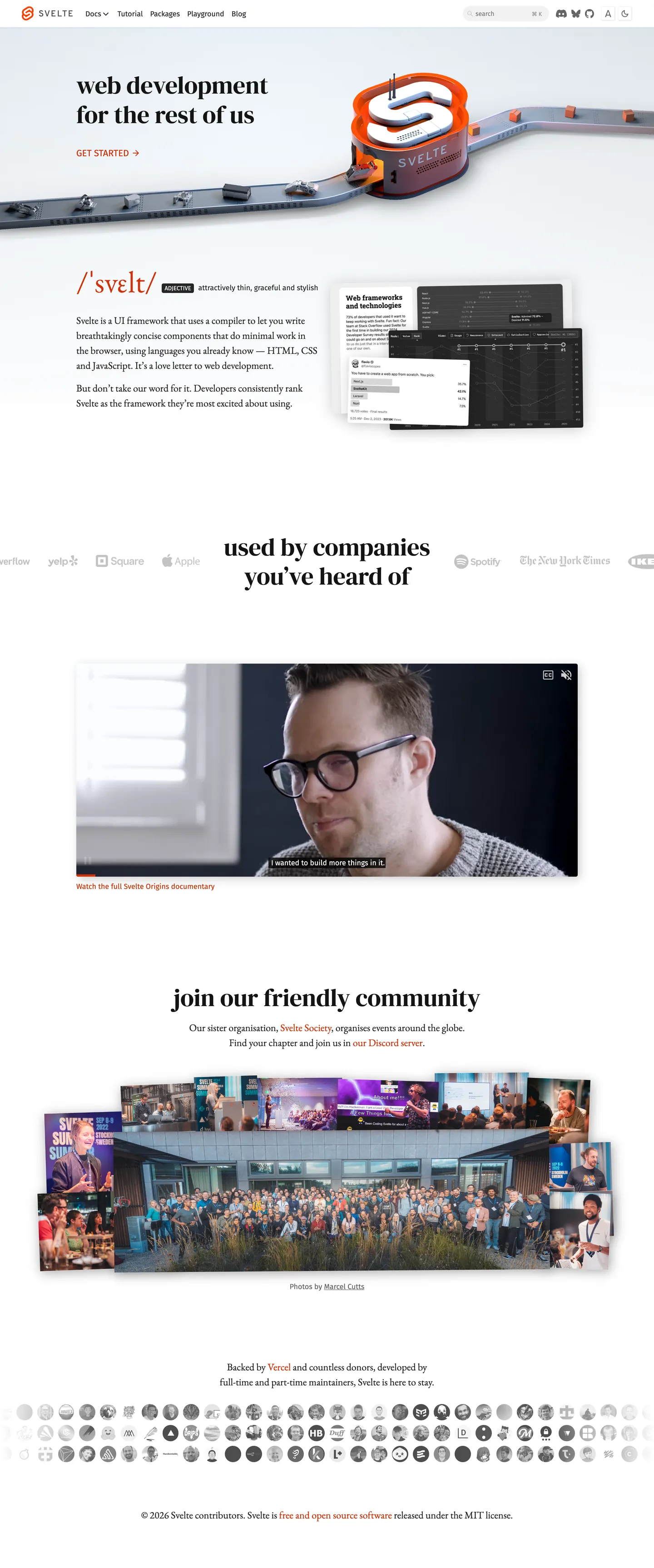
Svelte's marketing site announces its contrarian stance through typography before you read a single word. The hero headline — "web development for the rest of us" — renders in DM Serif Display at 54px weight 500. The body paragraph below it is set in EB Garamond at 22px. Nav links run in Fira Sans. Three families, none of them the neutral grotesque that React, Vue, Remix, and every other framework site defaults to. The serif headline reads like an editorial manifesto; the serif body copy reads like a book. For a developer tool, the choice is pointed: Svelte is not trying to look like a FAANG-adjacent product.
The single chromatic move is an orange-red voltage — present in the CSS as `--sk-bg-accent` and `--sk-fg-accent` — that runs through the page at high frequency. Unlike Cloudflare, which deploys its orange as a full-bleed hero canvas, or Spline, which reserves cobalt blue for a single CTA, Svelte's orange bleeds everywhere: it colors nav links, code syntax function tokens, button borders, and the prominent "GET STARTED" label above the fold. With 236 total uses across text (118) and border (118) roles, this is not a restrained accent — it is the brand's voice at full volume. The white canvas never competes; it just holds the stage.
For React developers reaching for Svelte's aesthetic, the operative discipline is the type hierarchy: DM Serif Display as the loudest voice, Garamond as the reading voice, Fira Sans as the functional voice. Mixing all three at the right tier creates the indie-editorial tension that distinguishes Svelte from every sleeker framework site. The radius scale is tight (4px default, 2px inner) — do not round corners up toward the 12-16px tier that SaaS products favor. The orange works at high frequency precisely because the canvas is white and the typography is so conservative in weight.
What makes it distinct
5
- Triple-family type stackDM Serif Display for headings, EB Garamond for body text, Fira Sans for UI labels; no other framework in the frontend space does this
- Scorched orange at maximum volumethe brand accent appears 236 times across the page in text, nav, code syntax, and borders — never held in reserve
- Serif body copyEB Garamond at 22px/33px brings editorial newspaper weight to a developer-tools site; every peer (React, Vue, Angular) uses a sans
- 4px tight radiuseven interactive elements stay at 4px or 2px inner; the contrast with the serif typography signals scrappy-indie, not polished SaaS
- Flat elevationno shadows, no tonal surface lifts; depth comes from the hairline border on cards and the accent color alone
svelte.dev
Live at svelte.dev
A snapshot of the brand in production. Scroll the frame to see the whole page.
Colors
11 colors
Svelte's system runs on #d43008 as its primary voltage, used in 4 of 14 components. Type is set in Fira Sans across 8 tokens from 13px to 54px, weights 400–500. Shape language is sharp — components average 4px corner radius, favoring crisp rectangles.
Brand & Accent
Sparing, CTA-only voltage · 1
Surface
Page and card backgrounds · 2
Text
Headlines, body, captions · 4
Borders & Hairlines
Dividers, outlines, rules · 1
Other
Specialty colors · 3
Typography
8 type tokens
Set in Fira Sans across 8 tokens, from 13px to 54px, weights 400–500. Shown in its own stack: where the font isn't installed, the fallback the file names stands in.
- display-xl54px · weight 500 · lh 64.8pxThe quick brown fox jumps over the lazy dog
- display-md30px · weight 500 · lh 36pxThe quick brown fox jumps over the lazy dog
- body-lg22px · weight 400 · lh 33pxThe quick brown fox jumps over the lazy dog
- body-md20px · weight 400 · lh 30pxThe quick brown fox jumps over the lazy dog
- ui-lg20px · weight 400 · lh 30pxThe quick brown fox jumps over the lazy dog
- ui-md16px · weight 400 · lh 24pxThe quick brown fox jumps over the lazy dog
- ui-sm13px · weight 400 · lh 19.5pxThe quick brown fox jumps over the lazy dog
- mono-md14px · weight 400 · lh 23.8pxThe quick brown fox jumps over the lazy dog
Layout
Radii and spacing
4 corner radii and 7 spacing values. Shape language: sharp.
Radii
- none0px
- inner2px
- sm4px
- full56px
Spacing
- xs5px
- sm10px
- md16.5px
- lg27px
- xl40px
- 2xl48px
- 3xl100px
Components
14 components
Each rendered from its tokens (color, type, radius, padding) on Svelte's own canvas.
- Button Primarybutton-primaryButton Primary
- Button Secondarybutton-secondaryButton Secondary
- Top Navtop-navTop Nav
- Nav Linknav-linkNav Link
- Hero Headinghero-headingHero Heading
- Body Paragraphbody-paragraphBody Paragraph
- CardcardCard
- Type here…text-inputText Input
- Code Blockcode-blockCode Block
- Code Inlinecode-inlineCode Inline
- Section Headingsection-headingSection Heading
- CaptioncaptionCaption
- Logo Chiplogo-chipLogo Chip
- FooterfooterFooter
In use
The system, in use
Svelte's tokens on the kind of product it builds.
Build something people actually use.
A short paragraph of marketing copy that previews how the brand's display tier and body tier read together. Two sentences is usually enough.
import { build } from "./build"

export async function main() {
  const result = await build()
  console.log("done", result)
}
FAQ
Svelte design system FAQ
Common questions about Svelte's tokens, components, and how to use this DESIGN.md in your project.
Read next
Related reading
Specs, directories, and component libraries that pair with this design system.
- Browse all design systemsThe full directory of DESIGN.md files on shadcn.io, with live mockups for each.shadcn.io
- Svelte — official siteSvelte's public marketing site — the source of truth for the live tokens captured in this file.svelte.dev (opens in a new tab)
- The DESIGN.md specificationGoogle Labs' open spec for machine-readable design system files — the format this page is built on.github.com (opens in a new tab)
Use it
Use Svelte in your project
One machine-readable file. Drop it into Claude, Cursor, or any AI tool that reads DESIGN.md.
Download the DESIGN.md
One machine-readable file: every color, type, radius, spacing, and component token of Svelte.
Feed it to your AI tool
Drop it into Claude, Cursor, or GitHub Copilot. The agent writes React components and Tailwind classes that match Svelte's visual language.
Reference the tokens directly
Or paste the values into your Tailwind config, CSS variables, or component library: every color, size and radius is a quoted, ready-to-copy value.
Read the full DESIGN.md: overview, rationale, do’s and don’ts
Overview
Svelte's marketing site is the only major framework site that refuses the neutral grotesque. Serif as Manifesto. The headline is DM Serif Display, the body is EB Garamond, and the UI labels are Fira Sans — a three-family editorial stack that reads more like a literary journal than a developer tool. Where React.dev uses Inter, Vue.js uses Inter, and Angular uses Roboto, Svelte chooses serifs, and the choice lands as a statement: "web development for the rest of us" means not looking like the rest of them.
The accent voltage — a scorched orange-red, CSS {colors.accent} — runs at extraordinary frequency. With 236 measured uses across the page (118 as text, 118 as border), the orange is not a held-in-reserve accent like Spline's cobalt or Cloudflare's Kumo brand on its below-fold surfaces. It colors every nav link, the GET STARTED label, function tokens in code blocks, and hairlines between sections. The white canvas provides the only neutral air.
Key Characteristics:
- DM Serif Display at 54px / weight 500 for the hero headline — the loudest display statement in the frontend framework space.
- EB Garamond as the body voice, at 22px / 33px line height — a newspaper-weight serif in a category defined by grotesque UI fonts.
- Fira Sans as the functional third voice for nav links, captions, and small UI elements.
- Scorched-orange accent at saturation — 236 occurrences across text, border, and syntax roles; not scarce, not held in reserve.
- Pure white canvas with a light gray surface tier for raised elements and code blocks.
- 4px default radius (inner radius 2px) — tight and utility-first, contrasting with the editorial serif stack.
- Flat elevation: no drop shadows anywhere; card depth is a hairline border only.
- Mono voice (Fira Mono) reserved exclusively for code surfaces.
Colors
Brand
- Accent (
{colors.accent}— #d43008): frequency 236. Used as text (118), border (118). The sole chromatic voltage; functions as nav link color, GET STARTED label, code syntax for function tokens, and structural borders across the page. Saturated scorched orange-red.
Text
- Ink (
{colors.ink}— #141414): frequency 6. Used as text (3), border (3). The darkest text tier; reserved for the hero heading and primary headings. - Ink Secondary (
{colors.ink-secondary}— #262626): frequency 153. Used as text (77), background (1), border (75). The dominant prose color — body paragraphs, h2s, card text, and most structural elements. - Ink Muted (
{colors.ink-muted}— #666666): frequency 9. Used as background (5), text (2), border (2). Caption-tier color for sub-labels and metadata. - Ink Faint (
{colors.ink-faint}— #808080): frequency 2. Used as text (1), border (1). Faintest text tier for comments and secondary metadata.
Canvas & Surface
- Canvas (
{colors.canvas}— #ffffff): frequency 9. Used as text (3), background (3), border (3). The page floor; pure white. - Surface-1 (
{colors.surface-1}— #f2f2f2): frequency 2. Used as background (2). Raised element surface — code blocks, card backgrounds, hairline highlight.
Hairlines
- Hairline (
{colors.hairline}— #f2f2f2): the border tone for cards and raised elements; shared with the surface background.
Syntax
- Syntax Keyword (
{colors.syntax-keyword}— #0074c2): declared as --shiki-token-keyword and --shiki-token-link. Appears in embedded code examples for keywords and link tokens. - Syntax String (
{colors.syntax-string}— #994d00): declared as --shiki-token-string and --shiki-token-string-expression. Amber-brown for string literals in code samples.
Typography
Font Families
The system runs three families simultaneously. DM Serif Display (Google Fonts — free) carries every headline and section title. EB Garamond (Google Fonts — free) carries all body prose. Fira Sans (Google Fonts — free) carries UI labels, nav links, buttons, and captions. This is the defining move: a framework site where reading a marketing paragraph feels like reading an essay, not a landing page.
Fira Mono handles code blocks and syntax annotations. It is the fourth voice, scoped entirely to code surfaces.
Hierarchy
| Token | Size | Weight | Line Height | Use |
|---|---|---|---|---|
{typography.display-xl} | 54px | 500 | 64.8px | Hero h1, above-fold headline |
{typography.display-md} | 30px | 500 | 36px | Section h2 ("used by companies you've heard of") |
{typography.body-lg} | 22px | 400 | 33px | Body prose — the dominant reading tier |
{typography.body-md} | 20px | 400 | 30px | Larger body instances, intro paragraphs |
{typography.ui-lg} | 20px | 400 | 30px | Nav links in uppercase variant |
{typography.ui-md} | 16px | 400 | 24px | Standard UI label, button text, nav links |
{typography.ui-sm} | 13px | 400 | 19.5px | Small captions, footnotes |
{typography.mono-md} | 14px | 400 | 23.8px | Code blocks and inline code snippets |
Substitutes
DM Serif Display: substitute Playfair Display at weight 600 or Lora at weight 600. EB Garamond: substitute Libre Baskerville at weight 400 or Source Serif 4 at weight 400. Fira Sans: substitute Inter or DM Sans at weight 400. The three-family split is the move to preserve — the specific families are secondary.
Layout
Spacing System
- Base unit: 5px (with 10px as the body module).
- Page side padding: 48px horizontal (
{spacing.2xl}), matching --sk-page-padding-side. - Section vertical padding: 100px top and bottom (
{spacing.3xl}), matching --sk-page-padding-top and --sk-page-padding-bottom. - Nav height: 60px.
- Content max-width: 76rem (~1216px), declared as --sk-page-content-width.
Grid & Container
- Full-bleed hero: above-fold section spans full width; headline and body stack center-aligned.
- Feature section: two-column layout with code sample left, prose right.
- Company logo wall: horizontal scrolling strip of monochrome partner logos.
- Community section: full-bleed image with overlay text.
Rhythm
The page alternates between wide editorial text sections (DM Serif Display heading + Garamond body) and demonstration panels (code block or video embed). Section breaks are marked by the accent color or a hairline border, never by background-color changes.
Elevation
The system is shadow-free. Cards and code blocks are distinguished from the canvas by hairline borders ({colors.hairline} — the same #f2f2f2 as Surface-1), not by shadows or tonal lifts. A faint drop shadow is declared in CSS as --sk-shadow (drop-shadow 14px, opacity 10%) but is applied sparingly — primarily on raised floating elements like the REPL editor panel. The raised card effect (--sk-raised-color, --sk-raised-shadow) uses a 1-2px beveled border in light silver tones, producing an old-school inset/outset button aesthetic that matches the scrappy-indie brand tone.
Shapes
The radius scale is tight and utility-first:
{rounded.none}0px — body, hero, most editorial sections.{rounded.inner}2px — inner radius on nested interactive elements; declared as --sk-border-radius-inner.{rounded.sm}4px — the default for buttons, cards, code blocks, inputs; declared as --sk-border-radius.{rounded.full}56px — pill treatment for promotional badge chips and large CTAs.
There is no 8px, 12px, or 16px tier. The tightest two values cover nearly every surface.
Components
button-primary — Scorched-orange {colors.accent} fill, white text, {rounded.sm} 4px radius. The "GET STARTED" instance sits above the fold in the hero at left-aligned position, not centered.
button-secondary — Transparent fill with orange text and a 1px orange border. Used for secondary calls-to-action in the hero and feature sections.
top-nav — White canvas surface, 60px height, 48px horizontal padding. Nav links render in orange, not in ink — the brand accent does the visual work of the navigation labels.
nav-link — Accent orange text, Fira Sans 16px / weight 400, left-padded at 48px. No hover background in the captured surface.
hero-heading — DM Serif Display at 54px / weight 500 in ink (#141414). The slowest, most editorial moment on a framework site.
section-heading — DM Serif Display at 30px / weight 500; appears for h2s like "used by companies you've heard of."
body-paragraph — EB Garamond 22px / weight 400 in ink-secondary (#262626). The reading rhythm of the page.
card — White canvas fill, hairline border, 4px radius, 10px padding. No shadow.
text-input — White canvas fill, hairline border, Fira Sans 16px, 4px radius, 5-10px padding.
code-block — Surface-1 (#f2f2f2) fill, Fira Mono 14px, accent color for function tokens. 4px radius, 10px padding.
code-inline — Surface-1 fill, accent text, 2px inner radius, 0-5px padding.
caption — Ink-muted (#666666) text, Fira Sans 13px.
footer — White canvas, ink-muted text, Fira Sans 13px, 40-48px padding.
Do's and Don'ts
Do use all three font families at their assigned tiers. DM Serif Display belongs to headings only; EB Garamond belongs to body prose only; Fira Sans belongs to UI elements only. Mixing them at the wrong tier — Garamond for buttons, Fira Sans for headings — breaks the editorial hierarchy that is Svelte's identity.
Do deploy the scorched-orange accent ({colors.accent} — #d43008) at high frequency in nav and interactive roles. This is not a scarce single-CTA voltage; it is the page's chromatic pulse. Constraining it to one element would read as a different brand.
Do keep the canvas pure white. The editorial serif typography reads best against white; any tinted or dark canvas changes the brand register from "scrappy indie" to "SaaS product."
Do keep the radius scale at 4px maximum for UI elements. The tight corners reinforce the utility-first, code-first signal.
Don't use a 12px or 16px border radius. The system explicitly tops out at 4px ({rounded.sm}) for interactive elements. Larger radii push the page toward a consumer-SaaS aesthetic that contradicts the Garamond body copy.
Don't replace the scorched orange with a brighter or more saturated variant. The #d43008 value reads as fire-engine red-orange at lower brightness than a pure red; swapping it for a louder fire-orange loses the warmth that makes the serif stack feel intentional rather than garish.
Don't add a drop shadow to cards. The system uses hairline borders for elevation on a white canvas; shadows would look out of place against a surface where every other elevation cue is flat.
Don't use gradient backgrounds in sections. The page is pure white throughout; introducing a gradient tint would work against the editorial newspaper character that makes Svelte's marketing position legible.
Known Gaps
- Primary button exact state: the extraction found no standalone primary button component with a captured background color; the button identity is inferred from the accent color CSS variables and nav behavior.
- Dark mode: Svelte's site exposes dark-mode variables (--sk-fg-1, --sk-bg-1 etc. flip on dark preference), but the captured surface is light-mode only.
- Hover and focus states: only resting states captured; the raised-button hover color is inferred from --sk-raised-hover-color but not measured on an interactive element.
- Mobile layout: nav collapses to hamburger; padding and font-size adjustments below 768px are not represented in the captured tokens.
- REPL / interactive editor: the embedded Svelte REPL on the docs surface has a richer token system (split panels, gutter colors, active-line highlights) not captured from the marketing page.
- SvelteKit-specific surfaces: the SvelteKit microsite at kit.svelte.dev has a partially distinct token set; this file covers svelte.dev only.
Developer Tools & IDEs
More systems like this
More DESIGN.md files in Developer Tools & IDEs.
Pricing
Build it with Pro
The DESIGN.md files are free. Pro adds 6,000+ blocks, premium templates and the MCP server, so your AI editor builds in your system for you.
4.9/5 out of 5 · 150+ reviewsfrom 150+ founders and developers.
Billing
Billed once a year in USD. Cancel anytime.
- How many people can use the license.
- Client work, SaaS products and anything you charge for.
- Production-ready React sections: hero, pricing, features, dashboards and more.
- Complete multi-page sites you can ship as they are.
- React icons from every major library, installable with one command.
- Presets that restyle every block, in light and dark.
- Lets your AI editor search, preview and install blocks for you.
- Priority requests are answered first.
Individual
For personal projects & open source
$32instead of $49/mo
$389 billed yearly
- Seats: 1 seat
- Commercial use: Personal & open source only
- Pro blocks: 6,000+ blocks
- Templates: All 14 templates
- React icons: 294k+ icons
- Themes: All 59 themes
- MCP server: Basic usage
- Support: Standard
Team
Most popularFor freelancers, agencies & startups
$66instead of $99/mo
$789 billed yearly · ≈ $13/dev/mo
- Seats: Up to 5 seats
- Commercial use: Included
- Pro blocks: 6,000+ blocks
- Templates: All 14 templates
- React icons: 294k+ icons
- Themes: All 59 themes
- MCP server: High usage
- Support: Priority
Organization
For companies with larger teams
$132instead of $199/mo
$1,589 billed yearly
- Seats: Unlimited seats
- Commercial use: Included
- Pro blocks: 6,000+ blocks
- Templates: All 14 templates
- React icons: 294k+ icons
- Themes: All 59 themes
- MCP server: Unlimited usage
- Support: Priority
Billed once a year in USD. Cancel anytime.
Individual
For personal projects & open source
$32instead of $49/mo
$389 billed yearly
- How many people can use the license.Seats: 1 seat
- Client work, SaaS products and anything you charge for.Commercial use: Personal & open source only
- Production-ready React sections: hero, pricing, features, dashboards and more.Pro blocks: 6,000+ blocks
- Complete multi-page sites you can ship as they are.Templates: All 14 templates
- React icons from every major library, installable with one command.React icons: 294k+ icons
- Presets that restyle every block, in light and dark.Themes: All 59 themes
- Lets your AI editor search, preview and install blocks for you.MCP server: Basic usage
- Priority requests are answered first.Support: Standard
Team
Most popularFor freelancers, agencies & startups
$66instead of $99/mo
$789 billed yearly · ≈ $13/dev/mo
Everything in Individual, plus
- How many people can use the license.Seats: Up to 5 seats
- Client work, SaaS products and anything you charge for.Commercial use: Included
- Lets your AI editor search, preview and install blocks for you.MCP server: High usage
- Priority requests are answered first.Support: Priority
Organization
For companies with larger teams
$132instead of $199/mo
$1,589 billed yearly
Everything in Team, plus
- How many people can use the license.Seats: Unlimited seats
- Lets your AI editor search, preview and install blocks for you.MCP server: Unlimited usage
- Secure checkout via Stripe
- Code lives in your repo
- Keep what you've shipped if you cancel
- License terms
Your system, built for you
Every block, template and icon, installed by your AI agent in your design system. The DESIGN.md files stay free.