Supreme Design System
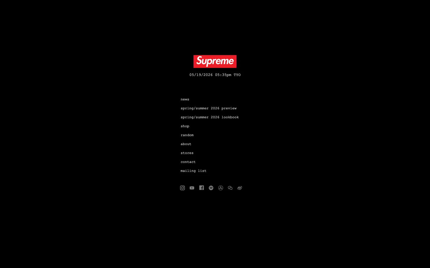
Supreme's homepage as a DESIGN.md file — a pure black canvas, Courier New across every tier, lowercase navigation, and a centered red box-logo image. The anti-hero homepage in machine-readable form.
Add shadcn.io to your AI agent. · Pro It installs blocks, icons and templates in your design system from a prompt, with Pro.
Set up MCP- Primary
- #000000
- Typeface
- Courier New
- Shape
- Sharp
- Base radius
- 0px
- Colors
- 2
- Type tokens
- 6
- Components
- 13
- Spacing values
- 8
About
About Supreme DESIGN.md
Curated by Dov Azencot · Updated May 19, 2026 · Source supreme.com (opens in a new tab)
Supreme's homepage is the anti-marketing homepage. The page is a pure black canvas; centered roughly one-fifth from the top sits the famous red box-logo wordmark as a 60x35-pixel raster image; directly beneath it, the current Tokyo time renders as `05/19/2026 05:35pm TYO` in 13px Courier New; beneath that, a stack of nine all-lowercase navigation links (news / spring/summer 2026 preview / spring/summer 2026 lookbook / shop / random / about / stores / contact / mailing list) sit at 12px / 400 with a 4px gap; and beneath the link stack, six monochrome social-platform glyphs (Instagram, YouTube, Facebook, Spotify, App Store, WeChat) align in a horizontal row. There is no hero image, no headline, no body paragraph, no scroll content, no CTA, no surface ladder, and no chrome of any kind below the social row. Where every other commerce site spends the homepage selling, Supreme spends the homepage refusing.
The DESIGN.md file packages this refusal into a machine-readable spec for React tooling. Inside: 2 colors tokens (the pure-black canvas at frequency 11 and the pure-white text at frequency 87 — those are the only two values that exist on the surface), 6 typography tokens all running Courier New at 10-13px in weight 400, zero radius tokens (every element renders at 0px corners), 2 spacing tokens (a 4px inter-link gap and a 2px intra-cluster gap), and 13 components definitions covering the centered link stack, the masthead timestamp, the social-glyph row, the box-logo plate, and the implicit footer-equivalent that simply does not exist. The red box-logo color is observed visually but lives in the raster asset, so the captured CSS palette is two tones only.
Feed this file to Claude or Cursor and it reproduces Supreme's specific moves: pure black canvas instead of white, Courier New as the only typeface, all-lowercase navigation, zero corner radius, and the willingness to ship a homepage with no content beyond a logo and nine links. The one move worth borrowing only if your brand has the cultural authority Supreme has: the willingness to refuse the homepage entirely. Most brands need an interstitial layer of explanation. Supreme has spent thirty years training its audience to know that the lookbook drops Thursday and the shop opens at 11am Eastern, so the homepage can be a mailbox rather than a billboard.
What makes it distinct
5
- Anti-marketing minimumno hero, no headline, no CTA, no scroll content; the homepage is just logo + timestamp + nine lowercase links
- Courier New monocultureevery text surface runs Courier New 10-13px / 400 with normal letter-spacing; no second typeface anywhere
- Box-logo as rasterthe red box-logo wordmark is an image asset rather than a CSS background fill, so the brand voltage sits outside the captured color palette
- Lowercase navigationnine link labels (news / spring/summer 2026 preview / shop / random / about / stores / contact / mailing list) at 12px / 400, no caps, no chrome
- Tokyo timestamp as mastheada live-updating timestamp (05/19/2026 05:35pm TYO) sits between the box-logo and the link stack; the only motion on the page
supreme.com
Live at supreme.com
A snapshot of the brand in production. Scroll the frame to see the whole page.
Colors
2 colors
Supreme's system runs on #000000 as its primary voltage, used in 6 of 13 components. Type is set in Courier New across 6 tokens from 10px to 13px, weights 400–400. Shape language is sharp — components average 0px corner radius, favoring crisp rectangles.
Surface
Page and card backgrounds · 1
Text
Headlines, body, captions · 1
Typography
6 type tokens
Set in Courier New across 6 tokens, from 10px to 13px, weights 400–400. Shown in its own stack: where the font isn't installed, the fallback the file names stands in.
- display-md13px · weight 400 · lh 14.04pxThe quick brown fox jumps over the lazy dog
- body-md12px · weight 400 · lh 14.4pxThe quick brown fox jumps over the lazy dog
- body-sm11px · weight 400 · lh 13.2pxThe quick brown fox jumps over the lazy dog
- caption10px · weight 400 · lh 12pxThe quick brown fox jumps over the lazy dog
- nav-link12px · weight 400 · lh 14.4pxThe quick brown fox jumps over the lazy dog
- button-md12px · weight 400 · lh 14.4pxThe quick brown fox jumps over the lazy dog
Layout
Radii and spacing
1 corner radii and 8 spacing values. Shape language: sharp.
Radii
- none0px
Spacing
- xxs2px
- xs4px
- sm8px
- md12px
- base16px
- lg24px
- xl32px
- 2xl48px
Components
13 components
Each rendered from its tokens (color, type, radius, padding) on Supreme's own canvas.
- BodybodyBody
- Hero Sectionhero-sectionHero Section
- Box Logobox-logoBox Logo
- Hero Headinghero-headingHero Heading
- Body Paragraphbody-paragraphBody Paragraph
- Nav Stacknav-stackNav Stack
- Nav Linknav-linkNav Link
- Social Glyph Rowsocial-glyph-rowSocial Glyph Row
- Social Glyphsocial-glyphSocial Glyph
- Button Primarybutton-primaryButton Primary
- Button Secondarybutton-secondaryButton Secondary
- Type here…text-inputText Input
- CardcardCard
In use
The system, in use
Supreme's tokens on the kind of product it builds.
Build something people actually use.
A short paragraph of marketing copy that previews how the brand's display tier and body tier read together. Two sentences is usually enough.
@curated.creator
Designer · Photographer · Writer
FAQ
Supreme design system FAQ
Common questions about Supreme's tokens, components, and how to use this DESIGN.md in your project.
Read next
Related reading
Specs, directories, and component libraries that pair with this design system.
- Browse all design systemsThe full directory of DESIGN.md files on shadcn.io, with live mockups for each.shadcn.io
- Supreme — official siteSupreme's public marketing site — the source of truth for the live tokens captured in this file.supreme.com (opens in a new tab)
- The DESIGN.md specificationGoogle Labs' open spec for machine-readable design system files — the format this page is built on.github.com (opens in a new tab)
Use it
Use Supreme in your project
One machine-readable file. Drop it into Claude, Cursor, or any AI tool that reads DESIGN.md.
Download the DESIGN.md
One machine-readable file: every color, type, radius, spacing, and component token of Supreme.
Feed it to your AI tool
Drop it into Claude, Cursor, or GitHub Copilot. The agent writes React components and Tailwind classes that match Supreme's visual language.
Reference the tokens directly
Or paste the values into your Tailwind config, CSS variables, or component library: every color, size and radius is a quoted, ready-to-copy value.
Read the full DESIGN.md: overview, rationale, do’s and don’ts
Overview
Supreme's homepage refuses every marketing-page convention. Anti-marketing minimum: the page is a pure black canvas carrying nothing but a 60x35px red box-logo wordmark, a live Tokyo timestamp, nine all-lowercase navigation links, and a row of six monochrome social glyphs. There is no hero image, no headline, no body paragraph, no CTA, no scroll content, no surface ladder. Where Off-White opens with full-screen lookbook photography and Palace opens with skater-video b-roll, Supreme opens with the equivalent of a fluorescent-lit mail room. The minimalism is itself the brand statement — refusing to do the homepage work that every other commerce site does is a status signal that only carries with thirty years of drop-culture authority.
The chromatic system is two values. The captured CSS palette is {colors.canvas} (#000000) at frequency 11 and {colors.ink} (#ffffff) at frequency 87. The red of the box-logo — the brand's only chromatic moment — is rendered as a raster image rather than a CSS background fill, so it sits outside the token system entirely. This is the inverse of every other brand's approach: instead of declaring the brand voltage in CSS and letting it propagate to buttons, links, and accents, Supreme keeps the chromatic identity locked inside a single image asset and renders the rest of the page as a duotone. Buttons elsewhere on the site invert white-on-black or black-on-white; nothing on the homepage uses the red except the logo image itself.
Courier New monoculture: every text surface — the timestamp at {typography.display-md} (13px), the nine navigation links at {typography.nav-link} (12px), the social-glyph aria labels at {typography.caption} (10px) — runs Courier New at weight 400. There is no second typeface anywhere on the captured surface. Where streetwear peers run Helvetica monoculture (Stüssy, Palace) or display serif systems (Aimé Leon Dore), Supreme runs Courier New monoculture — the typeface of receipts, IRS forms, and zine photocopies. The choice positions the brand outside both luxury and contemporary-streetwear registers, closer to a fanzine or a band flyer than to a fashion house.
Key Characteristics:
- Pure two-tone duotone —
{colors.canvas}(#000000) and{colors.ink}(#ffffff). The red box-logo lives in a raster asset, not in the token system. - Courier New across every text surface at 10-13px / 400. The typeface of receipts, used here as the typeface of an entire luxury streetwear brand.
- Anti-marketing homepage — no hero image, no headline, no CTA, no scroll content, no footer below the social-glyph row.
- All-lowercase navigation labels —
news / spring/summer 2026 preview / spring/summer 2026 lookbook / shop / random / about / stores / contact / mailing listat 12px / 400. - Zero border-radius on every element — sharp 0px corners across the timestamp, link hit-targets, social glyphs, and the box-logo plate.
- Live Tokyo timestamp (
05/19/2026 05:35pm TYO) as the only motion on the page — refreshes per minute, updates the brand's global routing implicitly. - 4px inter-link spacing inside the nav stack — the only non-trivial spacing value declared by the system.
- Six monochrome social-platform glyphs in a horizontal row (Instagram, YouTube, Facebook, Spotify, App Store, WeChat) at 16px height — every platform mark flattened to white on black, no native brand colors.
Colors
- Canvas (
{colors.canvas}— #000000): frequency 11. Used as text (5), background (1), border (5). The page floor and the active state of every interactive element. Pure black with no warm undertone, no near-black softening, no surface ladder — the homepage is literally a flat black rectangle with text floating in the centered safe zone. - Ink (
{colors.ink}— #ffffff): frequency 87. Used as text (43), background (1), border (43). The dominant text color across every surface — timestamp, navigation links, social-glyph fills, and any hover state that inverts (black text on a white surface). Pure white with no muted variant; the system has noink-mutedtier because there is no secondary text role to render.
Observed but untokenized
- Box-logo red: the famous Supreme red box-logo is rendered as a raster image (
.png/.svg) rather than as a CSS background fill orcurrentColorSVG. The red is visually consistent with the print box-logo (close to#da2128in spot color) but never appears in the captured CSS palette. This is intentional — keeping the brand voltage inside an image asset prevents accidental propagation of the red into buttons or links, which would dilute its scarcity.
Typography
Font Family
The system runs Courier New for every surface. The fallback stack walks Courier, monospace. There is no second typeface anywhere on the captured homepage — no display serif, no editorial sans, no second monospace. Courier New is the system monospace already shipped with macOS and Windows, so no font loading happens; the page renders the typeface instantly from the OS, which is consistent with the larger anti-decoration framing of the brand.
The use of Courier New as the entire typographic system is the homepage's most distinctive move. Courier New is the typeface of receipts, IRS forms, terminal output, and zine photocopies. Using it across a fashion site is a refusal of luxury-commerce typographic conventions (which tend toward bespoke display serifs or geometric sans) and a refusal of contemporary-streetwear conventions (which tend toward Helvetica or a Helvetica clone). The choice has stayed consistent since the early-2000s site, which gives it heritage standing inside the brand.
Hierarchy
| Token | Size | Weight | Line Height | Use |
|---|---|---|---|---|
{typography.display-md} | 13px | 400 | 14.04px | The live Tokyo timestamp (05/19/2026 05:35pm TYO) directly beneath the box-logo |
{typography.body-md} | 12px | 400 | 14.4px | Nine navigation links and any future body copy |
{typography.body-sm} | 11px | 400 | 13.2px | Reserved for secondary annotations not present on the homepage |
{typography.caption} | 10px | 400 | 12px | Social-glyph aria labels and microcopy |
{typography.nav-link} | 12px | 400 | 14.4px | The nine all-lowercase navigation links |
{typography.button-md} | 12px | 400 | 14.4px | Any button label on internal pages (no buttons on the homepage) |
Principles
Every text size sits between 10px and 13px. The widest type on the page is the 13px timestamp; the smallest is the 10px caption tier. Weight is 400 everywhere — there is no bold, no semibold, no italic. Letter-spacing is normal on every token; line-height tracks Courier New's default metrics (~1.08).
The deliberate refusal of typographic hierarchy is itself the move. Most commerce sites differentiate a display tier (hero headline) from a body tier (paragraph copy) by 3-5x size and 200-400 weight steps. Supreme uses a 1.3x size step (10px to 13px) and zero weight variation. The result reads as system output rather than as designed editorial — closer to a terminal status line than to a marketing page.
Note on Font Substitutes
Courier New is the system monospace already shipped with macOS and Windows; the fallback stack walks Courier, monospace, both of which are guaranteed to resolve locally. If you want an open-source alternative with the same letterforms re-drawn for screen, Courier Prime is the closest match. For a mechanical-typewriter feel with better hinting at small sizes, IBM Plex Mono at weight 400 transfers cleanly; for a tighter, more contemporary mono, Cousine is the closest free alternative.
Layout
Spacing System
- Base unit: 2px — the smallest measured gap, declared on the page as
0px 2pxon the link-stack container. - Tokens:
{spacing.xxs}2px ·{spacing.xs}4px ·{spacing.sm}8px ·{spacing.md}12px ·{spacing.base}16px ·{spacing.lg}24px ·{spacing.xl}32px ·{spacing.2xl}48px. - Dominant gap:
{spacing.xs}(4px) — the vertical gap between each of the nine navigation links inside the centered stack. - Hero padding (vertical): ~180px from the top of the viewport to the box-logo — the entire centered cluster sits roughly in the upper-third of the page, with empty black floor beneath the social-glyph row stretching to the bottom edge.
- Hero padding (horizontal): ~24px — but the centered cluster is so narrow (~250px wide) that the horizontal padding is invisible.
Grid & Container
- Max content width: ~250px — the navigation stack is narrower than a smartphone viewport. The page does not use a 12-column grid or a wide container; the entire layout is a centered single-column flex stack with each child sized to its content.
- Centered single-column layout: the box-logo, timestamp, link stack, and social-glyph row all align center-horizontal and stack center-vertical inside a roughly 250x500px safe zone.
- No grid, no columns, no responsive breakpoints visible: the page renders identically at every viewport — the centered cluster simply sits in the middle of whatever surface is available.
Rhythm
The page has a single rhythm: each element in the centered stack is separated by ~16px of black canvas. There is no atmospheric variation, no surface-color shift, no scroll-triggered band. The rhythm is dead-quiet — closer to a mail-room directory than to a designed editorial.
Elevation
The system has zero elevation. There are no shadows, no surface ladders, no hairlines, no border outlines, no layered z-index moves on the captured homepage.
- Flat (no shadow): every element on the surface.
- No surface ladder: the page has only one surface tone (
{colors.canvas}). There is nosurface-1orsurface-elevatedtier because there is nothing on the page that needs to lift. - No hairlines: the captured page has zero border occurrences. The wider site (shop pages, product detail) presumably introduces hairlines for product grids, but the homepage does not need them.
The absence of elevation is consistent with the larger anti-decoration framing — the page renders as a single flat plane with text floating in the middle.
Shapes
The radius scale is a single value: zero. Every element on the captured homepage uses {rounded.none} (0px) corners.
{rounded.none}0px — the box-logo plate, the timestamp baseline, the navigation link hit-targets, the social-glyph clickable areas, and the implicit form inputs (mailing list, search) all use sharp 0px corners.
There is no sm tier, no md tier, no pill tier. The captured CSS exposes no --rounded-* custom-property scale. The sharp-corner geometry is consistent with the larger refusal of decorative softening — corners stay architectural because the brand identity sits in a zine / fanzine / mail-room register, not in a 2020s SaaS register.
Components
body — Pure {colors.canvas} background, white text, Courier New body. The entire homepage is a single flex-column-center body with no wrapping section structure.
hero-section — Black canvas, ~180x24 top padding. Holds the centered cluster of box-logo + timestamp + link stack + social row.
box-logo — The famous Supreme box-logo rendered as a raster image (.png / .svg asset, not a CSS background). 60x35px size, centered, transparent surrounding plate. The single chromatic element on the page; the only departure from the duotone palette.
hero-heading — White text on the transparent hero, {typography.display-md} (13px / 400 Courier New). The live Tokyo timestamp (05/19/2026 05:35pm TYO) is the homepage's only h2 element and the only piece of dynamic content above the link stack.
body-paragraph — Default white text at {typography.body-md} (12px / 400). Reserved for any future body copy; not present on the captured homepage.
nav-stack — Centered single-column container holding the nine navigation links. {spacing.xs} (4px) vertical gap between children, {spacing.xxs} (2px) horizontal inset. Transparent fill; no border, no surface, no scroll.
nav-link — Transparent fill, white text at {typography.nav-link} (12px / 400), all lowercase. 4x0 padding, 0px corners. The hover treatment likely strikes through or color-shifts (the early Supreme site used a yellow hover) but is not visible on the static capture.
social-glyph-row — Horizontal row beneath the navigation stack, 16x0 padding, 44px height. Houses six platform glyphs (Instagram, YouTube, Facebook, Spotify, App Store, WeChat) at uniform white-on-black rendering.
social-glyph — White glyph at 16px height, 0x8 horizontal padding between siblings. Every platform mark flattened to monochrome white — no native Instagram gradient, no YouTube red, no Facebook blue.
button-primary — White {colors.ink} fill, black {colors.canvas} text, {typography.button-md} (12px / 400 Courier New), zero rounding, 8x16 padding, 32px height. Used on internal pages for "Add to bag" and "Sign up" — not present on the homepage.
button-secondary — Transparent fill, white text, 1px white border, zero rounding, 8x16 padding, 32px height. Used for cancel / back actions inside the checkout.
text-input — Black {colors.canvas} fill, white text, 1px {colors.ink} border, zero rounding, 8x12 padding, 32px height. Used in the mailing-list signup and search; absent from the captured homepage.
card — Black surface, white text, zero rounding, 16px padding. Used for product cards on the /shop index; absent from the homepage.
Do's and Don'ts
Do keep the homepage to the absolute minimum — logo, timestamp, navigation, social row. The anti-marketing minimum is the brand statement. Adding a hero image, a headline, or a "Shop the latest drop" CTA undoes thirty years of cultural positioning in a single change.
Do render Courier New across every text surface at 10-13px / 400. The monoculture is the typographic signature; introducing a second typeface (even Helvetica for body copy) breaks the zine / mail-room register.
Do keep the box-logo as a raster image asset rather than as a CSS background or an inline SVG with currentColor. Keeping the red voltage locked inside the image prevents accidental propagation into buttons or links, which would dilute the box-logo's scarcity.
Do keep navigation labels all-lowercase. The lowercase nav (news / shop / random / about) is part of the brand's typographic identity since the early-2000s site; switching to title case or all-caps reads as a different brand.
Don't render the navigation links as buttons with surface fills or border outlines. The system uses transparent-fill, no-border text links because the page is structured as a directory listing, not as a CTA stack. A border: 1px solid {colors.ink} treatment turns the directory into a button grid and breaks the mail-room reading.
Don't add a hover state that introduces the red box-logo color. The red sits inside the logo image and only there; using it on a link hover state propagates the brand voltage to the link tier and dilutes the scarcity. The early Supreme site used a yellow link hover precisely to avoid this — yellow has no semantic relationship to the brand red.
Don't introduce a corner radius anywhere — not 4px on the social glyphs, not 8px on the box-logo plate, not 2px on the navigation hit-targets. The sharp-corner geometry is the heritage move; even small rounding pulls the surface toward 2020s SaaS softness.
Don't scale type beyond the 10-13px range or introduce a weight variation. The page's deliberate refusal of typographic hierarchy is the move; bumping the timestamp to 18px or boldening the navigation labels breaks the system-output reading.
Known Gaps
- Box-logo color is untokenized: the red of the Supreme box-logo is the brand's load-bearing chromatic moment but lives inside a raster image rather than the CSS palette. The hex captured in the JSON is
nullfor this color; visually it sits close to#da2128in print but the rendered value is not measured. - Internal page surfaces: this DESIGN.md captures the homepage only. The
/shop,/news,/lookbook, and product-detail pages have their own grids and product-card systems not represented here. - Hover and focus states: the captured static surface does not expose link or button hover treatment. Historical sites have used yellow / black-on-white inversion, but the current behavior is not measured.
- Form input error states:
{component.text-input}carries an inferred resting state; the mailing-list signup and checkout error styling lives inside pages not captured here. - Mobile breakpoints: the captured surface is 1440px desktop. The centered cluster is narrower than any phone viewport so the layout presumably renders identically across breakpoints, but no media-query values are exposed in the CSS.
- Motion: the Tokyo timestamp updates per minute and is the only motion on the page. The hover micro-interactions on the navigation links are not represented.
- Drop-day surfaces: every Thursday at 11am Eastern, Supreme runs a drop and the homepage briefly surfaces drop-specific imagery and product cards. These transient surfaces are not represented in the captured tokens.
E-commerce & Retail
More systems like this
More DESIGN.md files in E-commerce & Retail.
Pricing
Build it with Pro
The DESIGN.md files are free. Pro adds 6,000+ blocks, premium templates and the MCP server, so your AI editor builds in your system for you.
4.9/5 out of 5 · 150+ reviewsfrom 150+ founders and developers.
Billing
Billed once a year in USD. Cancel anytime.
- How many people can use the license.
- Client work, SaaS products and anything you charge for.
- Production-ready React sections: hero, pricing, features, dashboards and more.
- Complete multi-page sites you can ship as they are.
- React icons from every major library, installable with one command.
- Presets that restyle every block, in light and dark.
- Lets your AI editor search, preview and install blocks for you.
- Priority requests are answered first.
Individual
For personal projects & open source
$32instead of $49/mo
$389 billed yearly
- Seats: 1 seat
- Commercial use: Personal & open source only
- Pro blocks: 6,000+ blocks
- Templates: All 14 templates
- React icons: 294k+ icons
- Themes: All 59 themes
- MCP server: Basic usage
- Support: Standard
Team
Most popularFor freelancers, agencies & startups
$66instead of $99/mo
$789 billed yearly · ≈ $13/dev/mo
- Seats: Up to 5 seats
- Commercial use: Included
- Pro blocks: 6,000+ blocks
- Templates: All 14 templates
- React icons: 294k+ icons
- Themes: All 59 themes
- MCP server: High usage
- Support: Priority
Organization
For companies with larger teams
$132instead of $199/mo
$1,589 billed yearly
- Seats: Unlimited seats
- Commercial use: Included
- Pro blocks: 6,000+ blocks
- Templates: All 14 templates
- React icons: 294k+ icons
- Themes: All 59 themes
- MCP server: Unlimited usage
- Support: Priority
Billed once a year in USD. Cancel anytime.
Individual
For personal projects & open source
$32instead of $49/mo
$389 billed yearly
- How many people can use the license.Seats: 1 seat
- Client work, SaaS products and anything you charge for.Commercial use: Personal & open source only
- Production-ready React sections: hero, pricing, features, dashboards and more.Pro blocks: 6,000+ blocks
- Complete multi-page sites you can ship as they are.Templates: All 14 templates
- React icons from every major library, installable with one command.React icons: 294k+ icons
- Presets that restyle every block, in light and dark.Themes: All 59 themes
- Lets your AI editor search, preview and install blocks for you.MCP server: Basic usage
- Priority requests are answered first.Support: Standard
Team
Most popularFor freelancers, agencies & startups
$66instead of $99/mo
$789 billed yearly · ≈ $13/dev/mo
Everything in Individual, plus
- How many people can use the license.Seats: Up to 5 seats
- Client work, SaaS products and anything you charge for.Commercial use: Included
- Lets your AI editor search, preview and install blocks for you.MCP server: High usage
- Priority requests are answered first.Support: Priority
Organization
For companies with larger teams
$132instead of $199/mo
$1,589 billed yearly
Everything in Team, plus
- How many people can use the license.Seats: Unlimited seats
- Lets your AI editor search, preview and install blocks for you.MCP server: Unlimited usage
- Secure checkout via Stripe
- Code lives in your repo
- Keep what you've shipped if you cancel
- License terms
Your system, built for you
Every block, template and icon, installed by your AI agent in your design system. The DESIGN.md files stay free.