Substack Design System
Substack's homepage as a DESIGN.md file. White canvas, near-black ink #363737, orange voltage #ff6719, Cahuenga serif, system-ui UI. For React, Next.js, and AI tools.
Add shadcn.io to your AI agent. · Pro It installs blocks, icons and templates in your design system from a prompt, with Pro.
Set up MCP- Primary
- #ff6719
- Typeface
- system-ui
- Shape
- Mixed
- Base radius
- 8px
- Colors
- 19
- Type tokens
- 10
- Components
- 19
- Spacing values
- 9
About
About Substack DESIGN.md
Curated by Dov Azencot · Updated May 13, 2026 · Source substack.com (opens in a new tab)
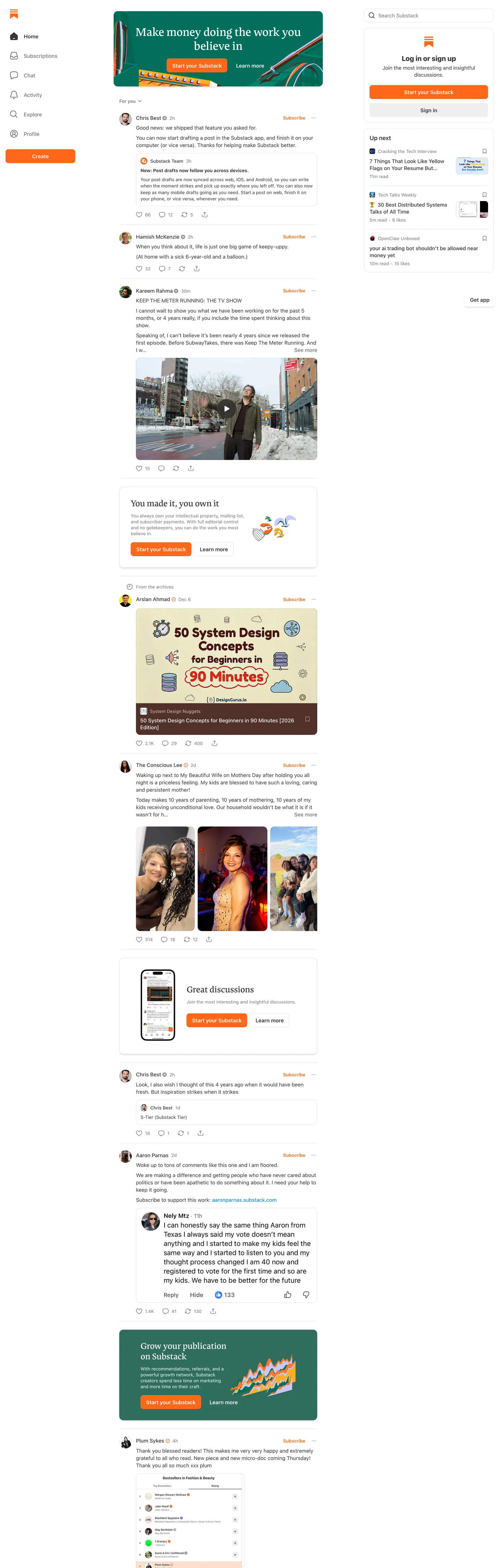
Substack's homepage is a feed of posts dressed as a marketing page. The canvas is pure white, the ink is a warm near-black ("#363737"), and the entire identity hangs on a single warm orange ("#ff6719") that does the work of wordmark, primary button fill, accent border, and the kicker chip beneath the hero. There is no gradient mesh, no dark hero section, no abstract product illustration loop — the page below the fold is the platform itself, rendered as a vertical column of real posts with avatars, reply threads, and emoji reactions. The marketing surface and the product surface are the same surface.
This DESIGN.md file packages the homepage system into a structured spec: 19 colors tokens covering the orange voltage, the four-step gray ladder from `#363737` ink down to `#eeeeee` hairline, and the single sky-blue link color, 10 typography tokens spanning Cahuenga serif (20–32px) and system-ui (13–17px), a four-step radius scale where the pill (`9999px`), the 12px card, the 8px button, and the 4px detail each own a distinct surface class, an 8-step spacing scale built on a strict 4px-and-8px unit, and 19 components specifications covering the top nav, hero cluster, primary orange button, post card, comment thread row, and the publication-detail mini-cards. The format follows the Google Labs DESIGN.md specification.
Feed the file to Claude, Cursor, or any agent that reads structured tokens and it reproduces Substack's exact voice — white reading-feed canvas, warm orange voltage held to one role, near-black ink at weight 500 for serif display, system-ui sans for every UI label. Where most subscription brands lean on a chromatic hero gradient and a 64px display headline, Substack commits the homepage to a vertical post-stream rendered at reading-body type sizes — that decision to show the product instead of describing it is the design. Reference the tokens directly in Tailwind config, paste the hex values into CSS variables, or use the spec as an audit checklist when reviewing whether a publishing surface looks like a marketing page or a feed.
What makes it distinct
5
- Single orange voltage#ff6719 used as the only saturated brand color, carrying the wordmark, primary CTA fill, and orange chip surfaces with zero gradient extension
- Cahuenga serif at 24–32px weight 500a literary serif treated at subhead scale rather than the 80px+ billboard most subscription platforms reach for
- Near-black ink #363737 over pure whitenot pure black, a warm dark gray that sits 8 points off black to soften the ink against long reading sessions
- Pill-and-card binary9999px chips for tags and primary buttons sit alongside 8px and 12px cards, with no 16px or 20px middle radius
- Hairline-only elevationa 1px #eeeeee divider carries every section break in place of shadows, with zero gradient surfaces anywhere on the page
substack.com
Live at substack.com
A snapshot of the brand in production. Scroll the frame to see the whole page.
Colors
19 colors
Substack's system runs on #ff6719 as its primary voltage, used in 5 of 19 components. Type is set in system-ui across 10 tokens from 13px to 32px, weights 400–700. Shape language is mixed across 19 components, blending pills, soft rounds, and squarer corners.
Brand & Accent
Sparing, CTA-only voltage · 1
Surface
Page and card backgrounds · 7
Text
Headlines, body, captions · 8
Borders & Hairlines
Dividers, outlines, rules · 2
Other
Specialty colors · 1
Typography
10 type tokens
Set in system-ui across 10 tokens, from 13px to 32px, weights 400–700. Shown in its own stack: where the font isn't installed, the fallback the file names stands in.
- display-lg32px · weight 500 · lh 1.24 · tracking 0The quick brown fox jumps over the lazy dog
- display-md24px · weight 500 · lh 1.25 · tracking 0The quick brown fox jumps over the lazy dog
- body-lg17px · weight 400 · lh 1.65 · tracking 0The quick brown fox jumps over the lazy dog
- heading-sm17px · weight 600 · lh 1.41 · tracking 0The quick brown fox jumps over the lazy dog
- body-md15px · weight 400 · lh 1.4 · tracking 0The quick brown fox jumps over the lazy dog
- label-md15px · weight 500 · lh 1.33 · tracking 0The quick brown fox jumps over the lazy dog
- button-md15px · weight 600 · lh 1.33 · tracking 0The quick brown fox jumps over the lazy dog
- body-sm13px · weight 400 · lh 1.4 · tracking 0The quick brown fox jumps over the lazy dog
- label-sm13px · weight 500 · lh 1.54 · tracking 0The quick brown fox jumps over the lazy dog
- caption-strong13px · weight 700 · lh 1.4 · tracking 0The quick brown fox jumps over the lazy dog
Layout
Radii and spacing
5 corner radii and 9 spacing values. Shape language: mixed.
Radii
- none0px
- xs4px
- md8px
- lg12px
- full9999px
Spacing
- xxs2px
- xs4px
- sm6px
- md8px
- base12px
- lg16px
- xl20px
- 2xl24px
- 3xl32px
Components
19 components
Each rendered from its tokens (color, type, radius, padding) on Substack's own canvas.
- Top Navtop-navTop Nav
- WordmarkwordmarkWordmark
- Nav Linknav-linkNav Link
- Button Primarybutton-primaryButton Primary
- Button Primary Pillbutton-primary-pillButton Primary Pill
- Button Secondarybutton-secondaryButton Secondary
- Button Tertiary Accentbutton-tertiary-accentButton Tertiary Accent
- Hero Headlinehero-headlineHero Headline
- Section Headlinesection-headlineSection Headline
- Body Paragraphbody-paragraphBody Paragraph
- Post Cardpost-cardPost Card
- Post Card Titlepost-card-titlePost Card Title
- Comment Rowcomment-rowComment Row
- BylinebylineByline
- Link Inlinelink-inlineLink Inline
- Hairline Dividerhairline-dividerHairline Divider
- Notification Badgenotification-badgeNotification Badge
- Chip Tagchip-tagChip Tag
- Input Textinput-textInput Text
In use
The system, in use
Substack's tokens on the kind of product it builds.
Build something people actually use.
A short paragraph of marketing copy that previews how the brand's display tier and body tier read together. Two sentences is usually enough.
FAQ
Substack design system FAQ
Common questions about Substack's tokens, components, and how to use this DESIGN.md in your project.
Read next
Related reading
Specs, directories, and component libraries that pair with this design system.
- Browse all design systemsThe full directory of DESIGN.md files on shadcn.io, with live mockups for each.shadcn.io
- Substack — official siteThe subscription publishing platform itself — visit to see the post-stream homepage and orange voltage in motion.substack.com (opens in a new tab)
- The DESIGN.md specificationGoogle Labs' open spec for machine-readable design system files — the format this page is built on.github.com (opens in a new tab)
Use it
Use Substack in your project
One machine-readable file. Drop it into Claude, Cursor, or any AI tool that reads DESIGN.md.
Download the DESIGN.md
One machine-readable file: every color, type, radius, spacing, and component token of Substack.
Feed it to your AI tool
Drop it into Claude, Cursor, or GitHub Copilot. The agent writes React components and Tailwind classes that match Substack's visual language.
Reference the tokens directly
Or paste the values into your Tailwind config, CSS variables, or component library: every color, size and radius is a quoted, ready-to-copy value.
Read the full DESIGN.md: overview, rationale, do’s and don’ts
Overview
Substack's homepage is a post-stream rendered as marketing. The canvas is pure white ({colors.canvas} — #ffffff) with Substack Ink ({colors.ink-primary} — #363737) as the default text — a warm near-black that sits eight points off pure black, just enough to soften the ink against long reading sessions. The only saturated voltage is Substack Orange ({colors.primary} — #ff6719), which carries the wordmark, the primary button fill, accent chip borders, and a single tertiary chip background. There is no secondary brand color, no gradient mesh, no abstract hero illustration. Below the fold the page is the product itself: a vertical column of real posts with avatars, reply threads, and emoji reactions.
Product-as-marketing: where most subscription brands open with a 64px display headline over a gradient hero, Substack drops a single 32px Cahuenga serif sentence into a card and then renders the actual feed — author avatars, post titles, reply counts, "Liked by Casey Newton" rows — directly beneath. The marketing page and the running app share a typeface, a card geometry, and the same orange chip. A visitor scrolling the homepage is reading the same chrome they would see logged in, which is a deliberate decision to flatten the funnel between "consider Substack" and "use Substack."
Single-orange voltage as commitment: the orange (#ff6719) appears 47 times across the homepage — 18 text occurrences, 18 borders, 11 background fills. It owns the wordmark, the primary CTA, the orange chip, and the notification badge. It never appears as a gradient, never fades into a secondary hue, never extends to a hover state in a darker variant. The only other saturated color in the system is #0083d5 sky blue, scoped exclusively to inline link text. Every other surface — every card border, every nav link, every byline — sits in the four-step gray ladder from #363737 ink down through #777777 muted, #b6b6b6 tertiary, and #eeeeee hairline.
Key Characteristics:
- White canvas (
{colors.canvas}—#ffffff): the default surface across the entire homepage and every post card. The page is a single continuous white field divided by hairlines. - Substack Ink (
{colors.ink-primary}—#363737): the warm near-black for body type, post titles, and the wordmark's structural ink. Frequency 1698, the most-used color on the page. - Single-orange voltage:
#ff6719for the wordmark, primary CTA fill, accent chip, and notification badge. Reserved for the moments that need to read as Substack rather than as web UI. - Cahuenga serif at 24–32px / weight 500: literary serif treated at subhead scale rather than billboard scale. The hero sits at 32px with 39.68px line-height; section headlines run at 24px with 30px line-height.
- System-ui sans across 13–17px: every nav link, button label, post-card title, byline, and body paragraph uses the platform stack with no custom UI sans loaded. Weight ladder 400 / 500 / 600 / 700.
- Hairline-only elevation: a 1px
#eeeeeedivider carries every section break and post-card boundary. Zero box shadows on the white canvas. - Pill-and-card binary: 12px radius for post cards and detail mini-cards, 9999px for chips and pills, 8px for buttons and inputs, 4px for the notification badge — and nothing in the 16–20px middle.
- Comment-row chrome inline: reply threads render with avatar, name in
#363737, body in#363737, timestamp in#777777, all at 13–15px system-ui. The marketing surface uses the exact same row geometry as the product.
Colors
Surface
- Pure White (
{colors.canvas}—#ffffff) — frequency 102 (29 bg, 30 text, 27 border, 13 shadow). The canvas across the entire homepage, every post card, and every input. Pure white rather than a warmed off-white — Substack does not borrow the cream-newsprint move from Medium; the surface stays at OLED white. - Surface Muted (
{colors.surface-muted}—#eeeeee) — frequency 47 (47 bg). The second-most-frequent surface, used as the fill for secondary buttons, accent chip backgrounds, and the post-card hover surface. The lightest gray in the system that still reads as a distinct fill against the white canvas. - Surface Tertiary (
{colors.surface-tertiary}—#d7d7d7) — frequency 0 (a declared token, scoped to elevated card hover states and material translucency variables). Appears in the CSS but rarely renders on the marketing homepage.
Ink
- Substack Ink (
{colors.ink-primary}—#363737) — frequency 1698 (863 text, 835 border). The most-used color on the page by a factor of three. Carries the wordmark, every post-card title, every body paragraph, every nav link, and every 1px ink border. Not pure black — a warm near-black sitting at OKLCH lightness0.34with a faint cool chroma of0.001at hue197, which prevents the ink from looking like a screen-pixel black against the white canvas. - Ink Secondary (
{colors.ink-secondary}—#777777) — frequency 544 (272 text, 272 border). The metadata gray for bylines, timestamps, reply counts, and tertiary-button outlines. Sits at OKLCH lightness0.57. Used as a workhorse text color for everything that should read as supporting rather than primary. - Ink Muted (
{colors.ink-muted}—#b6b6b6) — frequency 3 (3 border). Reserved for disabled-button labels and tertiary background fills. Rare on the homepage — appears only inside disabled-state CSS variables. - Ink Pure (
{colors.ink-pure}—#000000) — frequency 49 (1 text, 3 bg, 12 border, 33 shadow). Used almost exclusively as a shadow color and as the dark-mode utility ink. Not the default text color — Substack reserves#363737for type and pushes pure black into shadows and modal overlays.
Brand
- Substack Orange (
{colors.primary}—#ff6719) — frequency 47 (18 text, 11 bg, 18 border). The single saturated brand voltage. CSS variables include--color-accent,--color-button-primary-bg,--color-bg-accent, and--color-nav-logo. Reserved for the wordmark glyph, the primary CTA fill, accent chip borders, and the orange notification badge. Never extended into a hover gradient — hover darkens via--color-accent-bg-orange-hover, a single-step darker variant rather than a hue blend. - Link Sky (
{colors.link-default}—#0083d5) — frequency 10 (5 text, 5 border). The only other saturated color in the system, scoped to inline link text and the highlight semantic. Not a brand color — a utility color borrowed from the broader semantic palette for inline links.
Structural
- Hairline (
{colors.hairline}—#eeeeee): the 1px divider color between every section, every post card, and every comment row. Doubles as the secondary-surface fill. - Surface Dark (
{colors.surface-dark}—#232525): the dark canvas for the publication-detail card at the page floor and the dark-mode utility variables. Appears once on the homepage as a featured card background. - Surface Marketing Green (
{colors.surface-marketing-green}—#2f6d5d): the saturated green fill on the "Start a publication on Substack" promotional card near the page footer. Used as a single editorial color block, not as a recurring brand token. - Surface Marketing Lavender (
{colors.surface-marketing-lavender}—#c6c7fa): a pale lavender utility surface defined as--color-marketing-lavender, used on rare promotional tiles. - Shadow Cast (
{colors.shadow-cast}—#000000): used at low alpha for the rare card-shadow moment near the page floor.
Gradient System
Substack uses zero gradient backgrounds on the homepage canvas. Every primary surface is a flat single-hex fill. A handful of low-frequency gradient values (a brown, a blue, a tan) appear deep in the CSS, but they live inside cover-image overlay utilities for publication header backgrounds and never surface on the marketing page itself. The orange voltage does not glow, the wordmark does not have a gradient glyph, and the hero card does not fade into the canvas.
Typography
Font Family
Two families do the work. Cahuenga (a contemporary serif) is the display voice — used at 24px and 32px in weight 500 for the hero card headline and section subheads. System-ui is the UI workhorse — used across 13px, 15px, and 17px at weights 400, 500, 600, and 700 for every nav link, button label, post-card title, byline, body paragraph, and metadata row. A third family appears rarely: -apple-system-ui-serif (falling back to Spectral / Georgia) renders post-card body excerpts at 17px / 28px line-height — a reading-serif treatment for previewing newsletter content inside the feed. There is no italic on the homepage, no monospace, and no third UI sans.
Hierarchy
| Token | Size | Weight | Line Height | Use |
|---|---|---|---|---|
{typography.display-lg} | 32px | 500 | 1.24 | Hero card headline ("Make money doing the work you believe in") |
{typography.display-md} | 24px | 500 | 1.25 | Section subheads ("See work, in your work") |
{typography.body-lg} | 17px | 400 | 1.65 | Post-card body excerpts (Spectral serif fallback) |
{typography.heading-sm} | 17px | 600 | 1.41 | Post-card titles and section-row headings |
{typography.body-md} | 15px | 400 | 1.40 | Body paragraphs, post-card body, nav links |
{typography.label-md} | 15px | 500 | 1.33 | Nav link labels and metadata strong text |
{typography.button-md} | 15px | 600 | 1.33 | Primary and secondary button labels |
{typography.body-sm} | 13px | 400 | 1.40 | Bylines, timestamps, reply counts, footer items |
{typography.label-sm} | 13px | 500 | 1.54 | Chip-tag labels and emphasized metadata |
{typography.caption-strong} | 13px | 700 | 1.40 | Notification-badge counts and emphasized inline strong |
Principles
Serif-at-subhead scale: Cahuenga caps out at 32px on the homepage. Where most subscription platforms reach for an 80px serif hero — substack runs the editorial serif at 24–32px and trusts the post-stream beneath it to do the persuasion. The serif is sized like a magazine subhead, not a billboard.
System-ui as the brand stack: every UI label, button, and post-card title uses the platform stack rather than a custom UI sans. No Söhne, no Inter, no Hanken — Substack treats system-ui as the load-bearing UI family. The decision is visible everywhere: nav at 15px system-ui, post titles at 17px system-ui, bylines at 13px system-ui.
Weight 500 holds the serif: where the sans ladder runs 400 / 500 / 600 / 700, the Cahuenga serif sits exclusively at weight 500. Not 400 (too thin against the white canvas at 24px), not 600 (too aggressive for a literary voice). A single weight inside a single family for the entire display ladder.
Note on Font Substitutes
Cahuenga is a licensed contemporary serif. If unavailable, Source Serif 4, Newsreader, Tiempos Text, or Spectral substitute cleanly at the published sizes — hold the 500 weight rather than dropping to 400, and the 24–32px size range needs no metric adjustment for any of those substitutes. For the system-ui stack, no substitute is needed — system-ui already resolves to the platform's native UI sans (San Francisco on macOS, Segoe UI on Windows, Roboto on Android), which is the intended behavior.
Layout
Spacing System
- Base unit: 4px with a strict 8px primary step.
- Tokens:
{spacing.xxs}2px ·{spacing.xs}4px ·{spacing.sm}6px ·{spacing.md}8px ·{spacing.base}12px ·{spacing.lg}16px ·{spacing.xl}20px ·{spacing.2xl}24px ·{spacing.3xl}32px. - Top-nav padding: 0 vertical, 16px horizontal — the nav itself is 56px tall.
- Button padding: 0px vertical, 16px horizontal at 40px button height (gives
~10pxvisual breathing room above and below the 20px-tall label). - Card padding: 16px on post cards, 24px on featured publication-detail blocks.
- Inline gap: 8px is the dominant gap in the extracted spacing (239 occurrences), used between every avatar and label, between every metadata item, and between every button and the next.
Grid & Container
- Max content width: ~1280px with the post-stream column constrained to roughly 720px center-column width.
- Column patterns: a two-column hero (text card left, sample post stream right) on desktop, collapsing to a single stacked column on mobile.
- Outer padding: 16px on mobile, scaling to 24px on tablet and 32px on desktop.
Whitespace Philosophy
The page reads as a vertical scroll of post-card cells separated by 16px gaps, with the cells themselves carrying 16px internal padding. The post-stream is dense — closer to a newsfeed than a magazine layout — but the 1px #eeeeee hairline between cells and the generous 24px section gaps prevent the density from crowding. Substack uses spacing the way a feed app does, not the way a magazine does.
Border Radius Scale
{rounded.none}0px: hairline dividers and full-bleed image fills.{rounded.xs}4px: the notification badge and other microsurfaces.{rounded.md}8px: buttons, form inputs, and most labeled controls. 72 occurrences in the extracted radii.{rounded.lg}12px: post cards and publication-detail mini-cards. 50 occurrences.{rounded.full}9999px: chips, avatars, and pill-form CTAs. 140 occurrences — the most-frequent radius on the page, driven by every circular avatar in the post-stream.
The jump from 12px straight to 9999px without a 16px or 20px middle is the system's shape signature. Cards are 12px and chips are pills — there is no halfway softer card.
Elevation
Substack's depth philosophy is hairline-on-white. There are zero box shadows on the canvas, zero atmospheric blurs, and zero surface ladders between the white canvas and the post cards.
| Level | Treatment | Use |
|---|---|---|
| 0 | No border, no shadow | Default white canvas |
| 1 | 1px #eeeeee border | Post cards, input fields, every section divider |
| 2 | #eeeeee filled surface on white canvas | Secondary buttons, accent chips |
| 3 | #ff6719 saturated fill on white canvas | Primary CTA — depth via voltage, not shadow |
| 4 | #232525 dark surface fill | The single dark-canvas publication-detail card near the page floor |
When something needs to stand out it does not get a shadow — it gets either the orange fill or the dark surface fill. The single shadow color in the system (#000000 at low alpha) appears 33 times in extracted shadows but resolves to barely-visible 1px-2px casts on the featured cards near the page floor, not on the post-stream feed itself.
Shapes
The system uses four distinct radii mapped to four surface classes. Pills (9999px) are for chips, avatars, and the pill-form primary CTA. Cards (12px) are for post cards and publication-detail mini-cards. Buttons and inputs (8px) own the labeled-control class. The 4px microsurface is reserved for the notification badge and similar tiny corner treatments. The discipline is strict — no 16px rounded card, no 20px button, no 24px feature tile.
The pill-and-card binary keeps the post-stream visually grounded on rectangular cells while letting the CTA and the chip read as interactive controls. The orange chip near the top of the hero card is 9999px; the post card beneath it is 12px. That contrast — pill chip riding on a rounded card — is the visual rhythm of the entire page.
Components
Navigation
top-nav — White canvas bar at 56px height with the orange Substack wordmark left-aligned and a system-ui 15px nav rail to the right. Padding: 0 vertical, 16px horizontal. No bottom border — the post-stream feed beneath the nav handles its own hairlines.
wordmark — The Substack logo rendered in orange (#ff6719) — the only place the orange ink appears as a typographic glyph rather than as a fill. Set in {typography.heading-sm} at 17px / weight 600.
nav-link — System-ui 15px weight 500 in Substack Ink (#363737). Padding 8px vertical, 12px horizontal. No underline at rest, no chromatic hover.
Buttons
button-primary — Substack Orange (#ff6719) fill, white text, system-ui 15px weight 600, {rounded.md} 8px radius, 0px 16px padding, 40px total height. The default primary CTA across the homepage — usually "Start your Substack" or "Subscribe."
button-primary-pill — Same orange fill and label, with {rounded.full} 9999px radius applied instead of 8px. Used inside post-card chrome where the button should read as a chip rather than a labeled control.
button-secondary — Surface Muted (#eeeeee) fill, Substack Ink text, same 15px / weight 600 label and 8px radius. The default ghost button for secondary actions in the post-stream.
button-tertiary-accent — Surface Muted (#eeeeee) fill with Substack Orange text. The orange-on-gray chip used for tertiary CTAs like "Get it" on a recommended-publication card. 32px tall, 0px 12px padding.
Editorial Display
hero-headline — Cahuenga serif 32px weight 500 in white over a colored hero-card surface. Sized for one phrase: "Make money doing the work you believe in." Sits at the top of the page inside a dark or saturated card rather than over the white canvas — the hero is contained inside the card geometry.
section-headline — Cahuenga serif 24px weight 500 in Substack Ink. Used for section subheads like "See work, in your work" and "Start a publication on Substack." The recurring editorial voice between feed sections.
Post Stream
post-card — White surface with a 1px #eeeeee hairline border, {rounded.lg} 12px radius, 16px internal padding. Carries an author avatar, post title, body excerpt, and a metadata row of likes / comments. The fundamental unit of the homepage.
post-card-title — System-ui 17px weight 600 in Substack Ink. The post-title voice — set heavier than body copy at the same size to register as a hierarchical step without leaving the system-ui family.
comment-row — Transparent background with 8px vertical padding. Holds a 13px byline in #777777, a 15px body in #363737, and a metadata row of timestamps and reply counts. The comment chrome inside post cards uses the exact same row geometry that appears on the logged-in product surface.
byline — System-ui 13px weight 400 in Ink Secondary (#777777). Author names, timestamps, and "Liked by X" rows.
Inline
body-paragraph — System-ui 15px weight 400 with 1.40 line-height in Substack Ink. The default body voice across the marketing page and inside post-card body copy.
link-inline — Inherits the body-paragraph type with the color set to Link Sky (#0083d5). The only saturated color other than orange that appears in text, scoped exclusively to inline links.
hairline-divider — A 1px #eeeeee horizontal rule. Sits between every section and inside every comment-thread separator. The entire structural-elevation system in one token.
notification-badge — Substack Orange fill, white text, system-ui 13px weight 700, {rounded.xs} 4px radius, 2px 6px padding. Sits on top of nav icons to indicate unread counts — the only place the 4px radius appears.
Chips & Inputs
chip-tag — Surface Muted (#eeeeee) fill, Substack Ink text, system-ui 13px weight 500, {rounded.full} 9999px radius, 4px 12px padding. Used for category tags, publication-genre chips, and the orange-accent chip beneath the hero.
input-text — White fill with a 1px #eeeeee hairline border, {rounded.md} 8px radius, system-ui 15px weight 400 type at 40px height. The default form-field chrome for newsletter signup inputs and reply boxes.
Do's and Don'ts
Do
- Use
#ff6719only for the wordmark, primary CTA, accent chip, and notification badge. The voltage appears 47 times across the homepage and never as a gradient or a hover fade. Extending it to a section background would dilute its role. - Hold Cahuenga serif at weight 500 across the 24–32px range. The literary serif voice depends on the medium weight — dropping to 400 makes it too thin against white, jumping to 600 makes it shout.
- Pair Cahuenga for display, system-ui for everything else. The two-family discipline includes the deliberate decision to skip a custom UI sans. Adding Inter or Söhne breaks the platform-native UI voice.
- Use 12px for post cards and 9999px for chips. The binary card-and-pill geometry is the system's shape signature.
- Draw section boundaries with a 1px
#eeeeeehairline. That single hairline does the entire elevation job — the white canvas stays perfectly flat.
Don't
- Don't use
#777777(Ink Secondary) for primary headlines or button labels. It is a metadata-only ink (frequency 544, used entirely on bylines, timestamps, and tertiary borders). Headlines and buttons take#363737. - Don't introduce a
16pxor20pxborder-radius on any surface. The radius scale is4 / 8 / 12 / 9999— a16pxrounded post card breaks the card-and-pill rhythm and reads as a SaaS dashboard tile. - Don't add box-shadows to the post-stream feed. Substack's depth comes from the 1px hairline border, not from atmospheric blur. A
0 2px 4px rgba(0,0,0,0.05)would import a card-floating feel that the feed is engineered to avoid. - Don't replace the system-ui stack with Inter, Söhne, or a custom UI sans. The decision to use the platform-native UI family is deliberate — a custom sans turns the marketing page into a SaaS landing and breaks the feed's native-app feel.
- Don't use
#0083d5(Link Sky) anywhere other than inline link text. It is scoped to<a>tags and the highlight semantic only. Applied to a button or chip it reads as a Material-style action color, which the system is not. - Don't lift the Cahuenga serif above 32px on the marketing page. The serif is sized as a subhead, not as a billboard — pushing it to 56px or 80px collapses the post-stream-feels-like-the-product voice into a conventional marketing layout.
- Don't fill the right column with a static product screenshot. The right column carries an actual sample post-stream — real avatars, real comment rows, real reactions. Replacing it with a UI mockup turns the homepage from a feed into a landing page.
Known Gaps
- Article-reading surface: the long-form post reading view past the homepage uses a different type ladder (Spectral or
-apple-system-ui-serifbody at 17px with 28px line-height) that appears in the extraction but is not the marketing-page voice captured here. - Writer dashboard: the authenticated authoring surface (post composer, analytics, subscriber management) has its own component vocabulary not in scope.
- Paywall checkout flow: the Stripe-backed subscription flow uses its own form chrome and is not extracted.
- Per-publication overrides: each Substack publication can override the orange voltage with a custom hex applied to wordmark, CTA, and accent chip. The extraction captures the platform defaults; individual publications drift from these tokens.
- Dark-mode reader inversion: the reader-facing dark mode swaps the white canvas for a near-black surface (
#232525appears in the dark-mode CSS variables), but full dark-mode tokens are not part of the homepage spec. - Motion and transition timings: hover states on the primary CTA and nav links are described as color shifts but specific transition durations and easings are not captured in the extracted CSS.
- Podcast player and video embed components: Substack's audio and video chrome lives inside post-detail surfaces, not on the marketing homepage, and is not tokenized here.
News & Publishing
More systems like this
More DESIGN.md files in News & Publishing.
Pricing
Build it with Pro
The DESIGN.md files are free. Pro adds 6,000+ blocks, premium templates and the MCP server, so your AI editor builds in your system for you.
4.9/5 out of 5 · 150+ reviewsfrom 150+ founders and developers.
Billing
Billed once a year in USD. Cancel anytime.
- How many people can use the license.
- Client work, SaaS products and anything you charge for.
- Production-ready React sections: hero, pricing, features, dashboards and more.
- Complete multi-page sites you can ship as they are.
- React icons from every major library, installable with one command.
- Presets that restyle every block, in light and dark.
- Lets your AI editor search, preview and install blocks for you.
- Priority requests are answered first.
Individual
For personal projects & open source
$32instead of $49/mo
$389 billed yearly
- Seats: 1 seat
- Commercial use: Personal & open source only
- Pro blocks: 6,000+ blocks
- Templates: All 14 templates
- React icons: 294k+ icons
- Themes: All 59 themes
- MCP server: Basic usage
- Support: Standard
Team
Most popularFor freelancers, agencies & startups
$66instead of $99/mo
$789 billed yearly · ≈ $13/dev/mo
- Seats: Up to 5 seats
- Commercial use: Included
- Pro blocks: 6,000+ blocks
- Templates: All 14 templates
- React icons: 294k+ icons
- Themes: All 59 themes
- MCP server: High usage
- Support: Priority
Organization
For companies with larger teams
$132instead of $199/mo
$1,589 billed yearly
- Seats: Unlimited seats
- Commercial use: Included
- Pro blocks: 6,000+ blocks
- Templates: All 14 templates
- React icons: 294k+ icons
- Themes: All 59 themes
- MCP server: Unlimited usage
- Support: Priority
Billed once a year in USD. Cancel anytime.
Individual
For personal projects & open source
$32instead of $49/mo
$389 billed yearly
- How many people can use the license.Seats: 1 seat
- Client work, SaaS products and anything you charge for.Commercial use: Personal & open source only
- Production-ready React sections: hero, pricing, features, dashboards and more.Pro blocks: 6,000+ blocks
- Complete multi-page sites you can ship as they are.Templates: All 14 templates
- React icons from every major library, installable with one command.React icons: 294k+ icons
- Presets that restyle every block, in light and dark.Themes: All 59 themes
- Lets your AI editor search, preview and install blocks for you.MCP server: Basic usage
- Priority requests are answered first.Support: Standard
Team
Most popularFor freelancers, agencies & startups
$66instead of $99/mo
$789 billed yearly · ≈ $13/dev/mo
Everything in Individual, plus
- How many people can use the license.Seats: Up to 5 seats
- Client work, SaaS products and anything you charge for.Commercial use: Included
- Lets your AI editor search, preview and install blocks for you.MCP server: High usage
- Priority requests are answered first.Support: Priority
Organization
For companies with larger teams
$132instead of $199/mo
$1,589 billed yearly
Everything in Team, plus
- How many people can use the license.Seats: Unlimited seats
- Lets your AI editor search, preview and install blocks for you.MCP server: Unlimited usage
- Secure checkout via Stripe
- Code lives in your repo
- Keep what you've shipped if you cancel
- License terms
Your system, built for you
Every block, template and icon, installed by your AI agent in your design system. The DESIGN.md files stay free.