Statsig Design System
Statsig's marketing design system as a DESIGN.md file — charcoal ink buttons, Geist display at 65px, 11 colors tokens, 17 components for React and AI tools.
Add shadcn.io to your AI agent. · Pro It installs blocks, icons and templates in your design system from a prompt, with Pro.
Set up MCP- Primary
- #367eed
- Typeface
- Geist
- Shape
- Soft
- Base radius
- 5px
- Colors
- 11
- Type tokens
- 12
- Components
- 17
- Spacing values
- 8
About
About Statsig DESIGN.md
Curated by Dov Azencot · Updated May 19, 2026 · Source statsig.com (opens in a new tab)
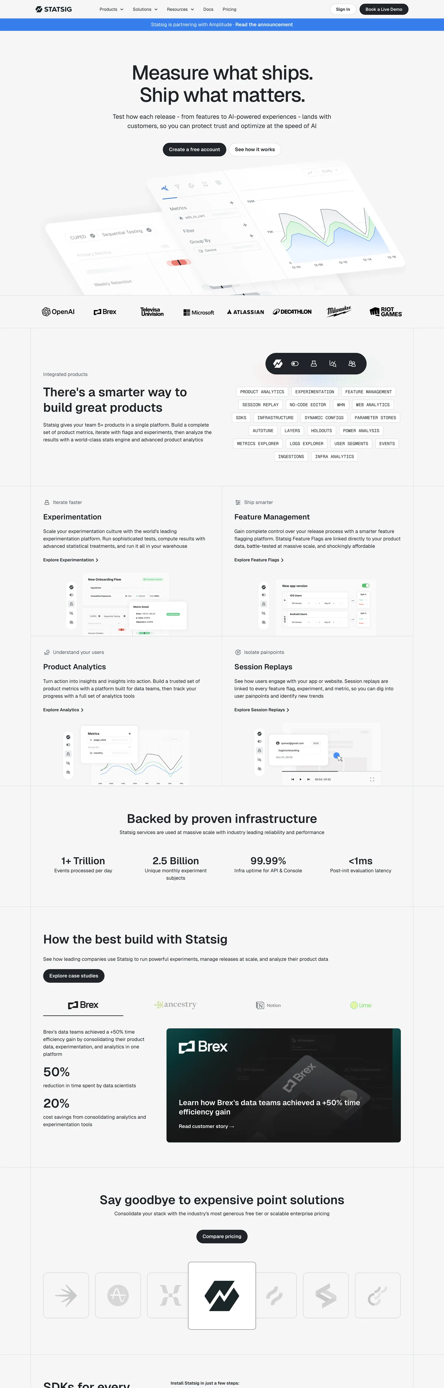
Statsig's marketing site is built with the same typeface Vercel ships its own product on — Geist — but the resemblance stops at the font stack. Where Vercel uses its brand identity on a dark canvas, Statsig uses Geist on a light off-white ground and replaces Vercel's white button with a charcoal-ink primary CTA. The hero headline reads "Measure what ships. Ship what matters." at 65px with -2px letter-spacing and weight 500. No chromatic voltage anywhere above the fold: the single registered brand color, a medium blue, appears once in the captured page as a background fill. The system communicates through density and typographic precision, not through saturated accent.
The DESIGN.md file packages the system into a machine-readable spec for React and AI tools. Inside: 11 colors tokens drawn from the charcoal ink palette, the near-white canvas, and a declared-but-scarce blue accent family; 12 typography tokens spanning Geist at five size tiers and Geist Mono in two uppercase label contexts; 5 radius tokens centered on 10px standard and 30px pill; 8 spacing values on a 20px-dominant scale; and 17 components definitions covering the ink-fill primary button, the tag chips at 30px radius, the section-feature cards, and the monochrome logo wall.
Feed this file to Claude or Cursor and it reproduces Statsig's specific moves: structural-ink primary CTA instead of a chromatic accent, Geist at tight display tracking, 10px card rounding with pill-shaped interactive elements, and a pure off-white canvas rather than stark white. The one discipline worth borrowing even if you have a strong brand color: holding the blue in reserve creates more perceived confidence than spending it on every link and button. Statsig's system is the clearest example in the dev-tools category of trust signaled by chromatic restraint.
What makes it distinct
5
- Ink-as-CTAthe primary button fills with charcoal #1f2328 rather than any chromatic accent, inverting the SaaS convention of reserving brand color for primary actions
- Geist across all tiersVercel's open-source sans runs display through caption; Geist Mono handles code labels in uppercase at 14px/400
- Declared but unseen blue#367eed is wired as --color-blue but appears once on the captured page; the system trusts structure over chroma
- Pill-radius buttons at 30pxthe CTA geometry is fully-rounded while cards sit at 10px, creating a sharp contrast between interactive and container shapes
- 65px / -2px display trackingthe hero h1 uses tight negative letter-spacing and weight 500, not 700; density communicates precision rather than volume
statsig.com
Live at statsig.com
A snapshot of the brand in production. Scroll the frame to see the whole page.
Colors
11 colors
Statsig's system anchors on #367eed (primary) as its primary color. Type is set in Geist across 12 tokens from 12px to 65px, weights 400–700. Shape language is soft — components average 22px corner radius, with no sharp interactive edges.
Brand & Accent
Sparing, CTA-only voltage · 3
Surface
Page and card backgrounds · 3
Text
Headlines, body, captions · 3
Borders & Hairlines
Dividers, outlines, rules · 1
Other
Specialty colors · 1
Typography
12 type tokens
Set in Geist across 12 tokens, from 12px to 65px, weights 400–700. Shown in its own stack: where the font isn't installed, the fallback the file names stands in.
- display-xl65px · weight 500 · lh 71.5px · tracking -2pxThe quick brown fox jumps over the lazy dog
- display-md40px · weight 600 · lh 50pxThe quick brown fox jumps over the lazy dog
- heading-lg32px · weight 600 · lh 40pxThe quick brown fox jumps over the lazy dog
- heading-md24px · weight 600 · lh 30pxThe quick brown fox jumps over the lazy dog
- heading-sm20px · weight 400 · lh 30pxThe quick brown fox jumps over the lazy dog
- body-lg16px · weight 400 · lh 24pxThe quick brown fox jumps over the lazy dog
- body-sm14px · weight 400 · lh 21pxThe quick brown fox jumps over the lazy dog
- label-md16px · weight 600 · lh 24pxThe quick brown fox jumps over the lazy dog
- label-sm14px · weight 600 · lh 24pxThe quick brown fox jumps over the lazy dog
- caption12px · weight 400 · lh 24pxThe quick brown fox jumps over the lazy dog
- mono-label14px · weight 400 · lh 24pxThe quick brown fox jumps over the lazy dog
- mono-bold14px · weight 700 · lh 24pxThe quick brown fox jumps over the lazy dog
Layout
Radii and spacing
6 corner radii and 8 spacing values. Shape language: soft.
Radii
- none0px
- sm4px
- md5px
- lg10px
- pill30px
- full9999px
Spacing
- xs8px
- sm10px
- md16px
- base20px
- lg30px
- xl40px
- 2xl60px
- 3xl80px
Components
17 components
Each rendered from its tokens (color, type, radius, padding) on Statsig's own canvas.
- Button Primarybutton-primaryButton Primary
- Button Secondarybutton-secondaryButton Secondary
- Button Ctabutton-ctaButton Cta
- Top Navtop-navTop Nav
- Nav Linknav-linkNav Link
- Hero Headinghero-headingHero Heading
- Section Headingsection-headingSection Heading
- Body Paragraphbody-paragraphBody Paragraph
- Body Paragraph Mutedbody-paragraph-mutedBody Paragraph Muted
- CardcardCard
- Feature Chipfeature-chipFeature Chip
- Stat Numberstat-numberStat Number
- Type here…text-inputText Input
- Logo Chiplogo-chipLogo Chip
- Tag Pilltag-pillTag Pill
- FooterfooterFooter
- Code Labelcode-labelCode Label
In use
The system, in use
Statsig's tokens on the kind of product it builds.
Build something people actually use.
A short paragraph of marketing copy that previews how the brand's display tier and body tier read together. Two sentences is usually enough.
FAQ
Statsig design system FAQ
Common questions about Statsig's tokens, components, and how to use this DESIGN.md in your project.
Read next
Related reading
Specs, directories, and component libraries that pair with this design system.
- Browse all design systemsThe full directory of DESIGN.md files on shadcn.io, with live mockups for each.shadcn.io
- Statsig — official siteStatsig's public marketing site — the source of truth for the live tokens captured in this file.statsig.com (opens in a new tab)
- The DESIGN.md specificationGoogle Labs' open spec for machine-readable design system files — the format this page is built on.github.com (opens in a new tab)
Use it
Use Statsig in your project
One machine-readable file. Drop it into Claude, Cursor, or any AI tool that reads DESIGN.md.
Download the DESIGN.md
One machine-readable file: every color, type, radius, spacing, and component token of Statsig.
Feed it to your AI tool
Drop it into Claude, Cursor, or GitHub Copilot. The agent writes React components and Tailwind classes that match Statsig's visual language.
Reference the tokens directly
Or paste the values into your Tailwind config, CSS variables, or component library: every color, size and radius is a quoted, ready-to-copy value.
Read the full DESIGN.md: overview, rationale, do’s and don’ts
Overview
Statsig's marketing page settles a quiet argument about brand color: what if the CTA wasn't chromatic at all? Chromatic abstinence. The primary button is filled with the same charcoal ink (#1f2328) that carries every headline, and the only registered blue (#367eed) appears once on the page as a single background fill. Where Mixpanel uses its purple on every interactive element and Amplitude plasters its orange across section headings, Statsig holds its blue entirely in reserve — a signal of infrastructure confidence rather than marketing energy.
The type system runs Vercel's open-source Geist across every tier: 65px display at weight 500 with -2px letter-spacing for the hero h1, 40px / 600 for section h2, 16px / 400 for body. Geist Mono appears in two distinct roles: uppercase category labels (14px / 400) and inline code annotations (14px / 700 bold). The result is a page that reads as if it were built by the same engineering team that built Vercel's dashboard, because it uses exactly the same typography tooling.
Key Characteristics:
- Charcoal ink primary CTA (
{colors.ink}— #1f2328) rather than any brand-color fill — the interactive hierarchy is established through shape (30px pill) not chroma. - Brand blue (
{colors.primary}— #367eed) appears once on the captured page; the secondary and dark blue variants are declared but unseen. - Geist across display, heading, body, label; Geist Mono uppercase for product-category chips (PRODUCT ANALYTICS, EXPERIMENTATION, FEATURE MANAGEMENT, etc.).
- Two-tone light system: near-white canvas (#f6f6f6) with white cards (#ffffff) creates tonal lift without shadows.
- Pill geometry for CTAs (30px radius) sharply contrasted with 10px standard card rounding — shape differentiates interactions from containers.
- Feature-category chips use Geist Mono in uppercase, creating a terminal-label aesthetic within an otherwise editorial layout.
- Shadow system runs a single soft token:
0 0 20px rgba(27, 37, 40, 0.05)— nearly invisible, enough only to lift a card 1 layer.
Colors
Ink & Text
- Ink (
{colors.ink}— #1f2328): frequency 1369. Used as text (678), border (643), shadow (40), bg (8). The dominant color on every surface — headlines, body copy, hairlines, and the primary CTA button fill. Mapped to--color-blackand--color-text-primary; the extraction clustered near-duplicate dark-charcoal values into this single representative hex. - Ink Secondary (
{colors.ink-secondary}— #535963): frequency 14. Used as text (7), border (7). The secondary text tier for supporting labels and muted metadata, wired as--color-text-secondary. Not abundant — used selectively for visual hierarchy. - Ink Dark (
{colors.ink-dark}— #343941): frequency 0 in render. Declared as--color-dark-gray. Reserved for hover states and active-state borders.
Canvas & Surface
- Canvas (
{colors.canvas}— #ffffff): frequency 98. Used as background (66), text (16), border (16). The card and modal surface — distinct from the page floor. Wired as both--color-whiteand--color-background. - Surface-1 (
{colors.surface-1}— #f6f6f6): part of the #ffffff cluster,--color-backgroundmapped here for the page floor. The near-white canvas on which white cards sit, establishing tonal lift. - Surface-2 (
{colors.surface-2}— #ededed): frequency 1. Declared as--color-soft-white. Used for inactive chips and tag pills.
Hairlines
- Hairline (
{colors.hairline}— #d4d7dc): frequency 27. Used as border (24), shadow (3). The standard card border and input border, wired as--color-grayand--color-input-border. Only border role — never appears as text or background.
Brand Blue
- Primary (
{colors.primary}— #367eed): frequency 1. Used as background (1). Wired as--color-blue. Appears once on the page — its rarity is the point. - Primary Dark (
{colors.primary-dark}— #1b63d2): frequency 0. Declared as--color-dark-blue. Hover state for the blue accent. - Primary Light (
{colors.primary-light}— #accfff): frequency 0. Declared as--color-medium-blue. Tint tier for focus rings or soft highlights.
Neutral
- Shadow (
{colors.shadow}— #000000): frequency 7. Used across text (2), border (2), gradient (2), shadow (1). The pure-black shadow base, used in CSSbox-shadowcalculations.
Typography
Font Family
The system runs Geist (Vercel's open-source geometric sans, available via next/font/google as well as npm) across every display, heading, body, label, and button tier. Fallbacks walk Helvetica, "Segoe UI", Arial. Geist Mono carries the product-category label chips and code annotations, always in uppercase or code contexts — never in headings.
Hierarchy
| Token | Size | Weight | Line Height | Letter Spacing | Use |
|---|---|---|---|---|---|
{typography.display-xl} | 65px | 500 | 71.5px | -2px | Hero h1 ("Measure what ships.") |
{typography.display-md} | 40px | 600 | 50px | 0 | Section h2 ("There's a smarter way…") |
{typography.heading-lg} | 32px | 600 | 40px | 0 | h3 sub-section titles |
{typography.heading-md} | 24px | 600 | 30px | 0 | h4 card headings |
{typography.heading-sm} | 20px | 400 | 30px | 0 | h5 feature sub-titles |
{typography.body-lg} | 16px | 400 | 24px | 0 | Default body copy |
{typography.body-sm} | 14px | 400 | 21px | 0 | Supporting body and nav links |
{typography.label-md} | 16px | 600 | 24px | 0 | Button labels, section callouts |
{typography.label-sm} | 14px | 600 | 24px | 0 | CTA buttons, nav labels |
{typography.caption} | 12px | 400 | 24px | 0 | Metadata and footnotes |
{typography.mono-label} | 14px | 400 | 24px | 0 | Geist Mono uppercase product chips |
{typography.mono-bold} | 14px | 700 | 24px | 0 | Bold code annotations |
Principles
The display tier tops at weight 500 with tight -2px letter-spacing — dense but not heavy. Section headings jump to 600 at 40px, the only bold-weight moment in the display range. Body and labels stay at 400 and 600 respectively, with no 700+ tier in the sans family (that weight lives only in Geist Mono for code annotations).
Note on Font Substitutes
Geist is open-source and free; use it directly via npm install geist or the Vercel font package. For teams unable to use Geist, Inter at the same sizes and weights is the closest alternative — the proportions are near-identical. For Geist Mono, JetBrains Mono or IBM Plex Mono are comparable monospace substitutes.
Layout
Spacing System
- Base unit: 8px, but the dominant spacing value on the page is 20px (106 occurrences), which functions as the de-facto module.
- Tokens:
{spacing.xs}8px ·{spacing.sm}10px ·{spacing.md}16px ·{spacing.base}20px ·{spacing.lg}30px ·{spacing.xl}40px ·{spacing.2xl}60px ·{spacing.3xl}80px. - Section padding (vertical): 80px top, 40px horizontal on major sections.
- Card internal padding:
{spacing.base}(20px) on feature cards;{spacing.sm}(10px) on compact chips. - CTA padding: 6x20 on the primary pill button; 10x20 on the secondary larger CTA.
Grid & Container
- Max content width: ~1200px on the hero; section content constrained to ~1100px.
- Feature grid: 2-column layout at desktop (Experimentation / Feature Management, Product Analytics / Session Replays), collapsing to single-column on tablet.
- Metric strip: 4-column stat row with numbers at display-md size.
- Logo wall: horizontal scrolling row of monochrome partner logos.
Rhythm
The page alternates between full-width typographic sections on the off-white canvas and constrained 2-column feature modules. Every section boundary is marked by the same 80px top padding rather than a background color change — the only background shift is the charcoal-ink CTA block in the middle of the page ("Say goodbye to expensive point solutions"), which uses the structural ink color as a full-section background.
Elevation
The shadow system has one token and uses it subtly. The CSS variable --shadow-regular resolves to 0 0 20px rgba(27, 37, 40, 0.05) — a nearly invisible bloom that lifts white cards off the off-white canvas without any visible shadow shape. The elevation system is:
- Flat: the page floor and every section background — no shadow.
- 1px tonal lift:
{colors.canvas}white cards on{colors.surface-1}near-white floor — the dominant elevation signal. - Hairline borders:
{colors.hairline}(#d4d7dc) 1px borders on cards and inputs — the most-used depth signal. - Soft glow:
--shadow-regulartoken for cards that need physical separation without a hard border.
Shapes
The radius scale is binary-ish: everyday containers at 10px, pills for all interactive triggers:
{rounded.none}0px — code blocks and flush sections.{rounded.sm}4px — the most compact chips and form labels.{rounded.md}5px (--border-sharp-radius) — smaller UI chips.{rounded.lg}10px (--border-standard-radius) — the default card, input, and modal radius. 45 instances — the dominant shape.{rounded.pill}30px (--border-button-radius) — every CTA button and the feature-chip pills.{rounded.full}9999px — avatar icons and logo marks in the partner wall.
The gap between 10px (container) and 30px (button) is the most pronounced shape contrast in the system — shape performs the role that color performs in chromatic systems.
Components
button-primary — Charcoal ink {colors.ink} fill, white text, {rounded.pill} 30px radius, 6x20 padding, 36px height. The canonical instance is "Book a Live Demo" in the top nav. No chromatic fill anywhere on the primary interactive element.
button-secondary — Transparent fill, charcoal text, 1px {colors.hairline} border, same pill radius and dimensions. Used for secondary CTAs like "See how it works."
button-cta — White fill with charcoal text at {rounded.pill}, 10x20 padding, 44px height. Used for the larger in-page CTA ("Create a free account").
top-nav — White canvas background, 56px height, charcoal text at {typography.body-sm} (14px / 400). Hairline border separates nav from page content.
hero-heading — Transparent background, charcoal text, {typography.display-xl} (65px / 500 / -2px tracking). Zero padding because the headline floats over the page canvas.
section-heading — Charcoal text, {typography.display-md} (40px / 600 / 50px line-height). Used for "There's a smarter way to build great products" and similar section openers.
card — White {colors.canvas} fill, charcoal text, {rounded.lg} 10px radius, 20px padding, 1px {colors.hairline} border. The standard feature card. The "Regular" shadow token lifts it off the near-white floor.
feature-chip — Near-white {colors.surface-1} fill, ink text, {typography.mono-label} in uppercase (PRODUCT ANALYTICS, EXPERIMENTATION), {rounded.pill} 30px radius, 3x12 padding.
text-input — White fill, charcoal text, {rounded.lg} 10px radius, 10x16 padding, 44px height, 1px {colors.hairline} border. Wired as --color-input-border.
stat-number — Transparent background, charcoal text at {typography.display-md} (40px / 600). Used in the metric strip for "1+ Trillion Events," "2.5 Billion Subjects," "99.99% Infra uptime."
tag-pill — Light-gray {colors.surface-2} fill, secondary-ink text, {typography.label-sm}, {rounded.pill} radius, 3x12 padding. Used for product-category labels in the nav dropdown.
footer — Near-white {colors.surface-1} background, secondary-ink text, 40x20 padding. The footer de-emphasizes rather than disappears — it's the same near-white as the page floor.
Do's and Don'ts
Do use {colors.ink} (#1f2328) as the primary CTA background. The charcoal-ink button is not a placeholder — it is the deliberate primary interactive state. Replacing it with {colors.primary} blue would spend the one scarce voltage on every action click rather than holding it for emphasis.
Do use {rounded.pill} (30px) exclusively for buttons and interactive chips. Containers sit at {rounded.lg} (10px). The gap between 10 and 30 is intentional — mixing intermediate radii (14px, 20px) collapses the shape contrast that replaces color contrast.
Do keep display weight at 500 for the hero h1 and 600 for section h2. There is no 700 moment in the sans type system. Bumping the hero to 700 turns the editorial density into a generic SaaS shout.
Do render all product-category chips in Geist Mono uppercase. The monospace + uppercase combination reads as a data label — a precision signal that distinguishes product taxonomy from marketing copy.
Don't use {colors.primary} (#367eed) as a button fill or section accent. It appears once on the captured page as a single background tile. Each additional usage of the blue dilutes the precision-discipline the system is built on. Use {colors.ink} instead.
Don't add a card shadow heavier than --shadow-regular (0 0 20px rgba(27,37,40,0.05)). The near-invisible glow does the lift work without competing with the hairline border. A heavier shadow (e.g., 10px 15px 30px) would make the page feel like a SaaS landing page rather than a data infrastructure product.
Don't use {colors.hairline} (#d4d7dc) as a text color. It is border-only — 24 border uses, zero text uses. For muted text, use {colors.ink-secondary} (#535963).
Don't use tight -2px letter-spacing outside the 65px display h1. The tracking is calibrated for very large type; applying it at 24px or below makes labels look compressed rather than precise.
Known Gaps
- Hover states: documented only for the primary button (background flips from #1f2328 to a lighter tint implied by --color-dark-gray #343941); full state matrix for links, cards, and chips is not captured.
- Mobile breakpoints: the captured surface is 1440px desktop width; responsive column collapse and type-scale reduction are not represented.
- Dark mode: no dark-mode variant is visible in the marketing page capture; the product dashboard likely has a separate dark token set.
- Animated feature modules: the Experimentation and Feature Management sections contain animated chart and UI previews; motion curves and timing functions are not captured.
- Branded illustration palette: the arrow and icon illustrations in the feature sections use a multi-color scheme not represented in the extracted CSS colors.
- Form states: error, success, and focus states for
{component.text-input}are not visible on the marketing surface.
Developer Tools & IDEs
More systems like this
More DESIGN.md files in Developer Tools & IDEs.
Pricing
Build it with Pro
The DESIGN.md files are free. Pro adds 6,000+ blocks, premium templates and the MCP server, so your AI editor builds in your system for you.
4.9/5 out of 5 · 150+ reviewsfrom 150+ founders and developers.
Billing
Billed once a year in USD. Cancel anytime.
- How many people can use the license.
- Client work, SaaS products and anything you charge for.
- Production-ready React sections: hero, pricing, features, dashboards and more.
- Complete multi-page sites you can ship as they are.
- React icons from every major library, installable with one command.
- Presets that restyle every block, in light and dark.
- Lets your AI editor search, preview and install blocks for you.
- Priority requests are answered first.
Individual
For personal projects & open source
$32instead of $49/mo
$389 billed yearly
- Seats: 1 seat
- Commercial use: Personal & open source only
- Pro blocks: 6,000+ blocks
- Templates: All 14 templates
- React icons: 294k+ icons
- Themes: All 59 themes
- MCP server: Basic usage
- Support: Standard
Team
Most popularFor freelancers, agencies & startups
$66instead of $99/mo
$789 billed yearly · ≈ $13/dev/mo
- Seats: Up to 5 seats
- Commercial use: Included
- Pro blocks: 6,000+ blocks
- Templates: All 14 templates
- React icons: 294k+ icons
- Themes: All 59 themes
- MCP server: High usage
- Support: Priority
Organization
For companies with larger teams
$132instead of $199/mo
$1,589 billed yearly
- Seats: Unlimited seats
- Commercial use: Included
- Pro blocks: 6,000+ blocks
- Templates: All 14 templates
- React icons: 294k+ icons
- Themes: All 59 themes
- MCP server: Unlimited usage
- Support: Priority
Billed once a year in USD. Cancel anytime.
Individual
For personal projects & open source
$32instead of $49/mo
$389 billed yearly
- How many people can use the license.Seats: 1 seat
- Client work, SaaS products and anything you charge for.Commercial use: Personal & open source only
- Production-ready React sections: hero, pricing, features, dashboards and more.Pro blocks: 6,000+ blocks
- Complete multi-page sites you can ship as they are.Templates: All 14 templates
- React icons from every major library, installable with one command.React icons: 294k+ icons
- Presets that restyle every block, in light and dark.Themes: All 59 themes
- Lets your AI editor search, preview and install blocks for you.MCP server: Basic usage
- Priority requests are answered first.Support: Standard
Team
Most popularFor freelancers, agencies & startups
$66instead of $99/mo
$789 billed yearly · ≈ $13/dev/mo
Everything in Individual, plus
- How many people can use the license.Seats: Up to 5 seats
- Client work, SaaS products and anything you charge for.Commercial use: Included
- Lets your AI editor search, preview and install blocks for you.MCP server: High usage
- Priority requests are answered first.Support: Priority
Organization
For companies with larger teams
$132instead of $199/mo
$1,589 billed yearly
Everything in Team, plus
- How many people can use the license.Seats: Unlimited seats
- Lets your AI editor search, preview and install blocks for you.MCP server: Unlimited usage
- Secure checkout via Stripe
- Code lives in your repo
- Keep what you've shipped if you cancel
- License terms
Your system, built for you
Every block, template and icon, installed by your AI agent in your design system. The DESIGN.md files stay free.