SSENSE Design System
SSENSE's luxury fashion design system as a DESIGN.md file. Graphite #333333, near-white canvas, serif-grotesque pairing, 19 colors, 21 components. For React and AI tools.
Add shadcn.io to your AI agent. · Pro It installs blocks, icons and templates in your design system from a prompt, with Pro.
Set up MCP- Primary
- #333333
- Typeface
- Favorit SSENSE Inter
- Shape
- Sharp
- Base radius
- 0px
- Colors
- 19
- Type tokens
- 12
- Components
- 21
- Spacing values
- 8
About
About SSENSE DESIGN.md
Curated by Dov Azencot · Updated May 13, 2026 · Source ssense.com (opens in a new tab)
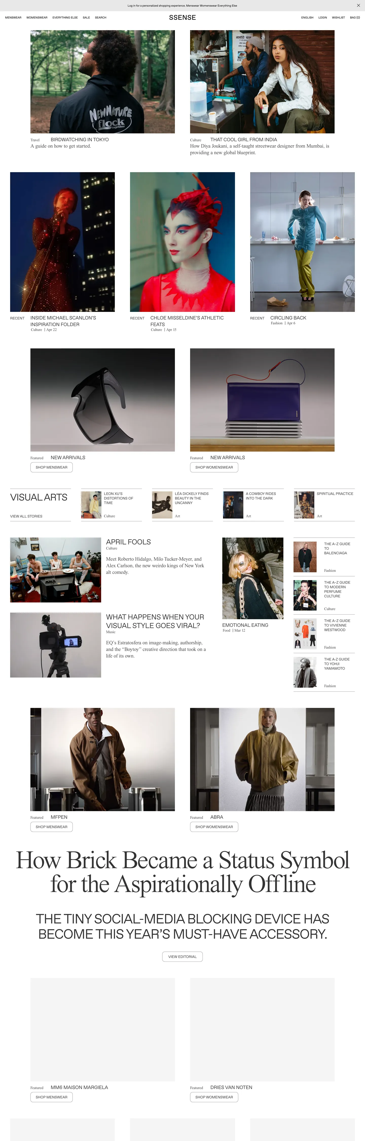
SSENSE's storefront reads like a fashion broadsheet rendered for the browser. The canvas is near-white with a quiet chip surface (#f4f4f4) breaking it into editorial bands, and the ink is a warm graphite (#333333) used 720 times across text and 1px hairlines — never the pure black that would feel pharmaceutical against designer garment photography. The masthead is a single JHA Times Now serif headline at 100px / weight 400 with -3.75px tracking ("How Brick Became a Status Symbol for the Aspirationally Offline"), and everything else — nav links, category caps, product cells, sub-heads, footer columns — drops to Favorit SSENSE Inter in uppercase. Two type personalities, one across the entire interface: a magazine cover up top, a typewritten archive beneath.
This page packages the storefront into a DESIGN.md file written to the Google Labs open specification. Inside: 19 colors tokens grouped into ink, surface, and hairline layers — the palette is genuinely a 7-hex grayscale because the extraction surfaced zero brand-saturated voltage; 12 typography roles built around JHA Times Now serif at 4 sizes (100/20/15px display + body) and Favorit SSENSE Inter grotesque at 7 size/weight pairings (53.2px h2 down to 11px nav link); a 3-step radius vocabulary that's effectively two values (0px almost everywhere, 10px on the small avatar chips); a 7-step spacing scale anchored on the observed 20px, 30px, 40px, 64px, 80px, 120px rhythm; and 21 components entries covering the top nav, hero feature, category cap, product cell, editorial split card, value-prop strip, newsletter input, and footer.
Feed the file to Claude, Cursor, or GitHub Copilot and the agent reproduces SSENSE's broadsheet discipline — the JHA Times Now display serif reserved for one editorial moment per page, the Favorit SSENSE Inter uppercase grotesque doing every other label, the graphite-on-near-white grayscale, the 0px corners — instead of inventing a generic luxury-template with rose-gold accents and pillowed cards. Reference tokens directly in Tailwind config or CSS variables. The reason this system rewards study is that most luxury fashion marketplaces ship saturated brand voltages and serif-everywhere display ramps to signal taste — SSENSE inverts the convention, paints the entire page in grayscale, holds the serif to one headline, and lets designer photography carry every chromatic moment.
What makes it distinct
5
- Editorial serif as front coverJHA Times Now at 100px / weight 400 / -3.75px tracking carries the single homepage feature headline; every other text role drops to a grotesque
- All-caps grotesque chromeFavorit SSENSE Inter renders every nav link, category cap, product cell, and h2 in uppercase with -0.05px to -2px tracking; lowercase never appears in the page chrome
- Zero saturated voltagethe palette resolves to 7 grays (graphite #333333 at 720 hits, pure black #000000 at 164, surface #f4f4f4) with no brand-colored CTA fill, the photography does that work
- Weight-100 magazine mastheadbody paragraphs and h4 caps run at weight 100, a hairline grotesque tier that most fashion DTCs would never ship below weight 400
- Two-tone ink laddergraphite (#333333) carries 368 text and 352 border occurrences, pure black (#000000) is scoped to 82 text + 82 border slots reserved for product cell text and primary-nav links
ssense.com
Live at ssense.com
A snapshot of the brand in production. Scroll the frame to see the whole page.
Colors
19 colors
SSENSE's system anchors on #333333 (ink-graphite) as its primary color. Type is set in Favorit SSENSE Inter across 12 tokens from 11px to 100px, weights 100–400. Shape language is sharp — components average 1px corner radius, favoring crisp rectangles.
Surface
Page and card backgrounds · 5
Text
Headlines, body, captions · 9
Borders & Hairlines
Dividers, outlines, rules · 4
Other
Specialty colors · 1
Typography
12 type tokens
Set in Favorit SSENSE Inter across 12 tokens, from 11px to 100px, weights 100–400. Shown in its own stack: where the font isn't installed, the fallback the file names stands in.
- display-serif100px · weight 400 · lh 0.94 · tracking -3.75pxThe quick brown fox jumps over the lazy dog
- display-grotesque53px · weight 400 · lh 1.13 · tracking -2pxThe quick brown fox jumps over the lazy dog
- heading-feature38px · weight 400 · lh 1.16 · tracking -1.25pxThe quick brown fox jumps over the lazy dog
- heading-md28px · weight 100 · lh 1.19 · tracking -0.5pxThe quick brown fox jumps over the lazy dog
- product-cell19px · weight 400 · lh 1.37 · tracking -0.25pxThe quick brown fox jumps over the lazy dog
- product-cell-light19px · weight 100 · lh 1.37 · tracking -0.25pxThe quick brown fox jumps over the lazy dog
- body-serif20px · weight 100 · lh 1.3 · tracking -0.05pxThe quick brown fox jumps over the lazy dog
- caption-serif15px · weight 100 · lh 1.2 · tracking -0.05pxThe quick brown fox jumps over the lazy dog
- h4-cap14px · weight 400 · lh 1.26 · tracking -0.05pxThe quick brown fox jumps over the lazy dog
- h4-cap-light14px · weight 100 · lh 1.26 · tracking -0.05pxThe quick brown fox jumps over the lazy dog
- nav-link11px · weight 400 · lh 1.36The quick brown fox jumps over the lazy dog
- button11px · weight 400 · lh 1.36The quick brown fox jumps over the lazy dog
Layout
Radii and spacing
3 corner radii and 8 spacing values. Shape language: sharp.
Radii
- none0px
- chip10px
- full9999px
Spacing
- xs10px
- sm15px
- md20px
- base30px
- lg40px
- xl64px
- outer80px
- band120px
Components
21 components
Each rendered from its tokens (color, type, radius, padding) on SSENSE's own canvas.
- Top Navtop-navTop Nav
- Nav Linknav-linkNav Link
- Hero Featurehero-featureHero Feature
- Hero Feature Deckhero-feature-deckHero Feature Deck
- Editorial Bandeditorial-bandEditorial Band
- Category Capcategory-capCategory Cap
- Category Cap Lightcategory-cap-lightCategory Cap Light
- Product Cellproduct-cellProduct Cell
- Product Cell Labelproduct-cell-labelProduct Cell Label
- Product Cell Metaproduct-cell-metaProduct Cell Meta
- Card Split Lightcard-split-lightCard Split Light
- Card Split Dividercard-split-dividerCard Split Divider
- Value Prop Stripvalue-prop-stripValue Prop Strip
- Hairline Rulehairline-ruleHairline Rule
- Type here…text-inputText Input
- Newsletter Formnewsletter-formNewsletter Form
- Button Primarybutton-primaryButton Primary
- Button Primary Hoverbutton-primary-hoverButton Primary Hover
- Button Secondarybutton-secondaryButton Secondary
- Icon Chipicon-chipIcon Chip
- FooterfooterFooter
In use
The system, in use
SSENSE's tokens on the kind of product it builds.
Build something people actually use.
A short paragraph of marketing copy that previews how the brand's display tier and body tier read together. Two sentences is usually enough.
FAQ
SSENSE design system FAQ
Common questions about SSENSE's tokens, components, and how to use this DESIGN.md in your project.
Read next
Related reading
Specs, directories, and component libraries that pair with this design system.
- Browse all design systemsThe full directory of DESIGN.md files on shadcn.io, with live mockups for each.shadcn.io
- SSENSE — official siteThe SSENSE storefront this DESIGN.md was extracted from on 2026-05-13.ssense.com (opens in a new tab)
- The DESIGN.md specificationGoogle Labs' open spec for machine-readable design system files — the format this page is built on.github.com (opens in a new tab)
Use it
Use SSENSE in your project
One machine-readable file. Drop it into Claude, Cursor, or any AI tool that reads DESIGN.md.
Download the DESIGN.md
One machine-readable file: every color, type, radius, spacing, and component token of SSENSE.
Feed it to your AI tool
Drop it into Claude, Cursor, or GitHub Copilot. The agent writes React components and Tailwind classes that match SSENSE's visual language.
Reference the tokens directly
Or paste the values into your Tailwind config, CSS variables, or component library: every color, size and radius is a quoted, ready-to-copy value.
Read the full DESIGN.md: overview, rationale, do’s and don’ts
Overview
SSENSE's storefront is built around one observation: a luxury-fashion marketplace can sell at four-figure price points without using a single saturated brand color. The page renders in a 7-hex grayscale palette extracted directly from the homepage — warm graphite ({colors.ink} — #333333) at 720 occurrences, pure black ({colors.ink-pure} — #000000) at 164, a chip surface ({colors.surface-chip} — #f4f4f4) at 25, and three quieter neutrals filling the rest. Designer-garment photography carries every chromatic moment: marled knitwear, terracotta jersey, brick-red dyed cotton, dark indigo leather. The chrome stays grayscale; the merchandise does the painting.
Where most luxury-fashion marketplaces ship rose-gold buttons and serif-everywhere display ramps to signal taste, SSENSE inverts the convention. The serif appears exactly once per page — a JHA Times Now masthead at 100px / weight 400 / -3.75px tracking carrying the homepage feature headline ("How Brick Became a Status Symbol for the Aspirationally Offline"). Every other text role drops to Favorit SSENSE Inter, an all-caps grotesque rendered at 11px nav links, 14–28px h4 category caps, 19px product cells, and a 53.2px h2 sub-head — all uppercase, all with negative letter-spacing (-0.05 to -2px).
Broadsheet discipline: SSENSE's interface inherits from print fashion broadsheets — the magazine cover is a single serif headline, the editorial section runs uppercase grotesque captions, the product index is a typewritten archive of garment names and prices. The system refuses pill-shaped CTAs, refuses gradient overlays, refuses any radius beyond 10px on a small avatar chip. Weight-100 masthead: where most fashion DTCs hold body type at weight 400 or above, SSENSE drops the JHA Times Now body serif to weight 100 — a hairline grotesque tier that requires a high-DPI display to read crisply and signals a print-quality typesetting culture rather than a screen-first one.
Key Characteristics:
- Graphite ink (
{colors.ink}— #333333) used 720 times across text and 1px hairlines — never pure black for body, because the warm graphite holds against designer photography without going pharmaceutical. - Pure black (
{colors.ink-pure}— #000000) scoped to 164 occurrences — reserved for product cell text and primary nav links, the system's hardest typographic moments. - Single JHA Times Now serif headline per page at 100px / weight 400 / -3.75px tracking. Every other text role drops to the grotesque.
- All-caps Favorit SSENSE Inter chrome — lowercase grotesque does not appear in the homepage chrome.
- 0px corners on every product cell, hero band, card, input, and footer.
{rounded.chip}(10px) reserved for tiny icon chips only. - Weight-100 body serif — body paragraphs and h4 caps render below weight 400, a hairline tier most fashion DTCs would never ship.
- 80px outer page padding — the homepage container sits inside 80px gutters at desktop, denser horizontally than the 96–120px SaaS norm but wider than a magazine, calibrated for 4-up product rails with editorial breathing room.
- Negative letter-spacing on every grotesque tier — from -0.05px on 14px h4 caps to -2px on the 53.2px h2, the uppercase rhythm depends on the tight tracking.
Colors
Ink
- Graphite (
{colors.ink}— #333333): frequency 720. Used as text (368), border (352). The dominant token — every editorial paragraph, h2 sub-head, h4 category cap, 1px hairline, and footer label sits on this exact warm gray. Not pure black, not slate — a warm graphite that reads as ink-on-newsprint. - Pure Black (
{colors.ink-pure}— #000000): frequency 164. Used as text (82), border (82). Reserved for product cell text ("MENSWEAR" link, brand names, prices) and the primary top-nav links — the system's hardest typographic moments, where the contrast against canvas matters more than the warmth. - Mid Gray (
{colors.ink-mid}— #888888): frequency 22. Used as text (11), border (11). The secondary label tone for meta information, breadcrumb separators, sub-nav rows, and quiet form hint text. - Quiet Gray (
{colors.ink-quiet}— #979797): frequency 7, all as border. The faintest tier — appears in disabled control outlines and very-quiet section dividers.
Surface
- Canvas (
{colors.canvas}— #ffffff): frequency 2 explicit. The default page floor — pure white, not warm-cream, because designer photography against warm white can shift garment color casting. The 2 explicit occurrences in the extraction are the rest implicit (nobackground-colordeclaration on the body). - Chip Surface (
{colors.surface-chip}— #f4f4f4): frequency 25. Used as background (25). The editorial band fill — every full-bleed section that needs to separate from the white canvas without introducing a saturated hue uses this near-white gray. Also the icon chip fill. - Divider Block (
{colors.surface-divider-block}— #e8e8e8): frequency 1, as background. A faintly deeper surface used for one specific divider block in the editorial split — the "Visual Arts" section header backplate.
Hairline
- Hairline (
{colors.hairline}— #333333): the 1px border tone on most editorial cards, the text input border, and the footer top rule. Same hex as{colors.ink}— borders feel like ink lines rather than separate elevation steps. This single design move (ink = border) is why SSENSE pages read as one continuous broadsheet rather than stacked cards. - Hairline Product Cell (
{colors.hairline-product-cell}— #000000): the harder 1px border tone reserved for product cell separators and primary-nav underlines. Pure black, because the product index is meant to read as a typewritten archive. - Hairline Soft (
{colors.hairline-soft}— #888888): the mid-gray divider used inside dropdown menus and meta-label rows. - Hairline Faint (
{colors.hairline-faint}— #979797): the quietest 1px tone, for disabled control outlines.
Typography
Font Family
The system runs two custom typefaces. JHA Times Now is the editorial display serif, reserved for the homepage feature headline at 100px / weight 400 / -3.75px tracking. It also handles body paragraphs at 20px / weight 100 and meta labels at 15px / weight 100 — wherever the page needs a serif voice. Favorit SSENSE Inter (a custom Inter variant) handles every grotesque role: h2 sub-heads at 53.2px, h4 category caps at 14.25–28.5px uppercase, product cell text at 19px uppercase, and 11px nav links. The fallback stacks walk GT Sectra, Tiempos Headline, serif for the editorial display and Inter, Söhne, sans-serif for the grotesque.
The split is editorial:
- JHA Times Now serif (weight 100/400) → the single feature headline + body paragraphs + meta labels
- Favorit SSENSE Inter grotesque (weight 100/400) → nav, h2, h4 caps, product cells, footer columns — always uppercase
Hierarchy
| Token | Size | Weight | Line Height | Letter Spacing | Use |
|---|---|---|---|---|---|
{typography.display-serif} | 100px | 400 | 0.94 | -3.75px | The single homepage feature headline — JHA Times Now |
{typography.display-grotesque} | 53px | 400 | 1.13 | -2px | Editorial h2 sub-heads — Favorit SSENSE Inter uppercase |
{typography.heading-feature} | 38px | 400 | 1.16 | -1.25px | Mid-tier feature card titles |
{typography.heading-md} | 28px | 100 | 1.19 | -0.5px | Section h4 at the larger end — uppercase, weight 100 |
{typography.product-cell} | 19px | 400 | 1.37 | -0.25px | Product cell brand + name labels — uppercase |
{typography.product-cell-light} | 19px | 100 | 1.37 | -0.25px | Product cell prices and meta — uppercase, weight 100 |
{typography.body-serif} | 20px | 100 | 1.3 | -0.05px | Editorial body paragraphs — JHA Times Now weight 100 |
{typography.caption-serif} | 15px | 100 | 1.2 | -0.05px | Meta labels and time stamps — JHA Times Now weight 100 |
{typography.h4-cap} | 14px | 400 | 1.26 | -0.05px | Default h4 category cap — uppercase grotesque |
{typography.h4-cap-light} | 14px | 100 | 1.26 | -0.05px | Secondary h4 cap — uppercase weight 100 |
{typography.nav-link} | 11px | 400 | 1.36 | 0 | Top-nav menu items — uppercase grotesque |
{typography.button} | 11px | 400 | 1.36 | 0 | Button labels — same tier as nav-link |
Principles
SSENSE's type system runs at two weights only — 100 and 400 — across every tier. There is no 500, 600, or 700 in the homepage extraction. Letter-spacing is negative on every grotesque tier, from -0.05px on 14px h4 caps to -2px on the 53.2px h2 — the uppercase rhythm depends on the tight tracking. The serif display headline pulls -3.75px, an editorial tracking value that only reads correctly at 100px or above. Line-heights run tight at 0.94 on the display serif and loose at 1.37 on product cells — the rhythm reads as a fashion broadsheet rather than a SaaS dashboard.
If JHA Times Now is unavailable, GT Sectra or Tiempos Headline at weight 400 are the closest editorial serifs — preserve the -3.75px tracking exactly. For Favorit SSENSE Inter, plain Inter or Söhne at weight 100/400 substitute well; preserve the uppercase + negative tracking pattern, since the all-caps rhythm depends on it.
Layout
Spacing System
- Tokens:
{spacing.xs}10px ·{spacing.sm}15px ·{spacing.md}20px ·{spacing.base}30px ·{spacing.lg}40px ·{spacing.xl}64px ·{spacing.outer}80px ·{spacing.band}120px. - Dominant rhythm: 20px (10 occurrences), 30px (14), 80px (20) — the body breathing units.
- Outer page padding: 80px gutters at desktop — denser horizontally than the 96–120px SaaS norm but wider than a print magazine.
- Section padding: 64px vertical band height between editorial rails; 30px between product cells.
- Product cell padding: 10px between image and label, then 20px horizontal gutter on the cell label.
Grid & Container
- Max content width: ~1360px centered (h1 width measures 1360px in the extraction).
- Product rail: 4-up at desktop, 2-up at tablet, 1-up at mobile.
- Editorial split: 50/50 between full-bleed photograph and caption column.
- Footer: multi-column link list at desktop, single column at mobile.
Whitespace Philosophy
The near-white canvas + zero-radius geometry + 80px outer gutters create a broadsheet pacing — SSENSE reads as a printed fashion archive rather than a marketing storefront. Section bands stay at 64px so the eye can scan 3+ product rails without leaving the fold; internal cell padding stays generous so the photography breathes.
Elevation & Depth
| Level | Treatment | Use |
|---|---|---|
| Flat | No shadow, no border | Body sections, top nav, footer |
| Hairline | 1px {colors.hairline} border | Product cells, text inputs, footer top rule |
| Chip surface | {colors.surface-chip} background on canvas | Editorial bands, icon chips |
| Inverse panel | {colors.ink-pure} background on white | Primary button fill, rare campaign overlay |
| Drop shadow | Not present in the extracted page | The system uses hairline borders for every separation moment |
The elevation philosophy is hairline as border: the same warm graphite (or pure black, on product cells) serves as both ink and 1px rule, so a bordered cell reads as inked-on-paper rather than a stacked card. No drop shadows on product chrome. No gradients. The depth comes from photography composition (foreground garment on white studio backdrop) and from the chip surface — {colors.surface-chip} bands on canvas — rather than from shadows or elevation steps.
Shapes
Border Radius Scale
| Token | Value | Use |
|---|---|---|
{rounded.none} | 0px | Every product cell, hero band, card, input, nav, footer — the system default |
{rounded.chip} | 10px | Small icon chips and avatar dots — 7 occurrences in the extraction |
{rounded.full} | 9999px | Reserved for a small handful of indicator pips — not present in the homepage extraction but documented for component extension |
Photography
SSENSE's photography is the brand's load-bearing visual asset:
- Designer garment hero shots against white studio backdrops — marled knitwear, terracotta jersey, brick-red dyed cotton, dark indigo leather
- Editorial portrait crops with environmental color casting (Tokyo neon, Berlin studio fluorescents, brick-warehouse interiors)
- Still-life product captures with cast shadows on white sweep — the "Visual Arts" section spotlights handbags, footwear, and accessories as sculptural objects
- Long-form editorial article hero images — full-bleed portrait photography that the JHA Times Now headline overlays
When photography is absent, the system falls back to inverse panels (pure black block) or chip surface bands. Photography is never decorative — every shot carries either a product or an editorial subject.
Components
Top Navigation
top-nav — White nav bar pinned to the top of every page. ~60px tall, {colors.canvas} background, no bottom border. Carries the SSENSE wordmark centered, primary horizontal menu (Menswear, Womenswear, Everything Else, Editorial, Sale) and a search / account / cart cluster at the right edge. Menu items in {typography.nav-link} (Favorit SSENSE Inter 11px uppercase) with 20px 80px outer padding.
nav-link — Individual top-nav item. Transparent background, {colors.ink-pure} text (pure black, not graphite — primary-nav links are the system's hardest typographic moment), 10px 15px padding, {rounded.none} corners.
Hero & Editorial
hero-feature — The single feature headline frame. White canvas, {typography.display-serif} (JHA Times Now 100px weight 400 -3.75px tracking). 64px 80px padding. The masthead — exactly one per page.
hero-feature-deck — The sub-deck beneath the masthead. Transparent, {typography.display-grotesque} (Favorit SSENSE Inter 53px uppercase / -2px tracking) — the editorial standfirst that introduces the feature article.
editorial-band — A full-bleed section with chip surface background. {colors.surface-editorial-band} fill, 64px 80px padding, {typography.heading-feature} titles. Used for the "Visual Arts" and "April Picks" editorial rails.
Category & Product
category-cap — The all-caps category title row that opens every product rail. Transparent background, {typography.h4-cap} (Favorit SSENSE Inter 14px uppercase weight 400). 15px vertical padding.
category-cap-light — The weight-100 variant of the category cap, used for secondary section markers and meta-row labels.
product-cell — The atomic catalogue unit. {colors.canvas} background, {colors.ink-product-cell} text (pure black), {typography.product-cell} (Favorit SSENSE Inter 19px uppercase / -0.25px tracking), {rounded.none} corners, 0px 20px horizontal gutter padding. Carries a product photograph, a brand label (Favorit SSENSE Inter uppercase), a product name (weight 100), and a price.
product-cell-label — The brand + name row inside a product cell. {typography.product-cell} (19px uppercase weight 400), pure black text, 10px vertical padding.
product-cell-meta — The meta row beneath the label — price, sale tag, color count. {typography.caption-serif} (JHA Times Now 15px weight 100), {colors.meta-label} text (#888888).
Editorial Cards
card-split-light — A two-column editorial card. One side carries a {colors.surface-chip} chip-surface band with an editorial photograph; the other carries the headline and body copy in {typography.heading-md} (Favorit SSENSE Inter 28px uppercase weight 100). {rounded.none} corners, 40px 30px internal padding.
card-split-divider — The divider variant. {colors.surface-divider-block} (#e8e8e8) background, used for one specific editorial divider block. Same padding and geometry as the light split.
Value Props & Strip
value-prop-strip — The horizontal value-prop band that runs above the footer ("Free Express Shipping", "Easy Returns", "Customer Care 7 Days a Week"). {colors.canvas} background, {typography.h4-cap} (Favorit SSENSE Inter 14px uppercase), 20px 80px padding.
Inputs & Forms
text-input — Standard form field. {colors.canvas} background, {colors.ink} text, 1px {colors.hairline} border, {typography.body-serif} (JHA Times Now 20px weight 100), {rounded.none} corners, 10px 15px padding, 44px height. Used for the email field in the newsletter form and the search input.
newsletter-form — Pre-footer email-capture row. Single {component.text-input} field on the left, {component.button-primary} ("Subscribe") on the right. Internal padding 30px 80px.
Buttons
button-primary — The pure-black inverse CTA. {colors.ink-pure} (#000000) background, {colors.on-ink} (#ffffff) text, {typography.button} (Favorit SSENSE Inter 11px uppercase), 12px 20px padding, 40px height, {rounded.none}. The system does not surface a primary CTA on the homepage extraction — this token documents the button used on PDP add-to-bag and account flow.
button-primary-hover — Hover state lifts to {colors.ink} (graphite #333333). The only state change documented in the system — SSENSE intentionally avoids press-state animation.
button-secondary — White button with 1px graphite outline. {colors.canvas} background, {colors.ink-pure} text, 1px {colors.hairline} border, same padding and height as primary. Used for "Continue Shopping" and editorial article CTAs.
Decoration
icon-chip — One of the few {rounded.chip} (10px) elements in the system. 32px tall, {colors.surface-chip} fill. Used as small avatar dots, sale badges, and editorial author chips.
hairline-rule — 1px horizontal rule in {colors.hairline}. Replaces every place a drop-shadow would normally separate sections in other systems.
Footer
footer — White-canvas footer with multi-column link list. {colors.canvas} background, {colors.ink} text, 1px top border in {colors.hairline}, padding 64px 80px. Column heads in {typography.h4-cap} (Favorit SSENSE Inter 14px uppercase weight 400), link rows in the same tier at weight 100. The footer never inverts to dark — SSENSE refuses the dark-footer convention that most fashion e-commerce brands use.
Do's and Don'ts
Do
- Anchor every page on the pure-white canvas
{colors.canvas}(#ffffff). Warm-cream reads as cotton and softens designer photography color casting; SSENSE chooses pure white because the merchandise needs accurate color reproduction. - Use
{colors.ink}(#333333) graphite for body text and most 1px hairline borders. The shared hex is what makes pages read as one continuous broadsheet rather than stacked cards. - Reserve
{colors.ink-pure}(#000000) for product cell text and primary nav links only. These are the system's hardest typographic moments — pure black holds against the photography there. - Render every interactive surface at
{rounded.none}(0px). The right-angle geometry is the system's strongest editorial decision. - Reserve the JHA Times Now serif for exactly one masthead per page. Every other text role drops to Favorit SSENSE Inter grotesque.
- Keep every grotesque label uppercase with negative letter-spacing. Lowercase Favorit SSENSE Inter breaks the broadsheet voice.
- Use photography to carry all chromatic moments. The chrome stays grayscale; the marled knitwear, terracotta jersey, dark indigo leather, and brick-red dyed cotton do the painting.
- Apply hairline borders (
1px {colors.hairline}) instead of drop shadows for every elevation moment.
Don't
- Don't use
{colors.ink-pure}(#000000) for body paragraphs — it reads as pharmaceutical against the photography and breaks the graphite-on-white continuity. Reserve pure black for product cell labels and primary-nav links only. - Don't round any corner beyond
{rounded.chip}(10px) on small icon chips. A 4px or 8px radius on a product cell or button immediately reads as a generic apparel template. - Don't use JHA Times Now for more than one headline per page. The serif scarcity is the design — running it on product cells or category caps destroys the singular editorial moment.
- Don't paint a saturated accent across the storefront. The extracted palette is 7 grays — introducing a brand-colored CTA fill collapses the entire editorial register into generic e-commerce.
- Don't add
box-shadowto product cells, cards, or modals. The system uses hairline borders for separation; shadows immediately read as Material-Design. - Don't lift body grotesque to weight 500 or 700. The system runs at weight 100 and 400 only — bumping to weight 500 pushes the page from broadsheet into SaaS-marketing register.
- Don't ship lowercase nav links. Every grotesque label in the extracted chrome is uppercase with negative letter-spacing; reverting to sentence case breaks the broadsheet voice immediately.
- Don't invert the footer to dark. SSENSE's footer is white-on-white because the brand refuses the dark-footer convention that most fashion e-commerce brands ship as a default.
Responsive Behavior
Breakpoints
| Name | Width | Key Changes |
|---|---|---|
| Mobile | < 768px | Hamburger nav; hero masthead drops to ~48px; product rails 1-up; footer columns → 1 |
| Tablet | 768–1024px | Top nav stays horizontal with collapsed menu; product rails 2-up; editorial cards stack |
| Desktop | 1024–1440px | Full top-nav with all menu items; 4-up product rails; 50/50 editorial split |
| Wide | > 1440px | Same as desktop with more outer breathing room; max content width caps at ~1360px |
Touch Targets
{component.button-primary}at 40px height — slightly below WCAG 44px; pair with generous outer padding for mobile.{component.text-input}at 44px height — hits WCAG 44px exactly.{component.nav-link}at ~30px effective tap area; mobile burger expands to a full-screen sheet to compensate.{component.product-cell}entire cell is tappable; effective tap area >> 44px.
Collapsing Strategy
- Top nav collapses to hamburger at < 768px; menu opens as a full-screen white sheet with uppercase Favorit SSENSE Inter links.
- Hero masthead JHA Times Now headline scales from 100px down to ~48px on mobile — the tracking value should scale proportionally.
- Product rails reduce columns rather than scaling cells down. A 4-up desktop rail becomes 2-up tablet, 1-up mobile.
- Editorial split 50/50 collapses to single-column — photograph first, caption below.
Known Gaps
- JHA Times Now and Favorit SSENSE Inter are custom licensed typefaces — substitutes (GT Sectra / Tiempos Headline for the serif; Inter / Söhne for the grotesque) are listed in the typography section but are approximations.
- The PDP product-detail page typography, the add-to-bag CTA placement, the size selector, and the slide-in cart drawer are not extracted from the homepage capture.
- The full checkout flow, the account / order-history area, the designer A–Z index, and the SSENSE Editorial long-form article pages each carry component variants not present in the homepage extraction.
- The palette is documented as a 7-hex grayscale because the extractor surfaced 7 raw hexes — if SSENSE uses a saturated voltage elsewhere (sale chips, status badges, error states, focus rings) it is not present on the homepage and the spec does not invent one.
- Hover-state colors per component, focus-ring color, motion behavior (hover-fade product cells, drawer-slide cart, image-carousel pagination), and the mobile bottom-bar navigation are undocumented.
- The primary CTA button token is inferred from the typographic + radius patterns observed on the homepage — the extractor did not surface a
primaryButtonselector because the homepage above-the-fold capture does not include a button element. PDP capture would surface the actual add-to-bag CTA tokens.
E-commerce & Retail
More systems like this
More DESIGN.md files in E-commerce & Retail.
Pricing
Build it with Pro
The DESIGN.md files are free. Pro adds 6,000+ blocks, premium templates and the MCP server, so your AI editor builds in your system for you.
4.9/5 out of 5 · 150+ reviewsfrom 150+ founders and developers.
Billing
Billed once a year in USD. Cancel anytime.
- How many people can use the license.
- Client work, SaaS products and anything you charge for.
- Production-ready React sections: hero, pricing, features, dashboards and more.
- Complete multi-page sites you can ship as they are.
- React icons from every major library, installable with one command.
- Presets that restyle every block, in light and dark.
- Lets your AI editor search, preview and install blocks for you.
- Priority requests are answered first.
Individual
For personal projects & open source
$32instead of $49/mo
$389 billed yearly
- Seats: 1 seat
- Commercial use: Personal & open source only
- Pro blocks: 6,000+ blocks
- Templates: All 14 templates
- React icons: 294k+ icons
- Themes: All 59 themes
- MCP server: Basic usage
- Support: Standard
Team
Most popularFor freelancers, agencies & startups
$66instead of $99/mo
$789 billed yearly · ≈ $13/dev/mo
- Seats: Up to 5 seats
- Commercial use: Included
- Pro blocks: 6,000+ blocks
- Templates: All 14 templates
- React icons: 294k+ icons
- Themes: All 59 themes
- MCP server: High usage
- Support: Priority
Organization
For companies with larger teams
$132instead of $199/mo
$1,589 billed yearly
- Seats: Unlimited seats
- Commercial use: Included
- Pro blocks: 6,000+ blocks
- Templates: All 14 templates
- React icons: 294k+ icons
- Themes: All 59 themes
- MCP server: Unlimited usage
- Support: Priority
Billed once a year in USD. Cancel anytime.
Individual
For personal projects & open source
$32instead of $49/mo
$389 billed yearly
- How many people can use the license.Seats: 1 seat
- Client work, SaaS products and anything you charge for.Commercial use: Personal & open source only
- Production-ready React sections: hero, pricing, features, dashboards and more.Pro blocks: 6,000+ blocks
- Complete multi-page sites you can ship as they are.Templates: All 14 templates
- React icons from every major library, installable with one command.React icons: 294k+ icons
- Presets that restyle every block, in light and dark.Themes: All 59 themes
- Lets your AI editor search, preview and install blocks for you.MCP server: Basic usage
- Priority requests are answered first.Support: Standard
Team
Most popularFor freelancers, agencies & startups
$66instead of $99/mo
$789 billed yearly · ≈ $13/dev/mo
Everything in Individual, plus
- How many people can use the license.Seats: Up to 5 seats
- Client work, SaaS products and anything you charge for.Commercial use: Included
- Lets your AI editor search, preview and install blocks for you.MCP server: High usage
- Priority requests are answered first.Support: Priority
Organization
For companies with larger teams
$132instead of $199/mo
$1,589 billed yearly
Everything in Team, plus
- How many people can use the license.Seats: Unlimited seats
- Lets your AI editor search, preview and install blocks for you.MCP server: Unlimited usage
- Secure checkout via Stripe
- Code lives in your repo
- Keep what you've shipped if you cancel
- License terms
Your system, built for you
Every block, template and icon, installed by your AI agent in your design system. The DESIGN.md files stay free.