Sony Design System
Sony's design system as a DESIGN.md file. Black-rectangle CTAs, SST W20 typography, 18 colors, 16 components. For React, Next.js, AI tools.
Add shadcn.io to your AI agent. · Pro It installs blocks, icons and templates in your design system from a prompt, with Pro.
Set up MCP- Primary
- #000000
- Typeface
- SST W20 Roman
- Shape
- Sharp
- Base radius
- 4px
- Colors
- 18
- Type tokens
- 11
- Components
- 16
- Spacing values
- 8
About
About Sony DESIGN.md
Curated by Dov Azencot · Updated May 13, 2026 · Source sony.com (opens in a new tab)
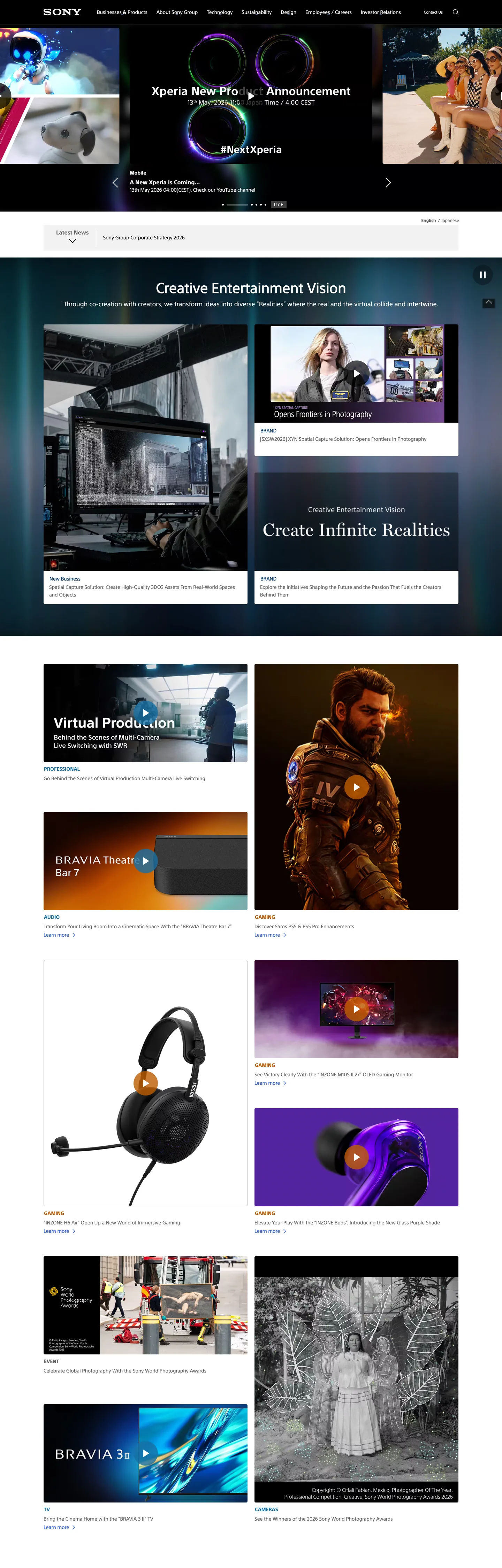
Sony's group portal is a corporate broadcast surface, not a marketing site. The chrome runs on grayscale — `"#656565"` text and hairlines carry 816 occurrences across the page, `"#ffffff"` carries 502, `"#000000"` carries 179 — and every primary CTA is a flat black rectangle with a white 1px outline. The page never reaches for a saturated brand voltage. Instead, four structural blues sit in the inline-link rail (`"#3865e0"`, `"#186fa4"`, `"#0000ee"`, `"#003366"`) and a single muted orange (`"#bc5b00"`) timestamps press releases. Where most consumer electronics portals lead with a hero CTA in brand color, Sony leads with editorial imagery — BRAVIA Theatre, Xperia, INZONE, Creative Entertainment Vision — and the chrome quietly recedes underneath.
This page packages the system as a Google Labs DESIGN.md spec. Inside: 18 colors tokens covering ink, surface, hairline, the four inline-link blues, the press-release timestamp orange, and the dark editorial canvas; 11 typography roles all set in the proprietary SST W20 face (Roman at 11.2–14px for body, navigation, and CTA labels; Bold at 12–16px for h2 and date stamps; a single 40px hero size pulled directly from the "Creative Entertainment Vision" headline); 5 radius tokens that collapse to a two-step scale of `"0px"` for structural surfaces and `"4px"` for cards; 9 spacing tokens stepping from 3px to 30px; and 16 components definitions covering primary and secondary buttons, the global nav, news strips, press-release rows, editorial cards, and the BRAVIA tile rhythm.
Feed this file to Claude, Cursor, or any AI tool that reads DESIGN.md tokens — the agent will produce React components that match Sony's actual restraint rather than a brighter consumer electronics template. Reference the tokens directly when building a corporate portal, an investor relations surface, or any product brand site where editorial photography needs to carry the page while typography stays under 14px. The system's value as a study is that it proves a consumer electronics giant can ship a homepage with zero saturated brand voltage and zero pill geometry — every action signal is the discipline of the rectangle.
What makes it distinct
5
- Ink-as-accent CTAevery primary button is a flat black rectangle ('#000000') with a 1px white hairline, never a saturated brand color
- Four-blue link rail'#3865e0', '#186fa4', '#0000ee', '#003366' are reserved for inline text links and never appear as fill, chip, or background
- Square-corner disciplineradius scale stops at '4px'; every CTA, every tile, every nav cell renders without pill geometry
- Photography carries the pagetypography sits at 12.8px and 14px across nav, body, and CTAs while BRAVIA, Xperia, INZONE editorials occupy the full bleed
- Proprietary SST W20 across every roleRoman for body and navigation, Bold for h2 and date stamps, no system fallback ever takes over above 16px
sony.com
Live at sony.com
A snapshot of the brand in production. Scroll the frame to see the whole page.
Colors
18 colors
Sony's system runs on #000000 as its primary voltage, used in 2 of 16 components. Type is set in SST W20 Roman across 11 tokens from 11.2px to 40px, weights 400–700. Shape language is sharp — components average 1px corner radius, favoring crisp rectangles.
Brand & Accent
Sparing, CTA-only voltage · 2
Surface
Page and card backgrounds · 3
Text
Headlines, body, captions · 10
Borders & Hairlines
Dividers, outlines, rules · 1
Other
Specialty colors · 2
Typography
11 type tokens
Set in SST W20 Roman across 11 tokens, from 11.2px to 40px, weights 400–700. Shown in its own stack: where the font isn't installed, the fallback the file names stands in.
- hero-display40px · weight 700 · lh 1.1The quick brown fox jumps over the lazy dog
- heading-md16px · weight 700 · lh 1.25The quick brown fox jumps over the lazy dog
- heading-sm14px · weight 700 · lh 1The quick brown fox jumps over the lazy dog
- body-lg18px · weight 400 · lh 1.4The quick brown fox jumps over the lazy dog
- body-md14px · weight 400 · lh 1.14The quick brown fox jumps over the lazy dog
- body-relaxed14px · weight 400 · lh 1.57The quick brown fox jumps over the lazy dog
- body-sm12.8px · weight 400 · lh 1.3The quick brown fox jumps over the lazy dog
- body-xs11.2px · weight 400 · lh 1.43The quick brown fox jumps over the lazy dog
- label-bold12.8px · weight 700 · lh 1.25The quick brown fox jumps over the lazy dog
- button-md14px · weight 400 · lh 1The quick brown fox jumps over the lazy dog
- timestamp14px · weight 700 · lh 2.28The quick brown fox jumps over the lazy dog
Layout
Radii and spacing
5 corner radii and 8 spacing values. Shape language: sharp.
Radii
- none0px
- sm2px
- md4px
- full9999px
- circle50%
Spacing
- xxs3px
- xs5px
- sm6px
- md8px
- base12.8px
- lg16px
- xl20px
- xxl30px
Components
16 components
Each rendered from its tokens (color, type, radius, padding) on Sony's own canvas.
- Button Primarybutton-primaryButton Primary
- Button Primary Hoverbutton-primary-hoverButton Primary Hover
- Button Secondarybutton-secondaryButton Secondary
- Primary Navprimary-navPrimary Nav
- Utility Navutility-navUtility Nav
- Text Linktext-linkText Link
- Text Link Investortext-link-investorText Link Investor
- Hero Band Darkhero-band-darkHero Band Dark
- Hero Band Lighthero-band-lightHero Band Light
- Product Tileproduct-tileProduct Tile
- Product Tile Darkproduct-tile-darkProduct Tile Dark
- News Cardnews-cardNews Card
- Press Release Rowpress-release-rowPress Release Row
- Timestamp Labeltimestamp-labelTimestamp Label
- Carousel Controlcarousel-controlCarousel Control
- Footer Sectionfooter-sectionFooter Section
In use
The system, in use
Sony's tokens on the kind of product it builds.
Build something people actually use.
A short paragraph of marketing copy that previews how the brand's display tier and body tier read together. Two sentences is usually enough.
FAQ
Sony design system FAQ
Common questions about Sony's tokens, components, and how to use this DESIGN.md in your project.
Read next
Related reading
Specs, directories, and component libraries that pair with this design system.
- Browse all design systemsThe full directory of DESIGN.md files on shadcn.io, with live mockups for each.shadcn.io
- Sony Group Portal — official siteSony Group Corporation's corporate portal covering businesses, products, technology, sustainability, and investor relations.sony.com (opens in a new tab)
- The DESIGN.md specificationGoogle Labs' open spec for machine-readable design system files — the format this page is built on.github.com (opens in a new tab)
Use it
Use Sony in your project
One machine-readable file. Drop it into Claude, Cursor, or any AI tool that reads DESIGN.md.
Download the DESIGN.md
One machine-readable file: every color, type, radius, spacing, and component token of Sony.
Feed it to your AI tool
Drop it into Claude, Cursor, or GitHub Copilot. The agent writes React components and Tailwind classes that match Sony's visual language.
Reference the tokens directly
Or paste the values into your Tailwind config, CSS variables, or component library: every color, size and radius is a quoted, ready-to-copy value.
Read the full DESIGN.md: overview, rationale, do’s and don’ts
Overview
Sony's corporate portal is a broadcast surface, not a marketing site — the chrome runs almost entirely on grayscale and the brand's primary action signal is ink-as-accent: every CTA is a flat black {colors.primary} rectangle with a 1px white hairline, and the saturated blues sit only in the inline-link rail where they never fill a button or chip. The page is organized as a vertical sequence of editorial bands — a top-of-page Xperia announcement strip, the Creative Entertainment Vision dark editorial band, a BRAVIA Theatre rail, an INZONE headphone callout, the "30 Years of PlayStation" content, and a press-release column — each a stack of product photography with structural captions at 14px or smaller.
Where most consumer electronics portals lead with a saturated brand voltage and a pill CTA, Sony's homepage leads with photography and asks the typography to stay under 14px across navigation, body, and CTA labels. The single 40px hero size appears once, on "Creative Entertainment Vision". Everything below it — taglines, product copy, press-release rows, footer chrome — sits at body proportion. This is typographic deference: the proprietary SST W20 face does the load-bearing work at sizes most marketing systems reserve for caption text.
Color rhythm comes from surface alternation rather than accent. The dark editorial band ({colors.surface-dark} — "#1f2024") takes over for the Creative Entertainment Vision moment, then the page returns to white {colors.surface} for product tiles, with {colors.surface-soft} ("#efefef") marking lighter card surfaces. Hairlines at {colors.hairline} ("#c3c3c3") divide rows in the press-release column. The four-blue inline-link rail ("#3865e0", "#186fa4", "#0000ee", "#003366") reflects different surface contexts under the Sony umbrella — corporate, legacy, IR — but no blue ever fills a surface.
Key Characteristics:
- Ink-as-accent CTAs:
{component.button-primary}is{colors.primary}("#000000") with a 1px{colors.primary-hairline}("#ffffff") outline,{rounded.none}, padding"20px 13px", height"54px". - Four-blue inline-link rail:
{colors.link-primary}("#3865e0"),{colors.link-deep}("#186fa4"),{colors.link-legacy}("#0000ee"),{colors.link-investor}("#003366") — text only, never fill. - Press-release timestamps land on a single muted orange (
{colors.timestamp}—"#bc5b00") rendered in SST W20 Bold at 14px. - Radius scale collapses to
{rounded.none}and{rounded.md}— every structural band is rectangular; only tiles and news cards round at"4px". - Proprietary SST W20 Roman + Bold covers every role, with Yu Gothic Medium as the Japanese fallback in the same declaration.
- Editorial photography from BRAVIA, Xperia, INZONE, and Creative Entertainment Vision carries 60–80% of every section's visual weight.
Colors
Source page analyzed: www.sony.com (Sony Group Portal home). 1763 elements scanned, 15 raw colors clustered to 13 perceptual tokens.
Brand & Accent
- Ink Primary (
{colors.primary}—"#000000") — frequency 179. Used as text (82), background (17), border (80). The CTA fill. This is the brand's load-bearing action signal — a rectangle in pure ink with a white hairline, not a saturated voltage. - Surface White (
{colors.surface}—"#ffffff") — frequency 502. Used as text (222), background (57), border (223). The dominant canvas across navigation, body, and the press-release column.
Text
- Body Gray (
{colors.body}—"#656565") — frequency 816. Used as text (410), border (406). The page's load-bearing text and hairline color simultaneously. Carries every secondary caption, every nav link, and every divider. - Body Strong (
{colors.body-strong}—"#1f2024") — frequency 9. Used as background (9). Reserved for the dark editorial band and the body strong text on light surfaces. Not pure black — a near-black that keeps the photography feeling editorial.
Surface
- Surface Soft (
{colors.surface-soft}—"#efefef") — frequency 66. Used as background (66). The lighter card surface in the product tile rail — just different enough from white to read as elevated. - Surface Dark (
{colors.surface-dark}—"#1f2024") — frequency 9. Used as background (9). The dark editorial canvas for the Creative Entertainment Vision band.
Hairlines & Borders
- Hairline Gray (
{colors.hairline}—"#c3c3c3") — frequency 2. Used as border (2). The press-release row divider and the product tile border. - Hairline Muted (
{colors.hairline-muted}—"#898991") — frequency 2. Used as text (1), border (1). A softer hairline reserved for utility nav row dividers.
Inline Link Rail
- Link Primary (
{colors.link-primary}—"#3865e0") — frequency 12. Used as text (6), border (6). The highest-occurrence inline-link blue across the page. - Link Deep (
{colors.link-deep}—"#186fa4") — frequency 8. Used as text (4), border (4). Older legal section inline links. - Link Legacy (
{colors.link-legacy}—"#0000ee") — frequency 6. Used as text (3), border (3). Browser-default blue retained for legacy surfaces. - Link Investor (
{colors.link-investor}—"#003366") — frequency 6. Used as text (3), border (3). Deep navy reserved for investor-relations deep links.
Semantic
- Timestamp Orange (
{colors.timestamp}—"#bc5b00") — frequency 8. Used as text (4), border (4). The press-release date-stamp color. The single warm tone in the entire system — appears nowhere else. - Swiper Accent (
{colors.swiper-accent}—"#007aff") — declared as the--swiper-theme-colorCSS variable for the carousel widget. Frequency 0 in the rendered page — the carousel inherits but doesn't paint the token directly on visible chrome.
Brand Gradient
No decorative gradients. Atmospheric depth comes from photography (BRAVIA Theatre product renders, Xperia lifestyle shots, INZONE headphone close-ups) rather than CSS overlays. Sony is the consumer electronics portal that ships without a single gradient-based design token on its homepage.
Typography
Font Family
- Primary:
"SST W20 Roman", "SST W55 Regular", Arial, "Helvetica Neue", Meiryo, "Hiragino Kaku Gothic ProN", sans-serif— Sony's proprietary corporate face, declared with Japanese fallbacks in the same stack for unified Western and JP rendering. - Bold variant:
"SST W20 Bold"— used for h2 headings at 14px and 16px, press-release timestamps, and the 40px hero headline at weight 700.
Hierarchy
| Token | Size | Weight | Line Height | Use |
|---|---|---|---|---|
{typography.hero-display} | 40px | 700 | 1.1 | The "Creative Entertainment Vision" headline — appears once on the page |
{typography.heading-md} | 16px | 700 | 1.25 | h2 section headings |
{typography.heading-sm} | 14px | 700 | 1 | Secondary headings, time stamps |
{typography.body-lg} | 18px | 400 | 1.4 | Editorial body callouts |
{typography.body-md} | 14px | 400 | 1.14 | Default body, CTA label |
{typography.body-relaxed} | 14px | 400 | 1.57 | Press-release row body with 22px leading |
{typography.body-sm} | 12.8px | 400 | 1.3 | Nav link, caption |
{typography.body-xs} | 11.2px | 400 | 1.43 | Utility nav, fine print |
{typography.label-bold} | 12.8px | 700 | 1.25 | Press-release definition list term |
{typography.button-md} | 14px | 400 | 1 | Primary CTA label — weight 400, not bold |
{typography.timestamp} | 14px | 700 | 2.28 | Press-release date stamp in {colors.timestamp} |
Principles
- Sub-14px load-bearing. The default body lands at 12.8px (nav, caption) or 14px (paragraph). The single 40px hero appears once on the page. Most marketing systems reserve 12.8px for footer fine-print — Sony uses it as the navigation default.
- CTA labels at weight 400, not 700.
{typography.button-md}is regular weight. The button's authority comes from the ink rectangle, not the type's bold weight. - Timestamps render at line-height 2.28. The press-release date stamps use
"32px"line-height on a 14px character — the relaxed leading is what gives the press-release column its breathable cadence. - Single-face system with Japanese fallback. SST W20 covers every role, and the fallback stack walks through Yu Gothic Medium and Hiragino Kaku Gothic ProN — Sony ships one declaration for both Western and JP rendering.
Note on Font Substitutes
- Inter at 400/700 is the closest open-source substitute. Run body at 14px / 400 / line-height 1.14 to keep the cadence.
- Roboto at 400/700 with the
Noto Sans JPfallback handles the Japanese-locale rendering. - Preserve the 16px line-height on body and the 20px line-height on h2 — Sony's tight leading is part of the corporate voice.
Layout
Spacing System
- Base scale: A non-power-of-two scale stepping 3px / 5px / 6px / 8px / 12.8px / 16px / 20px / 30px.
- Tokens:
{spacing.xxs}"3px"·{spacing.xs}"5px"·{spacing.sm}"6px"·{spacing.md}"8px"·{spacing.base}"12.8px"·{spacing.lg}"16px"·{spacing.xl}"20px"·{spacing.xxl}"30px". - CTA padding:
"20px 13px"on{component.button-primary}— a tall vertical, narrow horizontal padding that gives the button its 54px height. - Section vertical padding:
"30px"inside an editorial band; sections stack edge-to-edge without decorative gaps. - Press-release row padding:
"12.8px 0px"— the rows breathe vertically while sitting flush at the left and right edges of the column.
Grid & Container
- Page max width: ~1190px on editorial bands (the hero headline measured at 1190px wide), with full-bleed photography reaching the viewport edge.
- Column patterns: 2-column product tile grid on BRAVIA Theatre and INZONE rails; 1-column press-release rows; 3-to-4-column footer link grid.
- Gutters: 10px between tiles in a 2-up rail; 5px gaps inside CTA stacks.
Whitespace Philosophy
The page is dense by editorial-marketing standards — each section packs photography, headline, body copy, and a CTA into roughly one viewport. Photography occupies 60–80% of every band; copy compresses into a small slot at one edge. The press-release column inverts this: copy carries the band and photography drops out entirely. Unlike the convention of marketing pages that surround CTAs with 64px+ of breathing room, Sony's CTA pads to 20px vertical inside a 54px rectangle and the next section starts immediately below.
Elevation & Depth
| Level | Treatment | Use |
|---|---|---|
| Flat | No shadow, no border | Hero bands, editorial dark canvas, footer |
| Hairline | 1px {colors.hairline} border | Press-release row dividers, news cards |
| CTA outline | 1px {colors.primary-hairline} (white) on {colors.primary} fill | The primary action signal |
| Tile soft | {colors.surface-soft} background, no shadow | Product tile rail (BRAVIA, INZONE) |
Shadow philosophy. No drop-shadows appear on chrome. Elevation comes from (a) surface change between editorial bands (white ↔ {colors.surface-dark}), (b) hairline dividers in dense rows, and (c) the inverted CTA — a black rectangle with a white outline reads as elevated against the white canvas without needing a shadow. This is shadow-as-outline: where most systems use box-shadow for elevation, Sony uses a contrasting 1px border on the ink rectangle.
Decorative Depth
- Editorial photography (BRAVIA Theatre, Xperia, INZONE close-ups) supplies mood; no gradient overlay.
- Dark editorial band breaks the white-dominant page rhythm without using a border or rule.
- Hairline column in the press-release rail divides rows at
{colors.hairline}without inflating elevation.
Shapes
Border Radius Scale
| Token | Value | Use |
|---|---|---|
{rounded.none} | "0px" | Hero bands, primary CTAs, nav cells, editorial canvases, footer |
{rounded.sm} | "2px" | Rare inline chip — appears once on the page |
{rounded.md} | "4px" | Product tiles, news cards (30 occurrences) |
{rounded.full} | "9999px" | Reserved token, not used on default chrome |
{rounded.circle} | "50%" | Carousel control circle |
Geometry
- Hero imagery: full-bleed rectangular; product renders never round at the hero band.
- Product tile: square 1:1 or 4:3 crops at
"4px"radius on the news strip and BRAVIA rail. - Press-release row: zero radius — flush rectangular rows separated by
{colors.hairline}1px borders. - Carousel control: the one
"50%"shape in the system — the Swiper carousel paddle widget.
Components
Top Navigation
primary-nav — Persistent white nav bar with text in {colors.body} ("#656565") using {typography.body-sm} (12.8px / 400). Height "54px", padding "0px 12.8px", {rounded.none}. The brand mark sits at the left edge in pure black ink; nav links run inline at 12.8px without underline. Right-aligned cluster: language selector, search, account.
utility-nav — A thinner secondary nav row at 40px height, {typography.body-xs} (11.2px / 400). Houses category links and corporate-section deep links.
Buttons
button-primary — The Sony signature CTA. Background {colors.primary} ("#000000"), text {colors.on-primary} ("#ffffff") in {typography.button-md} (SST W20 Roman 14px / 400 — note weight 400, not bold), 1px {colors.primary-hairline} ("#ffffff") outline, {rounded.none}, padding "20px 13px", height "54px". The ink rectangle with the white hairline IS the brand action signal.
button-primary-hover — Same surface; hover state was not documented in the captured page.
button-secondary — Background {colors.surface} (white), text {colors.ink}, 1px {colors.hairline} border, {rounded.none}, padding "12px 16px". Reads as the "ghost rectangle" pair to the ink primary.
text-link — Inline body link in {colors.link-primary} ("#3865e0") with {typography.body-md}. The default link voltage across the editorial body.
text-link-investor — Inline link variant for investor-relations deep links in {colors.link-investor} ("#003366"). Reserved for IR contexts where the deeper navy distinguishes the link from corporate-page body links.
Bands & Cards
hero-band-dark — The Creative Entertainment Vision editorial band. Background {colors.surface-dark} ("#1f2024"), text {colors.on-dark}, {typography.hero-display} (40px / 700), {rounded.none}, padding "30px 20px". Sits at full bleed with a centered headline and a product render filling the remaining width.
hero-band-light — White editorial band for product callouts. Background {colors.surface}, text {colors.body-strong}, {typography.heading-md} (16px / 700), {rounded.none}, padding "30px 20px".
product-tile — BRAVIA, Xperia, INZONE tile. Background {colors.surface-soft} ("#efefef"), text {colors.body-strong}, {typography.body-md} (14px / 400), {rounded.md} ("4px"), padding "16px". Product photography occupies the top 60–70%; caption strip at the bottom.
product-tile-dark — Dark-canvas product tile variant. Background {colors.surface-dark}, text {colors.on-dark}, same proportions. Used in the headphone (INZONE) and editorial rails.
news-card — White card with {colors.hairline} 1px border, {rounded.md}, padding "16px". Houses a thumbnail, headline in {typography.body-md}, and a {component.text-link} "Read more" link.
press-release-row — A flush row at {rounded.none} with a 1px {colors.hairline} bottom border. Padding "12.8px 0px". Left: {component.timestamp-label}. Center: {typography.body-relaxed} (14px / 400 / line-height 22px). Right: a small category chip.
timestamp-label — {colors.timestamp} ("#bc5b00") text in {typography.timestamp} (SST W20 Bold 14px / 700 / line-height 32px). The single warm-color token in the entire system — and it appears only on press-release date stamps.
carousel-control — A 44 × 44px paddle for the Swiper widget. Background transparent, icon in {colors.swiper-accent} ("#007aff"), {rounded.circle} ("50%"). The one circular element on the page.
footer-section — Background {colors.surface} (white), text {colors.body}, {typography.body-sm}, {rounded.none}, padding "30px 20px". Multi-column link grid with category headings in {typography.label-bold} (12.8px / 700).
Do's and Don'ts
Do
- Use
{component.button-primary}({colors.primary}ink rectangle with a 1px white hairline) as the universal primary CTA. The rectangle IS the action signal — adding a fill color would dilute the system. - Run CTA labels at
{typography.button-md}(14px / weight 400). The button gets authority from the ink rectangle, not from bold weight on the label. - Reserve
{colors.link-primary}("#3865e0") for inline text links only. Never fill a button, chip, or card with it. - Use
{colors.timestamp}("#bc5b00") only for press-release date stamps and similar editorial metadata. It is the sole warm-tone token in the system. - Drop typography below 14px for navigation (12.8px) and utility nav (11.2px) — Sony's nav cadence depends on the sub-14px scale.
- Keep editorial photography at 60–80% of every band's vertical area; let typography compress into the remaining slot.
Don't
- Don't fill
{component.button-primary}with{colors.link-primary}("#3865e0") or any other saturated blue — the inline-link rail and the CTA grammar are intentionally separate. If a button needs more weight, increase contrast inside the rectangle, not by switching color. - Don't use
{typography.hero-display}(40px / 700) more than once per page. It is reserved for the editorial hero headline (Creative Entertainment Vision) and the page's typographic restraint depends on its scarcity. - Don't round
{component.button-primary}to{rounded.md}or{rounded.full}— Sony's CTA is{rounded.none}and the pill would read as a different brand entirely. - Don't apply
{colors.timestamp}("#bc5b00") to a body link or a button — its 8 occurrences on the page are all date stamps in{typography.timestamp}, never inline link text. - Don't introduce a saturated brand voltage for primary actions. The system's identity rests on ink-as-accent; replacing the black rectangle with a saturated fill collapses the discipline. If you must add a hover voltage, increase the white-hairline weight from 1px to 2px rather than swapping the
{colors.primary}token. - Don't use
{colors.body}("#656565") as a fill — 406 of its 816 occurrences are asborderColorand the other 410 are text. For surface fills, use{colors.surface}or{colors.surface-soft}instead.
Known Gaps
- Form validation states were not surfaced in the captured page; no text-input chrome appears on the home portal (search field was rendered as a Swiper carousel paddle, not a typing field).
- Hover and focus states were not captured per system policy; only default and structural states are documented.
- Sub-brand surfaces (PlayStation, Sony Pictures, Sony Music, BRAVIA product pages) were not analyzed — those carry their own design vocabularies layered on top of the corporate chrome.
- Mobile layout synthesizes the desktop evidence; mobile breakpoints were not captured directly.
- Investor relations and sustainability sub-pages likely introduce additional chart, table, and data-table chrome not present on the homepage.
- CMS-driven content (rotating Xperia announcements, BRAVIA seasonal callouts) varies per surface — the documented components describe structural patterns, not the rotating editorial content.
Consumer Electronics
More systems like this
More DESIGN.md files in Consumer Electronics.
Pricing
Build it with Pro
The DESIGN.md files are free. Pro adds 6,000+ blocks, premium templates and the MCP server, so your AI editor builds in your system for you.
4.9/5 out of 5 · 150+ reviewsfrom 150+ founders and developers.
Billing
Billed once a year in USD. Cancel anytime.
- How many people can use the license.
- Client work, SaaS products and anything you charge for.
- Production-ready React sections: hero, pricing, features, dashboards and more.
- Complete multi-page sites you can ship as they are.
- React icons from every major library, installable with one command.
- Presets that restyle every block, in light and dark.
- Lets your AI editor search, preview and install blocks for you.
- Priority requests are answered first.
Individual
For personal projects & open source
$32instead of $49/mo
$389 billed yearly
- Seats: 1 seat
- Commercial use: Personal & open source only
- Pro blocks: 6,000+ blocks
- Templates: All 14 templates
- React icons: 294k+ icons
- Themes: All 59 themes
- MCP server: Basic usage
- Support: Standard
Team
Most popularFor freelancers, agencies & startups
$66instead of $99/mo
$789 billed yearly · ≈ $13/dev/mo
- Seats: Up to 5 seats
- Commercial use: Included
- Pro blocks: 6,000+ blocks
- Templates: All 14 templates
- React icons: 294k+ icons
- Themes: All 59 themes
- MCP server: High usage
- Support: Priority
Organization
For companies with larger teams
$132instead of $199/mo
$1,589 billed yearly
- Seats: Unlimited seats
- Commercial use: Included
- Pro blocks: 6,000+ blocks
- Templates: All 14 templates
- React icons: 294k+ icons
- Themes: All 59 themes
- MCP server: Unlimited usage
- Support: Priority
Billed once a year in USD. Cancel anytime.
Individual
For personal projects & open source
$32instead of $49/mo
$389 billed yearly
- How many people can use the license.Seats: 1 seat
- Client work, SaaS products and anything you charge for.Commercial use: Personal & open source only
- Production-ready React sections: hero, pricing, features, dashboards and more.Pro blocks: 6,000+ blocks
- Complete multi-page sites you can ship as they are.Templates: All 14 templates
- React icons from every major library, installable with one command.React icons: 294k+ icons
- Presets that restyle every block, in light and dark.Themes: All 59 themes
- Lets your AI editor search, preview and install blocks for you.MCP server: Basic usage
- Priority requests are answered first.Support: Standard
Team
Most popularFor freelancers, agencies & startups
$66instead of $99/mo
$789 billed yearly · ≈ $13/dev/mo
Everything in Individual, plus
- How many people can use the license.Seats: Up to 5 seats
- Client work, SaaS products and anything you charge for.Commercial use: Included
- Lets your AI editor search, preview and install blocks for you.MCP server: High usage
- Priority requests are answered first.Support: Priority
Organization
For companies with larger teams
$132instead of $199/mo
$1,589 billed yearly
Everything in Team, plus
- How many people can use the license.Seats: Unlimited seats
- Lets your AI editor search, preview and install blocks for you.MCP server: Unlimited usage
- Secure checkout via Stripe
- Code lives in your repo
- Keep what you've shipped if you cancel
- License terms
Your system, built for you
Every block, template and icon, installed by your AI agent in your design system. The DESIGN.md files stay free.