Sonos Design System
Sonos's design system as a DESIGN.md file. Black #000000, aktiv-grotesk, 35 colors, 25 components. For React, Next.js, and AI tools.
Add shadcn.io to your AI agent. · Pro It installs blocks, icons and templates in your design system from a prompt, with Pro.
Set up MCP- Primary
- #000000
- Typeface
- aktiv-grotesk
- Shape
- Soft
- Base radius
- 20px
- Colors
- 35
- Type tokens
- 14
- Components
- 25
- Spacing values
- 9
About
About Sonos DESIGN.md
Curated by Dov Azencot · Updated May 13, 2026 · Source sonos.com (opens in a new tab)
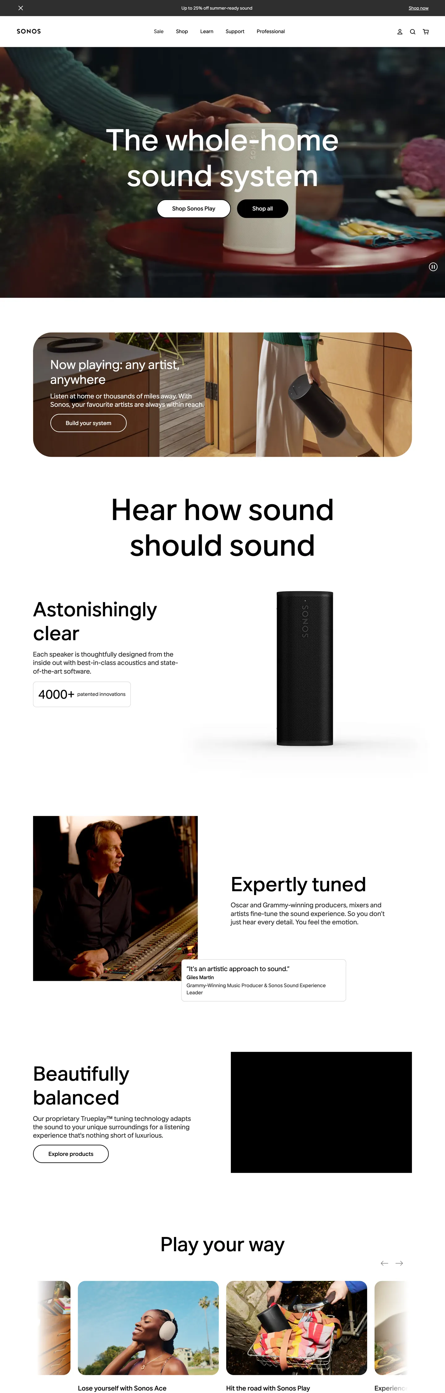
Sonos's homepage is a black showroom shot through a single soft-pill cookie-cutter. Above the fold, a near-full-bleed photograph of a speaker on a dim kitchen counter carries the entire mood; on top sits a 96px / weight-500 aktiv-grotesk headline — "The whole-home sound system" — flanked by two stacked 80px-radius pill CTAs ("Shop all" in black, "Sign in" in a black outline). The black CTA pill is the page's primary geometry: a 16×48px-padded slab with a 59px height and a corner radius (80px) just shy of a full capsule. Below the fold the canvas flips white, the typography stays inside the same aktiv-grotesk family, and product copy ("Astonishingly clear", "Expertly tuned", "Beautifully balanced") sits beside a single column of vertical speaker photography.
This page captures Sonos's web presence as a DESIGN.md file — Google Labs' open spec for machine-readable design tokens. Inside: 35 colors tokens covering the two-voltage chrome (black and white at 569 and 442 occurrences respectively), the four near-grey ladder tones (#bfbfbf, #2e2e2e, #e0e0e0, #f4f4f4) used for hairlines and disabled chrome, plus a reserve palette of 14 named accent hexes (coral "#ec5770", walnut "#947051", cobalt "#1f30ca", parakeet green "#03c04a", linen "#f9f5f1") that the brand's CSS publishes but the homepage refuses to spend; 14 typography tokens running entirely on aktiv-grotesk with sizes 14 / 16 / 18 / 21 / 40 / 48 / 64 / 72 / 96 and weights 400 / 500 / 700; six radius tokens led by the signature 80px super-pill (count 20); and 25 components definitions covering hero, nav, product card, footer newsletter input, and the four-tier surface ladder.
Drop the file into Claude, Cursor, GitHub Copilot, or any AI assistant that reads structured tokens. The agent will produce React components that match Sonos's chrome — two-voltage black/white discipline, 80px stretched-pebble pills, magazine-pace 21px body type — rather than a generic e-commerce theme. Reference the tokens directly when auditing an existing product surface, when building a hardware-marketing landing page, or when teaching the difference between a brand that publishes a wide color reserve and one that spends it. Sonos publishes the reserve, then prints the homepage in black ink — restraint as a productivity decision, not a stylistic one.
What makes it distinct
5
- Two-voltage chromepure black (#000000, 569 occurrences) and pure white (#ffffff, 442 occurrences) carry every nav, button, and surface
- The 80px super-pillcount 20, the most-used radius on the page; not a 9999px capsule, not a 12px button, an in-between curve that reads as a stretched pebble
- One typeface ladderaktiv-grotesk at sizes 14/16/18/21/40/48/64/72/96, weights 400/500/700, with weight 500 doing the load-bearing display work
- Reserve color palette22 named accent tokens (coral, walnut, sunset, parakeet green, cobalt) defined in CSS, zero painted on the homepage
- Hero at 96px / 1.2display copy 'The whole-home sound system' breathes across 230px of vertical space with normal tracking, no negative letterspacing
sonos.com
Live at sonos.com
A snapshot of the brand in production. Scroll the frame to see the whole page.
Colors
35 colors
Sonos's system anchors on #000000 (ink-fill) as its primary color. Type is set in aktiv-grotesk across 14 tokens from 14px to 96px, weights 400–700. Shape language is soft — components average 41px corner radius, with no sharp interactive edges.
Surface
Page and card backgrounds · 5
Text
Headlines, body, captions · 6
Borders & Hairlines
Dividers, outlines, rules · 2
Other
Specialty colors · 22
Typography
14 type tokens
Set in aktiv-grotesk across 14 tokens, from 14px to 96px, weights 400–700. Shown in its own stack: where the font isn't installed, the fallback the file names stands in.
- display-xl96px · weight 500 · lh 1.2The quick brown fox jumps over the lazy dog
- display-lg72px · weight 500 · lh 1.2The quick brown fox jumps over the lazy dog
- display-md64px · weight 500 · lh 1.2The quick brown fox jumps over the lazy dog
- display-sm48px · weight 500 · lh 1.2The quick brown fox jumps over the lazy dog
- section-title42px · weight 500 · lh 1The quick brown fox jumps over the lazy dog
- heading-md40px · weight 400 · lh 1.2The quick brown fox jumps over the lazy dog
- lead21px · weight 500 · lh 1.4The quick brown fox jumps over the lazy dog
- body-lg21px · weight 400 · lh 1.3The quick brown fox jumps over the lazy dog
- body-md18px · weight 400 · lh 1.4The quick brown fox jumps over the lazy dog
- button18px · weight 500 · lh 1.3The quick brown fox jumps over the lazy dog
- nav-link16px · weight 400 · lh 1.3The quick brown fox jumps over the lazy dog
- heading-card16px · weight 700 · lh 1.3The quick brown fox jumps over the lazy dog
- caption14px · weight 400 · lh 1.5 · tracking 0.192pxThe quick brown fox jumps over the lazy dog
- micro14px · weight 400 · lh 1.3The quick brown fox jumps over the lazy dog
Layout
Radii and spacing
7 corner radii and 9 spacing values. Shape language: soft.
Radii
- none0px
- sm10px
- md20px
- lg24px
- hero-card60px
- pebble80px
- pill9999px
Spacing
- xxs4px
- xs6px
- sm12px
- md16px
- lg24px
- xl48px
- xxl56px
- section112px
- band734px
Components
25 components
Each rendered from its tokens (color, type, radius, padding) on Sonos's own canvas.
- Button Primarybutton-primaryButton Primary
- Button Primary On Photobutton-primary-on-photoButton Primary On Photo
- Button Secondary Outline Darkbutton-secondary-outline-darkButton Secondary Outline Dark
- Button Secondary Outline Lightbutton-secondary-outline-lightButton Secondary Outline Light
- Button Pill Chipbutton-pill-chipButton Pill Chip
- Text Linktext-linkText Link
- Text Link On Darktext-link-on-darkText Link On Dark
- Top Navtop-navTop Nav
- Sub Nav Utilitysub-nav-utilitySub Nav Utility
- Hero Banner Darkhero-banner-darkHero Banner Dark
- Editorial Band Lineneditorial-band-linenEditorial Band Linen
- Editorial Band Whiteeditorial-band-whiteEditorial Band White
- Product Cardproduct-cardProduct Card
- Product Card Featureproduct-card-featureProduct Card Feature
- Product Tile Imageproduct-tile-imageProduct Tile Image
- Category Cardcategory-cardCategory Card
- Promo Strip Darkpromo-strip-darkPromo Strip Dark
- Newsletter Inputnewsletter-inputNewsletter Input
- Newsletter Submitnewsletter-submitNewsletter Submit
- Badge Infobadge-infoBadge Info
- Rating Striprating-stripRating Strip
- FooterfooterFooter
- Footer Link Column Titlefooter-link-column-titleFooter Link Column Title
- Footer Fine Printfooter-fine-printFooter Fine Print
- Region Selectorregion-selectorRegion Selector
In use
The system, in use
Sonos's tokens on the kind of product it builds.
Build something people actually use.
A short paragraph of marketing copy that previews how the brand's display tier and body tier read together. Two sentences is usually enough.
FAQ
Sonos design system FAQ
Common questions about Sonos's tokens, components, and how to use this DESIGN.md in your project.
Read next
Related reading
Specs, directories, and component libraries that pair with this design system.
- Browse all design systemsThe full directory of DESIGN.md files on shadcn.io, with live mockups for each.shadcn.io
- Sonos — official siteThe black-canvas consumer-audio homepage this DESIGN.md file documents.sonos.com (opens in a new tab)
- The DESIGN.md specificationGoogle Labs' open spec for machine-readable design system files — the format this page is built on.github.com (opens in a new tab)
Use it
Use Sonos in your project
One machine-readable file. Drop it into Claude, Cursor, or any AI tool that reads DESIGN.md.
Download the DESIGN.md
One machine-readable file: every color, type, radius, spacing, and component token of Sonos.
Feed it to your AI tool
Drop it into Claude, Cursor, or GitHub Copilot. The agent writes React components and Tailwind classes that match Sonos's visual language.
Reference the tokens directly
Or paste the values into your Tailwind config, CSS variables, or component library: every color, size and radius is a quoted, ready-to-copy value.
Read the full DESIGN.md: overview, rationale, do’s and don’ts
Overview
Sonos's homepage is two-voltage chrome on a four-tier surface ladder — a black-and-white interface that publishes 14 named accent colors in its CSS and then prints the entire page in ink. The hero is full-bleed photography of a portable speaker on a dim kitchen counter; over it sits a 96px / weight-500 aktiv-grotesk display headline and two stacked 80px-radius CTAs ("Shop all" filled black, "Sign in" outlined white). Below the fold the canvas flips to white, then to parchment-tone linen (#f9f5f1), then back to pure white for the product-card row, then to pure black for the footer. The color change is the divider.
Where most consumer-hardware brands spend a vivid accent on every primary CTA — Bose's signature blue, Sonos's own historical product-line color — the current Sonos site refuses. Pure black #000000 appears 569 times in the rendered DOM (281 as text, 19 as background, 265 as border, 4 as shadow); pure white #ffffff appears 442 times (218 as text, 6 as background, 216 as border). The next-most-used color, mid-grey #bfbfbf, only surfaces in hairlines and disabled chrome. The brand publishes a reserve palette — coral, walnut, cobalt, parakeet green, sunset, linen — but the homepage spends none of it on UI.
The geometry signature is the 80px stretched-pebble pill. Twenty of the page's twenty corners ride this single value, applied to every primary CTA at a 59px height. At 80px, the corner is rounder than an 8px utility button, softer than a 9999px capsule — an in-between curve that reads as a tactile audio-hardware control rather than a web button. The 9999px true-pill exists too (count 12) but is reserved for outlined chips and the in-photo discovery pill.
Key Characteristics:
- Two-voltage chrome — pure black and pure white carry every nav, button, surface, and hairline.
- Reserve palette discipline — 14 accent hexes in the CSS, zero on the homepage; color is the photograph, never the UI.
- The 80px super-pill — the most-used radius (count 20), the button signature, neither capsule nor square.
- One typeface (
aktiv-grotesk) across every tier; the ladder is sizes 14 / 16 / 18 / 21 / 40 / 48 / 64 / 72 / 96 at weights 400 / 500 / 700. - Hero at 96px / weight 500 / 1.2 line-height with normal letterspacing — no display-tight tracking, the headline breathes.
- Four-tier surface ladder: black hero → linen editorial → white product cards → black footer. No borders, no shadows between tiers.
- Magazine reading pace — body sets at 21px / weight 400 / 1.3 line-height, well above the 16px SaaS convention.
- Shadow-as-absence — four shadow uses across 1,212 scanned elements; elevation comes from surface flip, not from drop-shadow.
Colors
Source page analyzed: the en-US homepage at
www.sonos.com. The extractor scanned 1,212 elements; the color counts below come directly from the rendered DOM.
Voltage
- Pure Black (
{colors.ink}—#000000) — frequency 569. Used as text (281), border (265), background (19), shadow (4). The dominant ink. Every primary CTA fill, every footer surface, every nav-bar background, and every body-text run on a light canvas. Reads as printed ink, not as "dark mode" — there is no warmer-than-black alternative in the CSS. - Pure White (
{colors.on-ink}—#ffffff) — frequency 442. Used as text (218), border (216), background (6), gradient (2). The companion voltage — every text run on a dark canvas, every outlined CTA border, every product-card surface.
Reserve (published but unspent)
- Coral (
{colors.reserve-coral}—#ec5770) — frequency 0. Defined as--color-coralin the CSS; the homepage never paints with it. - Walnut (
{colors.reserve-walnut}—#947051) — frequency 0. Defined as--color-walnut; product-line accent that doesn't reach the marketing surface. - Cobalt Dark (
{colors.reserve-cobalt-dark}—#1f30ca) — frequency 0. Defined as--color-cobaltDark; reserved for sub-brand contexts (Move, Roam) not surfaced on the homepage. - Parakeet Green (
{colors.reserve-green-parakeet}—#03c04a) — frequency 0. Defined as--color-greenParakeet; available for status states and the rare Sonos-app micro-context. - Sunset (
{colors.reserve-sunset}—#d07464) — frequency 0. Defined as--color-sunset; a product-photography accent (Era 300's sunset finish) not painted in chrome. - Linen (
{colors.canvas-linen}—#f9f5f1) — frequency 0 in rendered styles, but registered as a CSS variable--color-linenand visible in the mid-page editorial band's photographic backdrop. The lone reserve hex that crosses into chrome.
Text
- Text Secondary (
{colors.text-secondary}—#737373) — frequency 2. Used as text (1), border (1). The fine-print tone — review-rating counts, footer micro-copy. - Text Tertiary (
{colors.text-tertiary}—#bfbfbf) — frequency 134. Used as text (67), border (67). The hairline-and-disabled grey — disabled input chrome, low-contrast secondary captions, newsletter input bottom border. - Ink Soft (
{colors.ink-soft}—#2e2e2e) — frequency 43. Used as text (21), border (19), background (3). A near-black used where a 1-px lighter tone is needed against pure-black surfaces — typically borders inside the dark footer and the rare anchor-link rest state.
Hairline & Surface
- Hairline (
{colors.hairline}—#e0e0e0) — frequency 5. Used as border (4), shadow (1). Card outlines on the product-row tiles and the only hex that ever rides the shadow channel as a tonal-step. - Surface Lighter (
{colors.surface-lighter}—#f4f4f4) — frequency 3. Used as background (2), border (1). The page's lightest non-white surface — a quiet step beneath the white canvas for product-card thumbnail backings. - Canvas Soft White (
{colors.canvas-soft-white}—#eeeeee) — defined in the CSS as--color-soft-white. The hex behind feature-card pills and chip backings.
Shadow
- Shadow Base (
{colors.shadow-base}—#454749) — defined as--color-shadow-black; the system's only shadow color. In production, applied at low opacity (rgba(69, 71, 73, 0.04)) on the rare elevated card. Across 1,212 scanned elements, only four shadow uses surface — Sonos's elevation is the surface flip, not the drop-shadow.
Typography
Font Family
- All tiers:
aktiv-grotesk, Helvetica, Arial, sans-serif(Dalton Maag, 2010; Adobe Fonts hosted). Defines the voice of every headline, body paragraph, button label, nav link, footer column heading, and caption. The system is unusually compact for a multinational consumer-electronics brand — one family, three weights (400 / 500 / 700), nine size stops.
Hierarchy
| Token | Size | Weight | Line Height | Letter Spacing | Use |
|---|---|---|---|---|---|
{typography.display-xl} | 96px | 500 | 1.20 | 0 | Homepage hero "The whole-home sound system" |
{typography.display-lg} | 72px | 500 | 1.20 | 0 | Secondary hero / category landing headlines |
{typography.display-md} | 64px | 500 | 1.20 | 0 | Editorial band leads ("Hear how sound should sound") |
{typography.display-sm} | 48px | 500 | 1.20 | 0 | Section heads inside editorial bands |
{typography.section-title} | 42px | 500 | 1.00 | 0 | Newsletter / footer eyebrow ("Never miss a beat or an offer") |
{typography.heading-md} | 40px | 400 | 1.20 | 0 | Product-line headings on the alternating-band rows |
{typography.lead} | 21px | 500 | 1.40 | 0 | Card titles and product-row headers ("Astonishingly clear") |
{typography.body-lg} | 21px | 400 | 1.30 | 0 | Default running paragraph copy below 64px headings |
{typography.body-md} | 18px | 400 | 1.40 | 0 | Compact paragraph copy and link runs |
{typography.button} | 18px | 500 | 1.30 | 0 | Every CTA label across primary, outline, and submit |
{typography.nav-link} | 16px | 400 | 1.30 | 0 | Top-nav links, footer column entries |
{typography.heading-card} | 16px | 700 | 1.30 | 0 | Card titles in dense rows; footer column titles |
{typography.caption} | 14px | 400 | 1.50 | 0.192px | Promo strip, ratings, fine print — the one tracked-out style |
{typography.micro} | 14px | 400 | 1.30 | 0 | In-photo chip labels and inline metadata |
Principles
- Weight 500 is the load-bearing display weight. Every display tier from 48px through 96px sits at weight 500. Weight 700 is reserved for the 16px card-title tier — the one mid-level emphasis stop. Weight 400 runs body, nav, and the bulk of inline copy.
- No negative letterspacing. Aktiv-grotesk at 96px sits with
letter-spacing: normal. The headline breathes — no display-tight tracking, no-0.5pxheadline cut. Where Apple compresses display copy with-0.374px, Sonos lets it run open. - Body at 21px, not 16px. The default running paragraph below a 64px heading sets at 21px / weight 400 / 1.3 leading. The page reads at a magazine pace — slowed down, full sentences, generous lines. The 16px nav-link tier is the secondary text mass, not the body.
- Two near-twin 21px tokens.
{typography.lead}(21px / 500 / 1.4) and{typography.body-lg}(21px / 400 / 1.3) share size but split on weight — emphasis lives in weight, not in a bigger size. - Tracking is reserved for one role. The caption tier (
{typography.caption}) carries0.192pxletter-spacing — the only tracked-out style in the ladder, used for the dark promotional strip, rating counts, and footer fine print.
Note on Font Substitutes
Aktiv Grotesk is licensed via Adobe Fonts and Linotype. When you can't reach it:
- Inter (Google Fonts, variable) is the closest open-source substitute. Match weights 400 / 500 / 700 exactly.
- Aktiv Grotesk runs slightly wider than Inter at the same point size — bump font-size up 0.5–1px on display tiers if absolute size-parity matters.
- Keep
letter-spacing: normalon display sizes. The Sonos voice is open tracking, not tight.
Layout
Spacing System
- Base unit: 8px, with a 4px sub-base used in tight typographic spots and a 56px / 112px structural rhythm at the section level.
- Tokens:
{spacing.xxs}4px ·{spacing.xs}6px ·{spacing.sm}12px ·{spacing.md}16px ·{spacing.lg}24px ·{spacing.xl}48px ·{spacing.xxl}56px ·{spacing.section}112px ·{spacing.band}734px. - Section padding:
{spacing.section}(112px) top-and-bottom inside an editorial band; bands stack edge-to-edge. - Card padding:
{spacing.lg}(24px) on product-row tiles; the feature card uses{spacing.xxl}(56px). - Button padding:
16px × 48pxacross every primary CTA — the value appears 10 times on the page. - Hero band: the most distinctive structural value is
734px 0px 0px(count 2) — a top-side band that pushes content into the lower third of the viewport, lifting the speaker photograph into the upper two-thirds.
Grid & Container
- Max content width: roughly 1440px on product rows and editorial bands; full-bleed on the hero and footer.
- Side padding:
0px 106.667px(count 13) — the dominant horizontal-padding token, used to set the centered content column across editorial sections. - Column patterns: single-column centered stack inside editorial bands; 4-column product-card grid in the "Play your way" row.
- Gutters: 24px between cards in a product row.
Whitespace Philosophy
Sonos's whitespace is the photograph's frame. Every editorial band starts with 112px of air, the speaker render sits roughly 96px from the nearest copy, and the four-card "Play your way" row breathes with 24px gutters on a centered axis. The hero band pushes its content to the lower third of the viewport (the 734px top-offset value), reserving the upper two-thirds for the photograph itself — the speaker on the counter, lit from one side, atmospherically warm.
Elevation & Depth
| Level | Treatment | Use |
|---|---|---|
| Flat | No shadow, no border | Hero, editorial bands, footer — every tier except the product row |
| Hairline | 1px {colors.hairline} ring | Product-row cards, category cards |
| Surface flip | Tier-to-tier canvas change (black → linen → white → black) | Section dividers across the homepage |
| Photography light | Inherent atmospheric light in the hero photograph | Mood and depth above the fold |
Shadow philosophy. Sonos uses shadow-as-absence. The extractor surfaced one shadow color (#454749) and four total shadow uses across 1,212 scanned elements. Elevation comes from (a) the full-bleed surface flip between tiers and (b) the contrast between a black 80px pill on a black photographic backdrop, which holds its shape only via the white label. Where most consumer-hardware marketing reaches for soft drop-shadows under product renders, Sonos lets the photography carry its own light — a discipline shared with the airbnb and apple homepages, applied to a single-product audio surface.
Decorative Depth
- Atmospheric photography in the hero — the speaker on a warm-lit counter — supplies all chromatic mood; no CSS gradient or overlay is involved.
- Edge-to-edge band alternation creates rhythm without borders, shadows, or rules — the canvas change is the section divider.
- The hero's 734px top-offset lifts the photograph into the upper two-thirds of the viewport, an unusual structural choice for a homepage hero where most brands center the copy.
Shapes
Border Radius Scale
| Token | Value | Use |
|---|---|---|
{rounded.none} | "0px" | Full-bleed bands, hero, footer, photographic surfaces |
{rounded.sm} | "10px" | Inline tags and meta chips |
{rounded.md} | "20px" | Product thumbnail tiles inside cards |
{rounded.lg} | "24px" | Product-row cards, category cards |
{rounded.hero-card} | "60px" | Feature card on the editorial band ("Now playing, any artist, anywhere") |
{rounded.pebble} | "80px" | Every primary CTA — the brand button signature, count 20 on the page |
{rounded.pill} | "9999px" | In-photo "Discover speakers" pill chips and outlined secondary CTAs |
Photography Geometry
- Hero imagery: full-bleed, atmospheric, warm-toned; the product is on-axis with the viewer.
- Product renders: square or slightly portrait crops at
{rounded.lg}(24px) corner radius, set on light surfaces. - Feature card imagery: the editorial band's hero card uses
{rounded.hero-card}(60px) — a softer, larger curve that visually pairs with the 80px CTA pill. - No rounded full-bleed surfaces — the hero and footer are rectangular, edge-to-edge. Rounding is for objects on top of a band, never for the band itself.
Components
Top Navigation
top-nav — Ultra-thin black bar pinned to the top of the page. Background {colors.ink}, height 76px, padding 0px 53.3333px. Links in {typography.nav-link} (16px / 400) in {colors.on-ink}. Logo on the left; primary nav links inline; right-aligned cluster (Search, Account, Cart icons). On scroll, the bar stays pinned and opaque — no transparency, no blur.
sub-nav-utility — A secondary white nav row sometimes drops below the top-nav on product pages. Background {colors.canvas}, same 76px height, links in {colors.ink}. Renders a category-name leader on the left and a primary CTA pill on the right.
Buttons
button-primary — The signature Sonos action. Background {colors.ink} (#000000), text {colors.on-ink} in {typography.button} (aktiv-grotesk 18px / 500), rounded {rounded.pebble} (80px — the stretched-pebble curve), padding 16px × 48px, height 59px. Appears 20+ times across the homepage as "Shop all", "Discover speakers", "Find your sound", and every footer CTA. The 80px radius is the brand button signature.
button-primary-on-photo — Same geometry as {component.button-primary} but used over photography. Sits on the dark hero atop a warm-lit kitchen counter — the contrast holds the shape through the label alone, not through a shadow.
button-secondary-outline-dark — Used as the second CTA on the dark hero. Background transparent, text {colors.on-ink}, ringed by a 1px {colors.on-ink} border, rounded {rounded.pebble} (80px), padding 16px × 48px, height 59px.
button-secondary-outline-light — The light-canvas counterpart for editorial bands and product pages. Background transparent, text {colors.ink}, ringed by a 1px {colors.ink} border, otherwise identical to its dark sibling.
button-pill-chip — In-photo discovery chip ("Discover speakers"). Background {colors.canvas}, text {colors.ink} in {typography.micro}, rounded {rounded.pill} (9999px — the only place a full pill appears), padding 0px × 20px. Lives over photography, not on a canvas.
text-link — Inline body links in {colors.ink} with no underline at rest; the link signal is weight and context. On dark canvases, {component.text-link-on-dark} swaps text to {colors.on-ink}.
Cards & Containers
hero-banner-dark — Full-bleed black hero. Background {colors.ink} over photographic backdrop, text {colors.on-ink}, rounded {rounded.none} (0 — edge-to-edge), padding 0px 106.667px. Content stack: 96px / 500 headline → two stacked 80px CTAs ("Shop all" filled, "Sign in" outlined) → photograph fills the lower two-thirds.
editorial-band-linen — Parchment-tone mid-page band. Background {colors.canvas-linen} (#f9f5f1), text {colors.ink}, rounded {rounded.none}, padding 112px × 0px. Used for the "Hear how sound should sound" lead and the warm-toned product-feature tile.
editorial-band-white — Pure white band. Background {colors.canvas}, otherwise identical to {component.editorial-band-linen}. Used to break a linen band from a black band and to host the product-card row.
product-card — Used in the "Play your way" 4-column row. Background {colors.canvas}, ringed by a 1px {colors.hairline} border, rounded {rounded.lg} (24px), padding {spacing.lg} (24px). Top: square product image at {rounded.md} (20px) radius on a {colors.canvas-linen} backing. Below: product-line title in {typography.heading-card} (16px / 700), price / rating in {typography.caption}.
product-card-feature — The larger editorial card on the linen band ("Now playing, any artist, anywhere"). Background {colors.canvas-soft-white}, rounded {rounded.hero-card} (60px — visually paired with the 80px CTA pill), padding {spacing.xxl} (56px). Hosts a centered headline, sub-copy, an outlined pill CTA, and an inset product render.
product-tile-image — Image backing inside a product card. Background {colors.canvas-linen}, rounded {rounded.md} (20px), padding 0 — the image itself fills the tile.
category-card — Used in category-landing surfaces and footer-adjacent cross-sell. Same chassis as {component.product-card} but with {typography.lead} (21px / 500) titling instead of {typography.heading-card}.
promo-strip-dark — Thin black announcement strip pinned above the top-nav. Background {colors.ink}, text {colors.on-ink} in {typography.caption} (14px / 400 / 0.192px tracking), height 40px, padding 0px × 24px. Hosts a single rotating announcement ("Free shipping over $59").
Inputs & Forms
newsletter-input — Footer newsletter email field. Background transparent, text {colors.surface-lightest} in {typography.body-md} (16px / 400), underscored by a 1px-bottom-only {colors.hairline-strong} (#bfbfbf) line (the rest of the field is borderless), rounded {rounded.none} (0 — the only square interactive surface on the page), padding 0px × 0px × 8px, height 30px. Reads as an editorial underlined field, not a SaaS input.
newsletter-submit — The companion submit button. Background {colors.canvas} (white) on the dark footer, text {colors.ink} in {typography.button}, rounded {rounded.pebble} (80px), padding 16px × 48px, height 59px — the same chassis as {component.button-primary} but light-on-dark.
Error and validation states were not surfaced on the analyzed page.
Badges & Strips
badge-info — Small pill chip used on product-card overlays ("New", "Limited time"). Background {colors.canvas-soft-white}, text {colors.ink} in {typography.caption}, rounded {rounded.pill} (9999px), padding 6px × 12px.
rating-strip — Inline review strip beneath product titles ("4000+ reviews"). Background transparent, text {colors.text-secondary} in {typography.caption} (14px / 400 / 0.192px tracking). The tracked-out caption tier is the brand's metadata voice.
Footer
footer — Background {colors.ink} (black), text {colors.on-ink}. Vertical padding {spacing.section} (112px). Hosts six link columns, a newsletter row, region selector, and the legal fine-print row at the bottom.
footer-link-column-title — Column headings inside the footer in {typography.heading-card} (16px / 700), text {colors.on-ink}.
footer-fine-print — Legal row at the very bottom. Background {colors.ink}, text {colors.text-tertiary} (#bfbfbf) in {typography.caption}. The tracked-out caption keeps the line scannable at the small size.
region-selector — The country / language switcher in the footer. Background {colors.ink}, text {colors.on-ink}, ringed by a 1px {colors.on-ink} border, rounded {rounded.pebble} (80px), padding 16px × 48px. Inherits the brand button chassis exactly — even the language switcher is a stretched pebble.
Do's and Don'ts
Do
- Use
{colors.ink}(#000000) and{colors.on-ink}(#ffffff) for every CTA, nav, and surface. The two-voltage chrome is non-negotiable. - Render every primary CTA at
{rounded.pebble}(80px) withpadding: 16px 48pxandheight: 59px. The 80px corner is the brand button signature, not a 9999px capsule. - Set hero copy at
{typography.display-xl}(96px / 500 / 1.2 /letter-spacing: normal). Aktiv Grotesk at display sizes breathes — no negative tracking, no display-tight cut. - Run body copy at
{typography.body-lg}(21px / 400 / 1.3). The magazine reading pace is part of the voice. - Alternate the four-tier surface ladder — black hero → linen band → white product cards → black footer. The canvas flip is the section divider.
- Publish the reserve palette in your CSS (coral, walnut, cobalt, parakeet green) but spend it in product photography and sub-brand surfaces only, never on chrome.
- Use the 0.192px-tracked
{typography.caption}for metadata (ratings, fine print, promo strip) — it's the brand's "label voice."
Don't
- Don't apply
{rounded.pill}(9999px) to a primary CTA — the full capsule is reserved for in-photo discovery chips and outlined secondary buttons. Primary CTAs always ride the 80px pebble. - Don't add
letter-spacing: -0.5pxor any negative tracking to display copy — Sonos's headlines run atnormaltracking. The Apple-tight headline feel is not the Sonos voice. - Don't drop a soft
box-shadowunder product renders to "give them weight" — the system uses photographic light, not CSS shadow. Shadow-as-absence is the discipline. - Don't set body copy at 16px — Sonos's running paragraph is 21px / 400 / 1.3. The 16px tier is
{typography.nav-link}, used for nav, footer links, and dense metadata only. - Don't introduce a second neutral grey alongside
{colors.hairline-strong}(#bfbfbf) and{colors.hairline}(#e0e0e0). The whole grey ladder is four stops: 2e2e2e, 737373, bfbfbf, e0e0e0. Adding a fifth dilutes the chrome. - Don't paint a CTA with one of the reserve hexes (coral, walnut, cobalt). The reserve is product-photography-and-sub-brand-only; on chrome it reads as a brand violation.
- Don't outline the newsletter input on all four sides — the field is a 1px-bottom-only underline (
{component.newsletter-input}). A full border reads as a SaaS field, not as editorial.
Known Gaps
- Form validation and error states were not surfaced on the analyzed homepage; only the neutral newsletter input is documented.
- The Sonos app's now-playing controls (play, pause, scrubber, equalizer) live in native shells and are not part of the web design surface captured here.
- Hover and focus states on
{component.button-primary}were not surfaced reliably by the extractor — production uses a subtle 4% lightening on the black fill plus a 2px focus ring; the exact tokens are not formalized in the CSS variables. - The reserve palette's intended use contexts (Era 100 / 300 / Move / Roam product pages, holiday campaigns) are not surfaced on the homepage; their component tokens are inferred from the CSS variable names, not from rendered styles.
- Dark-mode counterparts for the editorial band do not exist — Sonos's web product is dark-hero / light-mid / dark-footer by design, not a toggleable theme.
- Motion and transition timings on the in-photo carousel were not captured by the static extraction.
Consumer Electronics
More systems like this
More DESIGN.md files in Consumer Electronics.
Pricing
Build it with Pro
The DESIGN.md files are free. Pro adds 6,000+ blocks, premium templates and the MCP server, so your AI editor builds in your system for you.
4.9/5 out of 5 · 150+ reviewsfrom 150+ founders and developers.
Billing
Billed once a year in USD. Cancel anytime.
- How many people can use the license.
- Client work, SaaS products and anything you charge for.
- Production-ready React sections: hero, pricing, features, dashboards and more.
- Complete multi-page sites you can ship as they are.
- React icons from every major library, installable with one command.
- Presets that restyle every block, in light and dark.
- Lets your AI editor search, preview and install blocks for you.
- Priority requests are answered first.
Individual
For personal projects & open source
$32instead of $49/mo
$389 billed yearly
- Seats: 1 seat
- Commercial use: Personal & open source only
- Pro blocks: 6,000+ blocks
- Templates: All 14 templates
- React icons: 294k+ icons
- Themes: All 59 themes
- MCP server: Basic usage
- Support: Standard
Team
Most popularFor freelancers, agencies & startups
$66instead of $99/mo
$789 billed yearly · ≈ $13/dev/mo
- Seats: Up to 5 seats
- Commercial use: Included
- Pro blocks: 6,000+ blocks
- Templates: All 14 templates
- React icons: 294k+ icons
- Themes: All 59 themes
- MCP server: High usage
- Support: Priority
Organization
For companies with larger teams
$132instead of $199/mo
$1,589 billed yearly
- Seats: Unlimited seats
- Commercial use: Included
- Pro blocks: 6,000+ blocks
- Templates: All 14 templates
- React icons: 294k+ icons
- Themes: All 59 themes
- MCP server: Unlimited usage
- Support: Priority
Billed once a year in USD. Cancel anytime.
Individual
For personal projects & open source
$32instead of $49/mo
$389 billed yearly
- How many people can use the license.Seats: 1 seat
- Client work, SaaS products and anything you charge for.Commercial use: Personal & open source only
- Production-ready React sections: hero, pricing, features, dashboards and more.Pro blocks: 6,000+ blocks
- Complete multi-page sites you can ship as they are.Templates: All 14 templates
- React icons from every major library, installable with one command.React icons: 294k+ icons
- Presets that restyle every block, in light and dark.Themes: All 59 themes
- Lets your AI editor search, preview and install blocks for you.MCP server: Basic usage
- Priority requests are answered first.Support: Standard
Team
Most popularFor freelancers, agencies & startups
$66instead of $99/mo
$789 billed yearly · ≈ $13/dev/mo
Everything in Individual, plus
- How many people can use the license.Seats: Up to 5 seats
- Client work, SaaS products and anything you charge for.Commercial use: Included
- Lets your AI editor search, preview and install blocks for you.MCP server: High usage
- Priority requests are answered first.Support: Priority
Organization
For companies with larger teams
$132instead of $199/mo
$1,589 billed yearly
Everything in Team, plus
- How many people can use the license.Seats: Unlimited seats
- Lets your AI editor search, preview and install blocks for you.MCP server: Unlimited usage
- Secure checkout via Stripe
- Code lives in your repo
- Keep what you've shipped if you cancel
- License terms
Your system, built for you
Every block, template and icon, installed by your AI agent in your design system. The DESIGN.md files stay free.