SolidJS Design System
SolidJS's marketing design system: Gordita sans-serif, a steel-blue brand palette spanning dark navy to cornflower, 24px pill radius, and a uncluttered-white below-fold canvas. Tokens for React, Next.js, and AI tools.
Add shadcn.io to your AI agent. · Pro It installs blocks, icons and templates in your design system from a prompt, with Pro.
Set up MCP- Primary
- #4f88c6
- Typeface
- Gordita
- Shape
- Mixed
- Base radius
- 4px
- Colors
- 15
- Type tokens
- 11
- Components
- 16
- Spacing values
- 7
About
About SolidJS DESIGN.md
Curated by Dov Azencot · Updated May 19, 2026 · Source solidjs.com (opens in a new tab)
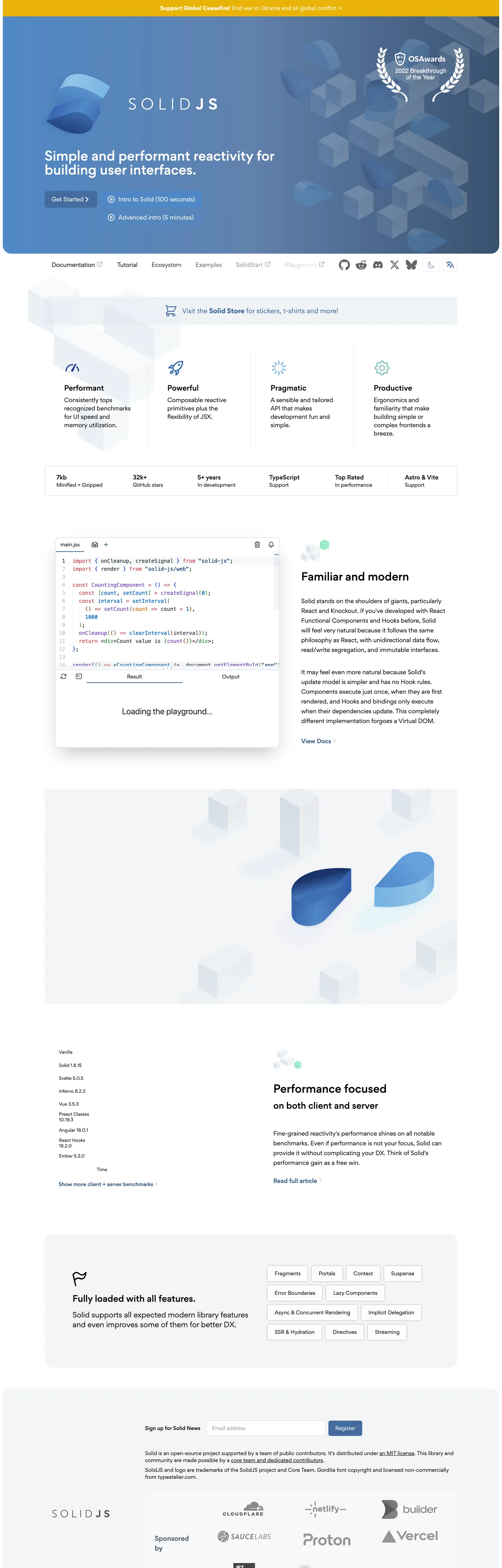
SolidJS's marketing site opens on a dark gradient hero — navy transitioning to mid-blue — with a geometric sans-serif headline ("Simple and performant reactivity for building user interfaces.") set in Gordita at 36px weight 600. The primary CTA is a cornflower-blue pill button leading to a 100-second video. Surrounding it, pale-steel 3D-rendered shape decorations (teardrop blobs and geometric tiles in varying blue transparencies) give the hero depth without the code-first austerity that frameworks like Angular or Preact lean on. It reads as the most approachable entry point in the fine-grained reactive space.
The system's whole identity lives within a single hue: blue. The brand ladder spans from a muted navy (#2c4f7c, the themeColor meta tag) through steel (#446b9e, section backgrounds and gradient node) to cornflower (#4f88c6, the primary button fill). Below the hero fold, the page washes to white and blue retreats to section headings, code syntax highlights, and link accents. The navigation at top runs on white with black ink, using Gordita at 16px weight 400 for link text — distinctly warmer than the cold grays that Preact or Qwik deploy.
For teams adopting SolidJS's aesthetic in React, the operative token is the pill radius: the 24px capsule at 21 occurrences tells you this is a friendly, rounded system. Pair that with Gordita (or its nearest substitute) at weight 600 for headings and 400 for body, and a blue-family accent ladder that stays within a single hue rather than mixing complementary colors. The library's performance-first ethos shows up more in the code than in the design — the visual identity is warmer and more accessible than you might expect from a framework that beats React in benchmarks.
What makes it distinct
5
- Gordita as proprietary identitya geometric sans used across all tiers (display, body, label, mono fallback) at weights 400-700, giving the site a distinct voice versus Inter/Roboto defaults
- Blue-family brand ladderthree distinct blues from dark navy (#2c4f7c) to medium steel (#446b9e) to cornflower button (#4f88c6); the whole page is within a single hue family
- 24px pill radius as dominantthe most-used radius at 21 occurrences, treating buttons and section chips as fully-rounded capsules while inner surfaces stay at 4-8px
- White below-fold canvasthe hero is dark-gradient, but 80% of the page is on a white or near-white surface with the blue palette used for accents only
- Monospace as syntax highlight onlyMenlo/Monaco mono appears exclusively in the embedded live code editor; Gordita handles every marketing surface
solidjs.com
Live at solidjs.com
A snapshot of the brand in production. Scroll the frame to see the whole page.
Colors
15 colors
SolidJS's system runs on #4f88c6 as its primary voltage, used in 1 of 16 components. Type is set in Gordita across 11 tokens from 12px to 36px, weights 400–600. Shape language is mixed across 16 components, blending pills, soft rounds, and squarer corners.
Brand & Accent
Sparing, CTA-only voltage · 1
Surface
Page and card backgrounds · 2
Text
Headlines, body, captions · 4
Borders & Hairlines
Dividers, outlines, rules · 2
Other
Specialty colors · 6
Typography
11 type tokens
Set in Gordita across 11 tokens, from 12px to 36px, weights 400–600. Shown in its own stack: where the font isn't installed, the fallback the file names stands in.
- display-xl36px · weight 600 · lh 40pxThe quick brown fox jumps over the lazy dog
- display-md30px · weight 600 · lh 36pxThe quick brown fox jumps over the lazy dog
- heading-lg24px · weight 600 · lh 32pxThe quick brown fox jumps over the lazy dog
- heading-md20px · weight 600 · lh 28pxThe quick brown fox jumps over the lazy dog
- body-lg18px · weight 400 · lh 28pxThe quick brown fox jumps over the lazy dog
- body-md16px · weight 400 · lh 28pxThe quick brown fox jumps over the lazy dog
- body-sm14px · weight 400 · lh 20pxThe quick brown fox jumps over the lazy dog
- label-md16px · weight 600 · lh 24pxThe quick brown fox jumps over the lazy dog
- label-sm14px · weight 600 · lh 20pxThe quick brown fox jumps over the lazy dog
- caption12px · weight 400 · lh 16pxThe quick brown fox jumps over the lazy dog
- mono-md15px · weight 400 · lh 23pxThe quick brown fox jumps over the lazy dog
Layout
Radii and spacing
7 corner radii and 7 spacing values. Shape language: mixed.
Radii
- none0px
- sm3px
- md4px
- lg6px
- xl8px
- 2xl24px
- full9999px
Spacing
- xs4px
- sm8px
- md12px
- base16px
- lg20px
- xl40px
- 2xl48px
Components
16 components
Each rendered from its tokens (color, type, radius, padding) on SolidJS's own canvas.
- Button Primarybutton-primaryButton Primary
- Button Secondarybutton-secondaryButton Secondary
- Top Navtop-navTop Nav
- Nav Linknav-linkNav Link
- Hero Headinghero-headingHero Heading
- Section Headingsection-headingSection Heading
- Body Paragraphbody-paragraphBody Paragraph
- CardcardCard
- Type here…text-inputText Input
- Code Blockcode-blockCode Block
- Feature Chipfeature-chipFeature Chip
- Stats Numberstats-numberStats Number
- Testimonial Cardtestimonial-cardTestimonial Card
- FooterfooterFooter
- Logo Chiplogo-chipLogo Chip
- BadgebadgeBadge
In use
The system, in use
SolidJS's tokens on the kind of product it builds.
Build something people actually use.
A short paragraph of marketing copy that previews how the brand's display tier and body tier read together. Two sentences is usually enough.
- · 1 project
- · Community support
- · 10k req/mo
- · 10 projects
- · Priority support
- · 1M req/mo
- · Custom domains
- · Unlimited
- · SLA
- · Audit log
- · SSO
FAQ
SolidJS design system FAQ
Common questions about SolidJS's tokens, components, and how to use this DESIGN.md in your project.
Read next
Related reading
Specs, directories, and component libraries that pair with this design system.
- Browse all design systemsThe full directory of DESIGN.md files on shadcn.io, with live mockups for each.shadcn.io
- SolidJS — official siteSolidJS's public marketing site — the source of truth for the live tokens captured in this file.solidjs.com (opens in a new tab)
- The DESIGN.md specificationGoogle Labs' open spec for machine-readable design system files — the format this page is built on.github.com (opens in a new tab)
Use it
Use SolidJS in your project
One machine-readable file. Drop it into Claude, Cursor, or any AI tool that reads DESIGN.md.
Download the DESIGN.md
One machine-readable file: every color, type, radius, spacing, and component token of SolidJS.
Feed it to your AI tool
Drop it into Claude, Cursor, or GitHub Copilot. The agent writes React components and Tailwind classes that match SolidJS's visual language.
Reference the tokens directly
Or paste the values into your Tailwind config, CSS variables, or component library: every color, size and radius is a quoted, ready-to-copy value.
Read the full DESIGN.md: overview, rationale, do’s and don’ts
Overview
SolidJS's marketing surface makes one clear architectural choice. Single-Hue Discipline. Every brand color on the page — hero gradient, primary button, section accents, link tones — lives within the blue family, from dark navy through medium steel to cornflower. Where React, Vue, and Angular use neutral-plus-accent systems (white with purple, white with green, white with red respectively), SolidJS commits fully to one hue at three depths. The result reads as focused and distinctly non-generic for a performance-first framework competing on technical differentiation rather than ecosystem size.
The Gordita typeface is the second identity signal. A round geometric sans with warm counters, it appears at weights 400-700 across display, body, label, and button tiers. No serif, no mono for marketing copy — just one family at varying weights. The hero headline at 36px / weight 600 is notably smaller than Svelte (54px) or Cloudflare (56px), which signals documentation-adjacent sobriety over marketing bravado. The page trusts its framework's benchmarks to do the persuasion.
Key Characteristics:
- Single-hue blue brand ladder: dark navy (
{colors.tertiary}) to steel ({colors.secondary}) to cornflower CTA ({colors.primary}) — all blues, no complementary accents. - Gordita sans-serif across every marketing tier at weights 400-600; a warm geometric that feels friendlier than the neutral grotesk defaults.
- Dark gradient hero above the fold; white canvas below — a two-mode page structure.
- 24px as the dominant radius for buttons, section containers, and larger UI chips (21 occurrences).
- Tight 3-8px radius for inline badges, code elements, inputs.
- Monospace font (Menlo/Monaco) scoped entirely to the live code editor; never in marketing surfaces.
- Below-fold canvas is white with a light gray surface tier for feature cards.
- Footer inverts to ink-on-black, the only dark surface below the fold.
Colors
Brand
- Primary (
{colors.primary}— ): frequency 4. Used as background (3), gradient (1). The cornflower-blue CTA button — the single brightest blue on the page. Wired as a brand-layer color. - Secondary (
{colors.secondary}— ): frequency 7. Used as text (4), background (2), gradient (1). Mid-range steel blue; appears in gradient nodes and section accent backgrounds. - Tertiary (
{colors.tertiary}— ): frequency 6. Used as text (4), border (2). Darkest brand blue; the themeColor value and deep gradient anchor.
Text
- Ink (
{colors.ink}— ): frequency 283. Used as text (271), shadow (12). Dominant text color across all below-fold prose. - Ink Secondary (
{colors.ink-secondary}— ): frequency 128. Used as text only. Secondary prose and card body text. - Ink Dark (
{colors.ink-dark}— ): frequency 13. Used as text only. Darkest ink variant for emphasis text in feature sections. - Ink Muted (
{colors.ink-muted}— ): frequency 2. Used as text only. Sub-label and metadata color.
Surface & Hairlines
- Canvas (
{colors.canvas}— ): frequency 57. Used as text (23), background (22), gradient (12). Below-fold page floor. - Surface-1 (
{colors.surface-1}— ): frequency 32. Used as background (11), border (12), shadow (9). Feature card and section fill. - Hairline (
{colors.hairline}— ): frequency 485. Primarily border (484). The dominant structural border; appears on 484 of 485 measured elements. - Hairline Inner (
{colors.hairline-inner}— ): frequency 12. Used as border only. Secondary hairline for input fields and tighter borders.
Code Syntax
- Code Red (
{colors.code-red}— ): frequency 17 (text only). Keyword and operator color in embedded GitHub-style code samples. - Code Green (
{colors.code-green}— ): frequency 14 (text only). String and success token color. - Code Blue (
{colors.code-blue}— ): frequency 9 (text only). Variable and attribute color. - Code Purple (
{colors.code-purple}— ): frequency 7 (text only). Built-in and type color.
Typography
Font Family
The system uses Gordita exclusively for all marketing surfaces — a proprietary geometric sans-serif with round, friendly counters. The full fallback stack is Gordita, ui-sans-serif, system-ui, sans-serif, "Apple Color Emoji", "Segoe UI Emoji", "Segoe UI Symbol", "Noto Color Emoji". There is no display serif, no secondary sans family.
Menlo / Monaco / "Courier New" appear at 15px / weight 400 exclusively inside the embedded live code editor panel. They do not appear in any marketing copy.
Hierarchy
| Token | Size | Weight | Line Height | Use |
|---|---|---|---|---|
{typography.display-xl} | 36px | 600 | 40px | Hero h2 headline |
{typography.display-md} | 30px | 600 | 36px | Section h2 headings |
{typography.heading-lg} | 24px | 600 | 32px | Sub-section h2 titles |
{typography.heading-md} | 20px | 600 | 28px | h3 card titles |
{typography.body-lg} | 18px | 400 | 28px | Intro paragraphs |
{typography.body-md} | 16px | 400 | 28px | Standard body prose, nav links, button text |
{typography.body-sm} | 14px | 400 | 20px | Feature cards, table cells |
{typography.label-md} | 16px | 600 | 24px | Button labels, bold link text |
{typography.label-sm} | 14px | 600 | 20px | Badge labels, strong inline text |
{typography.caption} | 12px | 400 | 16px | Table captions, metadata |
{typography.mono-md} | 15px | 400 | 23px | Live code editor only |
Substitutes
Gordita is proprietary. Nearest open substitutes: Nunito Sans at the same weights for the warm rounded geometry; Outfit for a slightly tighter but similar character; DM Sans for a more editorial feel. Inter is technically correct but too neutral — it will lose Gordita's warmth.
Layout
Spacing System
- Base unit: 4px.
- Card padding: 20px (
{spacing.lg}), consistent across feature and testimonial cards. - Button padding: 12px vertical / 20px horizontal (
{spacing.md}×{spacing.lg}). - Section vertical padding: 40px standard, 48px for the hero band.
- Nav padding: 12px vertical / 16px horizontal.
Grid & Container
- Hero: full-bleed dark blue gradient, centered content column, max-width ~768px.
- Feature strip: 4-column icon + label row for key framework properties (Performance, Flexibility, Pragmatism, Productive).
- Stats bar: single row of numbered metrics (stars, npm downloads, contributors, sponsors).
- Feature panels: alternating two-column layouts (code left / prose right, prose left / visual right).
- Testimonials: single-column quote cards.
- Benchmark section: performance table vs. React, Vue, Angular, Preact, Inferno.
Rhythm
The page alternates between white background feature sections and the blue-tinted hero. Each section is bounded by hairline borders or background-color changes rather than vertical whitespace alone.
Elevation
The system uses a layered shadow approach unlike Svelte's flat hairlines. Feature card shadows use the ink color at low opacity (box-shadow with at 12 occurrences) to lift cards off the white canvas. The shadow scale is subtle — the card elevation reads as a gentle lift, not a dramatic float. Input fields and code elements use hairline borders without shadow.
Shapes
Two distinct radius modes define the system:
{rounded.none}0px — editorial sections, hero.{rounded.sm}3px — inline code spans and compact badge elements (11 occurrences).{rounded.md}4px — nav links, small interactive chips (8 occurrences).{rounded.lg}6px — input fields, medium chips (4 occurrences).{rounded.xl}8px — buttons, card corners, inputs (8 occurrences).{rounded.2xl}24px — dominant pill radius for primary CTAs, feature cards, large containers (21 occurrences — the highest frequency).{rounded.full}9999px — tight pill chips.
The binary character (tight 3-8px for small elements, 24px for large containers) is the system's visual signature.
Components
button-primary — Cornflower-blue {colors.primary} fill, white text, {rounded.xl} 8px radius, 12px/20px padding, 48px height. The hero instance links to "Intro to SolidJS (100 seconds)" on YouTube.
button-secondary — Transparent fill, ink text, hairline border, same dimensions as primary. Used for secondary hero actions.
top-nav — White canvas, Gordita 16px, 48px height. Navigation links in ink-black, no accent color in nav.
nav-link — Transparent, ink text, Gordita 16px, 4px radius, 12-16px padding.
hero-heading — White text on the dark gradient canvas, Gordita 36px / weight 600.
section-heading — Ink text, Gordita 30px / weight 600.
body-paragraph — Ink text, Gordita 16px / weight 400, 28px line height.
card — White canvas, hairline border, 24px radius, 20px padding. Used for feature cards throughout the below-fold sections.
text-input — White canvas, hairline-inner border, Gordita 14px, 6px radius, 8-16px padding.
code-block — Surface-1 fill, Menlo mono 15px, 4px radius, code syntax using the red/green/blue/purple token set.
feature-chip — Surface-1 fill, Gordita 12px, 24px radius, 4-8px padding. Used for category labels (Performance, Flexibility, etc.).
testimonial-card — White canvas, hairline border, 24px radius, 20px padding.
stats-number — Ink text, Gordita 36px / weight 600. Used for the benchmark numbers row.
badge — Surface-1 fill, label-sm typography, 3px radius. Inline metadata labels.
footer — Ink fill, white text, Gordita 14px, 40-48px padding.
Do's and Don'ts
Do stay within the blue hue family for all brand accents. The system has no complementary warm or green accent; introducing one breaks the single-hue discipline that distinguishes SolidJS from React and Vue.
Do use the 24px radius for primary buttons and larger card containers. The capsule shape at {rounded.2xl} is the dominant visual move — 21 occurrences make it the system's calling card. Smaller elements should stay at 3-8px.
Do use Gordita at weight 600 for headings and weight 400 for body. The weight contrast between the two tiers (400 to 600) is moderate — avoid 700 or 800 which would push the page toward bold-display territory the system explicitly avoids.
Do keep the hero dark gradient and the below-fold white canvas as two distinct zones. The page's two-mode structure (dark hero / white body) is architectural; flattening both to white loses the visual weight that makes the hero landing feel like an entry point.
Don't use {colors.code-red}, {colors.code-green}, {colors.code-blue}, or {colors.code-purple} outside code blocks. These are GitHub-style syntax highlight colors borrowed for the embedded code samples — they are not brand accents. Using red in a status badge or green in a success notification would feel off-model.
Don't add a second typeface family. Gordita alone handles every tier; introducing a serif for headings or a different sans for captions would fragment the mono-family warmth that differentiates SolidJS from the Inter-everywhere defaults.
Don't reduce button radius below 8px. The system's smallest button radius is {rounded.xl} 8px; going tighter (4px or less) creates a sharp UI feel that contradicts the Gordita warmth and the 24px capsule dominance.
Don't use the dark gradient background below the fold. The hero gradient (navy → mid-blue) is confined to the above-fold section; everything below uses white. Extending the gradient into feature sections would flatten the two-mode architecture that makes the scroll feel like entering the documentation.
Known Gaps
- Hero gradient exact values: the dark blue gradient uses and as gradient nodes but the exact direction, angle, and stop positions are not captured in the extracted tokens.
- Hover states: button hover behavior is not captured; the primary button likely shifts to a slightly darker cornflower, but this is not measured.
- Animation: the pale blue 3D blob shapes in the hero appear to animate (floating or rotating); motion timing and easing are not captured.
- Dark mode: the site appears to have no dark-mode variant; the system is light-first throughout.
- Icon system: the feature-strip icons (Performance, Flexibility, etc.) use SVG illustrations; their color tokens and stroke widths are not captured.
- SolidStart surfaces: the SolidStart meta-framework has a distinct docs surface; this file covers solidjs.com only.
- Mobile breakpoints: nav collapse behavior and responsive padding adjustments below 768px are not represented.
Developer Tools & IDEs
More systems like this
More DESIGN.md files in Developer Tools & IDEs.
Pricing
Build it with Pro
The DESIGN.md files are free. Pro adds 6,000+ blocks, premium templates and the MCP server, so your AI editor builds in your system for you.
4.9/5 out of 5 · 150+ reviewsfrom 150+ founders and developers.
Billing
Billed once a year in USD. Cancel anytime.
- How many people can use the license.
- Client work, SaaS products and anything you charge for.
- Production-ready React sections: hero, pricing, features, dashboards and more.
- Complete multi-page sites you can ship as they are.
- React icons from every major library, installable with one command.
- Presets that restyle every block, in light and dark.
- Lets your AI editor search, preview and install blocks for you.
- Priority requests are answered first.
Individual
For personal projects & open source
$32instead of $49/mo
$389 billed yearly
- Seats: 1 seat
- Commercial use: Personal & open source only
- Pro blocks: 6,000+ blocks
- Templates: All 14 templates
- React icons: 294k+ icons
- Themes: All 59 themes
- MCP server: Basic usage
- Support: Standard
Team
Most popularFor freelancers, agencies & startups
$66instead of $99/mo
$789 billed yearly · ≈ $13/dev/mo
- Seats: Up to 5 seats
- Commercial use: Included
- Pro blocks: 6,000+ blocks
- Templates: All 14 templates
- React icons: 294k+ icons
- Themes: All 59 themes
- MCP server: High usage
- Support: Priority
Organization
For companies with larger teams
$132instead of $199/mo
$1,589 billed yearly
- Seats: Unlimited seats
- Commercial use: Included
- Pro blocks: 6,000+ blocks
- Templates: All 14 templates
- React icons: 294k+ icons
- Themes: All 59 themes
- MCP server: Unlimited usage
- Support: Priority
Billed once a year in USD. Cancel anytime.
Individual
For personal projects & open source
$32instead of $49/mo
$389 billed yearly
- How many people can use the license.Seats: 1 seat
- Client work, SaaS products and anything you charge for.Commercial use: Personal & open source only
- Production-ready React sections: hero, pricing, features, dashboards and more.Pro blocks: 6,000+ blocks
- Complete multi-page sites you can ship as they are.Templates: All 14 templates
- React icons from every major library, installable with one command.React icons: 294k+ icons
- Presets that restyle every block, in light and dark.Themes: All 59 themes
- Lets your AI editor search, preview and install blocks for you.MCP server: Basic usage
- Priority requests are answered first.Support: Standard
Team
Most popularFor freelancers, agencies & startups
$66instead of $99/mo
$789 billed yearly · ≈ $13/dev/mo
Everything in Individual, plus
- How many people can use the license.Seats: Up to 5 seats
- Client work, SaaS products and anything you charge for.Commercial use: Included
- Lets your AI editor search, preview and install blocks for you.MCP server: High usage
- Priority requests are answered first.Support: Priority
Organization
For companies with larger teams
$132instead of $199/mo
$1,589 billed yearly
Everything in Team, plus
- How many people can use the license.Seats: Unlimited seats
- Lets your AI editor search, preview and install blocks for you.MCP server: Unlimited usage
- Secure checkout via Stripe
- Code lives in your repo
- Keep what you've shipped if you cancel
- License terms
Your system, built for you
Every block, template and icon, installed by your AI agent in your design system. The DESIGN.md files stay free.