SKIMS Design System
SKIMS's marketing system as a DESIGN.md file — earth-tone photography carries the chromatic identity, with a warm cream canvas, oklch-warm ink at #2d2a26, and a single hairline tone wired into 23 components.
Add shadcn.io to your AI agent. · Pro It installs blocks, icons and templates in your design system from a prompt, with Pro.
Set up MCP- Primary
- #e8e5df
- Typeface
- Inter
- Shape
- Mixed
- Base radius
- 4px
- Colors
- 11
- Type tokens
- 12
- Components
- 23
- Spacing values
- 9
About
About SKIMS DESIGN.md
Curated by Dov Azencot · Updated May 19, 2026 · Source skims.com (opens in a new tab)
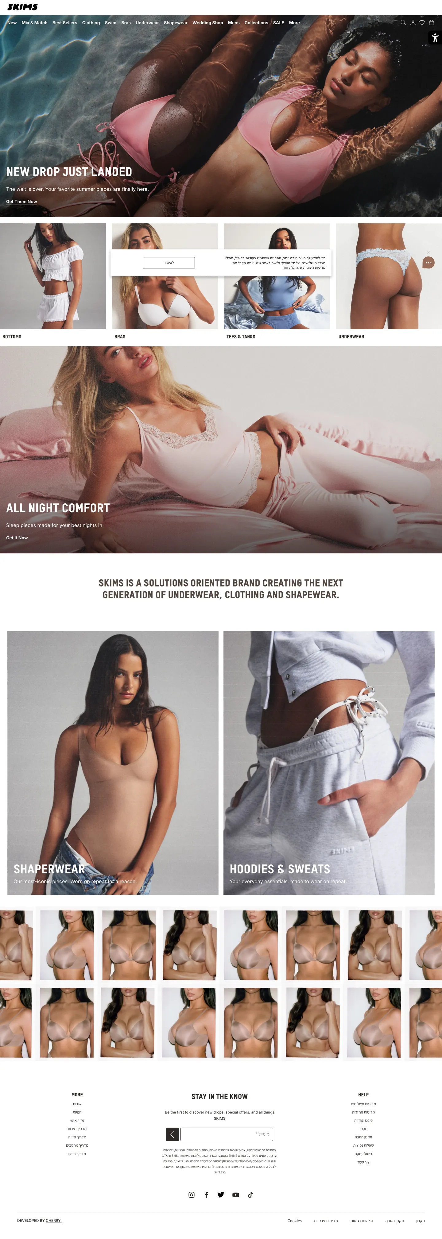
SKIMS's marketing surface does something almost no other commerce brand in the underwear or loungewear category does: it lets editorial photography of skin and fabric carry the entire chromatic system. The captured homepage opens on a full-bleed shot of two models in pink-sand shapewear floating in turquoise water, with a small "NEW DROP JUST LANDED" label in 12px TSTAR-PRO-Headline uppercase pinned to the lower-left and a 12px underlined "Shop now" CTA beneath it. Below the fold, four equal-width swatches alternate between editorial portrait shots (model in clay tan briefs, model in ash-gray bralette) and a single white-canvas product comparison band. The page chrome between photographs is reduced to a `{warm cream} #f6f6f6` canvas, a near-black ink at the unusual oklch-warm value `#2d2a26`, and a single warm-gray hairline at `#e8e5df` that handles every divider in the system. Where Calvin Klein opens with athlete portraiture on a pure-black canvas and Spanx opens with white-canvas product cutouts, SKIMS opens with editorial photography on a warm-neutral page and trusts the skin and fabric tones to do every chromatic job.
The DESIGN.md file packages the system into a machine-readable spec for React tooling. Inside: 11 colors tokens drawn from the captured CSS — a two-tone neutral pair of warm cream canvas (`#f6f6f6`) and warm-oklch ink (`#2d2a26`), a single warm-gray hairline (`#e8e5df`) that carries 100% of border occurrences, a secondary text tier at `#636363`, and the implicit on-image overlays at pure black and white. 20 typography tokens span TSTAR-PRO-Headline for uppercase display at 16-40px / 400, Inter for body at 11-16px / 400 / 700, and Assistant as the Hebrew localization fallback for the Israeli market site captured. 4 corner-radius tokens centered on a 20px default for image cards and a 2-4px sharp tier for buttons and inputs. 23 components cover the editorial photo card, the underlined-text CTA, the cream-canvas product band, the bilingual text input, and the bottom-anchored newsletter footer.
Feed this file to Claude or Cursor and it reproduces SKIMS's specific moves: warm-cream canvas instead of white, oklch-warm ink instead of pure black, photography as chromatic carrier instead of a brand voltage, and microscopic underlined-text CTAs instead of filled buttons. The token references resolve cleanly — `{colors.canvas}` for the cream floor, `{colors.ink}` for the warm-black body text, `{typography.display-md}` for the 40px uppercase TSTAR headline. The one move worth borrowing for any apparel brand built on photography is the chromatic restraint of the chrome: if your editorial shots are the brand voltage, the page around them needs to recede to a single warm neutral and let the imagery be the only color story.
What makes it distinct
5
- Photography as palettethe chromatic identity lives in the editorial shots of models in sand / clay / ash neutrals, not in the CSS tokens themselves
- Warm-oklch inkthe body text color is #2d2a26 (oklch hue 75°, a warm brown-black) rather than the conventional pure black or blue-black
- Single hairline tone#e8e5df (warm cream-gray) carries 195 of 195 captured border occurrences across every card, divider, and section rule
- TSTAR-PRO-Headline uppercase displaysection labels run at 16-40px / 400 uppercase with no second weight, the warm-Helvetica geometric chosen for muted authority
- Microscopic CTA treatmentevery shop-now link is a 12px / 400 underlined text label rather than a filled button; the editorial shots replace the call-to-action surface
skims.com
Live at skims.com
A snapshot of the brand in production. Scroll the frame to see the whole page.
Colors
11 colors
SKIMS's system runs on #e8e5df as its primary voltage, used in 1 of 23 components. Type is set in Inter across 12 tokens from 11px to 40px, weights 400–700. Shape language is mixed across 23 components, blending pills, soft rounds, and squarer corners.
Brand & Accent
Sparing, CTA-only voltage · 2
Surface
Page and card backgrounds · 2
Text
Headlines, body, captions · 4
Borders & Hairlines
Dividers, outlines, rules · 1
Other
Specialty colors · 2
Typography
12 type tokens
Set in Inter across 12 tokens, from 11px to 40px, weights 400–700. Shown in its own stack: where the font isn't installed, the fallback the file names stands in.
- display-xl40px · weight 400 · lh 44pxThe quick brown fox jumps over the lazy dog
- display-md24px · weight 400 · lh 39.6pxThe quick brown fox jumps over the lazy dog
- heading-md16px · weight 700 · lh 26.4pxThe quick brown fox jumps over the lazy dog
- label-md16px · weight 400 · lh 20pxThe quick brown fox jumps over the lazy dog
- body-lg16px · weight 400 · lh 26.4pxThe quick brown fox jumps over the lazy dog
- body-md14px · weight 400 · lh 23.1pxThe quick brown fox jumps over the lazy dog
- body-sm12px · weight 400 · lh 19.8pxThe quick brown fox jumps over the lazy dog
- body-strong14px · weight 700 · lh 23.1pxThe quick brown fox jumps over the lazy dog
- caption11px · weight 400 · lh 18.15pxThe quick brown fox jumps over the lazy dog
- nav-link12px · weight 400 · lh 15.6pxThe quick brown fox jumps over the lazy dog
- button-md14px · weight 400 · lh 23.1pxThe quick brown fox jumps over the lazy dog
- cta-underline12px · weight 400 · lh 14.4pxThe quick brown fox jumps over the lazy dog
Layout
Radii and spacing
7 corner radii and 9 spacing values. Shape language: mixed.
Radii
- none0px
- xs2px
- sm3px
- md4px
- lg10px
- xl20px
- full9999px
Spacing
- xxs2px
- xs4px
- sm8px
- md10px
- base15px
- lg16px
- xl20px
- 2xl32px
- 3xl40px
Components
23 components
Each rendered from its tokens (color, type, radius, padding) on SKIMS's own canvas.
- Top Navtop-navTop Nav
- Nav Linknav-linkNav Link
- Announcement Barannouncement-barAnnouncement Bar
- Hero Sectionhero-sectionHero Section
- Hero Image Cardhero-image-cardHero Image Card
- Hero Overlay Labelhero-overlay-labelHero Overlay Label
- Hero Headinghero-headingHero Heading
- Section Headingsection-headingSection Heading
- Body Paragraphbody-paragraphBody Paragraph
- Body Paragraph Mutedbody-paragraph-mutedBody Paragraph Muted
- CaptioncaptionCaption
- Cta Underlinecta-underlineCta Underline
- Cta Underline Darkcta-underline-darkCta Underline Dark
- Button Primarybutton-primaryButton Primary
- Button Secondarybutton-secondaryButton Secondary
- Type here…text-inputText Input
- Product Cardproduct-cardProduct Card
- Product Card Labelproduct-card-labelProduct Card Label
- Editorial Bandeditorial-bandEditorial Band
- Thumbnail Grid Cellthumbnail-grid-cellThumbnail Grid Cell
- Card Dividercard-dividerCard Divider
- FooterfooterFooter
- Newsletter Inputnewsletter-inputNewsletter Input
In use
The system, in use
SKIMS's tokens on the kind of product it builds.
Build something people actually use.
A short paragraph of marketing copy that previews how the brand's display tier and body tier read together. Two sentences is usually enough.
FAQ
SKIMS design system FAQ
Common questions about SKIMS's tokens, components, and how to use this DESIGN.md in your project.
Read next
Related reading
Specs, directories, and component libraries that pair with this design system.
- Browse all design systemsThe full directory of DESIGN.md files on shadcn.io, with live mockups for each.shadcn.io
- SKIMS — official siteSKIMS's public marketing site — the source of truth for the live tokens captured in this file.skims.com (opens in a new tab)
- The DESIGN.md specificationGoogle Labs' open spec for machine-readable design system files — the format this page is built on.github.com (opens in a new tab)
Use it
Use SKIMS in your project
One machine-readable file. Drop it into Claude, Cursor, or any AI tool that reads DESIGN.md.
Download the DESIGN.md
One machine-readable file: every color, type, radius, spacing, and component token of SKIMS.
Feed it to your AI tool
Drop it into Claude, Cursor, or GitHub Copilot. The agent writes React components and Tailwind classes that match SKIMS's visual language.
Reference the tokens directly
Or paste the values into your Tailwind config, CSS variables, or component library: every color, size and radius is a quoted, ready-to-copy value.
Read the full DESIGN.md: overview, rationale, do’s and don’ts
Overview
SKIMS's marketing surface does something almost no other underwear or loungewear brand does. Photography as palette: the chromatic identity lives entirely inside the editorial photography — models shot in pink-sand shapewear floating in turquoise water, in clay-tan briefs against a warm-cream studio backdrop, in ash-gray bralettes on a muted taupe surface — not inside a CSS brand voltage. The page chrome between the photographs is reduced to a warm cream canvas ({colors.canvas-warm} — #e8e5df, the system's hairline tone wired into 195 of 195 captured border occurrences), a warm-oklch near-black ink at {colors.ink} (#2d2a26, oklch hue 75°), and a single secondary gray ({colors.ink-muted} — #636363). Where Calvin Klein opens with athlete portraiture on a pure-black canvas and Spanx opens with white-canvas product cutouts, SKIMS opens with editorial photography on a warm-neutral page and trusts the skin and fabric tones to do every chromatic job.
Microscopic CTA treatment: every "Shop now" call on the captured page renders as a 12px / 400 Inter text label with an underline — never as a filled button with a brand-color background. The reasoning is editorial: SKIMS's value proposition lives in the photography, and a large filled CTA would force the eye away from the model and toward the button, breaking the editorial reading. The {component.cta-underline} token is small enough to be unmissable for a converting visitor (it sits beneath every editorial label, in white on the dark image overlay or in ink on the cream surface) but quiet enough to keep the photograph as the page's primary visual content. The few filled buttons in the system live in the checkout flow and the newsletter footer; on the marketing surface, the underlined text label is the entire CTA vocabulary.
Warm-oklch chrome: the page canvas is #f6f6f6 and {colors.canvas-warm} (#e8e5df), not pure {colors.canvas} (#ffffff). The ink is {colors.ink} (#2d2a26), an oklch hue at 75° that reads as warm brown-black rather than as a neutral or cool black. Both choices echo the warmth of the skin-tone photography — a pure-white canvas against editorial skin shots creates a cold edge contrast that fights the imagery, while the warm cream and warm-black let the photographs feel continuous with the page surface. The shift away from pure values is small enough that most viewers won't name it, but it runs consistently across every chrome surface in the system.
Key Characteristics:
- Photography carries the chromatic identity — editorial skin and fabric tones (sand, clay, ash, taupe) replace a brand-color voltage in the CSS palette.
- Warm-oklch ink (
{colors.ink}— #2d2a26 at hue 75°) replaces pure black for body text, headings, and labels. - Warm cream canvas (
{colors.canvas-warm}— #e8e5df) replaces pure white for section backgrounds; pure{colors.canvas}(#ffffff) used only inside product cards and inputs. - Single hairline tone (
{colors.hairline}— #e8e5df) carries 195 of 195 captured border occurrences — every card outline, divider rule, and section edge. - TSTAR-PRO-Headline at weight 400 uppercase carries every display surface — 16px section labels, 24px sub-displays, 40px headlines. No second weight at the display tier.
- Inter at 12-16px / 400 carries every body and CTA surface; Inter at 700 carries product-card labels and shop-the-edit emphasis tags.
- 20px rounded image cards across the editorial photo grid; 2-4px sharp corners on small UI surfaces (cart badge, cookie banner).
- Microscopic 12px underlined-text CTAs across every editorial section — no filled "Shop now" buttons on the marketing surface.
- 15px base spacing unit (the dominant captured gap) — slightly off the 16px convention to align with the warm-neutral chrome's softer rhythm.
Colors
Surface
- Canvas (
{colors.canvas}— #ffffff): frequency 221. Used as background (43), text (157), border (17), gradient (4). Pure white — reserved for product-card surfaces, text-input fills, and the inner content of the editorial-band sections. Wired in CSS as--vp-toggler-icon-color; the captured--vp-background-colorresolves to a near-cream#f6f6f6that visually clusters with the warm canvas. - Canvas Warm (
{colors.canvas-warm}— #e8e5df): frequency 195 — used as border (195). A warm-gray cream that doubles as the system's only hairline tone; visually the same value carries section borders, card outlines, and divider rules. The token name reflects the dual role — it's both a surface tier and the system's only border tone.
Text
- Ink (
{colors.ink}— #2d2a26): frequency 185. Used as text (157), background (1), border (19), gradient (8). The dominant text color — body paragraphs, display headings, navigation labels, and form input text. The oklch hue is 75° (warm brown-black) rather than the conventional pure black; the warm shift echoes the skin-tone photography and keeps text feeling continuous with the warm-cream surface. - Ink Muted (
{colors.ink-muted}— #636363): frequency 76. Used as text (51), border (25). Secondary running-text color — wired as--vp-primary-text-colorand used for footnotes, the "READ MORE" expand-on-detail strips, and breadcrumb tail labels. - Ink Soft (
{colors.ink-soft}— #1f1f1f): frequency 3. Used in the announcement bar at the top of the page (the small "Free standard shipping" strip) and inside the cart count badge — a near-black darker than the body ink, used for high-contrast utility chrome.
Overlay
- Overlay Dark (
{colors.overlay-dark}— #000000): frequency 73. Used as text (38), background (5), border (30). Pure black — reserved for the input border outlines, the dark-overlay scrim on hero photographs, and the cart-flyout dark surface. Wired as--vp-highlight-color,--vp-primary-color,--vp-border-color-light— the same value plays multiple structural roles inside the accessibility-toolkit overlay. - Overlay Light (
{colors.overlay-light}— #ffffff): frequency 221 (clustered with{colors.canvas}). The white text rendered over dark-overlay scrims on hero photography — the editorial labels and shop-now underlined CTAs that float on top of editorial shots.
Hairline
- Hairline (
{colors.hairline}— #e8e5df): frequency 195 — 100% as border. The single hairline tone in the system. Every card outline, every section divider, every product-grid dividing rule uses the same warm-gray-cream value. There is no secondary hairline tone, no border-soft / border-strong tier.
Accent (utility, not brand)
- Accent Swiper (
{colors.accent-swiper}— #007aff): wired as--swiper-theme-color. The iOS-blue default that ships with Swiper.js — used inside the product-image carousel arrow controls. Not a brand voltage; an artifact of the carousel library's default theme. Absent from the captured static render but present in CSS. - Accent Success (
{colors.accent-success}— #118f38): wired as--vp-toggler-active-color. The mid-green used to indicate "active" state on the accessibility-toolkit toggler. A utility tone rather than a brand color; never appears in the marketing chrome.
Shadow
- Shadow Ink (
{colors.shadow-ink}— #3f3f44): frequency 1, as shadow. The single shadow tone in the captured system — a warm-violet-black used in the--shadowand--shadow-mddeclarations as a rgba ink for card drop-shadows.
Typography
Font Families
The system runs three families. TSTAR-PRO-Headline (a licensed Mecanorma display sans, wired as --heading-font-family) carries every uppercase display surface at weight 400 — section labels, display headlines, navigation chrome. Inter (wired as --text-font-family) carries every body, caption, and underlined-CTA surface at 11-16px in weights 400 and 700. Assistant is loaded as the Hebrew localization fallback for the captured Israeli market site, used inside any bilingual text input that needs to render Hebrew script alongside Latin characters; on the global site (skims.com) it does not appear.
The pairing is split by case rather than by hierarchy: TSTAR-PRO-Headline handles every uppercase label and headline, Inter handles every sentence-case body. There is no editorial serif tier, no monospace voice, no decorative display family.
Hierarchy
| Token | Family | Size | Weight | Line Height | Use |
|---|---|---|---|---|---|
{typography.display-xl} | TSTAR-PRO-Headline | 40px | 400 | 44px | Section displays ("DRESSES", "NEW ARRIVALS") on collection-band rollovers |
{typography.display-md} | TSTAR-PRO-Headline | 24px | 400 | 39.6px | Mid-tier section headers ("SHOP THE EDIT") |
{typography.heading-md} | TSTAR-PRO-Headline | 16px | 700 | 26.4px | Product collection name on category-tile rollovers |
{typography.label-md} | TSTAR-PRO-Headline | 16px | 400 | 20px | Editorial-overlay labels ("NEW DROP JUST LANDED", "ALL NIGHT COMFORT", "SHAPEWEAR") |
{typography.body-lg} | Inter | 16px | 400 | 26.4px | Long-form editorial copy ("SKIMS IS A SOLUTIONS ORIENTED BRAND...") |
{typography.body-md} | Inter | 14px | 400 | 23.1px | Default running text |
{typography.body-sm} | Inter | 12px | 400 | 19.8px | Footer labels, footnotes |
{typography.body-strong} | Inter | 14px | 700 | 23.1px | Product-card titles, "SHOP NOW" emphasis |
{typography.caption} | Inter | 11px | 400 | 18.15px | Microcopy, marketing-consent footnotes |
{typography.nav-link} | Inter | 12px | 400 | 15.6px | Top-nav link labels |
{typography.button-md} | Arial | 14px | 400 | 23.1px | The system's filled-button label tier — uses Arial as a fallback because the button label is part of a Shopify-default form input |
{typography.cta-underline} | Inter | 12px | 400 | 14.4px | The signature "Shop now" underlined text CTA |
Principles
TSTAR-PRO-Headline holds at weight 400 across every display surface — there is no bold display tier at 700+. The 40px hero display sits at weight 400 with --heading-font-weight: 400 declared at :root, which is the system's loudest typographic moment and is still rendered at regular weight. The uppercase casing (--heading-text-transform: uppercase) is what gives the headline emphasis instead of weight. Where most apparel commerce systems lean on weight 700+ for display authority, SKIMS uses uppercase + tracking instead — a quieter editorial register that lets the photography stay dominant.
Inter holds at weights 400 (body) and 700 (product-card labels and emphasis tags). There is no semibold 600 tier — the system is binary at the body level. CTA labels at {typography.cta-underline} (12px / 400) are the smallest meaningful interactive type in the system; nothing larger reads as "click here" because nothing larger needs to.
Note on Font Substitutes
TSTAR-PRO-Headline is a licensed Mecanorma display sans. The closest open-source substitute is Space Grotesk at weight 400 uppercase — the warm geometric proportions transfer cleanly at 16-40px display sizes. For a tighter alternative, Inter Tight at weight 600 uppercase reads close to TSTAR's mid-tier display. Inter is open source and needs no substitute — load weights 400 and 700 only.
Layout
Spacing System
- Base unit: 15px — the dominant captured gap value (29 occurrences). Slightly off the conventional 16px base, the 15px unit aligns with the system's soft rhythm and the warm-neutral chrome.
- Tokens:
{spacing.xxs}2px ·{spacing.xs}4px ·{spacing.sm}8px ·{spacing.md}10px ·{spacing.base}15px ·{spacing.lg}16px ·{spacing.xl}20px ·{spacing.2xl}32px ·{spacing.3xl}40px. - Dominant body gap:
{spacing.base}(15px) and{spacing.xs}(4px) — tied at 29 occurrences each. The 4px gap is the inter-element gap inside dense control clusters; the 15px gap is the spacing between major content blocks. - Section vertical spacing:
--section-vertical-spacing: 1.25rem(20px) — the system uses tight 20px section padding rather than the 64-96px convention seen on dev-tools or fintech pages. The result reads more dense, more editorial-magazine. - Editorial band padding:
{spacing.3xl} {spacing.xl}(40x20px) on the white-canvas product comparison bands.
Grid & Container
- Max content width:
--container-xl-max-width: 85rem(1360px). The wider container is needed for the editorial photography to read at its intended cinematic scale. - Container tiers:
xxs27.5rem (440px) for newsletter signup,xs42.5rem (680px) for inline copy,sm61.25rem (980px),md71.875rem (1150px),lg78.75rem (1260px),xl85rem (1360px). - Hero grid: full-bleed editorial photograph at 100vw, with the label and underlined CTA pinned to the lower-left at
{spacing.xl}(20px) inset. - Product band grid: 4-column equal-width grid pairing editorial portrait shots with white-canvas product cutouts, with
{spacing.xs}(4px) inter-cell gap. - Thumbnail grid: 5- or 6-column thumbnail rows beneath each editorial section, showing alternate fabric colorways.
Rhythm
The page alternates between full-bleed editorial and white-canvas product band. Hero is full-bleed photograph. Section 2 is a 4-column band split between editorial and product cutouts. Section 3 returns to a full-bleed editorial photograph. Section 4 is a 2-up split between shapewear and hoodies. Section 5 is a tight thumbnail-grid colorway band. The cadence is photograph → product → photograph → product → thumbnail-grid, which trains the eye to expect editorial weight at every other scroll position.
Elevation
The system has a minimal shadow tier. The captured CSS declares --shadow (0 5px 15px rgb(0 0 0 / 0.05)) and --shadow-md (0 5px 30px rgb(0 0 0 / 0.05)) at extremely low opacity (5%), which renders as a barely-visible halo rather than as a meaningful elevation step.
- Flat (no shadow): body, hero, footer, every editorial section — 95% of surfaces.
- Soft shadow (5% opacity): product cards and dropdown menus carry the
--shadowtoken at 0/5/15px black-at-5% — almost invisible against the warm cream surface. - Hairline outlines:
{colors.hairline}(#e8e5df) at 195 occurrences carries the work that shadows would carry on a typical product surface. Cards lift off the cream canvas through hairline borders, not through layered elevation.
Shapes
The radius scale is split between soft photography surfaces and sharp utility chrome:
{rounded.none}0px — section dividers, hero band, full-bleed editorial photographs that bleed to the viewport edge.{rounded.xs}2px — the button-primary filled CTAs in the checkout, the cart count badge.{rounded.sm}3px — small chips and the cookie-banner accept button.{rounded.md}4px — input field corners, the text-input and newsletter-input.{rounded.lg}10px — thumbnail-grid cells.{rounded.xl}20px — the dominant value (24 occurrences). Editorial image cards, hero photograph containers, large product surfaces. The soft 20px rounding keeps the photography reading warm against the cream canvas.{rounded.full}9999px — wired as--rounded-full. Reserved for circular avatar chips and round-icon controls.
The system skips the 8 / 12 / 16px middle tier entirely. Either a surface is a small sharp 2-4px utility element or a large soft 20px editorial card — no in-between.
Components
top-nav — Pure {colors.canvas} (#ffffff) surface, 48px height, 12x24 padding. Houses the SKIMS wordmark center, primary category links (DRESSES / HOODIES & SWEATS / SHAPEWEAR / LOUNGEWEAR / SETS) left of center, and account / cart / search controls right. Sticky on scroll (--header-is-sticky: 1).
nav-link — Transparent fill, {colors.ink} text at {typography.nav-link} (12px / 400 Inter), 8x12 padding. No hover surface fill visible on the static capture.
announcement-bar — {colors.ink-soft} (#1f1f1f) near-black surface, white text at {typography.caption} (11px / 400), 49px height. Houses the "Free standard shipping" or seasonal promo strip at the top of every page.
hero-section — Full-bleed editorial photograph at 100vw, ~600-800px tall, zero padding around the image itself.
hero-image-card — {rounded.xl} (20px) corner rounding on standalone editorial images that sit inside a container rather than full-bleed.
hero-overlay-label — Transparent fill, {colors.overlay-light} (#ffffff) text at {typography.label-md} (16px / 400 TSTAR uppercase), 20px padding inset from the lower-left of the photograph. The signature editorial label ("NEW DROP JUST LANDED", "ALL NIGHT COMFORT").
hero-heading — {colors.ink} text at {typography.display-xl} (40px / 400 TSTAR uppercase). The largest typographic moment in the system; deliberately held at weight 400 with uppercase casing rather than at weight 700.
section-heading — {colors.ink} text at {typography.display-md} (24px / 400 TSTAR uppercase), 20px vertical padding. Used on section dividers below the fold.
body-paragraph — Default {colors.ink} running-text at {typography.body-lg} (16px / 400 Inter). The 26.4px line-height ratio (1.65) is generous — gives editorial copy room to breathe.
body-paragraph-muted — {colors.ink-muted} (#636363) variant for secondary copy and footnote text.
caption — {colors.ink} text at {typography.caption} (11px / 400 Inter), 4px vertical padding. The marketing-consent and microscopic-legal text tier.
cta-underline — The signature SKIMS CTA. Transparent fill, {colors.overlay-light} (#ffffff) text at {typography.cta-underline} (12px / 400 Inter), underlined, 4x0 padding, zero rounding. Sits beneath every editorial label on hero and section photography. No filled button background; the underline is the entire affordance.
cta-underline-dark — Same treatment as {component.cta-underline} but rendered in {colors.ink} instead of white. Used on the white-canvas product bands where there is no photo overlay scrim.
button-primary — {colors.ink} (#2d2a26) fill, {colors.overlay-light} text, {typography.button-md} (14px / 400 Arial — Shopify form fallback), {rounded.xs} (2px) corners, 12x24 padding, 44px height. Used in the checkout flow and newsletter signup form only — not present on the marketing surface.
button-secondary — {colors.canvas} fill, {colors.ink} text, 1px {colors.ink} border, {rounded.xs} (2px) corners. Used for "Continue Shopping" / "Cancel" tertiary actions.
text-input — {colors.canvas} fill, {colors.ink} text at {typography.body-md}, 1px {colors.overlay-dark} (#000000) border, {rounded.md} (4px) corners, 10x12 padding, 44px height. Used on form surfaces.
product-card — {colors.canvas} fill, {colors.ink} text, {rounded.xl} (20px) corner rounding, zero padding (the product photograph fills the card edge-to-edge). Used in the 4-up product band beneath the hero.
product-card-label — Transparent fill, {colors.ink} text at {typography.body-strong} (14px / 700 Inter), 10x0 vertical padding. The product-name and price tier beneath each product card.
editorial-band — {colors.canvas} (pure white) fill, {colors.ink} text, 40x20 padding, zero rounding. The white-canvas product comparison bands that punctuate the editorial photography rhythm.
thumbnail-grid-cell — {colors.canvas} fill, {rounded.lg} (10px) corners. The smaller thumbnail-grid cells beneath product sections, showing alternate fabric colorways.
card-divider — {colors.hairline} (#e8e5df) 1-pixel rule. The single divider treatment in the system; carries the elevation work that shadows would carry on a typical product surface.
footer — {colors.canvas} (pure white) fill, {colors.ink} text at {typography.body-sm} (12px / 400 Inter), 40x20 padding. Houses the newsletter signup form, the global category links (SHOP / ABOUT / SERVICES), and the legal / accessibility / shipping policy footer columns.
newsletter-input — {colors.canvas} fill, {colors.ink} text, 1px {colors.overlay-dark} border, {rounded.md} (4px) corners, 10x12 padding, 44px height. The signup field at the bottom of every page; paired with an {component.button-primary} submit button.
Do's and Don'ts
Do let editorial photography carry the chromatic identity. The skin and fabric tones in the imagery (sand, clay, ash, taupe) are the brand voltage; the page chrome between photographs needs to recede to a single warm neutral so the photography reads as the dominant color content.
Do use the warm-oklch ink {colors.ink} (#2d2a26) for every text surface — body, headings, labels. The warm 75° hue echoes the skin-tone photography; substituting pure black {colors.overlay-dark} creates a cold edge contrast that fights the warm imagery.
Do keep CTAs as 12px underlined text labels rather than filled buttons on the marketing surface. The {component.cta-underline} token is the entire shop-now vocabulary; introducing a filled {component.button-primary} on a hero or editorial section forces the eye away from the photograph and breaks the editorial reading.
Do use 20px ({rounded.xl}) rounding on editorial photo cards and 2-4px ({rounded.xs} / {rounded.md}) on utility chrome. The split radius scale is the brand's shape signature — soft photography, sharp utility.
Don't swap the canvas from {colors.canvas-warm} (#e8e5df / cream) to pure {colors.canvas} (#ffffff) on the section backgrounds. The warm shift is small but consistent across the system; mixing the two creates cold edge contrast where the photography needs continuity. Pure white is reserved for inner product-card surfaces only.
Don't render display headlines at weight 700. The system holds TSTAR-PRO-Headline at weight 400 across every display tier and uses uppercase casing for emphasis instead. Bumping to weight 700 turns the editorial section header into a SaaS shout and pulls authority away from the photography.
Don't introduce a brand-color voltage (a saturated orange CTA, a pink emphasis tag, a green sale flag). The system's chromatic restraint is the move — adding a brand voltage propagates color away from the imagery and turns the warm-neutral chrome into a backdrop for the brand rather than for the editorial.
Don't use {colors.hairline} (#e8e5df) for background fills or large surface colors — it is a border-only token (195 of 195 occurrences are borders). For a soft cream surface, use the warm canvas; for a pure cream, use the inner {colors.canvas} (#ffffff).
Known Gaps
- Captured site is the Israeli localization (skims.co.il): the localization variant of the global brand. The captured fonts include Assistant as a Hebrew fallback that does not appear on skims.com. Other than the bilingual text rendering, the color palette, photography, and component tokens transfer identically.
- Hover and focus states: the
{component.cta-underline}and{component.nav-link}resting states are captured; the hover treatment (likely an underline-thickness change or a color shift to{colors.ink-muted}) is not visible on the static surface. - Form input error states:
{component.text-input}and{component.newsletter-input}carry the resting state; error / validation styling for the checkout and newsletter forms is not exposed in the captured surfaces. - Motion: the editorial photographs likely fade-in on scroll-into-view and the product carousels animate horizontally; the spec captures end-state values only.
- Product surfaces: this DESIGN.md captures the marketing homepage only. The PDP (product detail page), the shop-the-edit category pages, the cart flyout, and the size-guide modals each carry additional component tokens (size selector, color swatch, fit-finder) not represented here.
- Brand-asset chromatic identity: the editorial photography uses a recurring palette of skin-tone neutrals (pink-sand, clay-tan, ash-gray, warm-taupe) but these are baked into the imagery rather than declared as named tokens. A complete brand-asset specification would name these colors explicitly; the marketing-surface DESIGN.md captures only the CSS chrome.
- Localization tokens: the captured CSS exposes a
--transform-logical-flip: 1and--transform-origin-end: rightpair that handle RTL Hebrew rendering. These bidirectional layout tokens are not represented in the components frontmatter but live in the global system.
E-commerce & Retail
More systems like this
More DESIGN.md files in E-commerce & Retail.
Pricing
Build it with Pro
The DESIGN.md files are free. Pro adds 6,000+ blocks, premium templates and the MCP server, so your AI editor builds in your system for you.
4.9/5 out of 5 · 150+ reviewsfrom 150+ founders and developers.
Billing
Billed once a year in USD. Cancel anytime.
- How many people can use the license.
- Client work, SaaS products and anything you charge for.
- Production-ready React sections: hero, pricing, features, dashboards and more.
- Complete multi-page sites you can ship as they are.
- React icons from every major library, installable with one command.
- Presets that restyle every block, in light and dark.
- Lets your AI editor search, preview and install blocks for you.
- Priority requests are answered first.
Individual
For personal projects & open source
$32instead of $49/mo
$389 billed yearly
- Seats: 1 seat
- Commercial use: Personal & open source only
- Pro blocks: 6,000+ blocks
- Templates: All 14 templates
- React icons: 294k+ icons
- Themes: All 59 themes
- MCP server: Basic usage
- Support: Standard
Team
Most popularFor freelancers, agencies & startups
$66instead of $99/mo
$789 billed yearly · ≈ $13/dev/mo
- Seats: Up to 5 seats
- Commercial use: Included
- Pro blocks: 6,000+ blocks
- Templates: All 14 templates
- React icons: 294k+ icons
- Themes: All 59 themes
- MCP server: High usage
- Support: Priority
Organization
For companies with larger teams
$132instead of $199/mo
$1,589 billed yearly
- Seats: Unlimited seats
- Commercial use: Included
- Pro blocks: 6,000+ blocks
- Templates: All 14 templates
- React icons: 294k+ icons
- Themes: All 59 themes
- MCP server: Unlimited usage
- Support: Priority
Billed once a year in USD. Cancel anytime.
Individual
For personal projects & open source
$32instead of $49/mo
$389 billed yearly
- How many people can use the license.Seats: 1 seat
- Client work, SaaS products and anything you charge for.Commercial use: Personal & open source only
- Production-ready React sections: hero, pricing, features, dashboards and more.Pro blocks: 6,000+ blocks
- Complete multi-page sites you can ship as they are.Templates: All 14 templates
- React icons from every major library, installable with one command.React icons: 294k+ icons
- Presets that restyle every block, in light and dark.Themes: All 59 themes
- Lets your AI editor search, preview and install blocks for you.MCP server: Basic usage
- Priority requests are answered first.Support: Standard
Team
Most popularFor freelancers, agencies & startups
$66instead of $99/mo
$789 billed yearly · ≈ $13/dev/mo
Everything in Individual, plus
- How many people can use the license.Seats: Up to 5 seats
- Client work, SaaS products and anything you charge for.Commercial use: Included
- Lets your AI editor search, preview and install blocks for you.MCP server: High usage
- Priority requests are answered first.Support: Priority
Organization
For companies with larger teams
$132instead of $199/mo
$1,589 billed yearly
Everything in Team, plus
- How many people can use the license.Seats: Unlimited seats
- Lets your AI editor search, preview and install blocks for you.MCP server: Unlimited usage
- Secure checkout via Stripe
- Code lives in your repo
- Keep what you've shipped if you cancel
- License terms
Your system, built for you
Every block, template and icon, installed by your AI agent in your design system. The DESIGN.md files stay free.