Shop Design System
Shop's consumer marketing site as a DESIGN.md file. Electric purple #5433eb as a single-voltage wordmark, GT Standard across every tier, 20-28px radii, media-grid storefronts. Tokens for React, Next.js, and AI coding tools.
Add shadcn.io to your AI agent. · Pro It installs blocks, icons and templates in your design system from a prompt, with Pro.
Set up MCP- Primary
- #5433eb
- Typeface
- GT Standard
- Shape
- Mixed
- Base radius
- 16px
- Colors
- 16
- Type tokens
- 9
- Components
- 16
- Spacing values
- 10
About
About Shop DESIGN.md
Curated by Dov Azencot · Updated May 19, 2026 · Source shop.app (opens in a new tab)
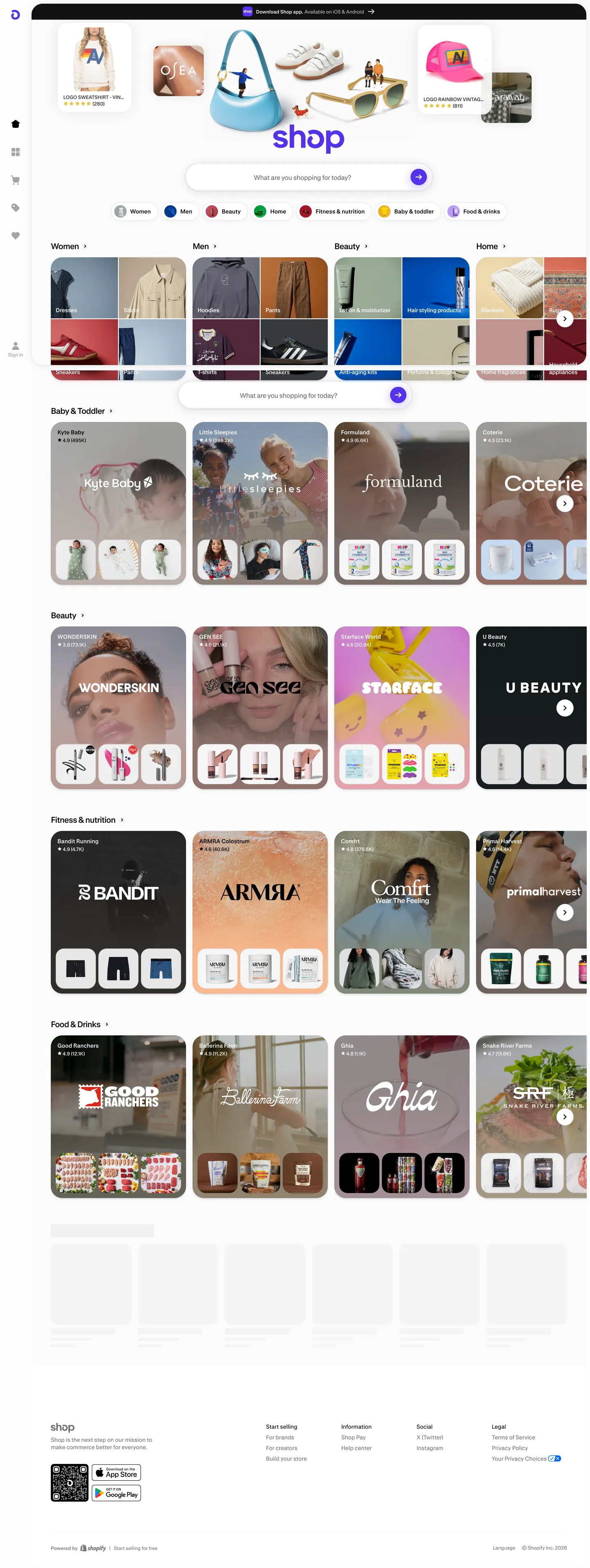
Shop's marketing site does something almost no other consumer-commerce brand attempts at the top of the funnel: it skips the hero illustration entirely. The page opens on a centered wordmark spelling "shop" in the electric Shop Pay purple, a pill-shaped white search bar with five category chips beneath it (Pet, Beauty, Home, Outdoor, Sports), and an avatar carousel of merchant logos hovering above the wordmark like a navigation rail of brands you might recognize. Below that, the page is a media-grid of merchant storefront cards organized by department — Women, Men, Beauty, Home, Baby & Toddler, Beauty again, Personal Care, Coastal Brands — each card a photo collage of the merchant's actual product imagery. The chrome is so quiet it disappears.
Where Amazon paints its hero with promotional banners and Etsy leans on warm coral and editorial photography, Shop trusts the merchants to do every chromatic job above the fold. The DESIGN.md file packages the move into a machine-readable spec: 16 colors tokens drawn from the captured render, of which exactly one is a brand voltage — Shop Pay purple — wired into the CSS as --bg-fill-brand, --text-brand, --border-brand, --border-input-brand-focus, and --bg-brand. Body type is GT Standard across the tier — a custom Shopify family that handles labels, search-bar text, and the department headings ("Women", "Men", "Beauty") at 20px / weight 400 with -1px tracking. There is no display weight above 400 and no size above 20px; the storefront photography is the loudest visual on the page.
Feed this file to Claude or Cursor and it will reproduce Shop's specific moves: a media-grid of merchant cards instead of a hero illustration, a single-voltage wordmark in electric purple held as the only brand-coded element, GT Standard at three sizes, 20-28px corner radii that match Shop Pay's pill checkout button, and true-white / true-black contrast. The one move worth borrowing only if you are aggregating someone else's content: the willingness to let the merchants out-color the brand. Most consumer-commerce sites need a stronger chromatic frame than this; Shop earns its quiet by sitting downstream of the entire Shopify merchant ecosystem.
What makes it distinct
5
- Storefront-as-herothe page is a department-sorted media grid of merchant cards, not a SaaS hero with stock illustrations
- Single Shop Pay voltageelectric purple #5433eb appears as the wordmark and search-bar focus ring; merchants supply every other color
- GT Standard, three sizes12 / 14 / 20px in Medium and Semibold, no display tier above 20px
- Soft 20px default radiusmerchant tiles, search bar, category chips all share the same generous corner
- Pure white over true blackink is rgba(0,0,0,1) and the canvas is #ffffff, with no cream or off-white softening
shop.app
Live at shop.app
A snapshot of the brand in production. Scroll the frame to see the whole page.
Colors
16 colors
Shop's system runs on #5433eb as its primary voltage, used in 2 of 16 components. Type is set in GT Standard across 9 tokens from 11.4046px to 20px, weights 400–400. Shape language is mixed across 16 components, blending pills, soft rounds, and squarer corners.
Brand & Accent
Sparing, CTA-only voltage · 4
Surface
Page and card backgrounds · 3
Text
Headlines, body, captions · 3
Borders & Hairlines
Dividers, outlines, rules · 2
Semantic
Status, errors, success, links · 2
Other
Specialty colors · 2
Typography
9 type tokens
Set in GT Standard across 9 tokens, from 11.4046px to 20px, weights 400–400. Shown in its own stack: where the font isn't installed, the fallback the file names stands in.
- display-md20px · weight 400 · lh 22px · tracking -1pxThe quick brown fox jumps over the lazy dog
- heading-sm14px · weight 400 · lh 18px · tracking -0.2pxThe quick brown fox jumps over the lazy dog
- body-md14px · weight 400 · lh 18px · tracking -0.2pxThe quick brown fox jumps over the lazy dog
- body-tight14px · weight 400 · lh 17.5px · tracking -0.5pxThe quick brown fox jumps over the lazy dog
- label-md14px · weight 400 · lh 16px · tracking -0.2pxThe quick brown fox jumps over the lazy dog
- caption12px · weight 400 · lh 16px · tracking -0.2pxThe quick brown fox jumps over the lazy dog
- caption-regular12px · weight 400 · lh 16px · tracking -0.2pxThe quick brown fox jumps over the lazy dog
- label-sm12px · weight 400 · lh 16px · tracking -0.2pxThe quick brown fox jumps over the lazy dog
- micro11.4046px · weight 400 · lh 15.2023px · tracking -0.2pxThe quick brown fox jumps over the lazy dog
Layout
Radii and spacing
7 corner radii and 10 spacing values. Shape language: mixed.
Radii
- none0px
- md16px
- lg20px
- xl28px
- 2xl32px
- pill9999px
- full1e+07px
Spacing
- xxs2px
- xs4px
- sm6px
- base8px
- md10px
- lg12px
- xl16px
- 2xl20px
- 3xl24px
- 4xl32px
Components
16 components
Each rendered from its tokens (color, type, radius, padding) on Shop's own canvas.
- Hero Wordmarkhero-wordmarkHero Wordmark
- Button Primarybutton-primaryButton Primary
- Button Primary Hoverbutton-primary-hoverButton Primary Hover
- Button Secondarybutton-secondaryButton Secondary
- Top Navtop-navTop Nav
- Nav Linknav-linkNav Link
- Hero Headinghero-headingHero Heading
- Body Paragraphbody-paragraphBody Paragraph
- Body Paragraph Mutedbody-paragraph-mutedBody Paragraph Muted
- CardcardCard
- Merchant Tilemerchant-tileMerchant Tile
- Category Chipcategory-chipCategory Chip
- Merchant Avatarmerchant-avatarMerchant Avatar
- Type here…text-inputText Input
- Search Barsearch-barSearch Bar
- FooterfooterFooter
In use
The system, in use
Shop's tokens on the kind of product it builds.
Build something people actually use.
A short paragraph of marketing copy that previews how the brand's display tier and body tier read together. Two sentences is usually enough.
FAQ
Shop design system FAQ
Common questions about Shop's tokens, components, and how to use this DESIGN.md in your project.
Read next
Related reading
Specs, directories, and component libraries that pair with this design system.
- Browse all design systemsThe full directory of DESIGN.md files on shadcn.io, with live mockups for each.shadcn.io
- Shop — official siteShop's public marketing site — the source of truth for the live tokens captured in this file.shop.app (opens in a new tab)
- The DESIGN.md specificationGoogle Labs' open spec for machine-readable design system files — the format this page is built on.github.com (opens in a new tab)
Use it
Use Shop in your project
One machine-readable file. Drop it into Claude, Cursor, or any AI tool that reads DESIGN.md.
Download the DESIGN.md
One machine-readable file: every color, type, radius, spacing, and component token of Shop.
Feed it to your AI tool
Drop it into Claude, Cursor, or GitHub Copilot. The agent writes React components and Tailwind classes that match Shop's visual language.
Reference the tokens directly
Or paste the values into your Tailwind config, CSS variables, or component library: every color, size and radius is a quoted, ready-to-copy value.
Read the full DESIGN.md: overview, rationale, do’s and don’ts
Overview
Shop's marketing site does what almost no other consumer-commerce brand does at the front door. Storefront-as-hero. The page above the fold is a media-grid of merchant cards organized by department (Women, Men, Beauty, Home, Baby & Toddler, Beauty, Personal Care, Coastal Brands), with the only platform chrome being a centered wordmark spelling "shop" in electric Shop Pay purple, a pill-shaped search bar carrying five category chips (Pet, Beauty, Home, Outdoor, Sports), and an avatar carousel of recognizable merchant logos hovering above the wordmark. Where Amazon paints the hero with rotating promotional banners and Etsy anchors on warm coral editorial photography, Shop trusts the merchants to do every chromatic job in the first viewport.
The system's chromatic restraint reinforces the move. There is exactly one brand voltage — Shop Pay purple ({colors.primary} — #5433eb) — and it appears in only two captured background fills: the wordmark itself and the focus ring inside the search bar input. Every other visible color above the fold belongs to merchant photography. This is closer to a marketplace navigation surface than to a SaaS marketing page; the platform color is the wordmark, and the merchants supply the chromatic floor. The remaining declared CSS variables ({colors.brand-soft}, {colors.brand-tint}, {colors.primary-hover}) are part of the broader Shopify Polaris palette but never appear in the captured marketing chrome outside of hover states.
Typography is GT Standard across every tier — a custom Shopify-licensed family that does display, heading, body, label, and caption duty without a second family. The hierarchy is unusually compressed: 20px / weight 400 is the loudest typographic moment (department headings like "Women", "Men", "Beauty"); body sits at 14px / 400; captions and footer text at 12px / 400. There is no 32px / 48px / 56px display tier, and no weight above 400 in CSS terms — the visual hierarchy comes from font-family swaps (GT Standard Regular vs. Medium vs. Semibold) rather than numeric weights.
Key Characteristics:
- Pure white canvas (
{colors.canvas}— #ffffff) and true-black ink ({colors.ink}— #000000), not the warm cream + charcoal that softer commerce brands lean on — the merchants supply the warmth. - Single Shop Pay voltage (
{colors.primary}— #5433eb) reserved for the wordmark and search-bar focus ring. Two captured background occurrences on the entire page. - GT Standard at three sizes (12 / 14 / 20px) with all CSS weights at 400 — the bold tier is delivered via separate font files (Medium, Semibold) rather than via the weight number.
- Generous-soft radius scale anchored on 20px (231 occurrences) and 28px (136 occurrences), with full pills on the search bar and category chips and full circles on the merchant avatars at the top of the hero.
- Media-grid storefronts: each row holds 4 merchant tiles in 20px-rounded containers, with a small product-thumbnail strip beneath the merchant logo and a paginating chevron on the right.
- Top promotional bar in true-black
{colors.ink}with white text — the single inverse surface in the captured render, carrying limited-time merchant offers above the wordmark. - Hairline borders rendered in
{colors.hairline}(#c9cbcc) or as 1px rgba(0,0,0,0.1) — there is no second border tone visible in the captured surface. - Department headings sit flush left with a thin chevron pagination control on the right; the grid scrolls horizontally within each row.
Colors
Brand
- Shop Pay Purple (
{colors.primary}— #5433eb): frequency 2. Used as background only — the wordmark fill in the hero and the search-bar focus ring. Wired in CSS as--bg-fill-brand,--text-brand,--border-brand,--border-input-brand-focus,--bg-brand,--text-fixed-brand. The single chromatic brand moment on the page; everything else is either true-black text, white surfaces, surface-1 chips, or merchant photography. - Shop Pay Purple Hover (
{colors.primary-hover}— #4524db): frequency 2. Used only as the hover / press state on the primary button. Wired as--bg-fill-brand-hover. One step deeper than the resting voltage. - Brand Soft (
{colors.brand-soft}— #dbd1ff): declared as--bg-fill-fixed-highlightand--border-brand-secondary. A pale lavender tint reserved for highlight surfaces in product flows; not rendered in the captured marketing chrome. - Brand Tint (
{colors.brand-tint}— #eeeaff): declared as--bg-fill-brand-secondary. An even paler purple wash; reserved for secondary brand surfaces and not visible in the captured page.
Surface
- Canvas (
{colors.canvas}— #ffffff): frequency 355. Used as text (121), bg (110), border (121). The page floor and the surface inside every merchant card. Wired as--bg,--bg-fill,--bg-fill-fixed-light,--bg-fill-float. Pure white, not cream — the warmth would compete with merchant photography. - Surface-1 (
{colors.surface-1}— #f2f4f5): frequency 45 — used on the category chip backgrounds, the hover state of secondary buttons, and the placeholder fill of empty grid tiles. Wired as--bg-fill-secondary,--bg-fill-hover,--bg-fill-placeholder. The single elevated light tone in the system. - Surface-2 (
{colors.surface-2}— #e1e4e5): wired as--bg-fill-secondary-hover. The hover variant of{colors.surface-1}on chip and secondary-button surfaces. - Ink Inverse (
{colors.ink-inverse}— #121212): frequency 1. Used as the top promotional bar background and as the inverted body surface. Wired as--bg-fill-inverse,--bg-inverse. Slightly off true black to soften the contrast against the white canvas below.
Text
- Ink (
{colors.ink}— #000000): frequency 3547 — the dominant text color across every tier. Used as text (1682), border (1527), bg (145), shadow (193). Wired as--text,--text-fixed-dark,--border-input-active, and as the source for every alpha-overlaid border tone (rgba(0,0,0,0.1)for--border,rgba(0,0,0,0.2)for--border-input). True black, not the slightly-warm charcoals that consumer brands typically pick. - Ink Muted (
{colors.ink-muted}— #7a6e68): frequency 4. Used for the captured footer link rows, "About / Press / Careers" rail, and secondary metadata. Wired as--bg-fill-active. A warm gray-brown that carries a slight tobacco undertone — distinct from the true-black ink.
Hairline
- Hairline (
{colors.hairline}— #c9cbcc): frequency 2. Used as the resting border on the search bar input and as the text color on dark surfaces (--text-fixed-light-secondary). The captured page also usesrgba(0,0,0,0.1)heavily as a border wash, but{colors.hairline}is the explicit token in the CSS variable set. - Border Image (
{colors.border-image}— #05294d): frequency 150 as border. Wired as--border-image. A deep navy used specifically as the image-frame border on product thumbnails and merchant-logo containers — distinct from the neutral hairline, picked to read warm against merchant photography rather than competing with it.
Semantic
- Caution (
{colors.caution}— #fff9e2): wired as--bg-fill-caution. A pale yellow wash for warning surfaces; not visible in the captured marketing render. - Critical (
{colors.critical}— #d92a0f): wired as--bg-fill-critical,--text-critical,--border-critical. The saturated red for destructive actions; reserved for sale tags and out-of-stock badges inside merchant flows. - Success (
{colors.success}— #008552): wired as--bg-fill-success,--text-success-secondary. The Shopify Polaris green for shipping confirmations and completed-order states. - Star (
{colors.star}— #e3be2b): wired as--icon-stars. The amber used inside product-rating star icons.
Typography
Font Family
The system runs GT Standard for everything — a custom Shopify-licensed grotesk shipped in three weight files (GT Standard Regular, GT Standard Medium, GT Standard Semibold) and rendered at CSS weight 400 across the board. Hierarchy comes from the font-family swap, not from the weight number. Fallbacks walk system-ui, -apple-system, sans-serif. There is no separate display family, no serif tier, no monospace voice anywhere in the captured marketing surface.
Hierarchy
| Token | Size | Weight (file) | Line Height | Letter Spacing | Use |
|---|---|---|---|---|---|
{typography.display-md} | 20px | Semibold | 22px | -1px | Department headings ("Women", "Men", "Beauty") |
{typography.heading-sm} | 14px | Semibold | 18px | -0.2px | h3 / merchant-card title |
{typography.body-md} | 14px | Regular | 18px | -0.2px | Default running text, body paragraphs |
{typography.body-tight} | 14px | Semibold | 17.5px | -0.5px | Tight-set body for inline labels |
{typography.label-md} | 14px | Semibold | 16px | -0.2px | Button labels, dense list rows |
{typography.caption} | 12px | Medium | 16px | -0.2px | Metadata captions, "sale" tags |
{typography.caption-regular} | 12px | Regular | 16px | -0.2px | Footer text, secondary captions |
{typography.label-sm} | 12px | Semibold | 16px | -0.2px | Small emphasis labels |
{typography.micro} | 11.4px | Medium | 15.2px | -0.2px | Micro-labels on dense merchant tiles |
Principles
Display size tops out at 20px and weight (numeric) never rises above 400. The department headings — "Women", "Men", "Beauty", "Home" — sit at 20px / -1px tracking and act as the only "loud" typographic moment in the captured surface; they are deliberately quiet so that the merchant card photography remains the page protagonist. Body and labels share 14px, with the only differentiation being letter-spacing (-0.2px for default, -0.5px for tight inline labels) and font-family swap (Regular for paragraphs, Semibold for emphasis). The 12px tier handles every caption and footer row.
Note on Font Substitutes
GT Standard is a licensed Shopify family. The closest open-source substitute is Inter at 95% line-height with letter-spacing dialed to -0.02em on display sizes; the proportions and tightening rhythm transfer cleanly. General Sans is tighter and reads closer to GT Standard at the 20px display tier but is not free. If you need a stricter geometric substitute, Geist (Vercel's open-source sans) at the same numeric weights matches the cap height. There is no monospace tier to substitute.
Layout
Spacing System
- Base unit: 2px — the dominant micro-gap value, appearing 49 times in the captured page; 4px and 6px carry the most paragraph-internal padding work.
- Tokens:
{spacing.xxs}2px ·{spacing.xs}4px ·{spacing.sm}6px ·{spacing.base}8px ·{spacing.md}10px ·{spacing.lg}12px ·{spacing.xl}16px ·{spacing.2xl}20px ·{spacing.3xl}24px ·{spacing.4xl}32px. - Section padding (vertical): ~32px between department rows; tighter than typical SaaS marketing because the grid is the content, not a band.
- Card internal padding: 0px — merchant tiles render their photography edge-to-edge inside the 20px-rounded container, with a small label strip beneath.
- Hero padding: 16x48 horizontal — the wordmark and search bar sit centered in a constrained safe zone, with the avatar carousel breaking the constraint above.
Grid & Container
- Max content width: ~2000px (
--page-content-max) — wider than most SaaS sites because the grid is meant to fill the viewport. - Hero: centered wordmark + pill search bar + five category chips, with the merchant avatar carousel hovering above; horizontal padding sits at 48px (
--screen-margin). - Storefront grid: 4-column row per department, with each tile holding a merchant logo / brand photo, a 3-up product thumbnail strip beneath, and a paginating chevron on the right edge to scroll the row horizontally.
- Top promotional bar: full-bleed
{colors.ink-inverse}band at 48px height carrying merchant offer copy in white. - Footer: condensed 5-column link rail (Shopping / Information / Brands / Apps), wordmark and app-store badges on the left.
Rhythm
The page is one long uniform grid, not the dense / generous alternation of a typical SaaS marketing site. Department rows stack at consistent 32px gaps; there are no breakout bands, no testimonial cards, no animated feature splits. The visual variation comes entirely from the merchant photography filling each tile — one row of perfume bottles next to a row of denim jackets next to a row of throw pillows. The platform chrome stays the same intensity throughout, letting the merchant content drive every shift in mood.
Elevation
The system has essentially no shadow tier in the captured marketing surface. The CSS exposes three shadow levels — --shadow-200 at rgba(0,0,0,0.12), --shadow-300 at rgba(0,0,0,0.16), --shadow-400 at rgba(0,0,0,0.24) — but none of them are visible on the captured page. The 193 captured occurrences of {colors.ink} as shadow ink are almost all confined to the merchant card hover state and to the small drop on the floating search bar.
- Flat (no shadow): hero, storefront grid, department rows, footer — 99% of surfaces.
- Tonal lift:
{colors.surface-1}(#f2f4f5) chips and placeholder tiles sit on the{colors.canvas}(#ffffff) floor — the small lightness gap reads as a quiet outline without any shadow being drawn. - Hairline outlines:
rgba(0,0,0,0.1)carries the search bar resting border;{colors.border-image}(#05294d) frames product thumbnails inside merchant tiles.
Shapes
The radius scale is generous-soft + pill + circle, centered on 20px:
{rounded.none}0px — only on the top promotional bar.{rounded.md}16px (6 captured occurrences) — secondary surfaces.{rounded.lg}20px (231 captured occurrences) — the dominant radius: merchant tiles, product thumbnail strips, category chips, search-bar input frame.{rounded.xl}28px (136 captured occurrences) — larger storefront cards and the avatar carousel container.{rounded.2xl}32px (4 captured occurrences) — outlier on the largest hero modules.{rounded.pill}9999px (15 captured occurrences) — the search bar shell and category chip pills.{rounded.full}1e+07px (39 captured occurrences) — effectively-infinite radius for the circular merchant avatars at the top of the hero. CSS-equivalent toborder-radius: 50%on square elements.
There is no 4px / 8px tight tier. Even the smallest surface starts at 16px. The scale is deliberately soft to match Shop Pay's pill checkout button and to keep the page feeling mobile-tappable on every surface.
Components
hero-wordmark — The centered "shop" logotype rendered as text in {colors.primary} (#5433eb) at {typography.display-md} weight. Sits below the merchant avatar carousel and above the search bar. The single brand-coded element in the captured viewport.
button-primary — The primary CTA across product flows. Shop Pay purple {colors.primary} fill, white text, {rounded.pill} full-pill radius, 12x24 padding, 44px height. Mirrors the Shop Pay checkout pill that ships across the merchant ecosystem.
button-primary-hover — Background flips to {colors.primary-hover} (#4524db) — one step deeper purple for the press state.
button-secondary — {colors.surface-1} fill with ink text, full-pill radius, 10x20 padding, 40px height. Used for category chips and "View all" style affordances.
top-nav — Full-bleed {colors.ink-inverse} (#121212) band at 48px height, white text in {typography.caption}. Carries time-bound merchant promotional copy ("Sale: 30% off at Brand X") above the wordmark hero. The single inverse-color surface in the captured render.
nav-link — Transparent background, ink text in {typography.body-md} (14px / 400). No hover surface visible in the captured marketing render.
hero-heading — Department headings ("Women", "Men", "Beauty", "Home", "Baby & Toddler", "Personal Care", "Coastal Brands") sit at {typography.display-md} in ink, flush left above each row of merchant tiles. 20px / 22px line-height / -1px tracking — the loudest typographic moment in the system.
body-paragraph — Default ink text at {typography.body-md} — used for merchant-card labels and footer link rows.
body-paragraph-muted — {colors.ink-muted} (#7a6e68) text at {typography.caption-regular} for secondary metadata and footer disclaimers.
card — White {colors.canvas} surface, {rounded.xl} 28px radius, 0 padding. The default storefront card on the page — holds a merchant logo or brand photo, with product thumbnails beneath.
merchant-tile — {colors.surface-1} placeholder fill or white surface, {rounded.lg} 20px radius, 0 padding. Used in the 4-up department rows; the merchant photography fills the tile edge-to-edge.
category-chip — {colors.surface-1} fill, ink text in {typography.caption}, full pill, 6x12 padding, 32px height. The five category chips ("Pet", "Beauty", "Home", "Outdoor", "Sports") sit beneath the search bar.
merchant-avatar — White surface, {rounded.full} 1e+07px radius (effectively circular), 0 padding, 48px height. The avatar carousel above the wordmark renders 6-8 recognizable merchant logos as monochrome icons in circular frames.
text-input — White surface, ink text, {rounded.pill} full radius, 12x20 padding, 48px height. 1px {colors.hairline} resting border that shifts to {colors.primary} on focus.
search-bar — The hero search input. White {colors.canvas} fill, {rounded.pill} full radius, 8x8x8x20 padding (extra room on the right for a submit pill), 56px height, 1px hairline border. The single focused-element design moment on the page.
footer — White canvas, {colors.ink-muted} text in {typography.caption-regular}, 32x16 padding. Five-column link rail (Shopping / Information / Brands / Apps), wordmark and App Store / Google Play badges on the left.
Do's and Don'ts
Do treat the brand voltage as the wordmark and almost nothing else. The system has exactly one Shop Pay purple background fill above the fold — the wordmark itself — plus a focus ring inside the search bar. Multiplying the voltage into category-chip fills or merchant-tile borders would dilute the only chromatic brand signal on the page.
Do use {colors.surface-1} (#f2f4f5) — NOT a shadow — to lift category chips and secondary surfaces off the white canvas. The system has effectively no shadow layer; the 2-point lightness gap does the entire elevation job.
Do keep typography at 20px / weight 400 maximum on display tier. The department headings ("Women", "Men", "Beauty") sit at 20px and that is the loudest typographic moment in the system. Bumping to 32px / 48px would turn the page into a SaaS hero and undercut the storefront-as-protagonist principle.
Do render the merchant avatar carousel as monochrome circles in the hero. The six-to-eight avatars above the wordmark all use {rounded.full} (1e+07px, effectively 50%) at uniform 48px size. Each merchant in its native brand color would create competing chromatic voices in the hero band and destroy the single-voltage discipline.
Don't swap the canvas from pure #ffffff to a cream off-white. Shop's surface is true white because the merchant photography needs to read against a neutral floor; warming the canvas would tint the merchant brand colors and break the platform-as-frame illusion.
Don't introduce a tight 4-8px corner radius tier. The system is generous-soft starting at 16px and centered on 20px and 28px. Adding tight corners would feel borrowed from a dev-tools system (Vercel, Linear) rather than from Shop Pay's pill-checkout heritage.
Don't use {colors.brand-soft} (#dbd1ff) or {colors.brand-tint} (#eeeaff) as background washes on the marketing surface. They are declared in the CSS as --bg-fill-fixed-highlight and --bg-fill-brand-secondary for product flows; using them on the marketing chrome dilutes the single-voltage rule.
Don't mix the brand purple with the {colors.border-image} deep navy (#05294d) in the same composition. The navy is a product-thumbnail frame color picked to read warm against merchant photography; placing it adjacent to the brand voltage reads as a system fault.
Known Gaps
- Dark mode: the captured marketing surface is light-only. A dark variant exists in the Shop mobile app (the iOS / Android product) but is not represented here; the
{colors.ink-inverse}(#121212) token captures the inverted promotional-bar surface only. - Hover and focus states: documented for
{component.button-primary-hover}only; the full state matrix (focus rings, active press, disabled tints) is not captured from the marketing surface. - Form input error states:
{component.text-input}and{component.search-bar}carry the resting state; error / validation styling lives inside the Shop checkout product and is not exposed on the marketing site. - Motion: the merchant avatar carousel and the storefront rows scroll horizontally with momentum, but the spec captures end-state values only. Easing curves, scroll snap behavior, and chevron-press transitions live in the live Shop runtime.
- Product surfaces: this DESIGN.md captures the marketing entry surface only. The Shop mobile app, the Shop Pay checkout button widget shipped across the merchant ecosystem, and the in-app merchant store pages carry richer token sets that are not represented here.
- Semantic colors: the declared
{colors.caution},{colors.critical},{colors.success}, and{colors.star}tokens belong to product-flow surfaces (warnings, destructive actions, shipping states, ratings) and do not appear in the captured marketing chrome. - Polaris alignment: Shop inherits much of its design language from Shopify's Polaris design system, but the marketing surface uses a more reduced palette and the Shop-specific brand voltage; the full Polaris token set is not represented here.
E-commerce & Retail
More systems like this
More DESIGN.md files in E-commerce & Retail.
Pricing
Build it with Pro
The DESIGN.md files are free. Pro adds 6,000+ blocks, premium templates and the MCP server, so your AI editor builds in your system for you.
4.9/5 out of 5 · 150+ reviewsfrom 150+ founders and developers.
Billing
Billed once a year in USD. Cancel anytime.
- How many people can use the license.
- Client work, SaaS products and anything you charge for.
- Production-ready React sections: hero, pricing, features, dashboards and more.
- Complete multi-page sites you can ship as they are.
- React icons from every major library, installable with one command.
- Presets that restyle every block, in light and dark.
- Lets your AI editor search, preview and install blocks for you.
- Priority requests are answered first.
Individual
For personal projects & open source
$32instead of $49/mo
$389 billed yearly
- Seats: 1 seat
- Commercial use: Personal & open source only
- Pro blocks: 6,000+ blocks
- Templates: All 14 templates
- React icons: 294k+ icons
- Themes: All 59 themes
- MCP server: Basic usage
- Support: Standard
Team
Most popularFor freelancers, agencies & startups
$66instead of $99/mo
$789 billed yearly · ≈ $13/dev/mo
- Seats: Up to 5 seats
- Commercial use: Included
- Pro blocks: 6,000+ blocks
- Templates: All 14 templates
- React icons: 294k+ icons
- Themes: All 59 themes
- MCP server: High usage
- Support: Priority
Organization
For companies with larger teams
$132instead of $199/mo
$1,589 billed yearly
- Seats: Unlimited seats
- Commercial use: Included
- Pro blocks: 6,000+ blocks
- Templates: All 14 templates
- React icons: 294k+ icons
- Themes: All 59 themes
- MCP server: Unlimited usage
- Support: Priority
Billed once a year in USD. Cancel anytime.
Individual
For personal projects & open source
$32instead of $49/mo
$389 billed yearly
- How many people can use the license.Seats: 1 seat
- Client work, SaaS products and anything you charge for.Commercial use: Personal & open source only
- Production-ready React sections: hero, pricing, features, dashboards and more.Pro blocks: 6,000+ blocks
- Complete multi-page sites you can ship as they are.Templates: All 14 templates
- React icons from every major library, installable with one command.React icons: 294k+ icons
- Presets that restyle every block, in light and dark.Themes: All 59 themes
- Lets your AI editor search, preview and install blocks for you.MCP server: Basic usage
- Priority requests are answered first.Support: Standard
Team
Most popularFor freelancers, agencies & startups
$66instead of $99/mo
$789 billed yearly · ≈ $13/dev/mo
Everything in Individual, plus
- How many people can use the license.Seats: Up to 5 seats
- Client work, SaaS products and anything you charge for.Commercial use: Included
- Lets your AI editor search, preview and install blocks for you.MCP server: High usage
- Priority requests are answered first.Support: Priority
Organization
For companies with larger teams
$132instead of $199/mo
$1,589 billed yearly
Everything in Team, plus
- How many people can use the license.Seats: Unlimited seats
- Lets your AI editor search, preview and install blocks for you.MCP server: Unlimited usage
- Secure checkout via Stripe
- Code lives in your repo
- Keep what you've shipped if you cancel
- License terms
Your system, built for you
Every block, template and icon, installed by your AI agent in your design system. The DESIGN.md files stay free.