Shopifi Inspired Design System
Shopify's two-track design system as a DESIGN.md file. Black #000000 and cream #fbfbf5 canvases, aloe #c1fbd4 accent, NHG 330, 18 components. For React and AI.
Add shadcn.io to your AI agent. · Pro It installs blocks, icons and templates in your design system from a prompt, with Pro.
Set up MCP- Primary
- #000000
- Typeface
- NeueHaasGrotesk Display
- Shape
- Mixed
- Base radius
- 8px
- Colors
- 22
- Type tokens
- 15
- Components
- 18
- Spacing values
- 8
About
About Shopifi Inspired DESIGN.md
Curated by Dov Azencot · Updated May 12, 2026 · Source shopify.com (opens in a new tab)
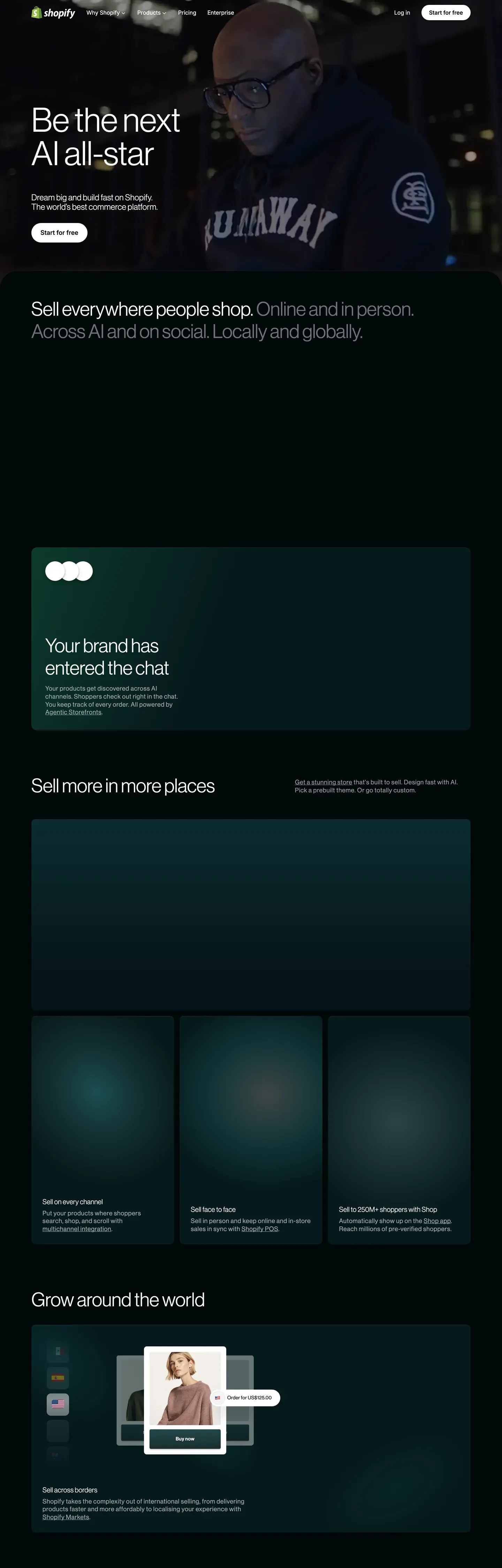
Shopify's public design language reads like two design systems sharing one wordmark. The marketing-hero and product-narrative pages live on a pure-black canvas (#000000) with full-bleed merchant photography, giant Neue Haas Grotesk Display headlines at weight 330, and a single white-stroked black-pill CTA per band. The transactional pages — pricing, signup, dashboards — flip to white #ffffff and an off-white cream #fbfbf5, with the same pill button vocabulary in inverse polarity and pastel mint #c1fbd4 and pistachio #d4f9e0 accents reserved exclusively for this lighter track. The two surfaces never blend. That polarity split is the brand's loudest design decision, more identifying than any single color or shape.
This page packages the full spec into one DESIGN.md file built on the Google Labs spec. Inside: 22 colors tokens grouped into brand accents, surface ladders, shade scales, and text tones; 15 typography tokens across Neue Haas Grotesk Display (display, headlines), Inter Variable (UI body, captions), and ui-monospace (code); 6 corner radius values topped by the 9999px pill that every button uses; 8 spacing tokens on an 8px base scale; and 18 components covering buttons, pricing cards, cinematic photo frames, mint pills, light and dark nav bars, and dual-canvas footers.
Feed this file to Claude, Cursor, or GitHub Copilot and the agent produces React components that respect the two-canvas split, the thin 330 display weight, and the pill-only button shape — not a generic e-commerce theme. Or reference the tokens directly: every hex, font, radius, and spacing value lives as a quoted string you can paste into Tailwind config or CSS variables. The system is worth studying precisely because of its discipline: one shape for buttons, one weight for display, one canvas per page intent. Shopify uses constraint as a brand voice.
What makes it distinct
5
- Two-canvas systempure black #000000 for cinematic marketing, white #ffffff and cream #fbfbf5 for transactional surfaces, never blended
- Thin-weight display typeNeue Haas Grotesk Display at weight 330 for every headline, including the 96px hero with 2.4px positive tracking
- Pill-only button shapeevery CTA uses rounded 9999px geometry across both tracks; rounded rectangles do not exist for buttons
- Mint accents scoped to lightaloe #c1fbd4 and pistachio #d4f9e0 appear only on transactional pages, never on the cinematic black hero
- Universal ss03 stylistic setthe OpenType feature is enabled across NHG, Inter, and ui-monospace as a character-level brand signature
shopify.com
Live at shopify.com
A snapshot of the brand in production. Scroll the frame to see the whole page.
Colors
22 colors
Shopifi Inspired's system runs on #000000 as its primary voltage, used in 1 of 18 components. Type is set in NeueHaasGrotesk Display across 15 tokens from 12px to 96px, weights 330–550. Shape language is mixed across 18 components, blending pills, soft rounds, and squarer corners.
Brand & Accent
Sparing, CTA-only voltage · 1
Surface
Page and card backgrounds · 5
Text
Headlines, body, captions · 7
Borders & Hairlines
Dividers, outlines, rules · 2
Other
Specialty colors · 7
Typography
15 type tokens
Set in NeueHaasGrotesk Display across 15 tokens, from 12px to 96px, weights 330–550. Shown in its own stack: where the font isn't installed, the fallback the file names stands in.
- display-xxl96px · weight 330 · lh 1 · tracking 2.4pxThe quick brown fox jumps over the lazy dog
- display-xl70px · weight 330 · lh 1The quick brown fox jumps over the lazy dog
- display-lg55px · weight 330 · lh 1.16The quick brown fox jumps over the lazy dog
- display-md48px · weight 330 · lh 1.14The quick brown fox jumps over the lazy dog
- heading-xl28px · weight 500 · lh 1.28 · tracking 0.42pxThe quick brown fox jumps over the lazy dog
- heading-lg24px · weight 400 · lh 1.14 · tracking 0.36pxThe quick brown fox jumps over the lazy dog
- heading-md20px · weight 500 · lh 1.4 · tracking 0.3pxThe quick brown fox jumps over the lazy dog
- heading-sm18px · weight 500 · lh 1.25 · tracking 0.72pxThe quick brown fox jumps over the lazy dog
- body-lg18px · weight 550 · lh 1.56The quick brown fox jumps over the lazy dog
- body-md16px · weight 420 · lh 1.5The quick brown fox jumps over the lazy dog
- body-strong16px · weight 550 · lh 1.5The quick brown fox jumps over the lazy dog
- caption14px · weight 500 · lh 1.49 · tracking 0.28pxThe quick brown fox jumps over the lazy dog
- micro13px · weight 500 · lh 1.5 · tracking -0.13pxThe quick brown fox jumps over the lazy dog
- eyebrow-cap12px · weight 400 · lh 1.2 · tracking 0.72pxThe quick brown fox jumps over the lazy dog
- code16px · weight 400 · lh 1.5The quick brown fox jumps over the lazy dog
Layout
Radii and spacing
6 corner radii and 8 spacing values. Shape language: mixed.
Radii
- xs4px
- sm5px
- md8px
- lg12px
- xl20px
- pill9999px
Spacing
- xxs2px
- xs4px
- sm8px
- md12px
- lg16px
- xl24px
- xxl32px
- huge64px
Components
18 components
Each rendered from its tokens (color, type, radius, padding) on Shopifi's own canvas.
- Button Primary Pillbutton-primary-pillButton Primary Pill
- Button Primary Pill Pressedbutton-primary-pill-pressedButton Primary Pill Pressed
- Button Outline On Darkbutton-outline-on-darkButton Outline On Dark
- Button Outline On Lightbutton-outline-on-lightButton Outline On Light
- Button Aloe Pillbutton-aloe-pillButton Aloe Pill
- Type here…text-inputText Input
- Card Pricingcard-pricingCard Pricing
- Card Pricing Featuredcard-pricing-featuredCard Pricing Featured
- Card Feature Cinematiccard-feature-cinematicCard Feature Cinematic
- Card Pistachio Bandcard-pistachio-bandCard Pistachio Band
- Card Photo Framecard-photo-frameCard Photo Frame
- Pill Tag Mintpill-tag-mintPill Tag Mint
- Pill Tag Shadepill-tag-shadePill Tag Shade
- Nav Bar Lightnav-bar-lightNav Bar Light
- Nav Bar Darknav-bar-darkNav Bar Dark
- Link On Darklink-on-darkLink On Dark
- Footer Darkfooter-darkFooter Dark
- Footer Lightfooter-lightFooter Light
In use
The system, in use
Shopifi's tokens on the kind of product it builds.
Build something people actually use.
A short paragraph of marketing copy that previews how the brand's display tier and body tier read together. Two sentences is usually enough.
FAQ
Shopifi Inspired design system FAQ
Common questions about Shopifi's tokens, components, and how to use this DESIGN.md in your project.
Read next
Related reading
Specs, directories, and component libraries that pair with this design system.
Use it
Use Shopifi Inspired in your project
One machine-readable file. Drop it into Claude, Cursor, or any AI tool that reads DESIGN.md.
Download the DESIGN.md
One machine-readable file: every color, type, radius, spacing, and component token of Shopifi Inspired.
Feed it to your AI tool
Drop it into Claude, Cursor, or GitHub Copilot. The agent writes React components and Tailwind classes that match Shopifi Inspired's visual language.
Reference the tokens directly
Or paste the values into your Tailwind config, CSS variables, or component library: every color, size and radius is a quoted, ready-to-copy value.
Read the full DESIGN.md: overview, rationale, do’s and don’ts
Overview
Shopify's public design language runs two parallel tracks that share typographic DNA and a single button vocabulary, but diverge sharply in canvas polarity. The marketing track lives on {colors.canvas-night} (#000000) — full-bleed merchant photography, giant {typography.display-xxl} headlines in Neue Haas Grotesk Display set at weight 330 (a thin, almost editorial cut), and a single CTA: a white-stroked black pill rendered as button-outline-on-dark. The pages read like a high-end print spread: lots of black, lots of negative space, photography that doesn't compete with text, and one and only one action per band.
The transactional track flips to {colors.canvas-light} (#ffffff) and {colors.canvas-cream} (#fbfbf5 — an off-white that's barely warmer than pure white). Pricing tiers, comparison tables, and signup flows sit on this lighter canvas, with the same pill button system in inverse polarity (a solid black pill with white text, or an aloe {colors.aloe-10} #c1fbd4 pill for the featured "Start free trial" tier). The mint accents {colors.aloe-10} (#c1fbd4) and {colors.pistachio-10} (#d4f9e0) appear exclusively on the light track — never on the cinematic dark hero pages.
Typography splits across three families. Neue Haas Grotesk Display at thin weights 330–500 handles every display, headline, and editorial moment — the brand's identity is that thin display cut. Inter Variable at weights 420–550 handles every UI body, button label, caption, and form field — utility text that doesn't fight the display. ui-monospace appears only in code blocks and rare technical eyebrows. The OpenType ss03 stylistic set is enabled across all three families — a character-level brand signature applied universally.
Key Characteristics:
- Two-canvas system:
{colors.canvas-night}(#000000) for cinematic marketing,{colors.canvas-light}(#ffffff) and{colors.canvas-cream}(#fbfbf5) for transactional surfaces — never blended on the same page. - Pill-shape (
{rounded.pill}9999px) is the only button shape across both tracks; rounded rectangles do not exist for buttons. - Thin-weight 330 display typography is the signature;
{typography.display-xxl}at 96px / weight 330 is the brand's loudest visual. - Aloe
{colors.aloe-10}(#c1fbd4) and pistachio{colors.pistachio-10}(#d4f9e0) are reserved for the light track — they signal commerce, growth, transactional success. - Photography is full-bleed, edge-to-edge, never inset in cards on the cinematic track; merchants and storefront imagery do the heavy lifting that gradients and illustrations would do elsewhere.
- The OpenType
ss03stylistic set is enabled across every text role — a character-level unifier that tracks across both canvas polarities. - Tight letter-spacing on display sizes (2.4px positive tracking on 96px display) gives the thin weight extra optical air.
Known Gaps
- Hover-state colors: the press state lifts to
{colors.shade-70}(#3f3f46), but hover styling between idle and press is more subtle and not reliably extracted. - Loading states / skeleton screens: not captured on the surveyed surfaces.
- Polaris admin system: Shopify's in-product merchant admin uses a separate design system (Polaris) with its own tokens and component library; not represented here.
- Dashboard chart palette: analytics widgets inside the merchant dashboard use chart colors not visible on the marketing or pricing pages.
- Form input error states: error styling for the
{component.text-input}token (border treatment, helper text color, icon) was not visible on the captured surfaces. - Motion specifications: the cinematic photography crossfades and pill-button press transitions have timing curves that weren't captured in static extraction.
E-commerce & Retail
More systems like this
More DESIGN.md files in E-commerce & Retail.
Pricing
Build it with Pro
The DESIGN.md files are free. Pro adds 6,000+ blocks, premium templates and the MCP server, so your AI editor builds in your system for you.
4.9/5 out of 5 · 150+ reviewsfrom 150+ founders and developers.
Billing
Billed once a year in USD. Cancel anytime.
- How many people can use the license.
- Client work, SaaS products and anything you charge for.
- Production-ready React sections: hero, pricing, features, dashboards and more.
- Complete multi-page sites you can ship as they are.
- React icons from every major library, installable with one command.
- Presets that restyle every block, in light and dark.
- Lets your AI editor search, preview and install blocks for you.
- Priority requests are answered first.
Individual
For personal projects & open source
$32instead of $49/mo
$389 billed yearly
- Seats: 1 seat
- Commercial use: Personal & open source only
- Pro blocks: 6,000+ blocks
- Templates: All 14 templates
- React icons: 294k+ icons
- Themes: All 59 themes
- MCP server: Basic usage
- Support: Standard
Team
Most popularFor freelancers, agencies & startups
$66instead of $99/mo
$789 billed yearly · ≈ $13/dev/mo
- Seats: Up to 5 seats
- Commercial use: Included
- Pro blocks: 6,000+ blocks
- Templates: All 14 templates
- React icons: 294k+ icons
- Themes: All 59 themes
- MCP server: High usage
- Support: Priority
Organization
For companies with larger teams
$132instead of $199/mo
$1,589 billed yearly
- Seats: Unlimited seats
- Commercial use: Included
- Pro blocks: 6,000+ blocks
- Templates: All 14 templates
- React icons: 294k+ icons
- Themes: All 59 themes
- MCP server: Unlimited usage
- Support: Priority
Billed once a year in USD. Cancel anytime.
Individual
For personal projects & open source
$32instead of $49/mo
$389 billed yearly
- How many people can use the license.Seats: 1 seat
- Client work, SaaS products and anything you charge for.Commercial use: Personal & open source only
- Production-ready React sections: hero, pricing, features, dashboards and more.Pro blocks: 6,000+ blocks
- Complete multi-page sites you can ship as they are.Templates: All 14 templates
- React icons from every major library, installable with one command.React icons: 294k+ icons
- Presets that restyle every block, in light and dark.Themes: All 59 themes
- Lets your AI editor search, preview and install blocks for you.MCP server: Basic usage
- Priority requests are answered first.Support: Standard
Team
Most popularFor freelancers, agencies & startups
$66instead of $99/mo
$789 billed yearly · ≈ $13/dev/mo
Everything in Individual, plus
- How many people can use the license.Seats: Up to 5 seats
- Client work, SaaS products and anything you charge for.Commercial use: Included
- Lets your AI editor search, preview and install blocks for you.MCP server: High usage
- Priority requests are answered first.Support: Priority
Organization
For companies with larger teams
$132instead of $199/mo
$1,589 billed yearly
Everything in Team, plus
- How many people can use the license.Seats: Unlimited seats
- Lets your AI editor search, preview and install blocks for you.MCP server: Unlimited usage
- Secure checkout via Stripe
- Code lives in your repo
- Keep what you've shipped if you cancel
- License terms
Your system, built for you
Every block, template and icon, installed by your AI agent in your design system. The DESIGN.md files stay free.