Sentri Inspired Design System
Sentri's observability design language as a DESIGN.md file. Midnight #150f23, lime #c2ef4e, Rubik + Monaco, 21 components. For React, Next.js, and AI tools.
Add shadcn.io to your AI agent. · Pro It installs blocks, icons and templates in your design system from a prompt, with Pro.
Set up MCP- Primary
- #150f23
- Typeface
- Rubik
- Shape
- Mixed
- Base radius
- 8px
- Colors
- 21
- Type tokens
- 16
- Components
- 21
- Spacing values
- 8
About
About Sentri Inspired DESIGN.md
Curated by Dov Azencot · Updated May 12, 2026 · Source sentry.io (opens in a new tab)
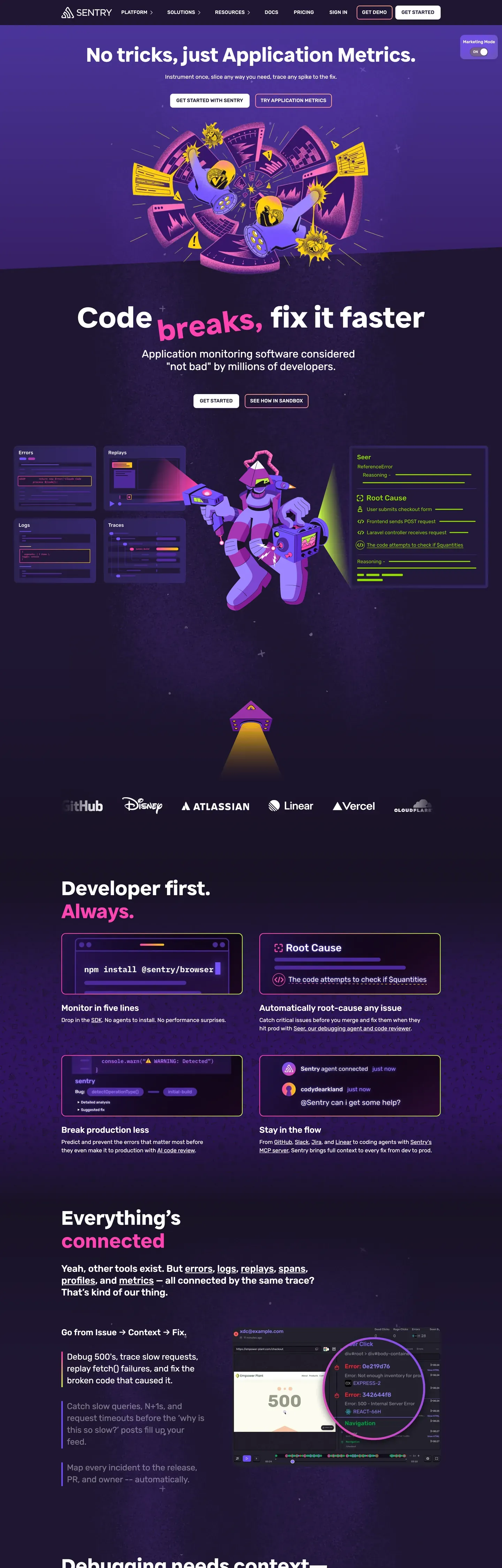
Sentri's design language reads like a debugging console wearing a leather jacket. The product surfaces sit on a near-black violet midnight (#150f23 and #1f1633), strewn with starfield textures and floating sticker-style mascots — astronauts, monsters, traffic cones — that puncture the seriousness of an observability product. Headlines run in a chunky proprietary display sans at 88px / 700, where the most important keywords get wrapped in lime-green highlight chips (#c2ef4e), as if a developer redlined their own console output. The palette is deliberately narrow: midnight as the dominant canvas, electric lime as the primary attention-grabber, hot pink (#fa7faa) as secondary punctuation, and a mid-violet (#79628c) for tag chips and hairlines. Pricing and contact pages flip to a pure white #ffffff canvas with the same near-black ink doing double duty as background on dark surfaces.
This page packages the system into a single DESIGN.md file built on the Google Labs spec. Inside: 21 colors tokens spanning the violet-and-lime brand palette plus surface, hairline, text, and semantic groups; 16 typography tokens running across a proprietary display sans, Rubik for every UI role, and Monaco for code; 7 corner radii from a 4px badge corner to the 18px image container; 8 spacing tokens on an 8px base with a 96px section unit; and 21 components entries covering buttons, cards, code blocks, form inputs, the pill-shaped nav, the lime keyword chip, and the sticker mascot signature. Every component references its tokens by name rather than hardcoded hex.
Feed the file to Claude, Cursor, or GitHub Copilot and the AI produces React components that match Sentri's "developer console" cadence — uppercase button caps with 0.2px tracking, two-polarity canvases, dark-inverted featured pricing tiers, single-primary CTA hierarchy — rather than a generic shadcn theme. Reference the tokens directly in Tailwind config or CSS variables. The discipline of treating lime as a typographic glyph rather than a color swatch is what gives the system its identity, and it's worth studying any time you're tempted to add a second accent.
What makes it distinct
5
- Two-polarity canvas systemdeep violet #1f1633 for marketing, white #ffffff for pricing, with no half-measures between
- Lime keyword chip#c2ef4e wraps single words inside the 88px hero display as a syntax-highlight glyph, never a button
- Single-primary CTAnear-black #150f23 stays the dominant action whether the canvas is dark or light
- Sticker mascot layerillustrated astronauts and monsters break section boundaries instead of drop shadows carrying depth
- Three-family type stackproprietary display sans, Rubik for UI, Monaco for code, with 0.2px tracking on every button cap
sentry.io
Live at sentry.io
A snapshot of the brand in production. Scroll the frame to see the whole page.
Colors
21 colors
Sentri Inspired's system runs on #150f23 as its primary voltage, used in 1 of 21 components. Type is set in Rubik across 16 tokens from 10px to 88px, weights 400–700. Shape language is mixed across 21 components, blending pills, soft rounds, and squarer corners.
Brand & Accent
Sparing, CTA-only voltage · 6
Surface
Page and card backgrounds · 5
Text
Headlines, body, captions · 6
Borders & Hairlines
Dividers, outlines, rules · 3
Other
Specialty colors · 1
Typography
16 type tokens
Set in Rubik across 16 tokens, from 10px to 88px, weights 400–700. Shown in its own stack: where the font isn't installed, the fallback the file names stands in.
- display-hero88px · weight 700 · lh 1.2The quick brown fox jumps over the lazy dog
- display-large60px · weight 500 · lh 1.1The quick brown fox jumps over the lazy dog
- heading-xl30px · weight 500 · lh 1.2The quick brown fox jumps over the lazy dog
- heading-lg27px · weight 500 · lh 1.25The quick brown fox jumps over the lazy dog
- heading-md24px · weight 500 · lh 1.25The quick brown fox jumps over the lazy dog
- heading-sm20px · weight 600 · lh 1.25The quick brown fox jumps over the lazy dog
- body-lg16px · weight 400 · lh 2The quick brown fox jumps over the lazy dog
- body-strong16px · weight 600 · lh 1.5The quick brown fox jumps over the lazy dog
- body-md16px · weight 500 · lh 1.5The quick brown fox jumps over the lazy dog
- eyebrow15px · weight 500 · lh 1.4The quick brown fox jumps over the lazy dog
- button-cap14px · weight 700 · lh 1.14 · tracking 0.2pxThe quick brown fox jumps over the lazy dog
- button-cap-light14px · weight 500 · lh 1.29 · tracking 0.2pxThe quick brown fox jumps over the lazy dog
- caption14px · weight 400 · lh 1.43The quick brown fox jumps over the lazy dog
- micro-cap10px · weight 600 · lh 1.8 · tracking 0.25pxThe quick brown fox jumps over the lazy dog
- code16px · weight 400 · lh 1.5The quick brown fox jumps over the lazy dog
- code-strong16px · weight 700 · lh 1.5The quick brown fox jumps over the lazy dog
Layout
Radii and spacing
7 corner radii and 8 spacing values. Shape language: mixed.
Radii
- xs4px
- sm6px
- md8px
- lg10px
- xl12px
- xxl18px
- full9999px
Spacing
- xxs2px
- xs4px
- sm8px
- md12px
- lg16px
- xl24px
- xxl32px
- section96px
Components
21 components
Each rendered from its tokens (color, type, radius, padding) on Sentri's own canvas.
- Button Primarybutton-primaryButton Primary
- Button Primary Pressedbutton-primary-pressedButton Primary Pressed
- Button Invertedbutton-invertedButton Inverted
- Button Inverted Pressedbutton-inverted-pressedButton Inverted Pressed
- Button Ghost On Darkbutton-ghost-on-darkButton Ghost On Dark
- Button Violet Tokenbutton-violet-tokenButton Violet Token
- Button Disabledbutton-disabledButton Disabled
- Pill Neutral Darkpill-neutral-darkPill Neutral Dark
- Chip Lime Keywordchip-lime-keywordChip Lime Keyword
- Type here…text-inputText Input
- Type here…text-input-focusedText Input Focused
- Select Violetselect-violetSelect Violet
- Card Pricingcard-pricingCard Pricing
- Card Pricing Featuredcard-pricing-featuredCard Pricing Featured
- Card Feature Darkcard-feature-darkCard Feature Dark
- Card Spotlight Violetcard-spotlight-violetCard Spotlight Violet
- Code Blockcode-blockCode Block
- Link On Darklink-on-darkLink On Dark
- Link On Lightlink-on-lightLink On Light
- Nav Bar Lightnav-bar-lightNav Bar Light
- Footer Lightfooter-lightFooter Light
In use
The system, in use
Sentri's tokens on the kind of product it builds.
Build something people actually use.
A short paragraph of marketing copy that previews how the brand's display tier and body tier read together. Two sentences is usually enough.
FAQ
Sentri Inspired design system FAQ
Common questions about Sentri's tokens, components, and how to use this DESIGN.md in your project.
Read next
Related reading
Specs, directories, and component libraries that pair with this design system.
Use it
Use Sentri Inspired in your project
One machine-readable file. Drop it into Claude, Cursor, or any AI tool that reads DESIGN.md.
Download the DESIGN.md
One machine-readable file: every color, type, radius, spacing, and component token of Sentri Inspired.
Feed it to your AI tool
Drop it into Claude, Cursor, or GitHub Copilot. The agent writes React components and Tailwind classes that match Sentri Inspired's visual language.
Reference the tokens directly
Or paste the values into your Tailwind config, CSS variables, or component library: every color, size and radius is a quoted, ready-to-copy value.
Read the full DESIGN.md: overview, rationale, do’s and don’ts
Overview
Sentri's design language reads like a debugging console wearing a leather jacket. The home and product surfaces sit on a near-black violet midnight ({colors.surface-canvas-dark} — #1f1633 — and {colors.surface-night} — #150f23), strewn with starfield textures and floating sticker-style mascots — astronauts, monsters, traffic cones — that puncture the seriousness of an observability product. Headlines run in a chunky proprietary display sans at 88px / 700, where the most important keywords get wrapped in lime-green highlight chips ({colors.accent-lime} — #c2ef4e), as if the copy itself has been marked up by a developer redlining their own console output.
The palette is deliberately narrow: deep midnight as the dominant canvas, electric lime as the primary attention-grabber, hot pink ({colors.accent-pink} — #fa7faa) as a secondary punctuation, and a violet-mid ({colors.accent-violet-mid} — #79628c) for tag chips and hairline strokes. White appears in two roles — as text on dark, and as the canvas for pricing, contact, and content-heavy pages where developers need to scan dense tables. The "single primary CTA" is visually inverted depending on context: filled black-violet ({colors.primary} — #150f23) with white type on light surfaces, or filled white with dark type on dark surfaces. The button always reads as the strongest UI affordance regardless of polarity.
Typography splits cleanly between three families: a custom display sans for hero and section openers (chunky, near-condensed, slightly playful), Rubik for every UI text role (body, captions, eyebrow caps, button labels), and Monaco for code. Buttons and eyebrows almost always run in uppercase with a 0.2px tracking lift to give them the snap of console output.
Key Characteristics:
- Two-polarity canvas system: deep violet midnight (
{colors.surface-canvas-dark}— #1f1633) for marketing hero and product feature pages, white ({colors.surface-canvas-light}— #ffffff) for pricing, contact, and dense reference content — the system never tries to blur the two. - Lime keyword highlight (
{colors.accent-lime}— #c2ef4e) treated as a typographic device, not a color swatch — it wraps single words inside the display headline to act as a syntax highlight on the reading flow. - Sticker illustration system: floating mascot characters with hand-drawn outlines, appearing at section junctions, never inside cards — they create rhythm and personality between dense info blocks.
- Uppercase eyebrow + button caps in
{typography.button-cap}and{typography.eyebrow}, with a consistent 0.2px tracking lift, give the brand its "developer console" cadence. - Single-primary CTA hierarchy: every page has one filled button reading either
{colors.primary}(#150f23) on light or{colors.on-primary}(#ffffff) on dark; outlined and ghost variants are downgraded. - Card surfaces follow the canvas: dark sections nest dark cards (
{colors.ink-deep}— #1f1633 — with subtle hairline) and light sections nest white cards with{colors.hairline-cloud}(#e5e7eb) borders — chrome stays consistent, only the polarity flips. - A pricing-page color rhythm of cream-white tiers with one dark inverted "featured" tier (
{colors.surface-night}— #150f23), avoiding the typical accent-bordered featured pattern.
Known Gaps
- Hover state colors: intentionally not documented per the global no-hover policy — only Default and Pressed states are captured for buttons and inputs. The pressed state for inverted buttons is captured (
button-inverted-pressed), but mid-press hover transitions are not. - Starfield hero texture: described as a low-opacity white-on-violet pinprick pattern overlaid on the hero canvas, but ships as a project-specific background image rather than a generated CSS pattern. Producers should treat it as a placeholder asset.
- Lime squiggly footer divider: specified at ~3px stroke at full container width, but the exact hand-drawn SVG is not bundled with the spec — recreate it per project.
- Sticker mascot library: the illustrated astronauts, monsters, and traffic cones are characterized in prose (hand-rendered outlines, saturated
{colors.accent-pink}and{colors.accent-lime}fills, no shadow) but no source library is provided — substitute house-style illustrations with the same color discipline. - Proprietary display sans: the chunky near-condensed display face is named (
Sentri Display) but not licensed for redistribution. Use Space Grotesk, Archivo, or Hubot Sans at heavier weights, adjusting line-height down by 0.05 to compensate for tighter leading at large sizes. - Loading skeletons: not visible on the captured surfaces. Inherit the dark/light polarity rule — skeletons on dark canvas use
{colors.hairline-violet}shimmer, on light canvas use{colors.hairline-cloud}.
Developer Tools & IDEs
More systems like this
More DESIGN.md files in Developer Tools & IDEs.
Pricing
Build it with Pro
The DESIGN.md files are free. Pro adds 6,000+ blocks, premium templates and the MCP server, so your AI editor builds in your system for you.
4.9/5 out of 5 · 150+ reviewsfrom 150+ founders and developers.
Billing
Billed once a year in USD. Cancel anytime.
- How many people can use the license.
- Client work, SaaS products and anything you charge for.
- Production-ready React sections: hero, pricing, features, dashboards and more.
- Complete multi-page sites you can ship as they are.
- React icons from every major library, installable with one command.
- Presets that restyle every block, in light and dark.
- Lets your AI editor search, preview and install blocks for you.
- Priority requests are answered first.
Individual
For personal projects & open source
$32instead of $49/mo
$389 billed yearly
- Seats: 1 seat
- Commercial use: Personal & open source only
- Pro blocks: 6,000+ blocks
- Templates: All 14 templates
- React icons: 294k+ icons
- Themes: All 59 themes
- MCP server: Basic usage
- Support: Standard
Team
Most popularFor freelancers, agencies & startups
$66instead of $99/mo
$789 billed yearly · ≈ $13/dev/mo
- Seats: Up to 5 seats
- Commercial use: Included
- Pro blocks: 6,000+ blocks
- Templates: All 14 templates
- React icons: 294k+ icons
- Themes: All 59 themes
- MCP server: High usage
- Support: Priority
Organization
For companies with larger teams
$132instead of $199/mo
$1,589 billed yearly
- Seats: Unlimited seats
- Commercial use: Included
- Pro blocks: 6,000+ blocks
- Templates: All 14 templates
- React icons: 294k+ icons
- Themes: All 59 themes
- MCP server: Unlimited usage
- Support: Priority
Billed once a year in USD. Cancel anytime.
Individual
For personal projects & open source
$32instead of $49/mo
$389 billed yearly
- How many people can use the license.Seats: 1 seat
- Client work, SaaS products and anything you charge for.Commercial use: Personal & open source only
- Production-ready React sections: hero, pricing, features, dashboards and more.Pro blocks: 6,000+ blocks
- Complete multi-page sites you can ship as they are.Templates: All 14 templates
- React icons from every major library, installable with one command.React icons: 294k+ icons
- Presets that restyle every block, in light and dark.Themes: All 59 themes
- Lets your AI editor search, preview and install blocks for you.MCP server: Basic usage
- Priority requests are answered first.Support: Standard
Team
Most popularFor freelancers, agencies & startups
$66instead of $99/mo
$789 billed yearly · ≈ $13/dev/mo
Everything in Individual, plus
- How many people can use the license.Seats: Up to 5 seats
- Client work, SaaS products and anything you charge for.Commercial use: Included
- Lets your AI editor search, preview and install blocks for you.MCP server: High usage
- Priority requests are answered first.Support: Priority
Organization
For companies with larger teams
$132instead of $199/mo
$1,589 billed yearly
Everything in Team, plus
- How many people can use the license.Seats: Unlimited seats
- Lets your AI editor search, preview and install blocks for you.MCP server: Unlimited usage
- Secure checkout via Stripe
- Code lives in your repo
- Keep what you've shipped if you cancel
- License terms
Your system, built for you
Every block, template and icon, installed by your AI agent in your design system. The DESIGN.md files stay free.