Skip to content

Semafor Design System

Semafor's homepage as a DESIGN.md file — warm cream canvas, Feature Flat serif throughout, no chromatic accents, and the Semaform editorial split. Tokens for React, Next.js, and AI coding tools.

Add shadcn.io to your AI agent. · Pro It installs blocks, icons and templates in your design system from a prompt, with Pro.

Set up MCP
Primary
#fffaeb
Typeface
FeatureFlatHeadline
Shape
Sharp
Base radius
5px
Colors
9
Type tokens
13
Components
16
Spacing values
8

About

About Semafor DESIGN.md

Curated by Dov Azencot · Updated May 19, 2026 · Source semafor.com (opens in a new tab)

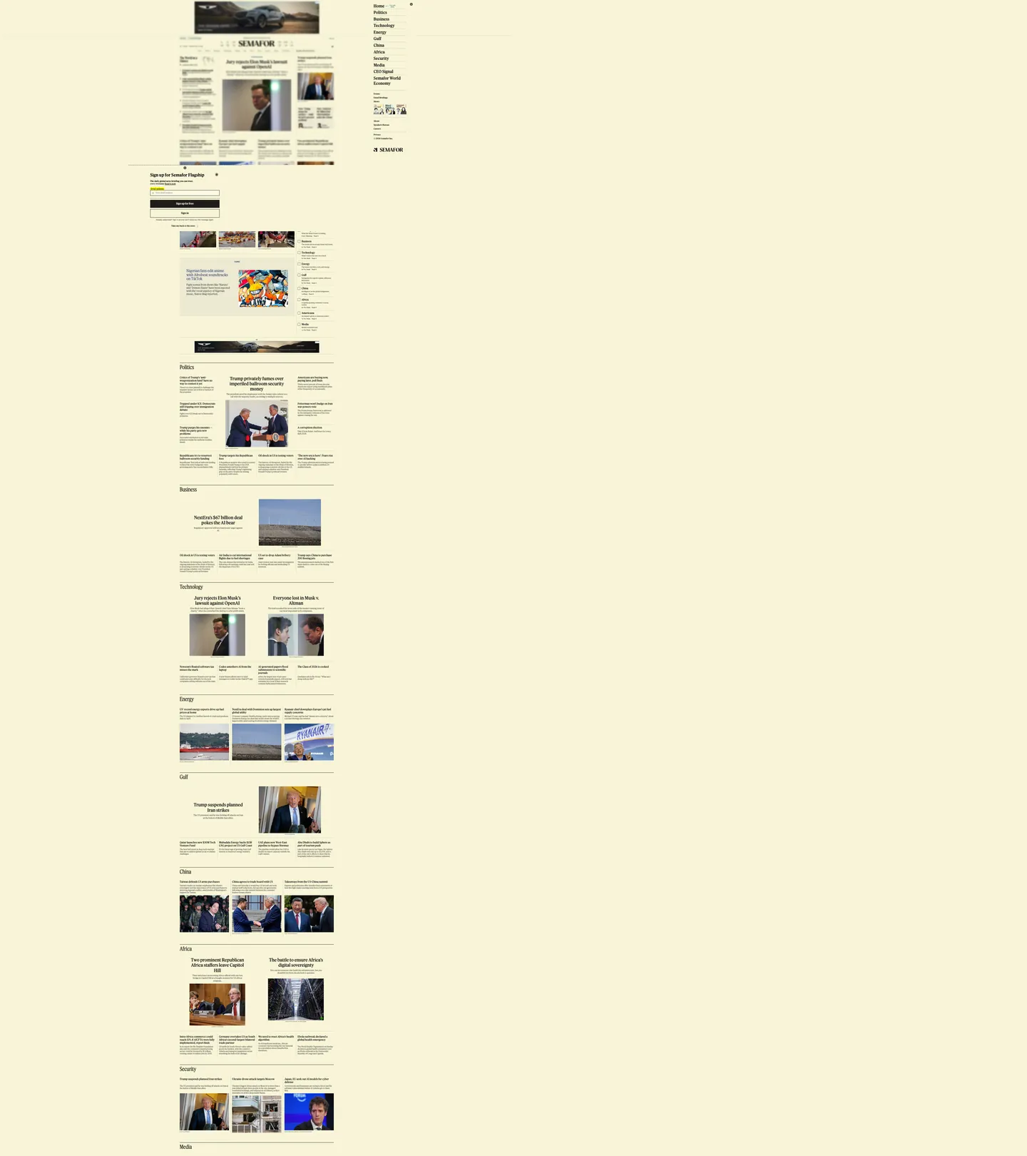
Semafor's homepage commits to a single chromatic decision that no contemporary news startup makes. The entire page renders on a warm cream canvas #fffaeb — a yellow-tinted off-white that traditional broadsheets used for a century when their paper was actual newsprint, and that almost every digital-native publisher abandoned for either pure white or a dark canvas. The cream is wired into the brand's CSS as `--theme-color` and is also declared on the meta tag (#f8f5d7) so the browser tints the address bar to match. There is no marketing hero, no rotating cover image, no full-bleed photograph, no chromatic accent anywhere in the visible chrome — just the engraved "SEMAFOR" wordmark at top, the cream backdrop that fades to a slightly-deeper yellow at the page edges through a 118-occurrence gradient, and a packed multi-column story grid where every headline links to an article rendered in the publication's signature "Semaform" format.

The DESIGN.md file packages the system into a machine-readable spec for React tooling. Inside: 9 colors tokens organized around the cream canvas #fffaeb (149 occurrences — 29 background, 1 text, 1 border, and 118 inside the page-edge gradient), an off-black ink ladder of #1f1d1a (465 occurrences, the dominant headline color) and #4b4a47 (1096 occurrences, the dominant body and metadata color), pure #000000 (375 occurrences) for hairline borders, and a single muted teal #3a6d78 reserved for editorial-section accents. Twelve typography tokens cover Feature Flat Headline at 13 / 15 / 16 / 20 / 24 / 31 / 34px in weights 180 / 300 / 370 / 395 / 400, plus Feature Flat Condensed at 42px for the section-bar treatments. Fifteen components describe the wordmark, the section-bar headers, the story-headline row, the dek paragraph, the Semaform-format article preview, the newsletter signup, and the hairline-divided sidebar nav.

Feed this file to an AI coding tool and it reproduces Semafor's specific moves: cream canvas #fffaeb instead of pure white or dark, Feature Flat serif across every tier, variable-weight serif type that runs at 180 / 370 / 395 instead of the traditional 400 / 700 step, right-angled chrome with no pill-rounded section chips, and the Semaform editorial split that organizes article previews into "The News" / "The View from" / "Notable" sections. The one move worth borrowing for any editorial product: the willingness to commit to a single warm canvas color and stop adding accent colors entirely. Most publishers reach for at least one brand accent for the CTA; Semafor trusts the cream backdrop and the Feature Flat serif to carry the entire identity.

What makes it distinct

5

  1. Cream-canvas-as-systemthe warm yellow #fffaeb that runs the entire page is the brand chrome, not a marketing accent; the system's only chromatic move
  2. Feature Flat serif throughoutevery headline, body paragraph, byline, and nav label runs the proprietary Feature Flat serif family at weights 180-395
  3. Variable-weight serif headlinesweight 370 is the workhorse, weight 180 the lightest body tier, weight 395 the heaviest emphasis; no traditional 400/700 step
  4. Right-angled chromeevery surface is right-angled or 2-5px softened; the cream canvas does the work that pill chips and rounded cards do on peer sites
  5. Variable headline scaledisplay headlines run 24 / 31 / 34 / 42px in Feature Flat Headline and Feature Flat Condensed, the condensed variant marking the section bars

semafor.com

Live at semafor.com

A snapshot of the brand in production. Scroll the frame to see the whole page.

Semafor's website at semafor.com

Colors

9 colors

Semafor's system runs on #fffaeb as its primary voltage, used in 6 of 16 components. Type is set in FeatureFlatHeadline across 13 tokens from 12px to 42px, weights 180–400. Shape language is sharp — components average 0px corner radius, favoring crisp rectangles.

Brand & Accent

Sparing, CTA-only voltage · 2

Surface

Page and card backgrounds · 1

Text

Headlines, body, captions · 3

Borders & Hairlines

Dividers, outlines, rules · 1

Other

Specialty colors · 2

Typography

13 type tokens

Set in FeatureFlatHeadline across 13 tokens, from 12px to 42px, weights 180–400. Shown in its own stack: where the font isn't installed, the fallback the file names stands in.

  • display-condensed-xl42px · weight 300 · lh 50.4pxThe quick brown fox jumps over the lazy dog
  • display-lg34px · weight 370 · lh 40.8pxThe quick brown fox jumps over the lazy dog
  • display-md31px · weight 395 · lh 37.2pxThe quick brown fox jumps over the lazy dog
  • heading-md24px · weight 370 · lh 28.8pxThe quick brown fox jumps over the lazy dog
  • heading-sm20px · weight 370 · lh 24pxThe quick brown fox jumps over the lazy dog
  • body-emphasis16px · weight 395 · lh 19.2pxThe quick brown fox jumps over the lazy dog
  • body-md20px · weight 400 · lh 24pxThe quick brown fox jumps over the lazy dog
  • body-sm15px · weight 180 · lh 18pxThe quick brown fox jumps over the lazy dog
  • dek13px · weight 300 · lh 16.9pxThe quick brown fox jumps over the lazy dog
  • body-tight14.5px · weight 400 · lh 18.85pxThe quick brown fox jumps over the lazy dog
  • nav-link31px · weight 395 · lh 37.2pxThe quick brown fox jumps over the lazy dog
  • caption12px · weight 395 · lh 14.4pxThe quick brown fox jumps over the lazy dog
  • button-md20px · weight 395 · lh 24pxThe quick brown fox jumps over the lazy dog

Layout

Radii and spacing

4 corner radii and 8 spacing values. Shape language: sharp.

Radii

  • none0px
  • xs2px
  • sm5px
  • full9999px

Spacing

  • xs4px
  • sm5px
  • md10px
  • base12px
  • lg20px
  • xl30px
  • 2xl40px
  • 3xl64px

Components

16 components

Each rendered from its tokens (color, type, radius, padding) on Semafor's own canvas.

  • Top Nav
    top-navTop Nav
  • Masthead
    mastheadMasthead
  • Nav Link
    nav-linkNav Link
  • Sidebar Nav Item
    sidebar-nav-itemSidebar Nav Item
  • Section Bar
    section-barSection Bar
  • Hero Headline
    hero-headlineHero Headline
  • Story Headline
    story-headlineStory Headline
  • Story Headline Sm
    story-headline-smStory Headline Sm
  • Body Paragraph
    body-paragraphBody Paragraph
  • Dek Paragraph
    dek-paragraphDek Paragraph
  • Byline
    bylineByline
  • Button Primary
    button-primaryButton Primary
  • Button Secondary
    button-secondaryButton Secondary
  • Newsletter Signup
    newsletter-signupNewsletter Signup
  • Type here…
    text-inputText Input
  • Hairline Divider
    hairline-dividerHairline Divider

In use

The system, in use

Semafor's tokens on the kind of product it builds.

Build something people actually use.

A short paragraph of marketing copy that previews how the brand's display tier and body tier read together. Two sentences is usually enough.

Get startedLearn more
Marketing heroHeadline, sub-copy, primary CTA — the universal homepage opener.
Reporting · 14 min read

The quiet collapse of an old idea

For decades the consensus held that the system would correct itself. Then it didn't. This is the inside story of what changed, told by the people who watched it unravel.

"Nobody noticed because the failure was indistinguishable from progress."

By Sam Reporter · Updated 2 hours ago

Editorial articleMagazine-style longform with display headline.

FAQ

Semafor design system FAQ

Common questions about Semafor's tokens, components, and how to use this DESIGN.md in your project.

Read next

Specs, directories, and component libraries that pair with this design system.

Use it

Use Semafor in your project

One machine-readable file. Drop it into Claude, Cursor, or any AI tool that reads DESIGN.md.

Download DESIGN.md
  1. Download the DESIGN.md

    One machine-readable file: every color, type, radius, spacing, and component token of Semafor.

  2. Feed it to your AI tool

    Drop it into Claude, Cursor, or GitHub Copilot. The agent writes React components and Tailwind classes that match Semafor's visual language.

  3. Reference the tokens directly

    Or paste the values into your Tailwind config, CSS variables, or component library: every color, size and radius is a quoted, ready-to-copy value.

Read the full DESIGN.md: overview, rationale, do’s and don’ts

Overview

Semafor's homepage commits to the rarest chromatic decision in contemporary news. Cream-canvas-as-system. The entire page renders on a warm yellow {colors.cream} (#fffaeb) — a tinted off-white that traditional American broadsheets used for a century when their paper was actual newsprint, and that almost every digital-native publisher abandoned for either pure white or a dark canvas. The cream is wired into the page CSS as --theme-color and declared on the HTML meta tag, so the browser tints its own chrome to match — the canvas color leaks past the page into the address bar itself. Where the Washington Post sits on pure white, Axios on a slightly-gray off-white, and Bloomberg on a darker stone, Semafor occupies a chromatic position none of its peers will touch.

The system's typographic discipline is serif-everything. Feature Flat serif carries every tier — headlines, body, dek, navigation, byline, button — without a sans counterpart. The family runs at non-standard variable weights (180 / 300 / 370 / 395 / 400) rather than the traditional 400 / 700 step, with 370 as the workhorse weight, 180 as the lightest body-dek tier, and 395 as the heaviest emphasis. A single Helvetica caption tier at 12px / 395 carries metadata only — bylines, timestamps, source attributions. The pairing of cream canvas + Feature Flat serif is the system's two-decision identity; remove either and the chrome reads as a generic content-management template. Where Axios runs sans headlines on serif body and the Post runs serif headlines on sans body, Semafor refuses the split and runs serif everywhere.

The chrome is right-angled. Every surface — top-nav, story cards, newsletter signup, sign-in button — sits at {rounded.none} 0px with the rare 2-5px softening. There is no pill-rounded section chip, no rounded card, no soft-corner CTA. Section structure is marked instead with 1px pure-black hairline rules: between the top-nav and the masthead, between themed section bands, between sidebar nav items, between Semaform-format article sub-sections. The right-angled chrome combined with the cream canvas reads as broadsheet-editorial; rounded corners would soften the system into a magazine-startup template.

Key Characteristics:

  • Cream canvas {colors.cream} (#fffaeb) — 149 occurrences across the page (29 background, 118 gradient stops, 1 text, 1 border). Declared on the HTML <meta theme-color> so the browser chrome tints to match.
  • Feature Flat serif across every typographic tier — headlines, body, dek, navigation, byline, button. No sans counterpart except for a single Helvetica caption tier.
  • Variable-weight serif at non-standard weights — 180 / 300 / 370 / 395 / 400 instead of the traditional 400 / 700 step. Weight 370 is the workhorse, 180 the lightest, 395 the heaviest emphasis.
  • Off-black ink ladder — {colors.ink} (#1f1d1a) at frequency 465 for headlines, {colors.ink-muted} (#4b4a47) at frequency 1096 for body and metadata, pure {colors.alpha-black} (#000000) at frequency 375 for hairline rules only.
  • Right-angled chrome — every surface at {rounded.none} 0px with rare 2-5px softening; no pill chips, no rounded cards.
  • Hairline-rule section structure — 1px pure-black rules separate every named section, sidebar nav item, and Semaform article sub-section.
  • No chromatic accent — there is no Semafor red, blue, or signature CTA fill. The chrome runs entirely on cream + ink + black hairlines.
  • Section-bar typographic treatment — Feature Flat Condensed at 42px / 300 sits above each themed section group, the only place the condensed cut appears.

Colors

Surface

  • Cream ({colors.cream} — #fffaeb): frequency 149 — 29 background, 118 gradient, 1 text, 1 border. The entire page floor. The merged token absorbs three near-identical hexes (#fffaeb, #f8f5d7, #fcfae4) that share the warm-yellow off-white luminance with slight saturation differences. Declared on the <meta theme-color> element so the browser address bar tints to match. The 118 gradient occurrences mark the cream-to-deeper-yellow page-edge falloff that pulls the floor into a subtle atmospheric envelope rather than a flat background fill.
  • Surface Warm ({colors.surface-warm} — #ece9d2): frequency 3 — all background. The slightly-deeper cream variant used inside the newsletter-signup card and a small set of inset surfaces that need a half-step contrast against the page floor.

Text

  • Ink Muted ({colors.ink-muted} — #4b4a47): frequency 1096 — 548 text, 548 border. The dominant body and metadata text color, a warm dark-gray that matches the cream canvas's slight yellow tint. The merged token absorbs a near-identical olive-tinted sibling. Carries Semaform-format body paragraphs, byline rows, and the 1px hairline rules between sub-sections.
  • Ink ({colors.ink} — #1f1d1a): frequency 465 — 233 text, 231 border, 1 background. The headline ink color — Feature Flat headlines at 24-34px sit here, distinct from the slightly-lighter body ink. The OKLCH hue (78° at 0.006 chroma) pulls toward the same warm yellow-brown family as the cream canvas, so the type reads as engraved newsprint rather than glowing black on yellow.
  • Ink Faint ({colors.ink-faint} — #9c9a92): frequency 6 — all border. The faintest ink tone in the system — used for tertiary divider rules and the rare ghosted-state UI element.

Hairlines

  • Alpha Black ({colors.alpha-black} — #000000): frequency 375 — 194 text, 181 border, 0 background. Pure black exists in the system and carries hairline-rule duty — every 1px section divider, every sub-section boundary inside Semaform articles, every form-input border. The 194 text occurrences belong to the engraved "SEMAFOR" wordmark and the rare bold-emphasis instance in nav labels.
  • Hairline Soft ({colors.hairline-soft} — #cbc9c0): frequency 3 — all border. A warm-gray softer hairline tone used for the rare in-card divider that needs to read quieter than the pure-black rule.

Accents (rare)

  • Accent Teal ({colors.accent-teal} — #3a6d78): frequency 8 — 4 text, 4 border. A muted desaturated teal used for editorial-section accents on the article-read page (the "Gulf" themed-section indicator, a small set of inline section markers). Almost absent from the homepage chrome but declared in the system as the single non-monochromatic option.
  • Accent Navy ({colors.accent-navy} — #1f2b6d): frequency 4 — 2 text, 2 border. A deep editorial navy reserved for the rare inline link or section accent. Like the teal, almost absent from the homepage chrome but exposed by the system as a reserve accent.

Typography

Font Families

The system runs the Feature Flat serif family across every tier — headlines, body, dek, navigation, byline, and button. The family ships in Headline and Condensed cuts. Headline carries 13 / 15 / 16 / 20 / 24 / 31 / 34px sizes at variable weights 180 / 300 / 370 / 395 / 400; Condensed appears at 42px / 300 only, marking the section-bar treatments above each themed group of stories. A small set of 12px navigation captions runs in Helvetica at weight 395 — the system's single concession to a sans tier, used only for byline metadata and source attributions. Fallbacks walk "Times New Roman", Times, serif for the Feature Flat tiers and sans-serif for the Helvetica tier.

The single-typeface-across-every-tier discipline is the rarest typographic move in editorial design — most contemporary publishers run a serif headline / sans body split or the reverse. Semafor commits to serif everywhere and uses weight variation (180 / 370 / 395) to mark hierarchy rather than family contrast.

Hierarchy

TokenFamilySizeWeightLine HeightUse
{typography.display-condensed-xl}Feature Flat Condensed42px30050.4pxSection-bar headers above themed groups
{typography.display-lg}Feature Flat Headline34px37040.8pxLead-story headline above the fold
{typography.display-md}Feature Flat Headline31px39537.2pxSidebar nav links, "Home / Politics / Business"
{typography.heading-md}Feature Flat Headline24px37028.8pxColumn-story headlines
{typography.heading-sm}Feature Flat Headline20px37024pxSection h2 ("Politics", "Business", "Energy", "Gulf")
{typography.body-emphasis}Feature Flat Headline16px39519.2pxSidebar nav items, sub-section labels
{typography.body-md}Feature Flat Headline20px40024pxInline body emphasis, button labels
{typography.body-sm}Feature Flat Headline15px18018pxDek paragraphs (the lightest body tier)
{typography.dek}Feature Flat Headline13px30016.9pxSidebar dek paragraphs, secondary descriptions
{typography.body-tight}Feature Flat Headline14.5px40018.85pxStory-card body excerpts ("Why it matters", "What they're saying")
{typography.nav-link}Feature Flat Headline31px39537.2pxSidebar nav anchors at the right of the homepage
{typography.caption}Helvetica12px39514.4pxByline metadata, timestamp rows, source attributions
{typography.button-md}Feature Flat Headline20px39524pxSign-in button, newsletter signup button

Principles

The headline tier runs at weight 370 (lead headlines) and 395 (sidebar links and section labels) — neither value corresponds to a standard CSS keyword. The body dek tier runs at weight 180 (the lightest variable instance in the captured page) and the inline-emphasis tier at 395. The system's deliberate non-standard weights signal a variable-font system tuned for newsprint feel: 180 reads as a faint dek, 370 as a confident body, 395 as a quiet emphasis, with the traditional 400 / 700 step entirely absent. The lightest dek at weight 180 is the system's defining typographic moment — most editorial systems would sit at weight 300 minimum.

The section-bar treatment in Feature Flat Condensed at 42px / 300 is the only place the condensed cut appears, and the only place the page leans on a typographic-display moment. Every other heading runs in the Headline cut, and the visual rhythm of the page is structural-bar → headline → dek rather than display-banner → body.

Note on Font Substitutes

Feature Flat is a custom proprietary family. Source Serif Pro at variable weights is the closest open-source substitute — comparable cap height, similar diagonal stress, available at non-standard weights through the VF axis. Tiempos Text is the closest licensed alternative if a paid family is on the table. For the Helvetica caption tier, the system font stack is already what Semafor ships; Inter at weight 500 transfers cleanly at 12px if you need an open alternative.

Layout

Spacing System

  • Base unit: 10-12px (the dominant gap values at frequencies 54 and 20 respectively).
  • Tokens: {spacing.xs} 4px · {spacing.sm} 5px · {spacing.md} 10px · {spacing.base} 12px · {spacing.lg} 20px · {spacing.xl} 30px · {spacing.2xl} 40px · {spacing.3xl} 64px.
  • Vertical rhythm: the dominant 10px 0px 0px pattern (frequency 52) marks the tight inter-element padding inside story cards.
  • Section vertical padding: 30-64px between major themed bands.
  • Newsletter-signup padding: 20px on every side; button padding 18px top / 10px sides / 20px bottom (asymmetric, accommodating the descender of the serif).

Grid & Container

  • Max content width: the homepage runs at a fluid multi-column grid with no fixed-pixel max-width on the captured page; sidebar nav anchored to a fixed right column at ~140px wide.
  • Above-fold layout: a packed multi-column story grid with lead headline + photograph anchor center, supporting story cards left and right, and an opinion / video strip top.
  • Sidebar nav: right-side fixed column carrying single-word section anchors (Home, Politics, Business, Technology, Energy, Gulf, China, Africa, Security, Media, CEO Signal, Semafor World Economy) at 31px / 395, separated from the page body by a 1px black vertical rule.
  • Below-fold section bands: each themed group (Politics, Business, Technology, Energy, Gulf, China, Africa, Security, Media) opens with a 42px Feature Flat Condensed section-bar header, then a 2-column story grid of stories from that vertical.

Rhythm

The page runs on uniformly dense editorial rhythm. There is no generous-vs-packed alternation; every section sits in the same multi-column grid with 10-12px internal padding and 30-40px between bands. Section bars ({component.section-bar}) with the Feature Flat Condensed 42px header are the only structural pause between bands. The Semaform article-preview format runs through the story cards with 'The News' / 'The View from' sub-sections marked by horizontal hairline rules, mirroring the inside-article structure on the homepage preview.

Elevation

The system has no shadow tier on the visible chrome. Every surface — story cards, newsletter signup, sign-in button, sidebar nav — sits flat on the cream canvas. Depth comes from the 1px pure-black hairline rules that separate every named section, and from the subtle cream-to-deeper-yellow gradient at the page edges that pulls the floor into an atmospheric envelope.

  • Flat (no shadow): masthead, story grid, newsletter signup, sidebar nav, footer — 100% of homepage surfaces.
  • Hairline structure: 1px {colors.alpha-black} (#000000) rules separate every named section, sub-section, sidebar nav item, and form input. The hairline carries the entire structural elevation job.
  • Page-edge gradient: 118 occurrences of the cream-token gradient mark a soft falloff at the page edges, fading cream {colors.cream} into a slightly-deeper yellow at the column rules.

Shapes

The radius scale is right-angled.

  • {rounded.none} 0px — every surface (masthead, story card, newsletter signup, sign-in button, text input, sidebar nav item). The dominant radius on the page.
  • {rounded.xs} 2px — frequency 10; a small set of icon-background corners.
  • {rounded.sm} 5px — frequency 2; the rare in-card chip rounding.
  • {rounded.full} 9999px — frequency 6 (rendered as 50% in CSS); circular profile-photo avatars only.

There is no pill-rounded section chip, no soft-cornered CTA, no rounded card. The right-angled chrome is the system's structural decision — softening any element would move the page from broadsheet-editorial toward magazine-startup template.

Components

top-nav — Cream {colors.cream} surface with a 1px {colors.alpha-black} bottom rule, 10px vertical padding. Carries the sidebar-nav anchor labels.

masthead — Cream surface, 20px vertical padding. Holds the engraved "SEMAFOR" wordmark in {typography.display-condensed-xl} (Feature Flat Condensed 42px / 300). The visual anchor — the only typographic-display moment on the page besides section bars.

nav-link — Transparent fill, ink text in {typography.body-emphasis} (16px / 395), 5px vertical padding. Renders inside the sidebar nav.

sidebar-nav-item — Transparent fill, ink text in {typography.body-emphasis} (16px / 395), 4×14px padding. The right-rail single-word section anchors (Home / Politics / Business / Technology / Energy / Gulf / China / Africa / Security / Media / CEO Signal / Semafor World Economy).

section-bar — Cream surface with a 1px {colors.alpha-black} bottom rule, 10px padding. Holds the section name in {typography.display-condensed-xl} (Feature Flat Condensed 42px / 300). Marks every themed-section group below the fold ("Politics", "Business", "Technology", "Energy", etc.).

hero-headline — Ink {colors.ink} text in {typography.display-lg} (Feature Flat Headline 34px / 370, 40.8px line-height). The lead-story headline above the fold.

story-headline — Ink text in {typography.heading-md} (24px / 370). Column-story headlines below the lead.

story-headline-sm — Ink text in {typography.heading-sm} (20px / 370). Section h2 headers and smaller story headlines.

body-paragraph — Ink-muted {colors.ink-muted} text in {typography.body-tight} (14.5px / 400). Story-card body excerpts.

dek-paragraph — Ink-muted text in {typography.dek} (13px / 300). Sidebar dek paragraphs and secondary descriptions under headlines.

byline — Ink-muted text in {typography.caption} (Helvetica 12px / 395). Byline rows, timestamp meta, source attributions — the system's only non-serif typographic moment.

button-primary — Cream {colors.cream} fill, ink text, 1px {colors.ink} border, right-angled {rounded.none} shape, 18px / 10px / 20px asymmetric padding (the top-bottom asymmetry accommodates the serif descender), 33px height. "Sign in" is the canonical instance. No fill color — the button shape comes from the rule outline, not a fill.

button-secondary — Inverted: pure-black {colors.alpha-black} fill, cream text, right-angled, same asymmetric padding. "Sign up for free" is the canonical instance in the newsletter-signup card.

newsletter-signup — Surface-warm {colors.surface-warm} (#ece9d2) fill, ink text, 1px {colors.alpha-black} border, right-angled, 20px padding. The inset signup card.

text-input — Cream fill, black text, 1px {colors.alpha-black} border on the bottom edge only (acting as an underline rule rather than a boxed input), 32px height, 0 padding. The newsletter input field.

hairline-divider — 1px pure {colors.alpha-black} rule with 0 padding. The structural separator that carries every section and sub-section boundary in the system.

Do's and Don'ts

Do commit to the cream canvas {colors.cream} (#fffaeb) as the system's chromatic foundation. The single decision to render on warm yellow instead of pure white or dark is the brand identity — switching to a white canvas erases the editorial-newsprint reference that defines the chrome.

Do declare the cream on <meta theme-color> so the browser's address bar tints to match. The canvas-leaks-into-browser-chrome move is part of the system's atmospheric envelope and the page reads incomplete without it.

Do run Feature Flat serif across every tier — headlines, body, dek, nav, byline, button. Adding a sans tier for the body or the CTA breaks the serif-everywhere discipline and turns the page into a contemporary-template news layout.

Do use 1px pure-black {colors.alpha-black} hairline rules for every named section and sub-section boundary. The hairline-rule structure replaces the rounded-card layout most peers use; pure black on cream reads as the engraved newsprint rule.

Don't introduce a chromatic accent for the CTA. The system has no brand voltage — the sign-in button is rule-outlined on cream, the newsletter button is black on cream. Adding a Semafor red or blue accent breaks the monochromatic editorial commitment.

Don't render the buttons with {rounded.sm} 5px or {rounded.full} softening. The right-angled chrome is the system's structural decision; soft-corner buttons read as magazine-startup template rather than broadsheet-editorial.

Don't swap the cream canvas for pure white. The merged token absorbs three near-identical cream hexes (#fffaeb, #f8f5d7, #fcfae4) that share the warm-yellow off-white tonality; switching to pure white loses the entire newsprint reference and makes the serif headlines read as too-cold.

Don't introduce a weight-700 Feature Flat headline. The system runs at non-standard variable weights (180 / 300 / 370 / 395 / 400) and the heaviest instance is 395 — bumping to 700 turns the editorial broadsheet into a generic news headline and undercuts the variable-font discipline.

Known Gaps

  • Article surfaces: this DESIGN.md captures the homepage only. The Semaform article-read page carries its own typographic scale and named sub-section dividers ("The News" / "The View from" / "Room for Disagreement" / "The View from" / "Notable") that are not represented here as components.
  • Newsletter surfaces: Semafor's named newsletter family (Flagship, Principals, Business, Technology, Africa, Gulf, etc.) carries its own per-newsletter chrome and accent treatments that are not represented here.
  • Hover and focus states: the captured surface exposes resting states only; hover variants for nav links, story cards, and the sign-in button are not visible in the static capture.
  • Section-specific accents: the declared {colors.accent-teal} (#3a6d78) and {colors.accent-navy} (#1f2b6d) carry editorial-section accent duty on article-read pages (the "Gulf" section in particular). Both are almost absent from the homepage chrome.
  • Dark mode: the captured homepage is cream-only; no dark variant is exposed in the visible CSS.
  • Motion: the page-edge cream-to-yellow gradient is static, but the lead-story photograph occasionally swaps via fade and the sidebar nav can collapse on narrow viewports. The spec captures end-state values only.
  • Helvetica caption tier: the single 12px Helvetica metadata tier is the system's only non-serif moment but it appears in fewer than a dozen locations on the page; the system's typographic identity is functionally Feature-Flat-only.

News & Publishing

More systems like this

More DESIGN.md files in News & Publishing.

Pricing

Build it with Pro

The DESIGN.md files are free. Pro adds 6,000+ blocks, premium templates and the MCP server, so your AI editor builds in your system for you.

4.9/5 out of 5 · 150+ reviewsfrom 150+ founders and developers.

Billed once a year in USD. Cancel anytime.

Individual

For personal projects & open source

$32instead of $49/mo

$389 billed yearly

  • How many people can use the license.Seats: 1 seat
  • Client work, SaaS products and anything you charge for.Commercial use: Personal & open source only
  • Production-ready React sections: hero, pricing, features, dashboards and more.Pro blocks: 6,000+ blocks
  • Complete multi-page sites you can ship as they are.Templates: All 14 templates
  • React icons from every major library, installable with one command.React icons: 294k+ icons
  • Presets that restyle every block, in light and dark.Themes: All 59 themes
  • Lets your AI editor search, preview and install blocks for you.MCP server: Basic usage
  • Priority requests are answered first.Support: Standard

Team

Most popular

For freelancers, agencies & startups

$66instead of $99/mo

$789 billed yearly · ≈ $13/dev/mo

Everything in Individual, plus

  • How many people can use the license.Seats: Up to 5 seats
  • Client work, SaaS products and anything you charge for.Commercial use: Included
  • Lets your AI editor search, preview and install blocks for you.MCP server: High usage
  • Priority requests are answered first.Support: Priority

Organization

For companies with larger teams

$132instead of $199/mo

$1,589 billed yearly

Everything in Team, plus

  • How many people can use the license.Seats: Unlimited seats
  • Lets your AI editor search, preview and install blocks for you.MCP server: Unlimited usage
  • Secure checkout via Stripe
  • Code lives in your repo
  • Keep what you've shipped if you cancel
  • License terms

Your system, built for you

Every block, template and icon, installed by your AI agent in your design system. The DESIGN.md files stay free.

Get Pro