Samsung Design System
Samsung's design system as a DESIGN.md file. Galaxy gradient #9a9af8 to #3b57fe, SamsungSharpSans, 26 colors, 19 components. For React, Next.js, AI tools.
Add shadcn.io to your AI agent. · Pro It installs blocks, icons and templates in your design system from a prompt, with Pro.
Set up MCP- Primary
- #1c1c1c
- Typeface
- SamsungOne
- Shape
- Mixed
- Base radius
- 12px
- Colors
- 26
- Type tokens
- 11
- Components
- 19
- Spacing values
- 8
About
About Samsung DESIGN.md
Curated by Dov Azencot · Updated May 13, 2026 · Source samsung.com (opens in a new tab)
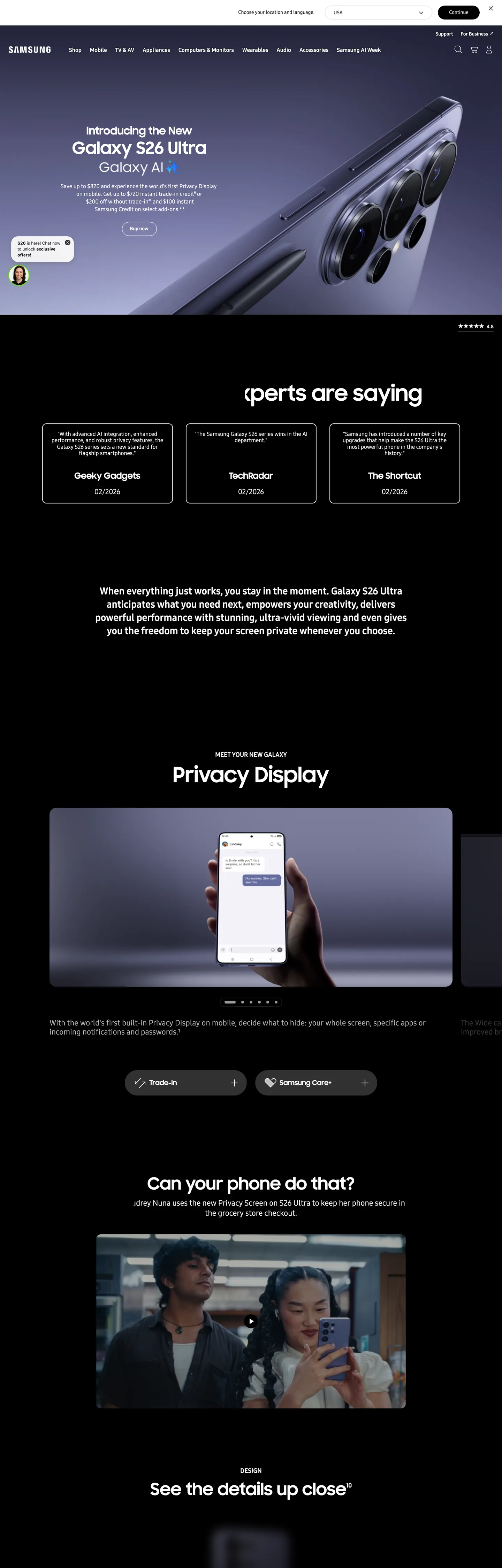
Samsung's marketing chrome operates as a chapter-book stacked vertically — every page descends through alternating hero and editorial bands, where lavender-to-cobalt Galaxy product renders push out of deep black surfaces and white modules carry the technical reading. The brand voltage lives entirely inside the photography. There is no flat cobalt fill, no decorative gradient overlay, no brand-tinted button — the Galaxy S26 Ultra body gradient (#9a9af8 to #3b57fe across six interpolated stops) appears only on the product render itself, and every other surface stays pure black, pure white, or one of seven graphite text grays. The Continue CTA is black, not cobalt. The hero heading is white on black at 60px / 700 SamsungSharpSans. The chrome refuses to compete with the device it is selling.
The file packages Samsung's chrome into a single Google Labs DESIGN.md spec: 26 colors tokens (one black, one white, six structured graphite ramps, six Galaxy gradient stops, two link blues, a single Pro Yellow safety beacon at #fff01f, and four photographic neutrals), 11 typography tokens running on SamsungSharpSans for display ≥ 47px and SamsungOne for body and UI, a four-step radius ramp where 20px dominates with 70 captured occurrences, an 8-step spacing system snapped to 4 / 5 / 8 / 12 / 14 / 24 / 36 / 88px, and 19 components specs covering buttons, locale and category nav, the product hero band, testimonial cards, the horizontal video carousel, and the privacy-display photographic frame.
Drop the file into Claude, Cursor, or GitHub Copilot to produce React components that match Samsung's discipline rather than a generic electronics theme — black CTAs, gradient locked to product imagery, 20px radius everywhere, alternating black-and-white chapter rhythm. The system is worth studying because it inverts the category default: where most consumer-electronics brands paint their primary action in brand voltage, Samsung paints it black and lets the Galaxy gradient live exclusively on the artifact being sold.
What makes it distinct
5
- Gradient-only brand voltageGalaxy lavender #9a9af8 and cobalt #3b57fe appear only inside the product render, never as flat fill
- One radius, 70 occurrencesevery pill button, every disclaimer chip, every locale picker locks to 20px and the system refuses to deviate
- Two-canvas chapter rhythm#ffffff editorial bands stack against #1c1c1c hero chapters with the surface change acting as the section divider
- Two-family typography ladderSamsungSharpSans reserved for 47px and above, SamsungOne carries everything from the 60px AI Week wordmark down to 12px legal
- Black-on-white primary CTAthe Continue button is #000000 background with white SamsungOne 14px / 400, inverting the cobalt-CTA convention most consumer-electronics brands follow
samsung.com
Live at samsung.com
A snapshot of the brand in production. Scroll the frame to see the whole page.
Colors
26 colors
Samsung's system runs on #1c1c1c as its primary voltage, used in 4 of 19 components. Type is set in SamsungOne across 11 tokens from 12px to 60px, weights 400–700. Shape language is mixed across 19 components, blending pills, soft rounds, and squarer corners.
Surface
Page and card backgrounds · 3
Text
Headlines, body, captions · 11
Borders & Hairlines
Dividers, outlines, rules · 4
Other
Specialty colors · 8
Typography
11 type tokens
Set in SamsungOne across 11 tokens, from 12px to 60px, weights 400–700. Shown in its own stack: where the font isn't installed, the fallback the file names stands in.
- display-xl60px · weight 700 · lh 1.2The quick brown fox jumps over the lazy dog
- display-lg48px · weight 700 · lh 1.2The quick brown fox jumps over the lazy dog
- display-md47px · weight 700 · lh 1.3The quick brown fox jumps over the lazy dog
- section-head28px · weight 700 · lh 1.33The quick brown fox jumps over the lazy dog
- eyebrow18px · weight 700 · lh 1.33The quick brown fox jumps over the lazy dog
- body-lg22px · weight 400 · lh 1.33The quick brown fox jumps over the lazy dog
- body-md18px · weight 400 · lh 1.33The quick brown fox jumps over the lazy dog
- body-sm14px · weight 400 · lh 1.33The quick brown fox jumps over the lazy dog
- utility-strong14px · weight 700 · lh 1.4The quick brown fox jumps over the lazy dog
- micro-caps12px · weight 700 · lh 1.33The quick brown fox jumps over the lazy dog
- fine-print12px · weight 400 · lh 1.33The quick brown fox jumps over the lazy dog
Layout
Radii and spacing
6 corner radii and 8 spacing values. Shape language: mixed.
Radii
- none0px
- sm4px
- md12px
- pill20px
- super38px
- full9999px
Spacing
- xxs4px
- xs5px
- sm8px
- md12px
- base14px
- lg24px
- xl36px
- section88px
Components
19 components
Each rendered from its tokens (color, type, radius, padding) on Samsung's own canvas.
- Button Primarybutton-primaryButton Primary
- Button Primary Activebutton-primary-activeButton Primary Active
- Button Secondary Lightbutton-secondary-lightButton Secondary Light
- Button Secondary Darkbutton-secondary-darkButton Secondary Dark
- Pill Localepill-localePill Locale
- Category Chipcategory-chipCategory Chip
- Global Navglobal-navGlobal Nav
- Sub Nav Productsub-nav-productSub Nav Product
- Hero Chapter Darkhero-chapter-darkHero Chapter Dark
- Hero Chapter Lighthero-chapter-lightHero Chapter Light
- Product Gradient Frameproduct-gradient-frameProduct Gradient Frame
- Testimonial Cardtestimonial-cardTestimonial Card
- Privacy Display Cardprivacy-display-cardPrivacy Display Card
- Video Card Darkvideo-card-darkVideo Card Dark
- Spec Rowspec-rowSpec Row
- Inline Disclaimerinline-disclaimerInline Disclaimer
- Text Link Cobalttext-link-cobaltText Link Cobalt
- Text Link Defaulttext-link-defaultText Link Default
- FooterfooterFooter
In use
The system, in use
Samsung's tokens on the kind of product it builds.
Build something people actually use.
A short paragraph of marketing copy that previews how the brand's display tier and body tier read together. Two sentences is usually enough.
FAQ
Samsung design system FAQ
Common questions about Samsung's tokens, components, and how to use this DESIGN.md in your project.
Read next
Related reading
Specs, directories, and component libraries that pair with this design system.
- Browse all design systemsThe full directory of DESIGN.md files on shadcn.io, with live mockups for each.shadcn.io
- Samsung — official siteSamsung's consumer marketing surface, the page this DESIGN.md captures.samsung.com (opens in a new tab)
- The DESIGN.md specificationGoogle Labs' open spec for machine-readable design system files.github.com (opens in a new tab)
Use it
Use Samsung in your project
One machine-readable file. Drop it into Claude, Cursor, or any AI tool that reads DESIGN.md.
Download the DESIGN.md
One machine-readable file: every color, type, radius, spacing, and component token of Samsung.
Feed it to your AI tool
Drop it into Claude, Cursor, or GitHub Copilot. The agent writes React components and Tailwind classes that match Samsung's visual language.
Reference the tokens directly
Or paste the values into your Tailwind config, CSS variables, or component library: every color, size and radius is a quoted, ready-to-copy value.
Read the full DESIGN.md: overview, rationale, do’s and don’ts
Overview
Samsung's chrome operates as a product-as-voltage system — the brand color does not live in the buttons, the navigation, or the typography ramp; it lives exclusively inside the Galaxy device render itself. Every other surface holds back. The hero chapter is #1c1c1c (warm graphite-black), the editorial chapter is #ffffff, the primary CTA is #000000 filled, and the only saturated hues in the entire captured page are the six lavender-to-cobalt gradient stops painted onto the Galaxy S26 Ultra body and a single yellow safety beacon ({colors.pro-yellow} — #fff01f) reserved for Pro-mode indicators.
Where most consumer-electronics sites paint their primary action in brand cobalt or signal red, Samsung paints it black and lets the product photography supply the chromatic register. The chassis surrounding the device is monochrome on purpose. Galaxy lavender ({colors.galaxy-lavender} — #9a9af8) appears only 28 times across more than 7,000 captured elements, and 24 of those are inside a linear-gradient declaration — the lavender is a paint, not a fill.
The page descends through alternating chapters: a dark hero with the Galaxy render bleeding out of frame, then a white editorial band documenting Privacy Display, then a dark chapter with a testimonial card grid, then a white module for camera capability, then another dark chapter for the horizontal video gallery. The surface change is the section divider — no rules, no shadows, no gradient transitions. Vertical padding inside a chapter snaps to {spacing.section} (88px), the most-used vertical token on the page.
Key Characteristics:
- Gradient-locked voltage: The Galaxy lavender-to-cobalt family (#9a9af8 to #3b57fe) appears 80+ times in
linear-gradientdeclarations and zero times as a flat fill on chrome. - One-radius lock: 20px is the only pill radius on the page, occurring 70 times across buttons, chips, locale pickers, and disclaimer pills.
- Two-canvas chapter rhythm: #1c1c1c hero chapters alternate with #ffffff editorial bands, with the surface change as the only divider.
- Black primary CTA: The Continue button is
{colors.ink}(#000000), not cobalt — the inverse of the category default. - Two-family typography ladder: SamsungSharpSans reserved for ≥ 47px display; SamsungOne for everything below.
- Flat-by-policy depth: 3 shadow declarations across more than 7,000 elements; cards rely on a 1px
{colors.hairline-soft}hairline.
Colors
Source page analyzed: Galaxy S26 Ultra product page (www.samsung.com/us/smartphones/galaxy-s26-ultra/). 7,095 elements scanned, 35 raw colors clustered to 29 perceptual tokens.
Voltage (Photographic Gradient)
- Galaxy Lavender (
{colors.galaxy-lavender}— #9a9af8) — frequency 28. Used as gradient (24), text (2), border (2). The lightest stop of the Galaxy device gradient; the top-light highlight on the S26 Ultra body. - Galaxy Violet (
{colors.galaxy-violet}— #747cf9) — frequency 24. Used as gradient (24). Mid-light interpolation stop in the device render. - Galaxy Periwinkle (
{colors.galaxy-periwinkle}— #8686f6) — frequency 7. Used as gradient (7). Tertiary mid-light stop, blends lavender into violet. - Galaxy Indigo (
{colors.galaxy-indigo}— #5c64f0) — frequency 7. Used as gradient (7). Mid-dark stop; the visible shadow side of the device gradient. - Galaxy Cobalt (
{colors.galaxy-cobalt}— #3b57fe) — frequency 24. Used as gradient (24). Primary cobalt stop; the saturation peak of the Galaxy product render. - Galaxy Deep (
{colors.galaxy-deep}— #1d3bed) — frequency 7. Used as gradient (7). Darkest stop; the bottom-edge shadow on the device gradient.
Canvas & Hero Surface
- Pure White (
{colors.canvas}— #ffffff) — frequency 1,167. Used as bg (29), text (576), border (562). The editorial canvas; carries every white chapter and every spec table. - Hero Canvas (
{colors.hero-canvas}— #1c1c1c) — frequency 18. Used as bg (18). Warm graphite-black for hero chapters and testimonial cards — chosen instead of pure black to soften OLED glare on Samsung's own display category. - Surface Elevated (
{colors.surface-elevated}— #313131) — frequency 76. The fill for pressed-state pill buttons and the inset modal track inside hero chapters. - Surface Graphite (
{colors.surface-graphite}— #414143) — frequency 1. A single dark photographic-overlay surface used behind the Privacy Display reading module.
Text Ladder
- Pure Black (
{colors.ink}— #000000) — frequency 1,563. Used as text (770), border (762), bg (28), shadow (3). The single dominant ink — every heading on white, every body paragraph, the Continue CTA fill. - Strong Gray (
{colors.text-strong}— #555555) — frequency 486. Used as text (242), border (244). The workhorse secondary text; eyebrow labels and category chip text. - Mid Gray (
{colors.text-mid}— #666666) — frequency 186. Spec-row body text and fine-print on white. - Mute Gray (
{colors.text-mute}— #8f8f8f) — frequency 42. Tertiary footnotes and helper text. - Soft Gray (
{colors.text-soft}— #9a9a9a) — frequency 9. Reserved for the dark-chapter caption text that needs to recede from #ffffff body without dropping into invisibility.
Hairlines & Dividers
- Hairline (
{colors.hairline}— #dcdcdc) — frequency 5. The 1px border on the locale-picker pill and the inline disclaimer card. - Hairline Soft (
{colors.hairline-soft}— #eeeeee) — frequency 125. The dominant 1px divider on white — spec rows, sub-nav underline, accessory grid separators. - Divider Mute (
{colors.divider-mute}— #aaaaaa) — frequency 217. Used as text and border across the dark testimonial chapter where #eeeeee would over-glow against #1c1c1c. - Divider Pale (
{colors.divider-pale}— #bdbdbd) — frequency 2. Reserved for the disabled-state border on locale-select pills.
Links
- Link Default (
{colors.link}— #0000ee) — frequency 20. The native-browser inline link color; Samsung leaves it untouched on legal disclaimers and footer policy links. - Link Cobalt (
{colors.link-cobalt}— #006bea) — frequency 36. The branded inline link; used inside the body copy of spec descriptions and care articles. - Link Cobalt Hi (
{colors.link-cobalt-hi}— #2189ff) — frequency 29. The active-state link variant; appears on the Compare and Configure inline anchors.
Beacons
- Pro Yellow (
{colors.pro-yellow}— #fff01f) — frequency 2. Reserved for the Pro-mode safety beacon — appears only on the camera-mode tab and the Privacy Display indicator. The lone non-gradient saturated hue in the entire system. - Spec Green (
{colors.spec-green}— #5ce600) — frequency 1. A single shadow-color flag used on the Eco indicator in the footer.
Typography
Font Family
- Display (≥ 47px):
SamsungSharpSans, SamsungOne, sans-serif— Samsung's proprietary display face; carries every headline at 47px, 48px, and 60px and never appears below 47px. - Body / UI (< 47px):
SamsungOne, arial, sans-serif— the workhorse running 12px legal copy, 14px CTA labels, 18px body, and 28px section heads in weights 300, 400, 700, and 900. - Fallback: Arial, then a generic sans-serif — documented in the production cascade.
Hierarchy
| Token | Size | Weight | Line Height | Use |
|---|---|---|---|---|
{typography.display-xl} | 60px | 700 | 1.2 | Hero heading on the testimonial chapter ("See what the experts are saying") |
{typography.display-lg} | 48px | 700 | 1.2 | Section hero ("MEET YOUR NEW GALAXY", "Can your phone do that?") |
{typography.display-md} | 47px | 700 | 1.3 | Sub-hero chapter title |
{typography.section-head} | 28px | 700 | 1.33 | White-chapter section title |
{typography.eyebrow} | 18px | 700 | 1.33 | Eyebrow caps above a chapter ("MEET YOUR NEW GALAXY" at 24px box height) |
{typography.body-lg} | 22px | 400 | 1.33 | Lead paragraph below a section head |
{typography.body-md} | 18px | 400 | 1.33 | Default body in spec descriptions and testimonial card text |
{typography.body-sm} | 14px | 400 | 1.33 | Button label, sub-nav text, default UI text |
{typography.utility-strong} | 14px | 700 | 1.4 | Active sub-nav anchor and category chip text |
{typography.micro-caps} | 12px | 700 | 1.33 | Uppercase utility caps in the global nav |
{typography.fine-print} | 12px | 400 | 1.33 | Footer legal copy and inline disclaimer |
Principles
- 47px is the family boundary. SamsungSharpSans is the display face and only appears at or above 47px. Below that line, every text role drops to SamsungOne — including the 28px section head which a designer might assume would stay on the display face.
- Weight 700 dominates display. Every SamsungSharpSans token sits at weight 700; there is no weight 400 or 600 display variant. Body sizes use 400 as the default with 700 reserved for emphasis labels.
- Weight 300 exists, rare. The hero subhead body paragraph runs SamsungOne at 16px / 300 — the only weight 300 in the captured page, used to make a long disclaimer paragraph breathe inside the cobalt-gradient hero band.
- Weight 900 exists, rarer. A single 20px / 900 SamsungOne style appears 10 times on
<strong>tags inside privacy disclosures — Samsung treats weight 900 as a contractual emphasis register rather than a typographic one. - Line-height stays near 1.33. Display headlines sit at 1.2; everything else clusters at 1.33. There is no 1.5 leading on body; Samsung's body copy reads tight by category convention.
- Letter-spacing is normal everywhere. Zero tracking adjustments across the entire ladder — Samsung does not tighten display nor open captions.
Note on Font Substitutes
SamsungSharpSans and SamsungOne are proprietary licensed fonts. When building off-license:
- For SamsungOne, Inter (Google Fonts, variable) matches the x-height and stroke contrast within ~2%. Manrope is a closer geometric match if you prefer the slightly more humanist character.
- For SamsungSharpSans, Manrope at weight 700 or Bricolage Grotesque approximates the display register without licensing it. Both carry the rounded terminal and the slightly extended display proportion.
- Keep Arial in the fallback stack — it is Samsung's own documented system fallback and resolves consistently on every device the chrome ships to.
Layout
Spacing System
- Base unit: 4px, with 14px breaking the convention as a structural increment.
- Tokens:
{spacing.xxs}4px ·{spacing.xs}5px ·{spacing.sm}8px ·{spacing.md}12px ·{spacing.base}14px ·{spacing.lg}24px ·{spacing.xl}36px ·{spacing.section}88px. - Section vertical padding:
{spacing.section}(88px) is the dominant vertical rhythm — it appeared 27 times on the captured page, more than any other padding token. - CTA padding: 7px × 24px on the global nav locale pill (67 occurrences — the most-used padding shorthand on the page); 9px × 23px × 10px on the Continue CTA (asymmetric vertical for optical centering of the 14px label).
- Card padding: 36px × 40px on testimonial cards.
Grid & Container
- Hero chapter width: Full-bleed across all viewports; the Galaxy render extends past the 1440px content lock.
- Editorial chapter content lock: ~1392px on white chapters (matching the captured
h2width). - Testimonial grid: 3-column at 1440px, stacked at narrow breakpoints.
- Video carousel: Horizontal scroller of three video cards on the dark chapter, each ~480px wide.
Whitespace Philosophy
Samsung uses 88px vertical breathing room between chapters rather than between elements inside a chapter — the rhythm lives at the chapter boundary. Inside a chapter, content stacks at 20–24px gaps. The result: long pages descend through wide-shouldered chapters with tight interior content, an inverted pattern to most consumer-marketing sites where interior padding grows in proportion to chapter density.
Elevation & Depth
| Level | Treatment | Use |
|---|---|---|
| Flat | No shadow, no border | Hero chapters, editorial canvas, the global nav |
| Hairline (white) | 1px {colors.hairline-soft} (#eeeeee) | Spec rows, sub-nav underline, accessory grid |
| Hairline (gray) | 1px {colors.hairline} (#dcdcdc) | Locale pill border, inline disclaimer |
| Inset graphite | 1px {colors.surface-elevated} (#313131) | Testimonial card border on dark canvas |
| Photographic | Inherent to image content | The Galaxy render on the hero chapter — ambient occlusion baked into the image |
Shadow philosophy. The captured page contains exactly three shadow declarations — Samsung's chrome is flat by policy. Where most consumer-electronics sites lean on an ambient elevation token to separate cards from canvas, Samsung lets the surface change itself (white chapter ↔ dark chapter) and a 1px hairline border do the work. The product photography carries its own studio-lit depth as image content. No CSS shadow appears on buttons, cards, modals, or popovers.
Decorative Depth
- Two-canvas chapter alternation creates the entire structural rhythm — no shadows needed.
- Gradient-painted product render supplies all visible voltage and depth in the hero band.
- 1px hairlines replace shadows on every white-canvas card; on dark-canvas cards, hairlines step up to
{colors.surface-elevated}(#313131) so they read against #1c1c1c.
Shapes
Border Radius Scale
| Token | Value | Use |
|---|---|---|
{rounded.none} | 0px | Hero chapters, editorial bands, the global nav, every full-bleed surface |
{rounded.sm} | 4px | Inline form inputs and the locale dropdown caret tray |
{rounded.md} | 12px | Testimonial cards, video cards, accessory grid tiles |
{rounded.pill} | 20px | Primary CTA, locale picker, category chip, inline disclaimer pill — the signature Samsung pill |
{rounded.super} | 38px | The rare double-pill compare control (4 occurrences) |
{rounded.full} | 9999px / 50% | Avatars, social icons, pagination dots |
The 20px lock. Samsung's radius scale is essentially binary at the interactive level — a 20px pill or a circle. There is no 8px / 16px middle ground for chips and buttons; every interactive shape commits to the 20px pill or it commits to a square chapter edge.
Photography Geometry
- Hero imagery: Full-bleed; the Galaxy S26 Ultra render bleeds out of the right edge of the hero band on desktop, anchored at the left.
- Testimonial cards:
{rounded.md}(12px) on dark canvas with a 1px{colors.surface-elevated}border. - Video carousel cards:
{rounded.md}(12px) with the video frame extending to the rounded edges. - Privacy Display module: Full-bleed white chapter with a centered photographic frame of a hand holding the Galaxy device.
Components
Top Navigation
global-nav — Persistent thin white bar pinned to the top. Background {colors.canvas}, height 56px, text {colors.ink} in {typography.body-sm} (14px / 400). Left: Samsung wordmark in {typography.utility-strong}. Center: primary category links (Shop, Mobile, TV & AV, Appliances, Computing, Displays, Memory & Storage, For Business). Right: cluster of Search, Sign In, Cart, and a locale-picker pill ({component.pill-locale}).
sub-nav-product — Surface-specific sub-nav that sticks below the global nav on product pages. Background {colors.canvas}, height 64px, text {colors.text-strong} in {typography.utility-strong} (14px / 700). Left: product family name ("Galaxy S26 Ultra") at 18px / 700. Right: inline anchor list (Overview, Specs, Compare) ending in a primary {component.button-primary} ("Pre-order" or "Buy now"). Bottom hairline: 1px {colors.hairline-soft}.
Buttons
button-primary — The signature Samsung primary action. Background {colors.ink} (#000000), text {colors.on-primary} in {typography.body-sm} (SamsungOne 14px / 400), rounded {rounded.pill} (20px), padding 9px × 23px × 10px (asymmetric for optical centering of the 14px label), height 40px. Used on the locale-selector Continue CTA, every Buy / Pre-order action, and the Configure your Galaxy entry point.
- Pressed state:
{component.button-primary-active}— fills{colors.surface-elevated}(#313131); no scale transform, no shadow.
button-secondary-light — The secondary action on white chapters. Background {colors.canvas}, text {colors.ink}, 1px {colors.text-strong} border, rounded {rounded.pill}, padding 8px × 23px × 8px × 22px. Used as the Learn More partner to a black primary.
button-secondary-dark — The secondary action on dark chapters. Background {colors.hero-canvas}, text {colors.on-dark}, 1px {colors.divider-mute} (#aaaaaa) border. Same dimensions as {component.button-secondary-light}. The lighter border weight is the only difference — at #aaaaaa it reads against #1c1c1c without over-glowing.
pill-locale — The locale-picker pill that sits in the right cluster of the global nav. Background {colors.canvas}, text {colors.ink} in {typography.body-sm}, 1px {colors.hairline} border, rounded {rounded.pill}, padding 7px × 24px. Carries a flag glyph + country name + caret. The 7px × 24px padding shorthand is the most-used padding token on the page (67 occurrences).
category-chip — The compact pill used for filter rails and Pro-mode toggles. Background {colors.canvas}, text {colors.text-strong} in {typography.micro-caps} (12px / 700 uppercase), rounded {rounded.pill}, padding 7px × 24px, height 32px. No border by default.
text-link-cobalt — Inline branded link. Text {colors.link-cobalt} (#006bea) in {typography.body-sm}. Used inside body copy on spec pages.
text-link-default — The native-browser-blue inline link reserved for legal, privacy, and footer policy copy. Text {colors.link} (#0000ee). Samsung leaves it untouched as a deliberate signal that the link belongs to a contractual rather than a marketing register.
Cards & Containers
hero-chapter-dark — Full-bleed dark chapter. Background {colors.hero-canvas} (#1c1c1c), text {colors.on-dark}, rounded {rounded.none}, vertical padding {spacing.section} (88px). Centered stack: eyebrow caps in {typography.eyebrow} → display heading in {typography.display-xl} → body lead in {typography.body-md} → primary CTA. Used on the testimonial chapter and the video-carousel chapter.
hero-chapter-light — Full-bleed editorial chapter. Background {colors.canvas}, text {colors.ink}, rounded {rounded.none}, vertical padding {spacing.section} (88px). Same content stack as {component.hero-chapter-dark} but with {typography.display-lg} (48px) as the heading default — slightly smaller than the dark chapter's 60px, by 12px.
product-gradient-frame — The hero band that carries the Galaxy render. Background gradient running {colors.galaxy-lavender} → {colors.galaxy-violet} → {colors.galaxy-cobalt} → {colors.galaxy-deep} painted across the device body; the surrounding chapter canvas remains {colors.hero-canvas} (#1c1c1c). Text {colors.on-dark} in {typography.display-xl} (Galaxy S26 Ultra / Galaxy AI).
testimonial-card — Used in the 3-column "experts are saying" grid on the dark canvas. Background {colors.hero-canvas}, text {colors.on-dark} in {typography.body-md}, 1px {colors.surface-elevated} hairline (the border that lifts the card from the surrounding chapter), rounded {rounded.md} (12px), padding 36px × 40px. Header: publication name in {typography.utility-strong}. Body: pull-quote. Footer: small star-rating row.
privacy-display-card — A photographic editorial module specific to the Privacy Display chapter. Background {colors.canvas} with a centered photographic frame of a hand holding the Galaxy device, text {colors.ink}, rounded {rounded.none}, padding {spacing.section} (88px). Below the photo: section head in {typography.section-head} and a one-line body in {typography.body-lg}.
video-card-dark — Used in the horizontal video carousel. Background {colors.hero-canvas}, video frame fills to {rounded.md} (12px) corners. No padding; the video extends to the rounded edges. Caption sits below the card in {typography.body-md} {colors.on-dark}.
spec-row — A divider-only row used on the spec sheet. Background {colors.canvas}, text {colors.text-strong} in {typography.body-sm}, 1px {colors.hairline-soft} bottom border, vertical padding 20px. Two-column layout: label left, value right.
Inputs & Inline Disclaimer
inline-disclaimer — A pill-shaped disclaimer card that floats below interactive controls (price, financing terms, Pre-order date). Background {colors.canvas}, text {colors.text-mid} (#666666) in {typography.fine-print}, rounded {rounded.pill} (20px), padding 5px vertical. Carries a small info glyph + one-line legal caveat.
A traditional text input was not surfaced on the captured Galaxy S26 Ultra product page; Samsung's search input lives behind the global-nav search trigger and was not in scroll range.
Footer
footer — Background {colors.ink} (#000000), text {colors.on-dark} in {typography.body-sm}. Vertical padding 88px. Top: 4-column link grid (Products, Shop, Support, Company) with column headings in {typography.utility-strong} and link rows in {typography.body-sm} weight 400. Middle: signup row + region selector pill. Bottom: legal row in {typography.fine-print} (12px / 400) with {colors.divider-mute} text, plus a tiny {colors.spec-green} Eco indicator before the copyright line.
Do's and Don'ts
Do
- Use
{colors.ink}(#000000) for primary CTAs — Samsung's chrome paints its primary action black, not cobalt. The Continue button on the locale picker is the model. - Paint the Galaxy gradient (#9a9af8 → #3b57fe across six interpolated stops) only inside the product render itself. The gradient is a product surface, not a UI fill.
- Snap every interactive shape to
{rounded.pill}(20px). Pills, locale pickers, category chips, and inline disclaimers all share the same radius. - Alternate
{component.hero-chapter-dark}and{component.hero-chapter-light}for page rhythm. The surface change IS the divider. - Reserve
{typography.display-xl}and{typography.display-lg}(SamsungSharpSans 60px / 48px / 700) for hero headlines only. Drop to SamsungOne at the 28px section head. - Use
{colors.hairline-soft}(#eeeeee) for every 1px divider on white chapters; step up to{colors.surface-elevated}(#313131) on dark chapters so the hairline reads. - Run body copy at
{typography.body-md}(SamsungOne 18px / 400 / 1.33) — not 16px. Samsung's body register is one step larger than the SaaS default. - Keep the global nav
{colors.canvas}(white) — Samsung does not invert nav to dark on dark chapters; the nav stays white and the chapter changes underneath.
Don't
- Don't paint primary CTAs in
{colors.galaxy-cobalt}(#3b57fe) — that hex appears 24 times in the captured page and every one of them is inside alinear-gradient, never as a flat fill. Use{colors.ink}instead. - Don't use
{colors.galaxy-lavender}(#9a9af8) as a card background or section tint. It exists to paint a Galaxy device body and nothing else. - Don't add a drop shadow to testimonial cards — they rely on a 1px
{colors.surface-elevated}border. The system contains 3 shadow declarations across more than 7,000 elements. - Don't use SamsungSharpSans below 47px. Every captured occurrence of the display face sits at 47px, 48px, or 60px; dropping it to 28px breaks the family boundary.
- Don't set the locale-picker pill at
{rounded.md}(12px) — locale pills sit at{rounded.pill}(20px) on Samsung. The 12px radius is reserved for cards. - Don't tighten letter-spacing on display headlines. Samsung's display ladder runs at letter-spacing 0; the brand voice is the proportion of SamsungSharpSans, not a tracking nudge.
- Don't run primary body at SamsungOne weight 300. Weight 300 appears once on the captured page, on a single 16px disclaimer paragraph inside the hero band — it is a register, not a default.
- Don't replace the default
{colors.link}(#0000ee) on legal copy. Samsung leaves the native-browser blue untouched on contractual links to signal a register change away from marketing copy.
Known Gaps
- Form input styling beyond the inline disclaimer pill was not surfaced on the captured Galaxy S26 Ultra page; the global-nav search trigger opens an overlay that was not in scroll range.
- Modal and dialog styling is not represented beyond the locale-selector popover; Samsung's checkout dialog and account modals live behind authentication.
- Hover states are intentionally omitted from this DESIGN.md — Samsung's chrome relies on default and pressed states only, and the captured CSS-stable snapshot does not declare separate hover tokens for buttons.
- Mobile responsive collapse was not captured at the breakpoint level; the system documented is the 1440px desktop chrome.
- Login and account chrome is not represented; the spec captures public marketing surfaces rather than the authenticated Samsung Account UI.
- Sub-brand palettes (Bespoke appliances, Frame TV interior decor, Knox enterprise security) maintain separate accent registers that were not in scope for this single-page extraction.
Consumer Electronics
More systems like this
More DESIGN.md files in Consumer Electronics.
Pricing
Build it with Pro
The DESIGN.md files are free. Pro adds 6,000+ blocks, premium templates and the MCP server, so your AI editor builds in your system for you.
4.9/5 out of 5 · 150+ reviewsfrom 150+ founders and developers.
Billing
Billed once a year in USD. Cancel anytime.
- How many people can use the license.
- Client work, SaaS products and anything you charge for.
- Production-ready React sections: hero, pricing, features, dashboards and more.
- Complete multi-page sites you can ship as they are.
- React icons from every major library, installable with one command.
- Presets that restyle every block, in light and dark.
- Lets your AI editor search, preview and install blocks for you.
- Priority requests are answered first.
Individual
For personal projects & open source
$32instead of $49/mo
$389 billed yearly
- Seats: 1 seat
- Commercial use: Personal & open source only
- Pro blocks: 6,000+ blocks
- Templates: All 14 templates
- React icons: 294k+ icons
- Themes: All 59 themes
- MCP server: Basic usage
- Support: Standard
Team
Most popularFor freelancers, agencies & startups
$66instead of $99/mo
$789 billed yearly · ≈ $13/dev/mo
- Seats: Up to 5 seats
- Commercial use: Included
- Pro blocks: 6,000+ blocks
- Templates: All 14 templates
- React icons: 294k+ icons
- Themes: All 59 themes
- MCP server: High usage
- Support: Priority
Organization
For companies with larger teams
$132instead of $199/mo
$1,589 billed yearly
- Seats: Unlimited seats
- Commercial use: Included
- Pro blocks: 6,000+ blocks
- Templates: All 14 templates
- React icons: 294k+ icons
- Themes: All 59 themes
- MCP server: Unlimited usage
- Support: Priority
Billed once a year in USD. Cancel anytime.
Individual
For personal projects & open source
$32instead of $49/mo
$389 billed yearly
- How many people can use the license.Seats: 1 seat
- Client work, SaaS products and anything you charge for.Commercial use: Personal & open source only
- Production-ready React sections: hero, pricing, features, dashboards and more.Pro blocks: 6,000+ blocks
- Complete multi-page sites you can ship as they are.Templates: All 14 templates
- React icons from every major library, installable with one command.React icons: 294k+ icons
- Presets that restyle every block, in light and dark.Themes: All 59 themes
- Lets your AI editor search, preview and install blocks for you.MCP server: Basic usage
- Priority requests are answered first.Support: Standard
Team
Most popularFor freelancers, agencies & startups
$66instead of $99/mo
$789 billed yearly · ≈ $13/dev/mo
Everything in Individual, plus
- How many people can use the license.Seats: Up to 5 seats
- Client work, SaaS products and anything you charge for.Commercial use: Included
- Lets your AI editor search, preview and install blocks for you.MCP server: High usage
- Priority requests are answered first.Support: Priority
Organization
For companies with larger teams
$132instead of $199/mo
$1,589 billed yearly
Everything in Team, plus
- How many people can use the license.Seats: Unlimited seats
- Lets your AI editor search, preview and install blocks for you.MCP server: Unlimited usage
- Secure checkout via Stripe
- Code lives in your repo
- Keep what you've shipped if you cancel
- License terms
Your system, built for you
Every block, template and icon, installed by your AI agent in your design system. The DESIGN.md files stay free.