Runway Design System
Runway's design system as a DESIGN.md file. Runway Black #000000, abcNormal, 17 colors, zero shadows. For React, Next.js, and AI tools.
Add shadcn.io to your AI agent. · Pro It installs blocks, icons and templates in your design system from a prompt, with Pro.
Set up MCP- Primary
- #000000
- Typeface
- abcNormal
- Shape
- Mixed
- Base radius
- 0px
- Colors
- 17
- Type tokens
- 10
- Components
- 16
- Spacing values
- 12
About
About Runway DESIGN.md
Curated by Dov Azencot · Updated May 12, 2026 · Source runwayml.com (opens in a new tab)
Runway is the AI-powered film and creative platform behind Gen-3 and a generation of generative video tools, and its marketing surface reads like a film reel rather than a tech product page. The interface retreats almost entirely. Full-bleed cinematic photography and AI-generated video fill the viewport while the UI itself shrinks to near-invisibility — minimal 1px borders at #27272a, zero shadows, and a near-monochrome dark palette anchored on Runway Black #000000. Where most SaaS sites compete with their content using gradients, icons, and decorative chrome, Runway commits to the opposite discipline: the photography IS the design, and the chrome stays out of the way.
This DESIGN.md packages that discipline into a machine-readable spec built on the Google Labs format. Inside: 17 colors tokens grouped into primary (#000000, #030303, #1a1a1a, #ffffff), surface (#fefefe, #e9ecf2), cool-slate neutrals (#767d88, #7d848e, #a7a7a7), and borders (#27272a, #c9ccd1, #d0d4d4). Nine type styles run on abcNormal at weights 400 through 600 plus the unusual 450 intermediate. Four radius tiers (4px, 6px, 8px, 16px), an 8px-base spacing scale, and roughly a dozen component recipes covering cinematic hero, research article cards, trust bars, and mission statements.
Drop the file into Claude, Cursor, or GitHub Copilot and the agent will reproduce Runway's restraint — cool slate grays instead of warm ones, line-height 1.0 instead of 1.5, photography instead of icons — rather than defaulting to a generic dark theme. Or reference the tokens directly: every hex, weight, and tracking value here is a quoted string you can paste into Tailwind config or CSS variables. The system is worth studying because it answers a hard question with conviction: when AI content is the product, the interface should disappear.
What makes it distinct
5
- Single typeface across every roleabcNormal handles 48px display through 11px tags, no font-family switching anywhere
- Zero box-shadow in the entire systemdepth comes from photography and dark/light section alternation, not CSS elevation
- Weight 450 for micro labelsan uncommon intermediate between 400 and 500 that signals typographic precision
- Cool-slate neutrals (#767d88, #7d848e) instead of warm grayssecondary text reads cinematic, not corporate
- Tight display line-height 1.0 with -1.2px trackingheadlines compress into film-title density rather than marketing copy
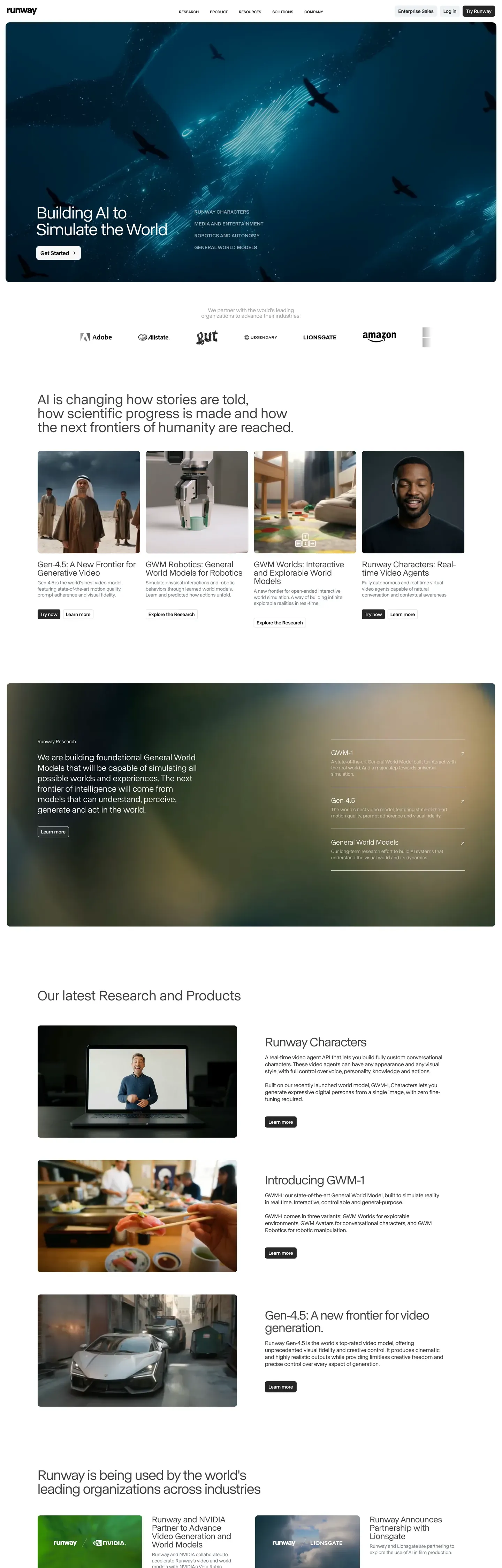
runwayml.com
Live at runwayml.com
A snapshot of the brand in production. Scroll the frame to see the whole page.
Colors
17 colors
Runway's system runs on #000000 as its primary voltage, used in 3 of 16 components. Type is set in abcNormal across 10 tokens from 11px to 48px, weights 400–600. Shape language is mixed across 16 components, blending pills, soft rounds, and squarer corners.
Text
Headlines, body, captions · 2
Borders & Hairlines
Dividers, outlines, rules · 1
Other
Specialty colors · 14
Typography
10 type tokens
Set in abcNormal across 10 tokens, from 11px to 48px, weights 400–600. Shown in its own stack: where the font isn't installed, the fallback the file names stands in.
- display-hero48px · weight 400 · lh 1 · tracking -1.2pxThe quick brown fox jumps over the lazy dog
- section-heading40px · weight 400 · lh 1.05 · tracking -1pxThe quick brown fox jumps over the lazy dog
- sub-heading36px · weight 400 · lh 1 · tracking -0.9pxThe quick brown fox jumps over the lazy dog
- card-title24px · weight 400 · lh 1The quick brown fox jumps over the lazy dog
- feature-title20px · weight 400 · lh 1The quick brown fox jumps over the lazy dog
- body16px · weight 400 · lh 1.4 · tracking -0.16pxThe quick brown fox jumps over the lazy dog
- button14px · weight 600 · lh 1.25The quick brown fox jumps over the lazy dog
- caption-label14px · weight 500 · lh 1.3 · tracking 0.35pxThe quick brown fox jumps over the lazy dog
- small13px · weight 400 · lh 1.3 · tracking -0.20pxThe quick brown fox jumps over the lazy dog
- micro-tag11px · weight 450 · lh 1.3The quick brown fox jumps over the lazy dog
Layout
Radii and spacing
5 corner radii and 12 spacing values. Shape language: mixed.
Radii
- none0px
- sharp4px
- subtle6px
- comfortable8px
- generous16px
Spacing
- xxs4px
- xs6px
- sm8px
- md12px
- base16px
- lg20px
- xl24px
- xxl28px
- section32px
- section-lg48px
- section-xl64px
- section-xxl78px
Components
16 components
Each rendered from its tokens (color, type, radius, padding) on Runway's own canvas.
- Button Primarybutton-primaryButton Primary
- Button Lightbutton-lightButton Light
- Cinematic Herocinematic-heroCinematic Hero
- Hero Subtexthero-subtextHero Subtext
- Section Labelsection-labelSection Label
- Dark Sectiondark-sectionDark Section
- Light Sectionlight-sectionLight Section
- Research Cardresearch-cardResearch Card
- Research Card Darkresearch-card-darkResearch Card Dark
- Alert Containeralert-containerAlert Container
- Trust Logotrust-logoTrust Logo
- Mission Statementmission-statementMission Statement
- Nav Linknav-linkNav Link
- Footer Linkfooter-linkFooter Link
- Image Cardimage-cardImage Card
- Tag Uppercasetag-uppercaseTag Uppercase
In use
The system, in use
Runway's tokens on the kind of product it builds.
Build something people actually use.
A short paragraph of marketing copy that previews how the brand's display tier and body tier read together. Two sentences is usually enough.
FAQ
Runway design system FAQ
Common questions about Runway's tokens, components, and how to use this DESIGN.md in your project.
Read next
Related reading
Specs, directories, and component libraries that pair with this design system.
Use it
Use Runway in your project
One machine-readable file. Drop it into Claude, Cursor, or any AI tool that reads DESIGN.md.
Download the DESIGN.md
One machine-readable file: every color, type, radius, spacing, and component token of Runway.
Feed it to your AI tool
Drop it into Claude, Cursor, or GitHub Copilot. The agent writes React components and Tailwind classes that match Runway's visual language.
Reference the tokens directly
Or paste the values into your Tailwind config, CSS variables, or component library: every color, size and radius is a quoted, ready-to-copy value.
Read the full DESIGN.md: overview, rationale, do’s and don’ts
Overview
Runway's design system is built around a single conviction: the AI-generated visual content IS the product, and the interface should disappear. The base canvas is Runway Black ({colors.runway-black} — #000000) with Pure White ({colors.pure-white} — #ffffff) inverse text, and the secondary text color is Cool Slate ({colors.cool-slate} — #767d88) — a distinctly blue-gray neutral that reads cinematic rather than corporate. There is no brand accent color, no gradient system, and no decorative palette. All visual richness comes from full-bleed photography and video; the chrome stays out of the way.
Type runs abcNormal, a custom geometric sans-serif, across every role from a 48px display hero down to 11px uppercase micro tags. The system makes no font-family switches — variety comes from size, weight, case, and letter-spacing rather than family contrast. Display headlines sit at line-height 1.00 with -0.9px to -1.2px tracking, compressing into film-title density. An unusual weight 450 (between regular and medium) is used on micro labels — a precision detail signaling typographic craft.
The shape language is subtly rounded, not pill-shaped. Buttons use 4px ({rounded.sharp}), small links use 6px ({rounded.subtle}), image cards use 8px ({rounded.comfortable}), and alert-style containers use 16px ({rounded.generous}). There is no rounded.full in the system — Runway's geometry is deliberately not circular.
Key Characteristics:
- No brand accent: the only "color" in the interface is
{colors.cool-slate}(#767d88) for secondary text. All saturation comes from photography and video content. - Single typeface commitment: abcNormal handles 48px display through 11px tags. Weight 450 used on micro labels — an uncommon intermediate step.
- Zero box-shadow across the entire system. Depth comes from dark/light section alternation (
{component.dark-section}vs{component.light-section}), photographic depth-of-field, and overlay transparency. - Tight display line-heights (1.00) with negative tracking (-0.9px to -1.2px) — the headline blocks read as film titles, not marketing copy.
- Cool-slate neutrals (
{colors.cool-slate}and{colors.mid-slate}— #7d848e) for secondary text, not warm grays. The cool tint is the system's most distinctive non-photographic signal. - Uppercase navigational labels at 14px with 0.35px positive tracking (
{typography.caption-label}) — the only tracking that goes positive in the entire system. - Image-first cards: research and feature cards use a cinematic photo plate at 8px corner clipping with a single title line below — no metadata stack, no badge cluster.
- 8px base spacing scale extending up to 78px section padding — generous section breathing room paired with tight component interiors.
Colors
Primary
- Runway Black (
{colors.runway-black}— #000000): The primary page background and maximum-emphasis text color. The dominant surface across the system. - Deep Black (
{colors.deep-black}— #030303): A near-imperceptible variant for layered dark surfaces. - Dark Surface (
{colors.dark-surface}— #1a1a1a): Card backgrounds and elevated dark containers. - Pure White (
{colors.pure-white}— #ffffff): Primary text on dark surfaces and the canvas for light editorial sections.
Surface
- Near White (
{colors.near-white}— #fefefe): The lightest surface variant, barely distinguishable from pure white. - Cool Cloud (
{colors.cool-cloud}— #e9ecf2): Light section backgrounds with a cool blue-gray tint. Used on{component.light-section}.
Borders
- Border Dark (
{colors.border-dark}— #27272a): The single dark-mode border color. Used only on{component.alert-container}— barely visible containment. - Cool Silver (
{colors.cool-silver}— #c9ccd1): Light borders and dividers. - Light Silver (
{colors.light-silver}— #d0d4d4): The lightest border/divider variant.
Text
- Charcoal (
{colors.charcoal}— #404040): Primary body text on light surfaces and secondary text inside{component.research-card}. - Near Charcoal (
{colors.near-charcoal}— #3f3f3f): A slightly lighter variant for dark-section secondary text. - Cool Slate (
{colors.cool-slate}— #767d88): Secondary body text — a distinctly blue-gray cool neutral. The system's signature non-photographic color. - Mid Slate (
{colors.mid-slate}— #7d848e): Tertiary text and metadata descriptions. - Muted Gray (
{colors.muted-gray}— #a7a7a7): De-emphasized content, timestamps. - Tailwind Gray (
{colors.tailwind-gray}— #6b7280): Standard supplementary text fallback. - Dark Link (
{colors.dark-link}— #0c0c0c): Darkest link text — nearly black. - Footer Gray (
{colors.footer-gray}— #999999): Footer links and deeply muted content.
Gradient System
There is no gradient in the interface. All visual richness comes from AI-generated and enhanced photographic content. The interface itself is intentionally colorless.
Typography
Font Family
The system runs abcNormal with abcNormal Fallback as the immediate fallback. For external implementations, Inter or DM Sans serve as close geometric substitutes — both transfer the proportions cleanly, though you'll need to set weight 450 explicitly on micro labels.
There is no separate display family. The single variable carries the entire scale.
Hierarchy
| Token | Size | Weight | Line Height | Letter Spacing | Use |
|---|---|---|---|---|---|
{typography.display-hero} | 48px | 400 | 1.00 | -1.2px | Cinematic hero headlines |
{typography.section-heading} | 40px | 400 | 1.00–1.10 | -1px to 0px | Feature section titles |
{typography.sub-heading} | 36px | 400 | 1.00 | -0.9px | Secondary section markers (mission statement) |
{typography.card-title} | 24px | 400 | 1.00 | 0 | Article and research card headings |
{typography.feature-title} | 20px | 400 | 1.00 | 0 | Small feature headings |
{typography.body} | 16px | 400 | 1.30–1.50 | -0.16px | Standard body, nav links |
{typography.button} | 14px | 600 | 1.25 | 0 | Button labels |
{typography.caption-label} | 14px | 500 | 1.30 | 0.35px (uppercase) | Section labels, metadata |
{typography.small} | 13px | 400 | 1.30 | -0.16px to -0.26px | Compact descriptions |
{typography.micro-tag} | 11px | 450 | 1.30 | 0 | Uppercase tags, tiny labels |
Principles
- One typeface, complete expression. abcNormal handles every text role. The design achieves variety through size, weight, case, and letter-spacing rather than family switching.
- Tight everywhere. Nearly every size uses line-height 1.00–1.30 — even body text is relatively compressed. This creates a dense, editorial feel.
- Weight 450 as precision detail. Some small uppercase labels use weight 450, an uncommon intermediate between regular (400) and medium (500). This signals typographic sophistication.
- Negative tracking as default. Even body text uses -0.16px to -0.26px letter-spacing, keeping everything slightly tighter than default.
- Uppercase as structure. Labels at 14px and 11px use
text-transform: uppercasewith positive letter-spacing (0.35px) to create navigational signposts that contrast with the tight lowercase display text.
Layout
Spacing System
- Base unit: 8px (with 4px and 6px micro steps).
- Tokens:
{spacing.xxs}4px ·{spacing.xs}6px ·{spacing.sm}8px ·{spacing.md}12px ·{spacing.base}16px ·{spacing.lg}20px ·{spacing.xl}24px ·{spacing.xxl}28px ·{spacing.section}32px ·{spacing.section-lg}48px ·{spacing.section-xl}64px ·{spacing.section-xxl}78px. - Section vertical padding: generous 48–78px on major bands. The scrolling experience reads like watching scenes change in a film.
- Component gaps: 16–24px between elements inside sections.
Grid & Container
- Max content width: up to 1600px (cinema-wide) on full-bleed sections; content sections center with generous margins.
- Hero: full-viewport, edge-to-edge.
- Image grids: intentionally asymmetric, magazine-style — large feature image paired with smaller supporting images creates visual rhythm.
- Footer: full-width dark section.
Whitespace Philosophy
Runway uses cinema-grade breathing room between sections (48–78px vertical gaps) but replaces typical whitespace inside sections with photography. The visual content IS the breathing room. Editorial grid asymmetry — large hero paired with smaller supporting images — generates rhythm without relying on empty space.
Elevation
The system uses zero box-shadow. This is a deliberate film-production decision: in cinema, depth comes from lighting, focus, and composition, not drop shadows. Runway's interface mirrors this.
| Level | Treatment | Use |
|---|---|---|
| Flat (Level 0) | No shadow, no border | Everything — the dominant state across the system |
| Bordered (Level 1) | 1px solid {colors.border-dark} (#27272a) | Alert containers only ({component.alert-container}) |
| Dark Section (Level 2) | {colors.runway-black} or {colors.dark-surface} background with light text | Hero, features, footer |
| Light Section (Level 3) | {colors.pure-white} or {colors.cool-cloud} background with dark text | Editorial content, research bands |
Depth is communicated through dark/light section alternation, photographic depth-of-field, and overlay transparency — never through CSS box-shadow.
Components
Buttons
button-primary — Transparent fill with white text, 14px weight 600, 1px {colors.border-dark} border, 4px radius ({rounded.sharp}). The button is extremely restrained — no heavy fills or bright surfaces. Interactive elements blend into the editorial flow rather than competing with photography.
button-light — Same restrained geometry on light surfaces, with {colors.charcoal} text instead of white. 4px radius, 14px weight 600.
Cinematic Hero
cinematic-hero — Full-viewport image or video with a text overlay. The headline runs in {typography.display-hero} (48px abcNormal, weight 400, line-height 1.00, -1.2px tracking) in white on dark imagery. Supporting body text uses {component.hero-subtext} (16px body in {colors.cool-slate}). The image is always cinematic quality — film-grade composition is non-negotiable.
Sections
dark-section — {colors.runway-black} background with {colors.pure-white} text. 78px vertical padding. Used for hero, features, and mission bands.
light-section — {colors.cool-cloud} (#e9ecf2) background with {colors.charcoal} text. 64px vertical padding. Used for editorial content and research bands.
Section-to-section alternation IS the elevation strategy. There are no medium gray surfaces between dark and light — the contrast is hard.
Research Article Cards
research-card — Photographic thumbnail at 8px corner clipping ({rounded.comfortable}) with a {typography.card-title} (24px abcNormal) caption beneath. On light surfaces the title renders in {colors.charcoal}. Cards are primarily photographic — the image IS the card.
research-card-dark — The same recipe on dark surfaces, with the title in {colors.pure-white}.
Cards arrange in mixed-size grid layouts: one large feature card paired with two smaller supporting cards, creating asymmetric editorial rhythm.
Section Labels
section-label — A 14px uppercase abcNormal at weight 500 with 0.35px letter-spacing in {colors.cool-slate}. No border, no background, no surface. The label sits above section headings as a navigational signpost.
Trust Bar
trust-logo — Company logos rendered in monochrome ({colors.muted-gray} or {colors.pure-white} depending on background). Horizontal layout with generous spacing. Clean and restrained — the brand wordmarks read flat and respectful.
Alert Container
alert-container — The single bordered surface in the system. {colors.dark-surface} (#1a1a1a) background, 1px {colors.border-dark} (#27272a) border, 16px radius ({rounded.generous}), 24px interior padding. White text in {typography.body}. The only place a border appears.
Mission Statement
mission-statement — A {colors.runway-black} band with {typography.sub-heading} (36px abcNormal, line-height 1.00, -0.9px tracking) white text, centered with 78px vertical padding. The emotional close of the page — artistic and philosophical rather than a CTA.
Navigation
nav-link — Transparent background, 16px abcNormal, weight 400. Sits transparent over hero content. On hover, opacity lifts. Extremely subtle — designed not to compete with visual content.
Footer
footer-link — {colors.footer-gray} (#999999) text in {typography.small} (13px). Sits inside the full-width dark footer band, restrained and quiet.
Image Treatment
image-card — Product screenshots and editorial photos render with 8px corner clipping ({rounded.comfortable}). Full-bleed cinematic photography dominates everywhere else, with dark overlays on hero images for text readability.
Tags
tag-uppercase — The smallest text role in the system: 11px abcNormal at the unusual weight 450, line-height 1.30, no tracking adjustment. Used for tiny labels and category tags. Weight 450 is the precision detail — the system's quietest signal of typographic craft.
Responsive Behavior
| Name | Width | Key Changes |
|---|---|---|
| Mobile | < 640px | Single column, stacked images, reduced hero text size; navigation collapses to hamburger; full-bleed maintained. |
| Tablet | 640–768px | 2-column image grids begin; navigation stays compact; hero still full-bleed. |
| Small Desktop | 768–1024px | Standard layout; mixed-size grids active; full navigation. |
| Desktop | 1024–1280px | Full layout with expanded hero; asymmetric editorial grid at full rhythm. |
| Large Desktop | 1280–1600px | Maximum cinema-width container; gutters absorb extra width. |
Touch Targets
- Navigation links sit at a comfortable 16px tap target.
- Article cards serve as large touch targets — the entire card surface is interactive.
- Buttons at 14px weight 600 with adequate surrounding padding.
Collapsing Strategy
- Navigation collapses to hamburger on mobile.
- Hero maintains full-bleed at every size; text scales down.
- Image grids reflow from multi-column → 2-column → single column.
- Research cards drop from feature-size into stacked full-width.
- Trust logos switch to horizontal scroll or reduced grid.
- Video content maintains aspect ratio across all sizes.
Known Gaps
- Button hover and active states: the system's interactivity is so subtle that hover deltas are hard to extract reliably — the spec captures rest states only.
- Form inputs: text inputs, selects, and validation states are not visible on the captured marketing surfaces.
- Modal and dialog patterns: scrim color, dialog radius, and close-affordance treatment aren't documented here.
- In-app Studio interface: the timeline, generation controls, asset library, and project view live behind authentication inside Runway Studio and aren't represented in this DESIGN.md.
- Mobile menu treatment: the hamburger-expanded panel styling and full-screen overlay specifics aren't fully captured.
- Animation and transition timing: the spec describes static states; the easing curves and durations used between section reveals aren't documented.
AI & LLM Platforms
More systems like this
More DESIGN.md files in AI & LLM Platforms.
Pricing
Build it with Pro
The DESIGN.md files are free. Pro adds 6,000+ blocks, premium templates and the MCP server, so your AI editor builds in your system for you.
4.9/5 out of 5 · 150+ reviewsfrom 150+ founders and developers.
Billing
Billed once a year in USD. Cancel anytime.
- How many people can use the license.
- Client work, SaaS products and anything you charge for.
- Production-ready React sections: hero, pricing, features, dashboards and more.
- Complete multi-page sites you can ship as they are.
- React icons from every major library, installable with one command.
- Presets that restyle every block, in light and dark.
- Lets your AI editor search, preview and install blocks for you.
- Priority requests are answered first.
Individual
For personal projects & open source
$32instead of $49/mo
$389 billed yearly
- Seats: 1 seat
- Commercial use: Personal & open source only
- Pro blocks: 6,000+ blocks
- Templates: All 14 templates
- React icons: 294k+ icons
- Themes: All 59 themes
- MCP server: Basic usage
- Support: Standard
Team
Most popularFor freelancers, agencies & startups
$66instead of $99/mo
$789 billed yearly · ≈ $13/dev/mo
- Seats: Up to 5 seats
- Commercial use: Included
- Pro blocks: 6,000+ blocks
- Templates: All 14 templates
- React icons: 294k+ icons
- Themes: All 59 themes
- MCP server: High usage
- Support: Priority
Organization
For companies with larger teams
$132instead of $199/mo
$1,589 billed yearly
- Seats: Unlimited seats
- Commercial use: Included
- Pro blocks: 6,000+ blocks
- Templates: All 14 templates
- React icons: 294k+ icons
- Themes: All 59 themes
- MCP server: Unlimited usage
- Support: Priority
Billed once a year in USD. Cancel anytime.
Individual
For personal projects & open source
$32instead of $49/mo
$389 billed yearly
- How many people can use the license.Seats: 1 seat
- Client work, SaaS products and anything you charge for.Commercial use: Personal & open source only
- Production-ready React sections: hero, pricing, features, dashboards and more.Pro blocks: 6,000+ blocks
- Complete multi-page sites you can ship as they are.Templates: All 14 templates
- React icons from every major library, installable with one command.React icons: 294k+ icons
- Presets that restyle every block, in light and dark.Themes: All 59 themes
- Lets your AI editor search, preview and install blocks for you.MCP server: Basic usage
- Priority requests are answered first.Support: Standard
Team
Most popularFor freelancers, agencies & startups
$66instead of $99/mo
$789 billed yearly · ≈ $13/dev/mo
Everything in Individual, plus
- How many people can use the license.Seats: Up to 5 seats
- Client work, SaaS products and anything you charge for.Commercial use: Included
- Lets your AI editor search, preview and install blocks for you.MCP server: High usage
- Priority requests are answered first.Support: Priority
Organization
For companies with larger teams
$132instead of $199/mo
$1,589 billed yearly
Everything in Team, plus
- How many people can use the license.Seats: Unlimited seats
- Lets your AI editor search, preview and install blocks for you.MCP server: Unlimited usage
- Secure checkout via Stripe
- Code lives in your repo
- Keep what you've shipped if you cancel
- License terms
Your system, built for you
Every block, template and icon, installed by your AI agent in your design system. The DESIGN.md files stay free.