Rolex Design System
Rolex's marketing design system as a DESIGN.md file. Near-black canvas, forest green #127749 accent, Helvetica Now Text, RolexFont-S, 15 components. For React, Next.js, and AI coding tools.
Add shadcn.io to your AI agent. · Pro It installs blocks, icons and templates in your design system from a prompt, with Pro.
Set up MCP- Primary
- #127749
- Typeface
- Helvetica Now Text
- Shape
- Sharp
- Base radius
- 10px
- Colors
- 8
- Type tokens
- 11
- Components
- 15
- Spacing values
- 7
About
About Rolex DESIGN.md
Curated by Dov Azencot · Updated May 19, 2026 · Source rolex.com (opens in a new tab)
Rolex's marketing site achieves something rare in luxury: the page retreats almost completely behind the watches. The canvas is near-black at #212121 for structural chrome (navigation labels, body text, hairlines) and white for the editorial body below the fold — not a warm cream, not a near-neutral, but a flat technical white. The only chromatic moment in the entire system is forest green at #127749, the Rolex brand color, which appears in the navigation crown mark and secondary-accent links. Everything else — the entire hero above the fold, the product grid, the editorial bands — is given over to watch photography against neutral gradient backgrounds. Where Patek Philippe layers dark watch photography on near-black and Omega uses its crimson voltage in section headings, Rolex holds color nearly completely in reserve.
The DESIGN.md file packages this system into a machine-readable spec using the Google Labs open format. Inside: 8 colors tokens drawn from a near-monochrome palette with a single forest-green accent; 11 typography tokens spanning Helvetica Now Text from the 78px display tier at weight 700 down through a 14px body at weight 300 — an unusually wide weight range for a single sans family — plus RolexFont-S at 11-13px for proprietary label attribution; a binary radius scale (9999px pill for the primary CTA, 0px for everything else); 8 spacing tokens on an 8px base; and 15 components covering the top nav, primary pill CTA, hero watch-photography band, section headings, body text, the watch-grid card, footer columns, and breadcrumb labels.
Feed this file to an AI coding tool and it will reproduce Rolex's specific stance: near-black text on white, a single forest-green accent held almost entirely in reserve, Helvetica Now Text with a 300-to-700 weight arc, pill CTAs against sharp-cornered cards, and no decorative chrome between the brand and the watch photograph. The restraint is the design statement — the one principle worth borrowing only if the product itself is visually strong enough to carry the page.
What makes it distinct
5
- Near-monochrome restraintthe entire marketing surface runs on three structural tones (near-black, white, mid-grey) with the forest green appearing only in navigation accents and brand marks
- Pill CTA on a zero-radius systemthe primary button is a 9999px full pill, every card and band carries 0px sharp corners — a deliberate binary tension
- Helvetica Now Text as the primary voicebody at weight 300, display at weight 700 — the gap between them wider than most luxury brands allow
- RolexFont-S at 1.4px trackingthe proprietary label typeface appears only at small sizes (11-13px) for category spans, functioning as a second voice for brand attribution
- Full-bleed watch photography does all decorative workno gradients, no brand colors in hero bands, no typographic ornamentation
rolex.com
Live at rolex.com
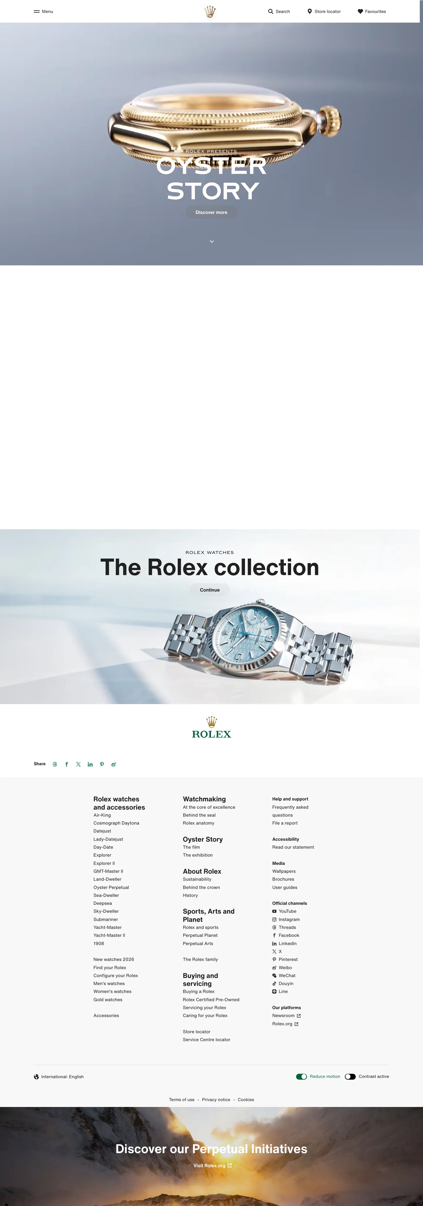
A snapshot of the brand in production. Scroll the frame to see the whole page.
Colors
8 colors
Rolex's system runs on #127749 as its primary voltage, used in 1 of 15 components. Type is set in Helvetica Now Text across 11 tokens from 11px to 78px, weights 400–700. Shape language is sharp — components average 0px corner radius, favoring crisp rectangles.
Brand & Accent
Sparing, CTA-only voltage · 2
Surface
Page and card backgrounds · 2
Text
Headlines, body, captions · 2
Borders & Hairlines
Dividers, outlines, rules · 1
Other
Specialty colors · 1
Typography
11 type tokens
Set in Helvetica Now Text across 11 tokens, from 11px to 78px, weights 400–700. Shown in its own stack: where the font isn't installed, the fallback the file names stands in.
- display-xl78px · weight 700 · lh 75pxThe quick brown fox jumps over the lazy dog
- display-lg42px · weight 700 · lh 51pxThe quick brown fox jumps over the lazy dog
- display-md35px · weight 700 · lh 35pxThe quick brown fox jumps over the lazy dog
- heading-md23px · weight 700 · lh 27pxThe quick brown fox jumps over the lazy dog
- body-lg16px · weight 700 · lh 1.4The quick brown fox jumps over the lazy dog
- body-md15px · weight 400 · lh 27pxThe quick brown fox jumps over the lazy dog
- body-sm14px · weight 400 · lh 20pxThe quick brown fox jumps over the lazy dog
- label-md15px · weight 700 · lh 27pxThe quick brown fox jumps over the lazy dog
- button-md16px · weight 700 · lh 1.4The quick brown fox jumps over the lazy dog
- brand-label13px · weight 400 · lh 18px · tracking 1.61pxThe quick brown fox jumps over the lazy dog
- brand-caption11px · weight 400 · lh 16px · tracking 1.42pxThe quick brown fox jumps over the lazy dog
Layout
Radii and spacing
3 corner radii and 7 spacing values. Shape language: sharp.
Radii
- none0px
- sm10px
- full9999px
Spacing
- xs8px
- sm10px
- md16px
- lg35px
- xl60px
- 2xl80px
- 3xl115px
Components
15 components
Each rendered from its tokens (color, type, radius, padding) on Rolex's own canvas.
- Button Primarybutton-primaryButton Primary
- Button Secondarybutton-secondaryButton Secondary
- Top Navtop-navTop Nav
- Nav Linknav-linkNav Link
- Hero Headinghero-headingHero Heading
- Section Headingsection-headingSection Heading
- Body Paragraphbody-paragraphBody Paragraph
- Brand Labelbrand-labelBrand Label
- Brand Captionbrand-captionBrand Caption
- Hero Bandhero-bandHero Band
- Product Cardproduct-cardProduct Card
- Card Darkcard-darkCard Dark
- FooterfooterFooter
- Footer Linkfooter-linkFooter Link
- Logo Bandlogo-bandLogo Band
In use
The system, in use
Rolex's tokens on the kind of product it builds.
Build something people actually use.
A short paragraph of marketing copy that previews how the brand's display tier and body tier read together. Two sentences is usually enough.
FAQ
Rolex design system FAQ
Common questions about Rolex's tokens, components, and how to use this DESIGN.md in your project.
Read next
Related reading
Specs, directories, and component libraries that pair with this design system.
- Browse all design systemsThe full directory of DESIGN.md files on shadcn.io, with live mockups for each.shadcn.io
- Rolex — official siteRolex's public marketing site — the source of truth for the live tokens captured in this file.rolex.com (opens in a new tab)
- The DESIGN.md specificationGoogle Labs' open spec for machine-readable design system files — the format this page is built on.github.com (opens in a new tab)
Use it
Use Rolex in your project
One machine-readable file. Drop it into Claude, Cursor, or any AI tool that reads DESIGN.md.
Download the DESIGN.md
One machine-readable file: every color, type, radius, spacing, and component token of Rolex.
Feed it to your AI tool
Drop it into Claude, Cursor, or GitHub Copilot. The agent writes React components and Tailwind classes that match Rolex's visual language.
Reference the tokens directly
Or paste the values into your Tailwind config, CSS variables, or component library: every color, size and radius is a quoted, ready-to-copy value.
Read the full DESIGN.md: overview, rationale, do’s and don’ts
Overview
Rolex's marketing site practices what might be called photographic authority — the brand retreats entirely behind the watches, trusting full-bleed product photography against neutral grey gradients to carry every visual job that other luxury brands give to typography, color, or ornamentation. The canvas is technically two-tone: near-black #212121 ink on a flat white body, with the hero area deploying a mid-grey gradient background that reads as a studio-photography surface. Where Patek Philippe layers its watches on near-black editorial panels and Omega introduces a crimson voltage into section headings, Rolex holds the chromatic moment down to a single forest-green mark at #127749 — the Rolex crown emblem and a handful of nav-link accents.
The typographic voice splits between two families that never share a size or weight tier. Helvetica Now Text carries every display, heading, body, and button role — ranging from 78px at weight 700 for the section heading "The Rolex collection" all the way down to 14px at weight 300 for body small. The proprietary RolexFont-S appears only at 11-13px with 1.4-1.6px letter-spacing for attribution labels like "Rolex presents" and model category spans. The weight gap between display (700) and body (300) in the same family is wider than most luxury systems allow — the brand uses this arc as a rhythm device rather than a hierarchy signal.
Key Characteristics:
- Single forest-green voltage (#127749) across the entire marketing surface — 20 total occurrences, nearly all as text or border in navigation elements.
- Near-monochrome two-tone palette: near-black (#212121) ink on white (#ffffff) canvas, with a grey studio gradient for hero photography backgrounds.
- Helvetica Now Text spanning weight 300 body through weight 700 display — the widest weight arc in the extraction.
- RolexFont-S at 11-13px / 1.4-1.6px tracking as a proprietary second voice for brand attribution labels only.
- Binary radius: 9999px full pill for the primary CTA, 0px sharp corners for every other surface — no middle tier.
- Primary CTA ("Discover more") is a grey-filled (#767676) pill with white text — the button color is not the brand green.
- Full-bleed cinematic watch photography with no decorative brand chrome competing with the product.
- 8px base spacing unit; section-level padding at 60-115px.
Colors
Brand
- Forest Green (
{colors.primary}— #127749): frequency 20. Used as text (10), border (10). The Rolex crown color — appears exclusively in navigation accents, brand crown marks, and the focus ring. Wired in CSS as--greenand--focus. The single chromatic moment on the page; every other visible color is structural. - Forest Green Dark (
{colors.primary-dark}— #006139): frequency 1, as background. Appears in the gradient CSS variable--gradient-qrcode-green-from— used inside the Rolex QR/explore band. Not part of the primary marketing chrome.
Surface & Canvas
- Canvas (
{colors.canvas}— #ffffff): pure white editorial body floor. Below-fold body paragraphs, product grid background, top navigation. The CSS variables include a near-identical near-white (--light-grey/--pure-white) that collapses into the same white cluster — the system is flat-white rather than warm. - Pure Black (
{colors.pure-black}— #000000): frequency 1, as background fill. Used for a single dark editorial band in the page layout.
Text
- Ink (
{colors.ink}— #212121): frequency 440 — the dominant color across the entire page; 220 as text, 220 as border. Near-black, never pure black. Wired as--light-blackin the CSS. Used for every body text instance, every navigation label, every hairline rule. - Ink Light (
{colors.ink-light}— #ffffff): frequency 79 — white text and borders, used over the hero grey gradient and any dark editorial bands.
Hairlines
- Surface Grey (
{colors.surface-grey}— #767676): frequency 1, as background. The hero watch-photography studio gradient — mid-grey background that displays the watch photographs at neutral contrast. - Hairline (
{colors.hairline}— #d4d4d4): frequency 1, as background. Light grey divider tone, matching--greyin the CSS variables. Used in footer rules and divider lines.
Typography
Font Families
The system runs two typefaces with completely separate roles. Helvetica Now Text carries every spoken surface — display, heading, body, button, nav — with a dramatic weight arc from 300 (body) to 700 (display). RolexFont-S, a proprietary family, appears only as a brand-attribution voice at 11-13px with wide letter spacing (1.4-1.6px). The two families never appear at the same size tier; the split is semantic rather than aesthetic.
Hierarchy
| Token | Size | Weight | Line Height | Letter Spacing | Use |
|---|---|---|---|---|---|
{typography.display-xl} | 78px | 700 | 75px | 0 | Primary section h2 ("The Rolex collection") |
{typography.display-lg} | 42px | 700 | 51px | 0 | Secondary display block |
{typography.display-md} | 35px | 700 | 35px | 0 | Sub-section h3 titles |
{typography.heading-md} | 23px | 700 | 27px | 0 | Nav-pane links, expanded navigation items |
{typography.body-lg} | 16px | 700 | 1.4 | 0 | Strong body / CTA label |
{typography.body-md} | 15px | 400 | 27px | 0 | Default body — most visible text |
{typography.body-sm} | 14px | 400 | 20px | 0 | Secondary body, footer text |
{typography.label-md} | 15px | 700 | 27px | 0 | Inline strong labels |
{typography.button-md} | 16px | 700 | 1.4 | 0 | Primary CTA label |
{typography.brand-label} | 13px | 400 | 18px | 1.61px | RolexFont-S — model attribution spans |
{typography.brand-caption} | 11px | 400 | 16px | 1.42px | RolexFont-S — category label spans |
Principles
Display weight tops at 700. Body bottoms at 300 (wired as --primary-font-weight: 300 in CSS). The gap between them — 400 weight points — is wider than most luxury brands use; Patek Philippe runs everything in Open Sans weight 300-400, Omega runs a narrow 400-700 arc on a single family. Rolex uses the full Helvetica Now Text weight range as the system's rhythm device. RolexFont-S at 1.4px tracking is the brand's proprietary accent voice — never for running text, always for attribution.
Note on Font Substitutes
Helvetica Now Text is a licensed font. The closest open-source substitute is Inter at equivalent weights — the proportions transfer cleanly at body sizes. For RolexFont-S, any uppercase-tracked sans (Inter at letter-spacing: 0.1em uppercase) approximates the visual role, though the proprietary character shapes are not replicable without the license.
Layout
Spacing System
- Base unit: 8px.
- Tokens:
{spacing.xs}8px ·{spacing.sm}10px ·{spacing.md}16px ·{spacing.lg}35px ·{spacing.xl}60px ·{spacing.2xl}80px ·{spacing.3xl}115px. - CTA padding: 0×35px (vertical 0, horizontal 35) — the pill button's generous horizontal padding is the primary layout spacing move.
- Section padding (vertical): 60px between major editorial bands; 115px on the deep hero photography canvas.
Grid & Container
- 12-column grid: explicit in CSS variables —
--grid-col-num: 12,--grid-gap: 8px,--outer-margin: 8vw. The product-watch grid calculates width from CSS:calc(((100vw - 8vw * 2) - (8px * 11)) / 12)per column. - Max content width: ~1280px on editorial bands; watch photography fills edge-to-edge.
- Product grid: 12-column watch catalog grid below the fold — Submariner, Datejust, GMT-Master II, etc. each in an equal-width tile.
Rhythm
The page alternates between a full-bleed photograph section (hero above fold, grey studio gradient background) and a white editorial body below. There is no dark canvas band in the main marketing body — the editorial sections are all white with near-black type. The dark band ({colors.pure-black}) appears as a single accent panel, likely a promotional strip.
Elevation
The system has no shadow tier. Depth comes from the photographic gradient — the mid-grey hero background (#767676, #d4d4d4) reads as a studio surface with depth implied by the watch's three-dimensional photography rather than by any CSS shadow. Cards in the product grid sit flat on the white canvas with hairline borders as the only distinction. No box-shadow values appear in the captured component data.
Shapes
The radius vocabulary is binary with no middle tier:
{rounded.none}0px — all cards, section bands, editorial surfaces. Sharp precision.{rounded.sm}10px — appears on a secondary surface (tooltip or dropdown), 3 occurrences.{rounded.full}9999px — the primary CTA pill. The single warm surface in the system.
No 4px, 8px, or 16px middle-range radius exists. The system reads as either rigorously architectural (0px) or inviting (full pill) — no middle ground. This binary tension is the radius signature: the pill says "this is the action" and sharp says "everything else is structural."
Components
button-primary — Grey (#767676) pill at 9999px radius, white text, 16px bold Helvetica Now Text, 0×35px padding, 44px height. The CTA label is "Discover more" — the button background is mid-grey, not the brand forest-green. The green is held for brand marks only.
button-secondary — Transparent fill with a 1px ink (#212121) border, ink text, 0px radius. Used for tertiary actions.
top-nav — White canvas, near-black text, 77px height. Houses the Rolex crown mark (in forest green), the primary nav links (Watches, Accessories, About, Watchmaking, Sustainability), and the right-side utility cluster (search, find boutique, language).
nav-link — Transparent background, near-black text at heading-md (23px / 700) — larger than typical nav links. The expanded nav pane uses these as primary category labels.
hero-band — Mid-grey studio gradient background, white text, full-bleed. Watch photography fills the band edge-to-edge with the brand label ("Rolex presents") in RolexFont-S floating over the watch.
hero-heading — Transparent background, near-black ink, display-xl (78px / 700). "The Rolex collection" — below the fold, not over the photography.
section-heading — Near-black text, display-md (35px / 700). Used for category names in the watch grid ("Oyster Perpetual," "Cellini," etc.).
body-paragraph — Near-black text at body-md (15px / 400 / 27px line-height). The default running text below section headings.
brand-label — White text at RolexFont-S body-label (13px / 400 / 1.61px tracking). Used over the hero photography for attributions like "Rolex presents."
brand-caption — White text at RolexFont-S brand-caption (11px / 400 / 1.42px tracking). Category span labels.
product-card — White canvas, near-black text, 0px radius, 16px padding. Each watch in the 12-column product grid: watch photograph top, model name + reference number, "Discover" link beneath.
card-dark — Pure-black canvas, white text, 0px radius, 60px vertical / 115px horizontal padding. The single dark editorial accent panel on the page.
footer — White canvas, near-black text at body-sm (14px / 400), 60px padding. 5-column link grid: Rolex watches / Maintaining / Discover / Sports, Arts and Culture / Buying on Rolex.com plus social icons.
footer-link — Transparent background, near-black text at body-sm. The standard footer navigation item.
logo-band — White canvas, forest-green brand mark, RolexFont-S label typography. Transition band between product grid and footer.
Do's and Don'ts
Do hold the forest green exclusively for the Rolex crown mark and navigation accents. The system's restraint depends on the green appearing 20 times across 440 structural occurrences — expanding it to CTAs or body text breaks the monochrome discipline.
Do let watch photography carry every decorative and depth job. The hero mid-grey studio gradient exists to give the watch photograph a neutral backdrop, not to function as a brand surface.
Do use the full Helvetica Now Text weight arc — weight 300 for body, 700 for display — rather than collapsing to a single weight. The weight gap is the system's rhythm device.
Do maintain the pill-or-nothing radius rule. Primary CTAs at 9999px full pill; every other surface at 0px sharp. Introducing a 4-8px intermediate radius softens the precision the brand is built on.
Don't use the forest green (#127749) as a CTA background color. The actual primary button uses mid-grey (#767676) — the green is a mark color, not an action color.
Don't add typographic ornamentation (serifs, decorative scripts, display ligatures) to the brand-label spans. RolexFont-S at its narrow tracked-uppercase form is the proprietary brand voice; replacing it with a decorative alternate undermines the attribution precision.
Don't introduce warm-cream or beige canvas tones. The system is flat technical white (#ffffff) — the warmth comes from the watch photography's gold and steel tones, not from the surface.
Don't apply {rounded.sm} (10px) to primary surfaces. The 10px radius is reserved for small secondary surfaces (tooltips, dropdowns) — using it on cards or section bands creates a visual inconsistency with the binary 0px/pill system.
Known Gaps
- Hover and focus states: the primary CTA hover variant is not visible in the captured marketing surface; the CSS does declare
--focus: 36 154 100(forest green) as the focus ring color. - Form input states: no text input appears in the extracted components; Rolex.com's boutique-finder and configurator surfaces carry input fields that are not represented here.
- Dark mode: the system appears light-only on the marketing surface. The CSS does include dark-canvas variables (
--dark-green,--gradient-dark-green-from/to) but no dark-mode page renders on the public marketing site. - Motion: the hero watch photography uses scroll-parallax and rotation; easing curves and animation durations live in the JavaScript runtime and are not captured here.
- RolexFont-S details: character spacing is measured from the rendered output; the proprietary typeface's full glyph set, optical sizes, and WOFF2 loading strategy are not exposed in the marketing CSS.
- Color token depth: the extraction captured only 8 distinct hex clusters across 1356 elements — the sparsest palette in the luxury watch set. The CSS variables reveal additional gold, bronze, and light-grey tones (
--rolex-gold: 146 108 28,--bronze: 116 114 102,--ocean-green: 155 249 206) that appear in sub-brand contexts (the Perpetual Planet initiative) but not in the primary marketing render.
E-commerce & Retail
More systems like this
More DESIGN.md files in E-commerce & Retail.
Pricing
Build it with Pro
The DESIGN.md files are free. Pro adds 6,000+ blocks, premium templates and the MCP server, so your AI editor builds in your system for you.
4.9/5 out of 5 · 150+ reviewsfrom 150+ founders and developers.
Billing
Billed once a year in USD. Cancel anytime.
- How many people can use the license.
- Client work, SaaS products and anything you charge for.
- Production-ready React sections: hero, pricing, features, dashboards and more.
- Complete multi-page sites you can ship as they are.
- React icons from every major library, installable with one command.
- Presets that restyle every block, in light and dark.
- Lets your AI editor search, preview and install blocks for you.
- Priority requests are answered first.
Individual
For personal projects & open source
$32instead of $49/mo
$389 billed yearly
- Seats: 1 seat
- Commercial use: Personal & open source only
- Pro blocks: 6,000+ blocks
- Templates: All 14 templates
- React icons: 294k+ icons
- Themes: All 59 themes
- MCP server: Basic usage
- Support: Standard
Team
Most popularFor freelancers, agencies & startups
$66instead of $99/mo
$789 billed yearly · ≈ $13/dev/mo
- Seats: Up to 5 seats
- Commercial use: Included
- Pro blocks: 6,000+ blocks
- Templates: All 14 templates
- React icons: 294k+ icons
- Themes: All 59 themes
- MCP server: High usage
- Support: Priority
Organization
For companies with larger teams
$132instead of $199/mo
$1,589 billed yearly
- Seats: Unlimited seats
- Commercial use: Included
- Pro blocks: 6,000+ blocks
- Templates: All 14 templates
- React icons: 294k+ icons
- Themes: All 59 themes
- MCP server: Unlimited usage
- Support: Priority
Billed once a year in USD. Cancel anytime.
Individual
For personal projects & open source
$32instead of $49/mo
$389 billed yearly
- How many people can use the license.Seats: 1 seat
- Client work, SaaS products and anything you charge for.Commercial use: Personal & open source only
- Production-ready React sections: hero, pricing, features, dashboards and more.Pro blocks: 6,000+ blocks
- Complete multi-page sites you can ship as they are.Templates: All 14 templates
- React icons from every major library, installable with one command.React icons: 294k+ icons
- Presets that restyle every block, in light and dark.Themes: All 59 themes
- Lets your AI editor search, preview and install blocks for you.MCP server: Basic usage
- Priority requests are answered first.Support: Standard
Team
Most popularFor freelancers, agencies & startups
$66instead of $99/mo
$789 billed yearly · ≈ $13/dev/mo
Everything in Individual, plus
- How many people can use the license.Seats: Up to 5 seats
- Client work, SaaS products and anything you charge for.Commercial use: Included
- Lets your AI editor search, preview and install blocks for you.MCP server: High usage
- Priority requests are answered first.Support: Priority
Organization
For companies with larger teams
$132instead of $199/mo
$1,589 billed yearly
Everything in Team, plus
- How many people can use the license.Seats: Unlimited seats
- Lets your AI editor search, preview and install blocks for you.MCP server: Unlimited usage
- Secure checkout via Stripe
- Code lives in your repo
- Keep what you've shipped if you cancel
- License terms
Your system, built for you
Every block, template and icon, installed by your AI agent in your design system. The DESIGN.md files stay free.